jingle all the way.

Back in April, Mary over at orphans with makeup (if you’ve never visited Mary’s blog, you should, she does beautiful work) posted about working with Homestead House to style and photograph all of their milk paint colors.

Her photo of the color Upper Canada Green (above) got me thinking about an oval gold frame that I’ve had hanging around for ages.

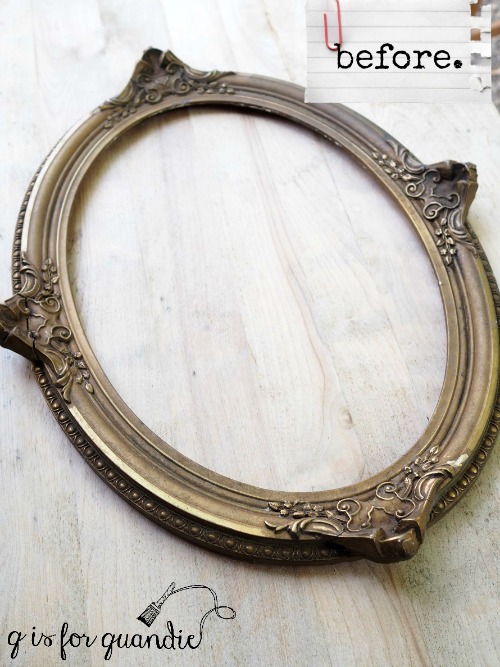
I used this frame in my dining room for a long time.  I never put anything in it.  I used it flat on the table as part of a centerpiece for a while, and I also layered it in front of a larger gold framed mirror hanging on the wall.  But as much as I loved it ‘as is’, when I decided to change up the dining room a couple of years ago it was time to sell it and move on.  As it turned out, no one else loved it as much as I did because it didn’t sell.  Maybe no one could figure out what to do with an empty frame?  Or maybe no one else loves the gold?

When I saw Mary’s photo it got me thinking about using some milk paint to give the frame a new look.  So a while back when I had some milk paint left over after painting my green alligator farmhouse table, I used it to paint this frame.

Green Alligator is a custom mix of equal parts Miss Mustard Seed’s Kitchen Scale, Homestead House’s Upper Canada Green and Loyalist.

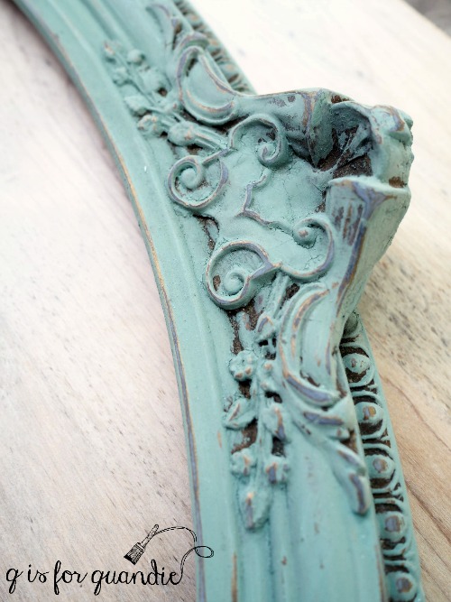
As you can see in that photo, I didn’t try to get paint into every crack and crevice.  I almost dry brushed it on, trying to leave bits of gold showing on the high points.

I then used 220 grit sandpaper to remove even a little more paint, and finally I waxed the frame with Miss Mustard Seed antiquing wax to give it some age.

The dark wax dulls the color a bit and adds more definition to the details.

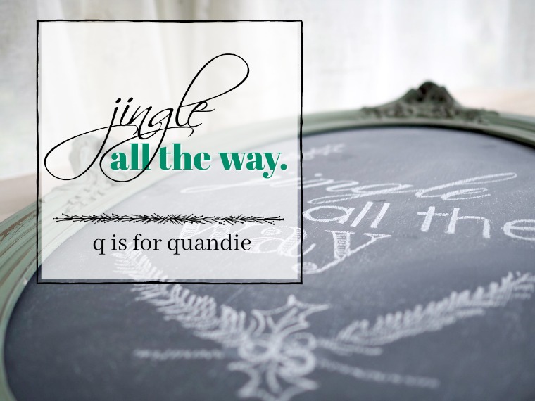
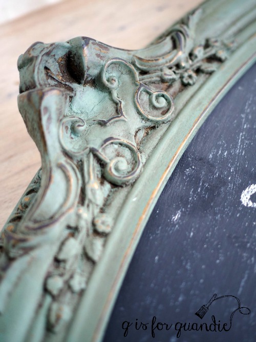
Ken cut a piece of hard board to fit the frame so that I could turn it into a chalkboard.

I added the ‘jingle all the way’ using my tracing method (shared here), and then I free-handed the holly and sprigs of evergreen.

So now that I’ve solved both of my problems; it’s no longer gold and it now has a designated purpose as a chalkboard, hopefully it will sell quickly at Reclaiming Beautiful.

What do you think?


skating away.

Who remembers the old show Ally McBeal?  Am I seriously dating myself with that one?   It was on back in the olden days when you actually had to watch a TV show when it was scheduled to be on.  Ah, the memories.

Well anyway, I was a fan of that show and at the time I purchased their Christmas CD which is mainly Vonda Shepard, but also a couple of numbers by the actors from the show including I Saw Mommy Kissing Santa Claus sung by Jane Krakowski and the song River sung by Robert Downey Jr.

Who knew that Iron Man could sing?

Well, that song is one of my favorites from the CD.  It’s a bit melancholy, but it’s so beautiful.  Normally I give myself permission to start listening to Christmas music on Thanksgiving, but I’m starting a little early this year.

I don’t actually wish I had a river that I could skate away on, but somehow that song always pops into my head when I see ice skates!

When I dug that pair of ski’s out of the back of the carriage house that I posted last week, I also grabbed this pair of skates.  These are another item that was left over from my occasional sale last year.  They weren’t quite so grungy at the time of the sale, but a year in the carriage house lean-to did them no favors.

So I decided to paint them.  Because … duh … that’s what I do!

I started by removing the laces and putting them in a bucket of water with some OxyClean to soak.  Then I washed the dirt off the skates with some Dawn dish washing soap and water and let them dry.

Then I painted them with Fusion’s English Rose.  After all, I did decide to have a pretty in pink Christmas this year, remember?

It only took one coat to get this beautiful coverage by the way. Once the paint was dry I added a couple of rub-on’s from my scrap-booking stash.  Unfortunately, I’ve had the leafy rub-on that is on the side of the skate so long that I doubt you could find it to purchase anymore.  If you want to search, it’s from the Sabrina line from Making Memories.

Didn’t those laces brighten up nicely from their soak in the OxyClean?

I also added a few random number rub-on’s from Tim Holtz.  Some on the heels …

and some on the toes …

By the way, if you know anything about ice skates you might have noticed that these are training skates.  You can’t really tell in the photos, but they are little bitty … only about 8″ long, meant for a little girl who is new to ice skating.

But I really think of them as a home decor item rather than for actual skating.  They are perfect for draping over a vintage sled, don’t you think?


a pretty in pink Christmas.

When the issue of Vintage Holiday magazine that featured my non-collection of vintage Christmas ornaments arrived in my mail box a while back I sort of fell in love with the pink Christmas scene on the front cover.

Isn’t that pink chippy mantle to die for?

Following closely on the heels of the magazine’s arrival, the people at Fusion offered to send me some of their newest shade of paint, a gorgeous pink called English Rose.

It seemed as though the universe was trying to tell me something, that I should plan a pretty in pink Christmas!

So I started with making some gift boxes using the same technique I’ve used in the past for faux french hat boxes.

I purchased several plain cardboard gift boxes at Hobby Lobby.  You can get these for just a few dollars each if you wait until they are on sale for 50% off (which seems to happen every 4 – 6 weeks or so).

Next I simply painted some of them in the new Fusion pink, English Rose and one in Fusion’s paler pink, Little Piggy, for contrast.  I painted each with two coats of paint.

I wanted to use a Christmas themed graphic on them, and when I found these 12 Days of Christmas graphics on Etsy I knew they would be perfect.  I purchased six of them from Project Printable for $1.50 each, so an investment of $9.  The seller conveniently provided a mirror image jpeg along with the regular jpeg so I didn’t have to worry about figuring out how to print a mirror image, which is what you need for a transfer.  Slick, right?

Yes, I know you can find free graphics online and I like to find those when I can as well, but sometimes it’s worth it to pay a little money for the convenience of finding exactly what I wanted.

Next I used Fusion’s transfer gel to transfer the graphics to the painted boxes.

  You can print a copy of the detailed instructions here:  making a faux hatbox with transfer gel.

And voila, I have pretty Christmas gift boxes that can be re-used over and over.

Keep in mind that you aren’t likely to achieve perfection with this method of transferring a graphic.  Some bits of your design will likely rub off.

But perfection is seriously over-rated.  I prefer to embrace a distressed, imperfect look.

These packages are going to look so pretty under my tree full of vintage ornaments … just as soon as I get that set up …

If any of you locals want to make your own pretty in pink gift boxes, Reclaiming Beautiful in Stillwater has some of the English Rose paint in stock while it lasts.  Plus their holiday open house is this afternoon from 3 p.m. to 7 p.m.  Stop by, have a glass of wine and do a little shopping.

If your aren’t local, click here to find a Fusion retailer near you!


faux ski re-style.

I picked up this beat up pair of faux wooden ski’s at a garage sale a couple of years ago.

Then I promptly forgot all about them until I was cleaning out my carriage house the other day.  I think they were about one step away from ending up in the burn pile.

They aren’t real ski’s, obviously.  I’m assuming they were always meant to be decorative in some way.  So I decided to see if I could improve them with a little paint.

I started by mixing up some Barn Red milk paint that Homestead House sent me a while back.

This color is pretty much exactly what you would expect from a barn red.  Just a tad darker and more muted than Miss Mustard Seed’s Tricycle.

It just took one coat to cover the wood perfectly.  Since this was bare wood the paint soaked in and didn’t chip at all.  Once dry, I stenciled my Christmas message in a warm white acrylic craft paint.

Can I just mention at this point that it’s really challenging to take interesting photos of long skinny items?

Once the stenciled designs were dry I sanded the ski’s to distress them a bit and then wiped them down with a rag and just a small amount of Miss Mustard Seed furniture wax.

And just like that these ski’s became colorful Christmas decor.

I put a hanger on the back so they can be hung on the wall horizontally under one’s banjo, if one happens to have a banjo on the wall.

But they also could be just propped up vertically.

I worked on a few other little painting projects last weekend, all part of a pile of stuff I’ll be bringing in to Reclaiming Beautiful  for their upcoming holiday open house on Thursday.

If you’re local, consider heading to Stillwater on Thursday starting at 3 p.m. for a little shopping!

french pumpkins.

When it comes to fall decorating, I’m not exactly a traditionalist.

Last year I made a French pumpkin using Fusion’s transfer gel and a printed French opera graphic.  And you’ve all seen my ‘hello fall’ book page banners.

This year I decided to add another white pumpkin to my line up.

I started out with this orange wooden pumpkin wall hanging with a decidedly 90’s country look.  In fact, I do believe I’ve probably owned this since the 90’s.

First I de-countrified it by taking off the heart and the “Autumn Greetings” top.

Next I painted it white with some Homestead House milk paint in Sturbridge White.  Once that was dry I sanded it to distress, vacuumed off the dust and then added a Iron Orchid Designs transfer.

I totally ignored the fact that pieces of the design got lost in the cracks.  It really doesn’t matter.  I was going for a very distressed look anyway.

Next I sanded lightly over the transfer with 220 grit sandpaper.

Since I was planning to hang this outside, I added a top coat of the Real Milk Paint Co’s Dead Flat to protect both the milk paint and the transfer.  However, you should note that Dead Flat is not intended for outdoor use.

I have it hanging on the carriage house where it is partially protected from the elements by an overhang and it will only hang here for a month or two, not year round of course.  Still, I’m taking a bit of a chance.  If it gets ruined I will only have myself to blame.

How about you, are you more of a traditional orange pumpkin sort of decorator?  Or do you also prefer some pumpkins with a french twist?


memory collectors.

Just before my occasional sale last year I had the idea to turn some vintage graters into photo holders.  I loved the way they turned out, so recently when I saw some graters at a garage sale I picked them up to make some more.

This time I decided to upgrade the idea a little with some more substantial clips.  I found these Tim Holtz Idea-ology clipboard clips at Hobby Lobby.

I pulled out the rest of the supplies I needed; some Little Billy Goat paint, Tim Holtz Idea-ology rub-ons, and some Homestead House Salad Bowl Finish (bees wax).

I started out with painting the clips.  Although they were OK as is, I wanted to ‘age’ them up with some paint.  I painted them with a couple of coats of paint, then sanded them to distress, added some rub-on designs and put a coat of Homestead House Salad Bowl Finish over it all.

I added various rub-ons to all of the graters themselves as well.

You know, at first I didn’t even realize that I’d used these Tim Holtz rub-ons in 3 out of 5 posts this week.  Sure enough, I used them on the yellow pots on Tuesday, the jewelry dresser yesterday, and now again today.  Obviously I love them.  I’ve always thought they would be so much fun to use on furniture if only they weren’t so very small.  I’m so glad that the ladies at Iron Orchid Designs started making their fabulous decor transfers in sizes suitable for furniture!

It wasn’t until I added the phrase ‘collector of memories’ to one of the clips that it hit me, that’s exactly what these are, memory collectors.

Although I have old photos clipped in place, you could also add some memorabilia like ticket stubs, old letters, greeting cards, old family recipe cards (that one is for you Meggan) … whatever.

This next one would be perfect for the family Christmas photo.

Since I’m not having an occasional sale at my house this year, I brought these in to Reclaiming Beautiful last night.  They are for sale at $12 each while they last!


storing the family jewels.

Way back last winter Mr. Q followed up on a Craigslist ad I sent him and he purchased this for me.

From the fuzzy pictures included with the Craigslist ad, I thought it was another old doll dresser.  When Mr. Q saw it in person he thought I would love it due to my love of tiny dressers, but he forgot to factor in that I am a bit of a tiny dresser snob.  You see, it’s not old.  Well, it’s probably slightly old … like 80’s old, but not the kind of old I like.  It’s also a bit bigger than I thought it would be.  I’m sure it was always intended to be a jewelry box.

So it sat.  First it sat in my Q Branch for a while, then it sat on my unused three season porch during the 4th season (winter), then it got moved out to my carriage house workshop where it sat all summer.

But I finally pulled it out and decided to give it a ‘quandie quickie Wednesday’ makeover.

First things first, I got out some sandpaper and gave the piece more of a distressed look.  That alone was a major improvement.  But then I swapped out the knobs on the front.  I just wasn’t loving either of the knob styles that the dresser came with.  The knobs on the tiny upper drawers were painted over metal and a bit too small, while the knobs on the lower drawers were plastic and just a bit too big.  So I replaced all of them with some white porcelain knobs that I had on hand.

I added some fun Tim Holtz rub-ons behind the lower knobs.

Next I added some more Tim Holtz rub-on numbers to the inside drawers.

But for me, the real pièce de résistance is the Iron Orchid Designs transfer I added to the top.

This is another of the designs that came with the “French Pots III’ set that I purchased for the cupboard in my bedroom.  Once again, even though these were meant for clay pots, this one worked beautifully for this jewelry box as well.

So, a few quick improvements added a lot to this piece, don’t you think?

This jewelry box found a new home with one of the Reclaiming Beautiful owners, Monique.  I hope she’s enjoying it!

taking a box from drab to fab.

I found this simple plywood hinged box at a garage sale this summer.

You might just see an ugly plywood box, but I see a blank canvas.

I knew that adding a little paint and some fun accents would dress this box up perfectly.

I started out by painting the box inside and out with a base coat of Fusion’s Algonquin.  The reason I did a base coat of Fusion paint was because I wanted to ultimately paint this with white milk paint.  If I painted over the bare wood with milk paint, the paint would absorb into the wood and be quite permanent, and not chippy at all.  That is definitely one of the great qualities of milk paint, but not necessarily what I wanted here.  Also, it would likely take quite a few coats to disguise that plywood texture since I’m using white.  I also like layering paint in this way because it adds a sense of age to the piece.

After the Algonquin was dry I added a little bit of Homestead House Salad Bowl Finish around the edges of the box to encourage chipping.  Since I’d recently been using both Homestead House’s Champlain and Sturbridge White milk paints and I had a little of each left over, I mixed them together for this box.  I painted two coats of the milk paint on the outside of the box only (I left the inside in Algonquin).

Once the paint was dry I sanded the box lightly all over which serves two purposes.  First it smooths out the milk paint surface.  You’d be amazed how much softer and smoother a milk painted surface feels with just a little light hand sanding with 220 grit sandpaper.  Second, it wore away the milk paint in the areas that had beeswax on them to reveal the base color.

Next I added the bottom portion of an IOD transfer.  This was left over after I used the upper portion on the foot board shelf I shared last month.

I love the bird on one side and the rat on the other side.  Did you notice them at first?

Once the transfer was rubbed on, I went over it ever so lightly with some 220 grit sandpaper.  The ladies at Iron Orchid Designs shared this tip with me for reducing the faint ‘halo’ that comes with the transfer.  After wiping it clean with a dry cloth, I used my new favorite top coat, Dead Flat Finishing Cream from the Real Milk Paint Co.  I applied that ever so quickly with a brush.  I feel like it also helps further diminish the look of that halo, mainly because it gives everything a consistent sheen.  In other words, the transfer is no longer shinier than the very flat milk paint.  They are both ‘dead flat’.

But wait, I’m not done yet!

I also added a really cool old door knob plate to the front of the box.

I have a stash of old hardware bits and pieces like this, so I went through it trying to find the perfect addition to the box.

Just so I wouldn’t see white box behind the openings in the door knob plate, I put an old Swedish bible book page behind it.  It’s a tiny detail that most people probably won’t even notice, but I will.

This box makes the perfect storage container for my old Jeanne d’Arc Living magazines.

This was such a fun project to work on.  Although there were a few steps, each one only took five or ten minutes.  I just worked on it a little bit each evening after work and by the end of the week it was done.

So the next time you see a plain and simple box, don’t pass it by.  Take it home and then take it from drab to fab!

laundry today or naked tomorrow.

My sister was off work last week, so on Friday she swung by my office, picked me up and we went to a few garage sales that were nearby on my lunch break.  We only had time to stop at about 5 sales and I didn’t find much, but my sister got a great deal on a leaf blower just in time for fall.

One thing I saw and debated buying was a vintage wooden ironing board.  I didn’t grab it because at $35 I thought it was a bit overpriced.  Plus I already had two of them in my carriage house.  However, it did inspire me to dig one of those out and turn it into a sign for today’s quandie quickie Wednesday post.

I used this ‘designer wall lettering’ to make my sign.  I can’t remember exactly where I found this, either Hobby Lobby or Joann Etc.

It couldn’t have been easier or quicker.  Simply remove the protective sheet, place the wording on your surface, rub with a plastic thingie (sort of like a credit card, it came in the package), and peel off the backing.

My only complaint about this product is how shiny the letters are.  The label says “appears hand painted”, but unless you are using some super glossy paint, I beg to differ.  They definitely look more like stickers than like hand painted lettering.

Next time I will opt for stenciling with actual paint.

Nonetheless, the ironing board laundry sign is pretty darn adorable.

I wish I had one of those gorgeous laundry rooms that other bloggers seem to have, with things like subway tile and vintage containers for the soap.

Oh, who am I kidding, even just having walls would be an upgrade.  My laundry facilities are in my cellar-like basement complete with cinder block walls, lots of spiders and perpetual dampness, so I had to stage these photos in the photo cottage.

But hey, I’m not complaining.  I’m lucky to have the photo cottage even if I have a less than stellar laundry room.

But if you happen to have a fabulous laundry room, or even just one with real walls, this fab vintage ironing board sign is available for local sale.  I’m planing to bring it down to Reclaiming Beautiful in Stillwater tonight so you can look for it there starting tomorrow. However, if you are local and want to call dibs on it for your laundry room, check out my ‘available for local sale’ page for more details and send me an email asap.


a garden stool.

I grabbed this little stool a while back when I saw it at a garage sale.

I love to buy small pieces like this to paint.  They are fun, quick little projects that bring a lot of satisfaction with just a little bit of effort.

They are also perfect projects for milk paint beginners.  So if you’re thinking about trying milk paint for the first time, look for something like this to experiment on.

I mixed up about 1/4 cup of Homestead House milk paint in a color called Upper Canada Green.  If you’re a Miss Mustard Seed milk paint fan, this color is quite similar to her Luckett’s Green.  I like to let my milk paint ‘simmer’ (I say simmer, but no heat or cooking is involved) a bit to be sure all of the pigments have had time to dissolve.  This is especially important with the greens.  So while I was letting the mixed paint sit for a bit, I sanded the stool and then wiped it down with TSP substitute.  I was trying to avoid getting too much chipping that would show that white paint underneath.

My efforts paid off because I didn’t get any chipping at all!

After two coats of paint and some drying time, I sanded lightly to distress the edges and then I added an Iron Orchid Designs furniture transfer.

This little stool is the perfect height to use for weeding your garden.  I don’t know about you, but I’m at a certain age where I pay later for sitting, kneeling or bending over the garden for too long.  So I like to use a little low stool when I’m gardening.  It just makes it so much easier!

I added a topcoat of Homestead House furniture wax to this stool, but I’m second guessing that decision now.  I’m not sure how well the wax will protect the rub-on from frequent sitting.  I probably should have opted for a more durable sealer, but … well … hindsight is always 20/20.

At this point I would not try to put a water based topcoat over the wax.  I don’t think it would adhere well or go on smoothly.  I wish I hadn’t been quite so quick to add that wax!  Live and learn, right?