my new favorite neutral.

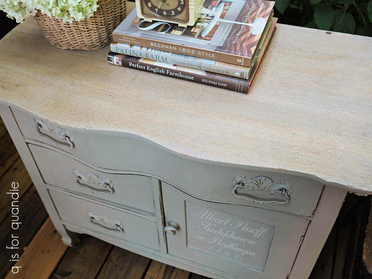
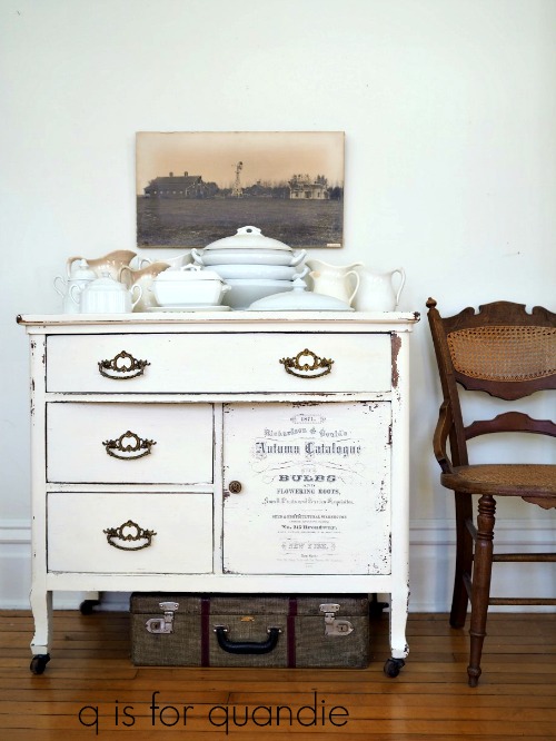
Remember the antique washstand that I brought home from the Nokomis neighborhood sale?

Well, I’ve been working on it for weeks!  Somehow it always seems like there is something else I need to focus on first.  But I’ve been chipping away at it, a little at a time, and it’s finally done.

I started with a few repairs that involved gluing some joints.  I also had to thoroughly scrub this one inside and out because it was filthy.  Next I stripped the top.  It took a couple of applications of CitriStrip to get that dark stain off.  Once it was gone, I sanded the top smooth and then stained it with Varathane’s Sunbleached wood stain.

I’ve used this stain a few times on various pieces and always love the way it turns out.

If you’re a fan of the sun-bleached look of raw wood, but you don’t like how adding back a topcoat darkens the wood back up again, then you may want to try this stain.

After letting the stain dry for 24 hours, I added two coats of Dixie Belle’s flat clear coat over it to protect the top.

As much as I know that people are loving the raw wood look these days, and that top looked fabulous, I just couldn’t bring myself to tackle stripping the entire piece.  There is just so much elbow grease involved no matter how you do it.

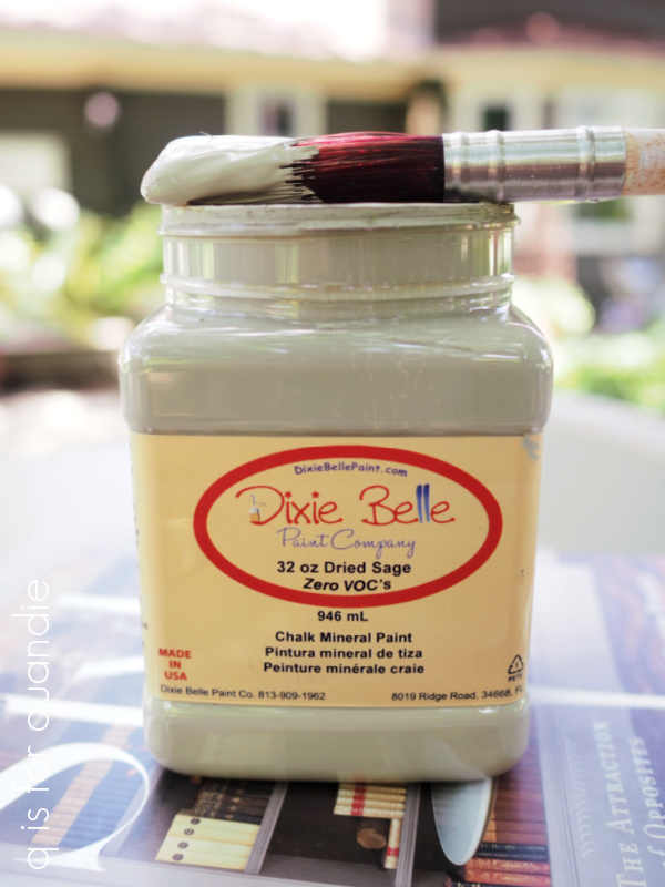
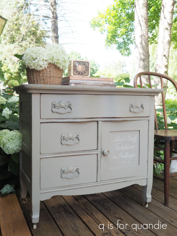
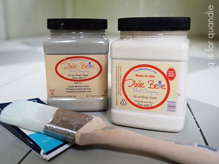
So instead I decided to ‘neutralize’ the base with some of Dixie Belle’s Dried Sage.

Step aside Drop Cloth, this color is slowly becoming my new favorite neutral.

Last year I used it on my potting shed floor (as I mentioned in Wednesday’s post), then I used it on Annie’s dresser

and then I used it on the Farmers Market bookcase

And of course I used it on the trunk on my front porch.

And now I’ve used it on this washstand.

I love that this color has a little more depth than the Drop Cloth (although, don’t worry, I do have another piece that I’m going to paint with Drop Cloth soon).

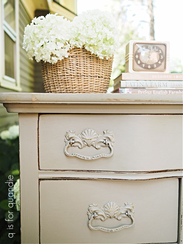
I opted to swap out the round knob that was on the door for a wooden one, which I also painted.  Then I also went ahead and painted the drawer pulls.

Since I was aiming for a more neutral sort of look, I wanted to blend those pulls in with the body a bit.

Next up I lined the two lower drawers, and the cupboard area, with some scrapbook paper.  Since scrapbook paper is 12″ x 12″, it works out great if your drawer/cupboard is that size or smaller.

I doesn’t work so well if your drawer is quite a bit wider, and also has a curvy front, though.  So instead of lining the top drawer, I freshened it up with a coat of Dixie Belle’s Big Mama’s Butta.

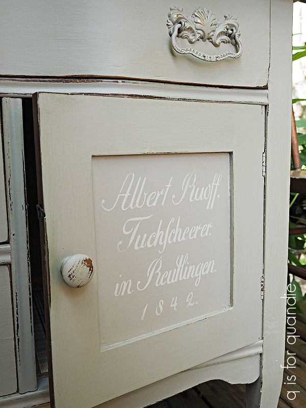
Finally, I couldn’t just leave this piece totally plain.  So I added a small stencil to the cupboard door.

This is one of the small 8″ x 8″ German Grain Sack stencils from ellen j goods, and it fit the opening perfectly.

I have to tell you that I initially stenciled it using Drop Cloth, but found that was too much of a contrast.  I wanted a far more subtle look so I sanded that down, repainted the door, and then tried again using some more Dried Sage that I lighted up a tad with Drop Cloth.

Perfect!

I top-coated the painted areas of the washstand with Big Mama’s Butta from Dixie Belle.

I have to say, I definitely lightened this one up.

What do you think?  Do you prefer the lighter version?  Leave a comment and let me know.

This piece is for sale locally, so be sure to check out my ‘available for local sale‘ page if interested.


a summer porch refresh.

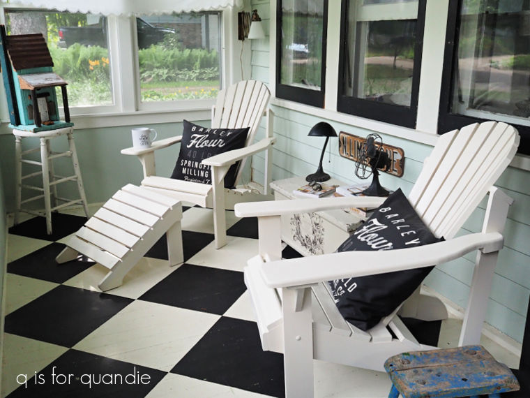
Last Friday I mentioned that we’ve been doing a lot of furniture shuffling around here lately.  So, while we were on a roll, I decided to give the front porch a refresh.

As much as I have loved the look of the wicker chaise lounge on the front porch (and I have to confess it has been out there for over 30 years!), I haven’t found it comfortable for a few years now.

I used to sit there and read in the evening, but my back just won’t tolerate that for long anymore.  So as a result, we never sit out there these days.

So when handyman Ken made another of his fabulous Adirondack chairs for me, I decided to use it in that spot.

They may not look it, but these chairs are super comfortable.

So as much as the chaise looked better out there, the Adirondack is the better choice if we actually want to use the space.  Yep, I’m going function over form for this one.

In case you’re wondering about the paint on the chair, it’s Rust-Oleum spray paint in Heirloom White.  These chairs can be rather tedious to paint (and trust me, I’ve painted many of them, many times), so I took a short cut with the spray paint.  Plus, the 2nd chair that was already out there was also already painted in Heirloom White.

After putting the new chair in place, it occurred to me that it was time for a makeover on the trunk that sits between the chairs.  Here’s how it started out …

I added that stencil way back in 2015 (you can read about that here), but I had grown tired of it.  Plus that original chippy white was just too bright of a white for me.  I like warmer shades of white like my favorite Dixie Belle Drop Cloth, or even the Heirloom White spray paint.

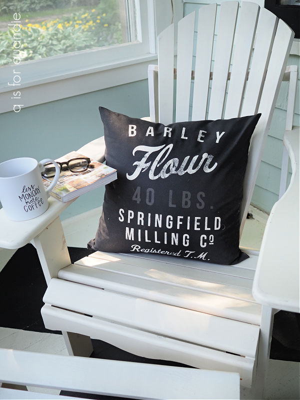
I did first consider painting it black, but I already have a couple of other touches of black out there that tie in to the floor such as the throw pillows that I purchased from H & M several years ago.

And the black cupboard.

Last week I said that I was going to sell it, but after this refresh I’ve decided it needs to stay.

I also considered painting the trunk with straight up Drop Cloth, but in the end I decided to darken it up just a tad so I mixed in a little bit of Dixie Belle’s Dried Sage.  You may remember that I lightened up the Dried Sage with some Drop Cloth when I used it on the checkered floor in my potting shed last summer.

As a sidebar, I am really loving the Dried Sage lately.  You’re going to see another piece painted in this color later this week.

But back to the trunk.

After painting it with my custom mixed color, I added a design from the I.O.D. Melange paint inlay to the front.

Isn’t that pretty?

After sealing the paint inlay with some matte spray sealer, I sanded the trunk well to bring back that chippy, worn look.  I followed that up with a topcoat of Dixie Belle’s Big Mama’s Butta.

I love how it turned out.

What do you think, was this an improvement for the trunk?  And how about the form over function question?

Would you have gone for adding a more comfortable chair that you’d actually use rather than a piece that you thought looked better?  Leave a comment and let me know.

As always, thank you to Dixie Belle Paint Co for providing the Dried Sage paint and Big Mama’s Butta used in this makeover.

a virtual garage sale.

I’m doing something a little bit different today!

I’m having a bit of a virtual garage sale.

We’ve been doing some re-arranging here at our house.  It’s one of those chain reaction sort of things.  We’re turning the guest room into a studio for Mr. Q, and he’s gotten a bigger table for that space, thus freeing up his old desk to become my desk.  But a bigger desk for me means getting rid of my small farm table desk, and also moving the rooster cupboard out to the porch and thus getting rid of the black cupboard on the porch.  You get the idea, things are being shuffled around and as a result I have several pieces of furniture to sell at garage sale prices.

After listing a few of them on Facebook Marketplace, and then getting multiple spam messages about them (argh!  so annoying!), I decided to try a blog post.

Now, be advised, I’m not willing to ship any of my items, so you have to be within driving distance of St. Paul, MN to purchase any of them.  But maybe some of my local readers will be interested.

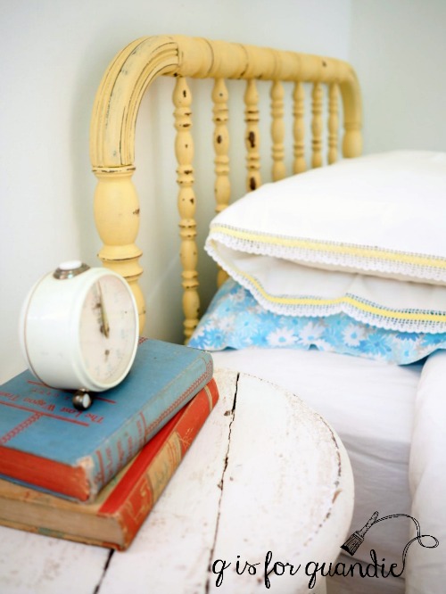
First up, the former guest room twin Jenny Lind headboard and bed frame.

The ancient mattress and box spring have already been picked up by my trash hauler, I’m just selling the headboard and the metal bed frame with wheels that I used with it.

All for $45, the headboard is 41.5″ wide by 40″ tall.

Next up, the wicker chaise lounge from my front porch.  It is 41.5″ tall, 64″ long and 40″ wide.

I’ve decided to replace that with another of Ken’s Adirondack chairs, so it has to go.  The cushion is slip covered in a basic beige linen, and the cover can be removed and washed, which is nice.  This is for sale at the same $45 price tag (throw pillows not included).

I’m considering spray painting it black and then asking a little more for it, but if you’re interested in it ‘as is’ be sure to leave a comment (or email me at qisforquandie@gmail.com) a.s.a.p. before I get out the spray paint!

I’m also selling the black cupboard from the front porch.

It’s an antique piece that I painted black a long time ago.  I added the Beautiful Botanist transfer to the inside back in 2019.

You can read all about that here.

I’m letting this one go for $195.  It is 79″ tall x 16.5″ deep x 38″ wide.

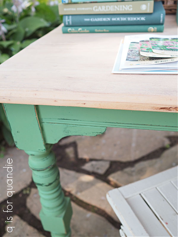
I also still have this square farmhouse style table for sale at $40.

The base is painted in Dixie Belle’s Kudzu.  These photos make it look just a bit brighter than it really is.  The top is finished with white wax.

It is 31″ tall and 34″ x 39″ wide, so not quite exactly square.

I added some casters to the feet after taking these photos, so this would be a great piece to use in a craft room, sewing room or studio since it can easily be moved around.

If any of you locals are interested in these pieces, leave a comment or email me at qisforquandie@gmail.com!

is English green a thing?

I watch a lot of British television.  Mostly garden shows, detective shows like Vera or Father Brown, and the occasional Graham Norton.

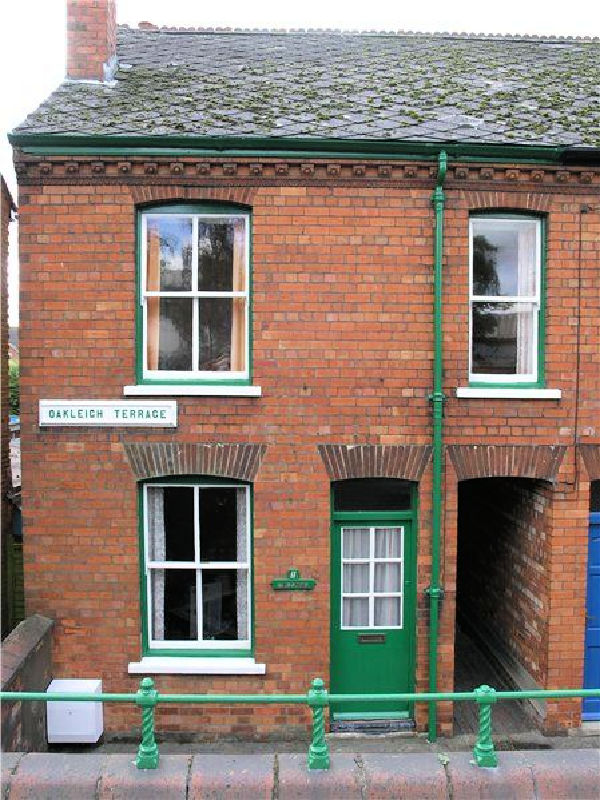
One thing that always seems to catch my eye are brick or stone cottages with a vibrant green trim.  I searched high and low online for a photo of the shade of green I picture in my head, but couldn’t find the exact color.  I have this photo that I took at The Beamish back in 2017.

That green isn’t quite as vibrant as others I’ve seen, this next one might be a bit closer.

Hopefully you get the idea.

Last summer I decided to change up my front door color to what I think of as that English Green.  I ended up choosing a color from Behr called Mown Grass.

Then earlier this week I pulled that color back out and painted the obelisk trellis that my handyman Ken made.

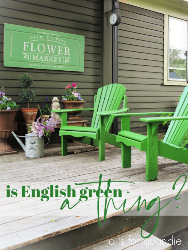
You may remember that earlier this spring.  I painted up a Flower Market sign to hang on my back deck.

Well, OK, it was supposed to be spring, but we had that freak snow storm on April 1.

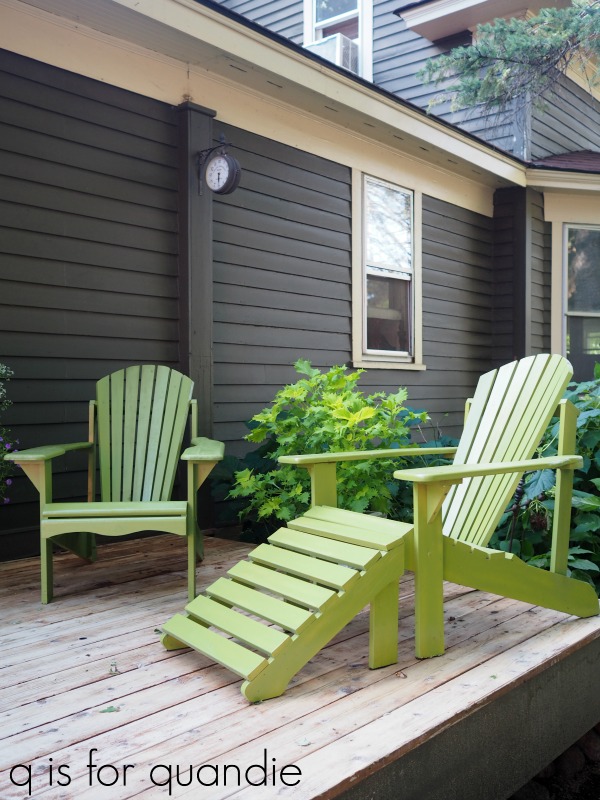
I used a Dixie Belle color called Kudzu on that sign, and I really love it.  At the time I was only thinking about what color would work well on the dark olive green-ish color of our siding.

I never even thought about the pair of Adirondack chairs that would sit in front of it.

It wasn’t until we pulled them out of winter storage this spring that I realized their existing yellow-green color was all wrong with the Kudzu.

I did love that color on the chairs.  It’s Rust-Oleum spray paint in a color called Eden.  It worked beautifully with all of the lime green foliage in my gardens.  But it definitely didn’t work with the sign.

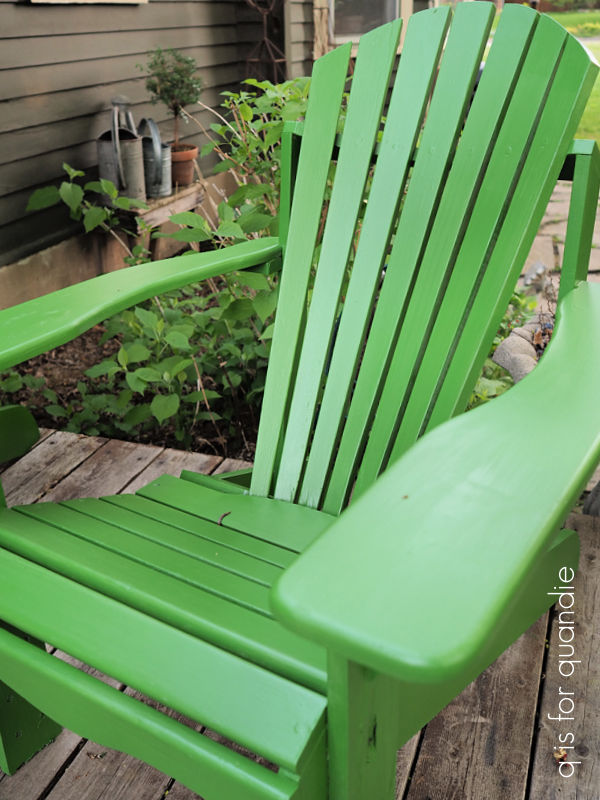
But that’s OK because the chairs needed a paint touch up anyway.  So after giving them a good cleaning with some TSP substitute, I went ahead and painted them with the Mown Grass too.

It’s the perfect garden green.

And this color works much better with my Flower Market sign.

Try to ignore the fact that there is a hole in our deck under the chair on the left.  We’re working on getting that repaired.  It’s on the list with all of the other spring projects.  But I can check off ‘paint the Adirondack chairs’ and that feels good.

How do you like the new color?  And have you ever noticed that shade of English green?  Leave a comment and let me know!

chairs, tulips and daffodils.

Phew!  My trip to Disney World really took it out of me.  My sister and I were there for 8 days, and we walked more than 20,000 steps almost every day.  It was really fun, but also really exhausting.  I’m still recovering.

I made a bit of a tactical error in that I didn’t have a completed project lined up to blog about upon my return.  So I’ve spent the last few days wondering just how in the heck I was going to come up with something, and where I was going to find the energy to quickly get it done.

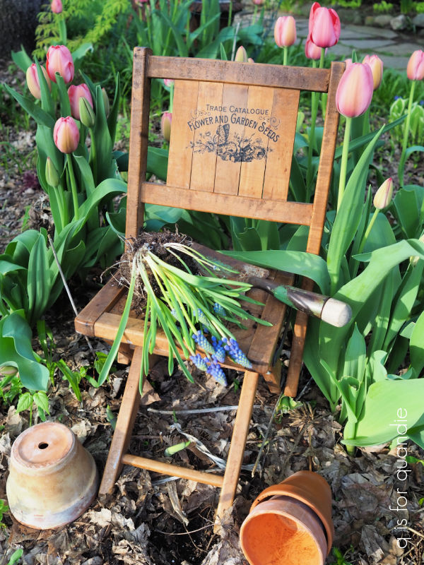
Then I remembered this pair of little wooden chairs that I’ve been meaning to sell.

My friend/picker, Sue, found these for me back in the fall of 2018.  I’ve had them hanging on the wall in our bedroom since then.  But I’m ready for a change so I thought I’d move them on.

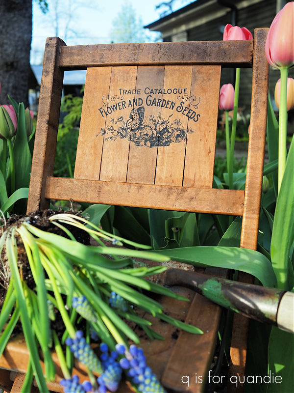
I was initially thinking about painting them in chippy milk paint, but the wood had a rather nice patina.  So rather than paint them, I decided to simply add some Classic Vintage Labels transfers to the backs.

I gave both of them a garden theme.

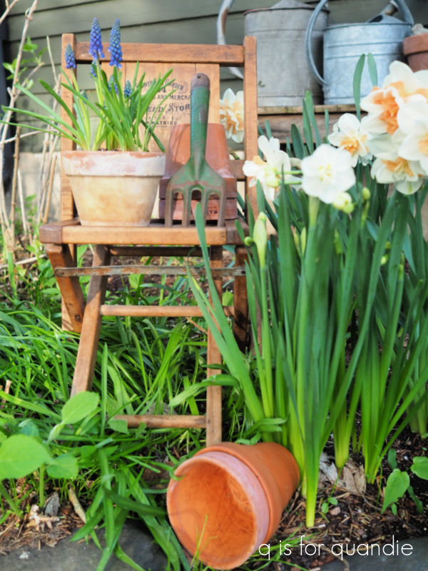
They are a bit wobbly, so I wouldn’t necessarily want a small child to sit in them.  But they’d be perfect for holding a potted plant, like this little pot of muscari.

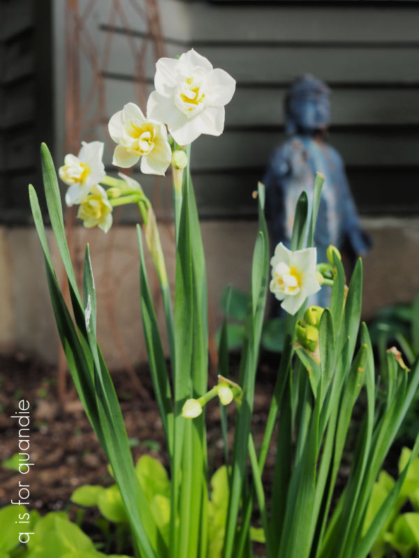
I staged them out in the garden, mainly because I wanted to show off my daffodils.

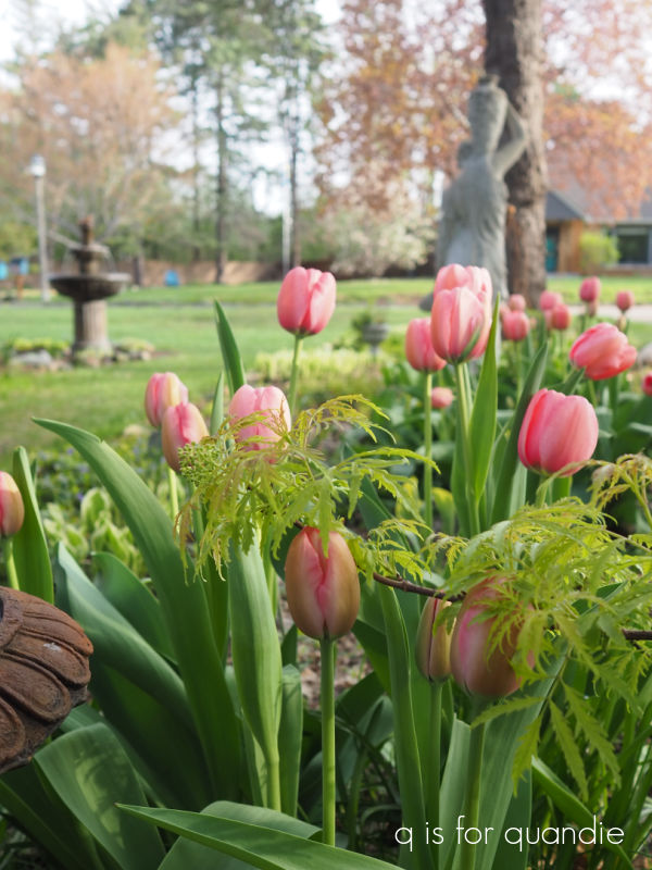
And my tulips.

But that being said, these little chairs wouldn’t hold up for more than one or two seasons if you left them outside unprotected.

They would be awesome on a protected porch though, or maybe in a sun room.  Or really anywhere inside.

In that last photo, you may have noticed that my scilla (all of that stuff that looks like grass in the garden behind the chairs) are pretty much done blooming.  They have been followed up by the daffodils and tulips.  I planted a few new ones last year (for more details on that, go back to this post), so I thought I’d share how they did and exactly what they are in case any of you want to get some this year.

This first daffodil is Narcissus Double Delnashaugh.  It’s a late blooming double, and the white and apricot flowers are fairly long lasting.

If you’re not a fan of the typical yellow of most daffodils, this is a great alternative.

I also planted Narcissus Double Cheerfulness.

The flowers on this one are about half the size of the first one and not nearly as showy, but they really are rather sweet I think.

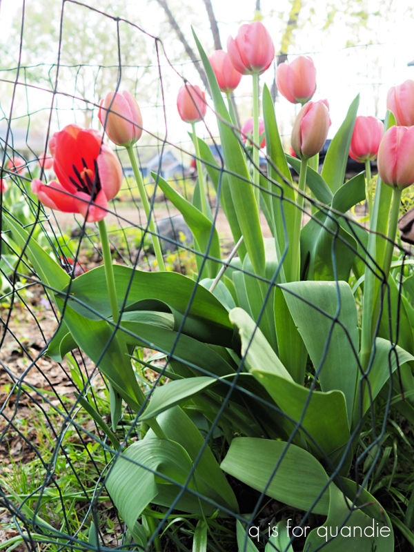
I managed to save a couple of patches of tulips from the deer by surrounding them with chicken wire.

If you use the green chicken wire, it’s not nearly as noticeable when it’s in place as the silver stuff so it’s not a horrible eye sore.

Also, I just loosely circled each patch and that seems to do the trick even though a deer could easily pop his head over it to eat the tulips.  My neighbor nnK gave me that tip.

I’ve been removing the chicken wire during the day so I can enjoy the tulips without it though.

These are Darwin Hybrid Pink Impression tulips.  And just to put quantity in perspective for you, I planted 100 of them and that gave me a patch this size …

I purchased these tulips, and both of the daffodil varieties from Longfield Gardens.  I also purchased three different varieties of allium from them last year, so I’ll keep you posted when those start blooming.

In addition, I planted some cheap tulip bulbs from my local Menards, but those were the ones that the deer got to before I could cover them.  So they look like this …

So it’s pretty much impossible for me to compare the quality of the cheap tulips with the more expensive tulips from Longfield.

But back to those chairs, what do you think?

Do you like them this way, or would you have painted them?  Leave a comment and let me know.

my all-time favorite.

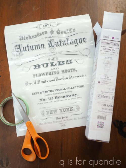
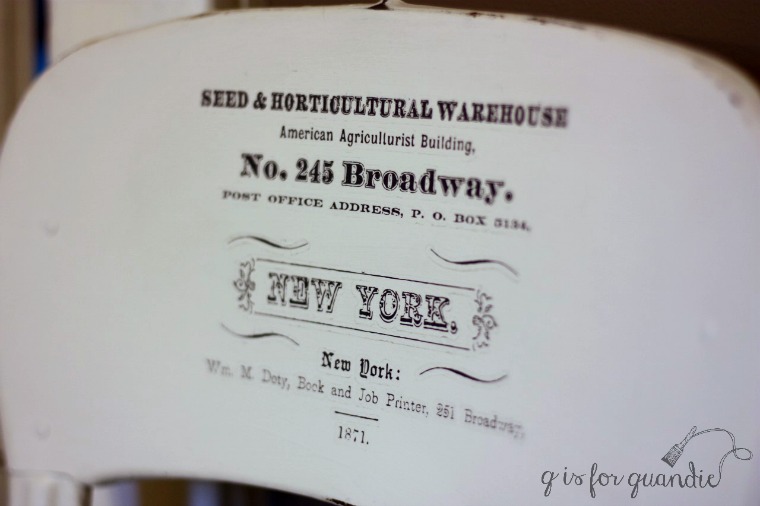
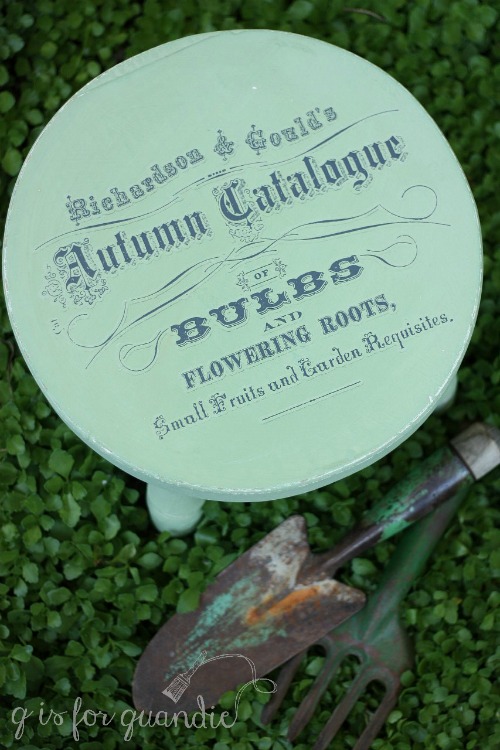
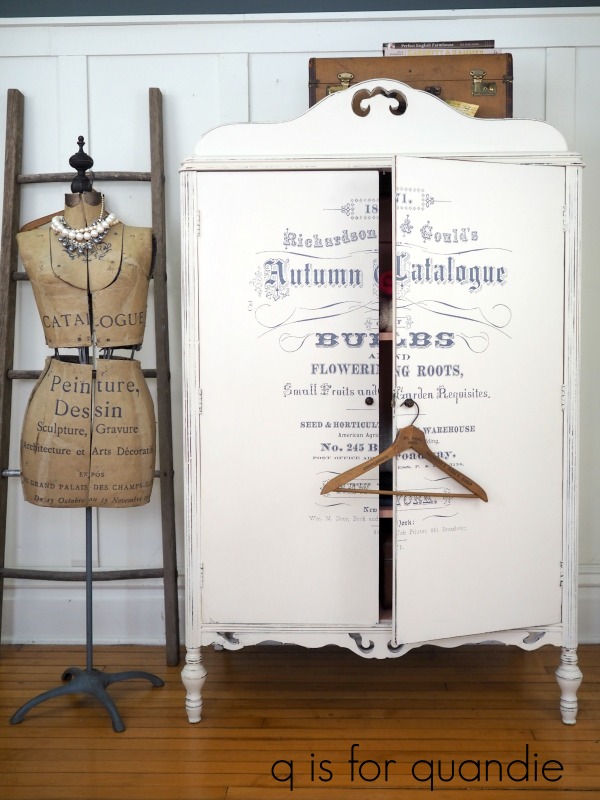
 For today’s ‘re-run’ I decided to share all many of the pieces I’ve done using one of my all-time favorite transfers called Seeds.

I’ve never actually added up how many times I used this transfer, I’ll try to do that with this post, but I’m not sure I’ll find all of them.

Unfortunately, this design is now retired and after a quick search online I was unable to find it for sale anywhere.  If any of you are retailers and have these available, be sure to leave a comment below with your details so people could buy them (or so I could buy them).

This transfer came in two different sizes and two colors, black or white.  And I’ve used them all, so let’s take a look shall we?

My first ever use of this transfer on a piece of furniture was the Blue Alligator dresser.

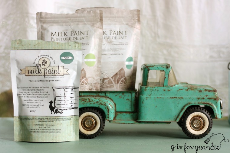
I had custom mixed the milk paint color for that piece using three different colors and two different brands of milk paint.  It’s equal parts Homestead House Loyalist, Homestead House Upper Canada Green and Miss Mustard Seed Kitchen Scale.

I loved the resulting color, and I named it Blue Alligator.

This was early days for furniture transfers (although smaller rub on transfers have been around for decades) and since then they have cleaned up the look of that hazy halo that a lot of people complained about.

But it never bothered me.  I was so thrilled to find a product for adding detailed typography to furniture that wasn’t incredibly painstaking and time consuming (hand-painting).

That was back in April 2017, and I used the smaller version of the transfer on a metal stool that month as well.

Or a portion of it anyway.

I used the upper half of that smaller transfer on a little wooden stool a couple of months later.

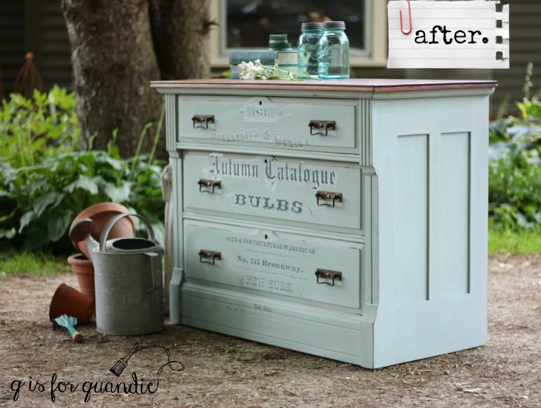
The next larger piece that I used the Seeds transfer on was this dresser in July 2017.

 I mixed up a custom milk paint color for this one too, mainly to use up a few partial packets of paint I had on hand.  I started by mixing equal parts Miss Mustard Seed’s Eulalie’s Sky and Shutter Gray.  The resulting color was just a bit too blue for me, so I then added another equal part MMS Grain Sack to both lighten it up and add a little more grey.  I loved the subtle pale blue gray color that I ended up with.

In autumn of 2017 I added the Seeds transfer to yet another dresser, this time over Fusion’s Limestone.

In January 2018 I used the smaller version of the transfer again, this time on a washstand that was painted in Miss Mustard Seed’s Linen milk paint.

I advise using caution when applying a transfer over chippy paint as the transfer can pull off the paint, rather than adhering to your piece.  You may want to add a clear coat over your milk paint first, then add the transfer to avoid that problem.

The next piece that received a Seeds transfer was this linen press dresser painted in Dixie Belle’s Drop Cloth.

That piece was a bit of work since I initially painted it in milk paint that then proceeded to almost completely chip off.  I had to sand it down and start over with Dixie Belle chalk style paint.  But in the end it was awesome.

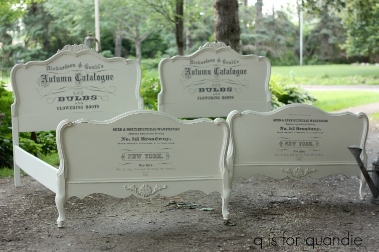
Next up came the garden beds.

It’s not often that I find a matching pair of twin beds, so I was thrilled to find this duo at a garage sale.

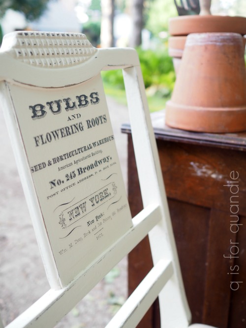
I added the smaller version of the transfer to the back of this chair in July 2018 …

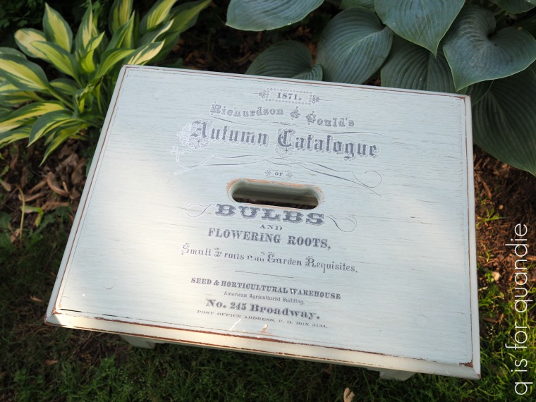
and also to this little wooden stool in the same month.

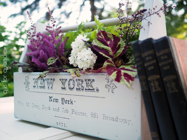
While I was at it, I also used some remnants from a large Seeds transfer on this wooden tote.

Let’s see, are you keeping track?  What am I up to?  An even dozen pieces so far.  Let’s keep going.

I used another small sized transfer on a mirror frame that I turned into a chalkboard in September 2018.

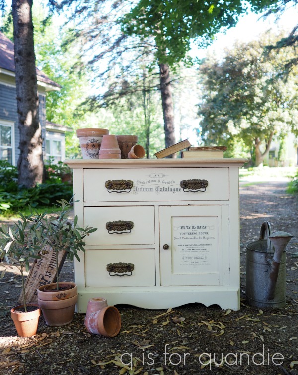
and also on this washstand in October of that year.

That one is also painted in Dixie Belle’s Drop Cloth.

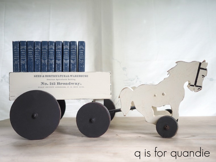
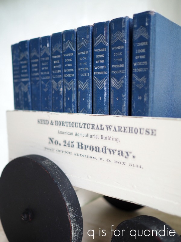
I also had some fun using pieces of the smaller version of the transfer on this pull toy.

I still can’t believe I paid less than $1 for that horse and cart at a garage sale.

I also applied bits of the smaller one to this vintage refrigerator box.

The following January I used the larger version again, this time on one of the bed benches that my handyman Ken created from an old headboard/foot board combo.

That bench is painted in Fusion’s Bedford.

In summer of that year I used the smaller versions on yet another washstand that was painted in Drop Cloth.

I also used the smaller version on the back of a wooden folding chair in July 2020.

It wasn’t until January 2021 that I used the larger version on a big piece of furniture again.  I think that’s because I was hoarding my last couple of these transfers knowing that I’d eventually not be able to find more.

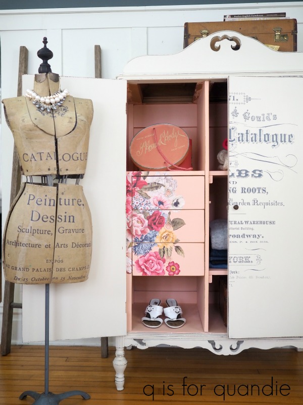
That armoire was perfect for it though.

It remains one of my all-time favorite pieces.

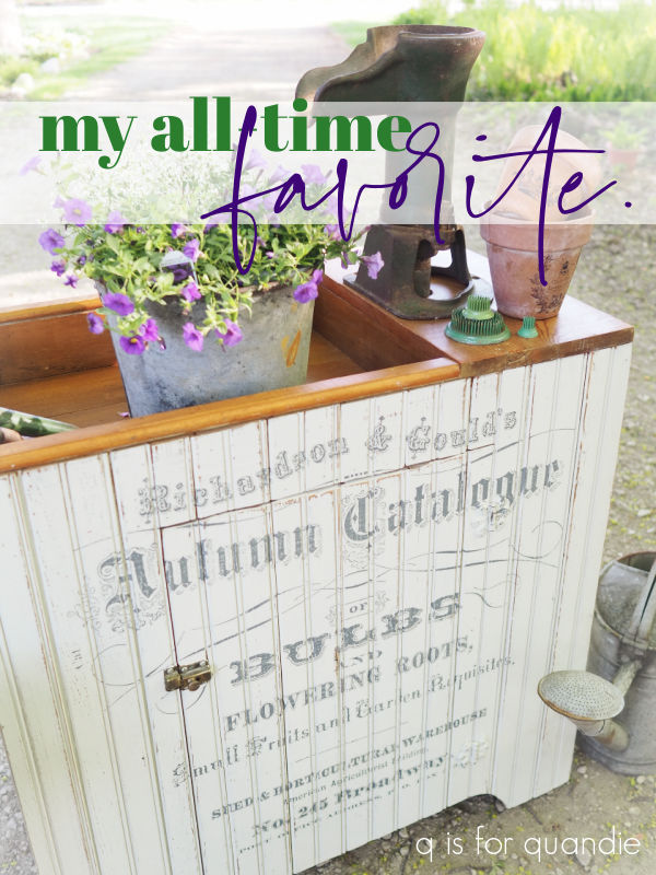
I used another of my carefully guarded stash of Seeds transfers on this dry sink last summer.

Wasn’t it just perfect for that piece?

As I mentioned in the blog post about that one, I don’t necessarily recommend hoarding a stash of transfers like I have done.  They do tend to dry out a little over time, and then they become harder to apply.  Not impossible necessarily, but certainly more difficult.

But when they keep retiring your favorites, there doesn’t seem to be any other option.

Sadly, that dry sink received the last of my large sized Seeds transfers.  However, I did have a few scraps that were left over from pieces where the entire transfer didn’t fit.  I used one of them on the wooden box I painted for my potting shed last fall.

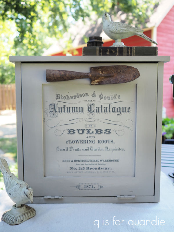
Then one of my lovely readers was kind enough to send me one of the smaller ones, and it made its way onto this little cupboard.

In the end I had one small white Seeds transfer left.  But to be honest, I never liked the white version.  The first time I used it was on a wooden box that I painted up as a gift for my sister in April 2018.

Yep, not spectacular.

I wouldn’t have purchased a second one, but when I ordered a black one from a retailer online she sent me a white one instead.  When I contacted her about the mix up, she admitted that she didn’t actually have a black one, so ultimately I just kept it.

I finally used part of it last fall on this toolbox.

It worked out well on that piece, I think because it was just a small dose.

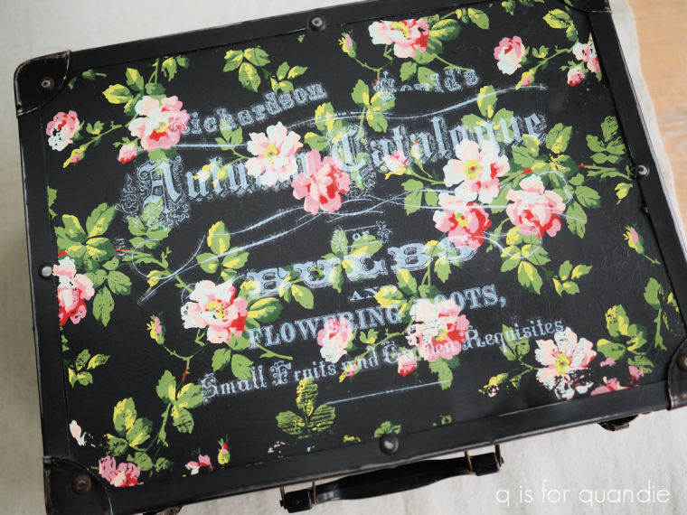
I also tried to use the remainder of that one on this case …

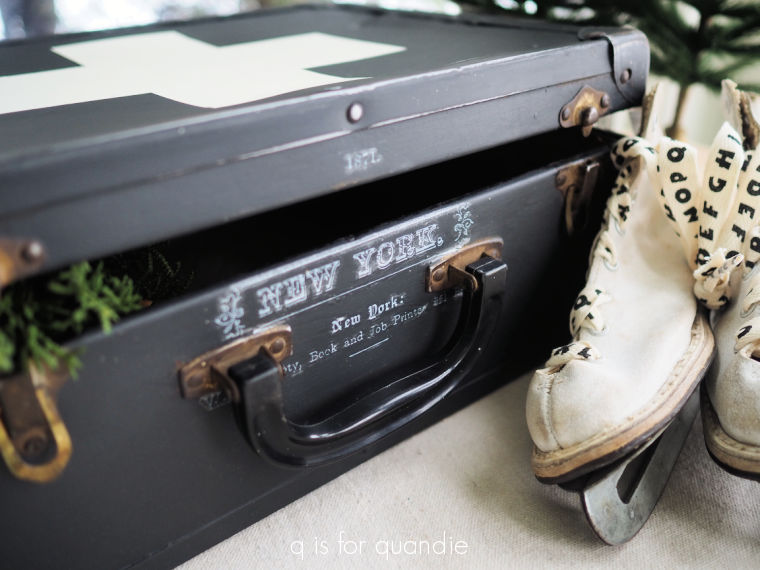
I applied it over the I.O.D. Rose Chintz paint inlay, and that was a bit of a fail.  I ended up sanding that down and painting over it.

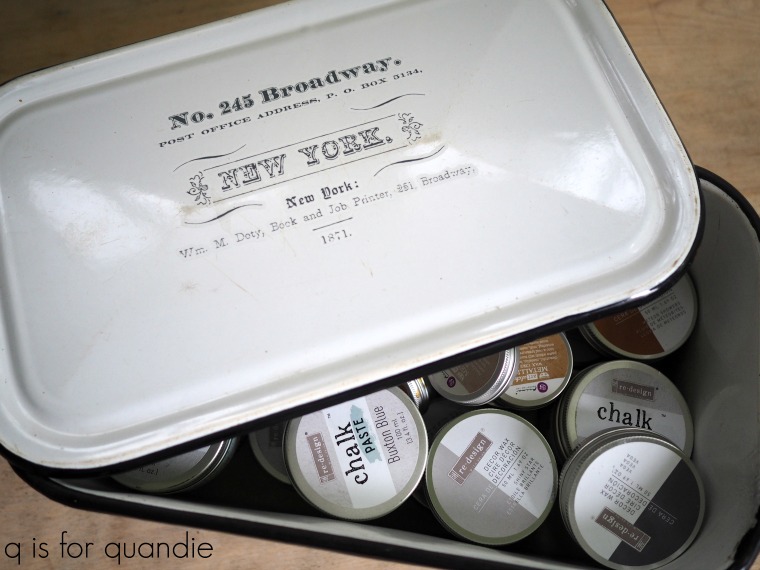
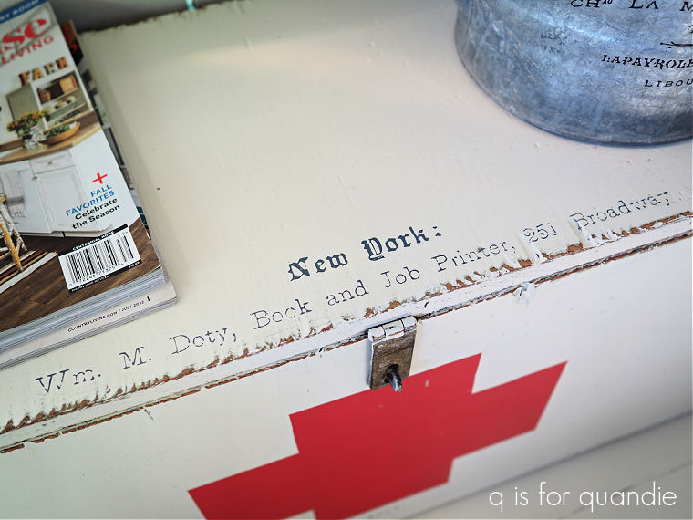
Although I did keep the little “New York” bit on the side.

OK, so I think I counted 26 pieces with some portion of the Seeds transfer on them.  Yep, I’d say this one was definitely a favorite of mine.

How about you?  Did you use the Seeds transfer on anything?  Or do you have another favorite that you used over and over?  Leave a comment and let me know.

this furniture is permanized.

I thought I would try something a little different while off on vacation this week, re-runs!

Hey, it works on T.V., so I thought maybe it could work here.

I’ve picked out a couple of different furniture makeovers from the past to share with you guys this week.  I tried to go a ways back so it wouldn’t feel too repetitive for those of you who follow me on a regular basis.

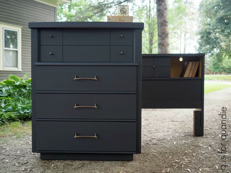
I refurbished these mid-mod pieces back in 2018.  Wow, can you believe that was five years ago now?  Time flies, doesn’t it?

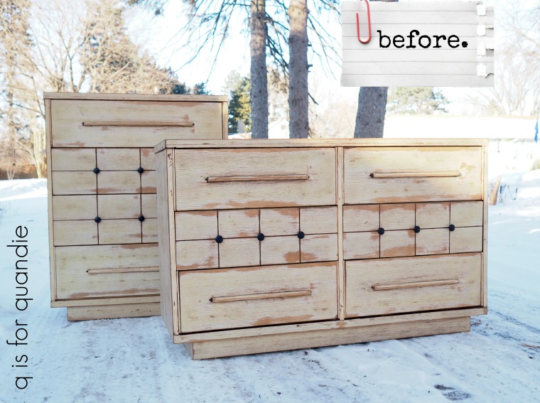
Here is how they looked when I brought them home …

I purchased these two along with a 3rd matching dresser that I painted up separately, and forgot to get a ‘before’ photo of.

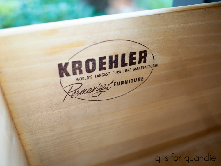
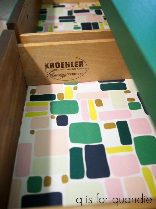
I thought it was funny that the manufacturer said these pieces were ‘permanized’.

I once again tried googling “Kroehler permanized furniture” to see if I could find any info on it, but that mostly took me to my own blog post about these two pieces.  So I still have no idea exactly what that means.

After scuff sanding and cleaning, I painted this pair in Fusion’s Ash.

This dark gray works beautifully with the mid-mod style.  I don’t typically use Fusion anymore, these days I would swap that out for Dixie Belle’s Gravel Road.  That’s simply because I find that a chalk style paint is more error proof than an acrylic paint.  It adheres to a dicey surface better, it distresses more easily, and if you water it down a tad you don’t have to worry about brush strokes.  On the other hand, chalk paint does require a separate top coat while the acrylic paints do not.  It’s a trade off.

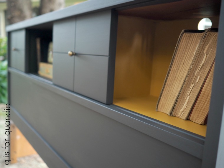
I painted the inside of the bookcase portion of the headboard in Fusion’s Mustard.

I love that pop of mustard yellow next to the gray, and it’s so easy to find bedding to coordinate with that combo.

In addition to the paint, I also refreshed the hardware using some of Prima Marketing’s art alchemy Metallique wax in Bronze Age.

The bronze was gorgeous next to the dark gray.

Although I painted these two pieces to match, if I remember correctly they didn’t sell together.  I believe the dresser sold right away and it took a while to sell that headboard.

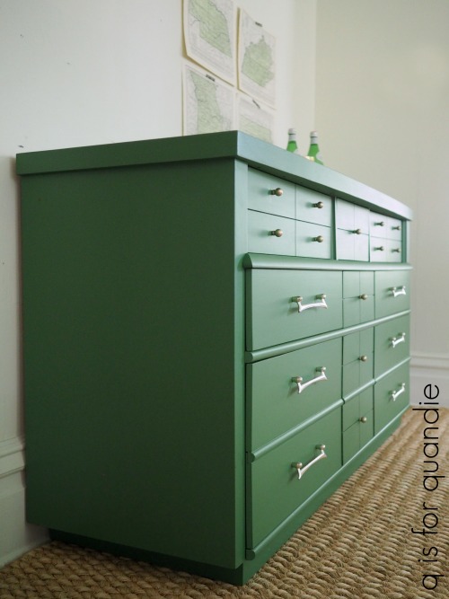
As for the 3rd piece from this set, I went in a different direction with that one.  I painted it in Fusion’s Park Bench.

I definitely went through a phase where I painted at least half a dozen mid-mod pieces in this gorgeous green.  They all sold super fast too, so it was definitely popular.

I lined the drawers on this one with some paper I’d found that was perfect to pair with the Park Bench.

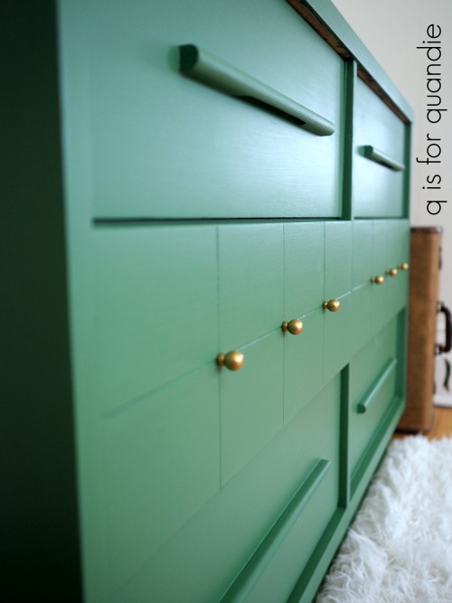
 I wanted to retain the original light gold on the drawer pulls for this piece, so I just washed those with soapy water and put them back on.  But the little round knobs were a much darker brass color than the pulls.  To get a better match, I again used the Metallique wax, but this time in a color called White Gold.

This trio was not actually the first time I followed this formula.  The previous February I’d painted another pair of mid-mod pieces in the same colors.

When I went back and read the original blog post, I was reminded that this pair had sat on Craigslist unsold for weeks before I purchased them and they were very reasonably priced.  Five years ago you could still get mid-mod pieces like this pretty easily.  I feel like that no longer seems to be the case, do you find that as well?

This time the tall dresser was painted in Dixie Belle’s Gravel Road.

And the credenza style dresser was painted in Park Bench.

You can check out all of the details on those makeovers here and here.

So tell me, which color appeals to you the most, the dark gray (whether it’s Fusion’s Ash or Dixie Belle’s Gravel Road) or that fabulous Park Bench green?  And what do you think of the mid-mod style, do you think it will continue to be popular for another five years or even longer?

Leave a comment and let me know.

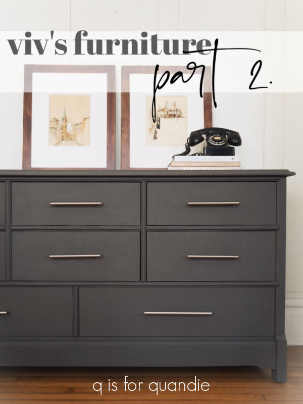
viv’s furniture, part 2.

On Friday I shared the makeover of my friend Viv’s nightstand.

I mentioned in that post that I was also working on the larger dresser that went with it.  Unfortunately, I didn’t get a ‘before’ picture of the dresser.  To be honest, it was just so big and heavy that I didn’t want to spend the energy to get it set up for a ‘before’.  So you’ll just have to use your imagination knowing that this large dresser was the same wood tone as the nightstand, and initially had the same round wooden knobs.

And now it looks like this …

I followed the same process that I used on the nightstand on this dresser.  I filled the holes for the original knobs with Dixie Belle’s Mud.  Then I scuff sanded and cleaned it.  I added a base coat of Dixie Belle’s B.O.S.S. just on the top, because much like with the nightstand, it had some water rings and other damage to the original finish that might have popped through otherwise.

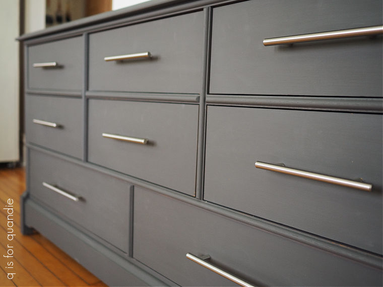
Finally I painted it with two coats of Dixie Belle’s Gravel Road.

Once dry, I sanded lightly with 220 grit paper and then finished it all with some of Dixie Belle’s Easy Peasy spray wax.

You might think that all of that took a fair amount of work and was rather time consuming, but that was actually the easy part.  For me, anyway.

The hard part for me was adding all of those drawer pulls … and keeping them straight.

I fell back on a trick I’ve learned from my handyman, Ken.  I made a template.

First, I measured all of the drawers.  I initially thought that the top two rows of drawers were all the same size, but lucky I measured, because they weren’t.  The top row drawers are 1″ shorter than the middle and bottom row.  So I have two horizontal lines on my cardboard template.  The top line is for the taller drawers, and the next line is for the shorter drawers.  I simply used the template on all of the taller drawers first, then cut that extra 1/2″ off and used it on the shorter drawers.

Unfortunately, I totally messed up when I got to the two bottom drawers.  Although I had adjusted everything for the different width of those two drawers, I completely forgot that Viv had purchased wider pulls for them.  So I drilled my holes at the same distance apart as the shorter pulls.  Ugh!

So I had to go back to the drawing board and fill those holes back in with the Mud, wait for them to dry, sand, re-paint, then re-measure everything and drill again.  Luckily I’d only done one of the bottom drawers when I realized my mistake.

And fortunately, it wasn’t too difficult to fix.

I added just a few props before photographing this one, my grandpa’s artwork, some books and an old phone.

Once again, it was fun to give this piece an updated, more modern look.

I think it turned out rather fabulous, don’t you?

Thank you to Dixie Belle Paint Co for providing all of their products used in this makeover.

viv’s trippy blocks nightstand.

First up, congrats to Monica.  I drew her name at random to win my Dixie Shine giveaway from last Friday.  Now, on with today’s post …

As you guys know, I don’t typically do custom work.  I’ve learned over the years that I find it too stressful to try to meet someone else’s expectations about how something might (or might not) turn out.

I also don’t like working on something that isn’t really my style.  To explain what I mean by that, I always tell the story of a customer who once asked me to paint a dresser for her because she absolutely loved my work.  She wanted it to be exactly like other pieces I had painted.  Except purple.  And not distressed at all.  And with lots of flowers on it.

In other words, nothing like my normal stuff.

But every once in a while there is an exception to my ‘no custom work’ rule.  The furniture owner has to be willing to pretty much allow me to do my own thing without much input.

In this case, the furniture owner is my friend Viv.  Now that she and her husband’s four kids have all flown the nest, she’s turning what was formerly the boy’s room into a guest room.

She’s added a pair of queen size beds (it’s a large room!) with fabulous upholstered headboards, new linens and a new paint color on the wall.  She had asked me over to give her some ideas on what else she could do with the space, and when I saw the nightstand and bureau combo with their dated finish I immediately suggested she paint them.  Duh.  Obviously.

Well … OK, in the end, I offered to paint them for her, starting with the nightstand.

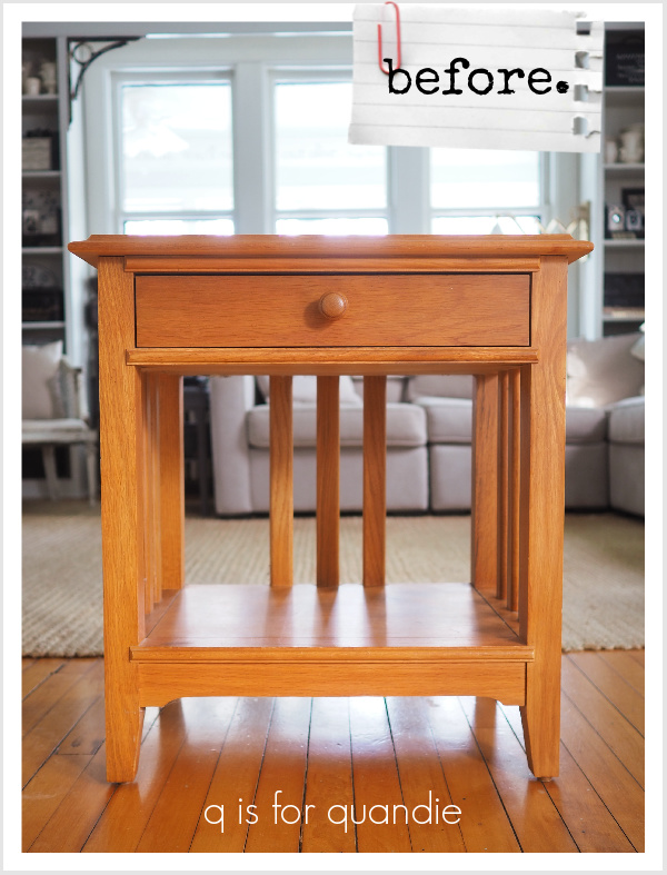
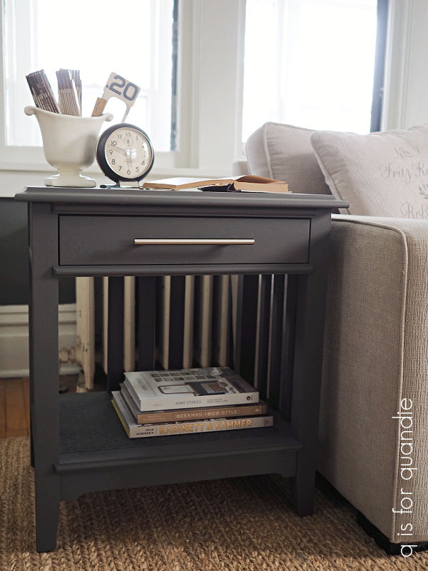
This piece of furniture was in really good condition.  Certainly better condition than 99% of the pieces I normally work on, and probably about 50 years newer.  The only problem was a few water rings on the top, and well … that orange-y sort of stain color (please just ignore how much that matches my floors, ugh!).

So aside from my usual prep process of scuff sanding and cleaning, I also opted to apply a base coat of Dixie Belle’s B.O.S.S. on the top before proceeding with the paint.

That brings me to today’s q tip:  when you have water rings or other damage that has compromised the existing finish, that change in texture may be hard to disguise with just a coat of regular paint.  You could end up seeing a ghost of those rings after your paint job.  To prevent that, create a uniform base by adding a coat of stain blocking primer, like the B.O.S.S., before painting.

That did the trick on this piece.

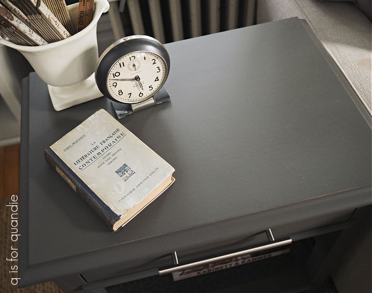
I painted Viv’s nightstand in two coats Dixie Belle’s Gravel Road.  Then I decided that the flat shelf at the bottom of the table needed a little something extra.  So I pulled out two stencils from Dixie Belle, Basket Weave and Trippy Blocks, and applied them to a tester board to figure out which one I wanted to use.

I used Dixie Belle’s Silk paint in Black Sands for the stenciling.  The color is a bit darker than the Gravel Road, and the sheen of the Silk paint is just a bit less matte than the chalk paint.  Whenever I mention the Black Sands color, I like to point out that it is not black.  It is a really dark grey, don’t be thrown off by that name.  I’d tried this technique once before (on this piece) using their Midnight Sky and Anchor (which is the black from the Silk line) and loved the subtle results.

I decided that Trippy Blocks would do the best job of modernizing the look of the nightstand, which was mainly what Viv wanted me to accomplish.

Once I had everything painted, I gave Viv the option of whether or not to distress the edges and in the end she decided against it.  So after a very light sanding with 220 grit on the flat surfaces, I sealed this piece with Dixie Belle’s Easy Peasy spray wax.

Next we decided to switch out the original wood knobs for something sleeker and more modern looking.  I had filled the center holes for the original knobs with some of Dixie Belle’s Mud before I painted, so we could do anything she wanted with the hardware.  Viv did a little shopping and came up with these drawer pulls from Menards.

They definitely go a long way towards making this piece look updated, don’t you think?

The pulls came in a wide range of sizes, so we were able to use one size on the nightstand, and two different sizes on the larger dresser (which you’ll see on Monday).

It’s always so satisfying to me to see the massive difference a little paint and a change of hardware can make to a piece of furniture.

I think we definitely met our goal of giving this nightstand an updated look.  What do you think?  Leave a comment and let me know!

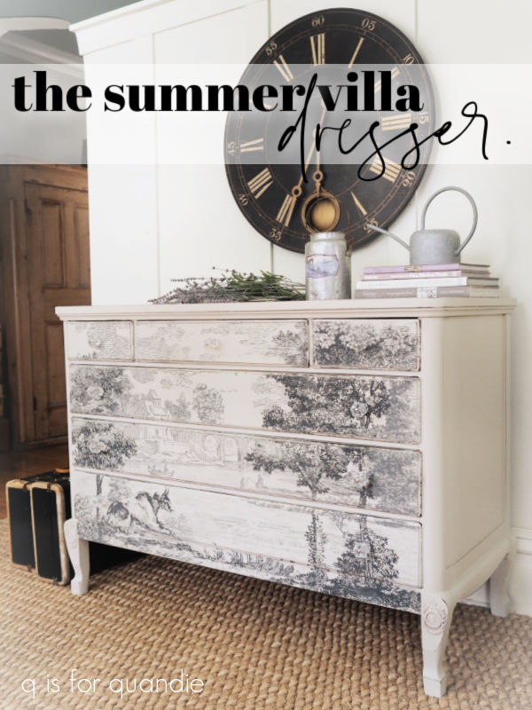
the summer villa dresser.

When I saw I.O.D.’s spring release, I looked at the two new transfer offerings and thought ‘nope, not for me.’  I’m just not a fan of bugs, fish, mushrooms or monkeys.  I was so disappointed.

I was really hoping for new typography transfers that would work well on my toolbox makeovers.

Unfortunately, the designs that would have been perfect for toolboxes were offered as the Melange paint inlay rather than as a transfer.  I so very much would have preferred those designs as a transfer.  Why?  Because I do a lot of layering on those toolboxes, like you see on this one …
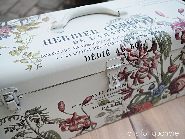
 I can’t think how you would layer the paint inlays in a similar fashion since you have to apply each one into a fresh coat of paint.  I know, I know, I could apply the first inlay into paint, and then layer another over it by applying it into a top clear coat on top of the first inlay, but doesn’t that sound putzy and time consuming?!  I also could apply a paint inlay as the bottom layer of a design and then layer a transfer over it, like I did on this tackle box where I layered wording from the Label Ephemera transfer over the Rose Chintz paint inlay.

But transfers are so much easier to layer!  If any of you know of a better method for layering paint inlays, please leave a comment and clue me in.

Anyway, initially I wasn’t going to purchase anything from the new release.

But then I saw the Summer Villa paint inlay.  And I had to have it.  I really tried to talk myself out of it.  After all, these dang paint inlays are rather pricey (it was $46) and I was fairly sure I’d only get one use out of this one.  As I mentioned last Friday, I’ve had mixed results with trying to use the inlays more than once.

  Still, I couldn’t resist, so I ordered it.

You know, sometimes you just have to splurge.  I have to admit, I spent more on a pedicure last week than on the paint inlay, and in the end I’d rather have the inlay (although my toes do look pretty good).

After ordering the paint inlay, I needed to find a piece of furniture to put it on.  I checked the measurements, and then started hunting on Facebook Marketplace and Craigslist.  I ended up finding this dresser on Craigslist.
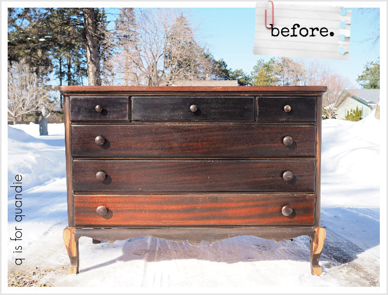
It presented the perfect canvas for the Summer Villa paint inlay, the front of this dresser is just slightly smaller than the inlay.

This was an almost perfect Craigslist transaction too.  The seller responded to my inquiries right away, we set up a time for the pickup in the afternoon on the same day, and when we got to his house the dresser was at the curb and ready to be loaded.  Best of all, we didn’t have to navigate another icy Minneapolis alley.

I say ‘almost perfect’ because there was a bit of a bait and switch problem with the damaged legs.

Not only were the curved feet missing, but the curved bits further up the leg were also missing.  Somehow I wasn’t aware of that before I got there, and it seems like a detail I would have noticed.  In fact, I went back later and pulled up the photo from the ad …

As you can see, those curved bits further up the legs were still intact in that photo.

I did ask the seller if he had the pieces that fell off, and he did not.  But you know what?  I bought it anyway.  We were already there, the dresser was ready to go, and the price was right at just $40 (yes, the piece of furniture was less than the inlay … and the pedicure, come to think of it).  I was fairly confident that Ken and I could figure out a way to deal with those legs.

After I got the piece home, I had Ken come over for a consultation.  We ended up deciding to remove the curvy trim board from the bottom of the dresser and replace it with a straight board that was flush with the flat fronts of those legs.  That made it far less obvious that there was a curved bit missing.
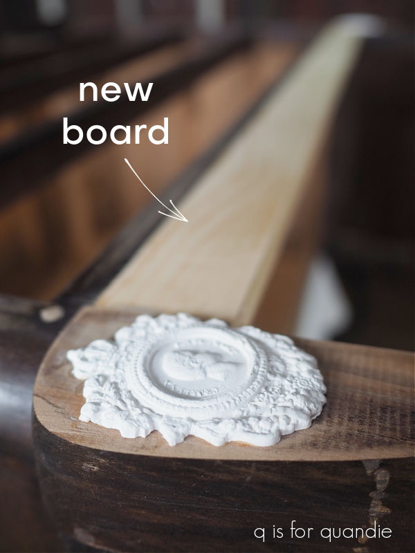
Then, in an attempt to make those flat legs looks more intentional, I added some molded medallions.
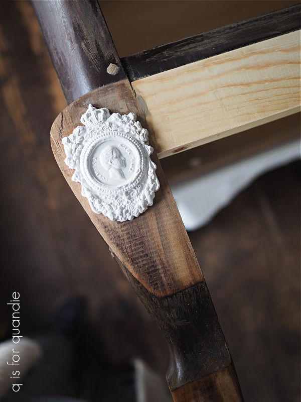
I made these using I.O.D. paper clay and the Ancient Findings mold from re.design with prima.  I glued them in place with regular wood glue.

After doing some other small repairs like gluing veneer and such, I scuff sanded the piece with 220 grit paper and then cleaned it.  Next I began painting with a coat of Dixie Belle’s clear B.O.S.S.   This dresser absolutely had the look of a bleeder with that dark reddish stain.  Better safe than sorry.  As I was applying the B.O.S.S. to the sides of the dresser, I noticed that my brush was picking up some orange coloration (that happens sometimes with severe bleeders), so for a little extra insurance I gave those sides a 2nd coat of B.O.S.S.

I also then painted that fresh new board and those medallions with a coat of Dixie Belle’s Coffee Bean.  I did that so that there would be a uniformly dark undercoat.

After waiting 24 hours (if you read the fine print, the B.O.S.S. should be allowed to dry for 24 hours to reach full efficacy in blocking stains), the next step was adding two coats of Dixie Belle’s Sawmill Gravy.
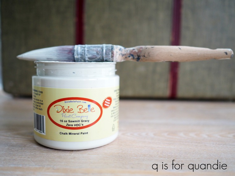
I debated between Drop Cloth and Sawmill Gravy, but ultimately decided that the Sawmill, with its slightly gray undertone, would be perfect with the paint inlay’s shades of gray.

The paint went on quickly and beautifully over the B.O.S.S. and only took two coats for full coverage, which isn’t always the case when painting white over a very dark color.  That’s another benefit to using the B.O.S.S.

Now it was time for the inlay.  After trimming the edges off each carrier sheet, I laid out the full design on my baby grand piano (yet another great use for it!).  I then measured the width of the front of the dresser and cut down the sides of the inlay to fit (I took off about 1.5″ from each side).  I then held the inlay sheets up to my dresser to make sure that key areas such as the cow’s head and the people in the boat didn’t fall on a line between the drawers.  I then adjusted up or down accordingly before trimming about 6″ off the top and another 1″ off the bottom.  Fortunately there was a lot of sky at the top of this design, so it still looks OK with that much trimmed off.

This inlay comes on 8 separate sheets.  When applying a big overall design like this, whether it’s a paint inlay or a large transfer, I find it best to start at the middle and then work my way out to either side, and that’s what I did here.  Also, after applying the first row of sheets, I realized that it would be far easier if I trimmed my sheets down to the height of the drawer fronts and then did each drawer separately.  So I did that from there on out.

You can find full instructions on applying an I.O.D. paint inlay in this post.

After letting the applied paint inlay dry, and then removing the carrier sheets and letting the drawers dry thoroughly, I sealed the inlay with some RustOleum clear matte spray sealer.

Next up I sanded the edges of my piece to distress them, then gave everything a final topcoat with clear wax.  I also added just a bit of dark wax to the medallions to give them a little more depth.

Talk about getting a pedicure, don’t those legs and feet look so much better!

I freshened up the insides of the drawers by sanding them lightly, cleaning them well and then adding a coat of Dixie Belle’s Big Mama’s Butta in the Orange Grove scent.

I opted to replace the original wood knobs on this piece with some glass knobs from D. Lawless Hardware that I already had on hand.  I knew they would come in handy some day!
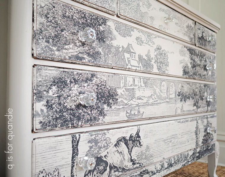
I felt like the glass knobs would be a bit more in keeping with the formality of the transfer design than a painted wooden knob, while also sort of disappearing into the background.

I really wish I had a dark grey wall to photograph this piece against, I think it would be stunning against a darker wall color.  I keep looking around my house trying to find a way to make that happen, but I have absolutely no spare wall space that I could paint dark gray for photo staging (maybe it’s time to reconsider that photo cottage?).
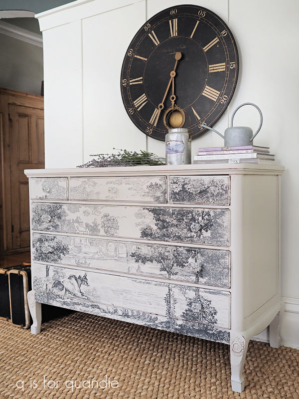
So we’ll just have to make do with photographing it on a white wall.

So, about the Summer Villa paint inlay, I feel like this is a ‘one and done’ sort of item (unlike the I.O.D. Label Ephemera transfer that I’ve purchased at least a dozen times!).  It is stunning, but it’s not terribly versatile.  Although it can be trimmed down a bit, you still need a fairly specifically sized piece to put it on.  You can’t really rearrange the design at all, although I suppose you could split it down the middle and use half on one piece and half on another (that could be pretty fab on a pair of nightstands, for example).

Still, I loved using the Summer Villa inlay to create this particular piece of furniture.  It turned out exactly how I pictured it.
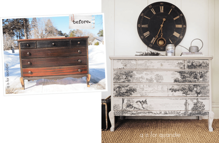
Hopefully someone else out there will fall in love with it too, because this piece is for sale locally (see my ‘available for local sale‘ page for the details).

What do you think of this makeover?  Leave a comment and let me know.
Thank you to Dixie Belle Paint Co for providing the B.O.S.S., Big Mama’s Butta and the Sawmill Gravy paint used in this makeover.