the mystic midnight blue dresser.

At midnight, in the month of June, I stand beneath the mystic moon.
– Edgar Allen Poe

OK, wrong month.  If only that quote said ‘in the month of October’, but that doesn’t quite rhyme, does it?  Nothing really rhymes with October, which was rather unfortunate for Edgar since October is the spookiest month of the year.

Well ‘midnight’ works with this dresser because I painted it in Homestead House milk paint in Midnight Blue, so I’m sticking with that quote.

Before I did any painting though, I sent this one over to Ken’s workshop where a simple repair job became a tad more complicated.  I thought I just needed a few drawer stops replaced, but as it turned out Ken had to replace a couple of the drawer glides as well.

Once the dresser came back from Ken’s workshop I stripped the top.  After sanding it smooth, I once again waxed with Miss Mustard Seed Antiquing Wax.  Gorgeous!

Next I painted the rest of the dresser with the Midnight Blue.

I probably could have gotten away with one coat (dark color over dark wood), but I went with two since I had the paint already mixed up and I wanted that deep, rich color.  I also used Miss Mustard Seed hemp oil as my top coat to get the darkest shade possible of this color.

Today’s Qtip:  hemp oil will darken up your colors more than wax or other top coats.  For this reason I love using it when I want a deep, rich color like this Midnight Blue.  I also prefer using hemp oil over black milk paint.  However, hemp oil does not provide quite as much protection as wax or poly.

I had a couple of people mention how much they liked the drawer pulls that came with this piece, but I didn’t put them back on.  I didn’t like the way the pulls on the top drawer hung down below the bottom of the drawer itself.  It makes me wonder if they were even original to the dresser.  I’ll save that set to use another time.  I added these glass knobs from Hobby Lobby instead.

The top drawer of the dresser was pretty grungy.  I think it stored greasy tools at some point in its life.  So I lined it with some pretty fabric.  I purchased this fabric at a garage sale a couple of years ago and I’ve used it to line quite a few drawers.  But I’m starting to run low, so only had enough for the top drawer which was really the only drawer that needed it.

The drawers in this dresser are really quite shallow.  I can’t imagine it being very practical for holding clothing.  But I think it would make a fantastic bedside table.  It would also be perfect for use in a home office with your printer on top and the drawers filled with office supplies.  I can also imagine someone using it to hold a TV, you could fill those drawers with DVD’s.

If you are local and you happen to need a dresser like this, be sure to check my ‘available for local’ sale page for more info.


the green alligator farmhouse table.

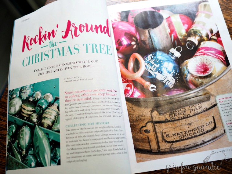
Before I get on with today’s post about the Green Alligator farmhouse table, two things.  First, the Vintage Holiday magazine with the article about my vintage Christmas ornaments is on stands now!

I was so excited to see my name in print for the very first time!

But in addition to my feature, the magazine is jam packed with great vintage holiday decor including an article featuring Pam Kessler from House of Hawthornes (if you aren’t familiar with Pam, you should check her out).  If you want to pick up a copy, I’m told they can be found at Target and Barnes & Noble.  If you’re a local, I found my copies at Cub Foods.  I picked up a couple of extra copies and plan to have a giveaway later this month, so stay tuned for that.

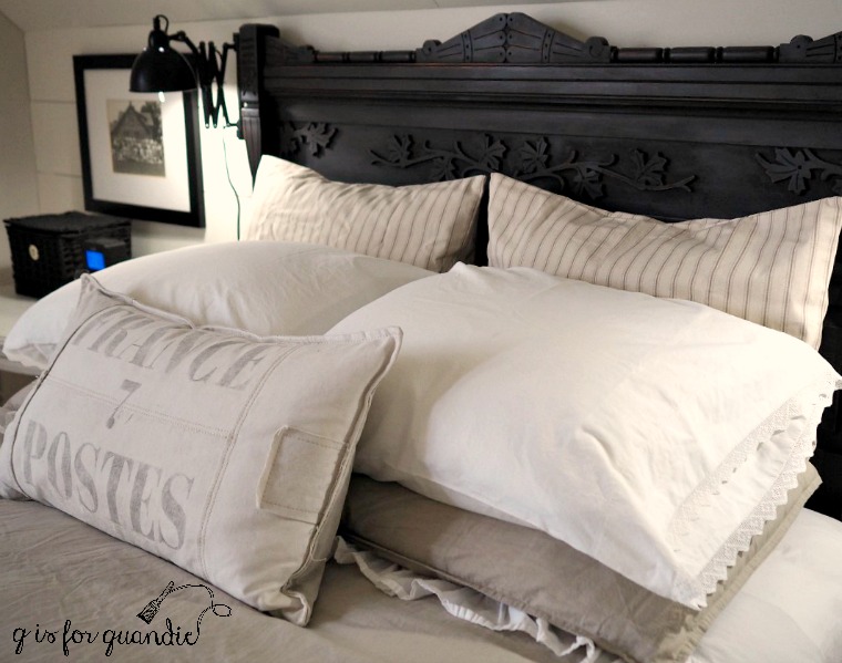
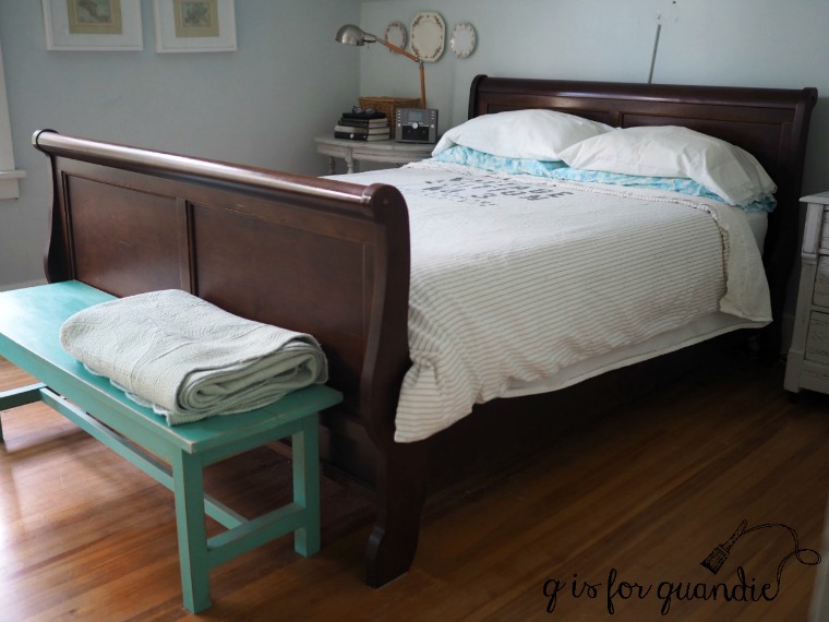
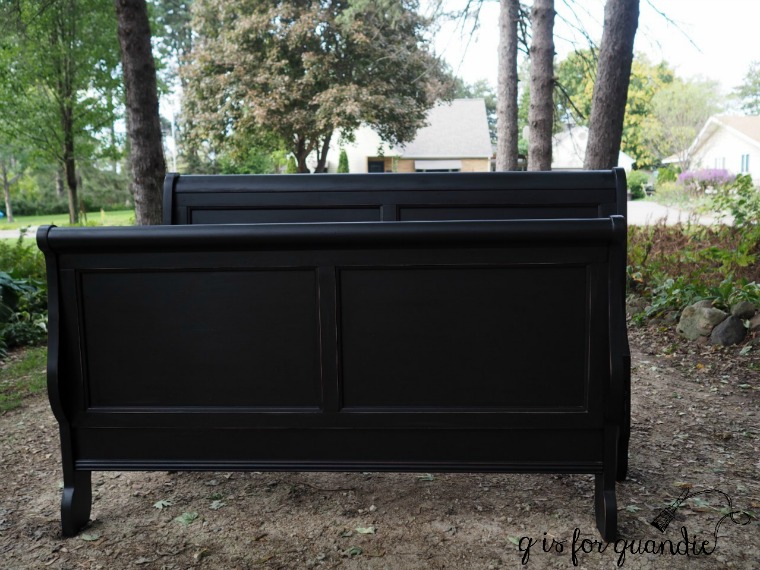
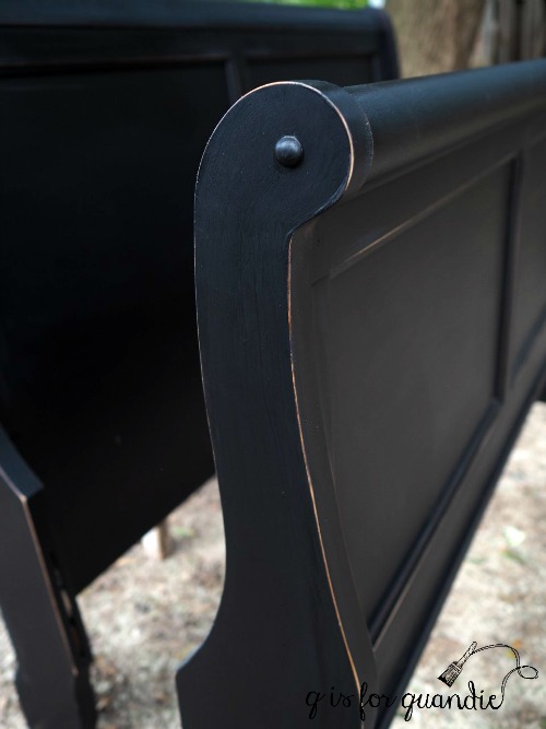
Second, I have to report that my ‘product differentiation‘ really paid off.  I sold my sleigh bed yesterday afternoon.  So, just over 24 hours!  Possibly a new record.  I truly believe it was the paint that made the difference, don’t you?

And now, on with today’s regularly scheduled post …

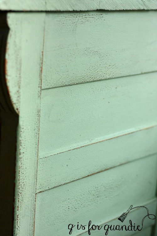
A while back I mixed a custom color that I called Blue Alligator.  Not because blue alligators are a real thing, but because the surface of the piece I was painting was ‘alligatored’ and the color was a pretty blue-green.  I found a lot of conflicting information on the web about what causes an alligatored finish and I don’t want to contribute to that further by pretending like I’m an expert.  All I know is that sometimes the finish on old pieces will crack and separate leaving a bumpy surface similar to that of an alligator’s hide.

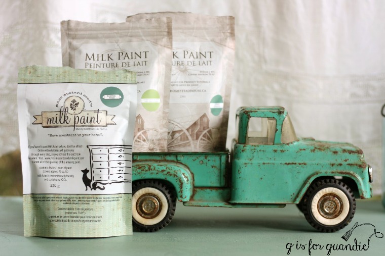
Well … anyway … I really loved the color I mixed for that dresser which was a combination of Miss Mustard Seed’s Kitchen Scale, Homestead House Upper Canada Green and Loyalist.

So I knew I wanted to use this color on something I was keeping for myself someday.

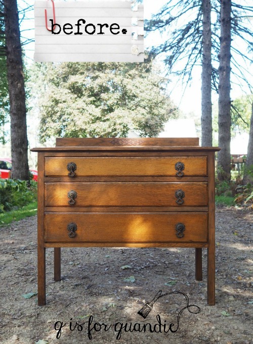
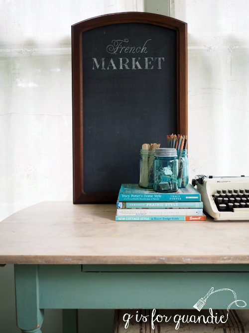
Flash forward to a week or so ago when Mr. Q and I brought home this drop leaf table.

Technically, that’s not a true ‘before’ photo.  I’d already removed the leaves and added new casters.  I’ve done a few of these tables over the past several years (here, here and here).  I’ve kept two of them for use in my own home.  One is being used as the desk in my Q branch, and the other is now being used as a desk in Mr. Q’s study.  The one that Mr. Q is using used to be on my front porch.

I found it so handy to have it in that spot because it made the perfect surface for close up photos for the blog, like this one …

But it was easy to move out of the way when I wanted to take a photo of something larger, like a piece of furniture, in that spot.

So after Mr. Q commandeered that table for his study I quickly realized how much I missed it and started looking for another.  I find that tables like this are fairly common in my area, but prices for them on Craigslist can be all over the place.  I was holding out for a bargain.  When I saw the ad for this one at $25, and only 15 minutes away, I jumped on it.

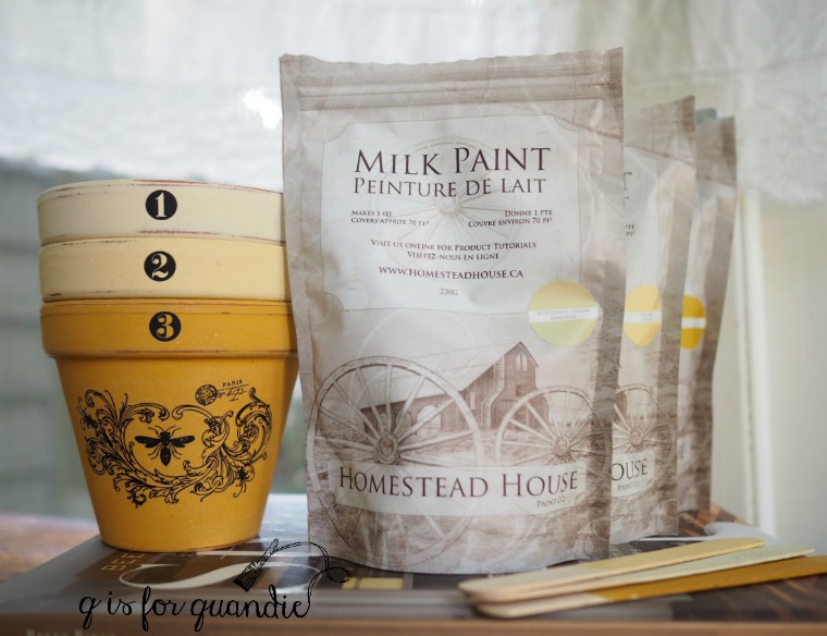
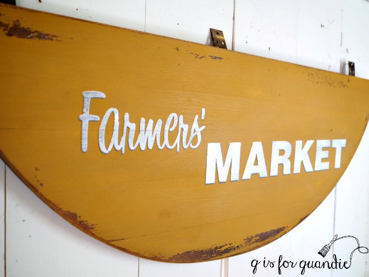
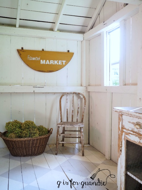
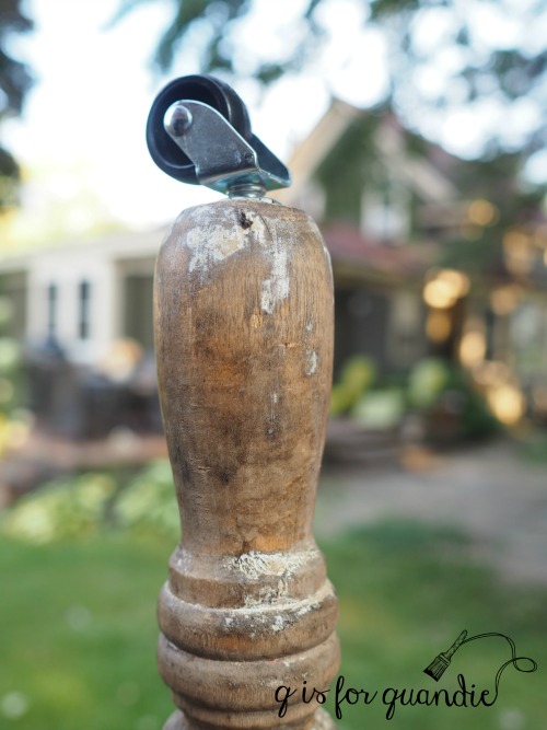
After I got it home I started by removing those leaves.  I’ve already turned one of them into a sign, and I’ll do the same with the other.  And as I mentioned, I added some new casters to the legs.  As much as I love the look of old metal or wood casters, I will be rolling this table in and out of position frequently.  And I have a painted floor on my porch.  So I decided it would be wise to add new rubber casters to this one to save my floor.

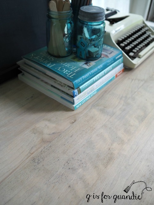
Next I stripped the finish off the top of the table and then waxed it with Homestead House white wax.

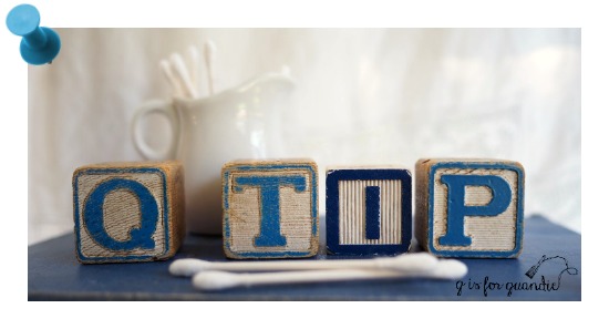
Qtip of the day:  when using white wax on bare wood you need to decide how much white you want to see before you start.  Full strength white wax on bare wood will leave obvious white areas in the grain.  If you want a more subtle look you can either wax first with clear wax and then add white wax over that, or mix some white and clear wax together to get a ‘reduced strength’ white wax.  For this table top I started with one coat of mixed wax, and then followed up with a 2nd coat of straight up white wax.  White wax will be easier to blend over a base coat of clear or mixed wax rather than on bare wood.

This particular tabletop had some black spots.  Had I planned to sell this piece I would have probably opted to go with dark wax on the top.  But since I’m keeping it, and I wanted a lighter surface for taking photos on, I just chose to ignore them.

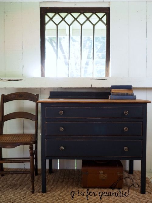
My next step was to mix up some Blue Alligator milk paint based on my recipe.  That’s when I discovered that I didn’t have much Miss Mustard Seed Kitchen Scale paint left.  So my ratio this time was a bit off.  I used a little more Upper Canada Green and a little less Kitchen Scale.  The resulting color is just a bit more green than the Blue Alligator.  Thus, I give you, Green Alligator!

Fortunately, I love this color just as much as the Blue Alligator.

Possibly even just a little bit more.

I used clear wax as my top coat over the paint which darkened up the color just a tad.

By the way, I took all of these pictures on a rather gloomy day so you can see why I love this spot for photos.  I get great light here even on the most dismal days.  With November and December just around the corner, I know I’ll be using this spot a lot in the next couple of months.  Since this porch isn’t heated it can get pretty chilly mid-winter, but you’ll still find me out there taking photos even when I can see my breath in the air.

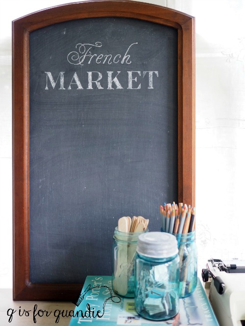
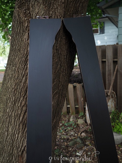
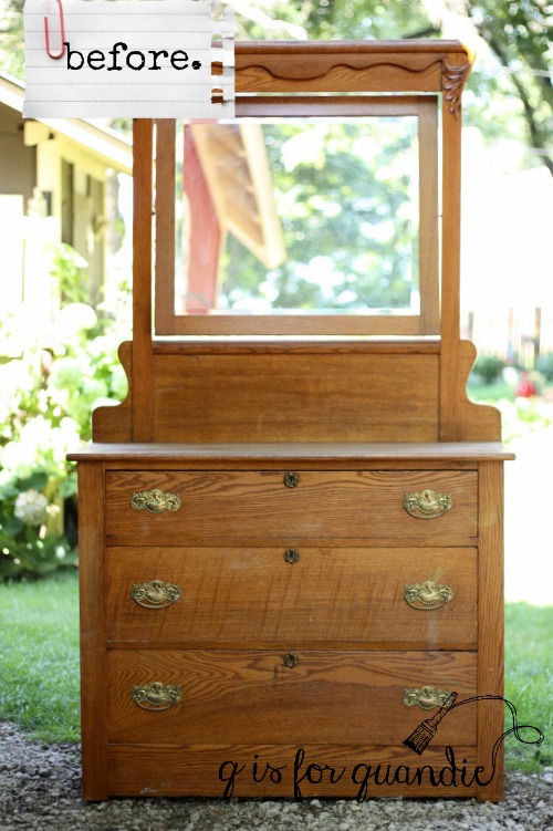
The chalkboard is made out of the framed mirror from a dresser Mr. Q picked up the other day.  You’ll see more of that dresser and it’s mirror harp soon, but in the meantime I whipped up this chalkboard.

I simply removed the back panel, took out the mirror, flipped the panel over to its smooth side, painted it with black Rustoleum chalkboard paint, and reattached it.  Easy peasy.

I freshened up the wood frame with a little of Miss Mustard Seed’s hemp oil.

It wasn’t until I was editing the photos for this post that I remembered that I had planned to embellish the frame with an old metal number plate, so I added it quickly and took one more photo.

It’s a small detail, but I love the small details, don’t you?


product differentiation.

As part of our recent master bedroom makeover, we replaced our 90’s sleigh bed with an antique headboard.  Mr. Q was not a fan of having a foot board, so he’s much happier with our foot-board-free bed now.  Here’s our new bed

Initially I was going to post our old sleigh bed on Craigslist ‘as is’…

Then I did a little research.  I found nearly 100 similar sleigh beds listed ranging from $95 all the way up to $579.  That’s a lot of competition.  I thought about listing mine for $75 just to stand out in the crowd.

But then I stopped myself.  Why in the world wouldn’t I paint it?  After all, painting furniture is my thing.  And out of those nearly 100 beds only a handful of them were painted.  Painting it would definitely help differentiate (that’s a fancy term I learned in my marketing class) my bed from those of my competitors.  It will also make my bed more attractive to my target market.  I already had all of the product on hand that I needed, some Fusion Ultra Grip and Coal Black paint, so the only additional investment into this project would be my time.

If you are considering selling items on Craigslist, I encourage you to do your research first.  Take a look at what else is out there and at what prices.  Keep in mind that just because you see an ad for a sleigh bed at $579 doesn’t mean it’s going to sell for that price, especially if there are 99 similar beds priced much lower.  Look at how long the ad has been posted.  Keep an eye on it over time.  Even if the ad disappears eventually, that doesn’t necessarily mean the item sold.  The seller may have given up and donated it to a charity.

One factor that still made me hesitate about painting our sleigh bed was the slick factory finish on the bed and not knowing how well the paint would stick to it.  So I decided to prep the heck out of it.

I started by sanding it well.  Not enough to totally remove the original finish, but enough to rough it up and give the paint something more to stick to.  Next I cleaned the surface with TSP substitute. Then I added a coat of Fusion’s Ultra Grip.  This product is designed to increase the adhesion of Fusion paint.

Today’s Qtip: do as I say, not as I do.  I should have read the instructions before I applied the Ultra Grip.  I really don’t know what I was thinking, but I used a big clunky paint brush that ended up leaving some pretty heavy brush strokes.  That was entirely user error on my part.  The Fusion website suggests applying it ‘thin and sparingly’.  After doing both the headboard and foot board, I did get out a better suited brush for the side rails and as a result the finish on those looks much better.  I can definitely see a difference.  So when using Ultra Grip, be sure to follow the directions!

I let the Ultra Grip dry the required 12 hours before painting over it though, so at least I got that part right.

The next step was to paint the bed.  I used just one coat of Fusion’s Coal Black.  Once dry I had to touch up just a couple of spots that I had missed the first time around, but I did not need a full-on second coat of paint.  When using a dark paint color over a dark wood, you can often get away with just one coat.

Next I sanded the edges to give the bed a distressed, pottery barn-ish look.  I added a little hemp oil to the areas where distressing had revealed the wood. This serves two purposes; it darkens up the fresh wood to make it look as though it was more naturally distressed over time and it also protects the bare wood from moisture.

Here are those side rails I mentioned.

As an added precaution I decided to hang onto this bed for the full cure time of the Fusion paint, which is 21 days, before offering it for sale.  If you aren’t familiar with the distinction, dry time is how long it takes for paint to be dry to the touch but cure time is how long it takes for the paint to reach maximum hardness and durability.  I wanted this bed to reach maximum durability before someone starts to use it, and probably even more importantly before they try to load it into a truck and get it home without dinging it up.

So, that was three weeks ago.  The cure time is up and this sleigh bed is ready to go.  I’ll be sure to let you guys know whether or not my ‘product differentiation’ paid off.

Any of you locals need a queen sized sleigh bed in black?  If so, be sure to check my ‘available for local sale’ page.

the autumn catalogue dresser.

I’ve mentioned before that I don’t normally do custom work.  Mainly because I find it too stressful.  I spend the entire time I’m working on a piece worried about whether or not it’s going to meet the customer’s specifications.  It’s just not as much fun for me.  I’d rather be free to make decisions on the fly as I run into problems, and then when the piece is finished try to find a buyer to match up with it.

However, earlier this year when I did the Blue Alligator dresser I had two people who really wanted it.

Since there was only one dresser, it went to the first person in line.  The second person in line, Debbie (not my sister, but another Debbie) mentioned that if I ever did another dresser with the same Iron Orchid Designs transfer she’d love to have it.

So, I did another one.

And as it turned out, Debbie didn’t like the color I chose.  Blue wouldn’t work in the room she wanted it for.

Ironically, I ended up again having two people who both wanted the blue one though, and once again it went to the first person in line.

So now I’ve done a third.  And although it wasn’t technically a custom job, I did paint it in a warm white, which is what Debbie wanted.

And this time I hit the nail on the head.  Debbie loves it.  And seriously, can you blame her?

But let’s start at the beginning, shall we?

Oh boy.  I’m not going to sugar coat it, this one was in rough, rough shape when I got it.  That ‘before’ photo was taken after it came back from Ken’s workshop.  Ken took this one completely apart and put it back together again with fresh glue and wood reinforcements in every corner.  As you can see, it had only one sad little drawer pull.  Ken added the twine handles so that he could operate the drawers while he was working on them.

Not only was all the glue dried out, the finish was pretty dried out and beat up as well.

But I had a feeling there was some gorgeous wood underneath all of that abuse.

So after Ken performed his repair magic, I got out the stripper and started with the top.  I stripped any remaining finish off the top and sanded it down.  Then I waxed it with Miss Mustard Seed Antiquing Wax.  Yes, it’s just the wax over the bare wood.  Miss Mustard Seed has a great video tutorial on how to do this on YouTube, so if you’ve never seen it be sure to check it out.

Sure enough, it was the perfect way to go.  Just look how beautiful that wood is now!  I love these dresser tops that are made out of solid planks of wood rather than a sheet of veneer.

Meanwhile, I filled in the holes for the original drawer pulls on the drawers.  I knew I wanted to switch to glass knobs on this one (with just one hole each rather than the two required for a pull), so I filled the extra holes with Elmer’s ProBond wood filler and let that harden up while I was working on the top.

To prep the rest of the dresser I sanded it lightly by hand.  That finish was so dry that it basically just came off at the merest touch of the sandpaper.  I vacuumed up the dust, wiped the dresser down with a damp cloth and then painted the body and drawer fronts in Fusion’s Limestone.  It took three coats to properly cover that dark wood.

Once dry, I sanded the edges to distress and then applied the Iron Orchid Designs ‘Seeds’ transfer.  The transfer worked beautifully with the Fusion paint.

Q-tip:  the entire ‘Seeds’ transfer is almost 37″ long, this dresser is just under 33″ tall total, while the total space for the transfer is only about 23″ tall.  So I didn’t use the whole thing.  If you look back to the first two dressers, you’ll see that I did the same thing with each of them.  And in fact, I used different sections of the transfer on each one.  It’s quite easy to ‘cut and paste’ in this way with the IOD transfers.  And now I have a section of the transfer left over that will work beautifully on another piece.  It’s a great way to get two pieces out of one transfer.

Once the transfer was applied I went over it ever so lightly with 220 grit sandpaper.  That helps minimize the ‘halo’ that shows around each letter at certain angles of light.

Finally, I drilled new holes and added my clear glass knobs.

I’ve refinished a few serpentine dressers in my day (some of my faves are here, here and here), but this one is especially curvy.

Even the sides are curved.

I think this dresser has been improved 100%, don’t you agree?

So tell me, which of the three versions is your favorite?

goldilocks and the three yellows.

The other day I came across an ad on Craigslist for a vintage Jenny Lind style twin size headboard at a price that fit right into my current budget for the guest room, $40.  This one had all of the spindles in place, unlike the $5 garage sale one that I passed up a few weeks ago.

So, I sent an email to arrange to see it.  Every once in a while I find someone on Craigslist who would prefer to meet somewhere rather than have potential buyers come to their home.  This tends to be rare with furniture purchases.  After all, it can be rather inconvenient for the seller to load up some furniture to meet you somewhere else.  But I did once buy a nice cane backed chair out of someone’s trunk at a gas station.  The seller of this bed also wanted to meet somewhere and offered to let me name the place.  As it turned out, she was a young woman by herself so I commend her for being safe about it.

I asked her to swing by my office at the day job.  Since I work at City Hall, it’s pretty easy to find.  And I think she felt perfectly comfortable since the police department happens to be right there.  She showed up promptly at noon, I handed over the cash and transferred the headboard from her car to mine.  Easy peasy.

I’ve already shared the chippy cabinet painted in Homestead House’s Laurentien milk paint that’s in the room.  Yes, it’s the same name as the Fusion Laurentien I used inside my giant English cupboard and close to the same color.  Both of these paints are made by Homestead House, but one is milk paint and the other is acrylic paint.

I’ve also shared the pretty little chair that I painted in Miss Mustard Seed’s Apron Strings milk paint.  FYI, it’s also made by Homestead House.

Since the walls in this room are white, I felt like I could get as colorful as I wanted with the furnishings.  Plus, aside from the cupboard, everything in this room is an inexpensive garage sale find, so if I get tired of the colors I won’t feel bad at all about replacing a piece with something else.

So I decided to choose yet another cheery vintage-y color for the bed, one that would bring out another color in the quilt that I’ll be using.

I considered green, but ultimately I felt like yellow might just be perfect.  But what shade of yellow?

A while back the lovely people at Homestead House gifted me with some of their milk paint in several shades of yellow;  Buttermilk Cream (check out this dresser that I painted in the Buttermilk Cream), Ochre, and Garden Seed.  Since the Buttermilk Cream is the only one I’ve used before, I decided to mix up just a bit of each of the other colors and paint them on popsicle sticks to decide which one would be right for my bed.

That’s Ochre at the top, Buttermilk Cream in the middle and Garden Seed on the bottom.

Then, since I already had some paint mixed up, I decided to paint some clay pots too.  In case you haven’t already figured this out about me, I just love painting stuff.  If I have some paint sitting in front of me ready to go, I like to put it on something.

Then, since the pots were pretty plain I added some Tim Holtz rub-ons to them to dress them up a bit.

Nothing like getting a little distracted and losing sight of my original purpose.

But this little exercise did help me decide that Ochre (2) is the yellow I want for my guest room bed.  The Buttermilk Cream (1) is just a bit too pale.  Especially when compared to the other yellows.  It almost looks more like a creamy white in these photos.  But when it’s compared to white you can see that it is a very pale yellow.  The Garden Seed (3) , on the other hand, is just a bit too mustard-y.

That’s not to say that I didn’t love the Garden Seed, just not for my guest room bed.  And since I already had a brush wet, I decided to mix up some more and paint a sign.

I used the table leaf from a table Mr. Q and I picked up the other day and my Funky Junk Farmers’ Market stencil.  If you’re wondering how I gave it that two dimensional look, I first painted the stencil in a medium grey.  When that was dry, I re-positioned the stencil by just a hair and then painted it in white.  It’s a simple way to make your stenciled sign look just a tad more legit.

Well, so much for getting that bed painted last weekend.  But when I do get around to it, I’m definitely going to paint it in Ochre.


living with it.

Mr. Q and I invited my sister over for dinner one Friday evening a while back, but it was all part of a secret ruse to get some help moving my giant English cupboard into the house.

We followed the advice that Marilee gave me and removed the doors from the cabinet to both lighten it up and make it easier to grab onto (thanks so much for that piece of advice Marilee, it made this so much easier).  Of course we also took all of the shelves out.  Even so, this cupboard is still big, bulky and heavy.  We used some moving straps to lift it, Mr. Q on one end, my sister and me on the other.

It actually went more smoothly than any of us thought it would.  I gotta tell you, in person the size of this cupboard is pretty intimidating.

I’d asked all of you to give your opinion as to whether I should paint the cupboard, or leave it ‘as is’.  I totally expected the majority to say I should paint it.  After all, painting furniture is what I do and also I assume why most of you enjoy my blog.  In the end I only got two votes for painting it, one of them from my sister which really surprised me (after all, I’m pretty sure she reads this blog because she’s my very supportive sister, not because she loves painted furniture).  On the other hand, several of my fellow furniture painters voted for leaving it ‘as is’ which also really surprised me.  But the really unexpected result was how many of you suggested I consider adding a lime wax finish.  Eureka!  I hadn’t even considered that, and what a great idea.

But for the moment, the advice I decided to follow is to live with the cupboard for a while ‘as is’ and see how it feels.  At a minimum I wanted to at least bring it into the room to see how it looked in place.

So far, so good.  It fits perfectly into this space and I absolutely love it.  I still have the blue rooster cupboard directly across from it next to my desk.

I was worried the room was going to look a bit cupboard-heavy with two large cupboards, but I don’t think it does in person.

Of course, the inherent danger with this ‘live with it for a while’ plan is that I’ll grow complacent.  Now that the cupboard is in place, it will be a little bit more trouble to refinish it and I won’t be as motivated to get it done.  Will I end up just leaving it ‘as is’ because it’s the easiest option?  Or will it truly be because I love it ‘as is’?  We’ll just have to wait and see.

In the meantime, I’ve decided to fill ‘er up and see how well it functions for storing my many craft supplies.

Since I was transitioning from a dresser with drawers to a cupboard with shelves, I had to come up with containers for holding things.  In other words, I didn’t want to just pile my glue guns, craft paints, greeting cards and colored pencils in a jumble on the shelves.

Fortunately I already kept quite a few of my craft supplies in cool vintage tool boxes.

My glue guns and extra glue fit perfectly into the rusty aqua toolbox my co-worker Jodie gave me for my birthday last year (the same aqua toolbox that’s pictured in Vintage Holiday!).

And although they aren’t here yet, the green box and possibly one or two of the toolboxes I brought home from those lunchtime garage sales last week will probably make their way into this cupboard as well.

My unopened bags of milk paint can just line up on the shelves along with an ironstone pitcher full of wax brushes and some glass canisters full of knobs (I keep my opened bags of milk paint in an air tight rubbermaid bin to extend their shelf life, exposure to too much moisture can ruin the powder).

I’m still thinking about that lime wax that so many of you suggested, but for the moment I’m just happy to have this giant storage piece in my Q branch.  It holds so much stuff, and I know I’m going to get some great use out of it.


the société dresser.

I’m pretty sure Mr. Q and I purchased this dresser via Craigslist way back in early spring and it has been hanging out in my carriage house ever since.

It was in quite good shape.  At some point someone refinished it complete with a shiny poly topcoat.  If you know me at all, you know I’m not a fan of shiny and I’m not a big fan of the heavy grain of oak either.

I was in the mood to work with Fusion paint when I started this dresser, so I prepped the piece by scuff sanding it lightly, and then cleaned it with some TSP substitute before painting on two coats of Fusion’s Limestone.  Limestone is the warmest of the Fusion whites.

Once dry, I sanded the edges to distress.  Here is a close up of the mirror to give you a better idea of what that looks like.

To feed my current addiction, I added an Iron Orchid Designs transfer to the drawer fronts and the mirror frame.

In hindsight this dresser would have been pretty with sparkly glass knobs, but I opted to keep the hardware that came with it since I had all of the pieces.

This dresser has pin and cove dovetailing.

I’ve talked about this kind of dovetailing before.  Pin and cove dovetails were only used for a short time, from around 1870 to 1890 or so, and they were only used in the U.S. and Canada.  They never caught on in Europe.  Although I’m sure that the dresser itself dates back that far, I don’t think the hardware does.  I think this is reproduction hardware because it’s very flimsy and light.  Older drawer pulls like these were much heavier and thicker.

You may have noticed in the past that I often split up mirrors and dressers.  I find that dressers tend to be a little more versatile without a mirror.  You can use it as a changing table, or as a TV stand, or as a buffet.  But this time I kept the mirror.  The dresser just has so much more personality with the mirror in place.  It even looks amazing without any staging at all.

But since it’s way more fun to add some fab vintage props, I added my apron strings chair from Tuesday as well as the other ‘apron strings’ colored items.  I also added a few of my Limelight hydrangeas which are starting to turn a little pink for fall.

And I set it all up in the driveway for a photo shoot.

Sometimes I wonder if people driving by my house notice that I always seems to have furniture in the driveway.

Here’s the official ‘before & after’, what do you think?

This dresser is for sale locally.  If interested, please check my ‘available for local sale’ tab for more details.

apron strings.

Last Friday I shared the beginnings of my guest room makeover with you.  I didn’t really purposely ‘choose’ a color scheme for the room, it came about rather by chance.  As I mentioned, the cupboard painted in Homestead House’s Laurentien milk paint was something I painted months ago not intending to keep.  I added my mom’s little crocheted dress to the mix, and then realized that these two colors worked beautifully with a couple of vintage books I had and thus a color scheme was born.

At that point I couldn’t help thinking that the dress and that Tom Sawyer book were both similar in color to Miss Mustard Seed’s Apron Strings milk paint.

It’s not quite a pink, more of a coral, but a pink-ish coral.  Hard to describe, but coincidentally all of these items are this same shade.

Since I happened to have some Apron Strings on hand, I decided to keep an eye out for some small accent piece to paint for my guest room.  So when I brought these chairs home on Saturday, I was inspired to paint one in Apron Strings.

I’ve seen some pieces painted in Apron Strings on pinterest where the pigments show a fair amount of variation, like this gorgeous dresser from All Dolled Up.

You can see that the paint has a little more yellow on the upper drawers, but is a little more pink on the lowers.  Certain color pigments don’t always dissolve as well as others, especially the yellow.  I actually love that look on the dresser above.  I think it gives it a gorgeous, almost water color, sort of effect.  I was hoping to get some of that color variation on my chair, but I really didn’t.  I think I may have mixed my paint a little too well.

I also thought I might get bleed through from the original dark stain, but there was none.  I worried it might end up taking at least 3 coats of paint to get good coverage over that dark color (this was the darkest of the three chairs), but no, it just took two.  I was also was prepared to get too much chipping because I didn’t prep the chair much at all.  I just wiped it down with a damp rag.  But again, no problem at all.  In the long run, painting this chair could not have been any easier.  Keep in mind that the existing finish was very worn and dried out.  If the finish had been more recent, more shiny, more impervious, I would have either sanded it down more thoroughly before painting, or used a base coat of Fusion paint followed by the milk paint.

Since I didn’t get much natural chipping I ‘created’ some with my masking tape method.  I basically press some tape into the paint and then sort of rip it back off quickly.  I use the yellow Frog tape (for delicate surfaces) for this.  If you want more chipping you could try a stronger tape like regular masking tape.

So to recap; very little prep, no primer, no pre-sanding, two coats of milk paint, some post-sanding, a little frog tape and then I added a final coat of hemp oil.

I recovered the seat using some white chenille that I already had on hand.  The chenille tones down the formality of the chair a bit.

I’d initially thought the chair would work next to the cupboard, until I put it there and it looked like a miniature.

OK, that photo is a bit misleading, it’s not really that small, but the cupboard is quite tall and the chair is a little on the petite side.

So I’ve moved it over to the corner next to the radiator, a much better fit.

By the way, I almost nabbed a Jenny Lind bed for my guest room at the garage sales last Saturday.  There was one for sale for $5.  But then I noticed it was missing a spindle.  And it didn’t have side rails, just a headboard and foot board.  Still … I debated grabbing it and using the foot board (which had all of its spindles) as a headboard.  In the end I walked away though.  I’m still holding out for the perfect find, but eventually this room is going to come together.


bats in my belfry.

Shortly after I brought home the giant English cupboard that I shared last week, Ken started working his magic and added bead board paneling to the inside back to cover up the particle board.

This is just cheap faux bead board paneling.  I debated adding actual bead board, but I felt it would make the cupboard way too heavy.  Plus I knew I was just going to paint it, and ultimately it would mostly be hidden by stuff on the shelves so no need to go overboard.  By the way, I suspect that the creamy color on the interior sides is the original color of the entire cupboard.

After adding the bead board, Ken moved the shelf supports on one side based on my specifications.  He also had to add new shelf supports on the other side because as it turned out there were only supports on one side of the cupboard.

 Then he cut down some 1″ x 8″ boards to use as shelves.  Two 1″ x 8″ boards side by side were a perfect fit for the depth of the cupboard, Ken just had to cut about 8″ off the length of each 6′ board.

Once that was done I painted the inside.  I decided to go with a pop of pretty color inside, even though I don’t really have this color in the room.  But since the cabinet is never intended to be left open, the only person who will see that color is me.  So why not go with a color that will make me happy every time I open those doors to put things away?

For me that color is Fusion’s Laurentien.  I really love this color.  The ladies who own Reclaiming Beautiful knew that about me when they gave me a jar of it last Christmas, and because of that I had plenty of it on hand (thanks again Monique & Susan).  Turned out that I definitely needed it for the cupboard interior plus the shelves.

I don’t know if you’ve noticed, but with summer coming to a close it’s starting to get dark out earlier in the evening.  When I started painting it was still light out, but by the time I was almost done with just the inside back and sides it was dark out.  As I was sitting on my stool painting the cupboard I kept seeing a shadow flicker out of the corner of my eye.  I figured it was a moth circling one of my lights because I’ve had that happen before.  The shadow looks so big, but it’s just a moth close to the bulb casting a big shadow.  No big deal.  But I kept looking up and not seeing a moth.  Finally I finished the cupboard interior, I stood up and eeeeeekkkk! a bat swooped over my head and through the door to the other side of my carriage house.

I know bats are good to have around, they eat lots of mosquitoes and so on.  I also know full well that I very likely have bats in my belfry … or is it technically a cupola?  Anyway, that thing on the top of my carriage house.  We certainly see plenty of bats in the night sky around here.

But I really would prefer they not swoop around my head while trapped inside a room with me.  Shudder.

At that point, although I had intended to continue on with painting the shelves, I found that I just couldn’t make myself stay out in my workshop with a bat for company.  So I decided to save the shelf painting for another day.  But at least I had gotten this far …

A few days later I set up an assembly line of sorts for painting the shelves (in broad daylight) and I cranked them out in no time.

So the inside is done.

I’m super excited to get it moved into place and start filling it up with stuff!

union jack with a side of mustard.

I feel like mustard is one of those things where you either love it or you hate it.  It’s true of the condiment and the color.

Personally I love all kinds of mustard; honey, dijon, yellow, brown.  Mmmmm, just thinking about mustard is making me kind of hungry.

I also love Fusion’s Mustard paint.  I fully admit that I probably wouldn’t have chosen this color initially, but Fusion sent me a free sample of it last year and I used it on a toolbox and fell in love.

Recently nnK returned a typing table to me that she purchased at one of my sales and no longer needed.  The top was a bit worn, so I decided to give it a fresh new look.

I was planning to give it a little more personality with a union jack on the top in shades of grey, like the end tables I painted last year.  But then Monique from Reclaiming Beautiful saw it and suggested I consider using Mustard as one of the colors.  I took her advice and thus gave it a lot more personality.  I’m calling it ‘union jack with a side of mustard’.

This color combo gives the table more of a modern twist, or maybe I’m sensing a bit of a mid-century vibe.  What do you think?

This table itself is really rather challenging to photograph.  From straight on you just see the metal base and the 1/2″ sides of the top.  I tried a bunch of different angles when I was getting the ‘before’ shots and they were all pretty awful.  So I really wasn’t sure how I was going to stage the piece and get good photos.  I also debated, do I stage it as a desk, or should I stage it as a side table?  How about staging it as a bar cart?  Or maybe as a nightstand?  All were possibilities.

But then I remembered the September issue of Conde Nast Traveler that nnK had left on my deck the other day.  Just look at all of that mustard!

I had to use that.  Then I added a vintage camera to play off the ‘travel’ theme of the magazine plus the union jack.  Finally I threw in a golden toned wooden piano stool that plays well next to the mustard.

It was still a bit tricky to get a good angle on the table, but I had fun trying.

This piece really wouldn’t function terribly well as a desk, except possibly for a child.  It is the ergonomically correct height for a typewriter which is a bit lower than typical desk height.  However, it would be perfect for all of those other uses I mentioned; beside the sofa, beside the bed, as a bar cart or for that matter as a TV stand.  There is a lever you move to lower and thus activate the wheels.  Or it can be perfectly stationary with the wheels raised slightly.

By the way, did you notice that it’s only Tuesday and I’ve got a blog post?  I was so productive this past weekend that I have a back log of stuff to post about.  So I’ll be posting every day this week, hope you enjoy!

In the meantime, this union jack table with a side of mustard is for sale.  Be sure to check my ‘available for local sale’ page for more details if interested.