the faux tiger.

I worked on a quite a few pieces of furniture during my recent blog hiatus.  I’m afraid this is a bit of a bad news/good news situation for you guys because it reminded me of how much more I can get done when I’m not spending quite so many hours editing photos and writing blog posts!  But not to worry.  I think I can find a balance between blogging and doing the actual furniture painting and that’s going to be my goal going forward so I hope you’ll stay tuned.  And of course the good news is that I’ll have lots of furniture makeovers to share with you for the next couple of weeks.

Today we’re starting with piece no. 1.

When I saw the ad for this dresser on Craigslist, I have to admit I immediately hated it.

OK, hate is a strong word.  But let’s just say I am not a fan of tiger oak.

I actually passed over the ad for this piece several times before I decided to look past the tiger oak-iness of the dresser.  I then realized that I liked the clean lines, the height, the original wood casters and the key holes.  It was a blank canvas really.

So Mr. Q and I went and picked it up.

I was just starting to prep it for its paint job when nnK (that’s new neighbor Karen, my neighbor across the street whose house is peeking out from behind the dresser in that before photo) stopped over.  She took a look at the finish and said “you realize that’s fake, right?”

Um, no.  I hadn’t really paid much attention since I wasn’t hoping for real tiger oak and in fact was trying really hard to ignore that finish and planned on painting right over it.

Sure enough, if you look closely where the finish has chipped off you can see that this is just a faux finish and underneath is a plain wood.

I’m not even sure what kind of wood it is.  But I should also have been clued in by the fact that the piece is not heavy enough to be oak.  Oak is definitely a heavier wood.

So yes, it’s a faux tiger finish.  For those of you who cringe when people paint over ‘real wood’, you can chill.  This one’s fake.

Aside from the really dried out finish, this dresser was in pretty decent shape.  All I had to do was sand it, wipe it down with TSP Substitute and start painting.  I think it took longer for me to pick a color than it did to paint it.  I debated using a grey, or even pink.  But in the end I chose Fusion’s Inglenook.

I really love this color, but I find it hard to get photos that really show the true color.  It’s a blue green that can look more blue in some light, and more green in others.  I’ve heard people describe it as a green, but I would be more inclined to call it blue.  The look of the color also depends upon the color of other items around it.  Put it next to a blue and it will look more green, and vice versa.

It’s definitely a color you should see in person and make your own judgement.

Once painted, this dresser was completely transformed but it was still a bit plain.  I wanted to add a little bit more.  So I pulled out an Iron Orchid Designs Le Fleur transfer that Mr. Q ordered for me somewhere online (I’m sorry I didn’t keep track of where this one came from, but if you google it you’ll find it at several places for less than $20).

The details on this transfer are absolutely amazing.

I’ve heard people say that they can’t justify spending the money on an IOD transfer for just one use, and I think we’ve already established that I am usually pretty frugal about such things myself.  But for less than $20 and about 30 minutes of extra labor, this adds a ton of personality to an otherwise somewhat plain piece of furniture.  When I add one of these transfers to a piece I can usually get anywhere from $50 to $75 more for the finished piece than I would have without it.  In other words, it more than pays for itself.

As you can see, I switched out the original wooden knobs that came with the dresser for some large, sparkly, clear glass knobs from D. Lawless Hardware (these are the 1 1/2″ antique clear glass knobs).

I could have just painted the wooden knobs and I think that would have looked OK.  It certainly would have been a cheaper option, but I wanted to add a little sparkle without distracting too much from the transfer so I went with clear glass.

I was having a bit of fun hanging this pair of vintage paint rollers on the wall above the dresser.

There is a story behind these.  A couple of weeks ago when my friend Meggan, the thrift doctor, and I got together for some thrifting she brought me a gift.  One of these rollers.  I burst out laughing and said ‘you aren’t going to believe this, but I already have a paint roller just like this!’

They are an exact match.  What are the chances?

So, what do you think?  Did you prefer the faux tiger?  Or is Le Fleur more your style?

If you are local and in need of a pretty piece to store things in, this dresser is for sale.  Be sure to check my ‘available for local sale’ page for more details.

learning things the hard way.

If there is one area in which I absolutely excel, it’s in learning things the hard way.  I also tend to give you guys lots of advice, and then not follow that good advice myself.  This past Saturday I worked on a project that was a prime example of both of these.

You see, I was so excited to start using my new IOD Decor Stamps on a piece furniture that I forgot one of my own best tips.  I didn’t test my technique on a practice board first.  Granted, I did test the stamps themselves first, but I used them over bare wood.  I should have also tested how the ink would interact with paint.  Instead I just jumped in at the deep end and then floundered a whole bunch!

But before we get there, let’s go back to the beginning.

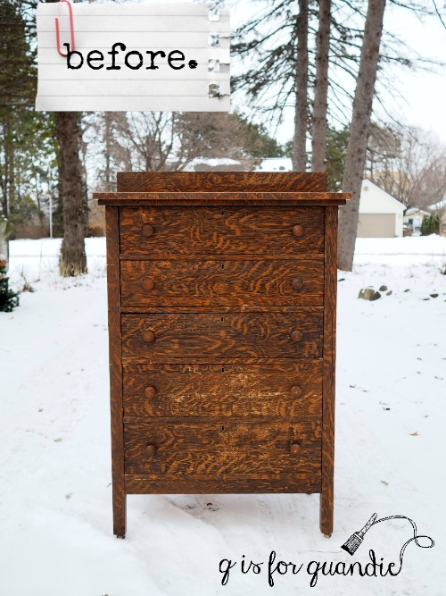
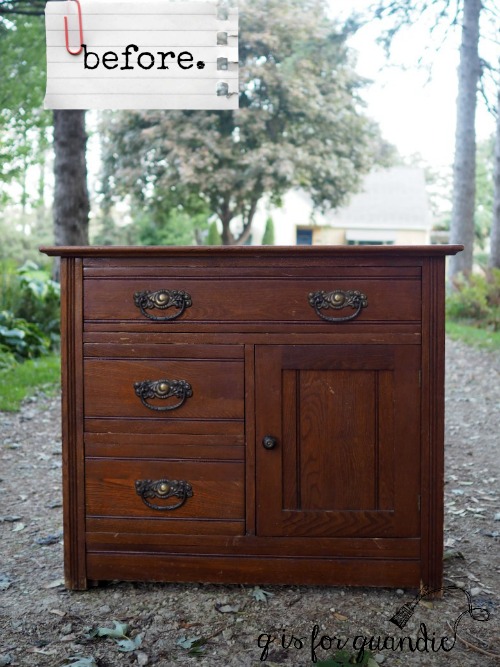
Over a year ago my bff’s sister Laura called me and said that there was a vanity free at the curb in her neighborhood, did I want it?  She was willing to pull it into her garage until I could get there to pick it up.  Unfortunately I neglected to take a real ‘before’ picture of the vanity.  But here’s the picture that Laura texted to me.

It was in pretty rough shape and the middle section was barely holding the thing together, so I decided to dismantle it and, with Ken’s help, turn it into two nightstands instead.  I have a plan for the mirror as well, but that will be down the road.

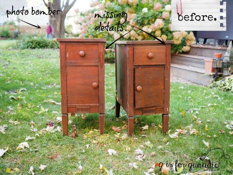
By the way, if you are new to my blog and don’t already know this, Ken is my next door neighbor.  He can always come up with a clever way to fix stuff.  In many ways, I think he is one of a dying breed.  These days people tend to prefer to replace broken things rather than repair them.  Ken is from the generation that repaired everything.  And apparently he’s also a photo bomber!  See him back there?  And yes, that is his back yard, with my back yard in the foreground.  He was actually on his way over to take a look at the repairs needed on this pair of nightstands when I took the photo (and yes, this was last fall when the grass was still green and not covered in snow).

I had a precise vision in my head of how I wanted these nightstands to look when finished.  Imagine chippy, old, ethereal, delicate, feminine. Can’t see it?  Well, stick with me, let’s see if we can get there.

My first step was to remove the big round wooden knobs.  They weren’t terrible, but they didn’t work with my vision for the piece.  Next I sanded lightly, cleaned with TSP Substitute and then painted a base coat of Fusion’s Little Piggy which is a very pale pink.  I didn’t get a photo, but they did look really pretty in the pale pink.  If I’d had enough Little Piggy to do a second coat, I could have just gone with the pink.  Life would have been so much easier.  But I was out of Little Piggy after one coat, and hindsight is always 20/20.

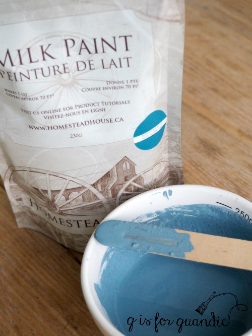
Next I added a little Homestead House Salad Bowl Finish (a.k.a. Miss Mustard Seed Beeswax) along all of the edges of each nightstand to provide a resist to the two coats of milk paint that I applied next.  This is where mistake no. 2 comes into play.  I wanted a warm white and I had several mostly used bags of various whites so I mixed them all together to give me enough paint for both nightstands.  Again, this would have been OK, except for what happens later.

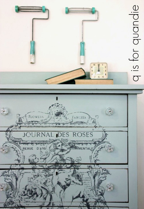
But for now the nightstands were painted and they looked amazing.  I sanded them to distress and that looked amazing too.  I got out my new IOD Decor Stamps (I used stamps from the Friffery set) and my Ranger Archival ink in a color called Watering Can.

I started small with a stamp on either side of the opening for the drawer.  They went on perfectly and looked gorgeous!  But 10 minutes later they looked decidedly less crisp.  My first thought was to check my glasses, didn’t I have my ‘cheaters’ on?  I did, and the stamp was definitely no longer as crisp.  So I waited another 10 minutes and looked again.

Oh boy, even worse.  That was not at all the look I was going for.  It didn’t take me long to figure out that the ink was bleeding into the milk paint.  I should have sealed my paint before applying the stamp, mistake no. 3.

Then I realized that I didn’t have enough paint left to cover up the bleeding stamps.  And since I had custom mixed the color, I knew I wouldn’t be able to recreate it perfectly.  Sigh, mistake no. 2 coming back to bite me.

That’s when I started drinking.

No, not really.  It was tempting, but it was still only about 10 a.m.

So instead I decided to back up a step and check my theory with a practice board.  If only I’d done that in the first place!

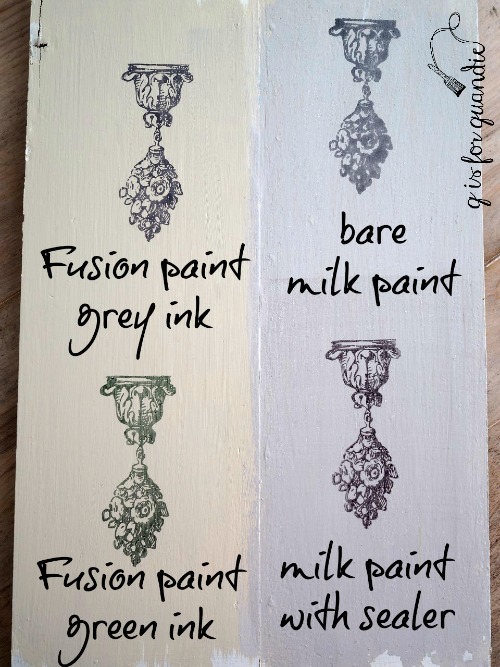
I found an old board and painted half in Fusion paint (left side) and the other half in milk paint (right side).  Once dry, I used The Real Milk Paint Co’s Dead Flat to seal the lower half of the milk paint side.  Once dry, I applied the stamp to each section.

As you can see, sealing milk paint first will make all the difference if you want to use an IOD Decor Stamp with ink on your piece.  Good to know for next time.

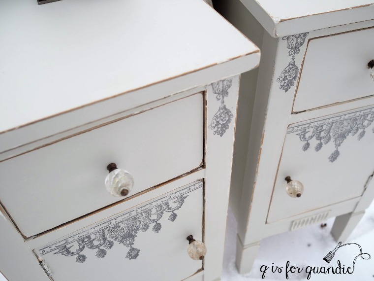
However, at this point I was back to square one.  I needed to repaint my pieces in their entirety because I didn’t have enough paint to just paint over the stamps.  It was time to re-think my entire plan and switch to Fusion paint.

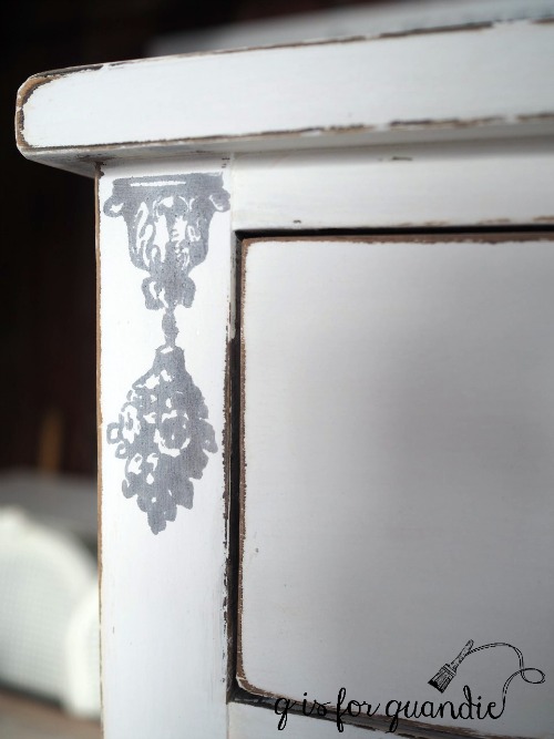
I was able to get away with just one coat of Fusion’s Putty, a pale grey, over the white milk paint.  Once that dried, I added the smaller stamp on either side of the drawer opening.  If you look back at the ‘before’ photo, you’ll see that I pointed out that these spots must have originally had some sort of carved detail.  All that was left were the shadows showing where they used to be.  I really liked the idea of replacing those with the stamp.

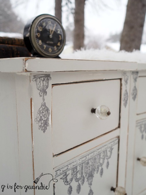
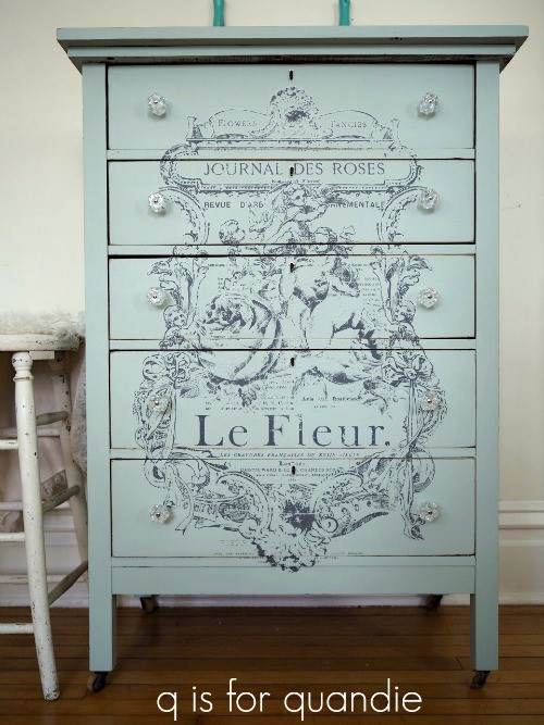
Next I wanted to use a larger stamp on the doors.

As it turns out, it takes a bit of finesse to use that big 10″ x 12″ acrylic block.  You must make sure that your surface is perfectly flat and there are no other obstructions to keeping the entire 10″ x 12″ block flat.  You know, things like hinges for example!

On my first attempt at stamping the door, the door itself pushed inward as I pressed down on the block.  Ugh, mistake no. 4.  I quickly realized that I should have taken the doors off so that they could lie flat while I stamped them.  So I removed the doors, added another coat of Putty to them, and when that was dry I tried again.

This time around, when I went to press down on the acrylic block I realized that the hinges I’d left on the doors impeded the block.  Mistake no. 5.

So after repainting the door fronts for a 3rd … or was it 4th … time, I adjusted where I placed my stamp on the acrylic block so that I could avoid those hinges.  And this time, eureka!  It worked!

Phew!

So let’s recap all of the Q-tips I learned while working on these nightstands.

  • Do not use Archival Ink over unsealed milk paint, it will bleed.
  • Do use Archival Ink over Fusion paint.
  • Be sure to allow the ink to dry before rubbing over it to avoid smearing.
  • Don’t use a limited amount of a custom mixed color of milk paint when experimenting with new products.
  • When using the large acrylic block, be sure you can keep it flat and not hit any obstructions, like hinges or raised trim.  Note:  you can use these stamps without the acrylic block to avoid this problem, but I haven’t tried that yet.  Maybe next time.
  • Be sure the the item you are stamping can’t move (even the smallest amount) while being stamped, like a door or drawer that can move inwards.  Instead remove them from the piece and place them on a firm surface while stamping.
  • Have extra paint on hand just in case.  It’s going to take some practice to get the hang of stamping on furniture, so be prepared to paint over the mistakes and try again.
  • Don’t expect perfection!

After much trial and error, in the end I think my nightstands turned out lovely.  Did I achieve my vision of chippy, old, ethereal, delicate, feminine?  Well, not entirely.  Certainly not the chippy part, but maybe the rest?

What do you think?

And before I close, I wanted to point out one of the best features of the stamps.  Buy them once, use them a million times.  They can be used over and over and over.   I’m planning to get lots of use out of them, especially now that I’ve learned how the hard way.


another cutie patootie chair.

Every time I see little kid sized wooden chairs I snatch them right up.  They are so fun to paint, and they always turn out adorable.  You can see some of my previous chairs here and here.

So when I saw this pair at a garage sale in September, I bought them.

Then I tucked them away to become winter painting jobs.  I made a point of saving some of these smaller projects so I would have easy things to paint inside the house this year.

So last weekend when I had my sister and my friend Terri over to paint, I pulled out one of the chairs to paint myself.

I prepped the chair by washing it down with some TSP Substitute.  I was planning to paint it with milk paint and I would have been OK with some chipping, so I didn’t bother to do any other prep.  If you want to control the chipping, a good way to do that is to sand your piece well before painting, but I skipped that on this one.

Then I mixed up some Homestead House milk paint in Maritime Blue.  I used this color once before on a galvanized watering can and I knew it was a lovely shade of blue.

I painted two coats of paint on the chair.

Next I added a stencil to the seat using a warm white acrylic craft paint.  Once dry I sanded the chair fairly heavily to give it that well worn appearance since I didn’t get much in the way of chipping at all (despite my lack of sanding).

For a top coat over the milk paint I decided to pull out a jar of Fusion’s new wax.

The Fusion people sent me a few different jars of the wax to try out (including that jar of Rose Gold wax that is being included in my giveaway).  In addition to this clear Furniture Wax, I also have the black, the copper and the espresso.  I’m looking forward to trying each of them over the next several months and letting you know what I think.

But for today, I used the clear wax on this chair and I loved it.  It is very lightweight and spreads much more easily than other waxes.  I would compare it to the difference between spreading your toast with butter that has been sitting out on the kitchen counter versus butter that came out of the fridge.  Not only is it easier to spread, but you tend to use a lot less of it.

It also has only the most mild of scents, not a chemical smell but just a pleasant waxy odor.

Much like the Homestead House and Miss Mustard Seed waxes, this new Fusion wax is also environmentally friendly and doesn’t require the use of a hazmat suit while applying.

Today’s q-tip:  remember that you do not have to add wax (or any other top coat) over Fusion paint.  It is durable and washable without the extra step of a top coat.  However, some people like to add wax for aesthetic reasons.  For example, adding a dark wax to give a more aged appearance or to highlight details.  The new Fusion waxes will work beautifully over Fusion paint for that purpose.  They will also work over milk paint as a top coat to add some additional durability and protection.

I have to say that I haven’t been waxing as many pieces as I used to because of the labor involved in applying and then buffing the wax, but this wax was so easy to apply.  You’re definitely going to see some more waxed pieces from me now.

Be sure to check out Fusion’s website to read more about their new waxes!

By the way, while I was writing up this post I had to google ‘cutie patootie’ to see if that was really the correct spelling.  Here is the Urban Dictionary’s definition …

someone or something so cute that the word cute itself has to morph into something cuter, thus cutie patootie was born

LOL, so, I’m not sure if this chair is cute enough to really qualify as ‘cutie patootie’, what do you think?

coffee is always a good idea.

First things first, I drew five names at random from the comments left on Friday’s post and Susan, Cynthia, Wendy, Alison and Kim all won some samples of Miss Mustard Seed milk paint.  I sent emails to all five winners, I know I have multiple readers with those first names, so if you didn’t get an email, I’m sorry to say you didn’t win.

But, keep in mind that you can still order 3 samples from Carver Junk Co for $18 with free shipping (use the code MILKPAINT), so I hope some of you will order some samples and give it a try even if you didn’t win.

Now, on with today’s post!

A while back (when the grass was still green and there were leaves on the trees) I picked up another small washstand.

I’ve painted quite a few of these over the years.  They make awesome bedside tables.  Initially that was my plan for this one, so I didn’t even include the towel rack that came with it in my ‘before’ photo.

That turned out to be unfortunate because a picture is worth a thousand words, and it will be so much easier to explain this with a photo so I borrowed a picture of a similar piece from the world wide web.

Freakishly tiny photo, but it shows a towel bar at the back that is very similar to the one on my piece.

Usually I just discard these towel bars.  Much like mirrors on dressers, I feel like they hamper the versatility of the piece.  You wouldn’t really want that towel bar on your nightstand for example.

But then I had an idea for this piece.  I decided to make it into a coffee bar, and to turn the towel bar into a frame for a chalkboard.  I asked Ken to remove the round dowel that went across the top and replace it with a piece of bead board instead.

Then he cut a piece of hardboard for the chalkboard and I painted it with Rustoleum’s black chalkboard paint.

Initially I was just going to paint the entire piece, after all, here is what the top looked like when I brought it home.

It was in pretty rough shape.  But I love to pair a wood top with black paint, so I decided to try stripping it.  After all, if it didn’t work out I could always paint it later.

I stripped it, sanded it down and then waxed it with Miss Mustard Seed antiquing wax, and I’m so glad I did.  It’s not perfect, but I still love the way it turned out.

I painted the rest of the piece in two coats of Miss Mustard Seed’s Typewriter.  If you haven’t tried milk paint yet, I always recommend starting with the black.  It’s so, so easy to use.  It often covers in just one coat, and I probably could have gotten away with one here but I like my paint really opaque so I went with two.  I never have any trouble with the pigments dissolving with the black either.  Also, as you can see, it distresses beautifully leaving a gorgeous authentic looking aged finish.

And speaking of finish, I used Miss Mustard Seed hemp oil as my top coat over the black milk paint.  If you are new to milk paint, keep in mind that it’s the hemp oil that gives the black this rich, deep color.

I cleaned up the original hardware by just scrubbing it with some dish washing soap and then I put it back on.

To give it a little bit of an industrial vibe I added some chunky black wheels.  Somehow I thought it would be more functional to have a coffee bar that is easy to move around.  In hindsight, I’m not sure why I thought that.  For use at parties?  In case you want coffee in bed?  Well, they look cool and they do add a bit of height to the piece even if there isn’t really a need for them.

And in case you are wondering, yes, that is snow.  Just enough to be pretty in the morning, but mostly melted by the afternoon.

I drew the chalkboard using the method I shared in my tutorial last week.

This coffee bar is the perfect size for your Keurig and all of your coffee making supplies.

After all, coffee is always a good idea!

Please check my ‘available for local sale’ page for details if you are local and in need of a coffee bar!

the hutch that took forever.

I’ve mentioned once or twice before that Mr. Q and I like to go on Friday date nights.  Only our Friday date nights involve driving across town to pick up a piece of furniture.  We both really enjoy spending that time together.  But one evening last June I decided to invite my sister along for the ride.

We were driving all the way up to Cambridge, Minnesota to pick up a hutch that I had found on Craigslist.  Cambridge is about an hour north of me.  Normally I wouldn’t go that far for something, but it was a great deal on a lovely china cupboard.  Plus, it was a beautiful summer Saturday evening that was perfect for a drive.  The sellers told me they lived on Spectacle Lake and it was a beautiful area, so I immediately knew that my sister would enjoy coming along to see the scenery.

When we arrived at the appointed address we discovered that it was an old 40’s lakeside resort that is no longer functioning as a resort.  The sellers told us that they’ve been living in one of the old cabins as caretakers of the property, but now the property is being sold, the old cabins will be torn down and replaced with McMansion lake homes.  I’m always a bit bummed out by stories like these.  Those old cabins with their knotty pine walls and screen doors that make a slapping sound when they close have so much charm.

 I really wish I’d brought my camera so I could share some photos!  But I didn’t, so I’ll just borrow one from pinterest to set the atmosphere.

After taking a little tour of the vintage cabin, we loaded up the hutch and before we drove away we asked for a dinner recommendation.  The sellers recommended a local place that had fresh fish and a decent patio, so we stopped off and had a delicious dinner before heading home with this in the back of our truck.

That was way back in July.  So what happened between July and November?

Well, I started out planning to paint this piece grey.  I have a customer who had mentioned that she wishes she’d bought the French hutch that I had at my sale last year, and said if I ever found another like it she’d love to have it.  So my plan was to do a similar treatment on this one.

But that plan required being able to remove the fretwork behind the glass.  And well … you know what they say about the best laid plans.

First of all, I didn’t notice until I took a closer look at this piece that the two narrow sides don’t open.  Not the top glass ‘doors’, nor the bottom ‘doors’.  I guess you wouldn’t really call them ‘doors’ at all, they are just stationary panels.  So I couldn’t get to that fretwork from the front.  OK, so next I removed the back of the cupboard.  I figured I could then remove the shelves and easily get to the fretwork from the back.  Um, nope.  The shelves are firmly glued in place.

Then I asked Ken to come over to consult.  He strongly recommended that I find a way to live with leaving the fretwork in place.

I still didn’t want to let my initial vision for the piece go, so I went ahead and painted one coat of grey.  Then two months went by.  I kept procrastinating and feeling guilty for not finishing the hutch, but I couldn’t bring myself to work on it.  Finally I realized what the underlying cause of my procrastination was.  The grey just wasn’t working with the brown wood of the fretwork, and that was keeping me from finishing the job.

So I pulled out my Annie Sloan chalk paint in Coco, a much better color choice with the wood fretwork.  I added a coat of Coco over the gray and realized it was just what I needed.  Once the paint was dry I started to sand the piece to distress the edges and quickly realized that the undercoat of grey was showing wherever I sanded in a way I also didn’t like.

Ugh.  I’d have to add another coat of Coco.  Frustration kicked in yet again and another couple of weeks went by.

With winter weather looming, and a trip to Disney World coming up, I knew I needed to get my act together and get this piece finished.  It’s really too big to work on in the house.  Plus I wanted to use up some Annie Sloan wax that I had on hand and I won’t use that product indoors.

So a few weeks ago when the forecast called for sunny and a high of 75 I took a day off at the day job to just get this hutch finished!

I have to tell you guys, the entire time I was waxing this piece I was cursing my decision to use the chalk paint.  It would have been so much easier to just use Fusion’s Algonquin.  It’s very similar to the Coco and I wouldn’t have had to wax it.

What was I thinking?  I’ll tell you what I was thinking, I wanted to just use up the Annie Sloan products that I had on hand rather than go buy some Algonquin.  Such a foolish choice.  It would have been worth every penny to just buy a pint of Algonquin.

Well, as they say, hindsight is 20/20.  But now the labor is behind me and this hutch really turned out lovely.

I made a lot of decisions while working on this one.  The first was to stencil the inside back with a French poem.  Since I had the back off anyway, I figured I might as well go for it.  It was a simple detail to add before putting the back on again.

I painted the panel with two coats of the Coco, then stenciled it with an acrylic craft paint.  Once dry, I waxed it with Annie Sloan wax and then put it back on.  I think it adds a great little subtle detail even though it will be mostly hidden behind the contents of the cabinet.

I also added some ‘grain sack’ liners behind the glass on either side of the hutch.  These are just some strips of fabric that I stenciled with “1918”.  They are just tacked into place, so the future owner of the hutch can opt to remove them if they prefer.

I swapped out all of the knobs on this one for vintage brass knobs that I thought suited it better.

So, a mere 4 months later, this piece is finally done!

 It’s such a pretty china cupboard, perfect for displaying a non-collection of ironstone or possibly your grandmother’s china.  Or for a little less traditional look, it could be filled up with books.

This hutch is available for sale locally while it lasts.  If interested, be sure to check my ‘available for local sale’ page for more details.


the handmade hutch.

Mr. Q and I picked up this petite secretary hutch a few weeks ago.  The gal we purchased it from said she got it from a friend who said that his grandfather made it.

It had a couple of flaws, but nothing major.  However, as you can see in the ‘before’ photo, one of the drawers fell apart as we were unloading it.  That was an easy fix that just needed some glue.

In addition, there were no stops in place to keep the drop down desk surface from falling back inside the piece when it was up.  The only way to keep that piece in place was to use the lock mechanism, which was rather tricky.  Ken solved that problem by just adding a small peg on either side.

When I first brought this piece home I had envisioned a fabulously chippy milk paint finish on it.  That didn’t quite work out.  I did start out painting it with a couple of coats of Homestead House milk paint in one of my favorite pale greys, Bedford.

However, when I came back out to the workshop the next day I saw that most of the paint had chipped off the fronts of the drawers and the front of the drop down desk.  The paint on the sides of the piece didn’t chip, but it looked really blotchy.  I had a feeling before I painted this one that I might end up with this problem.  You see there were spots on the sides where the previous finish was entirely worn away.  Those spots absorbed the milk paint quite differently than the spots that still had some finish on them.

I thought that maybe I could still work with the milk paint and just go really chippy and distressed, but in the end I knew I wouldn’t be happy with it.  So I wrote off the milk paint and switched to Fusion acrylic paint in the same color, Bedford.

First I vigorously sanded down the super chippy drawer fronts and drop down desk front.  If I hadn’t, the chippy texture of the milk paint would have shown.  Once I had those mostly smooth, I wiped them down and then added a coat of Fusion’s Bedford.  I didn’t sand the sides of the piece that hadn’t chipped, I just painted right over the milk paint.

It only took one coat of paint to get good coverage and to solve the blotchy problem on the sides.

I added another Iron Orchid Designs transfer to this piece.  I thought this design suited it perfectly.

I painted the inside of the hutch in Fusion’s Midnight Blue.  I thought this would be a great color if one has some ironstone that they want to display and they want to make it pop.


I also painted the inside of the desk in the same dark blue.

I had a heck of a time trying to get photos of this piece on a brilliantly sunny fall day.  The glass in the doors reflected everything.

I even resorted to moving the hutch inside, but I didn’t think those photos were any better.

Maybe outside was better after all.

Either way, I think the hutch itself definitely looks better painted.

Would you agree?

the jenny lind bed.

After getting distracted by other projects, I finally got my Jenny Lind bed painted.

As a reminder, here is the before photo.

I’m going to be honest with you guys, I didn’t do much prep here at all.  I tend to slack a bit more when I’m working on items I’m going to keep for myself.  If it doesn’t hold up over time, well, no big deal.  I can easily re-paint it.  If I was going to sell this piece, just to be on the safe side, I would have done my typical prep, a light hand sanding followed by cleaning with TSP substitute.  Instead, I just wiped it down with a damp cloth.

I mixed up some of the Homestead House Ochre milk paint (no. 2) that I chose after comparing 3 different shades of yellow (thanks again to Homestead House for providing me with the paint) and once I had it good and mixed, I started painting.

It took 3 coats to get good coverage with the pale yellow over that dark wood.  That’s something you should know about milk paint.  It is not as opaque as other kinds of paint, and if you’re covering something dark with a pale color it may take a few coats.  Or, as I learned this weekend from Miss Mustard Seed, another good option is to paint the piece in a medium shade first, then cover that with the lighter shade.  Next time I’ll give that a try.

All of those spindles!  Oy vey.  I’m not a big fan of painting spindles.

Today’s Qtip:  I did get some awesome chipping on this piece and you can chalk that up to the lack of preparation.  Had I done more sanding and cleaning with TSP, I wouldn’t have been as likely to get this amount of chipping.  Prep is the key to controlling chipping.  Check out {this post} for tips on how to get the perfect chippy finish.  Or just take your chances like I did with this bed.

I sealed the bed with The Real Milk Paint Co’s Dead Flat which will help halt any further chipping.

It wasn’t until I was making up the bed that I came across this single vintage pillow case in my linen cupboard.  I’d forgotten all about it.  Somewhere my sub-conscious must have had this in mind when I chose the yellow for this bed, don’t you think?

I still need a few final touches for my guest room.  I’m looking for the perfect something to hang over the bed.

I definitely need a bed skirt, as well as some sort of duvet cover.

But so far the guest room is really coming together.  Slowly maybe, but also very inexpensively which is a good thing.  I spent $40 on the headboard and another $25 on the frame.  I traded my former full size guest bed mattress and box spring for this twin set with my neighbor across the street, nnK.  She even included the sheets and duvet, so it was quite the bargain.

I’ll be sure to keep you posted as I continue to make progress in the guest room!


the gothic dresser.

A while back I sent Mr. Q off to purchase this dresser via Craigslist mainly for its mirror harp, which I took off and am keeping because it’s amazing (you’ll see it tomorrow).  But even though I was mainly interested in the mirror, I also thought the dresser itself was pretty fab.  Here is the ‘before’ photo, which doesn’t include the mirror, but it does include the ‘hanky drawers’.

Hanky drawers are those two little drawers, or in this case hinged boxes, that are sitting on top of the dresser.

They were meant to store handkerchiefs back in the day when people actually had such things.  I generally remove hanky drawers.  Much like mirrors, they tend to limit the use of the dresser.  And without the mirror, they look kind of silly sitting there on top of the dresser.  I’ve already re-purposed them as well, and I’ll share those later this week too.

But for today, let’s just talk about the dresser itself.  I’m calling it the gothic dresser, although technically I don’t think this dresser is ornate enough to qualify as ‘gothic’.  It has a kind of gothic vibe though.  Do any of you know what this style might be called?

I love those tear drop drawer pulls.  Even though one had fallen off, it was included with the dresser so they were all there.  They were the reason I chose to paint the body of the dresser in Homestead House’s Coal Black milk paint.

Unfortunately, when I went to put the drawer pulls back on after painting I discovered that the one that wasn’t on when I purchased the dresser was damaged beyond use.  Argh.  That explains why it was just lying in the drawer!

Luckily I had just purchased some round black knobs with a matte finish from Hobby Lobby and I think they ended up working well with the tear drop pulls.

Rather than paint the entire dresser black, I stripped the top and waxed it with Miss Mustard Seed’s Antiquing Wax for contrast.

I have been getting a ton of mileage out of that MMS Antiquing Wax lately!

I had so much fun staging this dresser with some of my favorite black props like my vintage phone.

And the all black Big Ben from my non-collection of clocks.

Since I had some paint left over after painting the dresser itself, I painted the 2nd drop leaf from my green alligator table with it and then added a French stencil.

I have to say, I absolutely love how this one turned out.  You can be sure there will be more drop leaf signs in my future with this stencil on them.

By the way, I added a top coat of Miss Mustard Seed’s hemp oil on both the dresser and the drop leaf sign.

I’m so glad I went with the Coal Black on this piece despite the damaged drawer pull, I think it was the perfect choice with the contrast of the wood top.

Both the dresser and the sign are available for sale while they last.  If you are local, be sure to check my ‘available for local sale’ page for more details.


sunbleached coffey.

You’re probably wondering about that weird title, but all will soon make sense to you.

Some of you may recognize the name Kent-Coffey, especially if you know your mid-century furniture designers.  I always thought Kent-Coffey pieces were expensive, high end, sleek, designer items.  On the contrary, a little bit of research has revealed that Kent-Coffey furniture was intended for the average consumer.  Much like Readers Digest books, it was mass produced and was priced affordably.

Not only that, but in addition to the sleeker, more modern designs, Kent-Coffey also made some French Provincial stuff.

Like this dresser from the Charmant line.

I picked this one up via Craigslist.  I had seen a photo of a similar piece online that had been refinished with white washed drawers and a pale grey painted body and I wanted to try the same look myself.  I wish I could remember where I saw it so that I could give proper credit, but I’ve searched and searched and can’t find it.  Suffice to say, this is a copied idea not one that I came up with on my own.

My first step was to strip all of the drawer fronts.  Once I had the finish removed I could see how beautiful the grain was.  After a good cleaning and sanding, instead of white washing them I chose to stain them with Varathane’s wood stain in Sunbleached, followed by a coat of Minwax Wipe on Poly.

I painted the body of the dresser in Fusion’s Bedford.

Bedford might just be my favorite of all the Fusion shades of grey (although I do also love Putty, which is just a little more pale).

I decided to keep the original hardware since it works so well with the whole French provincial look, but the drawer pulls really popped too much in their original brass color.  So I ‘white washed’ them using a Little Billy Goat Goat Stick in Cream.

For more info on Goat Sticks, check out {this post}.

Now the drawer pulls blend a little bit more with the overall sunbleached look of this dresser.

This is a bit different from my usual treatment for a French provincial piece (you can see others here, here and here).  What do you think of it?

Is it your cup of tea?  Or should I say Coffey?

This dresser is for sale. If you are local and in need of some Sunbleached Coffey, be sure to check my ‘available for local sale’ page for more details.

night and day bookcase.

A while back my sister and I were out and about in downtown North St. Paul, which is basically right down the street from me.  There are a couple of antique shops along the main street, as well as a couple of thrift shops so we were just meandering around doing a little window shopping.  We were walking into the larger antique mall when I noticed this bookcase in the window.

It was missing its shelves entirely, and one of the drawer pulls was broken.  Overall, it was just in pretty shabby shape, and not shabby in a good way.

But the price was right and I could see it had tons of potential.  So I bought it, and Debbie and I loaded it into the back seat of my VW bug.  Luckily it was a beautiful day and we were able to have the top down.  Plus, we only had to drive a few blocks with it.

Later I purchased a couple of inexpensive pine boards and Ken trimmed them down to create new shelves for it.  And then it was just a matter of adding some paint and some new knobs.

The lovely people at Fusion recently sent me a few more of their paint colors to try (plus a couple of favorites).  So I pulled out two colors from their Tones for Tots line for the bookcase, Little Lamb and Little Piggy.

I’ve used Little Piggy before (here, here, here and here).  It’s the most delicate pale pink.  I had never used Little Lamb, but I thought the two would make a great pairing.

I added two coats of Little Lamb to the outside of the bookcase, and two coats of Little Piggy to the shelves and inside of the bookcase.  Once dry I used some 220 grit sandpaper to distress the edges of the Little Lamb.

I know not everyone is a fan of distressed edges, but I think it serves to highlight the details like those pretty corners.  This bookcase was a little bland until I added the distressing.

Although my color choices make this bookcase perfect for a nursery, I didn’t really have any cute baby things to use while staging it for photos.  So I just went with some random items in the right colors.

And of course, you wouldn’t have to use this in a nursery.  It could be used anywhere that you happen to need a pink and grey bookcase.

I really struggled to capture the color of this piece.  I feel like the Little Lamb looks too blue, or too lavender in most of my photos.  Although in person it does have almost a periwinkle undertone to the grey.

This is just one of those colors where you really have to see it in person.

But truly, isn’t the difference between the ‘before’ and ‘after’ like night and day?

What a difference a little paint can make.

Be sure to check my ‘available for local sale’ page if interested.