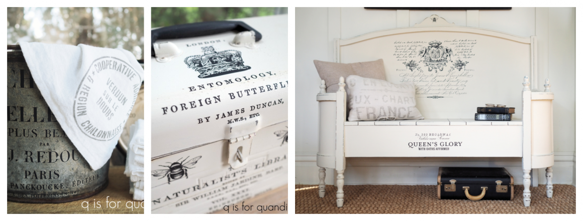
the romantic prairie style washstand.

Are any of you guys familiar with the book Romantic Prairie Style by Fifi O’Neill?

It came out in 2011, but it continues to be one of my favorite decorating books.  It’s one that I still refer back to periodically.

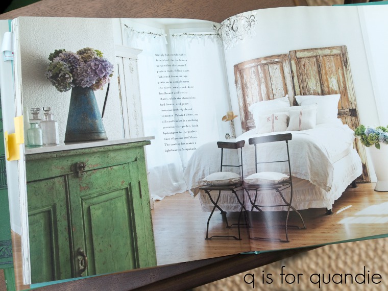
I was paging through it the other day and I came across this photo …

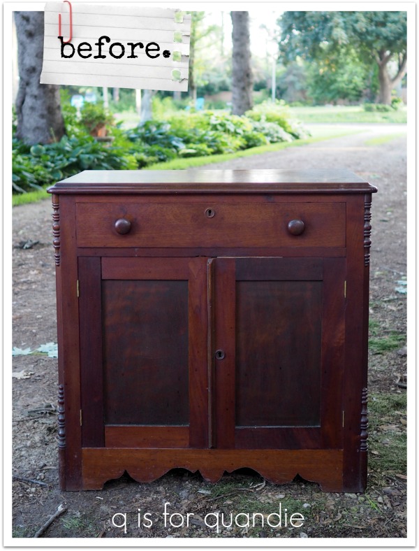
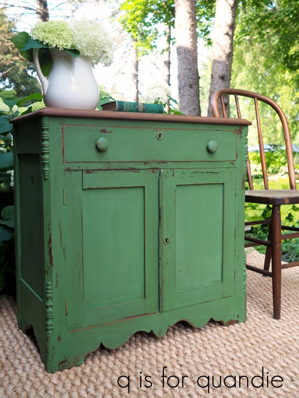
I was totally drawn to that green cupboard in the foreground.  Isn’t it fab?  So perfectly chippy, and that green is gorgeous.  As I was admiring it, I thought about the washstand that I brought home from the Prospect Park neighborhood sale a couple of weeks ago.

I thought I could possibly create a similar look on it using Sweet Pickins In a Pickle milk paint.

I started out by stripping the top.  As you can see in the ‘before’ photo, the stain on this thing was pretty dang dark.  The top also had several water marks on it.  I wasn’t sure I would have the patience to see this one through, but after two passes with the stripper, lots of rubbing with steel wool, then cleaning, then sanding, then more sanding … phew … I got ‘er done.

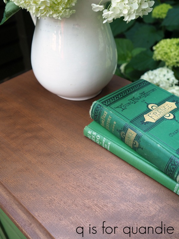
Once I had the top down to bare, unblemished wood I simply waxed it with Miss Mustard Seed’s Antiquing Wax.  You won’t get much sheen with this treatment, but it creates a wonderfully rustic look.

Then I moved on to paint the rest of the piece.  Since I was hoping to end up with a chippy finish, I opted to skip scuff sanding this one and instead just wiped it down with a damp cloth.  Sometimes this can backfire on you, so I don’t necessarily recommend it if you are someone who isn’t comfortable with an unpredictable outcome.  You do run the risk of having all of your paint chip off if there is something on the surface of your piece that resists the paint.  Scuff sanding will help prevent that from happening.

But I was feeling lucky, so I skipped the sanding and went right for the paint.

It took three coats of the In a Pickle to get good coverage over that really dark stain.

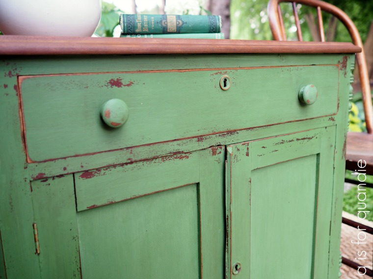
Initially I really didn’t get much chipping, except at the very bottom of the piece.  So I forced it by using painter’s tape to rip off chips here and there.

If you’ve never tried this trick, it’s similar to getting lint off your black slacks using masking tape.  Just press the tape down and then rip it back off.  This technique won’t always pull some chips off, but it often works pretty well (and sometimes too well, so use caution).

Once that was done, I sanded the piece with 220 grit to make it nice and smooth.  I finished it up with Fusion’s clear furniture wax.

I love the cut out detail at the bottom of the washstand, isn’t that pretty?

The bottom on the sides has a similar look, but I didn’t do a very good job of getting a photo of that.

I have to admit, I’m pretty pleased with how this one turned out.

Aside from not having a marble top, I think it looks quite similar to the inspiration piece, don’t you?  Although perhaps mine could look just bit more roughed up, huh?

I hesitated a bit before going with the green on this piece.  Historically pieces in this color have taken a bit longer to sell for me, which always surprises me because I absolutely love it.  Check out a few of my fave In a Pickle pieces here, here and here.

But I’ll keep my fingers crossed that this one finds a forever home soon!

If you are local and would love to have a romantic prairie style washstand (they make perfect bedside tables), be sure to check out my ‘available for local sale‘ page to see if this one is still available.

spring meadow life.

Pretty much everybody looked at me askance when I showed them today’s piece in its ‘before’ state.

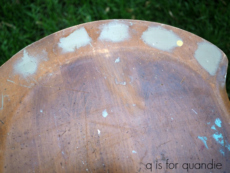
I know they were all wondering what in the world I was thinking.  I have to admit, I’m not even sure why I purchased this one.  I even paid way too much for it at $5.  It should have been in a free pile somewhere, or maybe priced at $1.  In the end, I really just wanted to take on the challenge of bringing this sad little half chair back to life.

In case you can’t tell, it’s basically an ugly 80’s kitchen chair that is missing its back.  It originally had some kind of spindled back, but someone had removed it and left holes where the spindles were.

Ken filled the holes with dowel sticks for me and then I used some wood filler to complete the job.  I sanded them smooth once the filler was dry.

I thought this would make a pretty cute stool … maybe?  hopefully?

I started by painting it with Fusion’s Laurentien.  I hadn’t used this color in a while and I’d forgotten how much I love it.  If you are a fan of turquoise Haeger or McCoy pottery, Laurentien is about that same color.

Such a gorgeous color, right?  And by the way, I took these pictures a week or so ago when the peonies were still blooming.  They are long gone now.

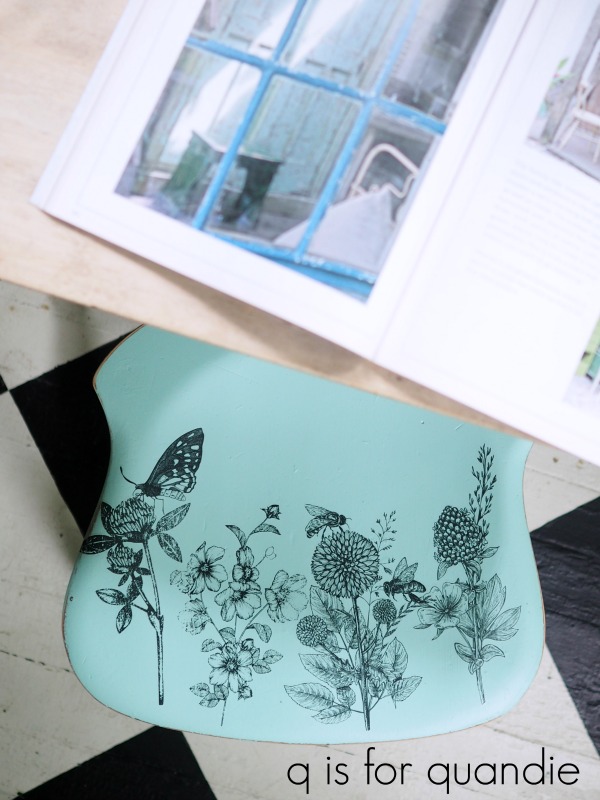
Once the stool was painted, I sanded the edges lightly to distress and then I added pieces of the Spring Meadow Life transfer from Prima Marketing.

Just look at all of those fun images that you could play around with!

I only used four sprigs of flowers on the stool, so I have lots more of this transfer left for future projects too.

 I think the black drawings look great over that punch of turquoise.

This actually makes quite a comfy little stool too.

Perfect for sitting on while perusing your favorite magazine.

So what do you think?  Did I accomplish my goal of bringing this piece back to life?

I took it to Reclaiming Beautiful, the shop in Stillwater, MN where I sell on consignment.  I’m not sure if it’s still there or not.  It will be interesting to see whether or not someone buys it.

Thank you to Prima Marketing for providing the Spring Meadow Life transfer and to Fusion for providing the paint.

If you’re wondering where to purchase the transfer, check out Prima’s ‘where to buy’ page.

If you’re wondering where to buy the Fusion paint, check out their ‘where to buy’ page.

a pair of motel chairs.

I showed you guys a terribly blurry photo of my haul from the Prospect Park sales last week.

I’m afraid this will have to do for a ‘before’ photo of the pair of motel chairs that I found there because I never took a better one.  It’s a bit hard to tell, but they were painted brown.  What’s with the brown anyway?  The planters I shared on Monday were originally brown too, but from an entirely different garage sale.

Anyway, I mainly snatched these up because they were super cheap and thus too good to pass up.  Once I got them home I realized I didn’t have a spot for them and would most likely sell them.

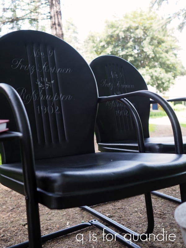
I knew I wanted to paint them, and I thought spray paint would be the easiest option.  Since I happened to have a bunch of black spray paint on hand, I decided to go black.  I also felt black would be a neutral choice that would sell well.

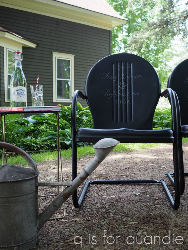
This is RustOleum Canyon Black in a satin finish.  And even with the satin finish I feel like they are just a bit too shiny for my taste.  Plus the sheen isn’t perfectly even, which bothers me.

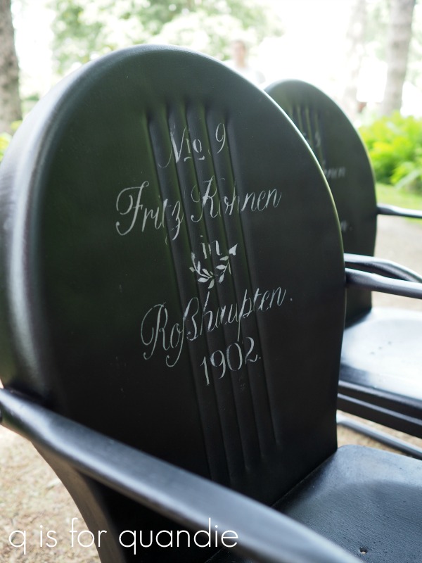
But I went ahead and moved on anyway, adding one of my favorite stencils to the backs of the chairs.

I used my normal trick of stenciling in a color called Deep Taupe, which is actually a dark greige color but reads much lighter when used over black.  This worked beautifully on my baby grand …

But I think the sheen of the spray paint is messing with that combination.  At certain angles it’s hard to even tell that these chairs have a stencil on them.

I don’t know, maybe that subtlety works for them?

Or should I spray over them and try again with a lighter color?  or maybe a different stencil entirely?

It would be simple enough to do.

Or am I just being too critical of my own work (which has been known to happen)?

Go ahead and share your thoughts on that with me in a comment.

Fair warning though, I’m on the road today with my mom and sister.  My cell connection might be a bit spotty so I may not be responding to comments right away.  We are heading to South Dakota to visit my mom’s cousins for the 4th of July holiday.

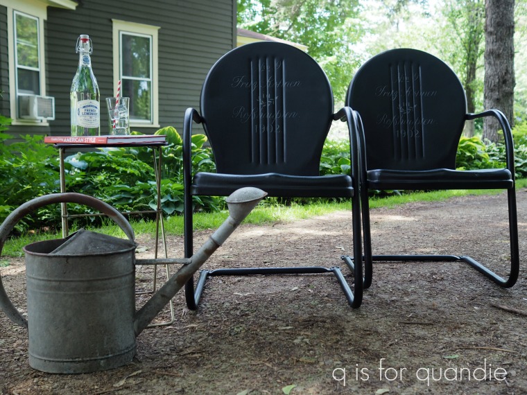
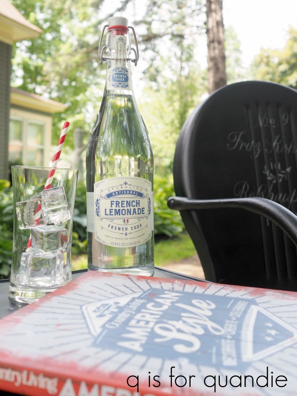
Speaking of which, my simple staging of these photos was supposed to represent the holiday in question.

I’ve got the red, white and blue colors right, plus the Country Living American Style book.  But I have to laugh because I’ve paired it with French lemonade and a German stencil on the chairs.  What can I say?  I fully embrace all nationalities.

That being said, Happy 4th of July to my U.S. readers!

the french peony bed.

My neighbor, nnK (that stands for ‘new neighbor Karen’ because when she moved in across the street we already had a Karen next door.  Granted, that Karen died a couple of years later and now there is just one Karen, but nnK stuck) found this bed free at the curb for me sometime last year.

I’m not a huge fan of waterfall style furniture, plus I always find that it’s rather cheaply constructed.  I think waterfall furniture was the IKEA of its day.  Inexpensive and mass produced.  But the price was right (ie. free) so I decided to see what I could do with it.

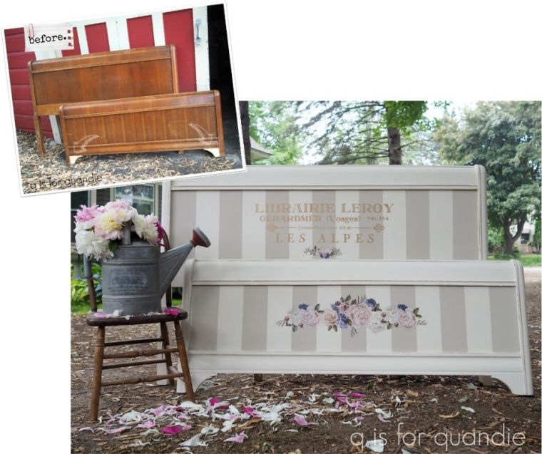
Before I started with the fun part though, Ken had to cut some replacement trim pieces for the bottom of the foot board.  He made quick work of that (that part was already done in my ‘before’ photo, see arrows in photo above).  Then we also worked together to re-glue the foot board because the sides were coming apart.

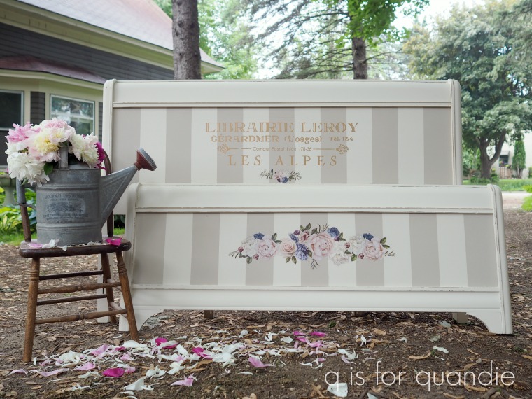
Next came the fun part.  I did my usual prep work and then painted the pieces in Dixie Belle’s Drop Cloth using my new favorite paint brush.

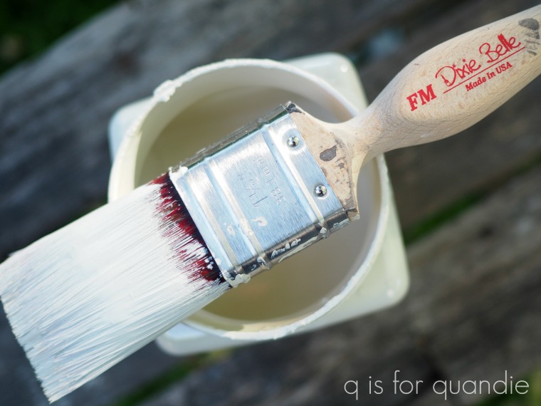
This is Dixie Belle’s Flat Medium synthetic brush and it costs $25 on their website.  I’m going to be honest with you guys, I’ve tried a lot of different paint brushes in a lot of different price ranges and so far none of them have particularly impressed me.  I like many of them for waxing, but not necessarily for painting.  But I really love painting with this brush.  I don’t know if it’s the ‘highest quality Dupont synthetic blend filaments’ or what, but I think this one is worth the money.  It just makes the paint flow smooth like butta’.

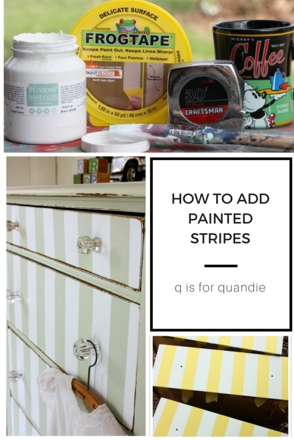
Anyway, next I taped off some 4″ stripes and painted them with Dixie Belle’s Sand Bar.  If you want more info on painting stripes, check out my more detailed how-to post.

Once the paint was dry, I added portions of two different Prima Marketing transfers, Somewhere in France and Lavender Bush.

The headboard got the lettering section from Somewhere in France and a little flower accent from Lavender Bush.

The foot board just got some flowers from Lavender Bush.  I cut out three different groupings of flowers from the transfer and overlapped them a bit to create my design.  I just wanted to point that out in case you are looking at that transfer and thinking ‘why do I not see that particular grouping of flowers?  Is this really the right one?’

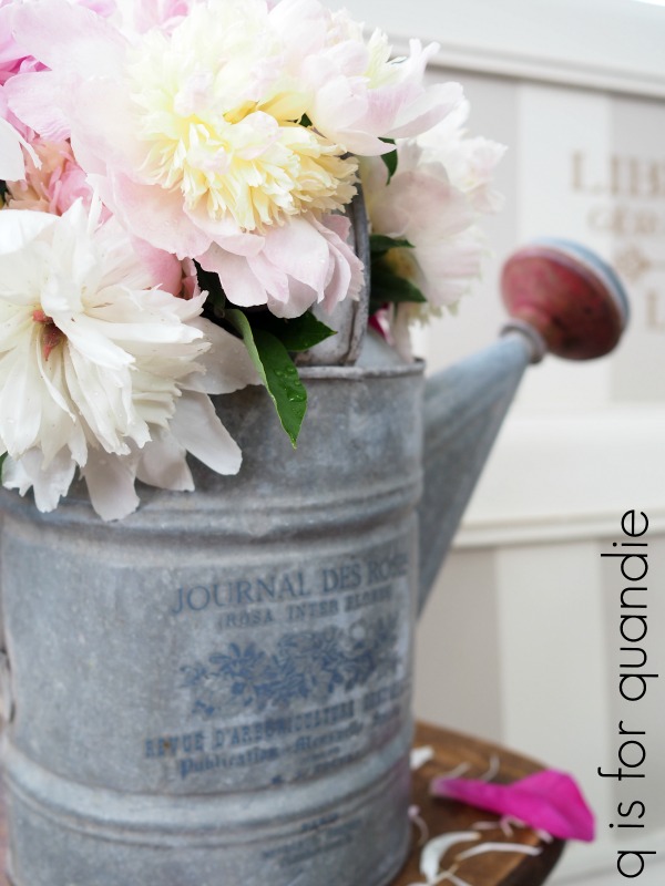
I’m not at all sure why this transfer is called Lavender Bush.  I don’t see any lavender (to be specific, I mean the plant and not the color, but there is that pretty blue-purple color that could potentially be called lavender I guess).  I am thinking that some of those pink and white flowers are peonies though, so it seemed apropos to stage the photos with some real peonies from my garden.

I’m so glad I did because I took these photos last Sunday and since then the peonies have all fizzled out.  They come and go so quickly!

Initially I wasn’t planning to go quite so feminine and pretty with the design on this bed, but in the end I think I made the right choice.  It really turned out sweet, don’t you think?

Once again, as with most vintage beds, this is a full or double sized bed.  You could easily modify it to fit a queen bed with the extenders available at places like Rockler.  I do have the metal side rails and wooden slats that go with the bed, but I didn’t pull them out for the photos.

Thank you to Dixie Belle for providing the paint for this project and to Prima Marketing for providing the transfers.

If you’re wondering where to purchase the Prima Marketing transfers check out their ‘where to buy’ page.

If you’re wondering where to buy the Dixie Belle Drop Cloth or Sand Bar, you can shop with them directly online or find a retailer near you.

And finally, if you happen to be local (Twin Cities, MN) and in need of a pretty French peony bed, check out my ‘available for local sale’ page for more details.

breakfast and lunch.

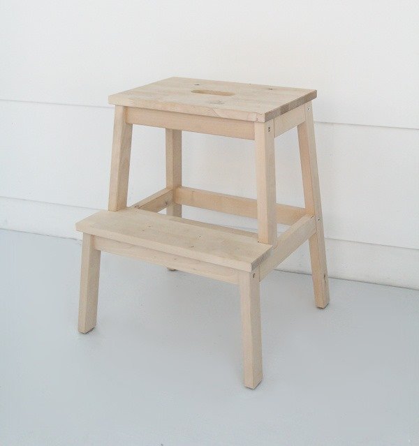
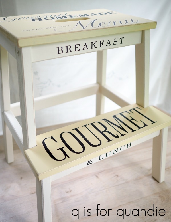
I purchased one of those IKEA Bekvam step stools at a garage sale a few weeks back.  Normally I’m not a fan of IKEA furniture, but in this case the price was right (at $3).  I knew it would be cute painted up.

I have to admit though, I wasn’t expecting to blog about this one.  I just thought I’d paint it quick and take it to Reclaiming Beautiful to sell.  Nothing fancy, it would be an easy project.  So I didn’t really take a ‘before’ picture of it, but then it turned out so fantastic that I had to share it with you guys.

So now I’m borrowing a ‘before’ photo from the web.  Try imagining this stool, but dirtier and marred with some spots of paint (it must have been used in a workshop) …

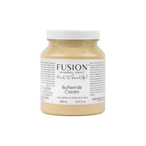
I wanted to paint the entire thing using Fusion’s Buttermilk Cream.  This is my favorite shade of pale yellow.

But when I pulled out my jar of this color it had only the smallest amount of paint left at the bottom.  So sad.

Therefore I just used the Buttermilk Cream on the tops of the stool, and I used Fusion’s Limestone on the legs.  These two colors make a lovely combo, I’ve used them before on a couple of pieces.

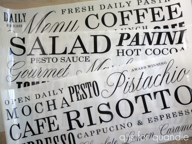
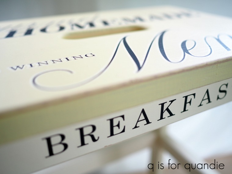
Once the paint was dried I pulled out Prima Marketing’s new Re.Design transfer called Delicious Menu.

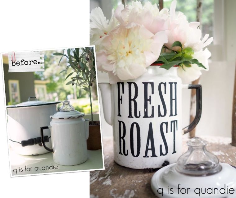
I used parts of this transfer last week to dress up an old metal picnic basket and a couple of other things like this old enamelware coffee pot.

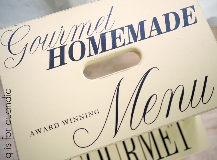
I simply pieced together different words that would fit on the stool and make some kind of sense.

Once I got started I couldn’t seem to stop.

What can I say, I just love adding words to things.

Super cute, am I right?

One last bit of info.  I often see people asking what is used to ‘seal’ the transfers.  I use different things depending on what paint I’ve used.  In this case, since Fusion is so durable and has its own built in top coat, I just add a little bit of Fusion clear wax over the transfer itself and over the raw edges where I sanded the paint away to distress the piece.

So how about you, are you a fan of things with words on them?  What do you think of this Bekvam stool update?

the botanical cupboard.

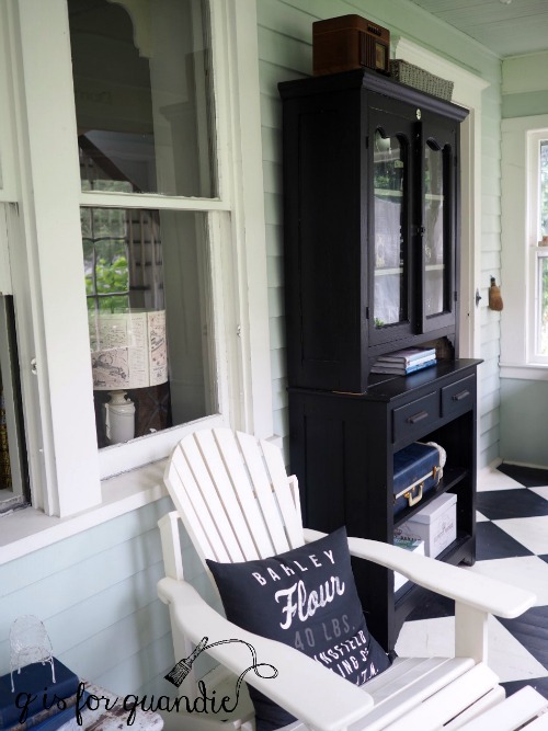
I’ve been painting furniture for a very long time.  Since the early 90’s in fact, when Rachel Ashwell made painted furniture a hot commodity.  This was way before I knew about things like chalk paint or milk paint.  Back then I painted everything with plain old latex, including my black cupboard which has been used in a couple of different spots in my house, most recently on the front porch.

It made a great display piece for my vintage camera non-collection.

But then last winter I restyled my living room and I moved a bunch of my cameras into the shelves in there which left the black cupboard mostly empty.

That had me feeling all Marie-Kondo-ish.  You know, discard everything that doesn’t spark joy.  And I thought, gosh, maybe I’ll just touch up the paint and sell this cupboard because it no longer brings me joy.

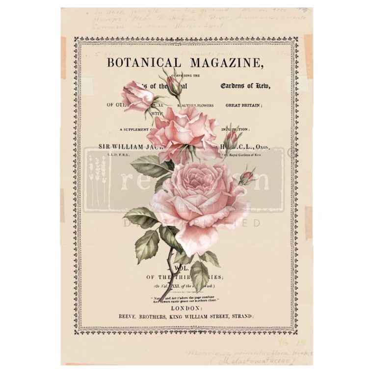
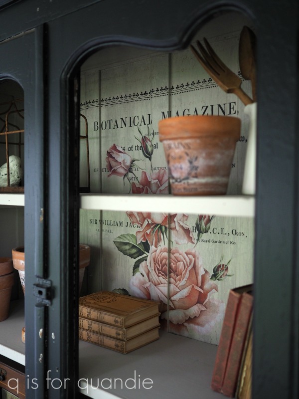
Then Prima Marketing sent me those samples of their new Summer 2019 release transfers including this one called Beautiful Botanist.

Now let me preface this next part by saying I’ve never particularly been a fan of the idea of using a transfer inside a cupboard with glass doors.  I’ve always thought that doing so makes the cupboard less useful.  After all, the purpose of the glass doors is to allow you to display something inside on the shelves.  And putting stuff on the shelves pretty much blocks whatever is behind it, right?

But, as you know, my motto is never say never.  Just when I’m convinced that I’m right about something like this I generally manage to prove myself wrong.

So I decided to try this transfer at the back of the black cupboard to give it a little more personality before selling it.

First things first, I repainted the inside of the cupboard.  The shade of grey that I used the last time I painted it had a bit too much green in it.  I’m afraid I can’t really tell you what the color is that I replaced it with, it’s a custom mix of chalk paint that I had left over from a previous project.  I felt like this color would work well with the transfer.

Applying the transfer was just a bit complicated because the shelves in this cupboard are not removable.  The transfer comes in 3 pieces though, and I used it that way here.  I had to trim just a little bit off the middle piece and several inches off the bottom piece.  But because of those shelves, you really can’t tell that any of the design is missing.

Application was further complicated by the fact that the back of the cupboard is not flat.

I solved that problem by using a razor blade to slice the transfer vertically on either side of each raised section (like I did with the picnic basket I shared a while back).

The application of this transfer would have been a lot easier if I’d had Prima’s new Transfer Tool.

I didn’t get the package with the tool in it until after I’d already finished this cupboard though.  I have used it since I got it though and it’s pretty slick.

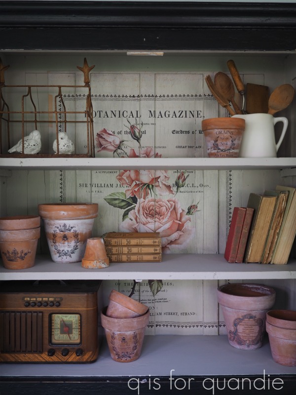
Once I had the transfer in place, I was contemplating what to use to stage the photos of the cupboard.  I wanted something that would work with the botanical theme of the transfer, and then I remembered my clay pots.  Perfect!

I also added a few old books, a rusty garden ornament and an old wooden radio.

As I was playing around with stuff, I was loving the way it looked more and more.

In fact, dare I say it?  It was even starting to spark a little joy.

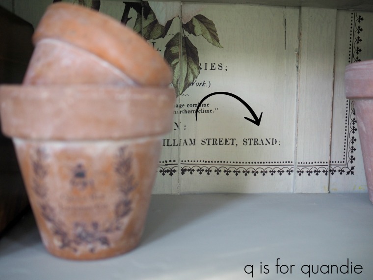
And then I noticed the piece de resistance … did you already notice it?

Yep, there it is.  Our name.  Just like it was meant to be.

So, as you’ve probably guessed by now, I’m going to keep this cupboard on my front porch after all.

I added a couple of vintage suitcases to the lower shelves, and they fit perfectly.

I ended up having to take the glass out of the doors to get some good photos without glare, and I think I love it even more this way.

As for whether or not it’s worthwhile to put a transfer in the back of a cupboard, I’ll let you judge for yourself.

But personally, I am loving it so much that now I have to keep this one.

Thank you to Prima Marketing for sharing this new transfer with me.  If you’re wondering where to buy this transfer or the transfer tool, check out Prima’s ‘where to buy‘ page.

a tale of two washstands.

It was the best of garage sales, it was the worst of garage sales …

Sorry, I couldn’t resist a little play on classic literature there, but actually it was just the best of garage sales because I found two fab washstands a week or so ago.

I purchased this one from a lunchtime garage sale first …

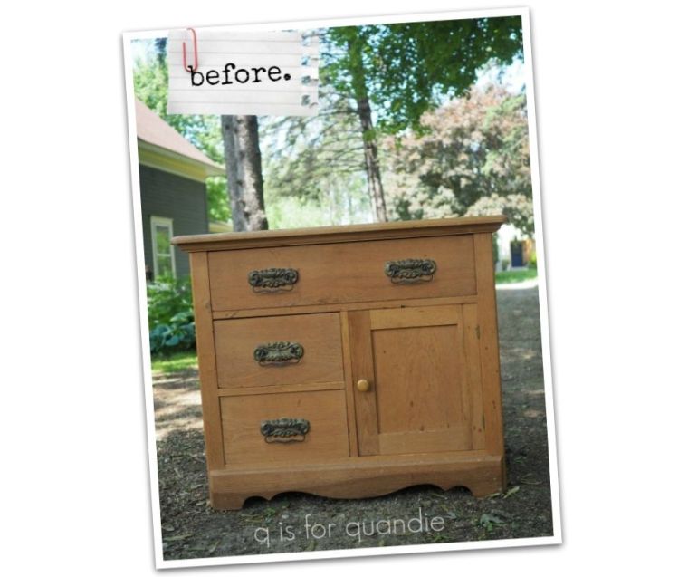
Looks pretty fab in that photo, but the finish was dried out and there were quite a few stains on both the top and the sides of the piece.

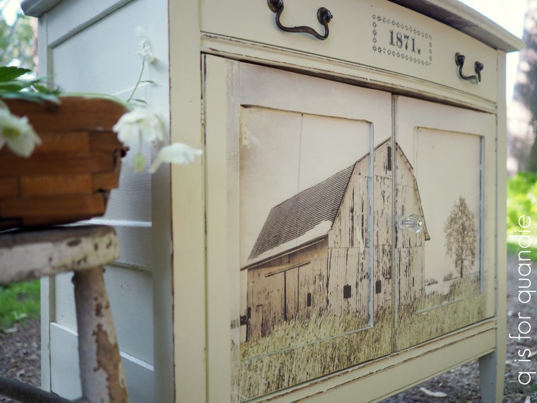
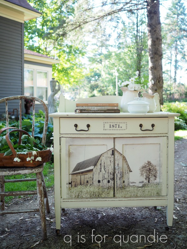
When I brought it home, I had just gotten a shipment of Prima Marketing’s newest transfers from their 2019 Summer line-up which debuts today!  There was one design included in my shipment that I thought would be perfect on a piece this size and style, Out on the Farm.

  I planned to put just the top half of the transfer (the photo of the barn) on the front of the washstand.  To prep for that, I stripped the top of the washstand and painted the body in Dixie Belle’s Drop Cloth.

But then, I hesitated.  The transfer wasn’t quite large enough to fill in the entire front of the washstand.  I wasn’t sure I would be happy with the results.  So I hemmed and hawed, and then delayed some more.

And then I found a second washstand!

Unfortunately, I neglected to get a good ‘before’ photo of this one alone, but you get the idea.  It was even already painted, and better yet, it was nearly the perfect size for the transfer.

What luck that I had hesitated on applying the transfer to the first one, it was going to work so much better on the second one!

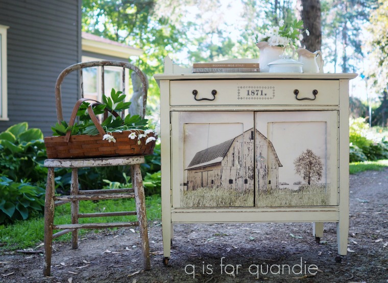
Ta da!

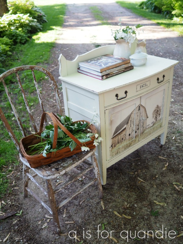
Oh my gosh you guys, I totally felt like I was cheating with this project.  I didn’t even have to paint it!  I just went with the existing paint job and simply added the transfer to those lower doors.

It was a little bit tricky getting it applied because of the raised trim, but not too bad.  I did trim a bit of excess from the top of the design so that it would fit.

I also swapped out the brass knob that came with the washstand for a glass knob on the door.  I wanted the knob to disappear allowing that fabulous barn to get all of the attention.

As you can see, the design was not quite as wide as the doors on the washstand.  I sanded those edges quite heavily to help them blend a bit more.  If I was good with custom mixing paint colors, and if I was aiming for perfection, I could have painted the uncovered edges of each door to blend even better.  But no, I didn’t need to make it perfect.

I think it looks pretty sweet as is.

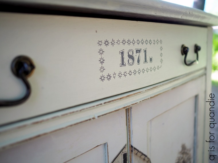
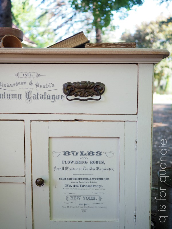
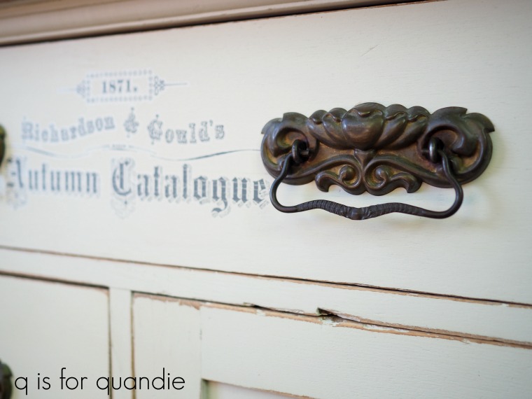
Oh, by the way, the ‘1871’ on the top drawer was a remnant left over from one of the Prima Marketing Seeds transfers that I used on a piece a while back.

I sort of neglected to get a good photo of that trim piece at the back of the washstand, which is pretty unique.  You can see it a little bit better here …

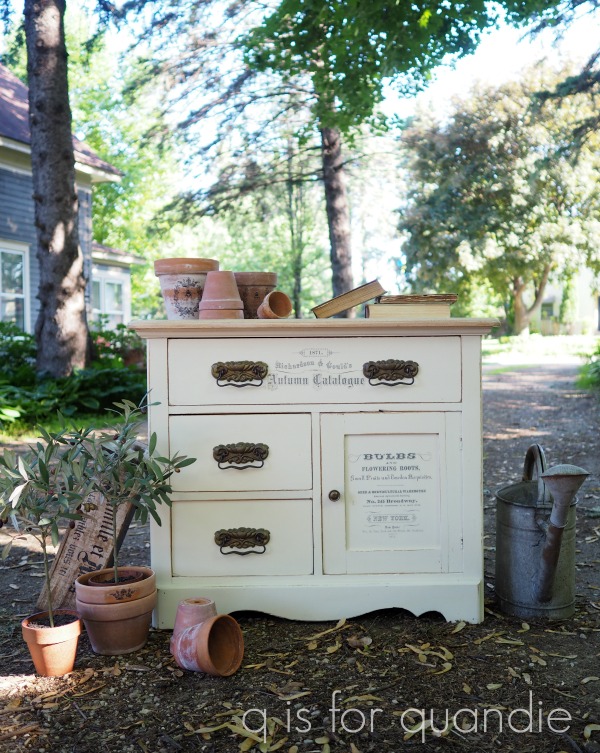
As for the other washstand, I went back to the smaller version of the Seeds transfer (it came in two sizes, and I say ‘came’ because they are no longer making this one, so if you love it you should order as many as you can online and then hoard them because that’s what I did).

And, funny enough, I swapped out the original wooden knob that came on the door with the brass knob from the other washstand (that I replaced with a glass knob).  It worked beautifully with the original brass drawer pulls.

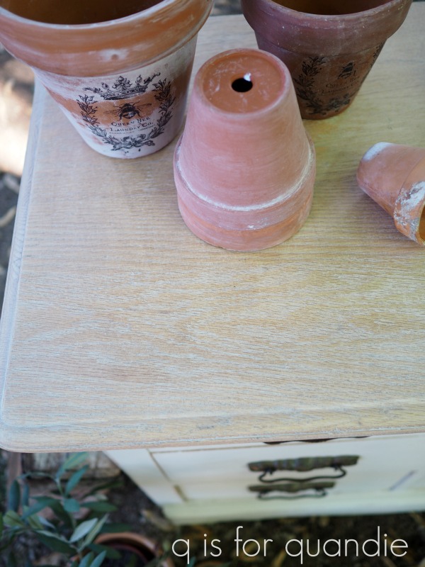
If you remember, I mentioned that I had stripped the top of this one.  I have to confess I did a rather imperfect job of it and I had trouble eliminating some of the stains.  So I decided to try using white wax on it to help mask some of those imperfections.

It’s definitely still not perfect, but I still think it looks pretty.  This washstand had a fairly heavy grain to the wood which really catches that white wax.

I used a mishmash of products on this one.  The paint is Dixie Belle’s Drop Cloth, the top is waxed with Fusion’s white wax, the body is waxed with Fusion’s clear wax.

You guys are probably getting tired of seeing my clay pots, but I’m digging the ‘gardening’ theme these days (pardon the pun).  So you’re going to be seeing them again at the end of the week too!

I’ll probably be over it about mid-August.

In the meantime, what do you think of my two washstands?

Which one is your favorite?

Many thanks to Prima Marketing for choosing me to help them reveal their new transfers.  I’ll be sharing a couple more of them later this week too.

If you’re wondering where to buy them, check out Prima’s ‘where to buy‘ page.

And if you are local (in the Twin Cities), these washstand pieces make amazing bedside tables.  Check out my ‘available for local sale‘ page to see if either of these pieces are still available.

baring your legs.

Here in Minnesota, I always feel a bit self conscious the first time or two that I bare my legs in the spring.  Oh, who am I kidding, spring?  As if!  I don’t let those suckers see the light of day in public until at least June.  This year I had a bit of a head start because we took our trip to Punta Cana in May.  I was able to get a little color on them before I had to expose them to the world back home.

But this post isn’t about that kind of bare leg, it’s about the furniture kind.

I’m sure you’ve seen the bare leg look on other people’s pieces.  They paint everything but the legs, or the legs and the top.  Katie of Katie & Co. furniture is a master at this look (check out some of her work here).  She paints some really lovely pieces.

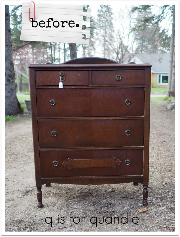
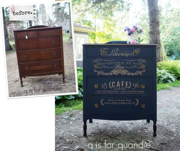
I have mixed feelings about the bare legs though.  Personally, I love the way they look, but I wonder if the average buyer will be saying ‘um, I think you forgot to paint the legs.’  But when I picked up this dresser at a lunch time garage sale a month or so ago, I thought it might be the perfect candidate for trying out the bare leg look to see how it goes.

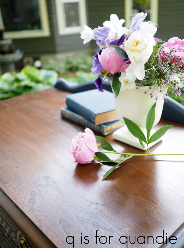
The first thing I did was strip the top.  The wood veneer on the top was in really great condition, but the finish was shot.  Once stripped, I sanded the top smooth and then stained it with Varathane wood stain in Dark Walnut.  Once that dried, I added a top coat of Fusion’s Tough Coat.

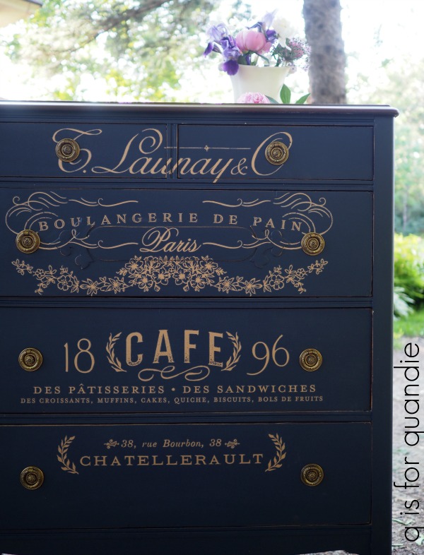
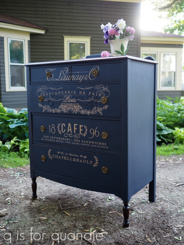
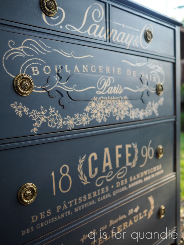
Next I prepped the body of the dresser, and then painted it in Fusion’s Midnight Blue.  Once that was dry I added the top 2/3 of Prima Marketing’s Somewhere in France transfer.

I should note here that this color and transfer combo was inspired by a similar piece by Denise at Salvaged Inspirations (you can see her piece here).

The gold transfer over a dark blue paint color was so striking on her piece, I just had to try it on my dresser too.

Before I move on here, I have to add that I’ve also seen this transfer used over a burgundy color and over a creamy white, plus I’ve used it over black …

and it looks gorgeous over all of these colors!  This really is a versatile transfer.

The Fusion paint doesn’t require a top coat for durability, but I like to go over the transfer itself with a little bit of their clear furniture wax which I think helps blend the edges of it more.

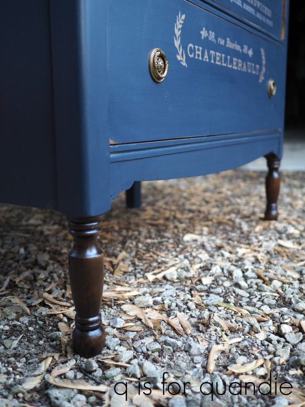
Next came those bare legs.  I wasn’t really sure if I needed to strip them entirely, or if I could get away with just sanding them down a bit and then staining them.  So I decided to just give it a try and see how it went.  It seemed to work great.  I sanded them, cleaned them and then wiped on the Varathane stain with a rag.  Once dry, I added a coat of Tough Coat Sealer.

I think they turned out pretty good, don’t you?

Honestly, there isn’t a huge contrast between the dark stained legs and the dark painted body of the dresser.

So, it doesn’t totally jump out at you that the legs are bare.

Next time I might go for a more pronounced contrast between the body and legs.

I brightened up the original hardware by adding some of Prima Marketing’s Vintage Gold Metallique wax.

The gold drawer pulls work beautifully with the gold transfer.

By the way, I don’t know if you noticed, but in the ‘before’ photo the drawer with the little raised detail on the front was at the bottom of the dresser.  That just looked wrong, so I moved it back up to just under the side by side top drawers which looks a lot more appropriate.

So there it is.  A gorgeous French themed dresser in Midnight Blue.

What do you think of bare legs?  Do you allow your’s to see the light of day before June?  Have you left any legs bare on your furniture, and if so, did anyone point out that you forgot to paint the legs?  Curious minds want to know!

Thank you to Prima Marketing for providing the Metallique wax and transfer and to Fusion for providing the paint and Tough Coat sealer.

If you’re wondering where to purchase the Somewhere in France transfer, check out Prima’s ‘where to buy’ page.

If you’re wondering where to buy the Fusion paint and Tough Coat, check out their ‘where to buy’ page.

And finally, if you happen to be local (Twin Cities, MN) and in need of a French themed dresser, check out my ‘available for local sale’ page to see if this one is still available.

the fresh flowers table.

Happy Friday everybody!  I’m taking a little break from the day job today to get some furniture painted in the morning and then I’m heading over to my bff’s new apartment for a little pool time.  It’s supposed to be 86 and humid here today, it finally really feels like summer!

  I’m motivated to get painting again because after many months of minimal sales, this week I sold 4 pieces of furniture, both matchy-matchy pieces, the green dresser and the boho desk which had been sitting around for a while …
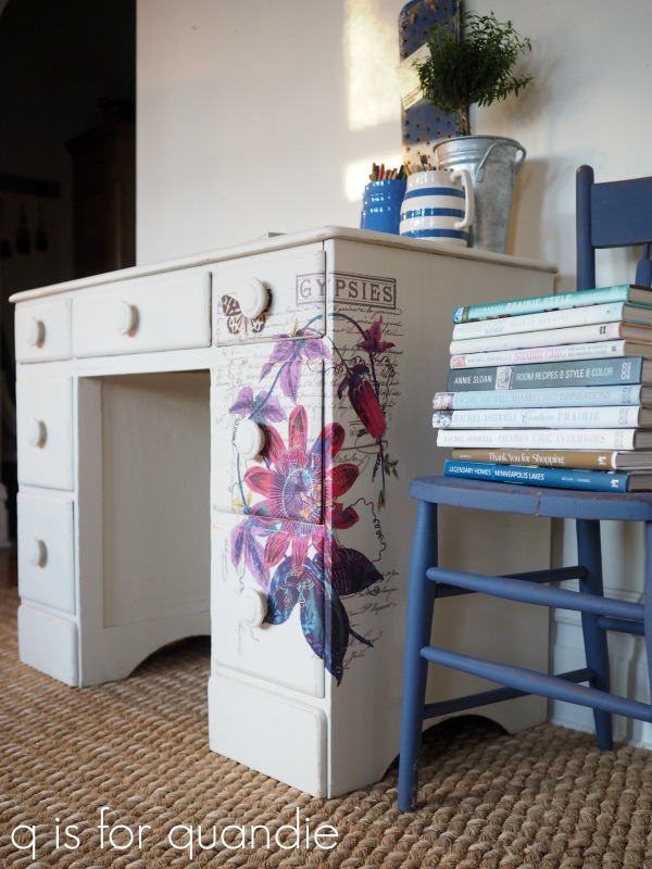
You know, sometimes I feel like certain pieces are destined to wait for the perfect owner and this desk was one of those pieces.  If you’ll remember, last July I painted it with a blue grain sack stripe down the middle.  It didn’t sell.  So then in January I re-finished it, this time using that gorgeous Prima Marketing Passion Flower transfer.

Still, I had no takers.

Until this past Tuesday that is, when a lovely gal drove all the way from Menomonie, Wisconsin to purchase it from me.  She absolutely loved it.  She considers herself a gypsy at heart, so obviously it was perfect for her.  Plus the desk will be situated in such a way that the corner with the transfer on it will be most visible.  Clearly this desk was just patiently waiting for her to come and claim it!  I love it when that happens!

Some of you were waiting to see how quickly the green dresser would sell, so I thought I’d update you on that too.  I posted it on Facebook Marketplace a week ago Wednesday.  A potential buyer contacted me right away that day and set up a time to see it on Friday, so I marked it ‘pending’.  She then rescheduled for Saturday afternoon.  Then, when she didn’t show up at the appointed time, I messaged her and she replied saying that she decided she really couldn’t afford it.  Argh!  I don’t love it when that happens!

At that point who knows how many other potential buyers I missed out on because they saw the ‘pending’ status and moved on.  But unfortunately this kind of thing is part of the package when selling your furniture using online marketplaces.  It can be frustrating, but you have to just roll with the punches.

Anyway, my point is that there was a 4 day delay in selling the dresser because I was ‘holding’ it for someone who didn’t bother to show up.  So you have to factor that in.  But the next buyer did show up at the appointed time and purchased the dresser on Tuesday.  So, it still sold in under 1 week even with the 4 days in ‘pending’ status.

I’m telling you guys, that Fusion Park Bench green on mid-century pieces is a magical combination for me.  If you’re keeping track, this is the 7th piece in that color that I’ve done.

Finally, as I’ve said before, the black pieces are also still amazing sellers for me.  Both of the matchy-matchy pieces have gone to good homes this week too!

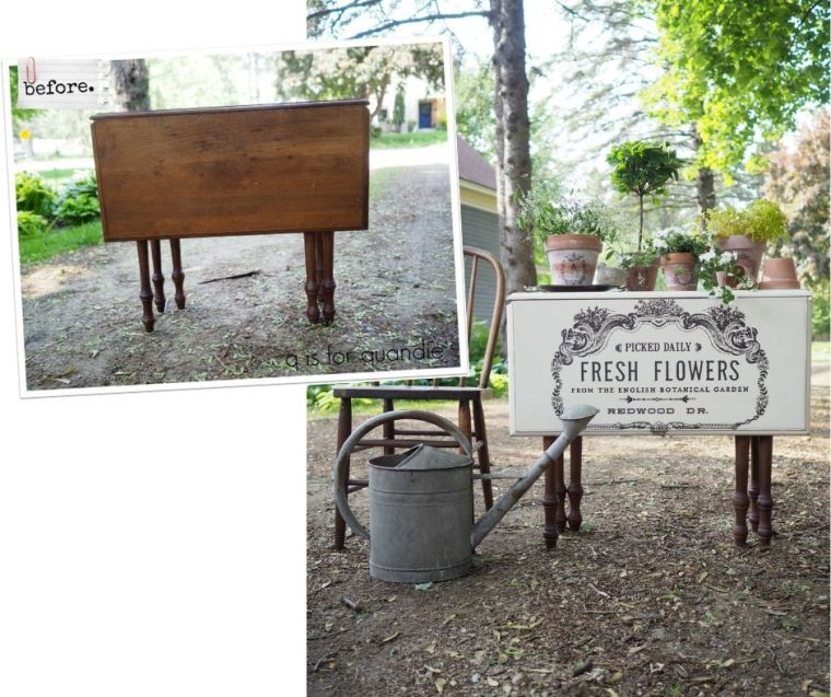
In other news, last weekend my neighbor, nnK, said someone she knows follows my blog and was wondering if I’d like a free drop leaf table.   I hesitated at first because I thought it was going to be one of those Duncan Phyfe drop leaf dining room tables, like this …

I already have one of these in my carriage house that has been sitting there for years.  I don’t think there is a great market for them so I’ve never gotten around to painting it (maybe I should try painting it in Park Bench, lol).

But nnK explained that the table in question was closer in style to the farmhouse tables that I like to do, so then I was picturing something more like this (only imagine that the drop leaves are still in place) …
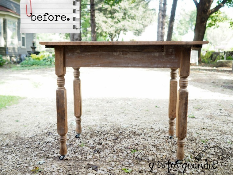
Still, I hesitated.  Mainly because I have painted four of these tables and so far I’ve only managed to sell one.  I’ve tried off and on to list them for sale, but they just don’t seem to go so I’ve ended up keeping the other three.  I use one as a desk in my Q Branch and I have one on my front porch.  The third is out in the photo cottage and I really should try listing that one for sale again.

But, the table was free, so I went for it.

When I went over to nnK’s to pick it up I was pleasantly surprised to find that it was actually quite a bit more narrow than the other drop leaf tables I’ve worked on.  With the leaves down it’s only 14″ deep.
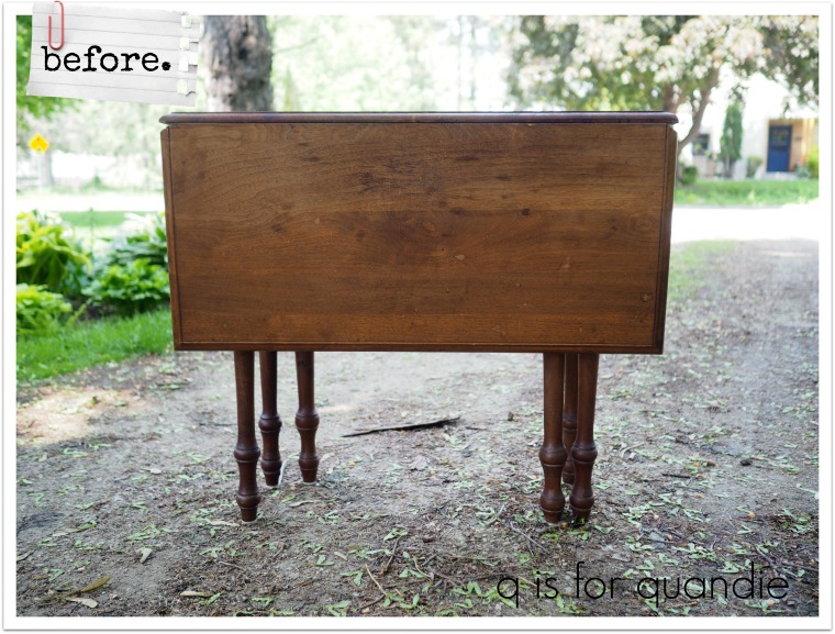
So really, it would work quite well as a sofa table.  But I also thought that it would be the perfect table to put in front of a window to hold your house plants.  And based on the water damage on the top, I’m guessing that might be what it was used for in the past.

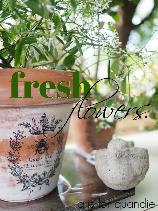
I debated removing the leaves like I normally do, but then I remembered one of the Prima Marketing transfers that I just happened to have on hand called Fresh Flowers.

I realized that this transfer would fit on the leaves perfectly.

I started by sanding the table top and cleaning it well.  Normally I strip the tops of pieces and leave them wood and paint the bases, but this time I switched it up and decided to paint the top and leave the base wood.

So I added a coat of Fusion’s Limestone to just the top.  As the paint dried, I could see that I had a ‘bleeder’ on my hands.  In other words, the existing stain on the table was bleeding though the paint.  In case you’ve never dealt with this, you should know that no amount of paint will ever ‘cover’ bleed-thru.  The stain will just continue to bleed through each layer of paint as you add it.

Instead you have to seal your piece with a stain blocking sealer of some kind before continuing to paint.  I normally like to use Dixie Belle’s BOSS for this, but I had some spray shellac on hand and I was working outdoors anyway, so I decided to just use that.  It also works well, but isn’t an option for me in the winter when I’m painting indoors.

So, I sprayed a quick two coats of shellac over the initial coat of Limestone.  Once that was dry, I added a 2nd coat of Limestone and it covered perfectly.  Next I sanded the edges of the table a bit to distress.
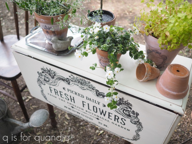
I applied the transfer to the drop leaf and it fit like a glove.

Initially I was planning to put the other half of the transfer on the opposite side, but then I realized that it would really be a bit of a waste.  Wherever this table eventually ends up, it’s highly unlikely that both sides of it would be visible.  One side will either be up against a wall, or up against the back of a sofa.  So why put a transfer on it if it will rarely be seen?   Instead I decided to save that other half for another project.
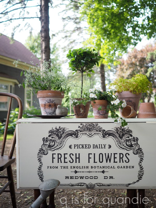
How adorable would this table be under a window, filled with plants?

By the way, I just used a little bit of Miss Mustard Seed’s hemp oil on the legs to freshen them up.   They were in great shape, have a nice dark stain on them and the wood is really quite pretty.

I specifically chose to use the Fusion paint on this table in case the future owner does use it to hold plants.  The Fusion is very durable and water resistant once cured even without an additional top coat.
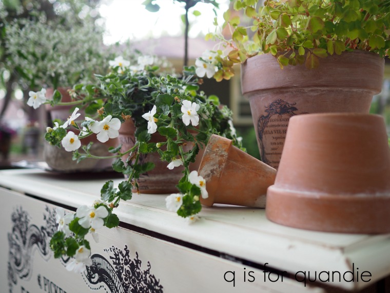
That being said, I still think I would opt to protect it a bit by putting a pretty silver tray or some other plate under each plant.

This tray was another of my finds from last Saturday’s neighborhood garage sale.  It was only $2 and it looks so pretty under a clay pot.

Thank you to Fusion Mineral Paint for providing the paint for this project, Miss Mustard Seed’s Milk Paint for providing the hemp oil and Prima Marketing for providing the transfer.

If you’re wondering where to purchase the Prima Marketing transfers, check out their ‘where to buy’ page.

If you’re wondering where to buy the Fusion paint, check out their ‘where to buy’ page.

If you’re wondering where to buy Miss Mustard Seed’s products, check out her ‘find a retailer‘ or ‘where to buy online‘ pages.

And finally, if you happen to be local (Twin Cities, MN) and in need of the perfect table to hold your plants, check out my ‘available for local sale’ page to see if this one is still available.
matchy-matchy.

First things first, the winner from last Monday’s drawing was Paulette.  Congrats to Paulette, and thank you so much to everyone else for all of your wonderful comments!

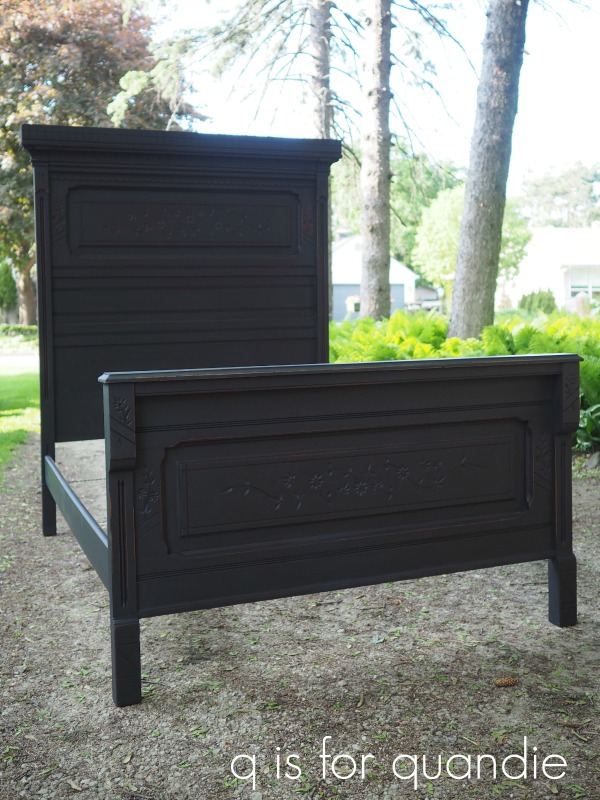
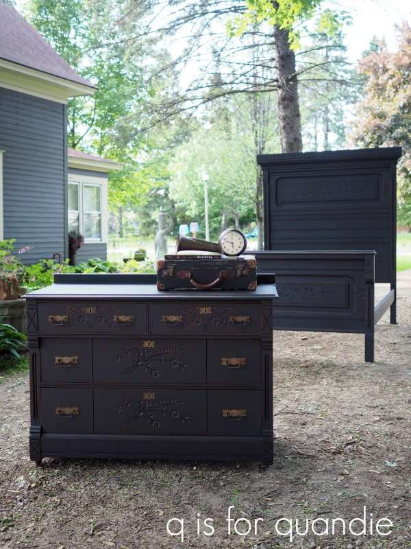
For today’s post I’ve done something I don’t do very often, I’ve painted a matching set.  If you’ve followed me for a while you might know that I’m not a fan of matchy-matchy furniture.  I prefer a more ‘collected over time’ look.  But, in this case I decided to paint both of these two pieces in the same color, just in case some future buyer wants to keep them together.

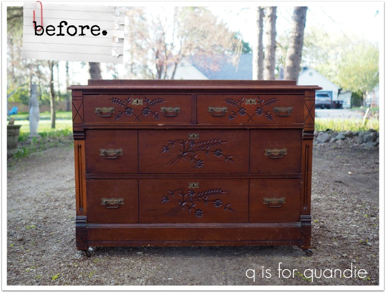
These pieces were originally part of a 3 piece set that I purchased a while back.  I’ve already painted and sold the matching washstand.

The bed is the one that didn’t fit in our van and I had to go back for it with nnK’s dad’s truck.

It’s a little hard to judge the scale of this piece by that photo, but that headboard is 73″ tall!

The foot board needed a little work after I got it home.  It had been inexpertly repaired in the past and had some drippy glue spots and some oddly placed nails.  My handyman/neighbor Ken loves these projects, he treats them like puzzles.  He takes the entire piece apart and then puts it back together again with fresh glue.  He’s a firm believer that glue (when used properly) holds better than nails any day.

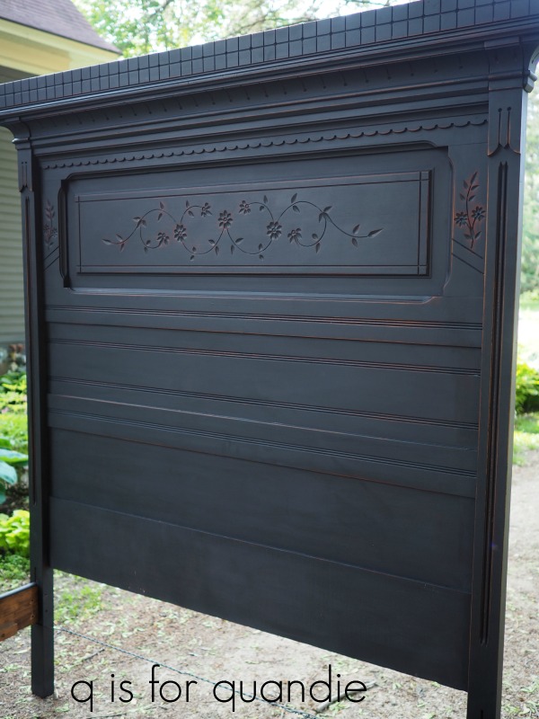
Once those repairs were complete, I sanded the piece lightly and then painted it with two coats of Dixie Belle’s Midnight Sky.  Dixie Belle has two shades of black, Caviar and Midnight Sky.  I’ve used quite a bit of the Caviar, and I do love it.  It’s a deeper black than the Midnight Sky.  I used the Midnight Sky on my piano and was drawn to its slightly more subtle shade, so I decided to go with that on this set. Although honestly, you can’t go wrong with either color.

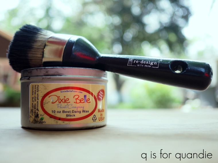
Once the paint was dry, I sanded the bed to distress and then added a top coat of Dixie Belle’s Best Dang black wax using one of Prima Marketing’s new wax/stencil brushes.

Let me tell you, that was a workout, talk about functional fitness!  That headboard is huge!

By the way, this is a full size (or double) bed.  However, it could be easily modified to fit a queen bed using an adapter (like this one from Rockler).

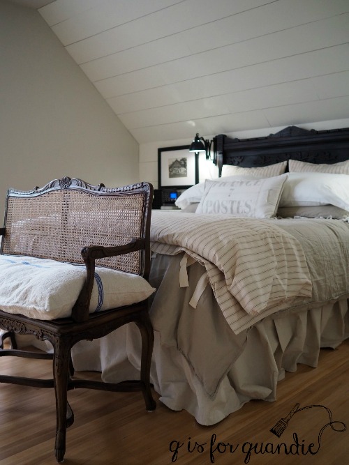
This bed would be an amazing statement piece.  I’d definitely keep it if we didn’t live in a 1 1/2 story house.  In case you didn’t know, the ‘1/2’ means that we have slanted walls in our upstairs rooms, which is why we had to cut down the headboard we used in our bedroom (and that is a full size headboard paired with a queen size mattress in our room) …

OK, enough about the bed, well, OK, here’s one more photo …

Let’s move on to the dresser.

That is not a truly legit ‘before’ photo of the dresser.  It actually came with a huge framed mirror attached that matches the headboard.  However, I find that dressers sell better without their mirrors, and mirrors turned into chalkboards sell really well too.  So I’ll be turning that mirror frame into a chalkboard down the road.  In the meantime, Ken had to do a few repairs on the top of the dresser where it was missing a couple of chunks of wood at the back.  The damage was hidden by the mirror, so once I removed it we had to do something to fix it.  I suspect that the weight of that mirror had done the damage.  Ken also added a new trim piece at the back to make up for the missing mirror.

Unfortunately, those fixes meant I had to paint the top.  Otherwise I definitely would have stripped and waxed it and just painted the body of the dresser.

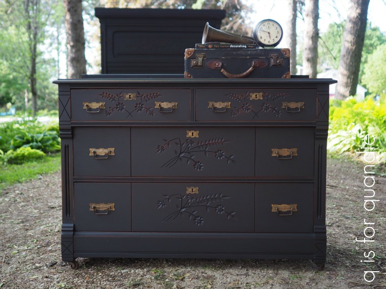
I followed the same process to paint and wax the dresser that I did on the bed.

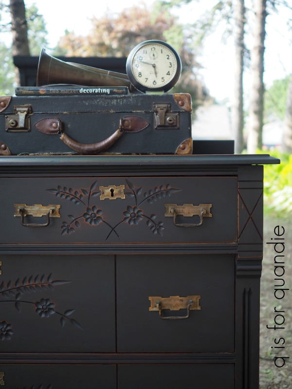
Then I cleaned up the original hardware and put it back on.

By the way, in case you were wondering, I did not find too much at the Kenny/Armitage neighborhood garage sale last weekend.  Just a couple of gems, including a set of old bugles.

Wouldn’t these be great for Christmas decorating?  Either added to a wreath or tucked into your tree?  I’ll probably hang on to these until the Christmas season and then take them to Reclaiming Beautiful to sell.

But in the meantime, I used one of them to stage my photos of this dresser.

The warm aged brass of the bugle worked perfectly with the dresser’s hardware.

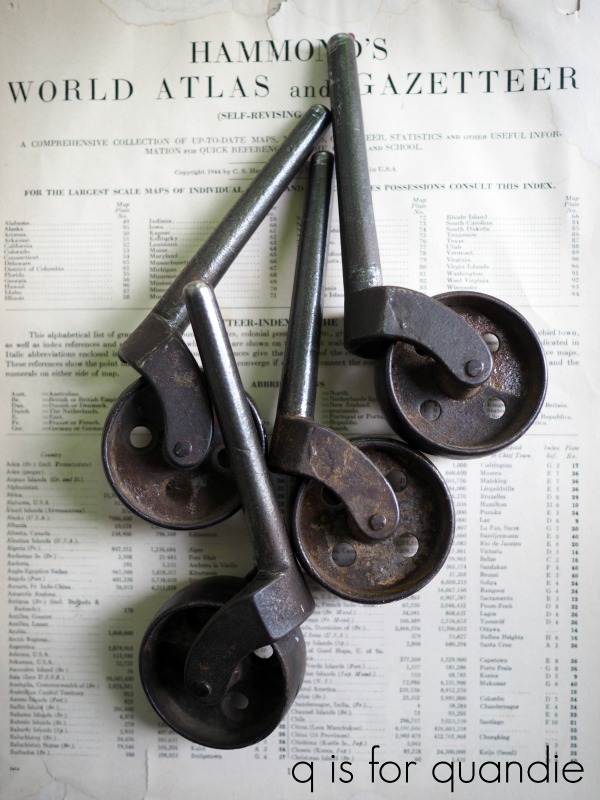
I almost forgot!  These pieces came with the most fabulous original metal casters.

Even the bed has them, but I totally forgot to put them on before staging my photos.  Here are the casters for the bed, they are huge …

So, there you have it, a matchy-matchy set.

Thanks to Dixie Belle Paint Co for sponsoring this post with free product, and thank you to Prima Marketing for sharing their new wax/stencil brush with me.

If you are local and ready for a change in your master bedroom (I’m just talking new furniture here people), be sure to check out my ‘available for local sale’ page for more details on these pieces.