into the woods.

I’ve been seeing a lot of articles recently about the mental health benefits of spending a little time communing with nature.  I don’t know about you, but I’m 100% on board with that idea.  I always feel more centered after a walk in the woods.

Mr. Q and I are lucky to have a beautiful wooded park just a few blocks away.  It is 200+ wooded acres and has a couple of miles of walking trails.  We try to get out there at least 4 or 5 days per week.  We made a special effort to stick with it this past winter and with the help of some good long underwear, an ankle length down coat and some great Sorel boots I made it through most of the winter (until I fell on the ice in February and we decided we should wait until the ice on the paths melted to return).

I have to say it is kind of magical to be out there when there is a full moon and some snow cover to reflect it.  Our park has some Great Horned Owls in residence and we would hear them calling to each other while we walked.  One evening we even saw one perched in a tree just over our heads.

I wish I could claim taking that photo, but no, I grabbed it from allaboutbirds.org.  Plus it was dark and we couldn’t really see him in much detail, but I’m sure he looked pretty much like that 😉

I will admit that it’s much easier to get out walking now that the days are getting longer, the snow is gone and I don’t have to wear four layers of clothing though!

At this point you might be wondering how I’m going to segue this into a post about painted furniture.

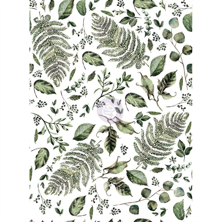
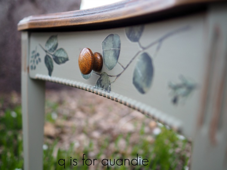
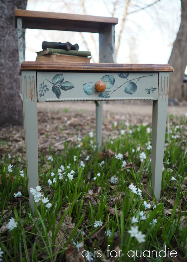
Well, the Fusion paint I used on today’s piece is in a color called Lichen and the Prima Marketing transfer is called Fern Woods.  So it definitely has a woodsy theme.

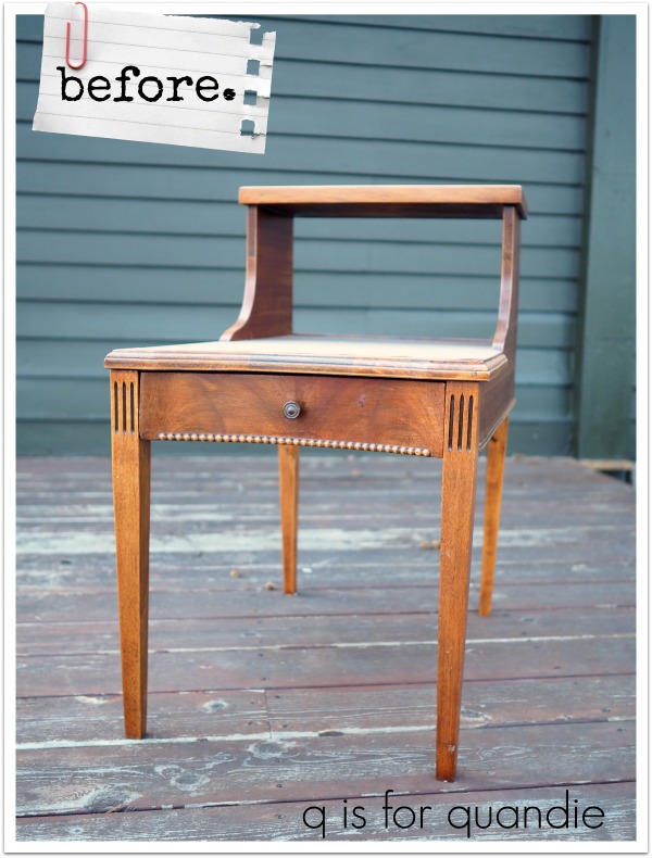
Here is the ‘before’ version of the table.

It’s just your basic 60’s end table.

It’s another piece that I picked up last summer at a garage sale on the cheap.  After I brought it out to work on it, I decided that the finish on it was really in pretty good shape and it might be fun to leave the tops alone and just paint the rest.

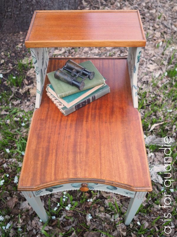
So I sanded the sides and legs lightly, cleaned them and then painted them with two coats of Lichen.

Then I pulled out the Fern Woods transfer.

You could use this transfer as one solid design, but instead I randomly cut out various leaves and applied them to the table wherever I thought they looked best.

I also swapped out the knob on the little drawer.  The original knob seemed a bit small to me.  I happened to have a wood knob that matched the table top perfectly.

I think the size works much better than that dinky original knob.

I couldn’t help nestling the table in my blooming Scilla to get some woodsy looking photos.  The Scilla is always the first thing up and blooming in my garden in the spring.  I have the white version shown above, and also the gorgeous deep blue version that you saw last week in my post about white washed clay pots.

Anyway, I think this is the perfect little side table for someone’s cabin.  It makes a great spot to stash your bird watching paraphernalia.

What do you think?

If you’re wondering where to purchase the Prima Marketing transfers, check out their ‘where to buy’ page.

If you’re wondering where to buy the Fusion paint, check out their ‘where to buy’ page.

And finally, if you happen to be local (Twin Cities, MN) and in need of a woodsy themed side table, check out my ‘available for local sale’ page to see if this one is still available.

the broken flower washstand.

The craziest thing happened last week when I went to pick up some furniture I was purchasing via Facebook Marketplace.

When Mr. Q and I arrived at the seller’s home I was mainly focused on taking a look at the pieces I was planning to buy.  The seller led us back to the bedroom and I looked over the set, which included a gorgeous spoon carved bed, washstand and dresser.  I checked the pieces over, handed the seller my cash, and then Mr. Q and I each grabbed an end of the headboard and headed back out to our van.

It wasn’t until we were almost out the door that I looked over, and what did I see?

Yep, that bench!  I swear my brain took a couple of seconds to register what I was looking at.  It was kind of surreal seeing a piece of my furniture in an expected place.  Then I thought, ‘no wonder this woman seems familiar!’  I’d sold her this bench last summer.

How crazy!  What are the chances?  Sometimes it really is just a small world.

I was happy to hear that she still loves the bench, she gets tons of compliments on it and all of her friends want to know where she got it.

The rest of the story is that after I got over my amazement at seeing one of my own pieces, Mr. Q and I finished hauling the headboard out to our van only to find that it wouldn’t fit.  It was just a couple of inches too big.  Argh.  So we hauled it back into the seller’s house and made arrangements to come back another day with a truck to get the headboard.  We were able to load up the washstand, dresser and foot board though.

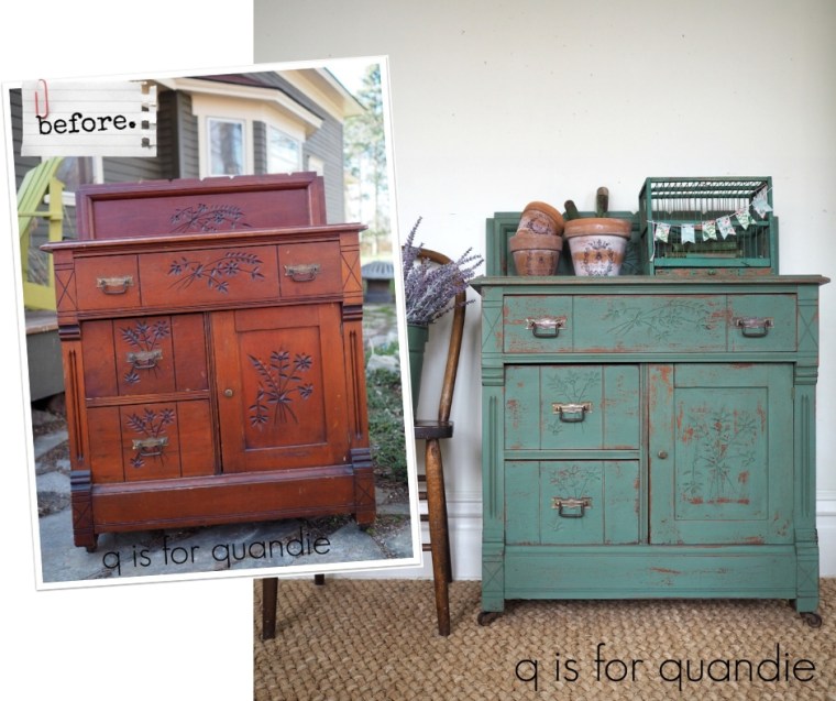
All of this by way of saying that I never got an opportunity to take a ‘before’ photo of the complete set, but here is the first piece I worked on …

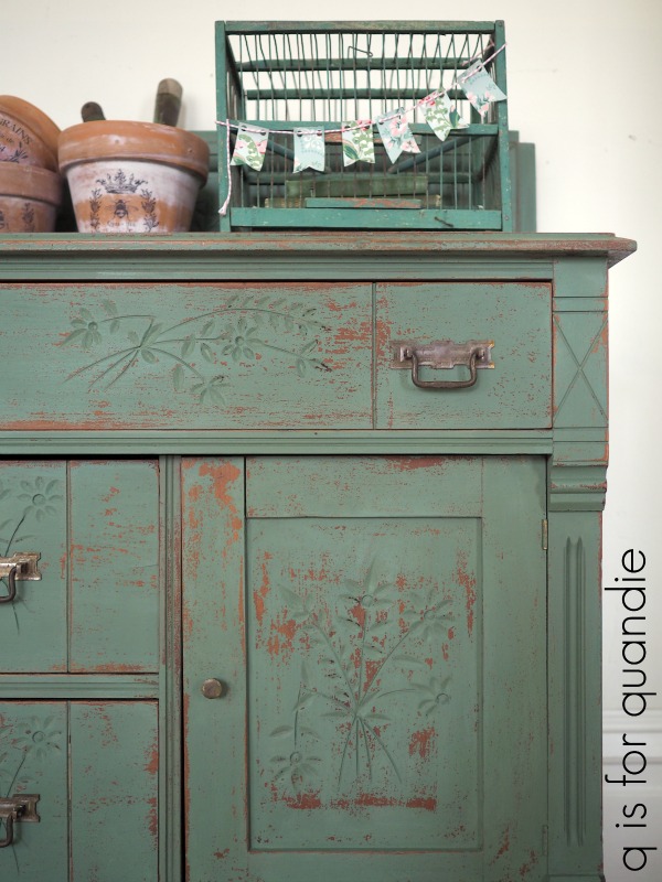
I love these washstand sized pieces, they are perfect to use as a bedside table, and the spoon carving on this one is totally charming.  See how each bunch of flowers has one stem that is broken?  That’s why I’m calling this the broken flower washstand.

I did my usual prep, a light sanding followed by a good cleaning.  As soon as I touched the sandpaper to this finish I could see that it was very old and dried out.  Sometimes when you start sanding an old finish like this it simply turns to dust at the lightest touch.

Although I immediately knew I wanted to use milk paint on this piece, I debated the color.  I really wanted to try a gorgeous custom mixed color that Jane Dawson recently shared on the Move Mountains with Miss Mustard Seed’s Milkpaint Facebook page.  Part of me felt like I should stick with a more neutral color that would help the piece sell faster though.

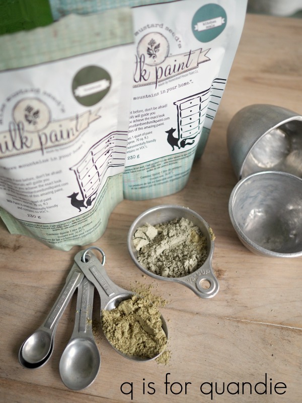
But I threw caution to the wind and used Jane’s recipe, 1/3 Boxwood to 2/3 Kitchen Scale.

As is often the case, the color looks entirely different on my piece than it did on Jane’s piece.  I think there are a few reasons for that.  For one thing, the beginning color of my piece was probably a bit different.  Second, I waxed my piece and Jane used a poly top coat on her piece.  Different topcoats can really change the color of milk paint.  And finally, as per the MMS website, there can be as much as a 15% variation in the color of milk paint from one batch to the next. If you are expecting to get exactly the same look every time with a particular color you might be surprised by this, so fair warning.

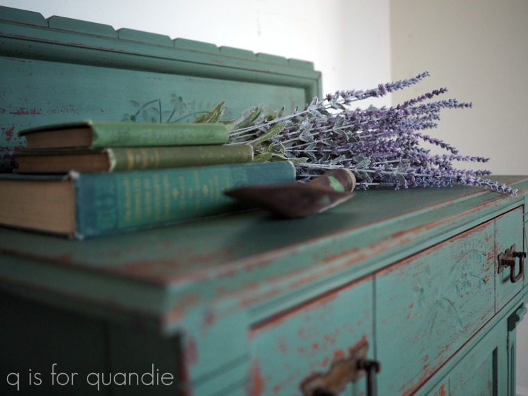
In the end, even though this wasn’t exactly the color I was going for, I think my piece turned out beautifully.  I got just the right amount of chipping.  Not too much, not too little.

I had mixed up 1/4 c of Boxwood, 1/2 c of Kitchen Scale and 3/4 c of water to make my paint. In case you’re wondering approximately how far 1.5 cups of mixed milk paint will go, I did two coats on this piece and had about 1/3 c of mixed paint left over.

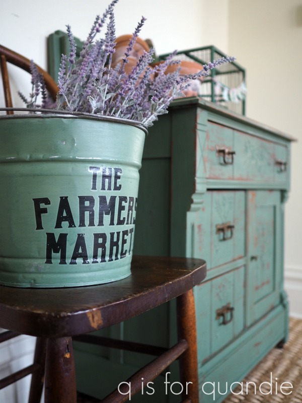
I painted this bucket with some of the extra paint and then added a transfer from the Prima Marketing Everyday Farmhouse set.

There is a city near me that has a Trash to Treasure clean up each spring.  Residents put anything they want to get rid of at the curb and people can drive around and snatch things up.  This year it was slim pickings, but I did get both the bucket and the chair that it’s sitting on.

I love the sort of scalloped edge on the piece at the back of the washstand.

I always end up calling that piece a ‘back splash’ although I don’t know if that’s the right name for it.  I suppose since this was originally a washstand with a bowl and pitcher for washing on it, maybe back splash is the right name.

All three of the pieces in this set have the most fabulous metal casters.

I scrubbed the drawer pulls with soap and a toothbrush to clean them up a bit and then put them back on.

I didn’t polish them with metal cleaner because I wanted to retain that aged patina.

I lined drawers of the washstand with some really pretty wrapping paper that I picked up last year at a shop in St. Paul.

I forgot to mention that I finished this piece with Miss Mustard Seed’s clear furniture wax.  The thing about spoon carving is that it tends to create drips.  Paint or a more liquid topcoat like the MMS Tough Coat pools in the carved areas and then drips down after you’ve walked away.  Since I struggle with drips anyway, I decided wax was a better bet for me on this piece.

So.  There you have it.  The broken flower washstand painted in a color I think I’ll call Dawson Green.  Or should it be Dawson Blue?  What do you think?

Thank you to Miss Mustard Seed’s Milk Paint for providing the paint and wax, and to Prima Marketing for providing the transfer for the bucket.

If you’re wondering where to purchase the Prima Marketing re.design Everyday Farmhouse transfers, check out their ‘where to buy’ page.

If you’re wondering where to buy Miss Mustard Seed’s Milk Paint or wax, here is where you can ‘buy online.’

And finally, if you happen to be local (Twin Cities, MN) and in need of a unique bedside table, check out my ‘available for local sale’ page to see if this one is still available.

the industrial mechanics tables.

Don’t let the green grass in this ‘before’ photo fool you.  No, it has not suddenly become summer here.  Last weekend while I was writing this post we had a solid layer of white (well, sort of white, and sort of brown from that Texas dust that blew in) snow on the ground, although it has melted again now.  The snow may be gone again, but things are only just starting to look green.

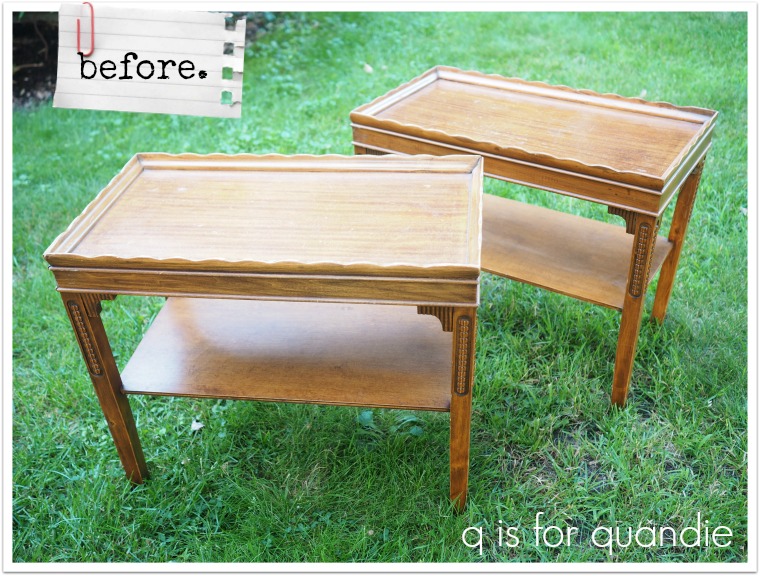
But I purchased this pair of tables at a garage sale last summer and I took a quick ‘before’ photo of them when I got them home.

I then put them in the photo cottage last fall along with a few other smaller pieces thinking I’d get to them over the winter.  Then they got snowed in.  I had a 4′ snow drift in front of the cottage and neither Mr. Q or I had any intention of shoveling that out just to get to some furniture to paint.

I’ll be honest, I only purchased the tables because they were ridiculously cheap.  I think I paid $10 each, or maybe it was $10 total.  I don’t remember for sure.  I considered it a bit of a gamble though, because I wasn’t sure if I could change them up enough to make them marketable.

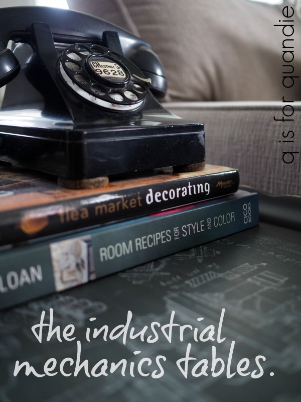
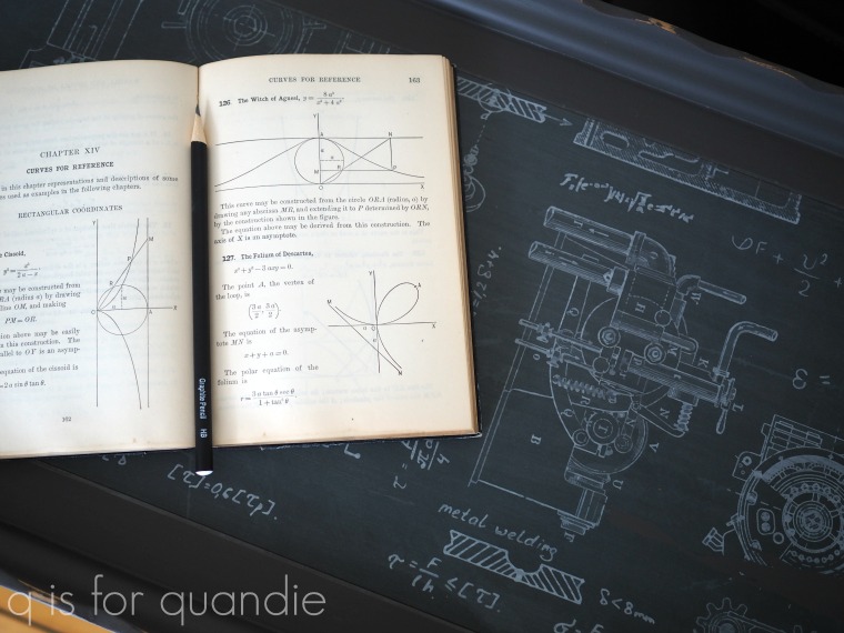
Initially I was going to go for a feminine look.  Paint them white and add a floral transfer to the tops.  But as I was going through my stash of transfers I came across Prima Marketing’s Industrial Mechanics transfer.

This transfer comes on three sheets.  I had used just part of one of them on a metal roller skate case …

So I had two full sheets plus part of a 3rd left.  Each full sheet fit the top of a table pretty well.  They didn’t go all the way to the edge, but I thought I could make that work by painting the tables a dark color.

I wasn’t sure how the transfer would look over dark paint though, so I was glad I had that scrap of the 3rd sheet to use in an experiment.

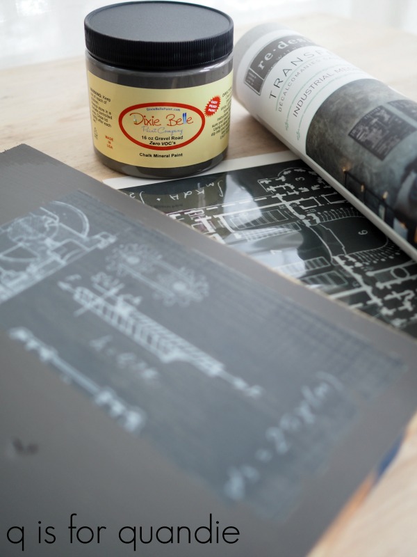
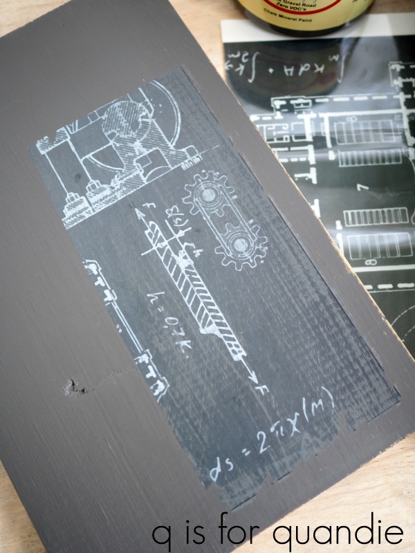
I pulled out some Dixie Belle paint in Gravel Road which is a deep, rich grey.  Then I grabbed an old board out of the workshop and painted it.  Once dry I added a section of transfer, sanded it lightly to distress and then finished it with The Real Milk Paint Co’s Finishing Cream.

I wanted to make sure that the transfer would look good over the Gravel Road, and also that it would look good with a durable, washable topcoat over it since they would be on a table top.  The sample board turned out great, so I knew I was good to go with this more masculine look for the tables.

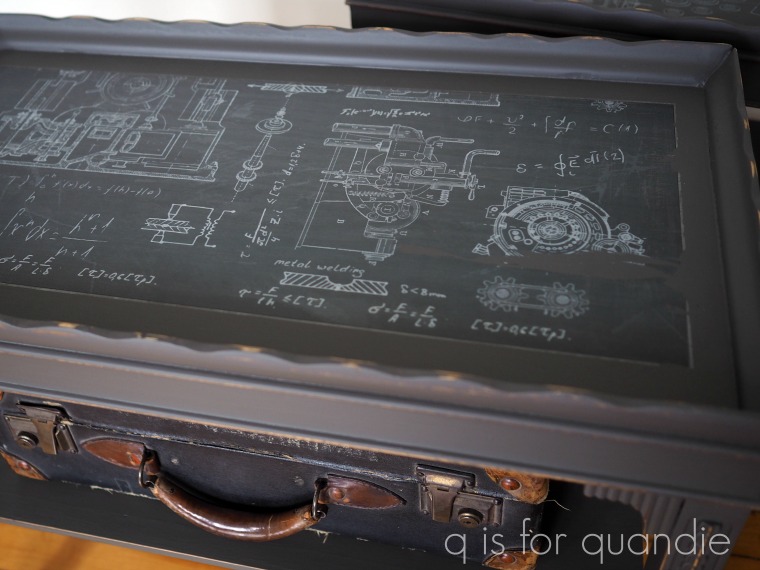
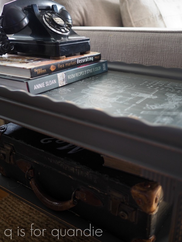
I followed my usual m.o.   Light sanding, followed by cleaning and then painting.  I used two watered down coats of the Gravel Road.  Next I sanded the tops lightly with 220 grit just to smooth them out a little.  I vacuumed away the dust and wiped them with a dry microfiber cloth to be sure they were mostly dust free.  Then I applied the transfer.  Both went on easily and once they were down I even burnished them lightly with the same microfiber cloth to make sure I removed any air bubbles.

So far, so good.  Everything looked great.

But then I decided to sand the transfers lightly to distress the edges a little, again with the 220 grit paper.  Sure enough, I pulled up a chunk of one of the transfers.  See it there on the right toward the lower corner?

Dang!

This is the second time this has happened to me with one of the full image transfers (a full image transfer is one where the transfer is one solid sheet).  Both times I was applying the transfer over unsealed chalk style paint.  I have not had this happen when using a full image transfer over Fusion Mineral Paint.  I touched on this briefly in Monday’s post about the different kinds of paint that I use.  I recently heard someone recommend sealing chalk paint with a water based topcoat before adding a transfer to improve adhesion (just be sure not to use wax, you can’t add a transfer over a freshly waxed surface).

The more I thought about it, the more that made sense to me.  The Fusion paint has a built in top coat.  If you’ve ever worked with these paints, you’ll know that when freshly dry the Fusion feels a bit more tacky.  Not tacky in a bad way, but it has more gripping power than freshly sanded chalk paint, which feels sort of chalky and dry.

I haven’t tried this yet myself, but I wanted to pass on this tip in case any of you have had similar problems using a full image transfer over chalk paint.

Luckily the background paint under my transfer was very close to the background color of the transfer, so my boo boo isn’t a glaring problem.  In addition, the overall distressed looks of the tables helps it blend in as well.

I think these transfers would look amazing over black, but I like them over the dark grey.

This would be a fun look for bedside tables in a boy’s room.

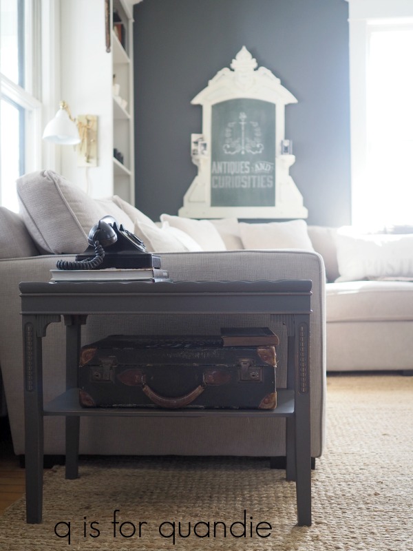
I set the tables up in my living room to stage some photos of them.

But it didn’t take long for me to realize that they were the perfect size to pair with my sectional.

Plus the Gravel Road worked perfectly with my new wall color.  So now I’m thinking I might just keep them.

It’s funny since I purchased them long before I had this sectional, and I certainly never thought I would be keeping them.  But for $10, why not?

Thanks to Dixie Belle Paint Co and Prima Marketing for sponsoring this post with free product.

what kind of paint should I use on furniture?

Every once in a while someone asks me that question.  I imagine that they expect a simple one or two sentence answer.  But no, there isn’t a simple one product fits all answer.  There are so many things to consider such as what sort of surface are you painting?  How much money do you want to spend?  What look do you want to achieve?  How durable does it need to be?  How much experience do you have?  Is environmental safety important to you?  How about protecting yourself and your family from harmful toxins?  All of these factors and more go into choosing which paint or other finishes to use, and the answer is not going to be the same for every project or every painter.

If you’ve read my blog for long, you’ll have noticed that I am not totally loyal to just one brand or type of paint.  I love to use milk paint, but I also use chalk paint all the time.  I often use Fusion’s acrylic paint too.  And sometimes I even use spray paint, but shhhh, let’s let that one be our little secret.  In the spirit of full disclosure, several different brands provide me with free product including Fusion Mineral Paint, Dixie Belle Paint Co, Miss Mustard Seeds Milk Paint, Homestead House Milk Paint and the Real Milk Paint Co.  However, I make no promises to any of these paint brands other than that I will try their product and I will blog about my experience and opinions.  Good or bad.  None of them pay me to promote their product, and I also don’t make any money from sales of any of these products.

I like it that way.  I don’t want to feel obligated to promote a product just because they pay me.  And more importantly, I don’t want to be limited to using just one paint line.

So, let’s compare, shall we?

Milk paint.  There are multiple milk paint lines out there, Miss Mustard Seeds, Homestead House, The Real Milk Paint Co and Sweet Pickins just to name a few.  When I say ‘milk paint’ I am referring to the casein (the protein found in milk) based milk paint that comes in powder form and you mix it with water yourself.  Milk paint is safe for both you and the environment.  It is a non-toxic, zero VOC product.
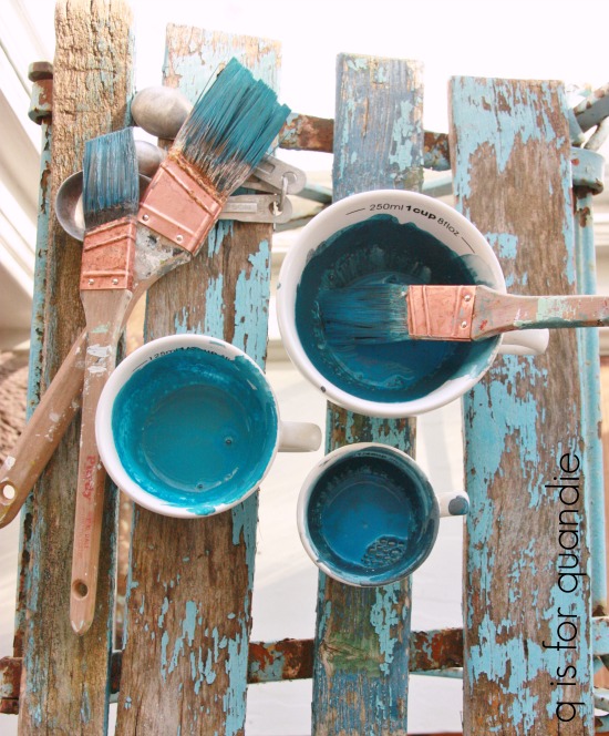
When I use it:  I use milk paint when I want to get a chippy, vintage farmhouse style finish.  It gives that ‘aged in a barn for 80 years’ sort of look.  In my opinion, a good chippy milk paint finish looks more authentic than a distressed chalk paint or acrylic paint job.  This is my personal favorite ‘look’ for furniture.  I have 17 pieces of furniture in my own home that are painted with milk paint, so it’s safe to say that I really love this stuff.

Prep required:  It really pays to do at least some minimal prep on all of your pieces, but it’s especially important when using milk paint.  By minimal prep I mean a light scuff sanding followed by cleaning with a degreaser such as TSP Substitute or Krud Kutter kitchen degreaser.  This prep will just take 15 to 20 minutes and is a great investment of your time.  Specifically with milk paint, proper prep will help control how much chipping you get.  Milk paint will chip when the surface you are painting ‘resists’ the paint.  A waxy/oily/shiny surface will resist the paint.  The amount of prep you do can give you some control over that.  Then again, if you’re OK with a massively chippy look, go ahead and roll the dice by skipping the prep (as I did with the chair shown above which is painted in Miss Mustard Seeds Aviary).

Topcoat options:  Technically you don’t have to put a topcoat over milk paint.  Several of my pieces painted in milk paint do not have one including my Specimens Cupboard.  I painted this piece two years ago and it still looks fantastic.
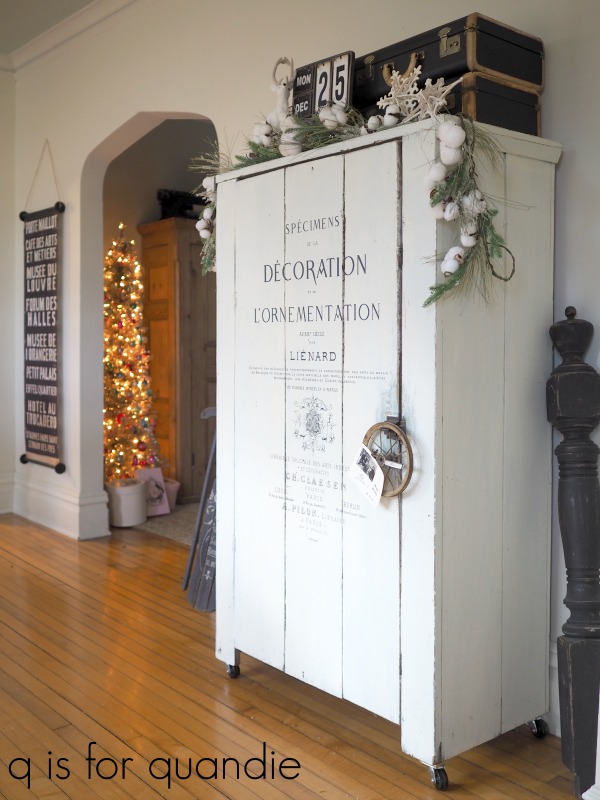
 I especially like the look of the lighter milk paint colors without a topcoat (although I prefer the look of the darker colors with a topcoat).  Over time the milk paint will harden making it fairly durable, however, milk paint without a topcoat is not water resistant or washable.  To achieve that you have to add a topcoat.  Recommended topcoats include hemp oil, wax or poly.  I love using The Real Milk Paint Co’s Dead Flat finishing cream over milk paint when I want a washable surface.

It barely changes the color of the milk paint, adds just the tiniest bit of sheen, is washable after 3 days and is easy to apply.

Cons:  Milk paint can be tricky to use.  It has a higher learning curve than other paints.  You have to mix it yourself and it takes a little practice to get the right consistency.  Making sure the pigments are well blended can also be dicey.  The color can be inconsistent, not only just from package to package, but even within one mixed cup of paint, especially with the green shades.  You have to pay attention and keep your paint well mixed as you are using it because some pigments are heavier than others and will settle to the bottom of your paint container.  Whether or not you get a chippy finish can also be difficult to control and/or predict.
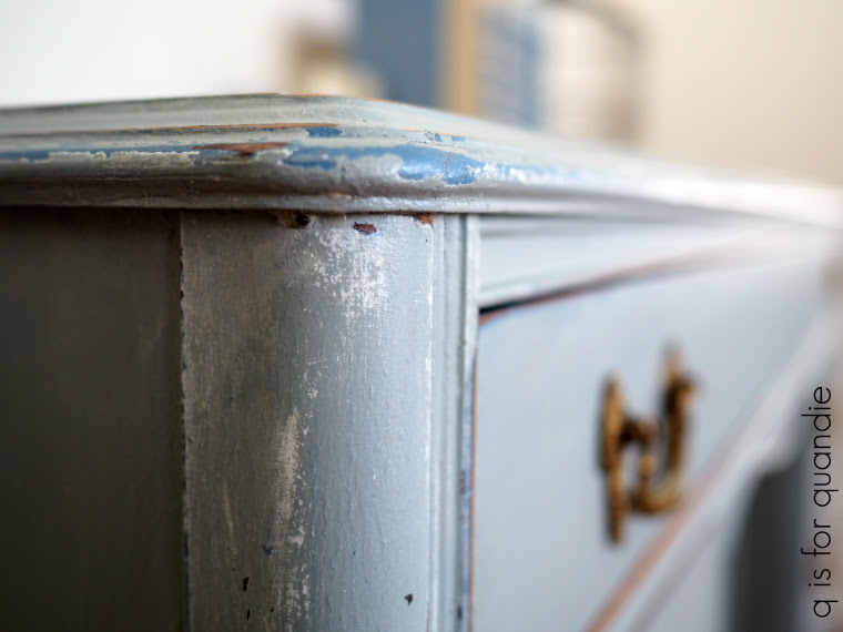
Pros: When it works right, milk paint can’t be beat for providing an authentic looking chippy finish!  I also find this to be one of the easiest paints to apply from a purely physical stand point.  It’s thinner than other paints and it just takes less hand strength to actually paint it on.  I’m having a little trouble explaining this the way I want to, but there is a noticeable difference when you switch from painting something in chalk paint to painting with milk paint.  The brush feels lighter in your hand and you don’t have to work so hard to apply it.  Does that make sense?  In addition, the thin consistency of this paint pretty much eliminates brush strokes and allows you to add multiple layers of paint without adding unwanted texture.  I also enjoy creating my own custom colors with this paint.  True, you can do that with other paints too, but somehow it’s more fun adding various powders to water and watching it turn into paint.  Another plus to milk paint is that although the mixed paint has a limited shelf life, the powder itself has an indefinite shelf life if kept dry in an air tighter container (I keep my opened bags of milk paint in a Rubbermaid container).

Find Miss Mustard Seeds Milk Paint retailers here.

Chalk style paint.

I think we all know that the list of paint manufacturers who have jumped on the chalk paint bandwagon is long.  Actually I think I read somewhere that Annie Sloan has trademarked the term “chalk paint” so all of the others tend to call themselves things like “chalky paint” or “chalk mineral paint”, but I don’t know for sure if that is true.  I’ve been using the Dixie Belle brand of chalk mineral paint for a couple of years now and I really love it.  This brand of chalk paint is non-toxic and has zero VOC’s.
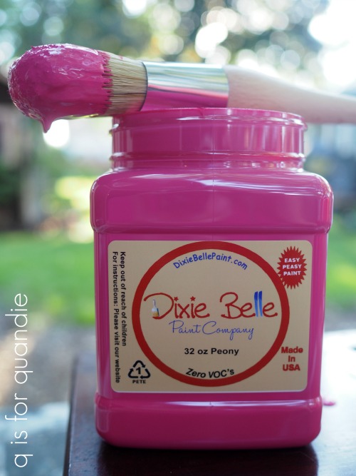
When I use it: I use chalk paint when I want a matte distressed finish, and I don’t want to worry about chipping or adhesion issues.  If I’m going to paint vinyl, such as a chair or a suitcase, I get the best results with chalk style paint.  Also, when painting something black my top choice is Dixie Belle’s Caviar or Midnight Sky with a wax top coat.  This combo just creates the most delicious looking finish with minimal brush strokes.  Dixie Belle’s Midnight Sky was perfect for my baby grand piano.

Prep required: You know what?  I’m going to say the same thing for every kind of paint.  It really pays to do minimal prep on your pieces.  By minimal prep I mean that light scuff sanding following by cleaning with a degreaser.  Many brands of chalk paint (including Dixie Belle) say that no prep is required, but I beg to differ.  If you run into a particularly waxy or oily surface you will wish you had taken the time to do minimal prep.

Topcoat options:  The Dixie Belle chalk paint does not require a topcoat.  However, the finish will be very flat and chalky looking without a topcoat, so if you want even just a little bit of sheen you’ll need to topcoat it.  For that reason I sometimes avoid using chalk paint on large pieces and also on areas that are more difficult to wax (like the inside of a cupboard for example).

Cons:  Um.  Yeah.  I can’t really think of any except what I mentioned above about topcoats.  You’ll need that extra step (and expense) of a topcoat if you want some sheen to your piece.

Pros:  This stuff is kind of a no-brainer.  Once you know the basics, you really shouldn’t run into to many problems using chalk paint.  Therefore, this is a great choice for a beginner painter.  The color will generally be consistent.  It’s easy to distress.  You can even just use a damp paper towel to distress chalk paint.  It adheres well to almost any surface including metal and fabric.  It is self-leveling and if you water it down a little you won’t have any issues with brush strokes.

Find Dixie Belle paint retailers here.

Acrylic paint.

Fusion Mineral Paint and General Finishes Milk Paint (a misnomer) are both acrylic paints.  I’ve been using Fusion paint for years.  I’m super impressed with this company’s commitment to providing products that are safe for both the painter and the environment.  Their Tones for Tots line underwent rigorous testing to be sure it was suitable for use on children’s furniture.  Needless to say, this paint also has zero VOC’s and is non-toxic.
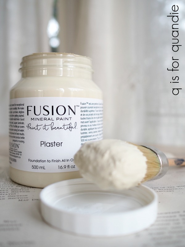
When I use it: First and foremost, I use Fusion when I’m feeling kind of lazy.  It is hands down the easiest of these products to use.  Here are the instructions; open jar, paint, let dry.  OK, that may be a little bit of an exaggeration.  You should do the same minimal prep that I recommend for every paint job when using Fusion paint, a light sanding and cleaning of your piece will do.  But from there it really is that simple. I tend to choose Fusion for large pieces that I don’t want to have to wax.  It’s perfect for the insides of cabinets, and I also like to use it on surfaces that need to be especially durable like the shelving in my living room. I also love to use Fusion on mid-century pieces that I am not going to distress.  Their Park Bench (the green shown below) is perfect for mid-mod pieces.

Cons:  The finish with Fusion is just a tad shinier than a waxed (or oiled) milk or chalk paint finish.  I hate to even use that word ‘shinier’ because it’s still not shiny by any stretch of the imagination.  It’s just not as matte as the other two.  So if you’re looking for a really matte finish, you might not like the sheen. Fusion is also a little more challenging to distress.  It can be done, but it takes a little more elbow grease.  Distressed acrylic paint looks a bit like distressed latex.  The paint sort of peels away rather than coming away as a powder like chalk or milk paint.  This really is a fine distinction though and won’t matter to most painters.

Pros: Fusion can definitely be the cheapest way to go, mainly because you don’t need to also purchase a topcoat.  Not requiring a topcoat also saves you some time/labor since you can skip that step.  Fusion is also fully washable once cured.  That makes it a great choice for items going to a home with small children.  Fusion also provides an ideal surface for transfers.  Of course, you can put transfers over chalk paint and milk paint too, but in my experience they adhere best over Fusion.  I have heard some transfer retailers recommend sealing a milk or chalk painted piece with a water based sealer first, then add the transfer in order to improve the adhesion of the transfer.  Fusion is water resistant, so it’s also a great choice for pieces that might be exposed to water on a regular basis like a bathroom vanity or a metal toolbox that you might use as a planter.

Find Fusion retailers here.

Spray paint.

All of my previous selections are environmentally sound, non-toxic, zero VOC products.  In general I stick with that type of product.  I do a lot of painting, so I try to be cognizant of what I’m exposing myself and Mr. Q to on a regular basis.  I also do a lot of indoor painting in the winter, so I need products that are safe and relatively odor free.  But I do have a confession to make.  Every once in a while I pull out the spray paint.  I will only spray outside though, so this is definitely not a winter friendly choice for me.  But if I’m going to paint wicker, cane, or something like a basket, I’ll spray paint it simply to save time and effort.

One of my favorite tricks is to spray paint the cane on a piece first and then go over that with the paint I’ll be using on the rest of the item so that it matches.  I used this approach with my cane dining room chairs.

So, yes, spray paint does have its place.

I hope this post gave you some good information on the different types of paint available.  Be sure to pin it for future reference!

But now I’m curious, what kind of paint will you be using on your next project and why?  Be sure to leave a comment!


another re-do.

Do any of you remember when I painted this chair?

It was back in October 2015.  I used it in my living room for a while, and then it moved to the Q branch.  I was actually going to sell it a while back, but my niece wanted me to keep it because it was the most comfortable option for added seating in the living room when needed (and she was always the one who ended up sitting in it).

But now that we have the sectional with plenty of comfortable seating for 4, I no longer need the chair.  So I decided to freshen it up with some new upholstery before selling it.

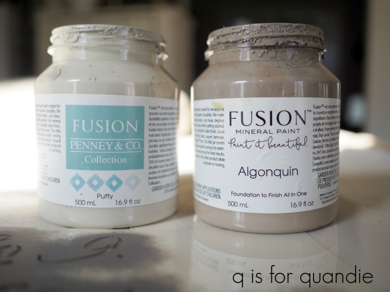
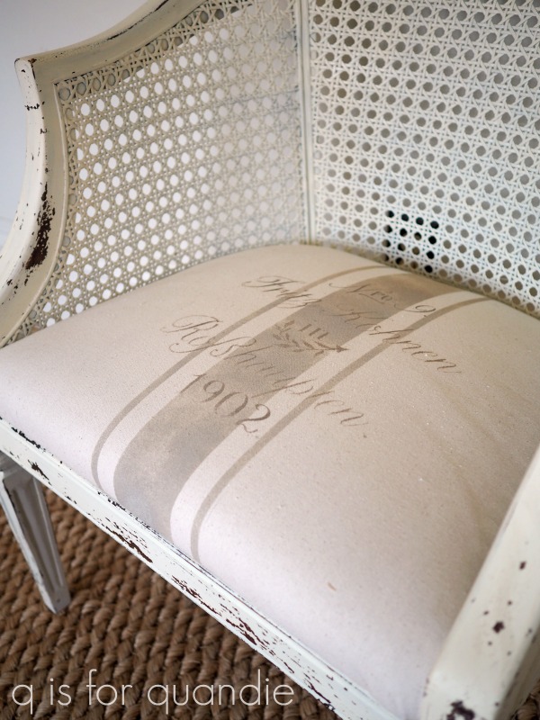
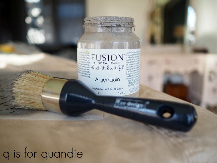
I pulled out some drop cloth material, a couple of stencils, and some Fusion paint in Putty and Algonquin.

I don’t have much paint left in either of those containers, but it doesn’t take much to stencil a faux grain sack look on fabric.

Prima Marketing sent me some of their brushes a while back and I assumed they were stencil brushes.  But, they actually call them wax brushes.  Ooops.  Well, FYI, they work great for stenciling too!

The one above with the round ball-like handle was perfect for adding the grain sack stripe to my fabric.  It made quick work of filling in that fat stripe down the middle.

This next brush worked great on the smaller details of the wording.

So, they may be meant for wax, but these brushes work great for stenciling too!

Once my paint was dry, which really only took about 20 minutes or so, I simply removed the old fabric and stapled the new stuff in place.

And now this chair is ready for a new home.

If you’re wondering where to purchase the Prima Marketing brushes, check out their ‘where to buy’ page.

If you’re wondering where to buy the Fusion paint, check out their ‘where to buy’ page.

And finally, if you happen to be local (Twin Cities, MN) and in need of a freshened up chair, check out my ‘available for local sale’ page to see if this one is still available.

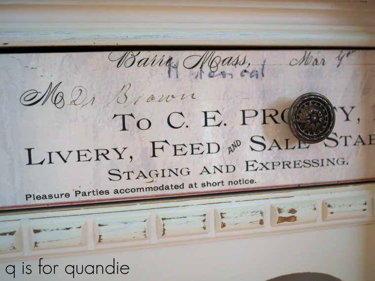
pleasure parties accommodated at short notice.

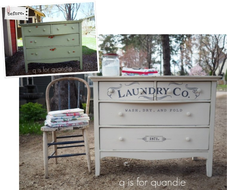
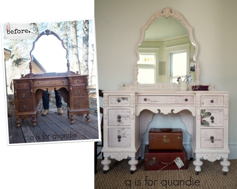
I purchased this pretty vanity or dressing table at an estate sale last summer.

Just ignore Mr. Q’s legs behind the vanity.  He was holding the mirror in place for me.  Ladies, you know you’ve got a keeper when he’s willing to duck behind a vanity while you take your time with some ‘before’ photos!

This piece has so many pretty details and I knew it would look great painted.  I’m not sure why it took me so long to get around to painting it.  Probably because I also knew it would be more putzy to paint with the mirror frame and all of those curvy, carved details.  And I was right.

But it was totally worth it!
I chose to paint it in Fusion’s Little Piggy from their Tones for Tots line.  If you’re afraid of going overboard with pink, or you’re just not a fan of bubblegum, this is the perfect shade of barely there blush pink for you.  In some lighting you can barely even tell that it’s pink.

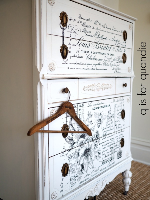
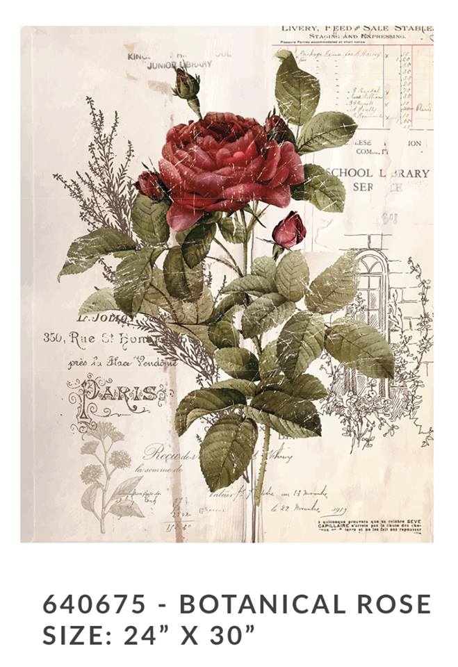
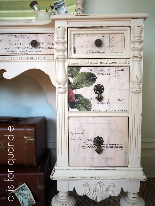
This is also the perfect shade of pink to pair up with one of Prima Marketing’s newest transfers, Botanical Rose (available for purchase in mid-April).

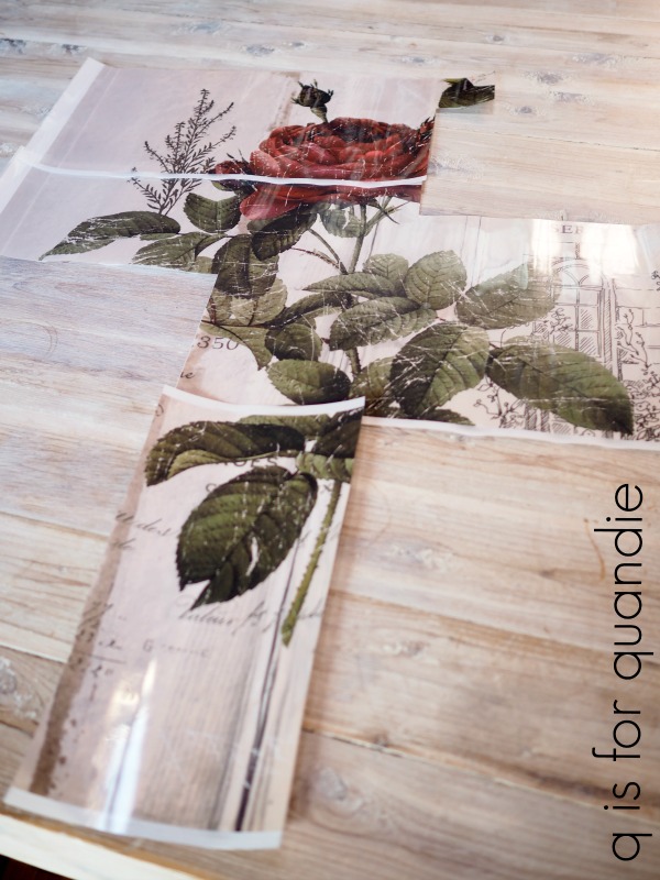
This piece provides the perfect example of how to use a 24″ by 30″ rectangular transfer on a piece that is not exactly a rectangle.  Since this transfer is a full image transfer, ie. it has a solid background, you might have thought you couldn’t cut it up and use it sort of piecemeal.  But you definitely can (although you may not totally recognize it when done).

I started out by deciding which parts of the transfer would work best on which drawers.  I wanted to mostly avoid using the giant rose in the middle of the design.  I began with the top center drawer, then the two top side drawers, and then I used what was left of the design to piece together the lower four side drawers.  I measured and cut out each section with the backing paper still in place, cutting each piece just a little larger than I needed so I had some wiggle room.

Here’s what was left of the transfer when I was done.

See how perfectly the background color on this transfer works with the Little Piggy

Each drawer front has a solid piece of transfer over it, those background colors on the transfer blended with the paint color perfectly.

It wasn’t until I was putting the knobs back on that I noticed what the section above said.  I wasn’t sure which phrase I liked better ‘staging and expressing’ or ‘pleasure parties accommodated at short notice’.  I went with the latter for my blog post title, but I may have to use ‘staging and expressing’ some time too.

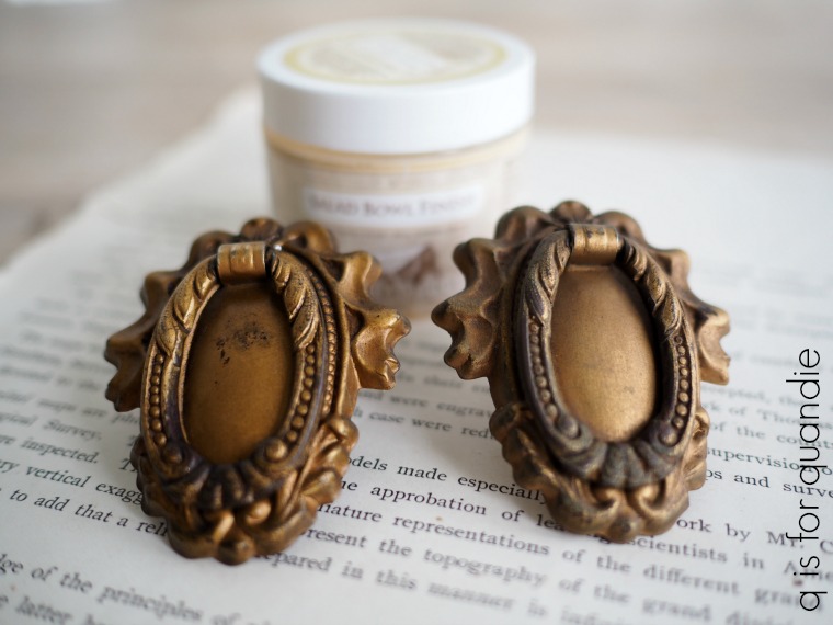
I kept the original hardware again this time.  Initially I was going to add some gold wax to them, but in the end I liked the way they looked ‘as is’.

So, what do you think?  Pretty in pink?

The Botanical Rose transfer is not yet available to purchase.  However, the new spring designs from Prima Marketing should be shipping to stores in mid-April so be sure to look for them then.

If you’re wondering where to purchase the Prima Marketing transfers, check out their ‘where to buy’ page.

If you’re wondering where to buy the Fusion paint, check out their ‘where to buy’ page.

And finally, if you happen to be local (Twin Cities, MN) and in need of a pretty pink dressing table, check out my ‘available for local sale’ page to see if this one is still available.

the lovely ledger dresser.

A week or two ago Prima Marketing contacted me and offered to send me a couple of the new transfer designs that were coming out so that I could be one of the first to try them out.

How cool is that?  I’m so happy that they thought of me, and trusted me to help unveil some of their fabulous new designs!
As soon as they arrived I knew exactly which one I wanted to try first, and I knew exactly what I would put it on.

Now, I know there are people out there who might think the wood on this dresser is beautiful and that it’s a crime that I painted it.  All I can say to that is ‘different strokes for different folks’.  Personally, I think it’s rather … uh, well … let’s just say unattractive.  So I didn’t feel even the slightest qualm over painting it.

I started by sanding the dresser lightly, vacuuming away the dust, then cleaning it with Krud Kutter.  Then I added two coats of Fusion’s Limestone, which is a lovely creamy white.

While the paint dried, I scrubbed up the drawer pulls with some dish soap.  I was planning to add a metallic gold wax to them, but in the end I decided I preferred them with a more subdued look.  However, they were a bit dull, so I waxed them with Homestead House Salad Bowl Finish to shine them up.

I couldn’t really get it to show up very well in a photograph, but the pull on the left is waxed and the one on the right isn’t.  The wax adds just a little bit more depth and shine.

Once the paint was fully dry I distressed the edges of the dresser with 220 grit sandpaper.

Always remember that Fusion acrylic paint is much easier to distress before it has much time to cure.  Once cured this paint is very durable (ie. harder to distress).  I always try to distress it within 24 hours of painting the piece, if not sooner.

Next came the really fun part, adding the transfer.  The Lovely Ledger transfer combines two of my favorite things, French writing and … well … ledgers!  I’m an accountant by day, furniture painter by night (or more realistically, weekend), so this Lovely Ledger transfer was perfect for me.

I had to doctor up the design just a tad to fit it on this dresser because of the detail on the middle drawer.

I suspect that you wouldn’t even notice it if I didn’t point it out.

But if you ever buy this transfer yourself and wonder why it doesn’t look exactly like mine, that’s why.  I removed a flower from one spot and filled in with more wording instead.  Always keep in mind that you can cut these transfers up and re-arrange them to fit your piece more precisely.

One of the things I love about using Fusion paint is that it has a built in top coat.  I find that the transfers work really beautifully over the Fusion in particular because it creates the perfect surface for them to adhere to.  Once the transfer is in place I usually go over it with just a little bit of furniture wax, or in this case I used the Salad Bowl Finish.

Today’s q-tip:  Remember, never try to apply a transfer over a freshly waxed surface.  You’ll end up with a sticky, gooey mess.  Always wait until after the transfer is applied to add wax if you want to.  If you’ve already waxed and are dying to add a transfer, you’ll have to wait 30 days for your wax to cure and then you can apply a transfer over the wax.

I have to say, if I’d had some glass knobs on hand I think I would have used them instead.  They would allow the transfer to be the star of the show.  But the pulls that came with this dresser are so gorgeous, I felt like it would be wrong to not use them.  Plus I only had a mishmash of unmatched glass knobs.

The pulls do cover up some of the transfer though.

So, what do you think?  Did I improve the dresser?  Which look is more ‘you’?  The ‘before’ or the ‘after’?

As I mentioned at the beginning of the post, the Lovely Ledger transfer is not yet available to purchase.  However, the new designs should be shipping to stores in mid-April so be sure to look for them then.

If you’re wondering where to purchase the Prima Marketing transfers, check out their ‘where to buy’ page.

If you’re wondering where to buy the Fusion paint, check out their ‘where to buy’ page.

And finally, if you happen to be local (Twin Cities, MN) and in need of a beautiful dresser, check out my ‘available for local sale’ page to see if this one is still available.

ebony and ivory.

I finally got around to painting my baby grand piano this past weekend and all I can say is, ‘what was I so worried about’?

Somehow I had built this up to be a HUGE project in my mind.  Obviously I should have known better.  I mean, come on, I’ve painted a few larger pieces of furniture in my day.  The Welsh cupboard in my dining room for example.

By comparison, the piano was so. easy.

As a reminder, here is how the piano looked originally.

Not super awful, but definitely not great.  And up close the finish on this thing was totally shot …

The arrows are pointing towards areas where the veneer has chipped away.

Before we move on, I have to explain something.  I don’t actually play the piano.  Well, I did take some lessons when I was a kid and I can now play ‘chopsticks’ fairly well.  But many years ago a former co-worker of mine was moving and needed to find a new home for her baby grand piano.  I had the brilliant idea that I would find the time to take lessons one day.  Ha.  Yeah, that never happened.

However, as it turns out, this is one incredibly handy piece of furniture.  It’s got a nice large work surface at exactly the right height for me while standing.  It’s perfect for folding laundry, wrapping presents, scrapbooking, painting small items and it also makes a great buffet/bar during parties.

I honestly can’t think of any other piece of furniture that I could put in this same spot that would be as functional for me while still looking appropriate in the room.  But it was starting to look a bit rough, so as part of my magic wand decorating plan, it was scheduled for a makeover.

I started by sanding it down which took about 10 minutes.  The finish was so dry on this thing that it didn’t take much work to rough it up.  I mostly wanted to make sure to sand down the paint drips that were on it because those can come back to haunt you if you just paint over them.  Next I vacuumed away the dust with my shop vac and then wiped it all down with a damp rag.

Next I pulled out some Dixie Belle paint in Midnight Sky.  You guys know how much I love their other black, Caviar, well this one is just a tad lighter.  That probably sounds odd to call a black color ‘lighter’, but it is just not quite as deep and rich as the Caviar.  It’s also a bit warmer with less of a blue undertone.

I watered down the paint just a tad.  I find that the Dixie Belle paint is pretty thick.  You can use it straight out of the jar if you want a more textured look, but if you want a smoother finish you can water it down which has the added benefit of making it go further.  I only used about 2/3 of the 16 oz jar to paint this piano.  That’s also partially because for the most part I got away with just one coat of paint.  There were only a couple of spots that needed a touch up with a second coat.

A couple of you suggested a strategy for moving forward on this project.  Start with painting the outside of the piano first, then tackle the inside bits at another time.  So I mostly did that, except that I opened the cover that goes over the keys and painted inside there.  I figure that’s the most likely spot to get opened up on occasion.

So I taped off the keys and painted that area.  I also took this opportunity to re-glue some of the ivories that had come unglued.

Just out of curiosity I did some google research on ivory piano keys.  Prior to 1930 almost all pianos had ivory keys, and mine are indeed ivory (check out this article to learn more about that).

Anyway, I used my E6000 glue to re-attach all of the loose ivories.  Then I added a stencil to the top of the piano.

I had so many ideas swirling around in my head about what to do with this piano.  I thought about painting it white and adding a transfer, but then it would compete with the Specimens Cupboard which is in the same room.

I also thought about wrapping some sort of stencil all the way around the sides of the piano.  But stenciling those curves would have been challenging, plus I felt like it wouldn’t be all that noticeable since you really can only see one side of the piano unless you happen to be squishing yourself between the piano and the wall or window.  So not a lot of bang for my buck.

Ultimately I tend to prefer a ‘less is more’ kind of style so I went with this simple ‘European grain sack’ stencil from Maison de Stencils.

Once the stencil paint was dry, I sanded the entire piece lightly with 220 grit paper to smooth out the paint.  I gave the edges a little extra pressure to add a distressed look.

After vacuuming away the dust, I then finished the piano with Fusion’s clear wax.  You might be wondering why I chose to wax such a large piece, and especially one that is probably going to see a lot of abuse.  There are definitely more durable top coats that I could have chosen.  But in my experience wax and/or hemp oil are the easiest finishes to ‘fix’ down the road.  If I get a ring from a sweaty glass, a scratch, or a drip of random paint here and there, all I have to do is sand it down lightly to smooth it out and then add a little wax to just that spot.  So in the long run I think I’ll be better off with wax.

One last thing, I had originally planned on keeping the chair I have ‘as is’.

I don’t want to go all ‘matchy-matchy’ with it and paint it black, but I’m not totally loving it with the piano.  I’ll probably keep an eye out for another option down the road.

By the way, I have to say I found it rather challenging to photograph a black piano in a room flooded with light reflecting off our latest snow fall.

Here’s the view out those windows.

Yep, lots of white to reflect the light.

OK, so if you are keeping track of the magic wand decorating project, here’s where I’m at …

    1.  repaint the insides of the bookshelves in the living room – check!
    2.  repaint the living room walls – check!
    3.  replace the living room furniture – check!
    4.  paint the baby grand piano – check!
    5.  replace the ceiling fan over the piano – check!
    6. repaint the piano room walls

That last item on the list, repaint the piano room walls is the last item on my original to-do list.  But I’m having so much success I’ve decided to go just a bit further with that last item plus add one more.  I’m adding ‘repaint the piano room built shelves beneath the windows’ because they really need it.  As for the walls, I have a plan and I have my handyman Ken’s commitment to help me with it, so you’ll just have to stay tuned to see what we do.

In the meantime, if you have been thinking about painting a piano or some other larger piece but haven’t had the nerve to make the leap, I say go for it!  It’s definitely not as hard as it looks.

the mariner’s chair.

You may have noticed that I haven’t mentioned my living room redecorating plan in the past week or two.  Going in I knew that the next step in the plan was going to be the most challenging for me.  It’s the step where I had to buy new stuff.  Living room furniture to be precise.  You guys know I love buying used furniture at thrift stores, garage sales, or from Craigslist.  I’m not particularly queasy about most vintage pieces.  But I draw the line at two things; sofas and mattresses (well, and also shoes, but seriously, have you ever seen the selection of size 11 shoes at the thrift store?).

Is it a fear of bedbugs?  Is it the fact that at some point I know I am going to wake up with my face smushed into that mattress or sofa cushion and I just want to be sure that some stranger’s hind end wasn’t resting on that same spot in the past?  Is it simply the fact that these items can’t be refreshed with a simple paint job (although I know some of you will argue that you can paint both fabric and leather upholstery, I’ve tried it on chairs and I’m pretty sure I don’t want to tackle a sofa)?

It’s really a bit of all of the above.

So, shopping for new furniture was in order and thankfully my sister agreed to help me out with that.  Last Saturday we headed out to a few different furniture stores and I found a couple of options that I liked.  I took Mr. Q back later and we pulled the trigger on a new sectional from Macy’s.  Since it was President’s Day weekend they had some sales going on that made it the perfect time for buying furniture (for my foreign readers, for some reason President’s Day is a very popular day for furniture stores to hold big sales).  I was also shocked to find that the sofa I wanted can be delivered tomorrow (because I didn’t customize the fabric)!  I was sure I’d be waiting months for something, but no.

So, all of that by way of saying, my plan is going full steam ahead and next week I’ll share the progress I’ve made.  In the meantime, while we wait for the new sofa to arrive, today I’m sharing another little chair that I painted.

This particular chair has been in the lineup for a while now. I actually painted it once already.  I should back up and point out that this chair was already painted red when I got it.  Last summer I decided to just give it a fresh topcoat of red paint and call it good.  So I sanded it a little to rough up the surface, cleaned it well and then pulled out some Homestead House milk paint in Barn Red and gave it a fresh coat of red.  Then I gave it a coat of hemp oil.

 Although I’d used Barn Red before on a pair of faux skis, this shade of red just wasn’t doing it for me on this chair.  So I put the chair on the back burner for a while.

Today’s q-tip:  Paint won’t adhere well over a freshly hemp oiled surface, however, you can paint over it if you give the hemp oil a good 30 days or so to cure and then sand the surface lightly before re-painting.

The 30 days on the back burner somehow turned into something more like 200 days with this chair though.  I finally pulled the chair out of the carriage house one evening last week because I was really in the mood to paint something.  It was too dark out at the time to take a ‘semi-before’ photo, so you’ll just have to imagine the chair being red.

I sanded the chair lightly, cleaned it with a damp rag and then added two coats of Dixie Belle’s In the Navy.

Next I pulled out a stencil and added it to both the seat and the chair back.

After the stencil paint dried I sanded the chair well to really rough it up and reveal some of that red layer underneath.  I wanted this little chair to truly look aged.

The theme of the stencil, ‘drygoods & sundries for mariners’ seems to tie in well with the paint color, In the Navy.  The red, white and blue combo has a nautical feel too.

I finished the chair with a coat of clear wax.

If it doesn’t sell to someone who sees it here first, this little cutie will be headed to Reclaiming Beautiful.  I’m sure someone will be irresistibly drawn to it, what do you think?

tiny cupboard update.

As you know, I have a fondness for tiny pieces of ‘furniture’.  I purchased this little cupboard at a garage sale quite a few years ago.  It was actually the first piece I ever painted in Miss Mustard Seeds milk paint.

That color is Eulalie’s Sky.

But then a little over a year ago I decided to unify all of my tiny pieces by painting them all white using Homestead House milk paint in Limestone.

I managed to break the glass in the door when I did that, so I replaced it with window screening.  I have to say that I kinda prefer the screening.

Then recently I swapped out the metal knobs on this one for some small glass knobs from D Lawless.  More for practical reasons than anything else, those metal knobs were sort of cobbled on with glue and they kept falling off.  I keep my chalk in the upper drawer of this little cupboard, so I need the drawer to be functional.

So that brings us to ‘before no. 2’.

Then recently I became slightly obsessed with one of the Iron Orchid Designs (IOD) transfers called Le Petit Rosier.

For those of you who are confused when it comes to IOD transfers, here’s the scoop.  Originally IOD partnered with Prima Marketing to design some transfers such as my absolute favorite, the Seeds transfer …

So there is an entire line of Prima Marketing transfers that were designed by IOD.  But then IOD branched out on their own and now have a line of transfers that are not from Prima Marketing.  Le Petit Rosier is one of them.  When you are searching for a place to buy IOD transfers, make sure you specify if you are looking for the older Prima Marketing line designed by IOD, or the newer IOD line of transfers.

After trying to resist buying any of the new IOD transfers (because I have a backlog of Prima Marketing transfers to work with), I finally caved a couple of weeks ago and ordered a few online.  La Petit Rosier comes in two sizes, so I ordered two of the smaller ones and one of the bigger ones.  Then I did this goofy thing that I tend to do, I ‘saved’ them for ‘just the right project’.  I call it goofy because obviously I could always order more when ‘just the right project’ comes along if I’ve already used these.  It’s not like I can’t ever get any more of them.

So rather than wait for just the right project to show up, I wandered around my house looking for something I could put one of these transfers on.  That led me to my tiny cupboard.

Only about half of the smaller sized transfer fit on the front (which explains why I originally felt it wasn’t quite ‘the perfect project’ for it).

But dang!  It’s adorable!  And I can always use the bottom half of the transfer on something else.

I love how the glass knobs allow the transfer to be the star of the show.

I did have some floral scrapbook paper lining the inside of the cupboard and the drawers before, but I switched that out for some French papers.  My friend Terri gave me this set of French ephemera for my birthday a few years ago.

Once again, I was ‘saving’ it for the perfect project when I could have been using it for any number of things.  What is wrong with me?

When I went through the things included in the packet of ephemera I found this French religious medal, so I hung that from the cupboard door.

After adding some little pieces of ironstone on the shelves, my tiny camera added the perfect final touch.

For now this little cupboard is on the shelf over the radiator at the foot of the stairs where I can admire it every time I go up or down.

I absolutely LOVE how it turned out.  Not that I didn’t love it before, but sometimes it’s fun to switch things up.

What do you think?