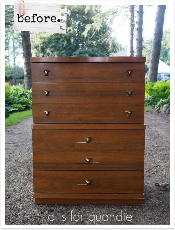
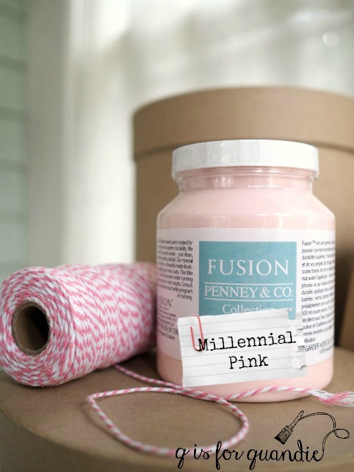
Recently I shared the story of a pair of mid-mod pieces I picked up at a garage sale. I painted the taller piece in my favorite millennial pink shade of paint …

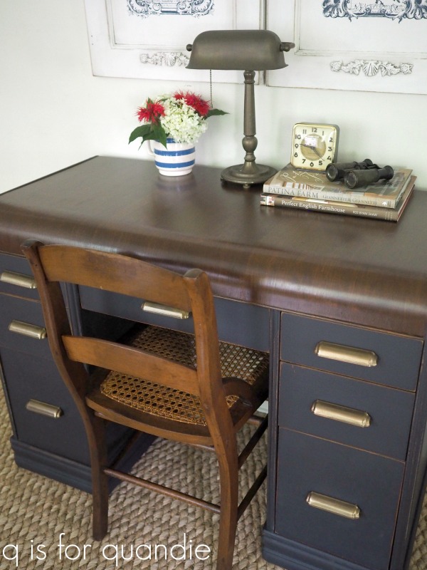
Here is the matching low boy …

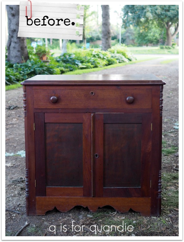
I decided to go in a completely different direction with this piece.
I started by stripping the drawer fronts. I thought the veneer on them was quite pretty. Even though there were some damaged spots, I thought I could minimize them with some stain-able filler.

Knowing what I know now, I’m not sure I’d make this same choice again. Not because of the veneer damage, I do think I successfully downplayed that damage. But there were a lot of steps involved in refinishing these drawers. It took three passes with the stripper to get all of the shiny varnish off, then gluing and filling damaged veneer spots with filler, then sanding, then two coats of Minwax Wood Finish Penetrating Stain in Special Walnut, then two coats of Minwax water based matte Polycrylic with a light sanding with 400 grit in between.
In other words, it took a lot more work (and drying time in between) than just painting. This is just something to keep in mind if you are refinishing furniture to sell.
The drawer fronts are pretty now though. It remains to be seen whether or not I can sell this piece for a good enough price to make the effort worthwhile.

In addition to refinishing the drawers, I painted the body of the piece in Dixie Belle’s Gravel Road. That part was fairly simple. Things went wrong a bit when I tried to top coat it with the Polycrylic. My initial thought was that having the same sheen on the paint (ie. matte) as on the drawers fronts would be a good move. However, the poly ended up looking really streaky over the dark grey. I’m not sure if my technique was faulty, or possibly the matte finish of the poly doesn’t work well over the dark grey color. Regardless, to fix the problem I painted back over it with the Gravel Road. Then I top coated it with a product I am much more familiar with, Dixie Belle’s clear Best Dang Wax. I probably should have just done that in the first place.
This gave me a good opportunity to try out my new buffer.

Mr. Q ordered this from Amazon for me and he decided we should name it Buffy. I have to say, it does make quick work of buffing a waxed finish. It’s also quite light and rather quiet for a power tool. I have no idea how well Buffy will hold up over time, and how many of those pads I’ll go through, but for now I am loving her.
I really liked the style of the original hardware that came with this piece, but the brassy gold color wasn’t really working for me. So I got out the Prima Marketing Art Alchemy Metallique wax in Bronze Age.
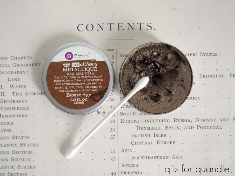
This stuff did a fantastic job of warming up the color of the hardware and it works so much better with the stain color on the drawer fronts.

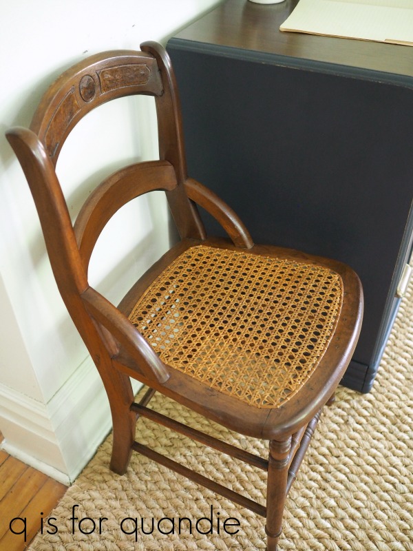
After many trials and tribulations, this piece is finally done. I know this style isn’t to everyone’s taste. Well, to be quite honest, it’s not to my taste either. But there is a market out there for these pieces so sometimes it’s fun to step outside of my comfort zone and work on something like this.

I’ve got a couple more mid-mod pieces waiting in the workshop too. But I also have some pieces that are more ‘me’, so be sure to stay tuned.
As always, thank you to Dixie Belle for providing the paint and the wax for this project, and to Prima Marketing for providing the Metallique wax.