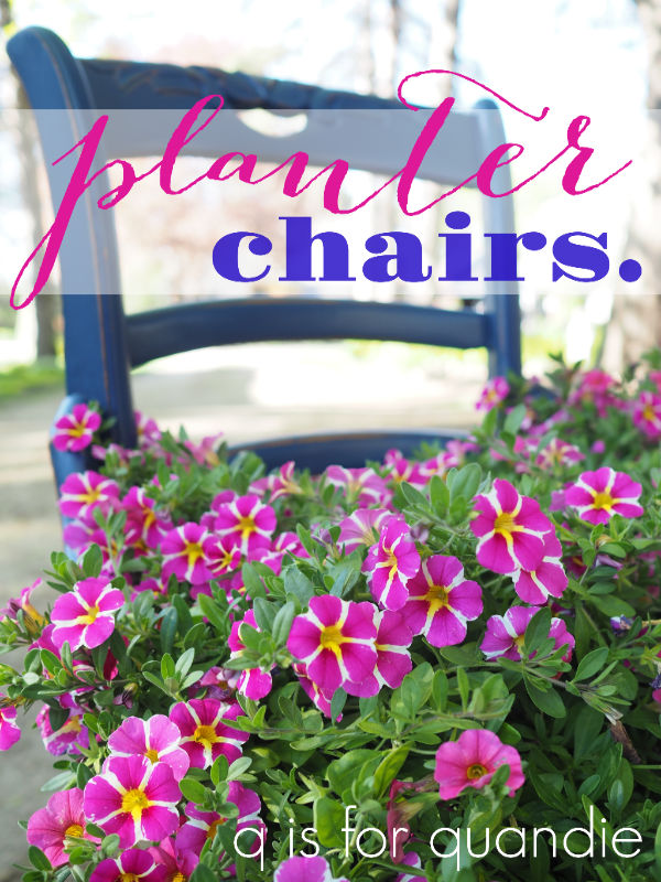
I know I’ve shared planter chairs before, but I whipped up a couple of them last weekend and I couldn’t resist sharing these with you as well.
If you aren’t familiar, a planter chair is basically a chair turned into a plant holder. I particularly like them for holding big baskets of flowering annuals, as you’ll see in a minute.
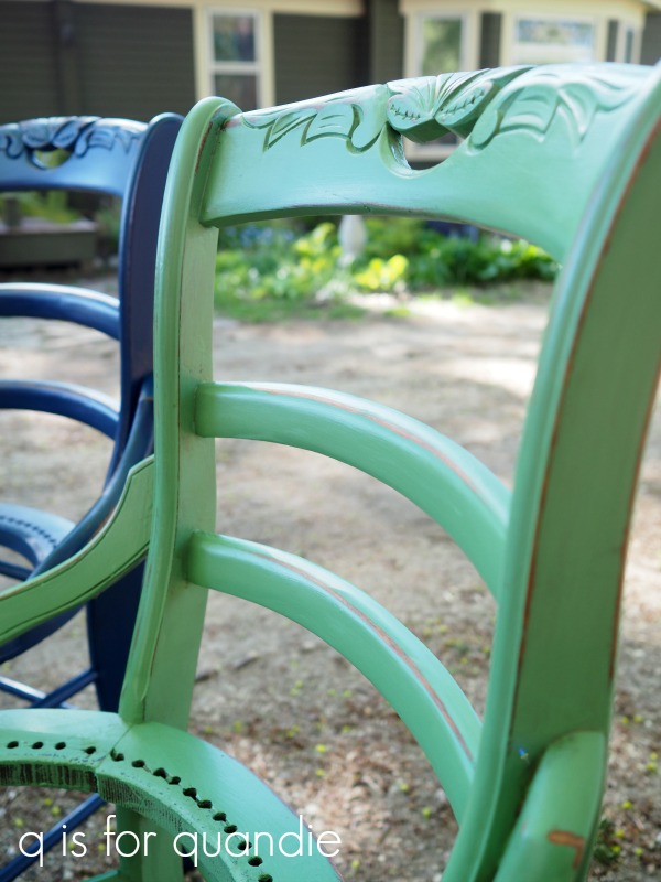
But first, I start with chairs that have seen better days.

Typically they are chairs that have ruined cane seats and I can usually pick them up super cheap at garage sales.

Let’s face it, repairing cane is probably best left to the professionals. Or at least to people with far more patience than I have.
It takes all of my patience just to remove the bad cane, I can’t imagine sticking with it long enough to also replace it with new cane. So instead, I turn them into planter chairs.
Once I’d removed the cane from both of these chairs (using a utility knife and a pair of needle nose pliers), I painted one in Dixie Belle’s Bunker Hill Blue and one in Kudzu.

Once the paint was dry, I sanded the chairs to distress and then added a topcoat of Dixie Belle’s Gator Hide.
Gator Hide is their most durable topcoat option, so it’s a great choice for outdoor pieces. I will point out that the Gator Hide has a bit more sheen than I normally like for furniture, which is why I tend to stick with either clear wax, hemp oil or the flat clear coat. But in this case, I thought I’d go for durability.

Here’s a q tip for you on finishes. The more shine to your finish, the harder it is to achieve perfection. Drips, brush marks, streaks and imperfect coverage will all show up more readily in a satin or semi-gloss finish. Shhhh … don’t tell anyone, but this might be the real reason why I usually go for a flat finish.
For these planter chairs though, I wasn’t concerned about perfection. The gorgeous flowers will draw attention, not any possible flaws in the finish.

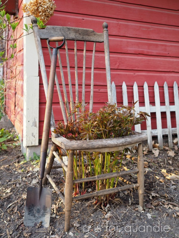
These chairs would be perfect as is for peony cages, much like the non-painted chair in my own garden that I shared last week.
But they also make great plant holders. Just buy a big hanging pot of your favorite flowering annuals and pop it in the hole where the seat once was.

If your pot is smaller than the hole, you can staple a strap in place to hold it.

I added a big pot of Wave petunias and one of my wordy plates, and ta da …

I add words to pretty plates using adhesive vinyl and my Cricut machine (for more details on this process, check out this post).

It works great on old enamelware pot lids too.

And if you don’t happen to have a Cricut machine, the Classic Vintage Labels transfers from re.design with prima work beautifully for this purpose as well …

This pair of planter chairs, and some more wordy plates and enamelware lids are going into the growing pile of stuff that I’ll be taking in to Reclaiming Beautiful this week. I’m so glad they’ll be able to open back up again on Thursday!
With some warmer weather finally here, and lots of plants coming up in the garden, it’s finally starting to feel like summer is coming this year after all.
As always, thanks to Dixie Belle Paint Co for providing the products used on my planter chairs. If you’re looking for Dixie Belle products you can find them here.


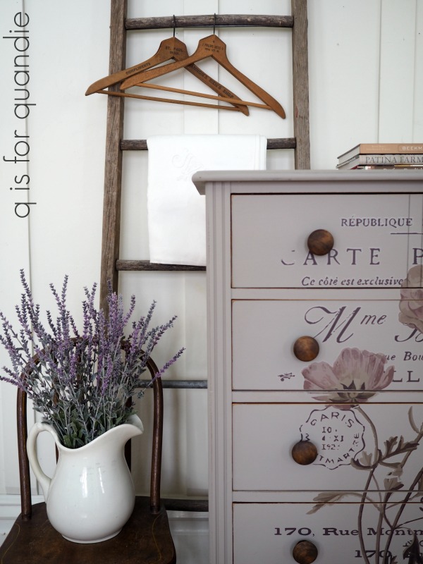
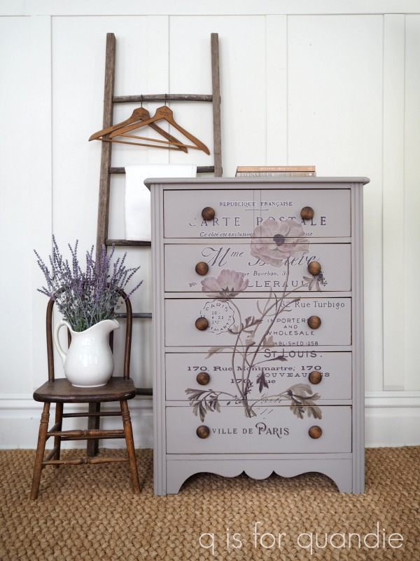
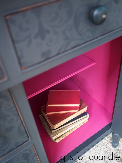
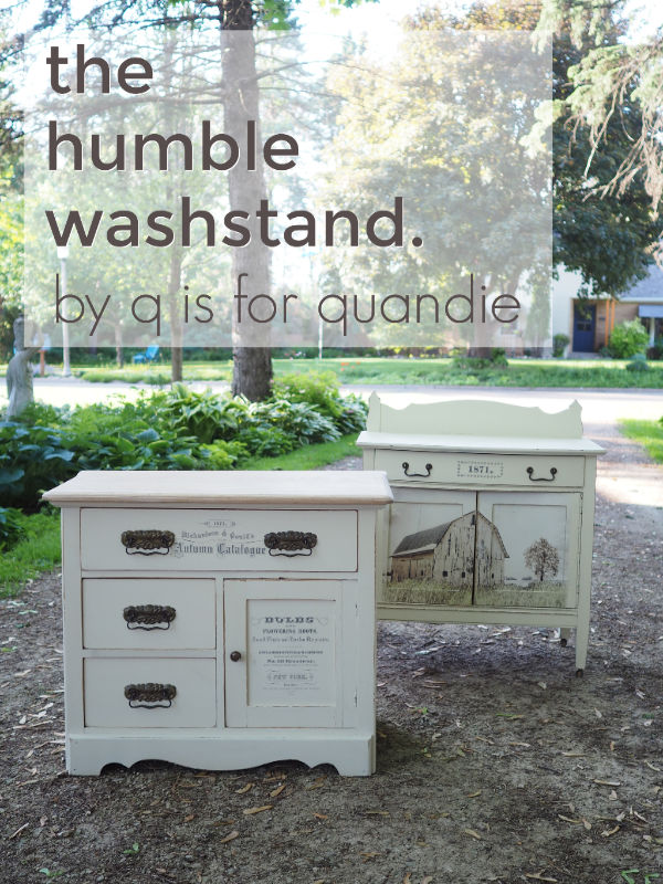
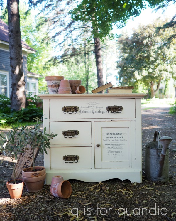
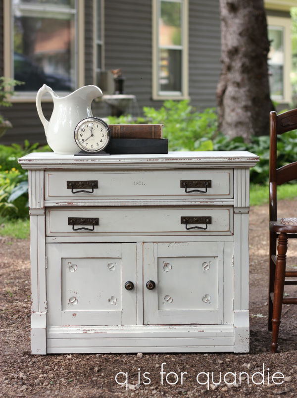
 I loved it so much that I painted two more buffets in Kitchen Scale.
 Plus this was back when I first started blogging and my photo skills were in need of practice. So, I don’t feel like my pictures did this one justice.


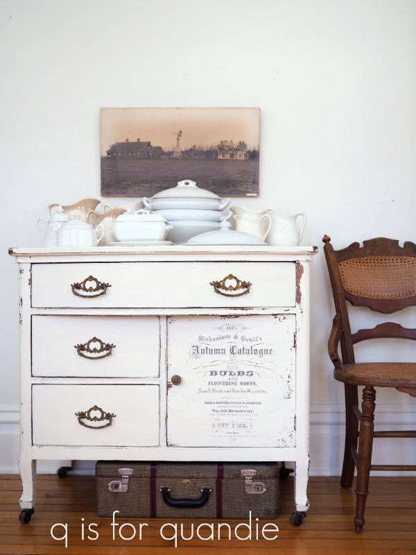


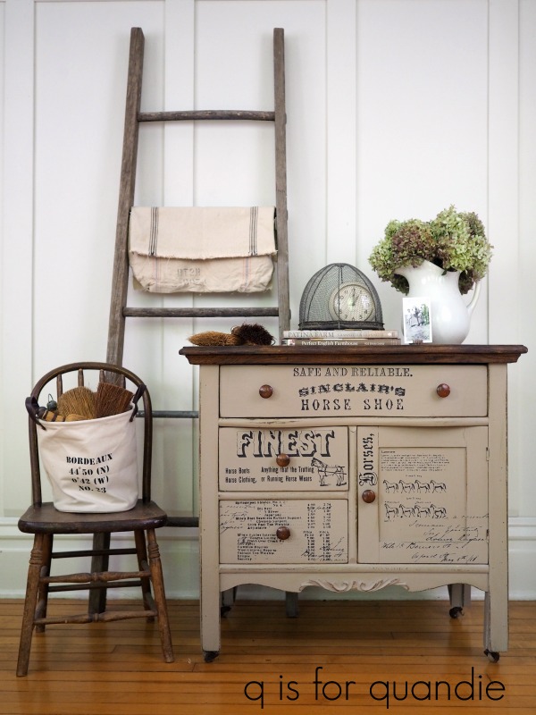
 As always, thanks to my blog sponsors Dixie Belle Paint Co and re.design with prima for providing many of the products used on these washstands.