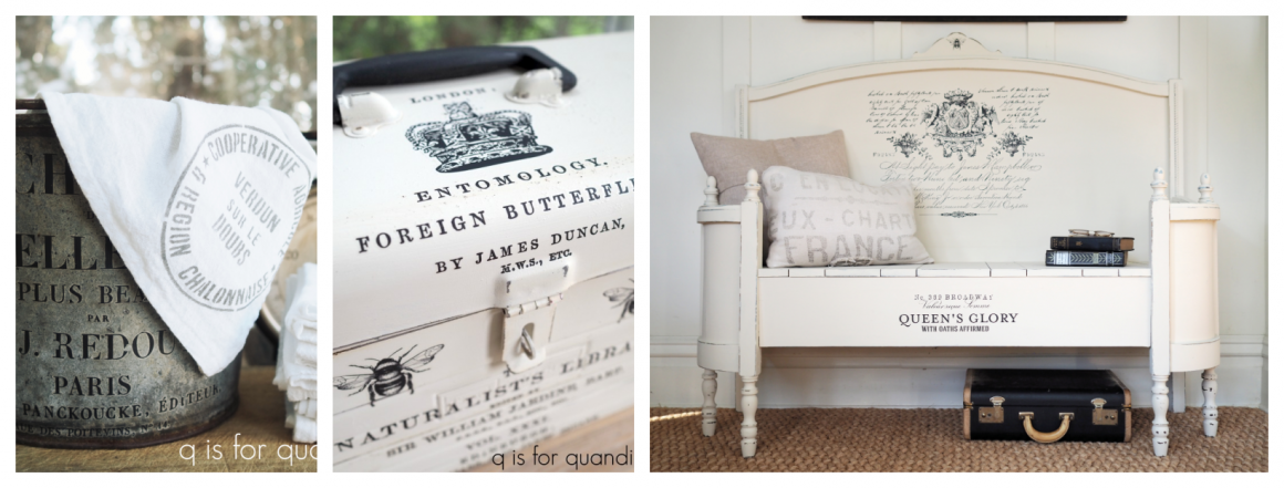
upgraded seats.

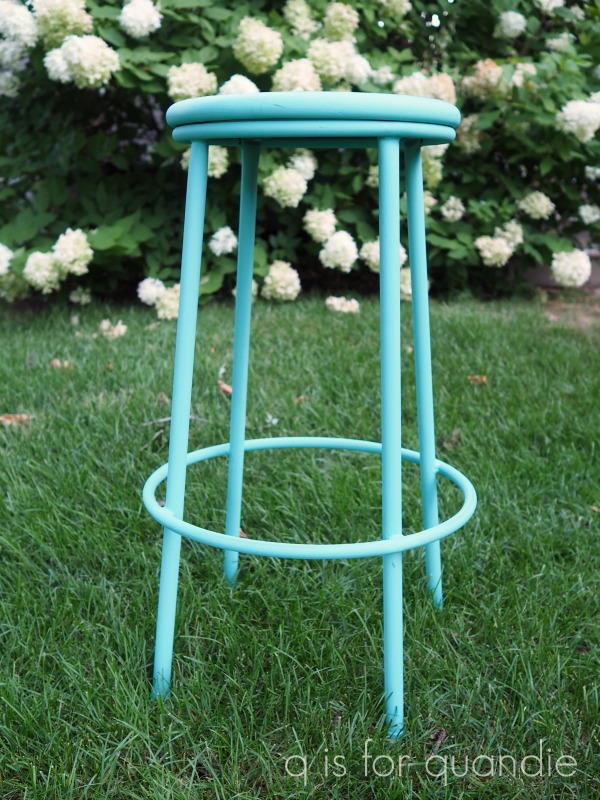
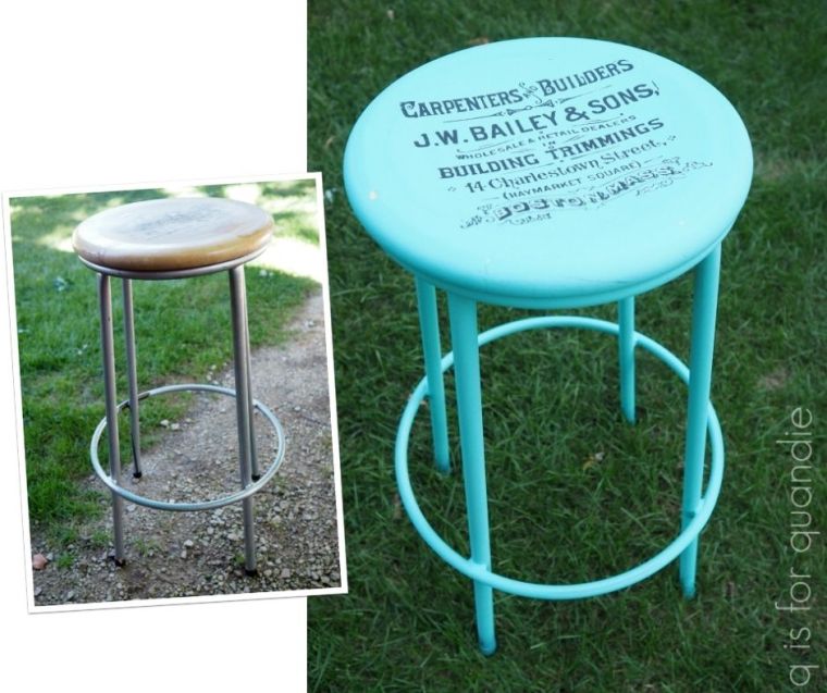
My picker has been finding some fun things for me lately including this old school chair and stool.
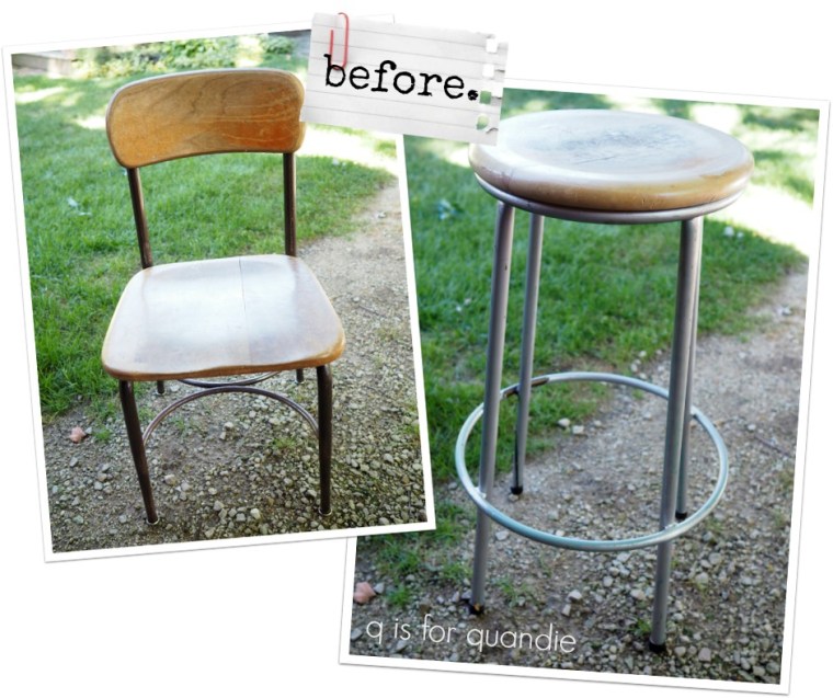
These two pieces have a few things in common.  They both have blonde colored wooden seats.  They both have unattractively colored metal legs.  And they were both in pretty rough shape.

So I knew right from the start that I would paint both of them entirely, including the metal legs.

I started with the stool first.  I sanded the wooden seat and then cleaned everything with some TSP substitute.  It looked like this stool may have been in someone’s workshop, and I just wasn’t sure if there were any oily residues on it that might resist paint.  I like to use a grease cutting cleaner in these cases rather than my normal plain ol’ water.

Next I pulled out The Gulf from Dixie Belle Paint Co.
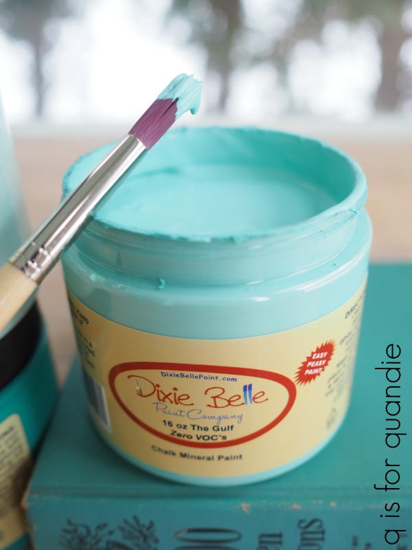
Isn’t that just the most delicious aqua?

I painted the entire stool, legs and all, in The Gulf.
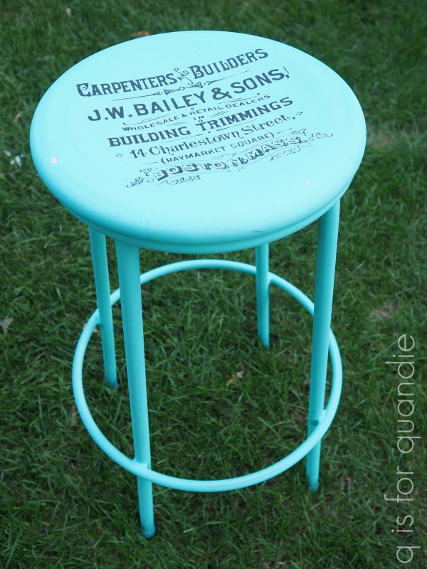
Once dry, I added another snippet from the IOD Label Ephemera transfer to the seat.
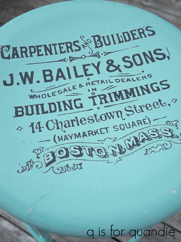
By the way, in case you are keeping track, so far I have used this one transfer on 7 pieces (the medicine cabinet, the folding chair, a painted pumpkin, a wooden box, a mirrored box, a recipe box, and now this stool).  The funny thing is that I mishandled the transfer when I first took it out of the tube and ended up ruining a section at the top (it stuck to itself), so I could have gotten even a couple more projects out of it if I hadn’t done that.  I still have a couple of small pieces left too.

Once the transfer was applied, I used clear wax over the entire stool.
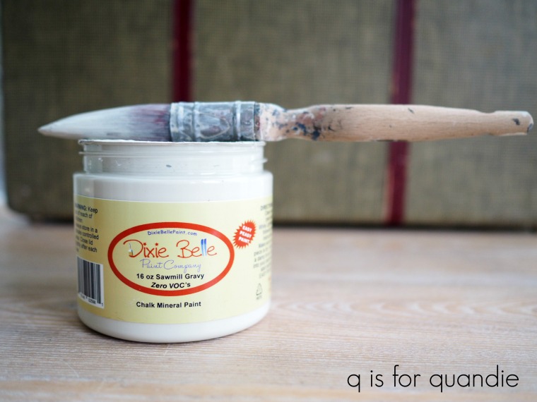
Next up is the school chair.  I had some Chalked spray paint in Charcoal left after painting the table I shared a couple of weeks ago, so I started by using that on the legs.  I thought it would work well paired with Dixie Belle’s Sawmill Gravy on the wooden parts, but after getting one coat of the Sawmill Gravy on I really didn’t like the two toned look.  So I pulled the spray paint back out and painted over the Sawmill Gravy.

Then, I was stumped.  The chair was a perfectly blank canvas with the solid dark grey color on it.  I debated adding a grain sack stripe and stencil (like I did on this one), I also considered painting a union jack on the seat (maybe in grey and mustard like I did on this school desk), but that is a lot of work and I didn’t think this chair was worth the effort.  I even went through all of my re.design with prima transfers looking for one that would be perfect on the chair, but I didn’t think any of them were quite right.

Finally I went through my stash of stencils and came across my notice of decommission stencil from Maison de Stencils.  You may remember that I used it last October to create a sign …

The stencil was the perfect size for the chair.  I masked off the border on the design, since I was placing part of it on the chair back and part on the seat.
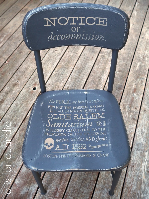
I love the way it turned out.

I used Dixie Belle’s Putty to do the stenciling.  Once it was dry, I sanded over everything to give it a worn appearance.

Then I used clear wax to finish.

So, what do you think of my upgraded seats?
I took both of them in to Reclaiming Beautiful this week, so if any of you locals are interested you should head to Stillwater and check them out!

I also brought in the notice of decommission sign because I never managed to get it there last year.  You’ll also find some of my painted pumpkins at the shop …

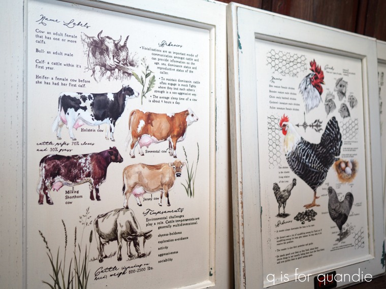
And my Farm Life cupboard door signs …
And the mirrored box …

And the boxes …

And the camp stool …

In other words, a whole bunch of stuff!

an updated antique.

Earlier this summer my friend/picker Sue texted to ask if I wanted to buy a small table that her brother was getting rid of.  Not only was the price right, but her hubby could deliver it right to my door!
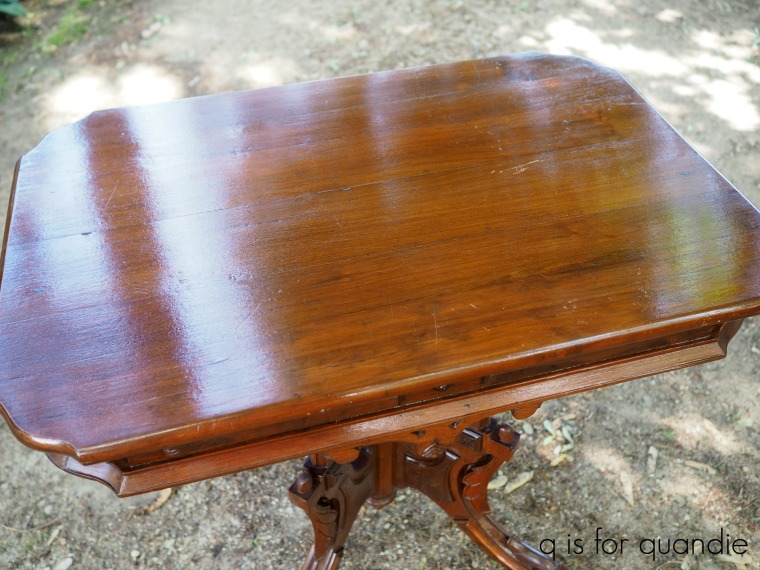
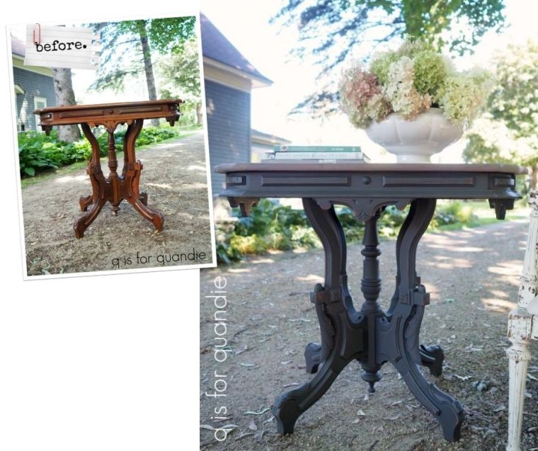
And here it is.

Just look at all of that beautiful detail.

But it had been refinished at some point in its life and given a super shiny finish.

As you all know by now, I am not a fan of shiny finishes on furniture.

Although this piece is constructed out of some lovely wood, there was no way I was going to strip the base with all of that detail.  That would have taken much more patience than I possess.  But stripping the top would be totally do-able.  So that’s where I started.

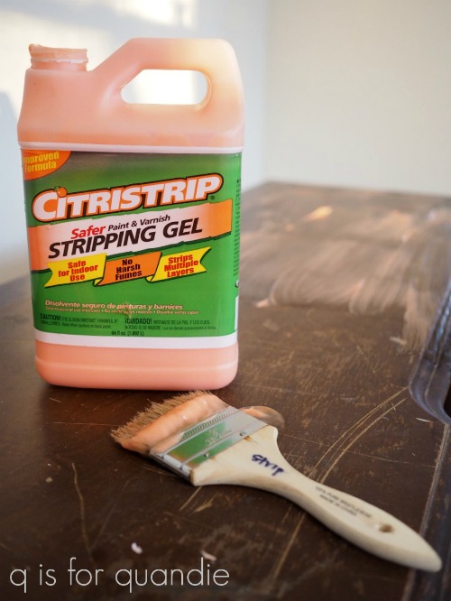
In case you are wondering, I use Citristrip for all of my stripping needs.

I like it because it’s safe for indoor use (although I did strip this particular table outside) and doesn’t have any harsh fumes.

Once I had the top of the table stripped, I then masked it off with newspaper and painter’s tape because my next step was to paint the base.  I took one look at all of that detail and decided spray painting would be my best bet.

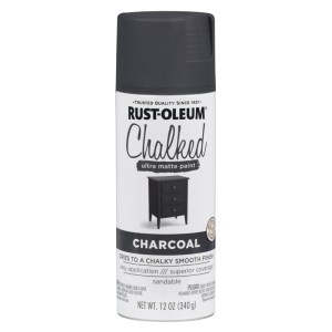
I used Rustoleum’s Chalked spray paint in Charcoal.

Here’s something interesting I came across while looking online for a picture of the product to use, I found it at a website selling the paint for $19.90/can.  Yikes!  I buy it at my local Menards where the ‘everyday low price’ is $6.48/can.  I certainly pays to shop around sometimes!
And here’s another tip for you today, I use the Comfort Grip Spray Paint Gun (also from Rustoleum) when I’m doing a lot of spray painting.

It just clips onto the top of the can.  It totally saves your finger from having to press down on that spray button all the time.  That helps me get a smoother result with the spray paint too.

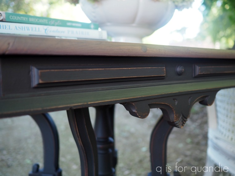
The Chalked paint can be distressed just like any other chalk-style paint.

Sticking with my theme of doing things the easy way on this project, I top-coated the paint with Dixie Belle’s Easy Peasy Clear Matte Spray Wax.

Just spray it on and wipe away any excess.

It worked beautifully over the Chalked spray paint.

OK, so after stripping the table top, spray painting, distressing and spray waxing the base, I pulled out a few options for finishing the table top.

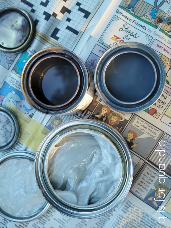
Here’s what each one looks like when you open the can …

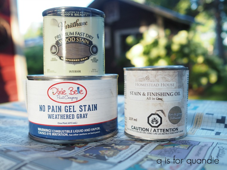
I immediately eliminated the Dixie Belle Weathered Gray Gel Stain (bottom) because I wanted a darker gray.  Then I eliminated the Varathane Weathered Gray stain (upper right) because I didn’t love the blue undertone it had.  That left me with Homestead House Stain & Finishing Oil (SFO) in Driftwood (now branded under Fusion Mineral Paint).  I liked the warmer tone and darker shade of the gray in the Driftwood.

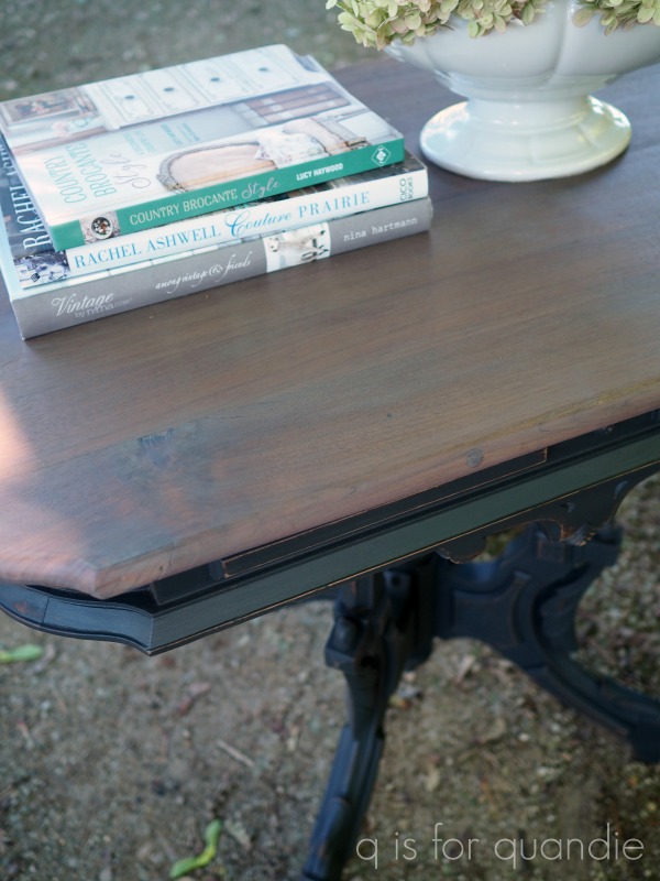
That is just one coat of the SFO.   This product is meant to be applied in several light coats.  Each coat progressively adds a little more color, durability and sheen.  But in the case of this table, I really liked the color after just one coat so I left it at that.  I could have added a couple of coats of the Natural color SFO over the Driftwood to add durability without adding color, but I didn’t have any of that on hand.

Keep in mind that this is how the Driftwood SFO looks over the wood on this particular table.  It is semi-transparent, so the look will depend a bit on what you’re putting it on.

All in all, I think this gorgeous antique table has been given a totally updated look, don’t you?

As always, thanks to Dixie Belle Paint Co and Homestead House for providing some of the products used on today’s project.

If you are local and could use an updated antique table, be sure to check out my ‘available for local sale‘ page for more details on this one.

if only I’d thought of that sooner.

A while back I shared this pile of goodies that I’d brought home from garage sales …

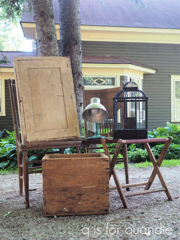
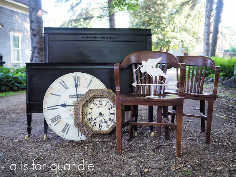
I’ve made over everything in this pile (medicine cabinet, box, birdcage, lamp) except for the pair of chairs which will likely become an early spring 2021 project (it’s a little late in the season for planter chairs now) and today’s project, the little camp stool.

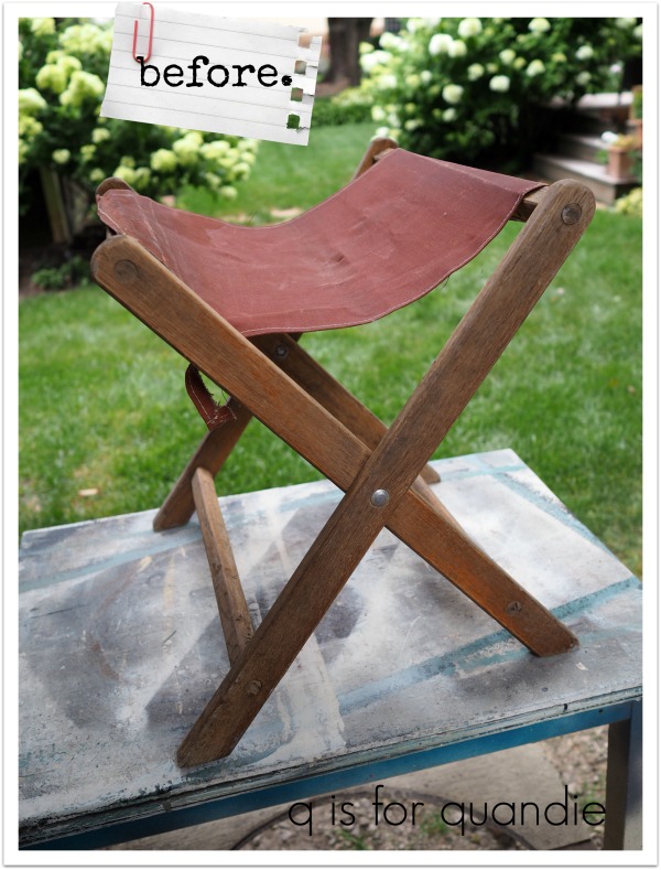
I didn’t quite remember to get a photo before I started working on it, but I did grab a quick one after removing the canvas seat …

The existing seat was pretty gross, and the wood frame was looking shabby as well.  The finish was mostly gone and the wood was quite dry looking.  I tried to capture that in this photo …

Once I had the seat off, I scrubbed the wooden frame with some Dawn and the garden hose.  Once it dried again, I re-evaluated.  At this point I could have painted it, but I really liked the warmth of the wood.  So I decided to see if I could rejuvenate the wood without totally stripping and refinishing it.

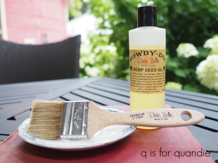
I started by sanding it to remove all loose bits of the previous finish.  Then I pulled out the Dixie Belle Howdy-Do Hemp Seed Oil.

This has become my preferred brand of hemp oil because it has almost no odor at all  (I have had issues with bad odors when using other brands).

I like to apply hemp oil with an inexpensive chip brush.  Some of the really cheap ones from the DIY/hardware store tend to shed their bristles and make a total mess of it, but the premium chip brush from Dixie Belle is little better quality and it’s only $1.50 on their website.  It’s perfect for using with hemp oil.

OK, so I brushed the hemp oil onto the wood.  Then I gave it a minute or so to soak in and wiped away any excess oil using an old rag.

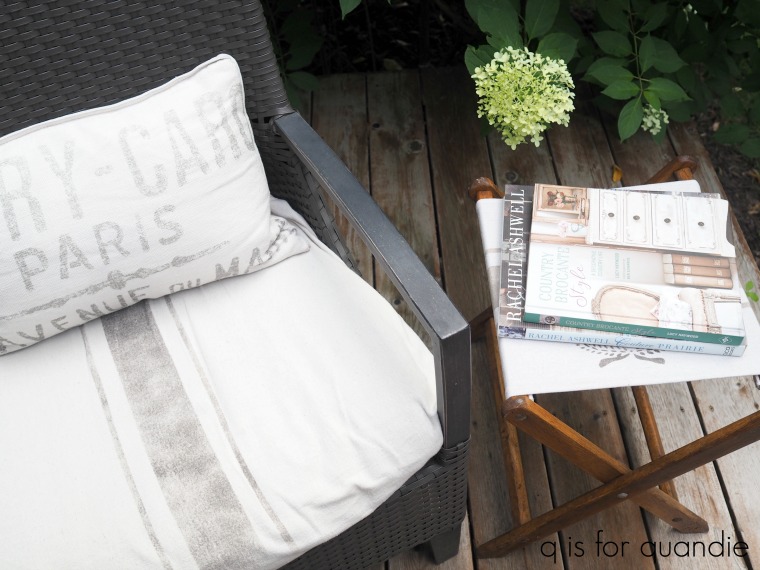
In the meantime, I had asked my friend/picker Sue (who also does a bit of sewing for me) to hem up a piece of drop cloth fabric to same size as the former seat of the camp stool.  She whipped it up in no time, and once I had that back from her I stenciled it to give it a grain sack look (the stencil used can be found here).

After that it was super simple to just staple the seat back onto the frame.

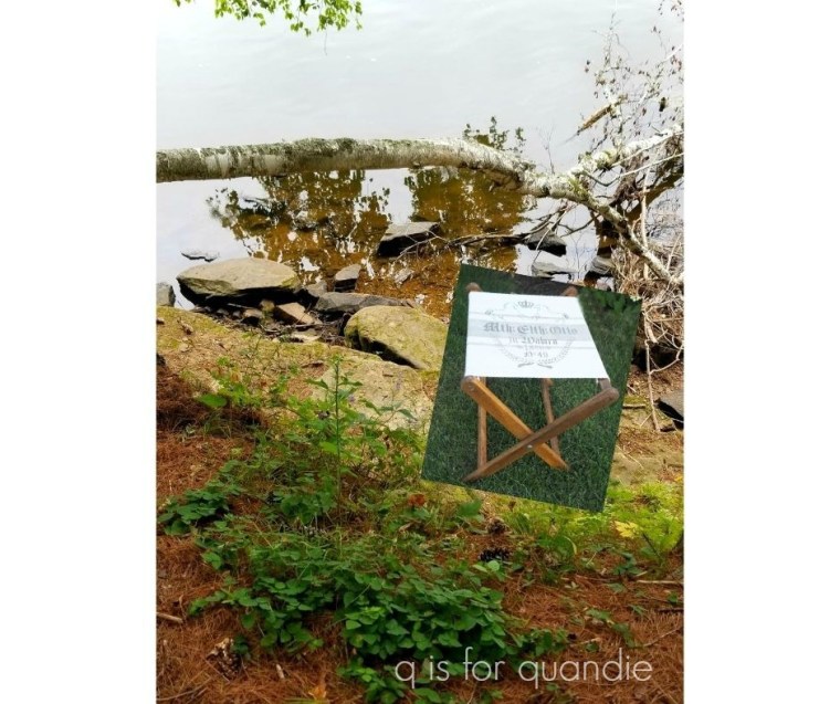
It wasn’t until I was contemplating how best to stage this camp stool for a photo that I realized I’d missed a prime opportunity.  Last weekend Mr. Q, my sister, my niece and I went for a hike in William O’Brien State Park.  If only I’d thought ahead and brought the camp stool along.  I could have gotten some photos of it with an appropriately camp-ish background.  I could have placed it beside the St. Croix River with an old fishing pole leaning on it.

Or maybe just next to this babbling brook with a vintage cooler beside it.

It would have been perfect!

Drat!  If only I’d thought of that sooner!

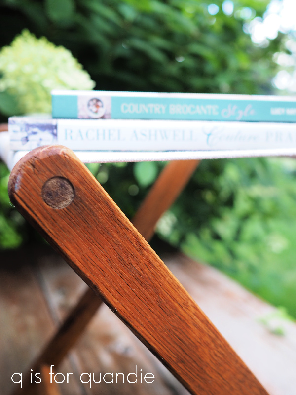
Instead I just took some photos of it on my deck next to the patio furniture.

Not quite as camp-ish, I know.

It makes a fun alternative to a traditional side table though.  It could also double as a foot stool.

What would you use an old camp stool for?

Many thanks to Dixie Belle for providing the Howdy-Do hemp seed oil used for this project. If you’re looking for Dixie Belle products you can find them here.

And if you need a refurbished camp stool, this one is for sale locally for $25.

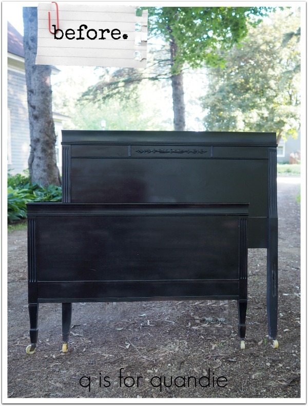
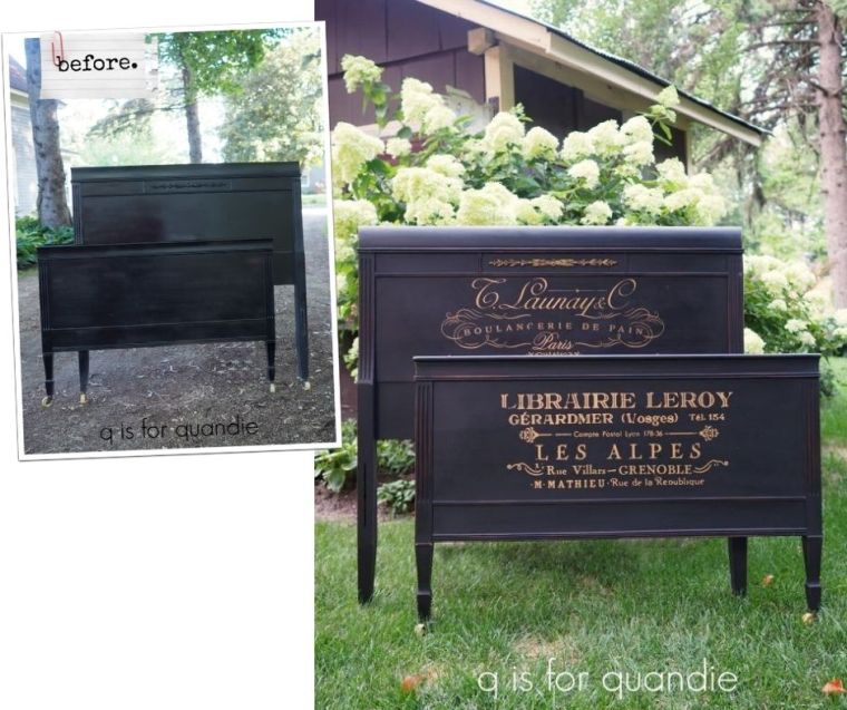
a french-ish bed.

A while back my friend/picker Sue gave me a heads up on a Saturday morning garage sale that was happening near me and I came home with a pile of goodies.

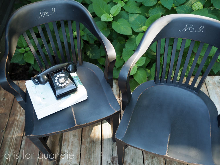
You’ve already seen the chairs made over …

This past weekend I worked on the bed.

Now, you might be thinking ‘hey, wait a minute, that bed is already painted! Q is totally cheating!’

But what isn’t entirely apparent in that ‘before’ photo is that it was spray painted.  Sometimes spray paint can leave an uneven sheen, especially on flat surfaces like this one.  Here’s a photo where you can really see what I’m talking about.

See those patchy dull areas?  Not really a good look, so this bed really needed a new paint job.

I briefly toyed with the idea of painting it in a warm white, and it would have been absolutely lovely in that color.  However in the end, I decided to save myself some effort and just go with the black.

I sanded the bed lightly all over to make sure I’d get good adhesion with chalk paint over the spray paint (by the way, just a random tip, milk paint does not adhere well over a shiny spray paint, just in case you were curious about that).  Next I cleaned the surface with a damp rag and then added a coat of Dixie Belle’s Caviar.

Since I was painting black over black, one coat of paint was totally sufficient.  Well … or, it would have been.  Except for the part where I had the headboard leaning against the Carriage House to dry and a stiff wind knocked it over face first onto my gravel driveway.  Ugh!  When will I learn not to do that?  This is not the first time this has happened.  I can only blame myself.

But after a quick sanding of the damaged areas, and another coat of paint, all was well again.

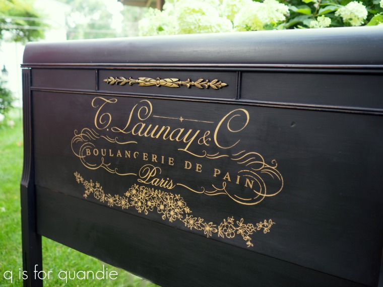
Next I pulled out the Somewhere in France transfer from re.design with prima.

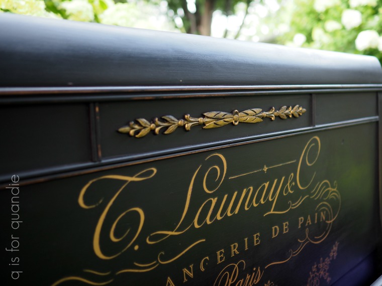
I used about 2/3 of the full transfer on this bed.  I added one section to the headboard …

and another section to the foot board (have any of you also wondered why ‘headboard’ is one word, but ‘foot board’ is two?) …

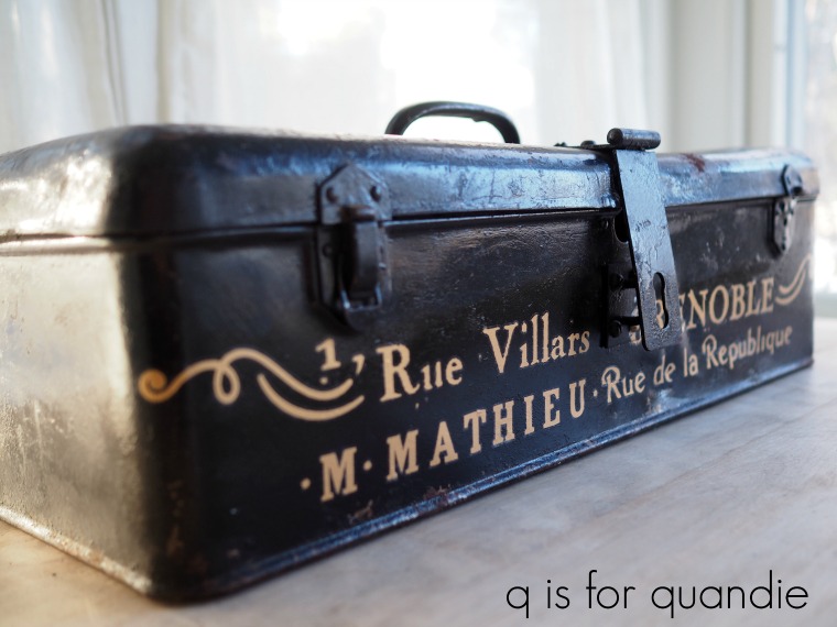
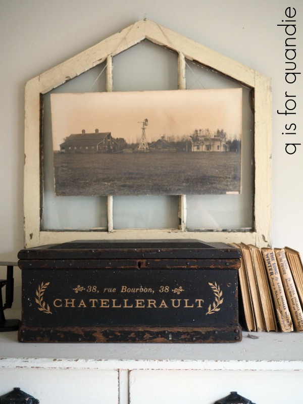
You can really get a good bang for your buck with the Somewhere in France transfer by splitting it up to be used on 3 or more different projects.

Here’s just a bit of it used on a hat box …

I’ve also used it on a toolbox  …

And on this old wooden box…

It’s also a great transfer to pair with other transfers, like the pretty floral one (Lavender Bush) on this bed.

Or the gold crown from the Gilded Home & Nature transfer that I used on Lulu, my manikin.

Anyway, I digress.  After adding the transfer to the bed, I added a coat of clear wax to everything.

But before calling it good, I also decided to dig out the Vintage Gold Metallique wax from prima …

I used a q-tip to add a bit of the gold wax to the carved wood applique at the top of the headboard.

It was just enough extra gold to tie in with the transfer.

In case any of you are gardeners and are wondering about the hydrangea in the background, that is a Little Lime.  It’s similar to a Limelight, but smaller.  The Little Lime will grow to 5′, while the Limelight will get up to 8′ tall.  So if you’re looking for a hydrangea that will stay a little smaller, go with the Little Lime.

Normally this is the part of my post where I mention that this bed is available to local buyers, etc … but this one is actually already spoken for.  One of my good customers stopped by to pick up the do-over dresser from last Monday, saw the bed and called dibs on it.

As always, thank you to Dixie Belle Paint Co and to re.design with prima for providing the products used for today’s project.

If you’re looking for Dixie Belle products you can find them here.

If you’re looking for re.design with prima products you can find local retailers here, or online sources here.

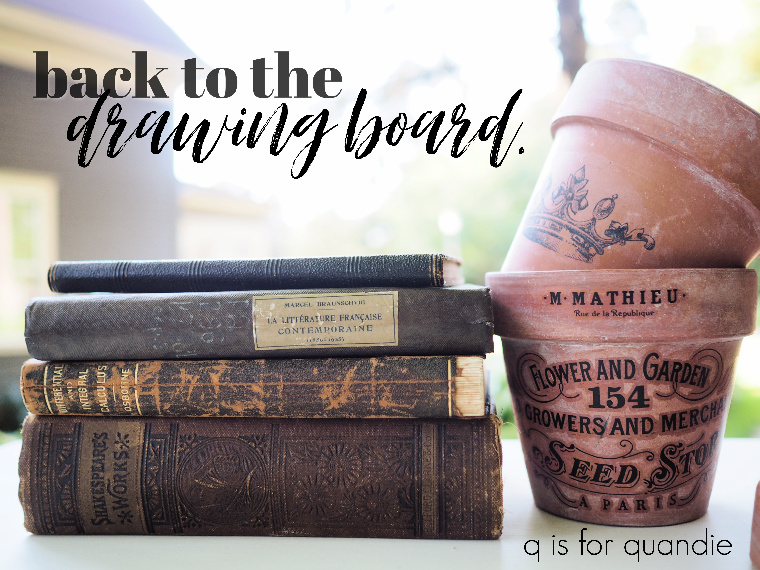
back to the drawing board.

Sometimes you just gotta go back to the drawing board.

Perhaps you remember this dresser that I painted back in February …

I loved how it turned out.  But then, I happen to be a fan of toile (that is the Simplicity transfer from re.design with prima).  Especially the black and white version.

It would seem that not very many other people are.  Or, at least that’s what I’m blaming for the fact that this dresser hasn’t sold.  Of course, it could be many other things, like COVID-19 for example.  Or it could be that I haven’t stayed on top of keeping ads for it posted and updated online.

Regardless, it has been collecting dust for six months now, so I decided it was time to re-think the design.

I began by sanding the transfer off the top two drawers.  I’ve found that sanding is the easiest way to remove a transfer (to read more about removing a transfer, check out this post).  For those of you who have wondered about the permanence of a transfer, I can say that once properly adhered they will stay on until you want to take them off.  And when you do want to take them off, you can do so, but you won’t be able to salvage the finish beneath them in the process.

So once I had the transfer (and most of the paint) removed, I simply repainted the top two drawers in the same paint I used on this piece back in February, Amulent paint from The Chippy Barn.

Back then, this color was called Cottage White.  For some reason, The Chippy Barn decided to rename it and now it’s called Country Cream, just in case you are looking for it.

Anyway, with very little effort, I then had a totally blank canvas on which to start over.

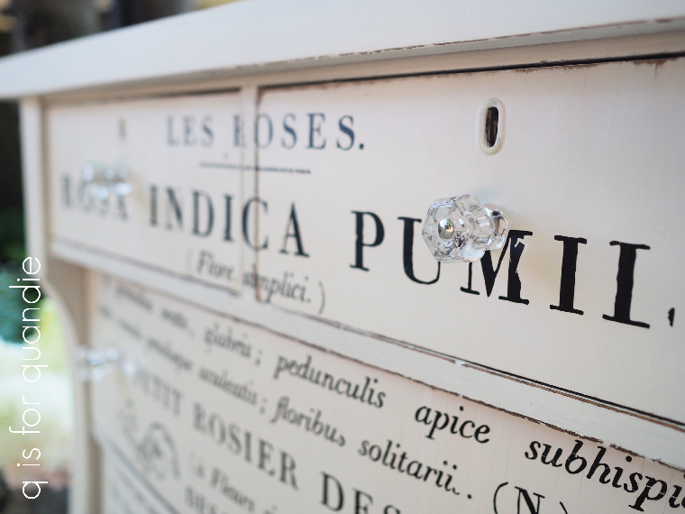
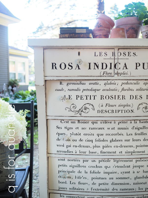
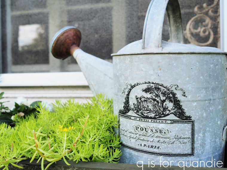
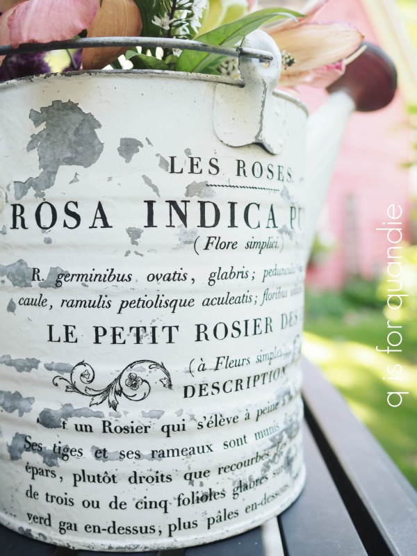
Quite some time ago I ordered a few IOD transfers.  You’ve seen some of the smaller ones that I’ve used on watering cans, a step stool, and a button box.  But I also ordered the larger version of their Le Petit Rosier (it’s 24″ x 33″).  I’d been waiting for just the right piece to use it on.

Turns out, this dresser is the one!

It took quite a bit of elbow grease to get this transfer applied.  I really had to work at each individual letter to make sure it was down before continuing to lift the backing.  And there are a lot of letters …

And I messed up on quite a few of them losing half of an ‘a’ or the top of an “L”.  But overall I think those mistakes just sort of blend in.

Once the transfer was on, I waxed over it lightly with clear wax and then put the same glass knobs back on.

The polka dotted paper I used to line the top two drawers continues to work with this new look as well.

Now, all that remains is to see whether or not the dresser will sell this time around.

And if it doesn’t, then I am going to find a way to keep it because I absolutely love it.

But if any of you locals want to snatch it up, check out my ‘available for local sale‘ page for more details.

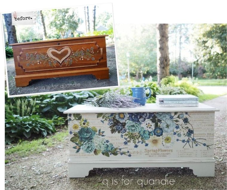
a heartless hope chest.

A couple of weeks ago my niece asked if I would paint a trunk for her, and when she added that I could paint it any color I chose, I was in.

Actually, I say that, but you all know the truth.  I would have happily painted it for her even if she wanted it to be orange (or purple and green) or something.  But I was glad to be given carte blanche.

Now, those of you who are wood lovers (and if so, I can’t imagine why you are still following my blog) should look away at this point.  I will fully admit that the wood on this particular trunk was still in beautiful condition.  It is a cedar chest made by Lane.

That being said however, that lacy heart really had to go.

And as Mr. Q likes to say, it’s only paint.  If sometime down the road Kris decides she no longer wants the trunk painted, she can always strip it back down to bare wood and refinish it.  That wouldn’t be too difficult because it has such clean lines and no carved details.

Back in the day, a piece like this was called a hope chest.  I’m not sure whether or not my niece calls it that.  The Wikipedia definition of a hope chest is …

‘a piece of furniture traditionally used to collect items such as clothing and household linen, by unmarried young women in anticipation of married life.’

Hmmmm.  That feels like a pretty dated idea these days.  But I suspect that my niece was originally given this trunk to serve as a hope chest.  That heart kind of gives it away.

But I gave it a whole new look starting with a paint job using Dixie Belle’s Sawmill Gravy.

You know, when I first saw this color I really didn’t think it was anything special.  But since then I’ve used it on numerous pieces and I seem to keep coming back to it.  There is something about it that I love.  Maybe that it’s not a bright white, and it’s not quite grey or beige or cream either.  It’s just the perfect pale neutral.

To start, I sanded the chest and cleaned it with a damp rag.  Then I painted it with two coats of the Sawmill Gravy.

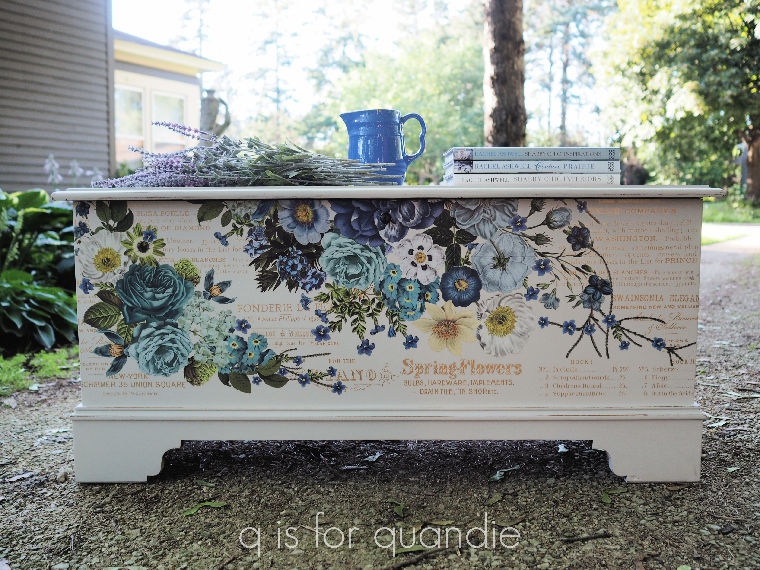
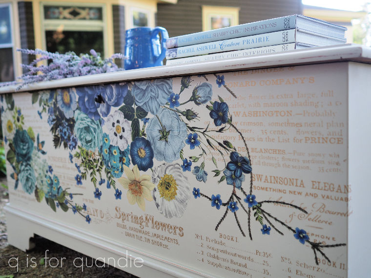
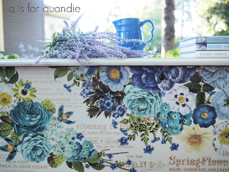
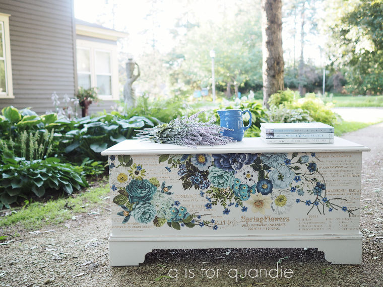
After giving it a light sanding with 220 grit sandpaper to smooth out the finish, I added the bottom half of the Cosmic Roses transfer from re.design with prima to the front.

I’ve yet to see this particular transfer look bad over any color.  It’s amazing over pretty much any shade of blue …

It also looks great over a mid-tone grey like Dixie Belle’s French Linen

I’ve also seen others use it over yellow, or even some really dark colors, and it still looks fantastic.

But I happen to love it over this color in particular.

I happen to know that Cosmic Roses is one of my niece’s favorite transfers, so it was the perfect choice for her trunk.

Before I forget, I’ve got a really important q-tip for you guys today; don’t try to apply a transfer in your non-climate controlled carriage house workshop when there is a heat advisory.  I had a heck of a time applying the first sheet of this transfer (it comes in a total of six sheets, I used two full sheets and two half sheets on this trunk).  So much so that I gave up and had Mr. Q help me haul the trunk into the air conditioned house to complete the job.

Once everything (me, the trunk, and the transfer) cooled down, it went on perfectly fine.  So, lesson learned, 90 degrees combined with high humidity does not work for applying transfers.  Keep that in mind.

But, I finally got it applied.  Once that was done, I added a topcoat of clear wax to protect it.

So, what to you think?  A definitely improvement?  Or did you prefer the heart?

As always, thanks to Dixie Belle Paint Co for providing the paint and to re.design with prima for providing the transfer for this project.

If you’re looking for Dixie Belle products you can find them here.

If you’re looking for re.design with prima products you can find local retailers here, or online sources here.

another pair of chairs.

Considering the fact that I usually tend to avoid painting chairs, I seem to have been working on lots of pairs of chairs lately.  They seem to be finding their way to me despite my best efforts.  There was the pair of folding chairs that my neighbor, nnK, gave to me.

Then it was the pair of library chairs that I purchased at a garage sale.

And then there is the pair of chairs I purchased to turn into planters …

Although I still haven’t worked on them yet.

And today I’m sharing a pair of chairs that one of my co-workers, Jackie, found for me at a garage sale.

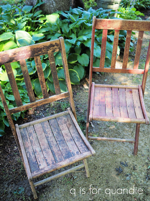
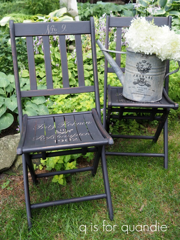
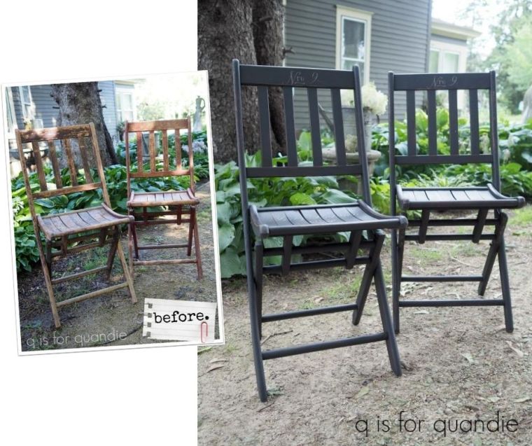
It’s another pair of folding chairs.  The original paint on one was black, and the other was a dark red.

The existing paint on these was so dry that it mostly came right off with the lightest touch of 220 grit sandpaper.  I sanded them to remove loose paint and then cleaned them with my Dawn/garden hose method to prep.

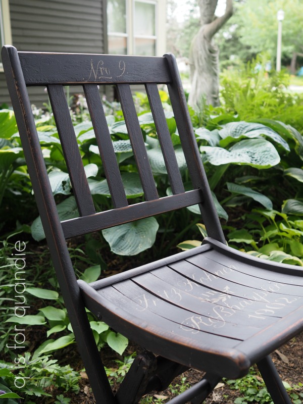
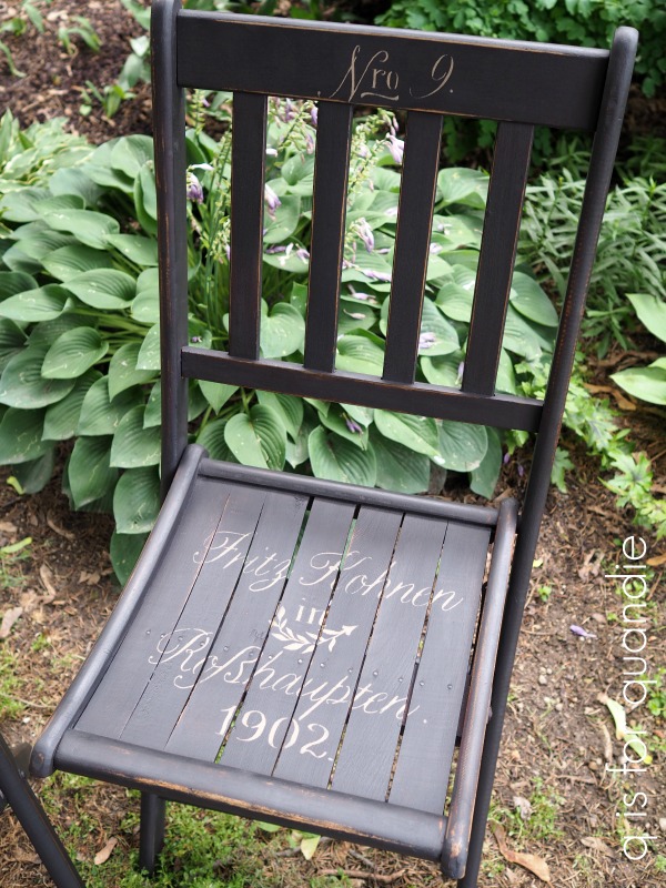
I decided to go dark with this pair in contrast to the previous pair of folding chairs that I painted in Dixie Belle’s Drop Cloth, so this time I used their Midnight Sky.

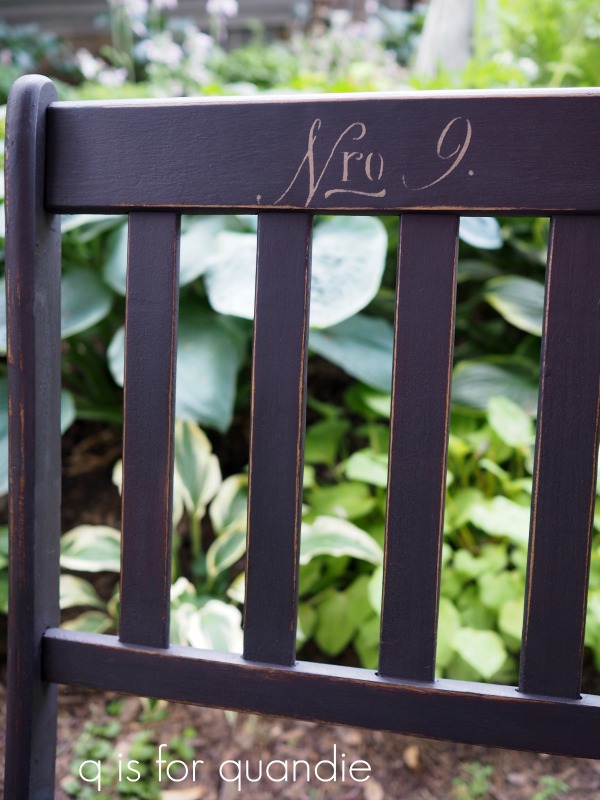
I used the same stencil that I used on the library chairs.

By the way, I used Dixie Belle’s Putty for the stencil.  Because the Dixie Belle paint is fairly thick, I find that it works really well for stenciling.

Once all the paint was dry, I sanded them to distress and then finished them off with some Fusion antiquing wax.  I love the way the dark wax kept the distressed edges from looking too freshly sanded.

I wish I had a cute little bistro table to go with the chairs, that would be adorable on a veranda or in the garden.

But they are also perfect for holding a watering can full of hydrangeas.

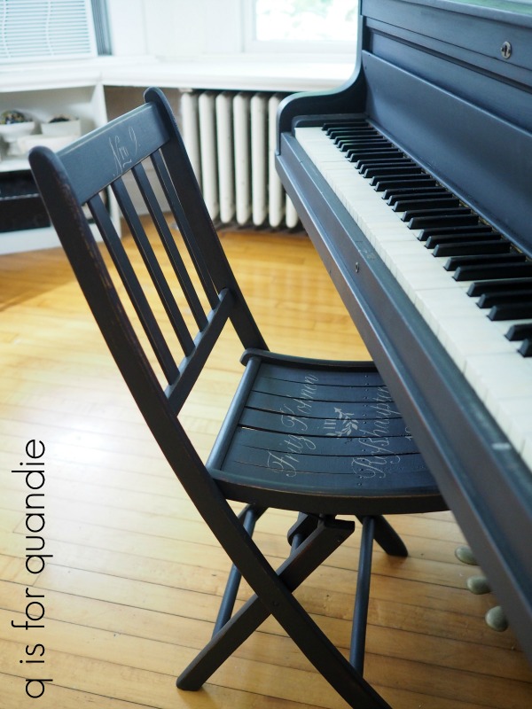
One of them would be perfect next to the front door holding a potted plant.  It would also make a great alternative to a piano bench.

Regardless of where they end up being used, I think they are vastly improved with just a little bit of paint.

As always, thank you to Dixie Belle for providing the paint used for this project. If you’re looking for Dixie Belle products you can find them here.

And if you are local and could use a pair of vintage folding chairs, be sure to check out my available for local sale page for more details.

the rebel yellow rocker.

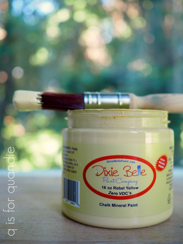
I recently decided to try out Dixie Belle’s Rebel Yellow.

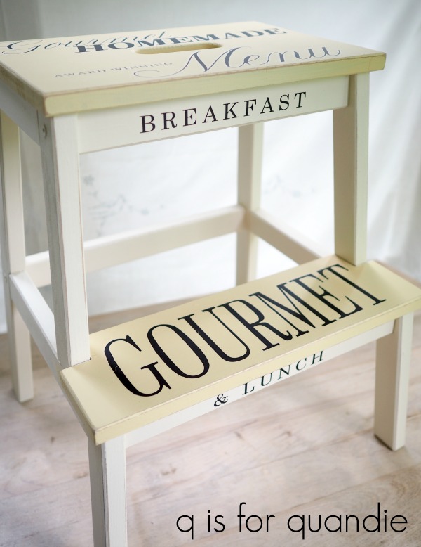
It’s a pretty shade of pale yellow.  It reminds me quite a bit of Fusion’s Buttermilk Cream, which is the pale yellow on this stool …

It’s also very similar to Homestead House milk paint in Ocher, color no. 2 on these pots …

If you’re already a fan of either of those two paints and colors but you want to use a chalk style paint, or you’re just looking for a nice pale yellow, I’d recommend Rebel Yellow.  I always like to have a pale yellow on hand, just in case something comes along that is calling out for that color.

To test out the Rebel Yellow, I pulled out a child sized rocking chair that my niece found for me at the thrift store over two years ago.  Unfortunately, I neglected to get a ‘before’ photo of it.  Just picture it in a medium toned wood with a shiny poly finish, OK?

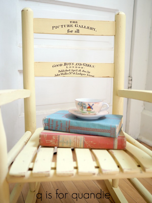
Here it is with a couple of coats of Rebel Yellow, some sanding to distress and a top coat of clear wax …

Sweet, right?

I added one of the IOD Classic Pots transfers to the back (always add the transfer before waxing) …

This is the same one that I used on that adorable button box I shared a few weeks back.

It seemed appropriate for a little kid sized rocker.

I staged it with some colorful vintage books and my favorite tiny teacup and saucer.

It would be adorable in a nursery.

It really fits in well in my guest room and pairs up nicely with my Jenny Lind bed that is painted in the Homestead House Ochre milk paint.

But I definitely didn’t need a kid size rocking chair in there.  So when one of my regular customers swung by the other night to pick up the step stool from Monday, she decided to take the rocking chair home too!

As always, thank you to Dixie Belle for providing the paint used on this rocker. If you’re looking for Dixie Belle products you can find them here.

the step stool.

I did a little lunchtime garage saling last week with my friend/co-worker/picker/garage sale mentor Sue.  We were in my VW bug, so saying I managed to fill it up isn’t really saying much.  But I did find a few fun things including this step stool (which just barely fit in the trunk).

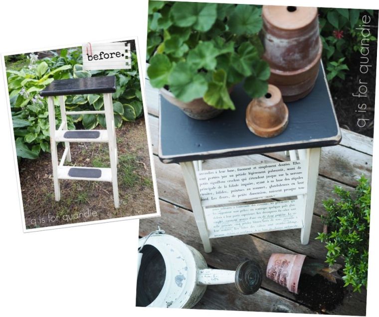
The stool was a bit beat up and the rubber treads on the steps were pretty grungy, but what I most needed to fix (in my humble opinion) was the shiny paint job.  I’m just not a fan of shine.

Step 1 (pardon the pun) was to remove the rubber treads from the steps.  Luckily they were not glued down, but just had little tacks a each corner holding them in place.

Next I sanded the whole piece to take off some of that shine.

It was fun to note that this stool had been several other colors in the past.  Clearly at one point the top was red, and there were hints of green, pink and yellow in other spots.

A good rule of thumb is that shiny surfaces of any kind will not hold onto new paint as well as dull surfaces.  So always give them a good scuff sanding to remove some of that shine.  In this case I also sanded the edges back a bit more than usual to remove that red because ultimately I didn’t want to see it when I distressed this piece after painting it.

I’ve been on a bit of a black and white kick lately, so I opted to keep its most recent color scheme and just freshen it up.  I used Dixie Belle’s Drop Cloth on the base, and Midnight Sky on the top.  The beauty of this plan is that it only took one coat of paint for each.

And as you can see, when I sanded the edges to distress I was careful to not sand back as far as the red paint so none of it shows.

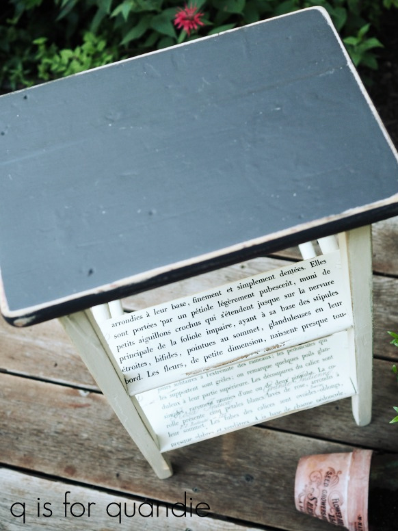
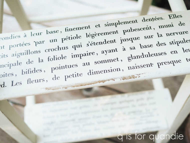
Originally I’d thought I would add a transfer or stencil to the top of the stool.  But after contemplating that for a bit, I realized that this piece would be perfect to use as a plant stand or a small side table.  In which case, there is likely to be stuff on the top that would cover it up.  So instead I decided to add a transfer to the steps.

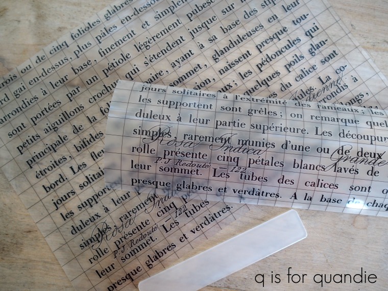
I used the bottom 7″ or so of the IOD Le Petit Rosier transfer (the smaller version, which is 11″ x 14″).

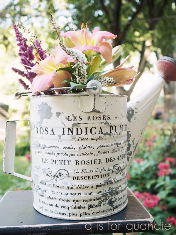
I had this bottom section left over after I used the top section on a watering can.

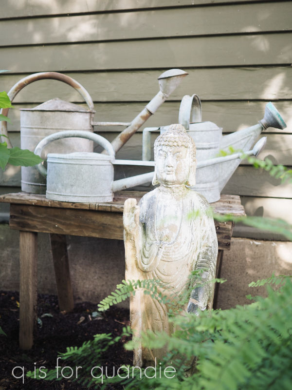
If you’re getting that weird déjà vu feeling, that’s because I’ve done something similar before.  I used the top half of the transfer on a watering can, and then the bottom half on the ceiling fan light fixture in my piano room.  Back then I sold the watering can.  Later I realized that I wanted one like it for myself.  So I ordered the transfer again specifically to use it on one of my watering cans, another non-collection of mine.  Not only do I have some unpainted versions displayed outside …

But I also have a few painted ones in the pantry.  See them there up at the top?

One of them is this pretty blue one that I painted using Homestead House milk paint in a color called Maritime Blue

And you can barely see it, but the one furthest to the right is white with a red spout.  It has a fantastically chippy finish, and now it also has a transfer …

And this time I’m keeping it!

But I digress.  The real subject of this blog post was supposed to be the step stool.

Even though I didn’t make sweeping changes to the look of the stool, keeping the original black and white color scheme and swapping out the rubber treads for a transfer … I think the difference is night and day.

Don’t you?

As always, thank you to Dixie Belle for providing some of the products used for this project. If you’re looking for Dixie Belle products you can find them here.

And if you are local and want an adorable step stool, be sure to check out my available for local sale page for more details.

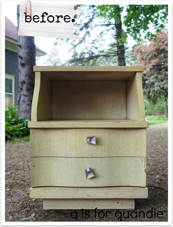
a classic mid-mod blonde.

I bet you are all thinking I’ve completely given up on painting large pieces of furniture these days, and in some ways that is true.  I’ve mainly been working on small items, and when I do work on furniture it’s smaller pieces of furniture too.  Things like the folding chairs I shared a week ago, or the pair of library chairs.

Today’s piece is no exception.  My neighbor, nnK, gave me this nightstand.  She had purchased a larger dresser and the seller gave her this matching piece as a freebie, so she passed it on to me.

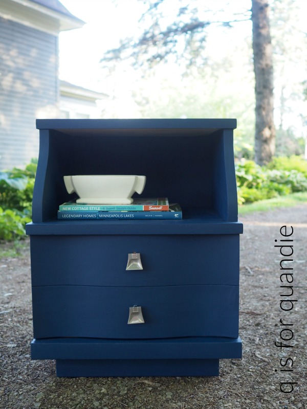
It’s just your classic mid-mod blonde.

It was pretty beat up, which made it a good candidate for painting.  I started out by re-gluing some veneer, patching some spots of damaged veneer using Dixie Belle’s Mud, cleaning it well and then painting it in Dixie Belle’s Bunker Hill Blue.

I finished it with Dixie Belle’s flat clear coat.  Then I cleaned up the drawer pulls with some soap and water and put them back on.

The hardest part of this project was trying to get some decent photos of this color!  I tried going for an industrial vibe inside the carriage house …

Then when I didn’t like any of those photos, I tried taking some outside …

Slightly better?  Maybe?  OK, not really.

What I really need is a fabulous mid-mod bedroom to use for staging this piece, but I don’t happen to have one of those.  So this will have to do.

In addition to staging problems, I was also having technical difficulties with PicMonkey last night while trying to edit these photos.  For some reason I simply could not get all of the fonts to load, including the one I usually use for my watermark.

Ultimately I threw in the towel.  I used a different font and called it good, shut the computer down and went for a walk with Mr. Q.  It was a beautiful evening and I figured it was better to spend it enjoying a walk rather than fighting with my computer.

See?  Like I said, a beautiful evening.  I’m glad I enjoyed it with Mr. Q, even if it does mean a substandard blog post to share with you all today.

As always, thank you to Dixie Belle for providing the products used on this mid-mod nightstand. If you’re looking for Dixie Belle products you can find them here.

And if you are local and like the looks of this piece despite the less than stellar photos, be sure to check out my available for local sale page for more details.