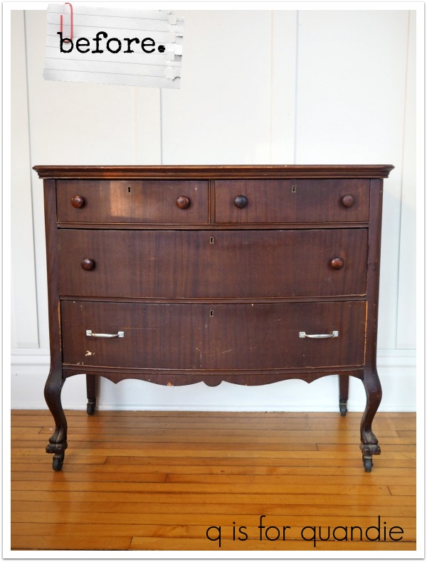
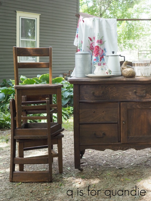
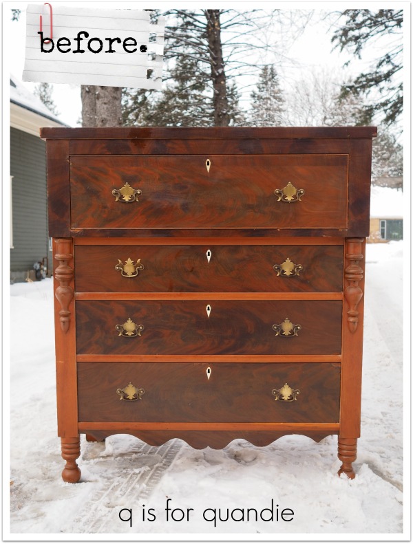
When I was searching out pieces for my Chippy Barn collaboration, I found this empire piece.
In the end I decided to paint this one dark, and instead used the taller empire dresser that I shared last Friday for that project.
I paid top dollar for this piece at $100. I don’t usually spend that much, but this one really appealed to me. Plus, it’s a good sized dresser. Plus, it was in relatively good condition. Plus, it’s a solid, well constructed sturdy piece of furniture. So I splurged.
I suspected right away that those drawer pulls were not original to the piece, they just aren’t the right style. And did any of you notice that just one of them is on upside down? Go back to the ‘before’ shot and see if you can find it. Or maybe 7 of them are upside down and only one of them is right side up, I’m really not sure.
Anyway, when I removed them I found that there were original holes behind them for a knob. Yep, they definitely weren’t original.

So I filled the two newer holes that had been drilled for the pulls before painting.

Here are my tips for filling holes like these. First, place some painters tape behind the hole. This keeps the fill you use from squeezing out the backside of the hole. Next, fill the hole as full as you can with Dixie Belle’s Mud. Let that set up overnight. Once dry, add a layer of spackle over the Mud. The spackle is not sturdy enough for the entire job, but will give a smoother result for the final coat. Once dry, sand smooth and paint.

I challenge you to find those filled holes now!
Once the holes were filled in, I sanded the dresser lightly and then cleaned it with TSP Substitute. I was planning on going with Dixie Belle’s Bunker Hill Blue on this one, but when I pulled it out I realized I didn’t have quite enough paint for this large piece. So I decided to stretch my paint by adding some In the Navy.

Here’s a comparison of the two colors for you.

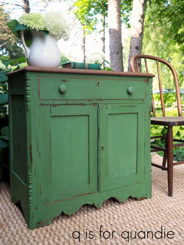
The Bunker Hill Blue is more cobalt, while the In the Navy is a very dark navy almost bordering on black (here is one of my fave pieces I painted with In the Navy). The combination of the two is a gorgeous, rich navy blue. It ended up being the perfect color for this piece.

Oh, hey, did you notice anything else about how I changed up this piece?
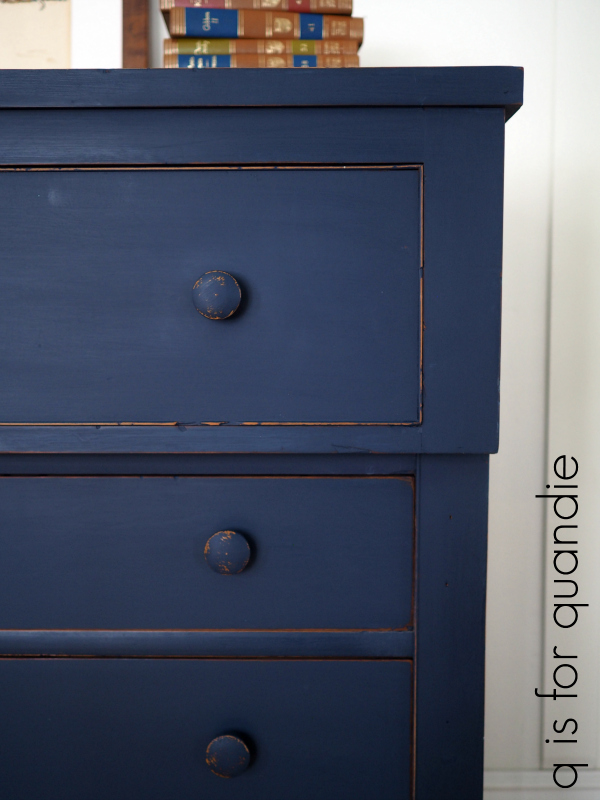
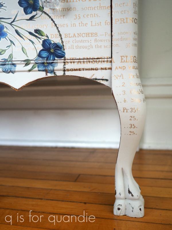
I removed the trim pieces that were on either side of the drawers.
That was totally just a personally preference kind of thing. I didn’t like how ‘colonial-ish’ they looked. I feel like the dresser has a much more current feel without them. I know some of you are going to wish I’d left them on, but I’m making all of the decisions here so they came off along with those classic colonial drawer pulls.
By the way, I replaced those pulls with some simple wooden knobs that I had in my stash.

Also, I finished this dresser with a coat of clear wax. You can see a couple of streaky spots on the top edge of the dresser in that photo above. Those are spots that I missed with the wax and didn’t notice it until looking at the photo. Ooops. That’s an easy fix though, just go over it with more wax.
I got the idea for staging this piece from Flea Market Finds magazine … or maybe it was Country Living … uh oh, I can’t remember. Well, regardless, a recent issue showed a room with shelves that housed the set of classic books that I found in my attic last December. I got these books from my parents and had entirely forgotten about them.
 I must confess, I never saw myself doing anything with these books other than donating them to the Goodwill eventually. But there they were in the magazine, and they looked pretty fabulous in a color-blocking sort of way. So I pulled them out of the attic once again.

You might be wondering why I titled this post ‘the beast’ and really it’s just because this dresser is quite a bit larger than it looks in photos. It is 46.25″ tall x 41″ wide x 22″ deep.
I think this dresser is a great example of how much you can change the look of a piece with just some paint and a hardware change.

As always, thank you to Dixie Belle Paint Co for providing the paint, as well as the Mud, used for this project. Thank you to Fusion Mineral Paint for supplying the clear wax (once again I used their new Hills of Tuscany scented wax).
You can find Dixie Belle products here.
And here is a link to info on where to buy Fusion Mineral Paint products.
If you’re looking for a beast of a dresser in a rich navy blue, check out my ‘available for local‘ sale page.