

Today I’m bringing you another wooden box makeover.
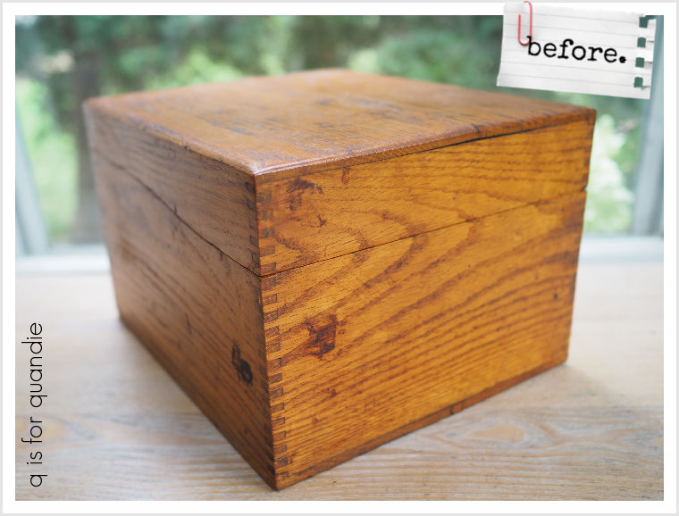
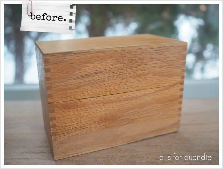
Since there really isn’t any way to tell the scale in that photo, I’ll tell you that this is bigger than your average recipe box. I suspect it was used by a business of some kind.

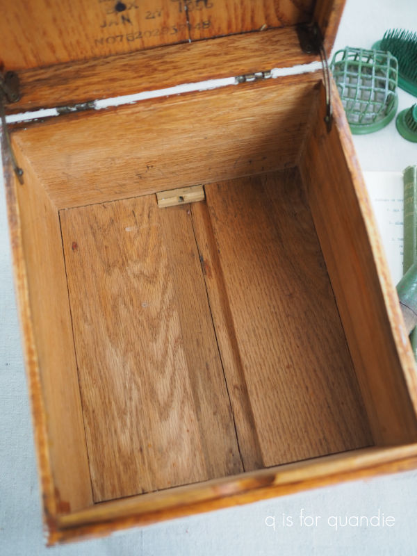
And that’s partially based on this stamp inside the lid calling it a ‘merchants box’, and partially based on the size.
I gave this box a quick scuff sanding, followed by wiping it down with a damp cloth. Then I painted the outside in two coats of Dixie Belle’s Sawmill Gravy.
Then I pretty much lost my head. That’s the best way to describe it.
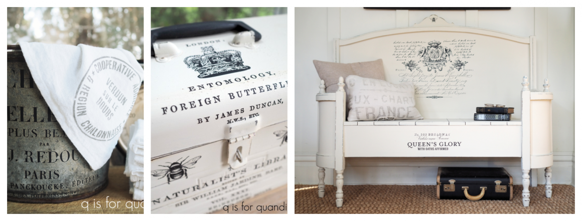
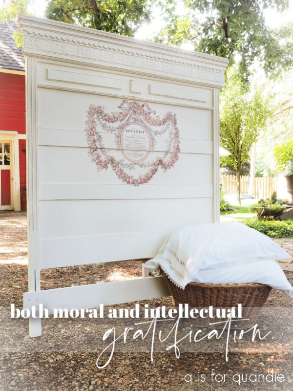
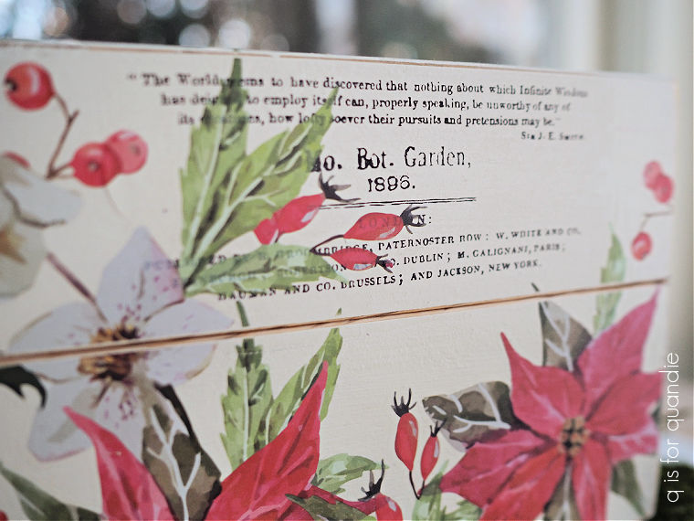
I decided I really wanted to use just the wording from inside the circle of I.O.D.’s The Botanist transfer. You may remember when I used this full transfer on a bed last summer.

I had ordered another one recently, and I just couldn’t resist using the typography portion on this box.

It was a perfect fit.
If I was keeping this box for myself I probably wouldn’t bat an eye over the $25 price tag for the transfer, but I’m planning to sell this box. So I fully admit that it doesn’t make any kind of good business sense to spend this much on a transfer that I used on one measly box makeover. I hesitated quite a bit before deciding I just had to do it. I also think I’ve come up with a use for the rest of the transfer, those floral swags that surround the typography, but we’ll have to wait and see if that comes to fruition.
So will I get my money back out of this one? Probably just barely. I certainly won’t be making any kind of profit. That’s OK with me, but I know many of you guys need to turn a profit, in which case this is not the way to do it.
By the way, yes, I did consider filling that big crack down the middle of the lid.

But I decided it added a little character and age to the box. I’m OK with that.
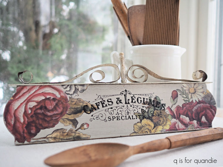
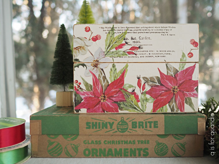
You may have noticed that in addition to the typography, I also decorated this box with some florals from the I.O.D. Floral Anthology transfer.
I filled the front of the box …
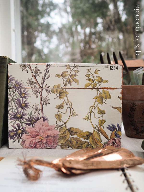
and trailed over to both sides …
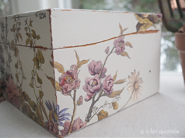
with various scraps of Floral Anthology.
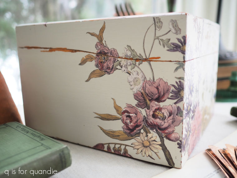
I should also mention that prior to adding any of the transfers, I used the wet distress method on this box. This method involves using a damp rag to rub paint away from edges where the box would have naturally been worn over time. It can be a good alternative to distressing the edges with sandpaper, often looking more authentic. This only works with a paint that is reactivated with water, so mainly chalk style paints.
I did add one little Tim Holtz number transfer to the front of the box as well.
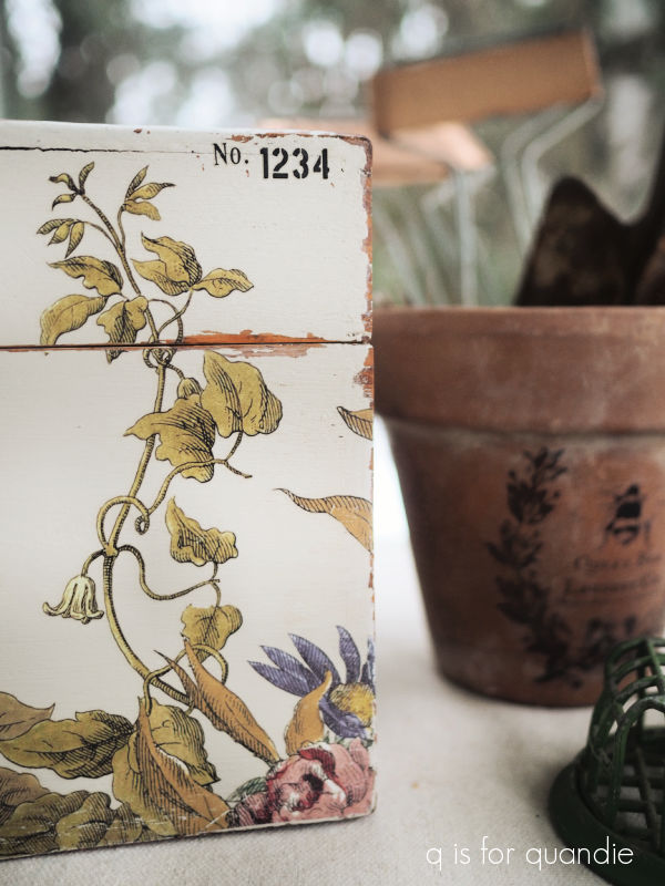
I finished the box with some clear wax both inside and out. I hadn’t painted the inside, but chose to leave it in the natural wood instead. The wax freshened it up nicely.
I should also point out that this box must have had some sort of slider thingie inside originally that had since been removed, leaving a sort of empty track in the bottom of the box.
To cover that up I simply cut a thick piece of cardboard to fit the bottom of the box, and then covered that with some scrapbook paper.
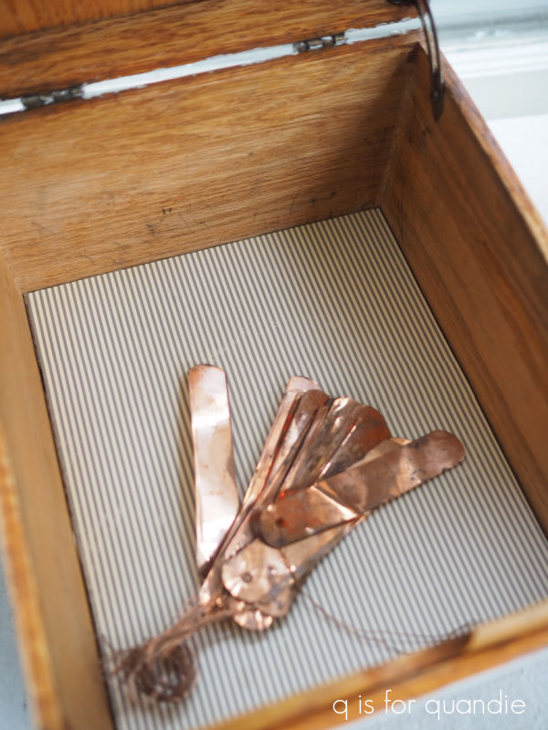
It’s quite sturdy, but also quite removable. So down the road if it gets all grungy from use, it can easily be pulled out and replaced with something fresh.

I took this one into the shop this week, so if any of you locals are interested in it you’ll need to pop into Reclaiming Beautiful in Stillwater.
As for the rest of you, what do you think of this box makeover?

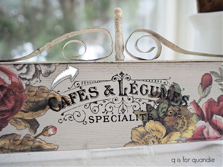
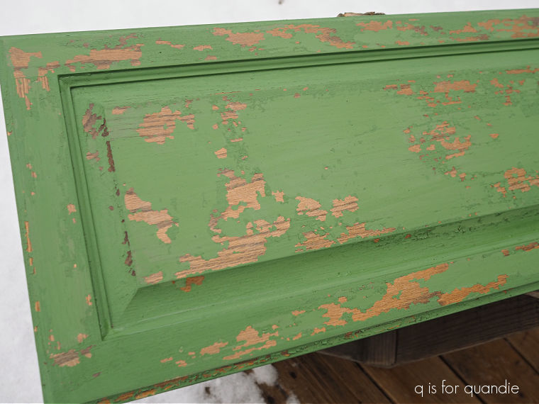
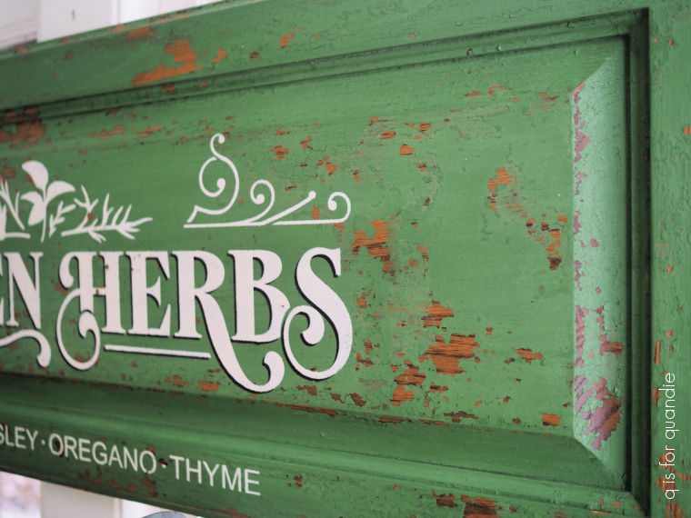
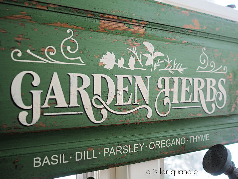
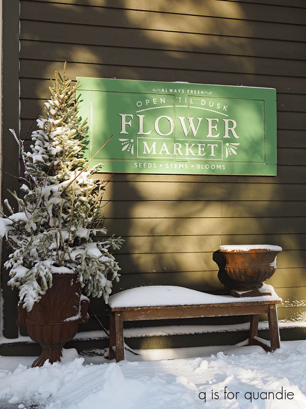
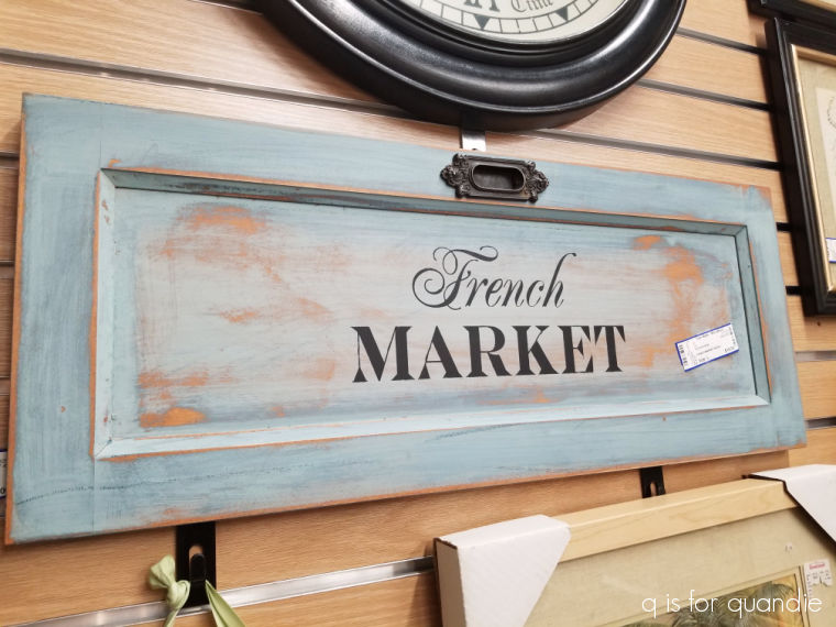 That was one of my first cupboard door signs, but I really don’t remember when I painted it. I couldn’t find a blog post about it, so it may even be pre-blog. Back in 2014 (yikes! 10 years ago!) I put that French Market stencil on A LOT of items including cutting boards …
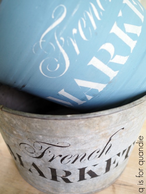










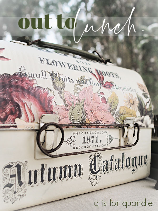
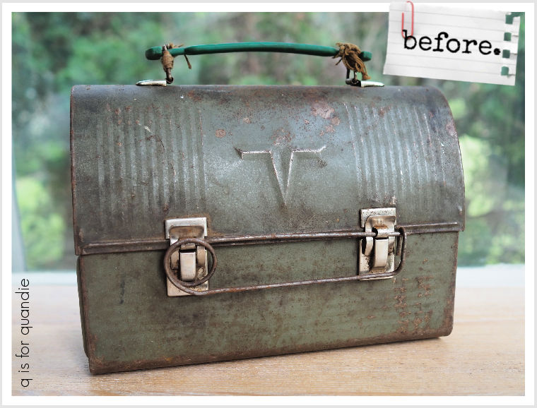


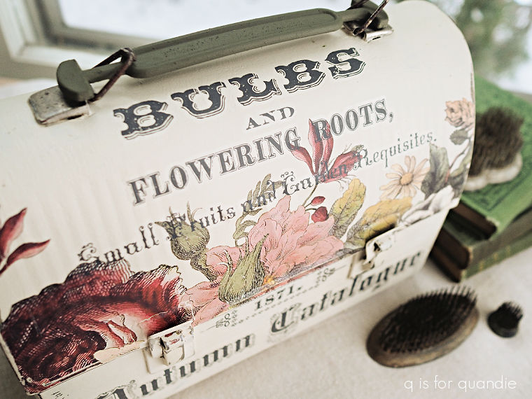


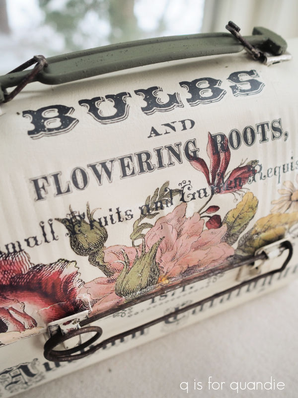











 to
to 


















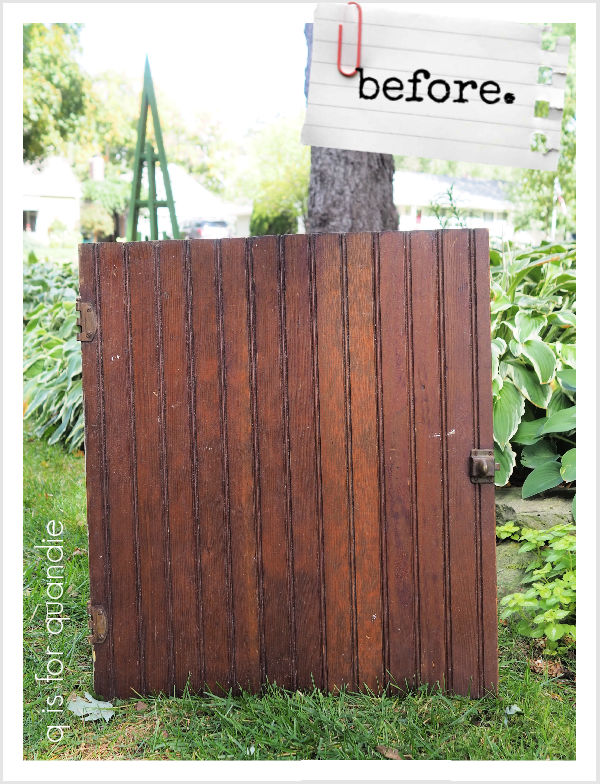





 After giving it a light scuff sanding and wiping it down with a damp cloth, I painted it in two coats of Dixie Belle’s Drop Cloth.







 q is for quandie