Amy made me do it.

A while back my friend Amy (whose lovely home I recently featured) took a quick phone pic in a shop and sent it to me …

amys-pic

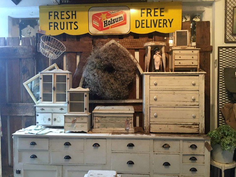
I think you can see why.

It’s a wonder I didn’t hop in my car and head straight for the shop, but she was all the way in Carver (which is on the other side of the cities from me), and she wasn’t 100% sure exactly which shop it was.  Well, I’m sure she was sure while she was in it, but not later when she sent me the photo.

Anyway …

Seeing this collection of all white mini dressers made me fall in love with the idea of unifying my little non-collection this way.  See why I’m saying that Amy made me do it?!

So I got out the Homestead House milk paint in Limestone and went to town.

the-minis

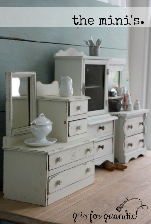
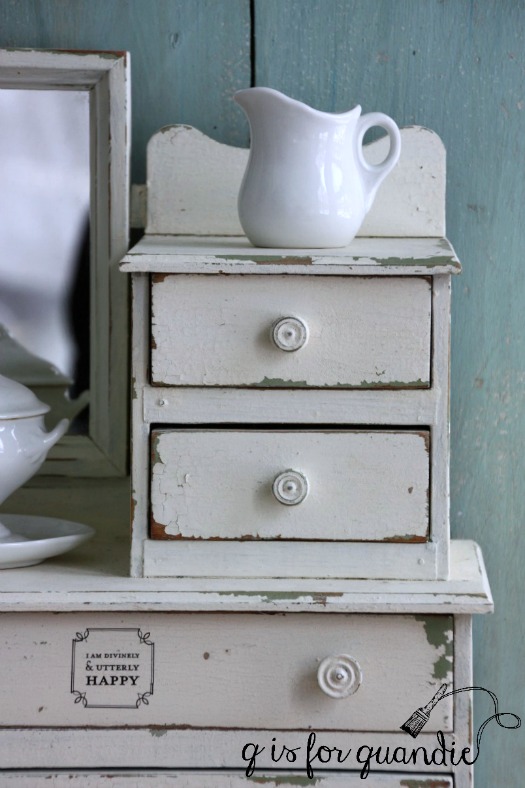
The first mini in the line up was already white.  And it’s painted in Miss Mustard Seed’s Linen.  You can see that the Linen is just a tad warmer than the Limestone.

So I had a head start with this one.  I painted it way back in March 2015 and you can see that post here.  It was a two layer paint job with MMS Luckett’s Green under the Linen.

mini-3-close-up

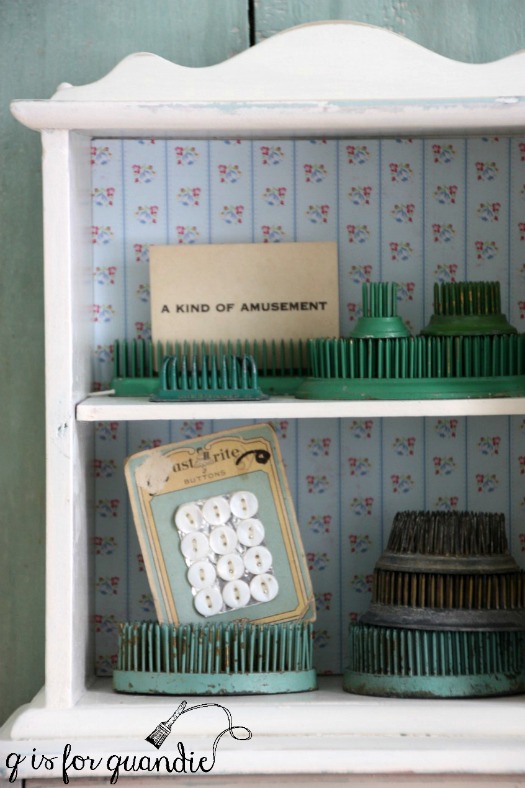
The second piece in the line up, the tall hutch style piece, was one of the first pieces I ever painted in milk paint.  It was in MMS Eulalie’s Sky and you can see it here.  Such a pretty color, but I was ready for a change.

Unfortunately there was a slight mishap while painting it.  I broke the glass!  Ooops.

mini-1

Well, no worries, I just took out the glass and replaced it with screening.  I love the look of screening anyway.

It houses a small non-collection of flower frogs.

mini-with-frogs

I’ve repainted the final mini multiple times!  You can read about the first paint jobs here.  This one is a chippy little thing.  The first paint job chipped off almost entirely.  I really liked the second paint job in MMS French Enamel, but I’m even happier now with my uniform whites.

mini-3

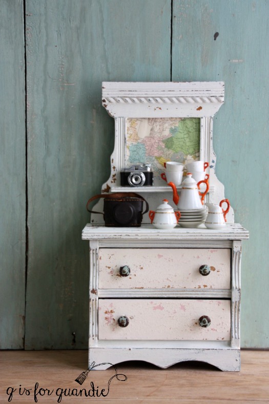
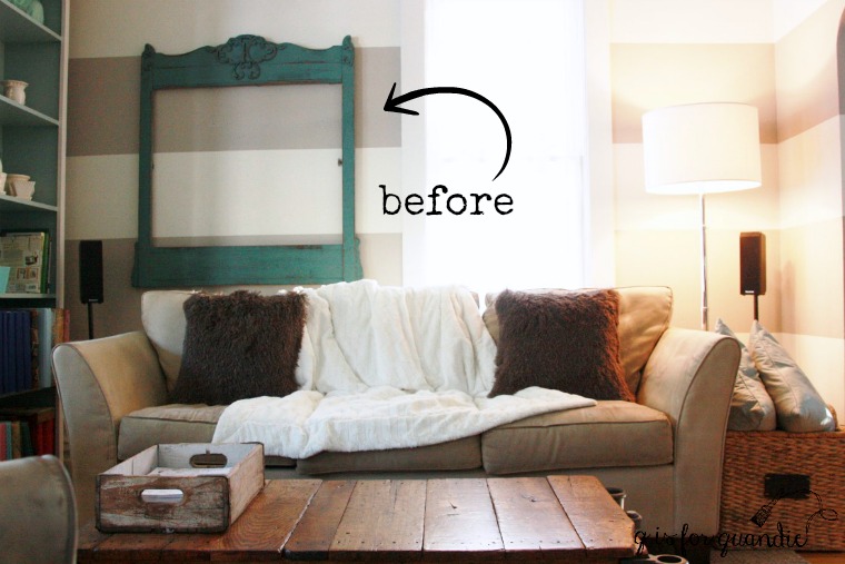
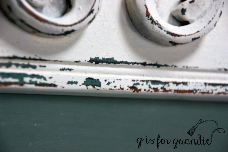
It’s still pretty chippy as you can see.  It was missing the mirror when I bought it and I had some vintage wallpaper in that spot, but I switched it up for an old map.  But I’m kinda thinking maybe I should put a little chalkboard in that spot instead, what do you think?

And did you notice something else?  I now have a tiny mini camera!

mini-2-close-up

Isn’t it adorable?  My niece gave it to me for Christmas.  It even has a tiny leather case.

mini-lined-drawer

It seems to be a real camera, although I can’t imagine where you would get tiny film to fit inside.

I’m quite happy with my trio of white minis.

mini-white-dressers

So thanks for making me do it Amy!

stenciling with chalk.

After I finished the Eastlake dresser mirror frame turned chalkboard and hung it on my living room wall last month, I decided to treat the frame that I removed from that spot in the same way.

I’m sure you don’t remember it, so here’s a ‘before’ photo.

aqua-chalkboard-before-2

I removed this frame from a dresser eons ago.  I painted and sold the dresser, but hung onto this frame and used it as a guinea pig for milk paint.  I originally painted it in MMS Artissimo, then I painted it in MMS Kitchen Scale (shown above).  As much as I loved the Kitchen Scale, I didn’t think it would work well with a black or green chalkboard insert.  So after sending the frame over to Ken’s workshop to have a shelf added, I got out some Homestead House milk paint in Limestone and painted it again.

aqua-chalkboard-angle-1

One thing I’ll note about the Limestone, it looks very creamy once mixed.  You will feel like you are getting a cream not a white.  Once painted and dried though, it is a gorgeous warmish white.  I once again chose not to use a topcoat.  This piece won’t get a lot of handling once it’s hung on the wall so I feel like it won’t need a lot of protection.  I think if I added wax it would bring out the creaminess of the color more.

I really love painting over pieces that are already painted in milk paint because I almost always get some awesome chipping this way.  This piece was no exception.  And the Kitchen Scale is a great color to have peeking through the Limestone.

aqua-chalkboard-chipping

Initially I was planning to paint the chalkboard inset in the same green I used before (you can see that here).  But then I was surfing pinterest and I saw an aqua chalkboard.  Eureka!  My favorite color as a chalkboard!  Why didn’t I think of that?

Since I’ve had such great luck using milk paint as a chalkboard finish, I just pulled out some Homestead House milk paint in Laurentien.  I used two coats, and sanded lightly with fine sandpaper in between each coat to keep the board fairly smooth.  Once dry, I seasoned my chalkboard by rubbing chalk all over it and then wiping it away.

The last step was to add a design of some kind to the board.  I use several different techniques for writing on a chalk board.  Sometimes I free-hand like I did on Debbie’s washboard chalkboard.  Sometimes I print a design on paper, rub the back with chalk and then trace around it to transfer the design onto the board (like I did on Ken’s thank you gift).  But this time I used a stencil.  I had a new one that I ordered from Etsy a while back but hadn’t had a chance to use yet, so I pulled that out.

Using a stencil can be a little tricky, after all they are not designed for use with chalk, so I thought I’d share a couple of tips.  For the fine lines of a stencil, you’ll need to use sharpened chalk, and lots of it.  You can only do a few lines before sharpening again … and again … and again.

I use an old lip pencil sharpener, and once the chalk gets short I can no longer sharpen it successfully.  So I end up with a pile of shorties.  As I said, you will go through a lot of chalk so lucky it’s cheap.

The next tip is essential.  Place your stencil over the chalkboard and use the sharp point of the chalk to fill in the stencil.  Don’t try to capture every detail at this point.  Just get the broad strokes.  Once you have them, remove the stencil and then go back in with more sharpened chalk and add the details free-hand.

In the photo above I have already done that with the upper part of the design, but the last line shows how it looked before I filled in free-hand.  If you have a sort of ‘outline’ of the design, it’s easy to go back in and connect the dots, so to speak.

aqua-chalkboard-design-2

The addition of the little shelf at the bottom of the frame makes this piece perfect for displaying a collection of ironstone pitchers or some other non-collectible.

ironstone-pitchers-2

I hung this chalkboard on the wall in my dining room, just to get some photos of it.  I think this next photo gives a little better indication of its size.

aqua-chalkboard-on-wall

It is 39″ wide by 46″ tall, so it’s really quite large.  It’s not going to stay in this spot though, I have other plans for this wall.  This charming chalkboard is for sale.  Be sure to check out my ‘available for local sale’ tab if you are local and are interested.

But I’m curious, what do you think of the aqua chalkboard?  Too pale?  Or just right?

the bedford dresser.

I know it’s kind of silly, but I actually purchased this dresser because of its mirror.

hopkins-dresser-2-before

I wanted to try an idea I had for the mirror frame and you all saw the results back before Christmas, the farm fresh chalkboard.

farm-fresh-chalk-board-1

That still left the dresser.  It’s just a simple little Eastlake style chest of drawers.

I decided to strip the top and give it a rustic waxed finish, and then paint the rest.  Originally I was thinking white, but when I started to dig through my paint I remembered that Homestead House had sent me some of their milk paint in a color called Bedford.

bedford-3

I’d used their Fusion paint in the same color and I knew it was a lovely warm ‘greige’ so I decided it might just be perfect for this dresser.  Some of my photos wash this color out a bit, but this next one comes closest to representing the color well, although I still think the color a just a bit richer in person.

bedford-angle

I used Miss Mustard Seed’s Grain Sack to pop the carved details down either side of the drawers.

bedford-closeup-corner

You may not have noticed in the before photo, but this dresser was missing one complete handle and part of another.  The amazing thing is that I had two matching handles in my stash of misfit hardware.  What were the chances?

bedford-1

I hadn’t waxed the wood top before painting the dresser and once I had the Bedford paint on it I felt like the top had a reddish brown cast to it.  I didn’t love the way it was pairing up with the Bedford so I decided to try a tip I’d just read about in Miss Mustard Seed’s ‘lookbook two’.  Mixing waxes.

I mixed the Homestead House white and black waxes to create a grey wax.  It worked beautifully on the top of this dresser giving the wood a weathered look with a hint of grey.

bedford-grey-waxed-top

I love how it turned out, it has a sort of driftwood look.

bedford-grey-wax-top-2

This ended up being such a pretty, yet neutral, look.

bedford-dresser-4

What do you think?

bedford-dresser-title

I’m going to go with ‘definite improvement’.

This lovely dresser is for sale.  Be sure to check my ‘available for local sale’ tab for more info.


it’s about time.

It was definitely time for me to get my paint brushes back out and start painting some furniture.

its-about-time

Taking a break over the holidays left me refreshed and feeling excited about getting back into it.

I’m starting small with this antique spool table.

spool-table-before

It was pretty wonky, but I sent it over to Ken’s workshop and he shored it up.  When Ken shores up a piece of furniture, he likes to take it apart first and then put it back together using fresh glue.  When he was disassembling this one, he found this old nail holding the top on.

nail

I always get a kick out of it when Ken saves these sorts of finds and leaves them for me with little notes (sometimes he even types them up on an old portable typewriter).  He knows I am fascinated by these sorts of details.

I think the age of this square nail gives some indication of how old this little table is.  I’m calling it a ‘square nail’, but if you look closely it’s actually rectangular.  Truly square nails were used prior to 1800.  Rectangular nails were used from 1800 – 1880 (Chervenka).

I found a very similar table online that is dated 1840 – 1860 (and the price tag is $1,295, bwa, ha, ha, ha).  The expensive antique has some finer details than my table including some hand cut dovetails, but the style is very much the same.

Given all of that, I wanted to give this table a paint job that would feel original and of the right period for its age.  For me that means milk paint.

Milk paint has been around for thousands of years, even some early cave drawings were done with a form of milk paint; a mixture of milk, lime and natural pigments.  Oil paint was developed in the early 1400’s and became the more popular choice of paint in medieval times (Rodgers).  However, during the French Revolution (late 1700’s) some of the ingredients of oil paint became hard to find which led to a resurgence in the use of milk paint.  The various French recipes for milk paint then made their way to Colonial America and became very popular (Candee).  Had this table originally been painted, it likely would have been painted in milk paint.

Fortunately, we don’t have to make our own milk paint with a recipe these days, we can just buy the powder, mix it with water and get painting.

black-table-1

Just before Christmas the lovely people at Homestead House offered to have Santa put some of their new black wax in my Christmas stocking.  I asked them if Santa could throw in some of their Coal Black milk paint too because I had this project in mind.

Since this table was so dark to begin with, I knew I could get away with just one coat of black milk paint.  It could not have been easier to paint this table!  Once the paint was dry, I sanded lightly.  Then I used the painters tape trick to force some chippy spots.  Next I added a coat of black wax.

black-table-close-up

The Homestead House black wax is so creamy, it goes on quite easily.  And it has very little smell.  This is so important to me when I’m working inside my house during a Minnesota winter.  You can’t be opening up a window to air the place out when it’s below zero outside!

black-wax

I like to use a brush to apply wax when I’m working with spindly pieces (like the legs on this table).  It’s so much easier to get the wax into all of the crevices with a brush.  I have a brush devoted to black wax, another for clear wax and a third for white wax.  You can clean your wax brushes with soap and warm water, but I’m a bit lazy for that.  I’d rather just have three brushes!  I’ll admit I don’t wash them after each use, but I do clean them once or twice a year.

I apply the wax with the brush and then remove any excess using an old black t-shirt to avoid leaving any light colored fibers behind.  The black wax deepens the color of the black milk paint a bit.

black-table-3

I had to discard the knobs that came with the table.  They were metal and one of them was badly misshapen.  No loss really, they were pretty blah.  I replaced them with two of the knobs that I picked up at the thrift store a couple of weeks ago.

black-table-knobs

Along with a few vintage clocks, I used my painted books to stage the table.

black-books

Who remembers back when I painted these?  It was way back when my blog was practically brand new.  They are also painted in black milk paint (Miss Mustard Seed’s Typewriter).

baby, it’s cold outside.

I had some fun working on a blog post for Reclaiming Beautiful last weekend.  The owners, Monique & Susan, wanted to pull together a hot cocoa bar in the shop.  With the ice castle opening up in Stillwater this week, they want to encourage people to stop in after visiting the castle and warm up with some free hot cocoa!

So I whipped up a couple of chalkboards to use in the photos for their blog (and they will be for sale there as well) using a design I downloaded {here}.

baby-its-cold-outside-2

I liked the design so much that I decided I needed it on the chalkboard chair that hangs in my kitchen.  And since the chair hangs right next to my Keurig, the arrow even pointed in the right direction.

I keep lots of hot chocolate on hand for my Keurig because my sister and niece don’t do coffee.  We’ve also found a pretty yummy hot apple cider that we like this time of year.  I keep my k-cups in this adorable faux vintage rack that I purchased at Reclaiming Beautiful last year (by the way, they have another one of these in the shop now).

So although we are expecting a high of only 1 degree today here in the Twin Cities, it’s easy to warm up at my house!  Just pop your beverage of choice into the Keurig.

Be sure to head over to the Reclaiming Beautiful blog and check out my post there.

window-bar-4

a crafty washboard chalkboard.

crafty-washboard-chalkboard-title

Remember the really cool vintage washboard that I picked up last summer at a garage sale?

washboard-before

Well, turned out that my sister really, really loved it.  And she wanted it turned into a chalkboard for her craft room.  Even though I had purchased it to hang in the Q Branch, I do already have one on the wall in there.  The one I have is not suitable for a chalkboard, but I definitely don’t need another chalkboard in that room.

So … this way cooler washboard had to go to Debbie.

But first I sanded the wood where the chalkboard would be to make it nice and smooth, and then I painted on a couple coats of Rustoleum’s black chalkboard paint.

craft-room-chalkboard-close-up

I added a little craft-y title just in case she doesn’t get around to writing anything on it right away.

crafty-washboard-chalkboard

Now it will be the perfect addition to her craft room.

craft-ribbon

craft-table

changes in attitudes.

I took off for a weekend last month just to try and recall the whole year.  All of the places and all of the faces, wonderin’ where they all disappeared. – Jimmy Buffet

Jimmy Buffet didn’t ponder the question too long, he was hungry and went out for bite, ran into a chum with a bottle of rum and they wound up drinking all night.  But I thought I’d ponder it a little bit longer and skip the drinking all night part, reflecting back on the pieces I painted in 2016.  It’s always fun to look back and remember some favorites.

I painted the book page dresser way back in January 2016.

book-page-collage

It’s painted in Miss Mustard Seed’s milk paint in Marzipan.  I used pages from an old Swedish bible to fill in spots of missing veneer and I also used them in the library card catalogue style pulls.  The aged book pages worked beautifully with the almond color of the Marzipan.

The spoon carved dresser that I painted in June definitely belongs on my favorites list for 2016.

spoon-carved-dresser-collage

And hey, it’s also painted in Marzipan.  Perhaps I like that color more than I realized.  I highlighted the spoon carving with a brighter white, and I really like the way it was emphasized in a subtle way.

I have to include the bed bench from Belgium on my list.  Obviously I loved it enough to keep it, so that says a lot right there.

bench-collage

I purchased the bench at a garage sale after my friend Meggan spotted it and sent me a text.  I wasn’t necessarily planning to keep it, and I wasn’t really looking for a bench for my house, but it turned out so fab that I knew it was meant to be.  It’s painted in a mix of Miss Mustard Seed whites (Ironstone, Linen and Grain Sack).

So far all of these pieces have a few things in common.  They are all shades of white, they are all painted in milk paint, and none of them have a significant top coat.  Huh?  What did I just say?  Yep, no top coat.

Last year I played around with not using a top coat over milk paint.  As is true with most things these days, there are all kinds of differing opinions about this.  I’d like to first point out that I am not an expert!  I think it would be more accurate to call me an experimenter instead.  As it turns out, I like the look of the lighter shades of milk paint better without a top coat.  And I’m finding that the milk paint holds up quite well without a topcoat.  It may wear a bit more, but I’m trying to achieve a worn look so that’s a bonus for me.  I will say that if you need to be able to ‘wash’ the surface of your piece you will need a top coat.  I certainly wouldn’t attempt a milk paint tabletop without a top coat.

Not all of my favorites from last year were white though.  This pretty little french desk was painted in a 50/50 mix of Miss Mustard Seed’s Trophy and Schloss.

french-desk-collage

I used a Little Billy Goat goat stick in Gold Leaf to add some gold to the details.

And not all of my favorites were painted in milk paint.  The the l.b.d., or little black dresser, was painted in Little Billy Goat’s Old Pickup.

the-l-b-d-collage

For some reason I didn’t have high expectations for this dresser, but I absolutely loved it when it was done.  The black body paired with the pale wood top and the simple touch of the Parisian address stencil were perfect.

And just in case you thought I’d forgotten to add a little color last year, this pretty little charmer was painted in one of my favorite Fusion colors, Inglenook.

charmer-collage

I painted several pieces in this color last year, it’s such a pretty subtle pale aqua.

So how about you, did you have a favorite among the pieces I painted last year?  Are you a fan of color?  Or white?  Or black?

Here’s to another year and hopefully lots more painted furniture!

testing, 1, 2, 3.

First of all, a big thanks to everyone who left an encouraging comment on my last post.  You all have convinced me to not give up on home improvement projects in 2017, and you’ve reminded me that it’s OK to keep plugging away at them over time rather than feeling like I have to get things done in the blink of an eye.  So maybe you’ll see one of two in 2017 after all!

But in the meantime, I’m getting out my paint and going back to basics with painting some furniture starting with some projects using Homestead House milk paint.  I mentioned a while back that they gifted me with some of what I like to call their ‘house brand’ of milk paint so I’m going to dig in and start painting!

I don’t know about you, but I tend to find that paint colors in real life almost always look a little bit different than they do in photos on the computer screen.  In fact, sometimes they look a lot different.  This is something that I really struggle with when editing my own blog photos; trying to get a realistic representation of a color in the photos.  I work on getting the white balance right so that the color looks true, but I know I sometimes miss the mark.

One of the reasons that I’m so comfortable working with Miss Mustard Seed milk paint is because I’ve used nearly all of her colors before so I know exactly what they look like in person regardless of how they look in photos on pinterest.  I know what shade of blue to expect if I paint something in French Enamel for example, and I know how it’s going to change if I put hemp oil on it instead of wax.  It’s my comfort zone.

homestead-house-milk-paint-1

So when Homestead House asked me if I’d like to try some of their other line of milk paint I got a little nervous.  I didn’t know what these colors were really going to look like in person!

However, as I was going through their color choices I realized that some of the Homestead House milk paint colors are the same as their Fusion colors.  So far I’ve been happy to find that the Midnight Blue milk paint looks pretty much exactly like the Midnight Blue Fusion paint.  And the Limestone milk paint looks pretty much like the Limestone Fusion paint.

But the Homestead House milk paint line also has some really pretty colors that they don’t make in Fusion paint, Cartier, Craftsman, Loyalist

homestead-house-milk-paint-2

I’m sure you can see why these colors appealed to me!

homestead-house-milk-paint-3

Before using a new color on a full sized piece of furniture, I like to mix up a small sample and paint it on a board.  Just so I have a good idea how the color looks in real life as opposed to on a computer screen.

So I mixed up 4 of my new colors to give them a look-see.

homestead-house-milk-paint-colors

1 Craftsman, 2 Upper Canada Green, 3 Loyalist, 4 Laurentien.

Pretty, pretty, pretty, right?  I’ll be using all of them down the road for sure, but my favorite was the Laurentien.  This should come as no surprise to anyone since Laurentien is my favorite Fusion color.  I was so hoping that it would be just as gorgeous in milk paint and I was not disappointed.

So I chose the Laurentien to spruce up the little thrift store chair that I purchased a while back.

thrift-store-chair-before-2

If you look closely towards the bottom of the chair, you can see that it was spray painted.  I’m guessing that the painter was running out of paint, or maybe running out of time, because they didn’t get good coverage there.  I knew that adding just one coat of milk paint would be a quick fix and help even things up.

thrift-store-chair-after-3

I gave this chair a quick pass with some Homestead House furniture wax and added a stenciled number to the back rest just for fun.

thrift-store-chair-close-up

You may be wondering why I didn’t get much chipping when painting milk paint over spray paint, but I actually did get a bit.  You just don’t notice it because the colors are so similar.  If you look closely at this next photo you can see the chipping on the back rest especially right under the ’19.’

thrift-store-chair-close-up

See the paler blue looking spots?  That’s chipping.

Now that I have my color tests done, I’ve picked out colors for several upcoming projects so be sure to stay tuned.

If you’d like to try Homestead House milk paint yourself, you can order the paint as well as the furniture wax directly from their website {here}.  If you are feeling limited by the colors available in Miss Mustard Seed paint, this is a great way to expand your horizons a bit.  If you prefer to buy your paint in person, check out their map of local retailers {here}.  There is a map of retailers in North America, and also links to retailers in the UK, Europe and Australia.  Unfortunately for you locals, I don’t see any retailers in Minnesota yet.  Let’s keep our fingers crossed that we get some soon!

a magic wand.

My sister, my niece and I were out shopping before Christmas and one of the items we came across was a magic wand for turning on the Christmas tree lights.  I have to admit that I kind of loved that idea.  In practice it was a little clunky though.  You had to actually push a button on the wand while waving it in the general direction of the tree to get the lights to come on and obviously the waving part was superfluous.  It wasn’t a real magic wand, but it did make a fun magical sound.

magic-wand

There was a lot of eye rolling taking place between my sis and my niece as I stood there admiring that magic wand.

But seriously, I could really use one.  Except I don’t need it to turn my Christmas tree lights off and on (although that would be handy because every time I lean in to plug in those lights I worry that I’m going to knock a fragile vintage ornament off the tree).

  What I really need is a magic wand for redecorating my house.  I have so many ideas rolling around in my head and only a very limited amount of time (and money) to execute them all.  If only I could wave my magic wand and have a ship lap wall in my bedroom, or wave my wand and have my bathroom repainted in the charcoal grey that I originally wanted instead of the dark greenish gray that I ended up with.  Or wave my wand and have my yellowing maple floors refinished.

But no, we all know it doesn’t work that way.  Unless of course you have an unlimited budget and can pay someone else to do the work for you while you spend a day at the spa.  I assume it goes without saying that I do not fall into that category.

I’ve often written about how much I enjoy blogging, but there is one aspect to it that I find difficult and that is my compulsion to compare my home to other bloggers out there and find it lacking.  Between a full time job, writing a blog (or two if I count the Reclaiming Beautiful blog) and painting furniture there is very little time left over for redecorating my home.

I really struggled with that this year as I was trying to take photos for a “holiday tour” of my house.  I felt like none of the photos were quite good enough.  All I can see as I look around are the projects that I haven’t had time for.  I do OK with a staged shot of a particular spot …

But trying to get a good photo of an entire room escapes me.

ct-kitchen-1

In the end I gave up on the idea of a full on Christmas ‘tour’ of my house.

So for now I’ve decided to cut myself some slack and go back to focusing on what I’m good at, and that’s painting furniture.

What I love about painting a piece of furniture is that I can generally go from conception to completion in about a week.  That’s about perfect for me.

pink vanity angle

I can stage a piece of furniture in any style that currently appeals to me, take some lovely photos of it, and then cross it off my list as ‘done’.  I’m a big fan of crossing things off the to-do list.

wash stand 3

So coming up in the new year on q is for quandie, expect to see more furniture transformations and don’t hold your breath waiting for home improvement projects.  Deal?

let it snow.

let-it-snow-title

I’ve mentioned it once or twice here before, I think, but not only does my neighbor Ken do all of my furniture fixes, but he also snow blows our driveway for us.

Honestly, I have no idea how I got so lucky to have such an amazing neighbor.  Clearly I did something pretty darn fantastic in a previous life.

Ken is generally pretty camera shy.  He does not want to be famous (as if writing about him on my blog would make him anywhere near famous).  But I think I’m safe with this shot of him in action …

ken-in-action

He has a pretty heavy duty snowblower.  He can get our whole driveway in just three or four passes.  He often goes across the street and gets nnK’s driveway as well.

Mr. Q and I always make a point of thanking him profusely, and Ken always underplays it and says it’s nothing.  But it really is something to have a neighbor who just does this for you.  So I try to get him a ‘thank you’ gift each year.  This year I put together a hot cocoa bar so he can go inside and warm up from the inside out when he finishes all of that snow blowing.

let-it-snow-gift-1

I started with a galvanized box that I purchased at a garage sale some time ago.

let-it-snow-before

I taped off a rectangle on the front of the box and painted it with black chalk board paint.   Once dry, I ‘seasoned’ it by rubbing chalk all over and then wiping it off.  Next, I used my ‘cheater’ method of adding some chalk lettering.  I printed a design on paper and then rubbed white chalk all over the back of the paper.  I placed the paper over my chalkboard rectangle and traced around it with a pencil, thus transferring a slight chalk outline to my box.

Then I used a sharp chalk pencil to darken (lighten?) up that outline.  I’ve done that on the ‘Let it’ above, but not the ‘snow’ yet.  Just to give you an idea how faint the design transfer will be at first.  Lastly I fill in the design with sharpened chalk (I use an old lip pencil sharpener to sharpen the chalk).

If you’re one of those people who always feels like your own hand drawn writing just isn’t quite good enough, this is a great way to fake it.

I filled the box with the ingredients necessary for a Peppermint Patty.

peppermint-patty

If you’ve never had one, it’s basically hot chocolate with peppermint schnapps.  You can doctor it up however you wish; whipped cream, marshmallows, peppermint stir sticks, and so on.

cookies

I added these adorable cups that my Carriage House sale co-hostess Sue made.

cups

Now Ken is all set for the next big snow.

let-it-snow-3

And I hope he knows how much we appreciate him!

snowy-carriage-house