spread the sunshine.

Hi guys!  I’m headed up north to my friend’s cabin for the weekend so I’ll be taking a social media break for a couple of days.  Rather than leaving you hanging though, I thought I’d spread some sunshine.

But first, I want to thank those of you who responded to my ‘for sale.’ post on Wednesday.  I’ve got sales pending pickup for almost everything.  The lamp with the green base is still available, and the blue ironing board.  I have some fun ideas for re-working that ironing board, so I won’t be disappointed if it doesn’t sell ‘as is’.  Also, if you didn’t leave a comment to be in the running for one of my ‘hello fall’ book page banners, you can still do that.  Just leave a comment on that post by Sunday at midnight.

OK, moving on.  Back on Labor Day weekend, my sister, my niece and I drove up to Andover, MN to check out some sunflower fields.

My sister-in-law had mentioned these to us the last time we got together, so we just had to check it out.

The team at Fish Sunflowers has been planting random sunflower fields for five years now.  As they say on their website, their ‘goal is to spread joy and provide a free and beautiful place for families, photographers and sunflower fans to gather and soak in the beauty! No politics. No donations or admission fees. Just joy, joy, joy!’

So, all you have to do is show up and enjoy.

This year it looks like they planted 11 different fields around the Twin Cities.  You can find a list of their locations and the dates they are open here.  Although I’ll tell you now, they are all done this year except for the Albert Lea field.  But if you’re local, keep this in mind for next year.  Or maybe you need to take a road trip to Albert Lea this weekend!

We happened to visit on an overcast day, but I always think that’s a good thing for photos.  No glaring sunshine, no harsh shadows, no washed out colors.

I was surprised to find that there were props provided at each of the sites, and in some cases quite significant props.

Both of the fields we visited had a piano.

And one of them had a mirrored vanity.

How cool is that?  Although I have to admit that part of me really wanted to rescue that vanity!

I’m curious, does anyone plant sunflower fields like this where you live?  Or maybe you are a local and have been to one of the Fish Sunflower fields.  If so, be sure to leave a comment and let me know!

Hope I was able to spread a little sunshine with this post.  I’ll be back next week with some more painted projects, so be sure to stay tuned.

for sale.

I’m afraid this post is mainly intended for my local readers, so I hope I’m not annoying those of you who don’t live in the Twin Cities.  But to cushion the blow for everyone else, I have a small giveaway at the end that is open to everyone, so be sure to check that out.

Last week I brought home a few items from Reclaiming Beautiful that haven’t sold there, so I thought I’d take a shot at selling them to my local readers via my blog

First up are the ironing board signs I made late last winter.

The white one in front, 2nd from left, was sold.  The other four all came back home with me.  These are vintage wooden ironing boards with the bases removed (to make them easier/lighter to hang on the wall as signs).

I’m planning to rework the apricot colored one, and possibly also the blue one.  But the black one is available in its original form with that gorgeous french laundry stencil for $40 …

Although the obvious place to hang these would be the laundry room, I think you could also hang it in your mud room, or even a bedroom.

It might also be fun hung outside, on a fence or on the side of your potting shed.

The Laundry Co version (left, below) is also available for $40 (sale pending)

For now, the blue one is also available for $40 so if you’re interested let me know.

If it doesn’t go I plan to re-do it as well.

Next up is one lonely yard stick shelf.  I’d brought in several of them to sell and for some reason this lonely last one didn’t sell.

I use a couple of these shelves in my living room to display my vintage alarm clock non-collection.

This unique shelf can be yours for a mere $12 (sale pending).  I suppose if it doesn’t sell I can always add a third shelf to my living room, which will give me an excuse to look for more clocks!

Next up are some vintage lamps that I had in my pile to bring in to the shop, but then, as I mentioned on Monday, the shop put a moratorium on vintage electrical items.  That’s totally understandable, they don’t want to be liable for faulty electrical wiring.  But now I have a handful of really cool vintage light fixtures that need to find new homes.

Starting with this fabulous green number …

I added some french words to the metal shade, and the green base is fantastic.

The original wiring on this one was definitely a bit dicey though, so I re-wired it.  It’s actually relatively simple to re-wire a lamp like this.  Just a question of taking the lamp apart, removing the old wiring, feeding new wiring up through the stem, and re-attaching everything.

It works great now and is perfectly safe …

This lamp is available at $22 for anyone local who can pick it up here at my house.

Next up, another vintage desk lamp.  This one is a traditional brass desk top lamp …

This time I added a fun Tim Holtz metal tag to the shade.

Although vintage, the electrical cord looks to be in good condition.  No fraying or cracks.

The lamp works well, and it provides a nice downward beam of light perfect for working at a desk.

This lamp is available to anyone that can pick it up for $20.

And finally, we have this little beauty.

This one also has its original wiring, which looks to be in good shape.

I tested this lamp as well and it fired up perfectly.

This one can be yours for $15.

If you are local and interested in any of these items, please email me at qisforquandie@gmail.com.

OK, so as promised, I’ll wrap this up with a little giveaway.  I also recently came across four of my old ‘hello fall’ book page banners that didn’t sell in previous years.

You can drape them just about anywhere to add a little Fall decor to your space.

So I’d like to give them away.  And they are super easy to ship (unlike lamps and ironing boards), so this giveaway is open to anyone.

The rules:  to be eligible to win today’s prize leave a comment on this blog post.  Your comment must be left on the blog, not on Facebook or Instagram.

I will randomly draw the name of four winners of ‘hello Fall’ book page banners from all of the comments left on this post by Sunday, September 20 at the stroke of midnight (U.S. Central time).

The fine print: no purchase necessary, you must be 18 years of age or older to win, void where prohibited by law, the number of eligible entries received determines the odds of winning, approximate retail value of prize is $8, if the prize is not claimed by Sunday, September 27 , another name will be drawn at random to win, blah, blah, blah.


lowry hill & east isles.

It has been a weird summer, right?  No pool days at my bff’s (she lives in an apartment complex that didn’t allow residents to invite guests to the pool this summer due to COVID).  No concerts in the bandshell at my local park.  No trips to the zoo.  No state fair. But I think the biggest change for me this summer was no neighborhood garage sales.

Usually my calendar is filled with neighborhood sales from early May through the end of June, and then again for most of August and September.

But COVID put an end to large gatherings this summer, and that meant most neighborhoods didn’t have their organized sales.

Sure, I found a few random sales, like the back to back barn sales we stumbled across back at the end of May.

But I’ve really missed my neighborhood sales, especially those in Minneapolis.  My sister and I just love going to those neighborhoods and having an excuse to wander around and admire the houses.

So when my picker first mentioned to me that the East Isles & Lowry Hill sales were taking place this past Saturday I was super excited.  But then the temperature took a nose dive and rain was in the forecast for Saturday morning.  I have to admit, I was ready to just skip it.  But my sister was more than willing to give it a go and her enthusiasm was contagious.  So she picked me up at 8:30 and we headed out.

As we were driving in to the city, there were low hanging clouds obscuring the tops of the high rise buildings, but it wasn’t raining so that was a plus.  As we headed towards the Hennepin Ave exit, my sister and I both remarked on how much we’ve missed going in to the city this year.  Between COVID and social unrest, this has been a rough summer for Minneapolis and we have pretty much avoided going there.

But it felt so good to be back, even if the sky was a bit cloudy.

There were plenty of people out and about enjoying the sales, the only obvious difference this time was that almost all of them were wearing masks.

Once again my sister and I had fun picking out our favorite houses, you know, the ones we would buy if we won the lottery.

I love the cottage appeal of this one.

My sister would love to have the amazing lake views from this one.

But, the reality is that neither of us is likely to ever win the lottery (especially me since I don’t even buy lottery tickets), so we just have to admire these gorgeous houses from the sidewalk and then buy their cast off items at their garage sales.

I came home from the sales with a few goodies.

There seems to be a seating theme.

All four of the wooden options (firehouse captains chair, bench, piano stool and small oak chair) are going to be transformed with paint.  I’ve already cleaned up the kid-size white metal chair and added a little something to the back …

How cute is that?  And it would work inside the house, or outside in the garden.

I’ll be taking this in to Reclaiming Beautiful, unless one of you locals want to snatch it up first ($28).

I’m starting to think ahead to Christmas (I know, it’s too early, but I have to plan ahead if I’m going to have things ready).  The smaller wooden chair is probably going to get a Christmas look similar to the chairs I did last year …

I also purchased this brass horn …

with the intention of adding it to the pile of similar pieces I purchased last year and used to decorate my Christmas tree.

And isn’t this tiny wooden sock stretcher totally adorable?

I’m trying to decide whether or not to paint and stencil it like the larger ones I did last year …

Coincidentally I just ordered some mini-stencils that would be perfect for the job.

Buying the footed ironstone bowl was a no brainer.

It’s the perfect size to use for fruit on my kitchen counter.

I also snagged a few old buckets, two enameled and one galvanized.

I’m not sure if these will be saved for next spring to be marketed as planters, or if I’ll come up with something for the holiday season.  They would be great for containing small evergreen trees like this example from pinterest, wouldn’t they?

So maybe they’ll make their way into the shop before the holidays.

I’ve saved find of the day status for a pair of light fixtures (just one of them is pictured below, but there is another).

The funny thing is that I almost didn’t even buy them.  Reclaiming Beautiful recently decided to no longer carry vintage electrical fixtures, so even though I thought these fixtures were too good to pass up at $5 each, I knew I wouldn’t really have a way to sell them on.  I was literally getting back in the car when I decided I just couldn’t leave them behind.  So I went back and purchased them.

I think I’ll keep them for my three season porch.  We need some reading lights out there and these will be perfect.  I’m also contemplating making over my home office (a.k.a. the Q Branch) this winter, and these lights might be perfect for the look I’m envisioning for that space.

Unfortunately, I think this might be my one and only neighborhood garage sale post for 2020.  Next weekend I’m heading up to my bff’s family cabin, and then the next thing you know, it will be the end of September already.  Let’s hope that the 2021 garage sale season is back to normal … or at least the ‘new normal’ that everyone keeps talking about!

upgraded seats.

My picker has been finding some fun things for me lately including this old school chair and stool.

These two pieces have a few things in common.  They both have blonde colored wooden seats.  They both have unattractively colored metal legs.  And they were both in pretty rough shape.

So I knew right from the start that I would paint both of them entirely, including the metal legs.

I started with the stool first.  I sanded the wooden seat and then cleaned everything with some TSP substitute.  It looked like this stool may have been in someone’s workshop, and I just wasn’t sure if there were any oily residues on it that might resist paint.  I like to use a grease cutting cleaner in these cases rather than my normal plain ol’ water.

Next I pulled out The Gulf from Dixie Belle Paint Co.

Isn’t that just the most delicious aqua?

I painted the entire stool, legs and all, in The Gulf.

Once dry, I added another snippet from the IOD Label Ephemera transfer to the seat.

By the way, in case you are keeping track, so far I have used this one transfer on 7 pieces (the medicine cabinet, the folding chair, a painted pumpkin, a wooden box, a mirrored box, a recipe box, and now this stool).  The funny thing is that I mishandled the transfer when I first took it out of the tube and ended up ruining a section at the top (it stuck to itself), so I could have gotten even a couple more projects out of it if I hadn’t done that.  I still have a couple of small pieces left too.

Once the transfer was applied, I used clear wax over the entire stool.

Next up is the school chair.  I had some Chalked spray paint in Charcoal left after painting the table I shared a couple of weeks ago, so I started by using that on the legs.  I thought it would work well paired with Dixie Belle’s Sawmill Gravy on the wooden parts, but after getting one coat of the Sawmill Gravy on I really didn’t like the two toned look.  So I pulled the spray paint back out and painted over the Sawmill Gravy.

Then, I was stumped.  The chair was a perfectly blank canvas with the solid dark grey color on it.  I debated adding a grain sack stripe and stencil (like I did on this one), I also considered painting a union jack on the seat (maybe in grey and mustard like I did on this school desk), but that is a lot of work and I didn’t think this chair was worth the effort.  I even went through all of my re.design with prima transfers looking for one that would be perfect on the chair, but I didn’t think any of them were quite right.

Finally I went through my stash of stencils and came across my notice of decommission stencil from Maison de Stencils.  You may remember that I used it last October to create a sign …

The stencil was the perfect size for the chair.  I masked off the border on the design, since I was placing part of it on the chair back and part on the seat.

I love the way it turned out.

I used Dixie Belle’s Putty to do the stenciling.  Once it was dry, I sanded over everything to give it a worn appearance.

Then I used clear wax to finish.

So, what do you think of my upgraded seats?

I took both of them in to Reclaiming Beautiful this week, so if any of you locals are interested you should head to Stillwater and check them out!

I also brought in the notice of decommission sign because I never managed to get it there last year.  You’ll also find some of my painted pumpkins at the shop …

And my Farm Life cupboard door signs …

And the mirrored box …

And the boxes …

And the camp stool …

In other words, a whole bunch of stuff!

painted pumpkins.

I have mixed feelings about the color orange, how about you?

I love wearing it.  Over the years, some of my favorite articles of clothing have been orange.

I also tend to like orange foods.  Pumpkin, sweet potatoes, carrots, oranges, Dreamsicles … all good.

But I’m not a big fan of decorating with orange for fall.  At least not inside the house, outside might be a different matter with all of those beautiful fall colored leaves accented with some orange mums or pumpkins.

But inside, I want to go in a different direction so I decided to paint up a few pumpkins to match my decorating style a bit more.  I actually purchased these faux pumpkins last year after the fall season when they were 75% off.  I was thinking ahead for once!

I decided to give these a base coat of grey primer spray paint because I felt that would be easier to cover with my Dixie Belle colors than the orange.  Once I had them fully coated in the primer, I painted each one a different color.  I used Dixie Belle’s Sea Glass, Sawmill Gravy, Drop Cloth and French Linen (from left to right).

Next I added some transfers to each pumpkin.  This one got some bits from the IOD Label Ephemera transfer …

A couple of them got Classic Vintage Label transfers from re.design with prima …

and this one …

And this one got a section from their Paris Valley transfer …

Once the transfers were in place I pulled out some of my metallic waxes from re.design with prima to add to the pumpkin stems.

I used Eternal, which is a brighter gold, on two of them …

And I used Bronze Age on the other two, which is a little more subdued.

So, how about you?  Do you prefer a more traditional approach to decorating with pumpkins in the fall?

or would you be happier with something a little bit different?

You can find a recap of my less traditional fall decorating projects from previous years here.

As always, thank you to Dixie Belle Paint Co and to re.design with prima for providing the products used for today’s project.

If you’re looking for Dixie Belle products you can find them here.

If you’re looking for re.design with prima products you can find local retailers here, or online sources here.

a folding chair do-over.

Many moons ago a friend of mine gave me a rusty, crusty vintage kid sized folding chair.  I painted the seat with chalkboard paint and recovered the back cushion with stenciled drop cloth …

I tried to sell it at my carriage house sale back then, but there were no takers so I hung it up in my home office, a.k.a. the Q Branch.

A year later I decided to erase that original design on the chalkboard seat and replace it with my Q Branch logo.

It was a fun piece and I had it hanging on the wall for nearly five years.  But recently I took it down to hang something else in that spot and decided to give it a fresh makeover and then take it in to Reclaiming Beautiful to sell.

This time I decided to paint over the chalkboard seat and add a transfer instead.  A couple of coats of Dixie Belle’s Drop Cloth covered up the black chalkboard paint.  What I love about Drop Cloth in particular is that it blends well with other shades of white.  It doesn’t make the old original white paint on the frame of the chair look dingy by comparison.

Next, I cobbled together some bits and pieces from the IOD Label Ephemera transfer …

Once the transfer was in place, I added a quick coat of clear wax over the entire chair.

Finally, I decided that rather than having an upholstered back it might work to use some of the re.design with prima decoupage tissue paper rather than fabric.

First of all, I should explain that the cushion on the back of the seat comes off quite easily, it’s just held in place by a couple of screws.  It’s basically a piece of particle board that had some batting and a piece of fabric over it.  I removed the batting and fabric and then decoupaged the tissue paper right to the particle board using Dixie Belle’s Gator Hide (you can read more details on that technique here).

I did not cut the tissue paper to size before adhering it, instead I left a good inch of so extra all the way around.  Once the Gator Hide was dry, I just ran a sanding block all the way around the edge of the seat back which trimmed off the excess tissue paper perfectly.

The tissue paper I used is called Dark Damask, and it worked beautifully with the rest of the black and white on the chair.

Now that the chair is finished, I’m feeling really tempted to keep it.  It looks awesome hanging on the dark grey walls in my living room.  Then again, maybe I’ll part with it.  I haven’t really decided yet.

I spent a few hours working on some other projects yesterday, so I’ve got a few things coming up for next week.  Be sure to stay tuned!

As always, thanks to Dixie Belle and re.design with prima for providing some of the materials used for today’s project.


ecotherapy.

I had taken a day off at the 9 to 5 job recently to get started on a large cupboard that I want to get painted before the snow flies.  I know, I know, it’s only the beginning of September, I shouldn’t be talking about the ‘s’ word yet.  But our fall weather can be unpredictable.  We might get gorgeous, sunny days in the 60’s and 70’s.  Or we might get this …

And this particular cupboard is too big and heavy to wrangle into the house, so I really need to get ‘er done.

But then my niece texted to ask if I wanted to go hiking with her in Banning State Park.  Not only was it a gorgeous day, but I’ve recently decided to work on getting out more.  In light of the whole COVID thing, I think it’s more important than ever to get out and do the things we can do safely, like hiking in the woods.  Plus, I always benefit from a little ecotherapy.  There is just something about immersing yourself in nature that feels rejuvenating.

So, rather than having a post about a finished project for you guys today, I just have a post about Banning State Park.  For those of you who are local, but haven’t been there (you could have included me in that category prior to this visit), Banning is just north of Hinckley, about a half mile east of I35 N and I’d say it’s worth the drive.

The trails we hiked were mostly flat, packed earth through a lovely, leafy forest.

(that’s my niece, Kris, and her dog, Jade)

But there were a couple of slightly more challenging spots …

There were also significantly more challenging trails that we could have chosen.  For example, the Hell’s Gate Trail.  The map said it was not recommended for small children though, so we chickened out 😉

Instead we did the Quarry Loop Trail which took us past the ruins of the old sandstone quarry that operated in the 1800’s.

We were also hiking along the Kettle River, although we couldn’t often see it well from the trail.

But when we could, it was magnificent.

And even when we couldn’t, the trail was still interesting.

I had read some reviews before we left and the one common denominator in all of them was the mention of how bad the bugs were.  So we came prepared with bug spray, and it was a lucky thing.  The mosquito population was definitely thriving in Banning State Park.

In addition to all of the trails in the park proper, you can leave the park and drive through the town of Sandstone to get to the Big Spring Falls Trail.  It’s a short, easy trail that leads to the Big Spring Falls.

Now, you might be wondering if the water is brown because it’s polluted, but that’s not the case.  The water in the Kettle River is amber colored due to tannins from wetlands that drain into the river.

We were hoping to see some kayakers or canoeists on the river, because this is a popular spot for white water enthusiasts, but no such luck.

We plan to get out and do a bit more hiking before winter, and hey, maybe we’ll even do some winter hiking this year.  I bet some of these trails are absolutely gorgeous in winter.

But in the meantime, I have a couple more days off at the day job this week so maybe I can get that cupboard painted!

an updated antique.

Earlier this summer my friend/picker Sue texted to ask if I wanted to buy a small table that her brother was getting rid of.  Not only was the price right, but her hubby could deliver it right to my door!

And here it is.

Just look at all of that beautiful detail.

But it had been refinished at some point in its life and given a super shiny finish.

As you all know by now, I am not a fan of shiny finishes on furniture.

Although this piece is constructed out of some lovely wood, there was no way I was going to strip the base with all of that detail.  That would have taken much more patience than I possess.  But stripping the top would be totally do-able.  So that’s where I started.

In case you are wondering, I use Citristrip for all of my stripping needs.

I like it because it’s safe for indoor use (although I did strip this particular table outside) and doesn’t have any harsh fumes.

Once I had the top of the table stripped, I then masked it off with newspaper and painter’s tape because my next step was to paint the base.  I took one look at all of that detail and decided spray painting would be my best bet.

I used Rustoleum’s Chalked spray paint in Charcoal.

Here’s something interesting I came across while looking online for a picture of the product to use, I found it at a website selling the paint for $19.90/can.  Yikes!  I buy it at my local Menards where the ‘everyday low price’ is $6.48/can.  I certainly pays to shop around sometimes!

And here’s another tip for you today, I use the Comfort Grip Spray Paint Gun (also from Rustoleum) when I’m doing a lot of spray painting.

It just clips onto the top of the can.  It totally saves your finger from having to press down on that spray button all the time.  That helps me get a smoother result with the spray paint too.

The Chalked paint can be distressed just like any other chalk-style paint.

Sticking with my theme of doing things the easy way on this project, I top-coated the paint with Dixie Belle’s Easy Peasy Clear Matte Spray Wax.

Just spray it on and wipe away any excess.

It worked beautifully over the Chalked spray paint.

OK, so after stripping the table top, spray painting, distressing and spray waxing the base, I pulled out a few options for finishing the table top.

Here’s what each one looks like when you open the can …

I immediately eliminated the Dixie Belle Weathered Gray Gel Stain (bottom) because I wanted a darker gray.  Then I eliminated the Varathane Weathered Gray stain (upper right) because I didn’t love the blue undertone it had.  That left me with Homestead House Stain & Finishing Oil (SFO) in Driftwood (now branded under Fusion Mineral Paint).  I liked the warmer tone and darker shade of the gray in the Driftwood.

That is just one coat of the SFO.   This product is meant to be applied in several light coats.  Each coat progressively adds a little more color, durability and sheen.  But in the case of this table, I really liked the color after just one coat so I left it at that.  I could have added a couple of coats of the Natural color SFO over the Driftwood to add durability without adding color, but I didn’t have any of that on hand.

Keep in mind that this is how the Driftwood SFO looks over the wood on this particular table.  It is semi-transparent, so the look will depend a bit on what you’re putting it on.

All in all, I think this gorgeous antique table has been given a totally updated look, don’t you?

As always, thanks to Dixie Belle Paint Co and Homestead House for providing some of the products used on today’s project.

If you are local and could use an updated antique table, be sure to check out my ‘available for local sale‘ page for more details on this one.

dogs in side cars.

Earlier this week I was on my way home from work when I noticed a car pulled over just in front of me.  The passenger had popped his hand out of the window with his phone as if to take a photo.  At first I thought he was taking a photo of me, but I figured that couldn’t be right so I took a look in the rear view mirror.  Just behind me was a guy driving a motorcycle with a side car, and perched in the side car was his dog.  And the dog had googles on!

Now, I didn’t actually pull over to take a photo, but I found a good one of a different dog in a side car to borrow from the web (and I also found out that this is kind of a thing and they make Doggles just for this purpose!)

I had the biggest grin on my face all the way home after seeing that dog.  He looked so blissfully happy riding down the road in that side car with the wind in his fur.

It just made me realize that we all need to take a moment and just enjoy the simple things.  I don’t know about you, but I could use a few more ‘dogs in side cars’ moments these days to remind me of that.

OK, I just had to share that story with you guys.  But now we can move on the official post for today.

In addition to new transfers, re.design with prima also released some new decoupage decor tissue paper designs this week.

‘Huh?  What is decoupage decor tissue paper?’ you ask?

Well, this product itself is not new.  They’ve had these decor tissue papers for a while now, but I haven’t done much with them aside from cutting one up and leaving it loose as a drawer liner.  Basically these are a fibrous textured paper that is thicker and more durable than normal tissue paper, or even just decorative paper.  The feel of it reminds me a bit of dryer sheets, or possibly interfacing material (if you have done any sewing and are familiar with that stuff).  Not only is it harder to tear, but it also is breathable which makes it perfect for decoupaging.  No more dealing with air bubbles!

I decided to finally do a little experimenting with it to see how I liked it.  OK, I’ll be straight with you guys, I didn’t especially love some of the original designs that came out so I hadn’t really felt inspired to work with them.  But I pretty much love all of the new ones that came out this week and that prompted me to get to work with them.

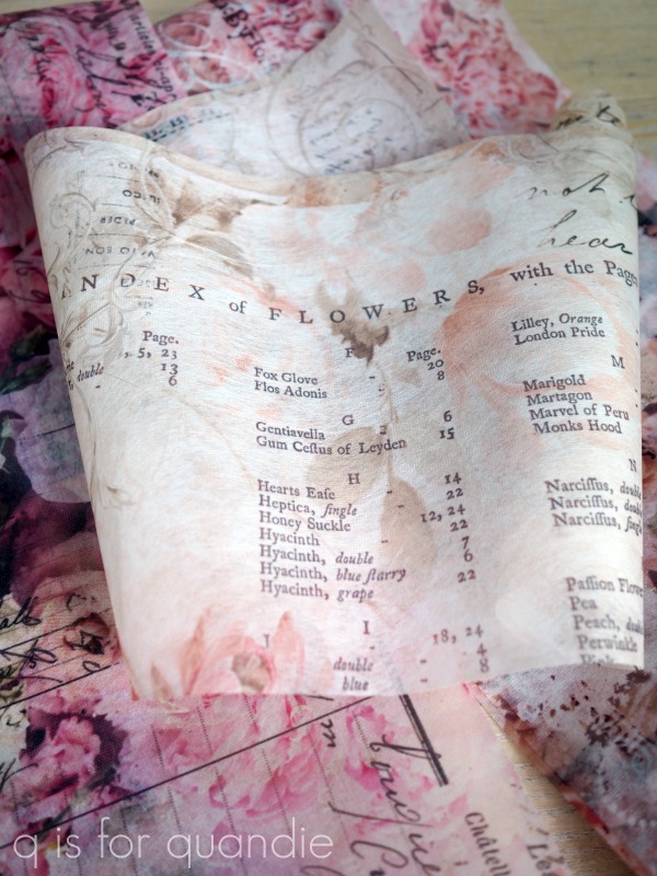
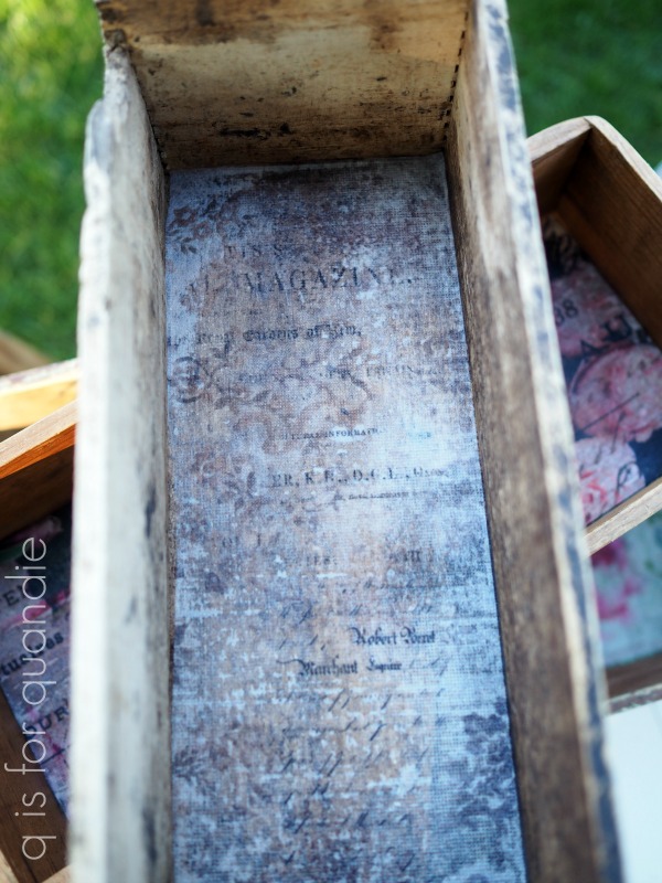
For my first project, I chose a design to use inside the hinged box on the mirrored box I shared with you last Friday.  I went with a design called Floral Parchment and I used Dixie Belle’s Gator Hide as a decoupaging medium.

The first thing you need to know is that this paper is not fully opaque.  In other words, it’s a little bit transparent.  Enough so that the color you put under it will make a difference in the final look.  Here’s how this paper looks over Dixie Belle’s Apricot paint color …

See what I mean?

I’ll share a few more examples in a minute, but first, here is the technique I used to apply the paper which was definitely easy peasy.

When lining something like this, I think it’s easiest to cut the tissue paper to size first.  Then do a test fit by placing it in the drawer dry.  Then pull it back out and brush a layer of the Gator Hide inside your drawer.  Next, place the tissue paper back in over the Gator Hide.  As long as the Gator Hide remains wet, you can maneuver the tissue paper around to get it straight and into place.  The paper is very easy to work with even when wet, I never felt like I was in danger of tearing it or leaving an unwanted crease somewhere.  You can even lift it back up and re-situate it if you need to.

Once you have the paper in place, go back over the top with another layer of Gator Hide.  Then use your fingers or your brush to go over the surface of the paper making sure that it is laying flat everywhere.  This is super quick and simple, nothing at all like trying to get those dreaded air bubbles out when decoupaging with other papers.

Don’t panic if it seems like the paper has gotten rather dark and obscured looking with the Gator Hide.  Once it’s dry it will lighten back up and be clear.

I was so happy with how my first example turned out that I decided to do a few more.  I pulled out some old wooden boxes that my picker found for me recently.

I rather liked the patina on all of them, so I opted not to paint them (for the most part).

Let’s just look at them one at a time to see what I did with them.

First up is the old cheese box.  Here’s how it looked after I cleaned it thoroughly.

I wanted to keep that worn look on the outside, but also make sure the inside was suitably cleaned up and sealed.  So I lined the bottom with the Washed Damask decoupage tissue and carried the final coat of Gator Hide up the sides inside the box.

Now you can store stuff in this box without feeling like it might get contaminated.

Next up was the rather plain box.  Initially I’d thought about painting it, but instead I cleaned it up and then added some scraps from IOD’s Label Ephemera transfer to the outside.

And then I lined it with the Flower Market tissue paper (by the way, this is one of re.design with prima’s older decoupage tissue papers, not one of the new ones).

Last up is my favorite of the boxes.  This box seems like it has been cobbled together from left over bits of wood.  The top slats on the sides had a couple of coats of paint on them (there is a lovely minty green under the brown), while the lower slats must have been from an old packing crate of some kind.

I added the “Specimen Blend” wording, but the “Montreal” was already there.

I did a little more work on this one by adding some old drawer pulls to the ends.

Next I painted just the bottom inside with Dixie Belle’s Mint Julep and once dry, decoupaged some Floral Wallpaper tissue inside it as well.

What I really like about using the Gator Hide as a decoupage medium is that you know it will create a durable surface.  So you could place some potted plants inside without worrying about doing too much damage to the bottom of the box (although I would remove them from the box for watering just to be on the safe side).

I love how all of these projects turned out.  I’ve also seen others doing some really fun things with the decoupage decor tissue, like covering old books or putting it on the sides of drawers.  And of course, you can also put it on drawer fronts too.

Here’s a q-tip for you on that though, keep in mind that these papers come with just two sheets to a package and each sheet is about 9.5″ tall x 30″ wide.  So there’s a good chance you’ll need several packages if you want to cover (or line) multiple drawers.  They are fairly inexpensive at around $8 to $11 per set, but if you need three or four sets that can add up quickly.

But I only needed about half of one sheet for the insides of my boxes.  I could have lined all four using just one set if I’d kept them all the same.  But these re.design with prima papers are all so pretty I couldn’t possibly have used just one!

Now, before you go hog wild and start decoupaging everything in sight, I have to note here that I have no idea how hard it might be to remove this stuff once it is applied.  I suspect it might be quite a mess.  So be sure that you want whatever you are decoupaging to stay decoupaged!  I’m not sure there is any going back.

As always, thanks to both re.design with prima and Dixie Belle for providing the products used in today’s post.

If you’re looking for Dixie Belle products you can find them here.

If you’re looking for re.design with prima products you can find local retailers here, or online sources here.

And finally, I highly recommend looking for dogs in side cars.  They are the perfect way to bring a smile to your face when you least expect it.

some pig!

First up, congrats to Sue P and Jackie for winning the two Dixie Belle problem solver giveaways from last Monday (both winners have been contacted by email).

OK, I think it’s safe to reveal one of the new designs from re.design with prima today.  As you may know, as one of their brand ambassadors I get the opportunity to work with new designs before they are released to the public.  When they send these preview items to me, they come all rolled up together in a tube for a different transfer because the official packaging isn’t available yet.  In other words, I don’t really know what I’ve gotten until I take them out of the tube and unroll them.

Well, as soon as I unrolled the Farm Life transfers I fell in love with the pig.

Even Mr. Q said that was some pig.  It totally made us both think of Wilbur from Charlotte’s Web.  He does look ‘terrific’, ‘radiant’, and ‘humble’, doesn’t he?

You’d think I had a thing for pigs.  This is the 2nd time I’ve fallen in love with a pig.  The first time it was these knob transfers from prima’s Farmhouse Delight set.

But no, I don’t normally especially admire pigs.  Something about these two designs just spoke to me.

Anyway, as soon as I saw the new Farm Life set I knew I wanted to create a quartet of signs made on old cupboard doors.  There was only one problem, I didn’t have any old cupboard doors that were the right size.  So I decided to check out my local Habitat for Humanity ReStore.

I’d never been to a ReStore before, so I didn’t know quite what to expect.  I also was keeping my expectations low because really, what are the chances that I would find specifically what I was looking for at a 2nd hand store?

Well, as it turned out, apparently pretty good.  I found 4 cupboard doors that were exactly the size I needed.

Well, in fact I found 5.  So even though I only needed 4, I bought all five.  I can always do something else with the 5th one.

The prices were right too.  I got all 5 of them for just under $20.

I would have preferred old cabinet doors with several layers of old paint on them, but three of these were unfinished and the other two had a clear poly on them.  And I knew I could recreate that look myself.  I started out with a layer of Dixie Belle’s Cocoa Bean.

I just painted around the perimeter in this dark brown color because I wanted to see just hints of it when I distressed the edges.

Next I added a layer of Miss Mustard Seed’s Milk Paint in Kitchen Scale.  I think this color has a historic feel.  As though these cupboard doors were painted back in the 50’s, and then painted over again later.  Perfect for adding a little age to them.

Finally, I added several coats of Sweet Pickins Milk Paint in Window Pane.

I did get some good chipping, which is what I was going for.  However, I was surprised to find that the paint chipped all the way down to the original finish.  In other words, even the Dixie Belle Cocoa Bean paint chipped off in spots.

But that only happened on the two doors that had started out with a clear poly, so in hindsight that does make some sense.

Once all four cupboard doors were painted and sanded to distress the edges, I vacuumed away any loose paint and then added the transfers.  There are four designs in this set and each one is approx. 11″ wide x 16″ tall.

There’s the cows …

The chickens …

The horses …

And of course, the pigs …

There are some interesting bits of info on each one …

Who knew that the chicken was the closest living relative of the t-rex?

Once the transfers were in place, I added a topcoat of The Real Milk Paint Co’s Finishing Cream.  I used the Low Sheen version this time, but I have used the Dead Flat version in the past and I really don’t see much of a difference between the two.  I like using this product over chippy milk paint because it’s thick and therefore I’m not in danger of getting any runs.

Once that dried, I added some label holders to the bottom of each cupboard door.

I purchased these in sets of 3 from Hobby Lobby for $3.99. (although I’m sure I bought them during a 40% off sale and probably only paid $2.40 for them).

They are technically for scrapbooking and came with brads to attach them to paper, but I swapped out the brads for little tacks to hold them to my cupboard doors.

I filled them with some vintage price tags that I also had in my stash of scrapbooking supplies.

And just like that, I created some unique wall art.

Wouldn’t these doors be fun hung on the wall in a farmhouse style kitchen?

Although I’ve turned old cupboard doors into wall art, you could apply these transfers right to your kitchen cabinets.  They would also be perfect for adding to the cupboard doors on an old hoosier cabinet or hutch.  Or, you could cut up the designs and use smaller sections on canisters.  There are so many possibilities.  What would you do with them?

As always, thank you to re.design with prima for providing the transfers used in today’s project.  If you’re looking for a place to purchase their products, you can find info on online or retail stores here.

I’ve also used products from Dixie Belle Paint Co, Miss Mustard Seed’s Milk Paint, Sweet Pickins Milk Paint and The Real Milk Paint Co today, all of whom have provided me with free products (although I haven’t necessarily kept track of which ones I’ve paid for and which ones were complimentary!)

Finally, these Farm Life doors are for sale locally at $30 each (you must be able to pick them up at my house in a suburb of St. Paul, MN).  I’ll soon be taking them in to Reclaiming Beautiful (the shop where I sell on consignment), but in the meantime if you’re local and need some cute signs be sure to leave a comment or reach out via email at qisforquandie@gmail.com.