A few weeks back I shared the birthday gift basket I put together for my friend Sue.

As I mentioned in that post, Sue has mastered the art of presentation and she always makes up the most amazing gift baskets for me on my birthday, so I knew she would appreciate my gift to her.
So today I thought I’d come full circle and share what she presented to me recently for my birthday.

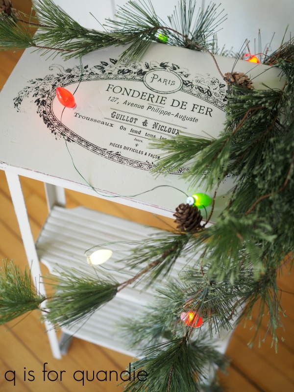
She always leaves her gift in my office at the day job, and this time when I walked in I exclaimed, “it even lights up!”
I didn’t capture it well in these photos, but there is a string of battery operated lights woven throughout. If any of you are putting together holiday gift baskets and you want a wow factor, consider adding some lights!
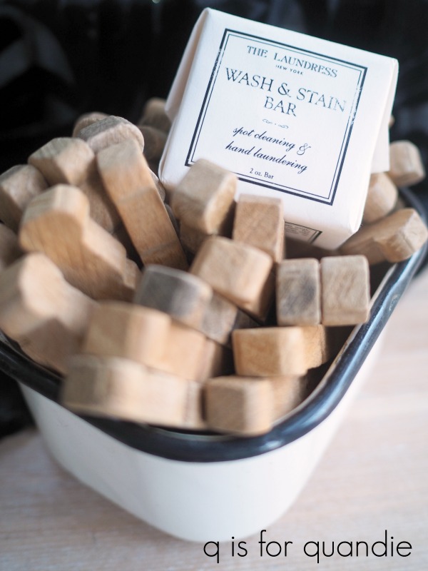
There were all kinds of other goodies tucked inside, like these vintage clothes pins in an old enamelware refrigerator container.
It probably seems silly, but I was really happy to see the soap too.
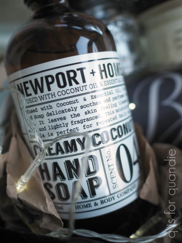
Funny story, last year my sister and my neighbor nnK both coincidentally got me a four pack of this exact brand of hand soap. And that was before COVID and frequent handwashing were even a thing. I had just cracked open the final bottle of that soap a couple of weeks ago, so it was perfect timing to get another!
Sue also threw in a candle from the White Cottage Co.

She and I have both been watching Mary Yoder’s YouTube channel for a while now. If you haven’t seen her, you should take a look. She shares lots of DIY and trash to treasure projects, and she’s very down to earth. She makes a lot of things using a Silhouette machine, so if you’re looking for inspiration on that front, be sure to check her out.
Aren’t the vintage glasses Sue included fantastic?

I feel like one should drink things like a Manhattan, a Rusty Nail or a Sidecar out of these. I may have to give that a try.
There were also a couple of magazines tucked inside the basket.
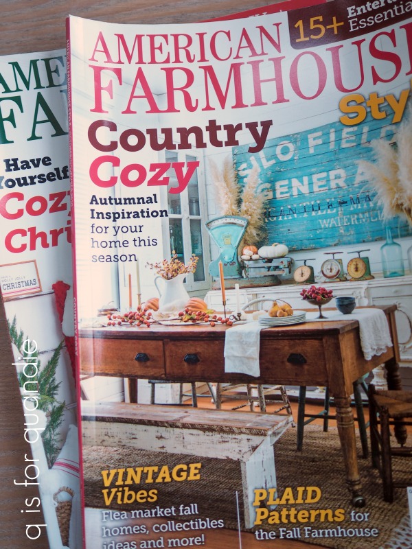
Sue has recently started sharing these American Farmhouse magazines with me, and I really like them. The style is right up my alley, and they are chock full of great decorating inspiration. The amount of content in each issue is almost overwhelming. If you haven’t seen this one, I definitely recommend it.
And of course, no gift would be complete without some wine and chocolate!
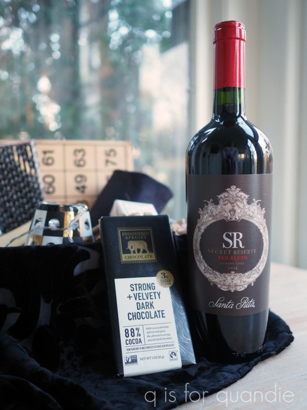
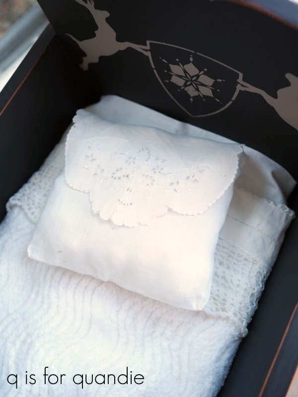
This sweet little ‘believe’ pillow cover was wrapped around the wine bottle. I just added some filler and voila …

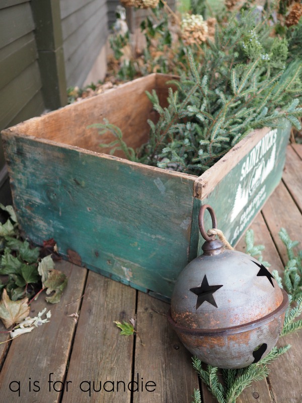
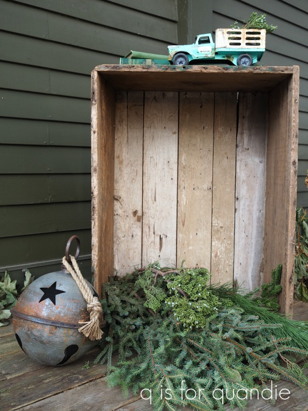
That’s a lotta stuff all tucked into one package! You can see why I so look forward to getting a birthday gift from Sue. There were so many fab things that I can’t even begin to pick a favorite. How about you? What would have been your favorite item to receive?