the star of the show.

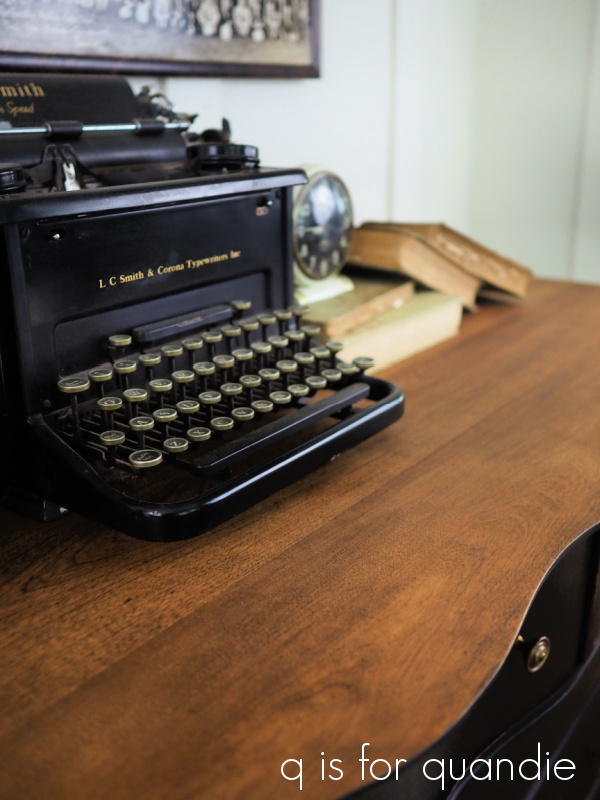
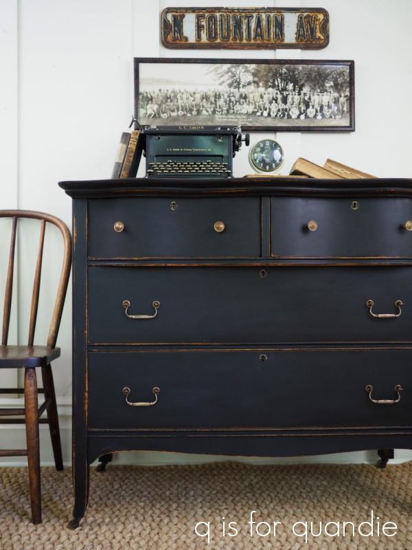
First, an update on last Friday’s Typewriter black dresser. The majority who commented loved the simplicity and predicted that it would sell fast, and it definitely did.  The buyer picked it up yesterday.

In my area, black continues to be an excellent seller, especially black with a wood top.  And I pretty much agree that it’s easier for most people to work a piece like that one into their existing décor.  It’s more of a team player rather than the star of the show.

The decision whether to keep a piece simple, like the black dresser, or add a more dramatic personality is always tough.  But it’s even more difficult when, in addition to selling refurbished furniture,  you are also a blogger.  I’m not only thinking about whether or not a piece will sell, but also whether or not the process of refinishing it will be interesting to my readers.  How bored would you all get if I painted everything black or white with no color and no transfers/stencils/etc?  Yawn.

The other factor is that I refurbish furniture (and other vintage items) mainly for enjoyment.  It’s a hobby for me, not my livelihood.  So I really tend to lean towards deciding what I want to do, rather than what I should do.  Of course I want my pieces to sell (because otherwise what would I do with them?), but that’s not the ultimate goal for me.  For me, the ultimate goal is to take something that was cast off and create something that is beautiful.  And then hopefully it will sell.

That brings me to today’s piece.

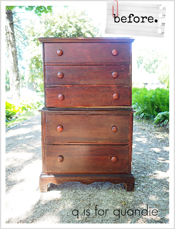
My friend (and former co-worker) Bruce brought this piece to me.  It had been in his cabin up north and wasn’t being used.  Quick sidebar, when he delivered it he shared the video of the large black bear that was roaming around his yard up there with me as well.  Yikes!

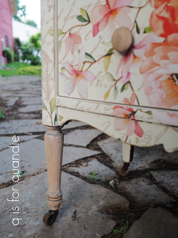
Anyway, back to the dresser.  As you can see, the veneer at the bottom had come off, but Bruce had saved the pieces.  I planned from the start to put a transfer on this one though, and I knew it would distract from any wonky veneer, so rather than trying to re-glue it, I just peeled off all of the veneer along the bottom.  That tends to leave some rough wood behind, so I gave it a good sanding.  Then I stripped and sanded down the front legs, the knobs and the top of the dresser.

Next up after painting the body in Dixie Belle’s Drop Cloth, I used Miss Mustard Seed’s white wax to finish those legs, knobs and dresser top.

I did not get a super perfect result with my stripping/sanding.  Personally, I’m OK with that.  I like a little age to show on my pieces.

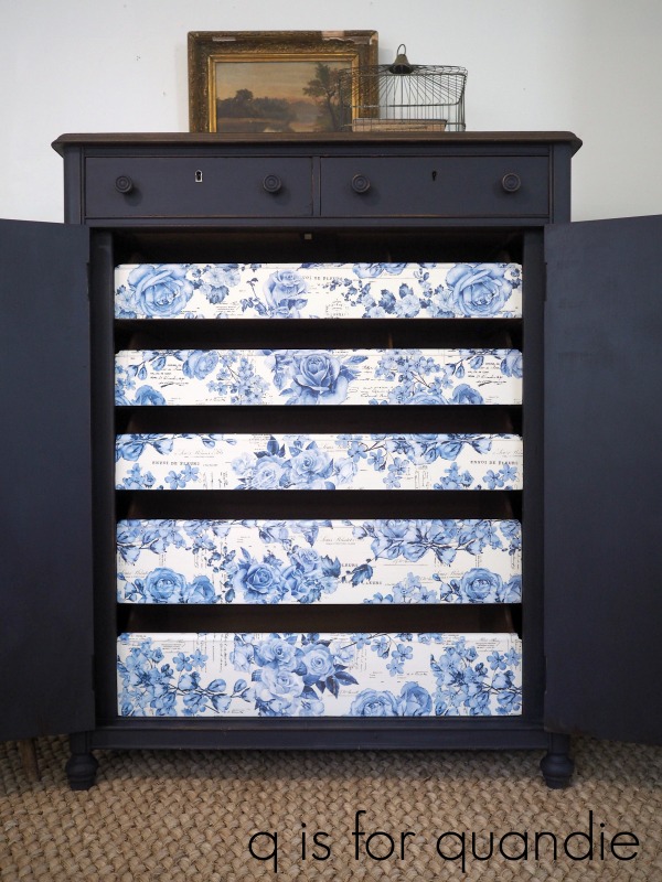
I knew I was going to be using the Rose Celebration transfer from re.design with prima on this dresser, and that the white waxed wood would play really well with the beige background of this transfer.

What do you think?  The knobs don’t quite disappear, but they don’t really distract either.

Next I added the Rose Celebration transfer to the front of the dresser.  For more details on how to apply a large transfer like this one you can check out this post.

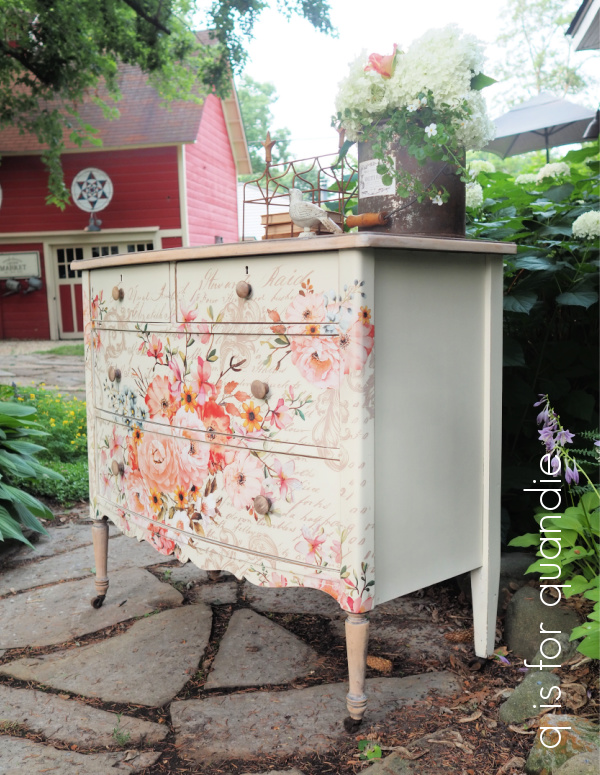
The transfer was a bit larger than the dresser front.  I wrapped it around the sides, and I had 5″ or so left over at the bottom.  I had originally contemplated centering the design both horizontally and vertically, thus cutting off about 2.5″ at top and bottom, but ultimately I decided I liked this look better.

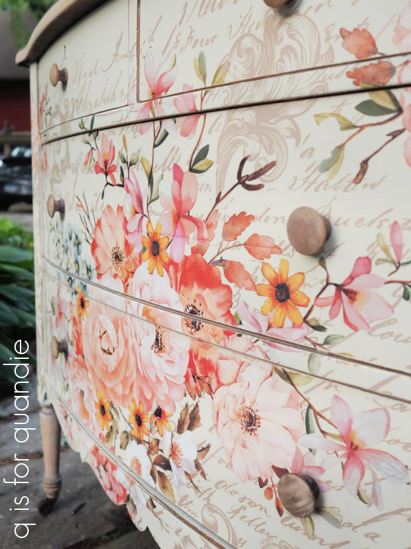
I just love the colors in this transfer, aren’t they pretty?  And the background of script and those swirly thingies (I’m guessing there is an official name for those, but I have no idea what it is, do any of you?), so lovely.

If you look closely, you can see that there are seams where the different pieces of the transfer line up (this transfer comes in six pieces).  I’m not too bothered by those seams, but if you are avoiding the multi-piece transfers because you don’t like the look of the seams, you can mitigate that by trimming off the 1/4″ or so of clear transfer at the edge of each piece before you apply them, and of course, also line up your transfer more precisely than I did.

As you can see, the transfer really disguises the area at the bottom where I removed the veneer.

Once the transfer was applied, I sanded the edges of the piece to distress and then added a coat of clear wax.

I did one final thing before calling this piece finished.  I refurbished the insides of the drawers using Dixie Belle’s Big Mama’s Butta in the Orange Grove scent.

I sanded them lightly, cleaned them well, and then applied the Butta’.  It really freshened up both the look and the smell of the drawers.  This is the first time I’ve tried this on the inside of drawers, and I’ll definitely be doing this more often.  It’s such a simple way to freshen them up.  And you all know that I really don’t enjoy the process of lining drawers with paper so this is a nice alternative.

And there you have it.

The star of the show!

What do you think?  Now, I’ll just have to wait and see how long this one takes to sell.  I’ll keep you posted.

If any of you locals are in the market for a dresser, be sure to check out my ‘available for local sale‘ page for all of the details on this one.

As always, thank you to Dixie Belle for providing the paint and the Big Mama’s Butta used on this project.  And thank you to re.design with prima for providing the Rose Celebration transfer.  Although I am no longer a Brand Ambassador for them, they did give me this transfer for free back when I was.

I made a trade.

A while back Brigitte contacted me and asked if I’d consider making a trade for the coral dresser.  I have done this once or twice before, and I’m always open to at least considering such an arrangement.  Brigitte had a dresser that she’d meant to refurbish herself but had never gotten around to it, how many of us can relate to that?  So she sent me a few photos of her piece and sure enough, it was right up my alley …

before

So she gave me this dresser plus some cash, and she took the coral dresser home in return.

I debated cropping Mr. Q out of that ‘before’ photo, but decided why not be real?  This is the lazy way of getting a before photo.  Why go to all the work of re-attaching that mirror just for a photo?  So much easier to just have Mr. Q hold it in place for the few seconds it took to snap the picture.  Also, although I included the mirror in the ‘before’ shot, I’m not putting it back on.  It is gorgeous, and I will re-do both it and the harp it’s attached to, but I have always felt that dressers like this sell more quickly without a mirror.

And by the way, that tiger striped grain?  It’s fake.  To me it looks like it was stamped on, but I haven’t been able to find any info on how they created this look back in the day.  It must have been a popular technique though because I’ve painted over a few of these faux finishes.

I ended up going with a classic combo on this one.  I stripped the top, re-stained it in Special Walnut, and once dry I added a couple of coats of Dixie Belle’s Flat Clear Coat.

Then I painted the rest of the dresser with Miss Mustard Seed’s milk paint in Typewriter.

I didn’t get much chipping on this piece, and that didn’t surprise me.  The original finish was very dried out, and that usually translates to minimal chipping.  But I did sand the edges quite a bit to create the worn out appearance that I wanted.

After sanding and then wiping away the dust, I added a coat of Dixie Belle’s Big Mama’s Butta.  If wax and hemp oil had a baby, it would be this product.  It’s made with all natural Hemp Seed Oil, Coconut Oil, Beeswax and Carnauba Wax.  It’s much easier to apply than straight up wax, but it’s a bit more substantial than just hemp oil on its own.  I highly recommend using this product over the darker shades of milk paint.

Once I had the Butta applied, I decided to do a little wet sanding with Dixie Belle’s Howdy-Do Hemp Oil over it.  Why?  Mainly because I realized I hadn’t done a super great job of sanding it smooth the first time around.  This was an easy way to smooth out the final finish.  Basically I wrapped some 320 grit sandpaper around a sanding sponge, applied some hemp oil directly to the paper, and then sanded the flat areas with it.  Then I buffed it with a clean, lint free rag.  This gave me a buttery, smooth finish.

I swapped out the knobs that were originally on the top drawers for some that I had on hand that had a little more detail and were in better condition, but I kept the original pulls on the bottom two drawers.  I gave them all a good wash with soapy water, and once dry I added some of the Bronze Age Metallique wax from Prima Marketing to the pulls to brighten them up a bit.

I found it easiest to put on a latex glove and then use my fingertip to apply the wax.  I gave the wax a couple of hours to dry and then buffed it with a clean rag (a.k.a. one of Mr. Q’s old socks).

I have to admit, I’m always torn about producing simple pieces like this.

Should I have added a stencil or a transfer to give it more character?  Make it more unique?  Or is it OK to occasionally just stick with something more simple?

I guess I’ll see how well it sells and keep that in mind for next time.

In the meantime, what do you think?

If any of you locals are interested in this dresser, be sure to check my ‘available for local sale‘ page for more details.

Thanks to Dixie Belle Paint Co for providing the Big Mama’s Butta, Flat Clear Coat and Howdy-Do Hemp Oil used on this project.


the seed tray tamper.

I shared this garage sale find a few weeks ago …

I thought perhaps it was a seed tray tamper, like the one that Monty Don uses on Gardener’s World.

But as a couple of you pointed out, it’s much more likely some sort of trowel and I think you’re right about that.  But I can still pretend it’s a seed tray tamper, can’t I?  And in fact, one could absolutely use it for that purpose.  Especially now that I’ve dressed it up accordingly.

I gave it a coat of Dixie Belle’s Drop Cloth, sanded it back and then added a Classic Vintage Label transfer from re.design with prima.  I followed all of that up with some clear wax.

And voila, a seed tray tamper is born.

While I was at it, I doctored up a couple of old wooden crates that my picker found for me.

This was simply a matter of stenciling them with some garden themed designs.

And now they make great trays for starting seeds in … or for just about anything for that matter.

These items are joined by a vintage watering can that my handyman Ken found while cleaning out his shed.  He was going to just toss it, but thought maybe I might want it.

That was a pretty good bet I’d say.

I added another Classic Vintage Label to the watering can.

I piled all of these things on top of a dresser that my picker found for me last week to get these photos.

She found it at a garage sale near us (we live less than a mile apart), she texted me a picture of it, paid for it after I said ‘yes’, and then I texted Mr. Q to go pick it up.  Talk about team work!

I’ve got two other dressers that I’ll be sharing with you before I can get to this one though, so you’ll have to stay tuned to see how it turns out.

But in the meantime, I’m bringing these some of these items in to the shop where I sell on consignment, Reclaiming Beautiful in Stillwater, MN.  So if any of you locals are in need of a seed tray tamper, be sure to stop in!

mid-season garden update.

For those of you who are gardeners, I just thought I’d check in with a mid-season garden update.  I suppose that early July is not technically the middle of summer, but I always feel like we’re about halfway through our short gardening season on the 4th of July.

I have to warn you up front, this post got long.  I tend to want to share all of the details about every plant, and that’s probably a mistake.  So here’s your chance to just click out of this post and get on with your day if you’re not interested in gardening.  Run now, while you still can!

Although we have lost five trees in the last two years, we still have quite a lot of shade in our yard.  I much prefer gardening in the shade, so I am glad we still have some big maples that block the heat of the sun.

I’ve learned to rely on foliage more than flowers to provide interest in my shade garden although currently there are some Asiatic lilies blooming, and the Evening Primrose is just at the tail end of its bloom time.  A week or two ago there was a solid swath of yellow flowers right through the middle of this garden.

The hostas are still looking fabulous, which is kind of amazing for July.

We haven’t had any hail (knock on wood!) so far this summer, and it has also been quite dry so the slugs haven’t taken over.  I’ve had to do quite a bit of watering, and our lawn has lots of brown patches, but the trade off seems to be no slugs so I’ll take it.  It’s also been a bit warmer than usual for us (although nothing like the heat that has been hitting other parts of the country) so everything is growing like gangbusters.

FYI – I’m fairly sure that the hosta above is montana ‘Aureomarginata’ and it’s perfect for adding a bright pop in a shady area.  Isn’t it gorgeous?

I’m working on a curb appeal refresh in the front and I’m going to share that with you when the Limelight hydrangea is blooming.  But for now, I’ll share the window box.  I try to change up the plants I use in it each year so that I don’t get stuck in a rut.

I absolutely love this combination of plants.  I am relying almost entirely on foliage to provide the color this time around.

I’ve included several varieties of coleus including Ruby Slippers (the deep red one with the lime green edge), Blackie potato vine, a chartreuse potato vine, a red caladium, and some Lemon Coral sedum anchoring both ends.  I also threw in some white New Guinea impatiens, but they are totally getting crowded out by the other plants.  I’m thinking I will pull them out of there and put them somewhere else at this point.

Back at the end of May we had a really late frost and the coleus really took a hit.  I cut it back and hoped for the best, and now it looks great.  In fact, I think cutting it back so early made it bush out really nicely.  I’ll have to remember that next year.

By the way, since starting to watch Garden Answer on YouTube, I have been using the Espoma Bio-Tone Starter Plus and I did add that to the soil in this window box before I planted everything.  I think it’s safe to say that it’s working quite well.

And while we’re on the subjects of gardening and YouTube, I thought I’d share my latest YouTube favorite, The Impatient Gardener.  There is a long list of the things I like about Erin.  First of all, she gardens in a similar climate to mine (she’s in Wisconsin).  She’s also been in the same house for 20+ years, plus she drinks wine with ice cubes in it (I don’t think you can get any less pretentious).  But I really like the fact that she does all of her gardening herself (with occasional help from Mr. Much More Patient, but no paid staff), and she has a day job, and she has a blog, so the gardening she does is a realistic example of what someone like me can do too.  Check her out if you’re looking for more garden inspiration.

Anyway, back to my garden.

The garden beneath the window box is looking good right now too.

It contains a variegated upright sedum, some Purple Palace heuchera, red and white varieties of astilbe, several hosta varieties and some Lemon Frost lamium.

I never used to grow lamium because I thought it was kind of ugly.  But that was back in the day when all I knew was the variety that was medium green with silver veining.  I still think that variety looks more like a weed than a purposely grown plant.  But this Lemon Frost variety is so much better, and again, excellent for providing a bright pop of color in a shady area.  Lamium is super hardy and can be semi-evergreen even in our Minnesota climate.  When the snow melts away in the spring, it often reveals lamium that is still green.  Use caution with this one though, it is a ground cover that will take over if you let it.  Be prepared to beat it back if you have to.

I tried something new to me this year with the upright sedum.

In years past this sedum has always gotten really tall and then flopped over.  There are a couple of reasons this can happen; the plant needs to be divided, or it doesn’t get enough sun.  And in this case, these upright sedums just have a tendency towards flopping.  So last year I divided it and replanted so that I have multiple clumps together instead of one big plant.  The loss of those trees I mentioned means it gets a bit more sun now (although this is a north facing garden, so it still doesn’t get anything like full sun).  But this year I also gave it the Chelsea Chop which encourages the plant to bush out more and not get quite so tall.  Check out Erin’s YouTube video on the Chelsea Chop if you want to learn more about it.

One of the bonuses to the Chelsea Chop with sedums is that you can take all of the tops you cut off and root them giving you more plants (Erin explains this in her video too).  So I rooted up five cuttings and they are looking great.  I just potted them on to individual pots.

I am super excited to finally have flower buds on my fairy candles this year.  Some of you may remember the tour of Jackie’s garden that I shared back in August 2018 where she had these amazing tall, spiky, white flowers blooming …

These are one of those plants with many names, they are Actaea racemosa, or Fairy Candles, or Black Cohosh, or Bugbane.  I prefer to call them Fairy Candles myself, because really, who wouldn’t?  Anyway, Jackie kindly shared some with me and I planted them next to Cossetta, my garden statue (a garage sale find).

I’ve been waiting for them to bloom ever since, and finally this will be the year!  They aren’t quite open yet, but I’m watching and waiting.

In the far background of that photo above you can just see the Annabelle hydrangea that is in the garden under the kitchen window.

The Annabelles are in full bloom now.  I have two of them (there is another one in the cutting garden behind the carriage house) and they both come from one original plant that I purchased at least 25 years ago.  Personally I would not purchase/plant an Annabelle these days.  There are so many better varieties, like my favorite Limelights for example.  The problem with Annabelles is that they have weak stems and the once the heavy flowers appear they tend to flop, especially after a rain.  Although you can prune these down to the ground in late winter or very early spring and still have flowers (they bloom on new wood), I have read that it’s better to leave at least 18″ of old wood to help support the plant.  Now I just prune out any dead stems, remove the dried flower heads and otherwise pretty much leave it alone.  It has made a little bit of a difference and they don’t flop quite as much as they used to.  But I also have an old brass bed headboard mounted just in front of it to hold it up off the path.

 I don’t currently plan to pull this plant out of the garden, but like I said, I wouldn’t plant it again.  It does make a great backdrop for the occasional furniture photo shoot though.

And it looks pretty good when provided with some support or placed somewhere that you don’t mind it getting a bit floppy.

Remember the galvanized chicken feeder that I picked up at a garage sale earlier this summer?

I mentioned at the time that I wanted to turn it into a flower planter, and here is the result.

I removed the old label and added a stencil.  Then Ken helped me drill some holes in the back so that I can hang it from a couple of nails.  Easy peasy.

I have one last thing to share before I end today’s post.  Remember the fairy garden from this spring?

That’s how it looked back at the end of May, and here it is now …

Everything has totally filled out except for the little green and pink plant next to the angel statue.  That one appears to have barely grown at all, go figure.

Well, I’d better end this post now.  I need to get out in my workshop and finish painting some furniture.  I hope you enjoyed this mid-season update on my garden.  How is your garden growing this year?

the farm fresh honey washstand.

First up, I drew a name at random to win the Dixie Belle Silkscreen stencil giveaway from last week.  Congrats to Laura Hopwood!  I’ll be sending those stencils out as soon as I get an address from her (I sent you an email Laura).  OK … well, I think by now we all know that I am really bad about getting things shipped promptly (which is why I don’t sell any of my items online), but I’ll try to get them mailed a.s.a.p.

Remember the washstand that I picked up off the curb at the White Bear Lake Trash to Treasure day?

Well, I’ve given it a makeover and it’s ready for its close up.

First up,  I needed Ken to do a really simple small repair.  He replaced the little pieces of wood that are acting as drawer stops (to keep the drawers from pushing in too far).

The original stops were totally worn down and as a result the drawers would get pushed in too far and then be impossible to pull back out again.

Next, I stripped the top using Citristrip.  Once I had the old finish off, I sanded the top smooth and added a couple of coats of white wax to give it a lime waxed look.

To really emphasize the look of the grain when using white wax, simply work the wax in going against the grain of the wood.  I think this piece is oak (I’m never that good at identifying wood species), and oak is one of the most popular types of wood for lime waxing due to its open grain.  Check out my how-to post on lime waxing for more tips on this technique.

I sanded the base of the washstand lightly and gave it a good cleaning.  I followed that with two coats of Dixie Belle’s Drop Cloth.

I ended up painting the interior of this piece too.  The insides of the drawers were looking pretty shabby, and the inside of the little cupboard area had a wierd red colored bottom.  Giving it all a fresh coat of Dixie Belle’s Putty really cleaned everything up.  I also added a topcoat of Dixie Belle’s Flat clear coat for durability.

I really didn’t care for the copper drawer pulls that came with this piece.  I guess they could potentially be original to the piece, but somehow I doubt it.  They give off a strong 80’s vibe to me.

It’s probably the hearts.  In case you didn’t already realize, I’m fairly heartless when it comes to hearts.  Luckily I found the perfect replacement drawer pulls in my stash.

I purchased these a while back (probably more than two years ago) because I absolutely loved them and I hoped to find just the right project for them.  This is always a dicey proposition because I usually buy six of them and then tend to end up having either too many, or not enough, for the project I want to use them on.  That’s why I have a big container full of single knobs that don’t match!  But this time I had just the right amount, and they were exactly the look I wanted on this piece.

By the way, I purchased them at Hobby Lobby and I just tried to find them on their website and didn’t see them so perhaps they no longer carry them.  Bummer.

I then reviewed my full inventory of transfers and stencils to find just the right option for dressing up the little door on this piece and I ended up with my Farm Fresh Honey stencil from Wallcutz.  Not only is it totally adorable, but it’s the perfect accompaniment to the ‘honeycomb’ pattern on those drawer pulls.

In order for the stencil to lay flat I had to trim down the sides of it a bit.  It’s difficult to get crisp lines if your stencil isn’t laying completely flat (this is one of those instances where the flexibility of those Dixie Belle silkscreen stencils would have come in handy!).  But luckily I was able to trim down those sides without compromising the stencil design and then it fit perfectly on the door.

I used Dixie Belle’s Coffee Bean first to stencil just the word ‘honey’ to create a shadow.  Then I moved the stencil slightly up and to the left and stenciled the entire design using DB’s Putty.

I really love the muted color scheme on this piece with its white waxed top, Drop Cloth base, Putty interior and Putty stencil.

What a vast improvement, don’t you think?

Well, unless you were a fan of that awful orange colored finish and the hearts on those original drawer pulls.  But then, in that case I can’t imagine you’d be following my blog 😉

This is where I would normally mention that this piece is for sale locally, but this one has already gone to its new home.  And as always, thanks to Dixie Belle Paint Co for providing the paint and sealer used for this makeover.

whitewashing on wicker.

While out garage saling a little while back I purchased this wicker picnic basket.

It’s definitely not a fabulously vintage picnic basket, but it was in great condition and I loved the shape of it, and the slatted lid.  Plus it was priced right, so I grabbed it.  I thought it would be fun to try and give it an update.

Have you ever painted wicker?  It can be a real pain.  If you spray paint it (which seems like the logical solution), you have to do a lot of spraying to get in all the cracks and crevices.  You have to come at it from all angles to make sure you haven’t missed any spots.  And I usually end up using most of an entire can of spray paint.

It can also be a test of one’s patience to paint it with a brush.

So I decided to try whitewashing it (or in this case, greywashing?) it instead.

All you need for this technique is your paint, some water, a brush, your container of choice (I went with the classic red solo cup) and some paper towels.

I used Dixie Belle’s French Linen paint, a chalk style paint like this one works beautifully for creating a wash.  This pale, warm grey was the perfect color for this technique too.

First up, water your paint down alot.  I probably had about 2/3 water to 1/3 paint in my cup.  Then just ‘wash’ this mixture onto your piece with a brush and quickly wipe away the excess with the paper towel.  You’ll want to act fairly quickly and not give the paint a chance to dry before you wipe it away.  In other words, you do this in sections.  You can’t paint the entire basket and then start wiping.

There are two big benefits to whitewashing on wicker.  First the paint is really liquid-y so it tends to settle into those cracks and crevices without any extra effort.  Second, the end result is a semi-transparent look so it doesn’t really matter if you missed some spots because you aren’t aiming for 100% coverage.

I went with just one coat of whitewashing to keep the look quite sheer.  If you want a more solid look you could add a second coat.

Once the paint was dry, I decided to add a little extra something to the basket with a transfer.

This is the French Ceramics transfer from re.design with prima.

It’s such a lovely transfer.  I used it on the interior drawers of this linen press dresser

The only downside was that it took two sets of the transfer to cover all of those drawers and that can be a pricey proposition for most people.  Although, that being said, I do think it would be worth it!

Anyway, back to my basket.

The top of the basket only took one of the three sheets that come with the French Ceramics transfer, so I have two sheets left to use another day.

To apply the transfer between those cross pieces, I took some measurements and then cut my transfer into three strips before removing the backing paper.

Once applied, I sanded the edges of the basket top to distress and then I ran my fingernail down the transfer between all of those vertical slats to give them more definition.

Finally, I added a very light coat of clear wax over everything.  When I say a light coat of wax, I basically put a little wax on a cloth and then wipe it gently over the surface, focusing a little extra on the handles for better durability where the basket is likely to get worn.

And that’s it.  A little white greywashed wicker basket.

What do you think?  Would you give this technique a try yourself?

As always, thanks to Dixie Belle for supplying the very teeny tiny amount of paint that it took to greywash this basket!

keep it clean.

A little while back Dixie Belle sent me some of their new silkscreen stencils from their Belles and Whistles line.

I’d never actually tried using a silkscreen stencil before, so I decided to do a little playing around with one this past weekend to see how I liked it.

I pulled out a little wooden bench that my picker found for me and gave it a coat of Dixie Belle’s French Linen, followed by taping off some grain sack style stripes and painting them in Drop Cloth.  Once all of that was dry, I sanded it down with some 220 grit sandpaper to smooth out the ridges left by the taped off lines and distress the edges.

Then I pulled out the Fresh Eggs stencil from the Farmhouse set and saw that it was going to fit on my bench perfectly.

Silkscreen stencils are a little different from typical reusable stencils.  First up, they are slightly sticky (on the sticky scale, I’d say they are sort of like a post it note) on the back and they come stuck to a backer sheet.  You’re going to need that backer sheet to store your stencil, so don’t toss it away when you peel it off for the first time.  They are also not rigid like a typical stencil and can be curved around an edge which could be a handy feature.

I peeled the stencil off its backer sheet and applied it to my bench.

A couple of things at this point.  First, you’ll see that I have yellow tape on the edges.  That’s not because I need it to hold the stencil in place, the stickiness has it firmly in place.  I added the tape because I used a large stencil brush and I didn’t want to get any stray paint over the edges of the stencil.

Second, I do kind of wish these weren’t made out of that darkish purple material.  It’s a little difficult to get your placement right because you can’t see through it terribly well.  I wonder if we can convince Dixie Belle to make them in a more transparent color.

Next up I grabbed my Dixie Belle paint in Gravel Road and applied the paint using my stencil brush.  I have to admit, I did that “wrong”.  It wasn’t until after I was done that I realized the little plastic thingie in the package was for applying the paint.

You can simply scrape the paint over the stencil using that bit of plastic (you know, as in ‘silk screening’).  Ooops!  Well, no worries, because my method worked beautifully too.  Clearly these silkscreen stencils are much more forgiving than traditional stencils.

The really great thing about using a silkscreen stencil is that you get a nice crisp result with very little effort.  No need to worry about getting too much paint on your brush and getting a sloppy, splotchy looking result.

So for those of you who struggle to get a crisp, clean edge with traditional stencils, a silkscreen stencil might be just the ticket.

Once the paint was dry, I sanded over the stencil to give it a more blended, faded appearance and then I coated the entire bench with some clear wax.

It seriously couldn’t have been any easier.  Recently someone asked me if the sticky stencil would pull off fresh paint, but I didn’t have any issues with that at all.  I don’t think it’s sticky enough to be a problem.

Now, here’s the kicker.  These silk screen stencils can only be re-used about 8 to 10 times, and then only if you wash the paint out of it after each use.  In other words, you have to keep it clean people.  I know myself well enough to know that I’m going to find that tricky.  I always intend to keep my stencils clean, and I always start out that way.  But two or three uses in I usually slack off.  We’ll see how many uses I can get out of this one before throwing in the towel.

So let’s recap the pros and cons of silkscreen stencils.

Cons:  You have to clean them, and even with dedicated cleaning they are only good for about 8 to 10 uses.  It’s difficult to see through the dark purple stencil material when placing the stencil.

Pros:  It’s much easier to get a crisp, clean result.  They can have a much higher level of detail than traditional stencils.  They don’t need to have those bridges in letters that you have to fill in later.  They are more flexible, so you could stencil around a corner.

I thought it might be fun to give away a couple silkscreen stencils so one of you can give them a try.

The rules:  Simply leave a comment on this blog post to be eligible to win.

Your comment must be left on this blog post, not on Facebook or Instagram.  You are not required to follow my blog, although it would be awesome if you did!

I will randomly draw the name of a winner for today’s prize from all of the comments left on this post by Wednesday, June 30, 2021 at the stroke of midnight (U.S. Central time).

The fine print: no purchase necessary, you must be 18 years of age or older to win, void where prohibited by law, the number of eligible entries received determines the odds of winning, approximate retail value of prize is $50, if the prize is not claimed by Friday, July 2, 2021 another name will be drawn at random to win, blah, blah, blah.

As always, thanks to Dixie Belle for providing the paint I used on this little bench as well as their silkscreen stencils.

the easy way to paint furniture.

I picked up this chest on chest dresser at a garage sale a little over a week ago.

I’m a big fan of this style.  I’ve done a few others (here, here, here, here, and here).

This one needed just a little bit of work before I got started painting.  Ken had to reglue a foot at the back, and then re-attach the top section to the bottom section.  The seller had taken them apart, but they weren’t meant to come apart.  Once the two sections were put back together, Ken also had to re-attach the trim that went around the spot where the two came together.

Next I removed the knobs and scuff sanded the entire thing.  It was quite scratched up, so I wanted to even out the surface a bit plus promote good adherance of the paint (Dixie Belle recommends scuff sanding to prep for their Silk paint).

Looking at that dark reddish stain color, I decided to make life easier for myself and paint this one a dark color.  Plus, it’s a fairly masculine looking piece, so a dark charcoal grey seemed an appropriate choice.  So I pulled out some of Dixie Belle’s new Silk paint in a color called Black Sands.

I’m going to share a huge q tip with you here.  Don’t be confused into thinking that Black Sands is the black Silk paint.  It’s actually a very dark charcoal grey.  I made the mistake of ordering the Black Sands thinking it was black.  Turns out that the color called Anchor is actually the black.  Hopefully this tip saves a few of you from ordering the wrong color!Besides making painting this one easier with a dark color, I also chose the Silk paint because it doesn’t require a topcoat so it saves the effort of waxing or adding a clear topcoat.  Plus, it has a built in stain blocker, just in case that reddish stain decided to bleed through a bit.  That isn’t usually a problem if you use a dark color, but sometimes that bleed thru can create a shadow through dark paint.

I ended up needing only one coat, plus a few touch ups here and there (spots I missed because I have terrible lighting in my workshop) to cover this dresser.  I also did two coats on the top of the dresser for added durability.

I was able to paint the first coat one evening after work.  The next day I added the 2nd coat to the top and then added the stencil (using Dixie Belle’s Sawmill Gravy) …

This stencil is from Maison de Stencils, although I’ve seen almost an exact match for it available from Wallcutz as well.  With Wallcutz you can order different sizes which is a nice feature, at Maison de Stencils it is available in this one size only.  I filled in the bridges in the letters using a small brush to give it less of a ‘stenciled’ look and more of hand painted look.  If you’re confused about what that means, here’s a little bench I painted where I didn’t fill in the bridges.

See the difference?

Next I sanded the edges to distress a little and added just a quick swipe of clear wax over those sanded edges.  I like to do that so that the freshly sanded edges don’t look quite so raw.

I kept the original wooden knobs because I kinda love the oversized look of them.  They also got a coat of paint, some distressing, a quick swipe of wax and then I popped them back on.

And that was it.  All that was left was taking the photos.  It may have actually taken me longer to take the photos and create this blog post than it took to paint the dresser!

I staged it with some laundry themed items including some pretty monogrammed linens and the enamelware box of vintage clothespins that my friend Sue gave me for my birthday.

The moral to today’s story; if you’re looking for the easiest way to paint a piece of furniture then give the Silk paint a try.

And if you’re local and looking for a new dresser, this one is available.  Check out my ‘available for local sale‘ page for more details.

Thanks to Dixie Belle Paint Co for supplying the Silk paint used for this project.

the crackled box.

Remember the wooden box I found while garage saling a few weeks back?  You can see it here behind the Land O’Lakes recipe box …

The seller said he thought it was part of an old record player or radio cabinet, although he really wasn’t sure.

I thought it would be fun to paint it up so someone could use it to store their treasures, whatever they might be.

I also thought this old box was a great candidate for milk paint.  I haven’t been using as much milk paint these days simply because it can be so unpredictable.  And as you’re about to see, once again it surprised me.

I wanted to do some color layering on this one too.  So I started with painting the entire thing with a base coat of Dixie Belle’s Kudzu inside and out.  Next I mixed up some of Sweet Pickens milk paint in Window Pane and added it to the outside of the box.  When I went back out to my workshop the next day the milk paint was thoroughly crackled.

I’m not entirely sure why this happened.  I mixed the milk paint on the thicker side, so that might be part of it.  I also don’t know what kind of finish was on this box originally.  Sometimes milk paint will crackle when applied over shellac, although I had painted this one with that coat of Kudzu so that shouldn’t have mattered.  Otherwise it usually takes some heat to get this kind of crackling, and it certainly wasn’t hot here when I painted this (it was before the massive heat wave we had last week).  However, if you ever want to end up with a crackle finish using milk paint you can dry it using the high heat on your blow dryer to get this effect on purpose.  Putting your piece out in the hot sun to dry will sometimes cause crackling as well.

Anyway, like I said, milk paint can be unpredictable.  Sometimes it crackles and you’re not sure why.  If you’re using milk paint you will save your sanity if you are prepared to go with the flow.

And the crackling looks pretty cool on this old box, not to mention authentic.

To give the box even more character, I added some sections from the IOD Label Ephemera transfer to the front …

and to the top …

Use caution when adding a transfer over chippy, crackled milk paint.  If there is any loose paint, the sticky transfer will pick up the paint rather than the transfer sticking to your piece.  To prevent that you can either sand well, being sure to vacuum away any dust or chips, which is what I did here.  Or you can topcoat the paint with a clear water based sealer like Dixie Belle’s flat clear coat, before applying the transfer.

As you can see in my photos, not much of my undercoat of the Kudzu green shows through.  Instead the milk paint took the Kudzu with it and chipped right down to the wood.  However, I did keep the Kudzu on the interior.

And then I lined it with some October Afternoon scrapbook paper.

So, like I said, milk paint can be unpredictable.  But as long as you are OK with rolling the dice a bit, it’s a fun medium to work with.  If you love the chippy look, it can’t be beat.

How about you?  Are you a fan of the crackled or chippy look?  Or would you rather just stick with chalk paint for a more predictable, smooth finish?

I took this box in to Reclaiming Beautiful, the shop in Stillwater where I sell on consignment, this week.  So if any of you locals are in need of a cool treasure box it might be time for a shopping trip!


a garden rocker.

Do you guys remember the little rocking chair that I picked up at the Goodwill last January?

At the time I said I was going to hang onto it until I could give it a bath with the hose out in the yard because it was filthy.  Well, that day has finally arrived!  Or at least it arrived last weekend.  I scrubbed the chair down using some Dawn dishwashing soap.  I let it dry thoroughly and then re-evaluated the situation.  And you know what?  That chippy original paint was just too good to cover up.

I mean seriously, how hard do we work to create a fake version of this chippy look?

Plus the green color was pretty good.  Especially for a garden chair.

So, in keeping with that theme, I added a garden themed transfer from re.design with prima’s Classic Vintage Labels to the back.

Then I topped the whole thing off with a couple of coats of Dixie Belle’s Flat Clear Coat to seal that chippy paint.

How cute is this rocker just tucked into the garden?  It won’t last forever outside in the elements, but you could probably get a couple of summers out of it.

Or of course you could always choose to keep it on a covered porch or in some other protected location if you wanted it to last longer.

I’m not planning to keep this one, but then again, if no one snatches it up I just might.  It looks awfully sweet there in my garden.

If any of you locals have just the right spot for it, be sure to check out my ‘available for local sale‘ page for more details!