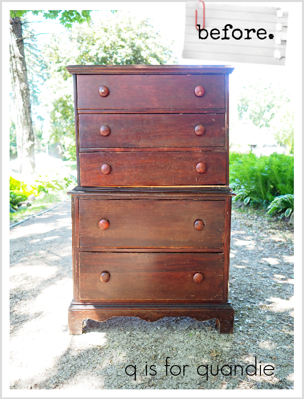
I picked up this chest on chest dresser at a garage sale a little over a week ago.
I’m a big fan of this style. I’ve done a few others (here, here, here, here, and here).
This one needed just a little bit of work before I got started painting. Ken had to reglue a foot at the back, and then re-attach the top section to the bottom section. The seller had taken them apart, but they weren’t meant to come apart. Once the two sections were put back together, Ken also had to re-attach the trim that went around the spot where the two came together.
Next I removed the knobs and scuff sanded the entire thing. It was quite scratched up, so I wanted to even out the surface a bit plus promote good adherance of the paint (Dixie Belle recommends scuff sanding to prep for their Silk paint).
Looking at that dark reddish stain color, I decided to make life easier for myself and paint this one a dark color. Plus, it’s a fairly masculine looking piece, so a dark charcoal grey seemed an appropriate choice. So I pulled out some of Dixie Belle’s new Silk paint in a color called Black Sands.

I’m going to share a huge q tip with you here. Don’t be confused into thinking that Black Sands is the black Silk paint. It’s actually a very dark charcoal grey. I made the mistake of ordering the Black Sands thinking it was black. Turns out that the color called Anchor is actually the black. Hopefully this tip saves a few of you from ordering the wrong color! Besides making painting this one easier with a dark color, I also chose the Silk paint because it doesn’t require a topcoat so it saves the effort of waxing or adding a clear topcoat. Plus, it has a built in stain blocker, just in case that reddish stain decided to bleed through a bit. That isn’t usually a problem if you use a dark color, but sometimes that bleed thru can create a shadow through dark paint.
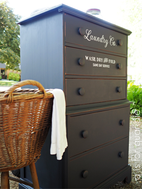
I ended up needing only one coat, plus a few touch ups here and there (spots I missed because I have terrible lighting in my workshop) to cover this dresser. I also did two coats on the top of the dresser for added durability.
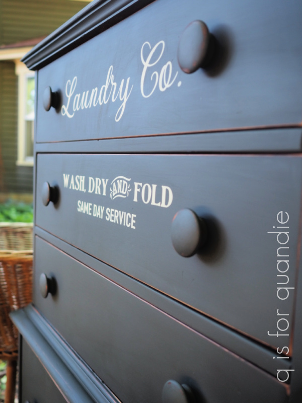
I was able to paint the first coat one evening after work. The next day I added the 2nd coat to the top and then added the stencil (using Dixie Belle’s Sawmill Gravy) …

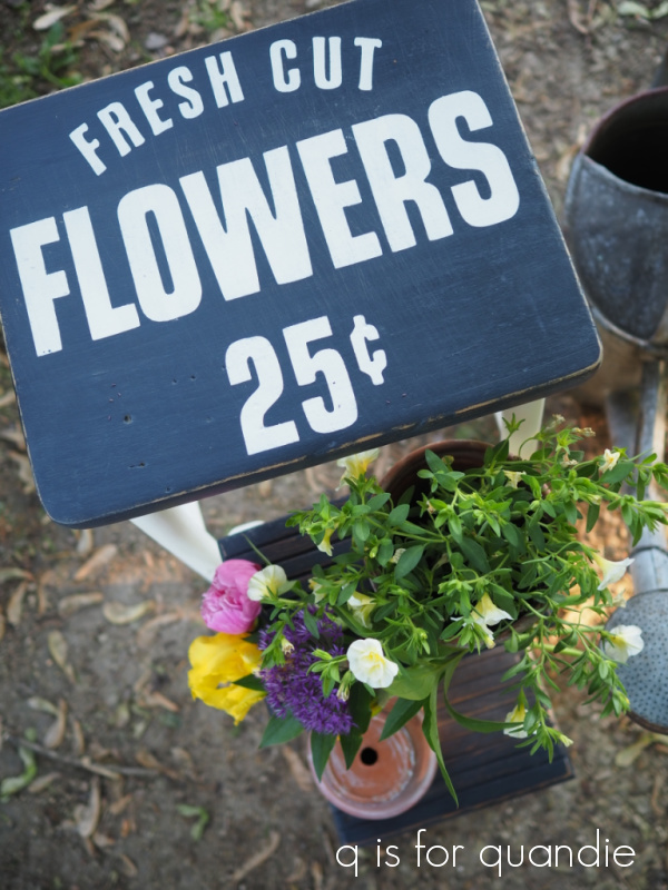
This stencil is from Maison de Stencils, although I’ve seen almost an exact match for it available from Wallcutz as well. With Wallcutz you can order different sizes which is a nice feature, at Maison de Stencils it is available in this one size only. I filled in the bridges in the letters using a small brush to give it less of a ‘stenciled’ look and more of hand painted look. If you’re confused about what that means, here’s a little bench I painted where I didn’t fill in the bridges.

See the difference?
Next I sanded the edges to distress a little and added just a quick swipe of clear wax over those sanded edges. I like to do that so that the freshly sanded edges don’t look quite so raw.
I kept the original wooden knobs because I kinda love the oversized look of them. They also got a coat of paint, some distressing, a quick swipe of wax and then I popped them back on.
And that was it. All that was left was taking the photos. It may have actually taken me longer to take the photos and create this blog post than it took to paint the dresser!
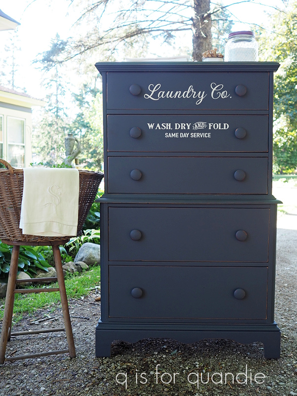
I staged it with some laundry themed items including some pretty monogrammed linens and the enamelware box of vintage clothespins that my friend Sue gave me for my birthday.

The moral to today’s story; if you’re looking for the easiest way to paint a piece of furniture then give the Silk paint a try.

And if you’re local and looking for a new dresser, this one is available. Check out my ‘available for local sale‘ page for more details.
Thanks to Dixie Belle Paint Co for supplying the Silk paint used for this project.