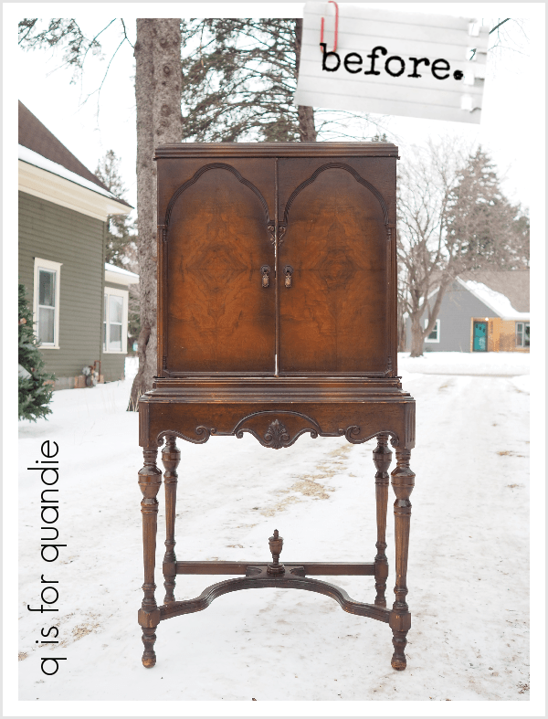
First things first, congrats to Patty. I drew her name at random to win my Shades of White giveaway. There were a couple of Patty’s who commented, but I have been in contact with the winning Patty so I apologize to the other Patty’s who may have momentarily thought they won and now realize they didn’t.
My friend Sue and I went out thrifting on a cold, but sunny, day last week and I managed to fill up the trunk of her car. That’s saying something, because as Sue likes to say, she originally purchased her car for the size of the two-body trunk (yep, you could easily fit two bodies in there, or a ton of garage sale/thrift finds). On the other hand, my car (the VW bug convertible) has a trunk about the size of a bread box.
Anyway, I came home with A LOT of stuff. And not my typical haul, I have to say. I don’t think I purchased a single item that needs to be painted. Want to see what I found? That’s rhetorical, I know you do.
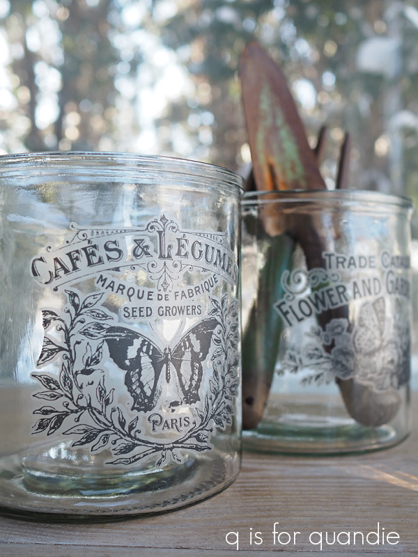
Let’s start with the clear glassware. Normally I totally steer clear of glassware (lol, pardon the pun), but for some weird reason I was just drawn to it this time.

Ideas came to mind for most of these items.
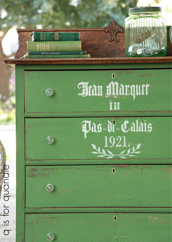
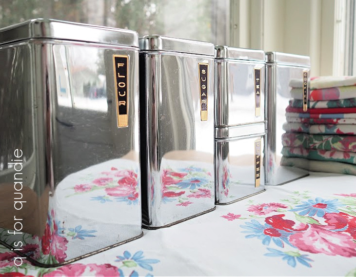
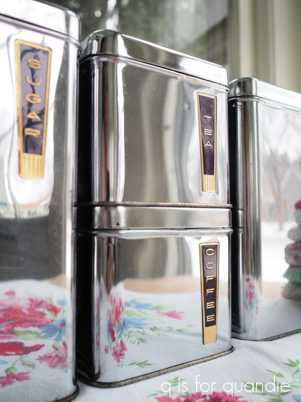
For example, I added transfers to a few of the canister type pieces.
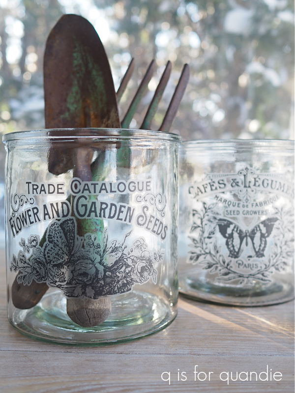
These two glass vessels would be great for holding gardening tools, or kitchen utensils (or paint brushes for that matter).
I initially thought this next one would just make a great vase, but I also like it filled with vintage silverware.

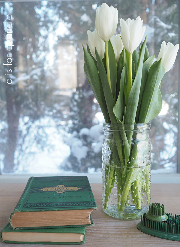
You can’t quite see it in the group photos, but I purchased a clear glass hobnail jar.

I’m keeping it to use for casual bouquets of flowers from the garden next season … or maybe even just tulips purchased at the grocery store while it’s still bitter cold outside.
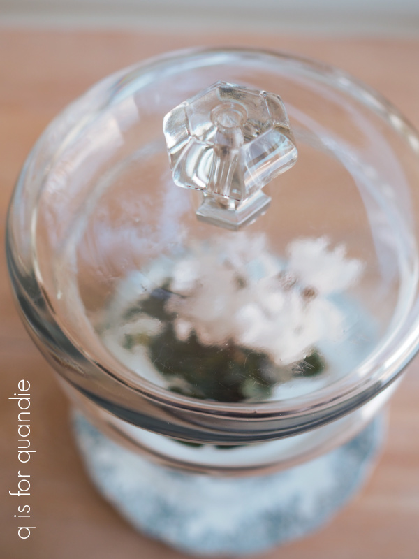
Sue suggested I try turning the larger vase I purchased into a cloche. She’d seen it done on White Cottage Co’s YouTube vlog just that morning. So I gave it a shot.

All I did was flip it upside down and use E6000 to glue a glass knob to the top (former bottom).
I’m always looking for cute little jars to put in metal baskets or wood totes that I find, so when I saw this trio I thought I’d tuck them away for the next container that comes along.

They fit pretty nicely into this one, for example …

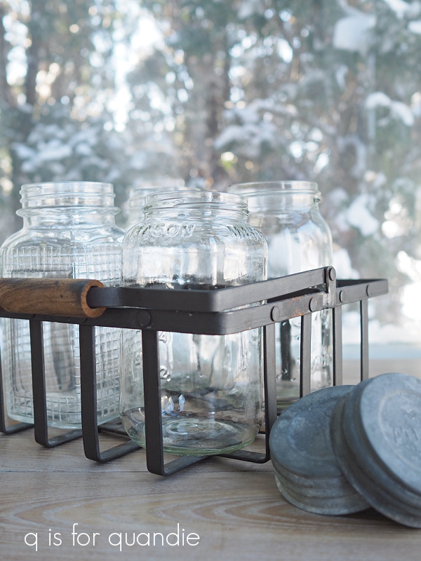
And speaking of containers, I purchased this metal one separately from the jars that are in it. I only bought the jars for their zinc lids. I needed lids for some older, cooler lid-less jars that I had at home.
Instead of filling that wire basket with jars, I decided it would make a fantastic windowsill herb garden.
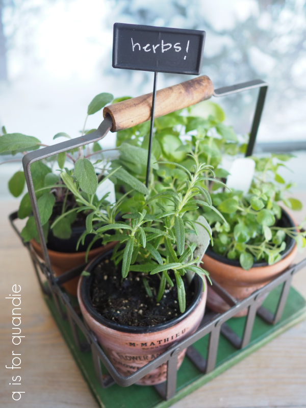
My local Bachmans just happened to have these potted herbs on sale for $3.99 each so I grabbed four of them and put them in clay pots and then in the basket. This is my feeble attempt to bring a little summer to my wintery world.
Last up in the glassware category are these corn on the cob dishes.

I purchased these just for myself. Probably the last thing in the world I need is specialized dishes just for corn on the cob. But as I stood in the aisle at Goodwill looking at them, I could just picture a summer BBQ on the deck with steaks sizzling on the grill, a delicious cocktail in my hand, and fresh picked corn on the cob swimming in melted butter in those dishes.
What can I say, there’s a foot of snow on the ground and it was about 9 degrees outside that day. I’m totally blaming that decision on the cabin fever!
I was lucky this time out and came across the holy grail of thrifting … ironstone.
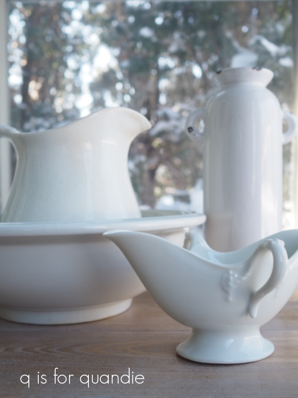
I rarely find ironstone at our thrift stores here in the mid-west. I am separating the pitcher from the bowl. I think a pitcher in a bowl has that 80’s country antique vibe, but separately they are both great pieces.
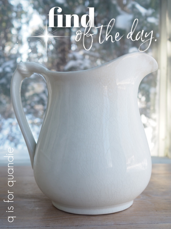
You can’t tell from that photo, but the pitcher is a big one at about 8.5″ tall. I’m probably going to end up adding it to my non-collection. It was definitely the find of the day.
The bowl is 14″ across and would be perfect to use as a fruit bowl in the middle of your kitchen table, it’s going to go to the shop to sell along with a couple of other large ironstone bowls that came from my picker.
I wasn’t planning to keep the gravy boat, but I just happen to have the perfect spot for it on my Welsh cupboard so I may just have to.

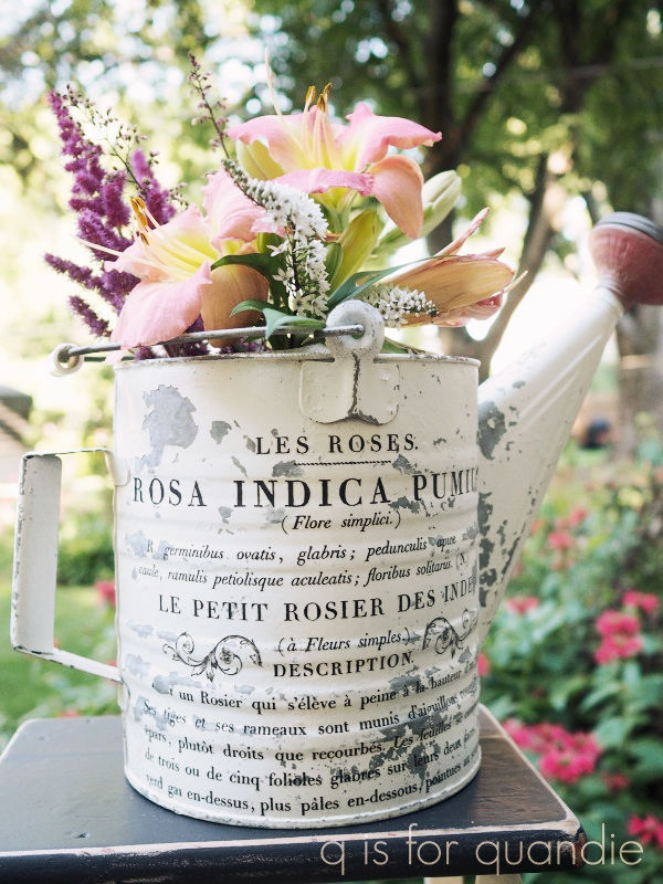
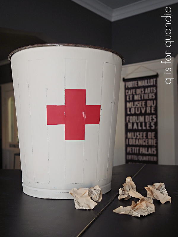
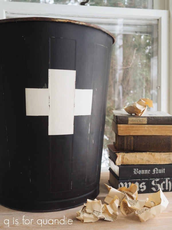
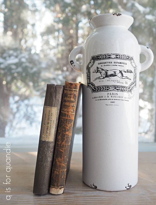
That tall piece in the background of my ironstone haul photo is not ironstone. It’s a sort of faux, crackly … I don’t know what material it’s made out of. But I knew it would look great with a transfer on it.
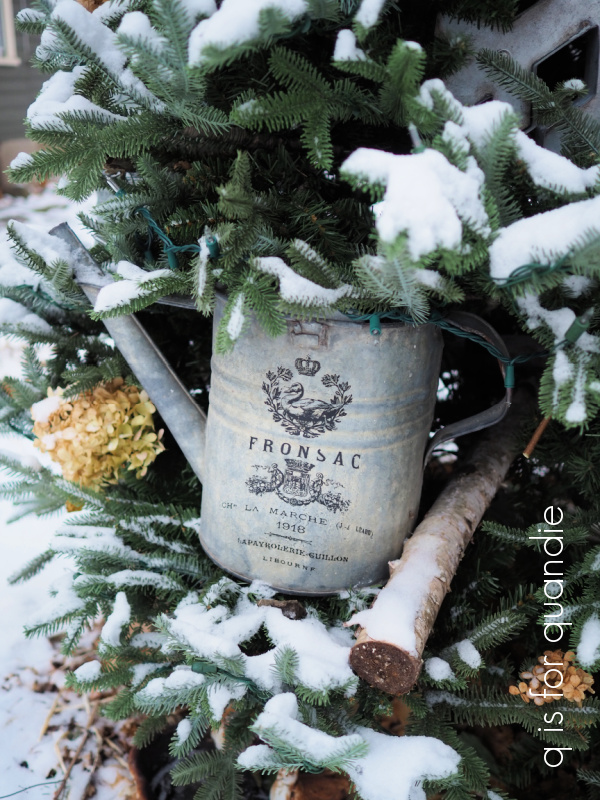
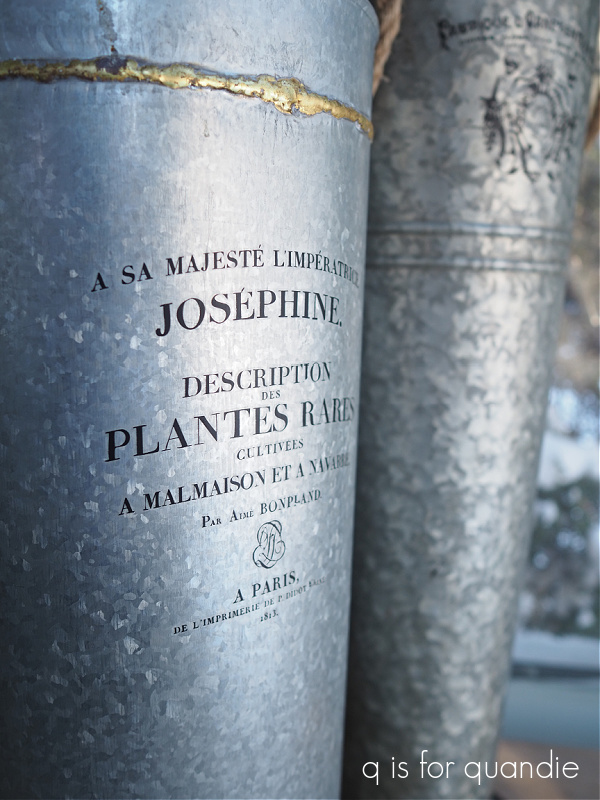
I came across a few galvanized items that day as well.

The two pieces on the left are from the Hearth & Hand line. And all three of these are much bigger than they look in the photo. The tallest one is 2′ tall, and the squat one is 16″ across.
I had to dress up the two tall ones with some transfers, but I left the short one unadorned.
I also came home with some dishes. I seem to be a sucker for these sets of decorative plates.
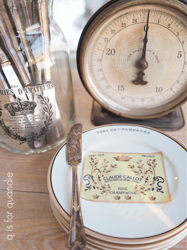
They are perfect for tucking into a gift basket.
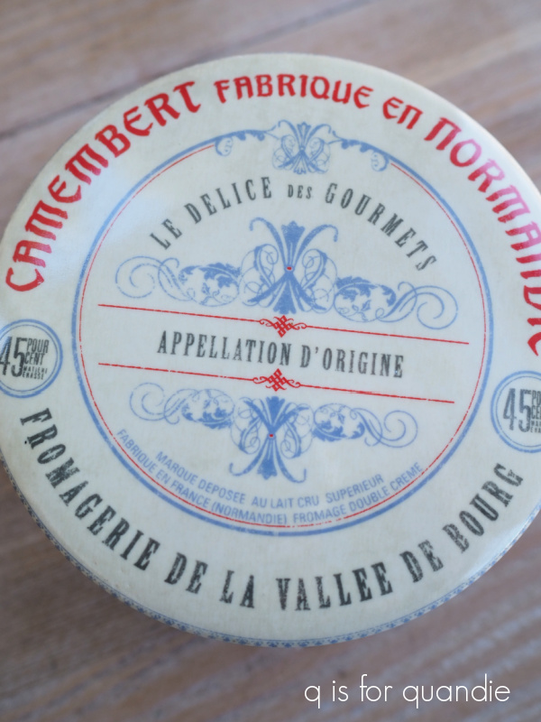
I happened to have purchased another cute metal basket and a book called The Cheese Course while thrifting that day.

I added some cheese knives that I had on hand. Now all it needs is a couple of fancy cheeses, and it’s the perfect hostess gift.

In the ‘fail’ department, I also purchased this fabulous cheese baker that I was going to include in my cheese themed basket …
But I made a rookie mistake. The cheese baker was in a box when I picked it out, and I never pulled it out to look it over. When I got it home and out of the box, I discovered it was chipped.

Drat! Now what do I do with it? I certainly can’t sell it like that. Is there a simple way to repair that chip? Do any of you have any ideas? I may just have to toss it.
I also grabbed this set of china as a sort of experiment.

I thought the colors on them were lovely.
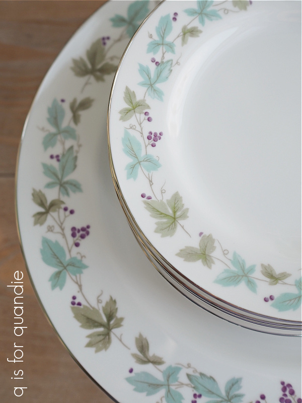
They were in perfect condition, and there were six dinner plates and six salad plates. And hey, they say right on the back that they are ‘vintage fine china’, so who am I to argue?
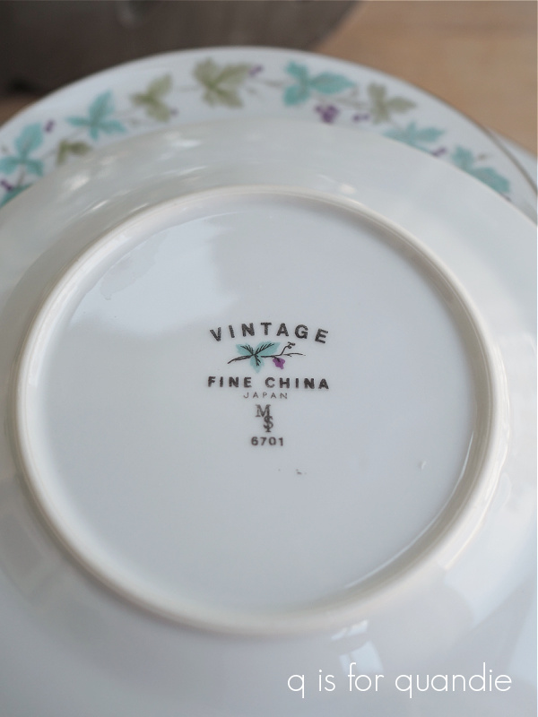
I googled them and found some interesting info on them. They were manufactured from the 1950’s through about 1964. In addition, according to antigotrunk.com “this was an exclusive pattern for Max Schoenfeld (that’s the MS on the back stamp). Max was was a California distributor of china and pottery in the Los Angeles area and distributed for many different porcelain houses. Some designs were given to him as “exclusives” only he could sell them, and the initials MS would be added to the back of the each piece.”
Anyway, I thought I’d give it a shot and see if a set like this will sell at the shop. I’ll keep the price very affordable and see what happens.
So there you have it, a bunch of fabulous finds from the thrift store. Which one is your favorite?


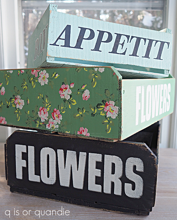
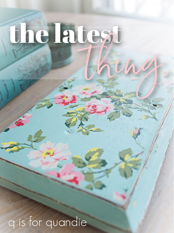
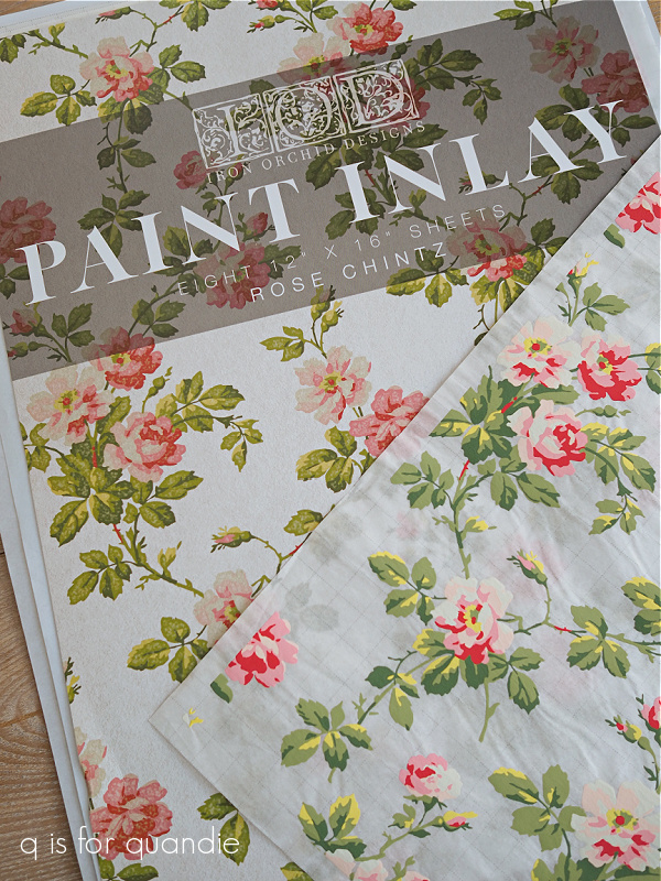
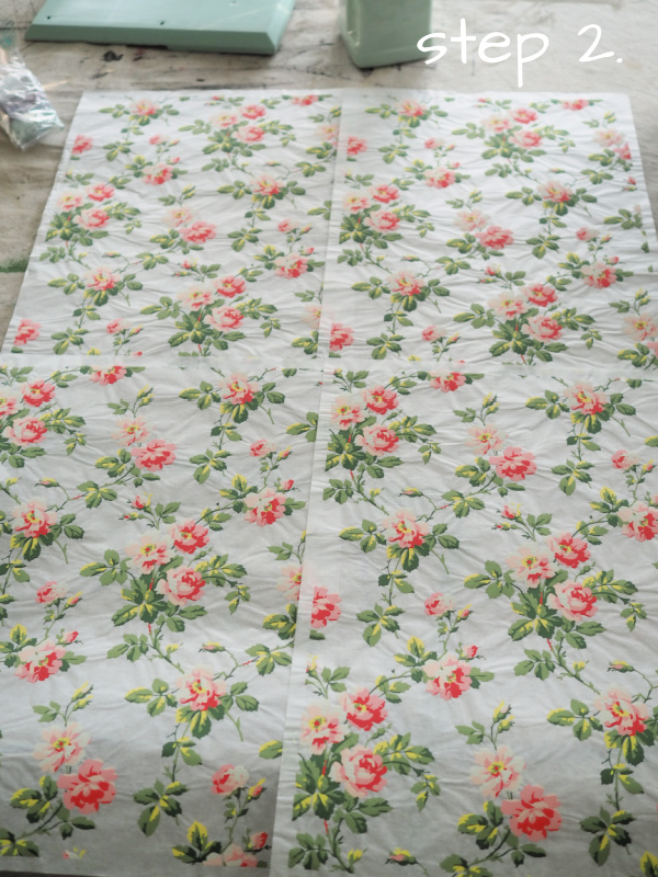
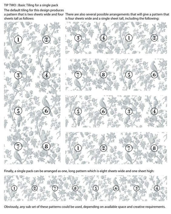 You can do 2 sheets wide by 4 sheets tall. Or you can do 8 sheets wide by 1 sheet tall. You can not do 4 sheets wide by 2 sheets tall without using multiple packs.