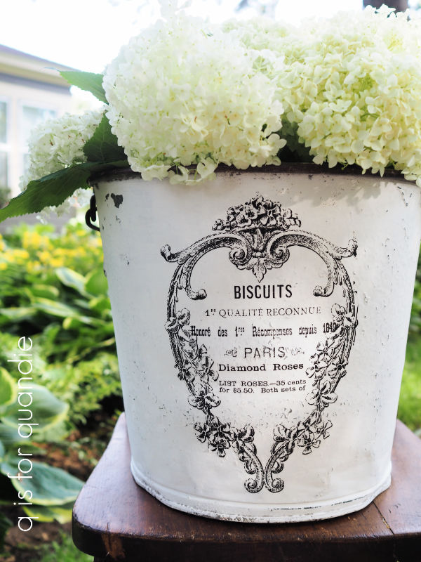
Good morning from the garden!
This morning I thought I would share my successes, and my failures, in this year’s planters.
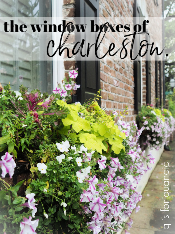
In my garden I pretty much plant annuals in pots, and perennials in the ground. There are a few exceptions to this rule here and there, but for the most part this is how I roll. I’m working on changing that up a bit and maybe I’ll do more of that in the future, we’ll see. But really, here in my zone 4b garden, asking perennials to survive the winter in a pot can be dicey. The rule of thumb is that a plant must be hardy to 2 zones lower than your actual zone to survive the winter in a pot. So as much as I loved all of those window boxes in Charleston with heuchera growing in them …
as a zone 4 – 9 plant, heuchera won’t survive the winter in a planter here.
And for those of you non-gardeners out there, I don’t mean that zone 2 plants will stay green and growing in a pot throughout the winter here. They will still die back to the ‘ground’, but they have a better chance of coming back in the spring.
As for annuals in the ground, of course they will grow just as well in the ground here as in a pot. Annuals only live for one growing season either way. I just don’t have a lot of space in my garden beds to add in annuals, although this year I did make a couple of exceptions.
But back to the planters, let’s start out with the failures beginning with the planters on either side of the steps to our deck with the Eugenia topiary balls in the center.
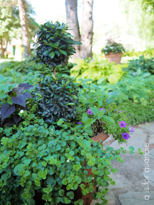
It’s time for me to wake up and smell the coffee on this one. We just don’t have enough sun in this spot for full sun annuals. I had decided to give them one more try, this time making sure to feed them with a bloom boosting water soluble fertilizer (I used Miracle Grow Bloom Booster) on a regular basis. However, I still got very few blooms on both the Snowstorm Giant Snowflake bacopa and the Superbena Violet Ice (both from Proven Winners). They were lush and green and grew like weeds, but got very few flowers. I did shear them both back a couple of weeks ago, but they still haven’t flushed back with flowers.
The Supertunia Mini Vista Indigo on the other hand gave me lots of blooms in these pots, but didn’t actually fill in at all. I wasn’t expecting that. Now granted, this petunia is meant to stay on the smaller side (hence the ‘mini’ part of its name).
I also planted the Mini Vista Indigo in my chicken feeder planter (on left in photo below), and it was the perfect plant for that planter because of its compact size.
There is only room for about 3″ of soil in that thing, so it’s impressive that these did as well as they did.
Now that I understand how the Mini Vista grows, I will plant it more strategically next year in spots where it won’t get crowded out by more vigorous growers.
Another failure for me this year was the lobelia that I planted at the end of May. I purchased four of the Laguna Sky Blue lobelia (also Proven Winners) because it’s just so pretty. I had given up on planting lobelia in the past because it has always died on me around mid-summer. But theoretically this newer variety of lobelia is supposed to be “much more heat tolerant than past plants” (taken straight from the Proven Winners website). But mine was all dead or nearly dead by the end of June. Definitely no more lobelia for me.
As it died off I replaced it with other things, one of which I ended up really loving, and that was the gomphrena (the bright pink balls).
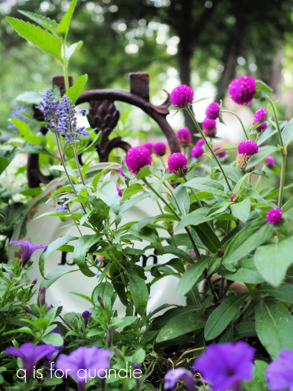
I’ve never grown this one before because I always thought it was kind of small and boring. But now I’m realizing that it looks great mixed with other things.

I also think it could look kind of fab mixed in a garden bed around perennials to provide summer long color.
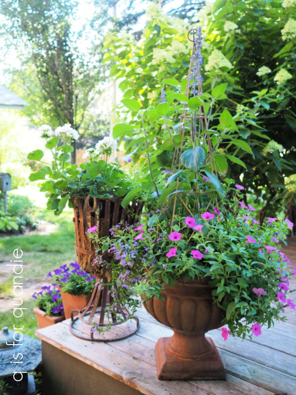
Another plant that replaced some of the lobelia was the Supertunia Vista Jazzberry.

It’s a gorgeous, bright, cool pink. You’ll notice that it doesn’t have the name ‘mini’ in it, this plant grew much faster and larger than the mini vista.
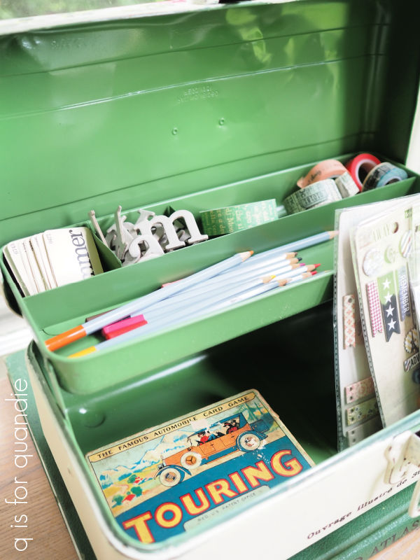
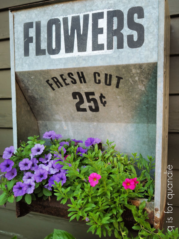
I also used the Jazzberry to replace some failures in our mailbox planter. We share a mailbox post with our neighbor, nnK, and she added planters to either side of the mailboxes a while back. I replaced the one on my side with … what else? … a rusty old toolbox, although you can barely see it right now.

We started out the season with the lemon coral sedum (left), a bright pink new guinea impatien, a small dahlia, and the purple scaevola on the end. As you can see, the impatien and the dahlia didn’t make it. Well, actually, I pulled out the dahlia to put in the Jazzberry. The impatien is still in there but it has been totally overtaken by the Jazzberry.
Aside from the mailbox, in general all of my pots with flowering annuals in them look kind of scraggly at this point. I probably should have been shearing them all back on a more regular basis.
I’m not going to feel at all bad about pulling all of these out and replacing them with some fall flowers in September.
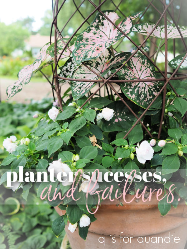
But this brings me to the real successes of 2022, the non-flowering annuals that I grow for their colorful foliage like coleus, caladium, oxalis, and sweet potato vine.

I shared my guest bed planter with you guys recently, and that was only planted up back at the end of July so maybe it’s not a great example of how these plants look great all season.
And in fact, I did have a bit of a fail with the caladium at first. It doesn’t like the cold, and we had some cold nights in late spring. They weren’t below freezing, but they were in the 40’s and the caladium I had already put out in pots died back to the ground. It came back eventually, but it took a 4 to 6 weeks before it looked good.
But it looks fantastic now …
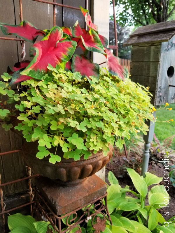
That’s one of my favorite combinations; it’s Molten Lava oxalis with a red caladium (sorry, didn’t retain a name on that one).
I also had planted this pretty pink and white caladium surrounded by pale pink impatiens.
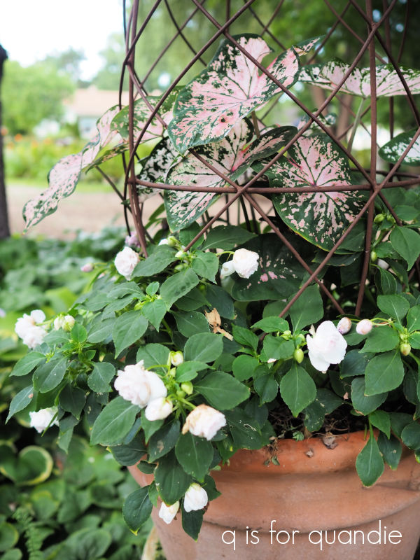
Although that caladium initially died back, it came back strong and now this is one of my favorite combos.
I have one more caladium planter that I planted later in the season after the pansies that were in this urn started looking really pathetic.

Hopefully I have learned my lesson about waiting until warmer weather to plant caladium. By the way, for those of you who suffer from deer problems, caladium is deer resistant.
Coleus can also be susceptible to cold weather, but not quite as bad as the caladium, and it’s also deer resistant. I filled my front window box with several varieties of coleus this year including Colorblaze Velveteen, Colorblaze Strawberry Drop and Wasabi.

The Wasabi totally tried to take over. I’ve pinched it back hard several times this summer.
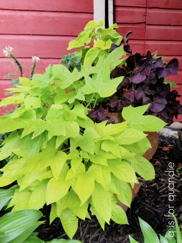
I’ve combined the coleus with some black sweet potato vine, some more of that lemon coral sedum, some Shadow Dancers ‘Marcia’ fuchsia, and some Charmed Wine oxalis.

That oxalis is really fighting for some space (the dark one on the right end).
You know, when you can get constant, consistent color like this out of a plant that requires almost no work (except for pinching it back a few times), it’s hard to argue with it.

I also had superb results with sweet potato vines this year.
When the Japanese beetles became abundant in our area about a decade ago, they were devouring these. I had quit planting them for a few years. But I’ve gradually added them back and now the beetles seem to leave them alone. I’m not sure if that’s the result of improvements made in the plant varieties, or because I seem to have fewer of the beetles lately (although they did a number on my ferns again this year).
One other planter success worth mentioning is my herb garden.

It was definitely as success as far as growing the herbs, but a little bit of a fail in that I rarely remember to actually cook with them!
I’m planning to take a stab at attempting to save some of my annuals over the winter this year including the caladium, the oxalis and the Eugenia topiary balls … and maybe even some of those herb plants. Now that I’m retired, I should be able to find the time to care for them. I’ll try to remember to share some ‘Sunday mornings in the garden’ posts about that process.
So, how about you? Did you have any failures or success stories from your planters this year? Or do you have any tips on overwintering some of these annuals? If so, be sure to share them in a comment!