
I’d been suffering from a little toolbox withdrawal recently, so I decided to take a break from the bigger stuff and paint a couple of them starting with this one.

I have pretty much developed a technique for dealing with these old, dirty, greasy, crusty, rusty toolboxes after having painted so many.
I start out with scraping away as much gunk as possible and then vacuuming out any loose dirt. Next I clean the toolbox inside and out with a grease cutting cleaner (I’ve used Dawn dish soap, TSP, Mean Green Cleaner & Degreaser) and the garden hose. I try to take advantage of hot sunny afternoons for that step. It’s fun to play in the water in the backyard, and then I can leave the toolbox to dry in the sun.
Next I sand the surface to remove any remaining loose paint and to smooth out areas of rust. Then I vacuum again and wipe everything down again with a damp cloth.

Today’s q tip: are you wondering why the sanding step comes after the cleaning step, and then I have to basically clean again? Well, that’s to avoid embedding the oily dirt in the tiny cracks and crevices by sanding on it. It’s better to remove that oily dirt first.
After all of that, I paint inside and out with a coat of Dixie Belle’s B.O.S.S. This product may not totally prevent the rust from eventually coming through the paint, but it will definitely slow it down. It also gives me a fantastic surface for painting over.
I usually paint the inside first, and this time around I decided to go red.

This is Dixie Belle’s Silk Paint in Fiery Sky from their Desert Collection. Isn’t that a gorgeous shade of red? It definitely has a cool/blue undertone. I ended up doing three coats to get good coverage (which is often the case with red paint). In hindsight, I should have used the grey B.O.S.S. rather than the clear version. A grey primer will always improve the coverage with red paint. The next time I use Fiery Sky I’ll try to remember the grey B.O.S.S.!
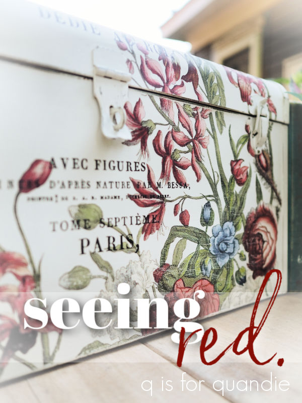
Next up I painted the outside of the toolbox in two coats of Dixie Belle’s Sawmill Gravy. Once that was dry I pulled out a few different I.O.D. transfers and started getting creative.

I used sections from their June, Ode to Henry Fletcher (florals on the front), Floral Anthology (floral on the top left) and Label Ephemera (wording) transfers.

I specifically chose floral sections with lots of red to go with the Fiery Sky on the interior.

And I used some of my favorite French wording from the Label Ephemera transfer.

I’m starting to run low on my stash of this particular I.O.D. transfer, and it has been retired. I’ve been hunting for it, and I even found a shop to mail order it from last week. I placed my order, only to get a call from the proprietor a few hours later telling me that she didn’t actually have it in stock. Bummer. I’ve found another source though and I’m hoping this one comes through. Fingers crossed.
Once the transfers were all applied, I added a couple of coats of Dixie Belle’s flat clear coat to seal them.
I didn’t do much staging for this toolbox, it was hot outside so I wanted to snap these pics quickly.

But I did fill one of my vintage vases with some like-colored foliage from caladiums and coleus, as well as an Annabelle hydrangea blossom.

I love how that deep purple coleus has just the slightest dusting of chartreuse in the newest leaves. Isn’t that pretty? You have to look closely to really see it, but it’s a fun detail.
Although florals typically make us think of summer, I think the colors on this one are leaning into fall … or dare I say it … even winter. With all of those reds and greens, this would be pretty for Christmas filled with an arrangement of evergreens.

So, what do you think? Do you prefer the ‘before’ or the ‘after’?

This toolbox is for sale so be sure to check my ‘available for local sale‘ page for more details if interested.
Thank you to Dixie Belle Paint Co for providing the B.O.S.S., paint and clear coat used on this project.

Perfect combo of paint and transfers! I wonder why these companies retire certain transfers? Seems to happen a lot. I hope you find some because I so enjoy seeing how you put them to use. I agree this would look so lovely with a Christmas arrangement or my Christmas cactus would look spectacular inside!
LikeLike
There must be some sort of reasoning behind retiring a transfer, and I’m sure it must have to do with increasing sales in some fashion. I do wonder if it’s because people tend to buy things more readily if they think they won’t be able to get them in the future. I do wish they would at least come out with an equal alternative in this, another transfer that is all typography!
LikeLike
Red, red, I love red! Great job – another toolbox masterpiece. Love the colors, the transfers and wow that red inside! Great job.
LikeLike
Thanks so much Laura, and I do love that pop of red inside too 🙂
LikeLike
So surprized to see red. Another fantastic make over, I got tired reading all the steps it took to create this beauty. I am having such a hard time getting things done in this heat, how do you manage? Can I have a transfusion, I need some of your vision and energy! Thanks for such an inspirational, interesting and informative blog.
LikeLike
I don’t have any sort of heat/air con in my carriage house workshop, so when it’s going to be hot I get up early and work until around noon when the day heats up. But, that being said it’s only 56 degrees here this morning. It may have to let it warm up a bit to start painting 😉
LikeLike
It’s perfect! Whenever I see that you’ve posted, I wait until I have a quiet spot and a cup of coffee so I can savor every word and examine your photos closely. You remain a constant inspiration.
I recently scooped up 4 of the Label Ephemera transfers because, like you, I love to cut that one up and use it on small projects. I found the transfers on the Facebook group “IOD First Gen & Retired Designs Pop Up group.” I often find older/retired IOD products on that page.
Label Ephemera was recently offered on that page by this seller, and can be found here: https://sanctuaryvintage.com/collections/iron-orchid-designs/products/label-ephermera.
Best of luck in finding more!
LikeLike
Thanks so much for that info! I will check that out. I did find another online retailer and placed an order, but I’m waiting on confirmation that she has them and is sending. If not, I’ll definitely try your resource next.
LikeLike
Wow, that red is amazing and such a surprise when you open that frilly box up! 🥰 Another great transformation. I noticed this one didn’t have the tray that a lot of them have. It made me wonder about those trays. When you do have toolboxes with the trays and you decide to keep the tray with the toolbox, are there any issues with the trays scraping the interior paint?
LikeLike
This toolbox would have originally had a tray, because it does have the little edges that the tray would have rested on, but it was not included when I purchased it. Basically, going forward my plan is to keep the tray if one does come with the toolbox. As for scratching … well, if the owner of the toolbox isn’t terribly careful and drags the sharp corners of the tray along the inside of the toolbox I have to say that it is likely it would get scratched up over time. I feel like that’s just the nature of the beast though, anything that is painted is in danger of scratching and showing other wear over time.
LikeLike
Another amazing transformation! Each time I see this I maybe I should try all those tool boxes in my garage! You give me courage 😉. I just love your visions!
Smiles, alice
LikeLike
Absolutely! Give it a go!
LikeLike
Love it! That is a pretty red and I am not a red person. That combination of the inside red and outside floral works really well. Those toolboxes are a lot of work!!! Thanks for the constant and different inspirations. On the outside how do you decide if you want to use wax or clear coat?
LikeLike
They are a fair bit of work, I definitely don’t want to calculate how much $$ I make per hour working on them. But I really enjoy the process, it’s not like work for me. As for the final coat, well … I prefer to use wax over dark colors because it doesn’t get streaky. The water based clear coats can get streaky, although you can solve that problem by adding a little bit of the paint color into the clear coat. But really, 9 times out of 10 I just grab whichever one is handy at the moment.
LikeLike
Your toolbox makeovers are my favorite. They are how/why I started following you originally. Awesome!!
LikeLike
That’s good to know because I have a big pile of toolboxes waiting to be transformed! Thanks for following along Deb 🙂
LikeLike
Enjoying another piece of your toolbox artwork! Very nice!
LikeLike
Thanks so much!
LikeLike
I love all of the toolboxes that you have done. This one is very pretty.
LikeLike
I am not normally a fan of red, but I have to say that the red interior combined with the exterior florals is show stopping! Thanks for sharing your inspired transformation. If only the previous owner could see that toolbox now! (Eye pop haha!)
LikeLike
Very pretty!! I am so excited to see some bold colors and lots of floral transfers…totally my preference!
LikeLike