when inspiration strikes.

Sometimes I find inspiration in the most unexpected places.  This time it struck while watching a movie.  Cuba starring Sean Connery came out in 1979, but it’s set in the late 50’s.

cuba

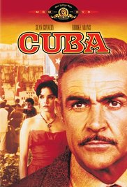
There is a scene in the movie where one of the characters fills a suitcase with money in anticipation of fleeing the country after the fall of the Batista regime.  Ding, ding, ding!  Fabulous black and white vintage suitcase!  My eye went straight for it.

I just love the graphic punch of black and white, as evidenced by my front porch floor.

summer porch

Or this mid-mod bureau that I painted last summer …

black and white title

Seeing that black and white suitcase in the movie reminded me that I’ve had a couple of hard sided vintage suitcases lying around for a while.  One of them is Uncle Leon’s suitcase that I picked up at the Nokomis neighborhood garage sales last summer.

suitcase collage

The other is a thrift store find.

unicorn

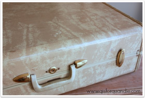
There are a lot of vintage suitcases that I wouldn’t dream of painting, but I’m not a big fan of these marble-ish finishes.

So I pulled out some chalk paint in black (Cece Caldwell’s Beckley Coal) and white (Annie Sloan’s Old White), some frog tape and some stencils and got to work.

inspiration title

I have no idea what the material is that this particular style of suitcase is made out of (do any of you know?), they certainly aren’t leather or cardboard.  I’m fairly sure the edges are some sort of rubber or plastic maybe.  Despite not knowing what this material is, I still follow my usual m.o. for painting them.  I sand them down a bit to rough up the surface so paint will adhere better, then I wipe them down with TSP substitute to remove surface grime and oils.  I have painted this type of suitcase with milk paint and with Fusion paint, both of which worked great.  This time I used chalk paint.  If you’re going to use tape to make a clean line (like I did on these) I would say stick with either Fusion or chalk paint.  The milk paint is going to be a bit too thin for a crisp line, and your tape is going to pull paint off.  I used the yellow frog tape for these (the one meant for delicate surfaces).  I removed it carefully shortly after painting the second coat of paint and I had no problems with paint lifting off.

The first case I worked on most closely resembles the suitcase in the movie (it was black with a wide white stripe down the middle).  I painted this one black first, then measured off my white stripe, taped it off and painted three coats of white.

1918 stencil

I added a subtle extra detail with some stencils.

suitcase rue henri

I changed up the stencil on the reverse side of the suitcase.

paris stencil close up

I used the wet paper towel method of distressing on the edges, handles and hardware.  Have you tried that with chalk paint?  Rather then using sandpaper and getting a rough effect on those rubber/plastic/whatever they are edges, I used a damp paper towel and just rubbed paint off.  It worked great on these!suitcase with Paris

The fact that you can wipe the paint right off with a damp paper towel suggests that you really do need a top coat over the chalk paint.  I used clear wax on these, and I have to admit it got a little tricky.  The wax picks up some of the paint, so I had to be very careful not to get black paint onto my white areas.  I used separate rags for waxing the black and white areas.

Just to be clear, I never intend for these suitcase to be functional as suitcases.  They are really just for decor purposes only.  Despite a wax top coat, if you tried to send one of these through the baggage system at your local airport it would come out much worse for the wear. They will get dinged up.

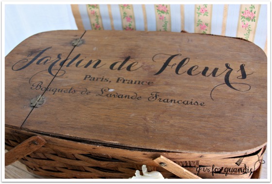
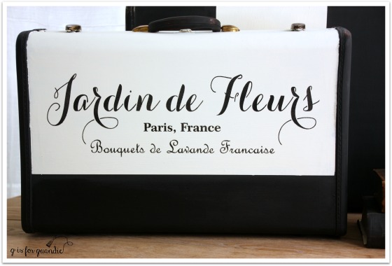
The second case got a little different black and white treatment, and I used my new Jardin de Fleurs stencil on it (by the way, are you keeping track?  This is the 3rd use of the stencil so far).

jardin de fleurs suitcase

I really can’t decide which suitcase I like best, can you?

suitcase tops

I love that Jardin de Fleurs stencil, but I also think the striped suitcase looks more authentically vintage.

They kind of make a great pair.  Don’t they?

suitcase pair

These guys need to find a new home, so if you are local (sorry, no shipping available) and interested in purchasing them just leave a comment and I’ll get back to you with the details.

an invitation.

Who would like to make their own faux french hatboxes?

repeats 2

A couple of my friends have mentioned that they’d be interested.  So I’ve decided to host a hatbox painting party!

class title

And since I have three extra spots at the table, I thought I’d open the invitation up to my local readers.

Here’s how it will work.  I will provide everything except the hatbox, including paint, transfer gel, transfer images (unless you want to bring your own, remember it must be a mirror image), snacks and lots of laughs.

You just need to bring a hatbox (or two if you like).

repeats before

You can find these at Hobby Lobby, Michaels and JoAnn Etc. in various shapes and sizes.

The party will be held at my house on Saturday, February 27 at 2 pm.

This is a party, not a paid-for class.  There is no charge.

Why?  Since the Fusion people have incredibly generous with some transfer gel and paint samples, I am paying it forward.

transfer gel

Even though I’m not calling it a ‘class’, you will learn how to layer paint colors and how to use the transfer gel.  Keep in mind that the gel takes 6 – 12 hours to set, so you won’t be going home with a fully completed project.  You’ll finish your hatbox up to applying the transfer.  I’ll have some samples ready that are already set so that we can get some hands on experience removing the paper after your transfer has set.  So you’ll get a feel for the process, but you’ll have to remove the paper on your own hatbox at home the next day.

I wish I had room for more people, but sadly I don’t.  So if there are more than 3 people who want to join, I will have to draw names.

Finally, since I don’t want those of you who aren’t local to feel left out, I’m also going to draw names and give away two ‘faux hatbox kits’.  The kits will include the hatbox, as well as transfer graphics and enough paint and transfer gel samples (compliments of Fusion) to finish your hatbox.

And before I let you go, I just wanted to give you all a heads up on Fusion’s custom color contest!

custom color contest

Fusion is having a contest, where you, yes YOU, can combine existing Fusion paint colors to create your own custom color. To enter, simply head over to their Facebook page and comment there with a picture of your custom color on a piece of furniture, its name and recipe.

They will choose 8 favorites entered in the months of February and March and then the fans will vote on the final 8 colors to ultimately decide on the winning color recipe! The winner will receive a custom Fusion giftpack valued at $350.  Nice!  So get creative and have fun inventing your own color.

And for those attending the hatbox party, rather than watch paint dry on our hatboxes, we can play around with my Fusion paint and make up some fun colors of our own in between steps on our hatboxes.

So, who wants to make a hatbox while simultaneously inventing a new paint color?

Here’s what I need you to do; leave me a comment.  If you want your name in the running for the party, make sure to mention that you are available to attend (I am located in a suburb of St. Paul, MN in case you didn’t already know that).  If you can’t attend the party, just any old comment will do.  The winners of the hatbox kits will be chosen at random from all comments excluding those selected to actually attend the party.  Please have your comments in by Sunday, February 14 at midnight to be eligible for the drawings.  Best of luck to you!

repeats 1

love monkey.

My friend Meggan has a real knack for coming up with really creative Valentines for her kids to hand out, and seeing as she has three adorable boys which leaves out ‘pink’ and ‘hearts’, that’s really saying something.  So when she offered to share some of her ideas in a Valentine blog post I jumped at it.  Some of you may remember Meggan from her guest post last November, reflections on gratitude, where she shared the hostess gifts she put together for Thanksgiving.  She has put together another fun post full of creative ideas just in time for Valentine’s Day!

So, with no further ado, I give you Meggan …

Well, hello again!  It appears that I’m drawn to these holiday posts as my first appearance on q is for quandie was last Thanksgiving.  I’m happy to return with some Valentine creativity that is personal, super quick, easy and inexpensive not to mention darling!  (We will get to the post title in a second, ha!)

First off, has anyone seen this photo?  I snagged it off of Instagram from the feed @futureworldhealth.

valentine 1It really strikes a chord with me.  I have three boys which means multiple parties and multiple treats.  I always try to challenge myself to think outside the Valentine box to come up with a non-food alternative that is still fun to get/give.  Not like the houses that gave out toothbrushes on Halloween.  Anyone remember those?  Although I totally understand the sentiment as an adult, at the time it was…lame.

I will admit right now that I am not the overachieving Martha type (ahem, Linda), so whatever creative endeavor I embark on is usually simple and achievable so I;  1. don’t turn into a freak the day before Valentine’s are handed out and 2. don’t need to take out a second mortgage to fund them.  There is absolutely nothing wrong with heading to the dollar store and picking out whatever superhero/princess cards that call the siren song to your youngster, in fact, I am totally dialing it in for my Kindergartener this year.  He is all about Ninja Turtles and so. be. it.  But, if you have any persuasion over their Disney riddled brains, here are some rather cute alternatives.

Some years ago, I became obsessed with Google’s picture editing software called Piknik.  It was free and early on in this world of editing that has grown exponentially to become so user friendly.  I used it for photos, art prints, invitations and cards.  Then they sent out a notice that Piknik would be no longer.  Sad face.  But, they were offering PicMonkey.  Happy Face!  I figured at the time that I would be hooked and then there would be all of these fees to join, etc.  I was pleased that although there is an upgraded version of PicMonkey that is called “Royale” where you can get more fonts/images/editing options, you can still do quite a bit of creative editing with their free offerings.

A few years ago, when I was still trying to fit into the “must hand out food” for parties mindset, I came up with the following Valentines and handed them out with the respective fruits.  I had a bit of the “toothbrush lady” fear, but they went over amazingly well.  I teased my boys that it was “nature’s candy”.  Eyeroll.  You simply upload a picture to PicMonkey and then click the “add text” button.  There are loads of options for clipart, frames and overlays to apply.

valentine sully
sawyer valentine
valentine henry

Another idea is to make references that the parents will get, but the kids have no idea.  It makes it funnier, no?  My oldest loves anything with guns or hunting, so I picked up some plastic soldiers and put a little Pat Benatar into it.

love battlefield
battlefield 2

If you look closely at the picture, you can see little heart shaped bokeh, which is the fancy word for light bubbles in pictures.  Bokeh is one of the free options for pictures, as is making the edges of the pictures look frosty.  You can begin to see the possibilities.

Then, there’s this kid.  I have no words for Sawyer.  This was sent with a piece of gum.

stuck on you
It doesn’t even have to be a picture to upload, you can create anything with a blank background and make up your own card under the “Design” tab (there is also a collage tab that’s kind of fun).  For example, I now have a 6th grade boy.  Valentine’s are not cool anymore.  Unless it has an arrow on it and definitely no hearts.  He loves archery, I love inspirational quotes, it was really a match made in…google?  I simply save the finished product from PicMonkey onto my computer and then print them off in wallet sizes.
valentine 2
Cut them to size …
valentine 3
insert glow sticks and you have a socially acceptable Valentine for a pre-teen boy.
valentine 4

If you are not inclined for computer aided Valentining, the craft stores are teeming with fun options.  Last year, I wanted to simulate an animal mount, specifically a deer.  I found these little balsa wood plaques with pre-drilled holes, a deerhead stamp, some twine and we went with “You’re a deer friend.”

valentine 5

You would think with all of my fan-girling over this, it would be a compensated post.  It is not.  However, should the Google/PicMonkey/Michaels squad feel the urge to send some Oscar-esque swag this way, this lady would blush, act surprised and then snatch it up like the last…piece of fruit.  Google you can send said swag bag to….oh who are we kidding?  You know where I am along with everything else.  Ha! (She laughs whilst looking over her shoulder)

Thanks for the time Quandie readers!  I hope you read between the lines that this is applicable to anyone, not just people with kids and also not just for Valentine’s Day!  Perhaps you’ll try it out and let us know what you think!  Big, big love to all of your beautiful hearts.

valentine 6
Big, big love right back at ya Meggan for sharing these great ideas!

the winter carnival.

winter carnival

Each year St. Paul hosts a winter carnival.  I’m pretty sure it was started just to prove that Minnesotans are tough and that we laugh in the face of winter.  The carnival has been taking place since 1886 and is the oldest winter festival in the United States.

Back in the early days they built amazing ice palaces as part of the festivities such as this one from 1888.

1888 ice palace

Even as late as 1941 the palaces were pretty extravagant.

1941 ice palace

Unfortunately they no longer make anything like this.  The last time we had a decently sized ice palace was 2004.

2004 ice palace

It was large, but certainly not as elaborate as some of those earlier models (I’m betting that there are more safety regulations these days!).  Mr. Q and I did go see it that year along with about a bazillion other people.

This year since my sister and my niece are new to Minnesota they decided it would be fun to visit the winter carnival.  So last Saturday we headed into St. Paul to check it out.

To be honest, this year’s ‘mini ice palace’ was looking pretty sad by the time we saw it.  I didn’t even take any photos it was so pathetic.  I did get a couple of photos of some ice sculptures though.

ice sculpture 1

ice sculpture 2

ice sculpture 3

As a special bonus, we got to see a marriage proposal taking place in front of one of the ice sculptures.  It was pretty sweet.

There is a fake legend that goes along with the winter carnival (you can read the full story here).  The legend says that on the last day of the festivities Vulcanus Rex and his Krewe storm the ice palace and force King Boreas to give up his icy hold over his winter capital.  Thus there is a Vulcan Victory Torchlight Parade on the final day.

torchlight parade

Back in the day the Vulcan Krewe would kiss the girls along the parade route leaving smears of black grease paint on their face, but that custom has been toned down.  These days they just use a grease paint crayon to leave their mark.  I warned my niece Kris that pretty girls were obvious targets!

kris at winter carnival

Hail the Vulc!

By the way, are you wondering what appropriate attire is for a winter carnival?

me and deb at winter carnival

Down parkas of course!

Here’s hoping the Vulc’s have done their job properly and booted King Boreas off his throne!  I am ready for a little less winter, how about you?

jardin de fleurs desk.

jardin de fleurs desk

Mr. Q crossed state lines (to Wisconsin) a week or two ago to pick up this desk for me.

desk before

I thought the vertical trim on the corners was lovely.  I knew that a little paint would really bring out those details.

First step was having Ken work on the structural integrity.  He glued up some joints and replaced all of the screws holding the top on.  He also had to re-glue a couple of the drawers.  Once that was done, I stripped the top.  You can see in this next photo that there was a shadow on the top of this desk.  I suspect that there was a desk pad in place for a long time and as a result the desk top faded all around it, but not under it.

desk top before

After stripping, I sanded this some by hand.  Since it’s veneer, I didn’t want to sand too heavily and sand right through it.  If I had been able to completely eliminate that shadow, I would have then just waxed the top.  However, although it was diminished somewhat, I could still see it.  So I decided to stain the top to help even out the color.  I added two coats of Varathane gel stain in Dark Walnut.  Since I am far from being an expert wood stainer, I really like working with a gel stain.  They are super easy to apply, I just wear gloves to avoid staining my hands too, and then use an old t-shirt to rub the stain on.  I find that I can work the stain without it getting streaky or uneven.  I waited 24 hours and then added a couple of coats of  Minwax Wipe on Poly in clear satin using that same technique.  I don’t usually use a poly, but I do like it for desk tops that might get a fair amount of wear.

desk top

Unfortunately that shadow is still there.  Perhaps I should have tried bleaching that area a little.  Or, I cold have gone with a really dark stain like Java gel.  But although the shadow is obvious when the desk top is empty, once there are a few things on top it’s not so glaring.

black desk top filled

Another problem this desk suffered from was ‘ring around the drawer pull’.

ring around the drawer pull

See that groove worn into the wood around the drawer pull?  That is from the pull being too loose and spinning around, thus wearing that groove into the wood.  So sad.  Usually when you see this problem it’s because the escutcheon pin is missing from the drawer pull.  On many old pieces of furniture with this type of pull, there is a tiny little nail that holds the back plate stationary so that it won’t spin.  Those are often long gone on older pieces.  However, in this case there were never any pins.  The handles had just been allowed to work loose over time and no one took the time to tighten them up.

I added a little wood filler to all of those circular grooves and then sanded them smooth so that when I painted the dresser they wouldn’t be quite as obvious.  You can still see them if you look closely, but they are far less obvious …

black desk and typewriter

I sanded all of the flat surfaces lightly before painting, but I didn’t sand the detailed corners at all.  I was hoping for some chipping!  As it turns out I was hoping in vain; I didn’t get any chipping at all.  I even tried my masking tape trick (using tape to pull the paint off creating more chipping) and nada.  This is Miss Mustard Seed’s Typewriter milk paint by the way, and it’s finished with hemp oil.

black desk corner

I also painted the back of this desk.

black desk back
The desk is trimmed out all the way around so that the back is presentable and could face out, so I went ahead and painted it too.  The middle piece of that back was positively calling out for a stencil, so I couldn’t resist using my new “Jardin de Fleurs” stencil there.black desk stencil close up

I used Martha Stewart acrylic craft paint in Grey Wolf.  I’ve mentioned this before, but when I stencil on black I don’t like to use white paint because the contrast is too heavy.  The Grey Wolf is actually a medium grey, but on the black it reads as ‘white’ without being too harsh.

black desk back close up

One final fix that I thought I would share with you is replacing the doodads that keep the drawers from pushing in too far.  You  know, these things …

doodad 
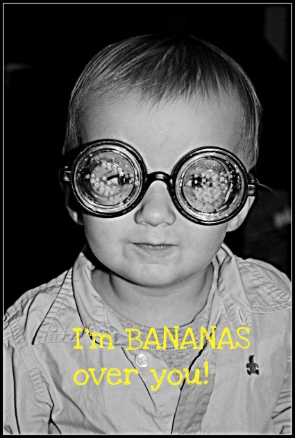
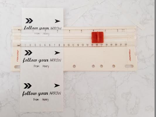
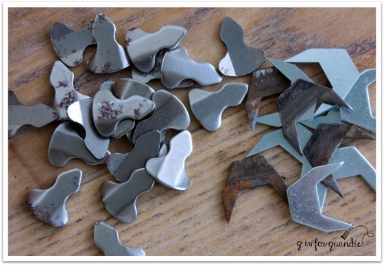
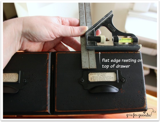
I think I’ve established that I often don’t know the proper names of tools and other hardware.  I get a lot of funny looks at my local Menards store when I ask the employees if they have those ‘metal thingamajigs that keep the drawers from getting pushed in too far’ or ‘that tool with the slide-y thing on the ruler’.  I was never able to find these at any of my local hardware stores, but I did ultimately find them online at VanDyke’s Restorers.  And by the way, they are called ‘drawer stops’ (duh) and there are two different styles that I see fairly regularly in vintage furniture.

do dads

This desk has the type that are on the right.  You are better off replacing like with like because the grooves they go in are different sizes.

And here’s what it looks like when one is missing.

doodad space

It’s quite simple to just pound another one into that groove.

I had a lot of the props from my photos of the faux card catalogue handy including my chalk board, so I used them again.

black desk angle

Don’t you love that sweet little chair?  Some of you might recognize it from previous posts (here, here or here).

desk chair

It works perfectly with this desk, but unfortunately the cane seat is in very bad shape.  It would be cute with a little skirted seat cover, but I am sadly lacking in sewing skills!  I just keep the chair around to use as a prop with desks.

The jardin de fleurs desk is available for local sale.  If interested leave a comment and I’ll get back to you with the particulars.

Linking up with Making Broken Beautiful at The Curator’s Collection and Friday’s Furniture Fix at Patina Paradise.


think spring.

I’m probably jumping the gun a little thinking about spring, but last weekend it was sunny and close to 40 here in the Twin Cities.  Sunlight was streaming in through my windows.

roses in blue jar

After our previous stint of sub-zero temps, that felt positively balmy.  Snow was melting, birds were singing and it just smelled like spring outside.   The days are starting to get longer already, I’m no longer coming home from work in the dark.  But then yesterday we got a big pile of snow dumped on us.  I think it was Mother Nature’s way of reminding me that it really is only early February after all.  Drat.

Nonetheless, I am ‘thinking spring!’ and in anticipation of gardening season I ordered a new stencil for myself via Etsy.  I took it for a test run on this vintage picnic basket that I found at the thrift store.

stenciled picnic basket

And I love it!  I hope to use it on many more things.

While I was feeling floral, I also picked up some more pretty floral plates to add words to, as well as a Le Jardin themed table runner, both also from the thrift shop.

thrift store finds 2

I also ordered some more vintage floral wallpaper from Hannah’s Treasures via Etsy.

vintage wallpaper

This is in anticipation of an upcoming project that I have in mind using this …

coming soon

Ta da!  I am so excited!  I’ve been sent some samples of the new Rachel Ashwell Shabby Chic paint line to try out!

But before I can get to that project, I have to finish up the desk that I’m currently working on.

desk before

And speaking of desks, my February post at Reclaiming Beautiful is up and running today and is all about desks.  Head on over and check it out!

desks

a faux card catalogue.

chalkboard 2

On what proved to be the coldest day of the winter so far (windchills of more than 30 degrees below zero), my friend Meggan and I decided to do some thrifting.  I believe we officially qualify for ‘die hard’ status now, don’t you?  But our local thrift store was having a 50% off preview day for members only (we are members), so we had to check it out.  This piece proved to be the ‘find of the day’.

apothecary before

Can you see the giant flaw?  Lower right corner? A huge chunk of trim was ripped off.

But the price on this was really right at a mere $15.  And I could just picture using the same label cup pulls that I used on the book page dresser on it.  Most of all, I knew that my handyman neighbor Ken was up for the challenge of repairing that trim.

Sure enough, I sent it home with Ken and a few days later he sent it back over with this patch job …

apothecary fix

Super impressive, right?  Honestly, this kind of repair just boggles my mind.  I don’t know how he does it, and I can’t even begin to explain it.  Let’s just reiterate how very lucky I am to have Ken living next door and leave it at that.

Once that repair was done, next I removed all of the knobs and filled the holes with wood filler.  The fill didn’t have to be perfect because the holes are behind the new label holder cup pulls.  With a ‘label’ in place, you can’t even see them, but if you take the book page paper labels out you can.  So I filled them.  I then sanded the whole piece.  The existing finish was a little shiny and I wasn’t sure how milk paint would react with it, so when in doubt I tend to sand.

Next came a simple paint job using two coats of Miss Mustard Seed’s Typewriter.  I sanded to distress and added a top coat of hemp oil.

faux card catalog angle

Here is how that front repaired section looks after the paint job.

faux catalog front corner

If you didn’t know it was there, I don’t think you would really notice it.  But it does stand out a little in so far as it isn’t as distressed as the rest of the piece.  Had I been really meticulous I should have stained the new wood first, then painted over it.

Once the paint job was finished it was time to attach the new label holder cup pulls.

Ken taught me a little trick to making sure they all lined up properly using a combination square.  Do you have one of these?  I bought mine at a garage sale for a couple of bucks, of course.  It looks like this …

combo square

Basically you loosen up the tightening thingie which allows the slide-y part to move along the ruler part (I’m so technical!).  In my case, I then decided exactly how far down from the top of the drawer I wanted to place the pulls.  Once you have that measurement, you tighten it back up.  Now it’s easy to measure for the placement of each pull …

combo square demo

Just rest the flat edge of the slide-y part along the top of your drawer, then butt your label pull up to the bottom of the ruler part.  You can slide the square along making sure that the pull is straight all the way across.  Does that make sense?  I then used a pencil to mark the holes for the screws, pre-drilled small holes, and then screwed the pulls on.

This worked great for the top to bottom placement, as for the side to side placement, I just eye-balled it.  That could probably have backfired for me, but I did it carefully and was able to keep each pull centered on it’s faux drawer.  I think I did a pretty good job keeping them all lined up.  When I mentioned this to Ken, he asked me if my arm hurt.  I thought he meant from having to attach so many pulls, which wasn’t really that hard, so I said “no, not really” and he said, “oh, I thought it might hurt from all that patting yourself on the back!”  Ha!  Yes, it’s true, I was overly proud of myself for getting these all on straight.

faux catalog pulls

I used more Swedish bible book pages to fill the slots for labels.

faux catalog label pulls

Are you wondering what makes this a ‘faux’ card catalogue?  It’s because those aren’t really small drawers.  Each set of 4 across is really just one drawer.

faux catalog drawer

So much more functional than lots of small drawers!  Although I did once see a real card catalogue turned into a wine cabinet.  Each drawer held one bottle of wine.  That was pretty cool.  But this piece is really just a small dresser.  I think it’s the perfect size to use as a bedside table.  It would also work great in a foyer or as a TV stand.  I also like the idea of using it in your home office with your printer on top and various office supplies inside.  There are so many possibilities for a small chest of this size.

How do you like my chalkboard?  This was a fun little project of its own!  The frame actually belonged to a mirror that came attached to the book page dresser.  I took it off the dresser.  The size wasn’t the right scale for it.  Plus it was poorly attached.  I had to wonder if it was even original to the dresser.  So, it never went back on.  Later I removed the mirror from the frame and replaced it with some hardboard painted with chalkboard paint.  Then I added a little brass number plate to the frame (at the bottom).  Next I got out the Complete Book of Chalk Lettering that my sister gave me for my birthday and did some more practicing.  I love how it turned out!

chalkboard 1

My chalkboard skills are slowly improving.

chalkboard angle

These make a great pair, don’t you think?

faux card catalogue

Both the chalkboard and the little chest of drawers are available for sale (chest of drawers is SOLD).  If interested, leave a comment and I’ll email you with details.

DIYFM-featured1-250x250

sit.

I painted this little chair last summer and then took it to Eye Candy ReFind.

sit before

Since it didn’t seem to be selling, I decided to bring it home and add a little more pizzazz to it.

But first, I managed to dig up the original ‘before’ photo from May of 2014.

Linden Hills 8

Yep, this chair and its companion were pretty ratty looking when I first brought them home.

Initially I painted this chair with an undercoat of Miss Mustard Seed’s Flow Blue and MMS Linen over that.  The second chair was painted in MMS Luckett’s Green, but that one is long gone.

I decided to jazz up the white chair with some grain sack stripes on the seat, and a stenciled ‘sit’ on the back.  I have to give credit for the ‘sit’ idea to my friend Sue.  She brought the most darling little chair to one of our occasional sales that was painted with ‘sit.’  I am totally copying her.

I used my Cricut machine to cut a vinyl stencil for the ‘sit’.  My sister gave me some of the stencil vinyl for Christmas.  It worked perfectly for this project.

sit chair stencil

sit chair 1

I just used tape for the grain sack stripes.  I sanded them down a bit to make them look good and worn.

sit seat

I think the chair has a little more pizzazz now.

sit chair 2

Don’t you?

sit 2

repeats.

How do you feel about repeats?  Personally, I’m not a huge fan.  I almost never watch the same movie twice (exceptions made for James Bond and Jason Bourne).  I don’t buy movies on DVD specifically for this reason.  I don’t watch too many television repeats either, nor will I read the same book twice.  In general I don’t even like to travel to the same places, but prefer exploring a new destination.  I try not to repeat my furniture makeovers either.

repeats title

But sometimes I repeat smaller projects because I loved them so much the first time around.  Such is the case with my painted hatboxes.

I painted my first one back in February of last year.  It was painted using chalk paint though, which made the transfer process a little tricky.

hat box on suitcase

I then improved on the idea back in March by using Fusion paint instead …

painted hat box

It worked much better because it held up well to getting wet when removing the paper after the transfer.

When I ran across a couple of cardboard hatboxes at a garage sale last summer for a dollar each, I grabbed them so that I could make more faux French hatboxes.

repeats before

I used the same basic process as before (check out those previous posts for more detail).  I painted them in a couple of layers of Fusion paint, then used a gel medium to transfer mirror images that had been printed on a laser printer.

repeats 1

I used a few different graphics.  I used to always get my graphics from Graphics Fairy, but lately I’ve found some good ones on pinterest also.

I actually purchased this next graphic a couple of years ago on Etsy.  I think I paid a few dollars for it at the time.

repeats 3

If perfection is your goal you might not like the results you get with a gel medium transfer, but I like the aged and worn look.

repeats close up

How about you?

repeats 2

the charmer.

charmer title

Remember I told you that I sent Mr. Q after two dressers recently?  The first was the ‘how chippy is too chippy’ dresser from last week, and this is the second.

charmer before

Before getting started on the paint job, there was a small fix on this one that Ken helped me out with.  This dresser must have originally had a mirror.  It would have been mounted onto the back and the mounting would have fit into two notches cut into the top of the dresser at the back.  I did a crappy job taking photos of the fix, so you’ll have to excuse the poor picture.

charmer repair

The lighter piece is an insert that Ken cut to fit the notch.  He used glue to hold it in place, along with a few nails driven in from the back.  I then patched the edges with another new wood filler I’m trying, Elmer’s ProBond in Walnut.

These are the kinds of flaws that make pieces good candidates for painting.  If one wanted to strip and stain this piece, you’d have those two big notches at the back of the top.  Do you try to match the wood?  Do you leave the notches?  Either way you’d probably end up with a so-so end result.  But with paint, the repair is barely even noticeable.  In fact, you might roll your eyes in disbelief, but I totally forgot about this repair by the time I had this painted.  It wasn’t until I started editing the photos for this post that I remembered, ‘oh yeah, Ken fixed this one.’

charmer fixed top

See, you can’t even tell there is a patch back there can you?

As you can see in the ‘before’ photo, the existing stain on this dresser was dark, dark, dark and had a slightly reddish tinge.  I was fully prepared for it to be one of the dreaded ‘bleeders’.  You know, where the stain bleeds through the paint?  I was pleasantly surprised to find that it was not.  My course of action when I have a piece that might bleed is to paint the first coat and then watch for bleeding.  If I see stain coming through the first coat of paint, then I seal it before moving on to coat number two.  In this case, my plan payed off.  No bleeding after the first coat meant I didn’t have to seal this one, thus saving myself the cost of sealer and the time spent to apply it.

If you’ve been following me for a while, you might know that my usual philosophy is to not fight against the existing color of pieces.  In other words, with a finish this dark to begin with I would usually paint it in a dark color.  Originally I was leaning towards Miss Mustard Seed’s Typewriter (black).  Or possibly the Little Billy Goat Prizewinner (dark blue).  But in the end, this dresser was crying out for light (or maybe that was just me projecting my own feelings onto an inanimate object on a dreary winter day).

After reviewing my paint inventory, I pulled out Fusion’s Inglenook.  Good grief I love this color!  It’s just so pretty.

charmer 2

In addition to being pretty, I am once again impressed with Fusion’s coverage.  It did take two coats to cover this piece, but look again at how dark it started out!  Going this light in two coats is pretty impressive.

charmer angled view

And of course, the second real benefit of the Fusion, I didn’t have to use a top coat!  I sanded the edges for a distressed look and I was done.  I accomplished this makeover (not including Kens’ repair) in two evenings after work.  The first evening I removed hardware, lightly sanded, wiped it down with TSP substitute and painted the first coat.  The second evening I painted a 2nd coat of paint before dinner, watched an episode of The Blacklist (James Spader, who remembers when he had hair?) while it dried, sanded the edges and replaced the hardware.  Bam!  Done!

the charmer title

Isn’t this dresser just a little charmer?  I love that curved bottom on the lowest drawer, and the curve of the front two legs.  This piece is just full of subtle curves.  I purposely left the paint job simple so that the design of the dresser could speak for itself.

You’ll notice that I replaced the hardware with glass knobs.  The wood knobs were still in good shape.  I could have opted to just paint them and put them back on.  In fact, I most likely would have done that had I chosen a dark color for this one.  But this color was calling out for pretty glass knobs.  Right?

charmer glass knobs

Like adding sparkly jewelry to a pretty outfit.

This vintage alarm clock was the perfect color to use for staging.

charmer staging

It’s still set to midnight from New Year’s Eve!

charmer collage

So what do you think?  It’s hard not to be charmed by this pretty little dresser isn’t it?

Linked up with:  the FAB Friday link party.