I know that a few of you out there are fellow furniture painters. Some of you might just take your pieces to a shop to sell them, but I’m betting that many of you need to take good photos of your pieces to sell them online too. Possibly you share photos of your furniture on Facebook. Or maybe you’re a blogger, or thinking about starting a blog, in which case you really do need to have great photos.
I’m hoping that whether you take your photos with a smartphone, iPad, click and shoot or a more expensive DSLR, you’ll get some info out of this post that you can put to use. I’m planning to stick with tips that you can use without having to purchase software or buy new equipment of any kind.
Today’s post focuses (pardon the pun) on one of the most important pieces of the photography puzzle and that is composition. That are lots of things to consider when it comes to composition, so let’s just briefly touch on the ones that can be directly applied to furniture photos.
Rule of thirds.
Many of you probably already know about the rule of thirds because it’s one of the basic rules of good photography of any kind. Many cameras even have an option for including a grid in your view screen that will help you instantly see if you are following this rule. It might look like this …

The basic idea is that you will create a more dynamic photo if rather than centering your subject, you place it on one of the lines of a grid separating your frame both vertically and horizontally into thirds.
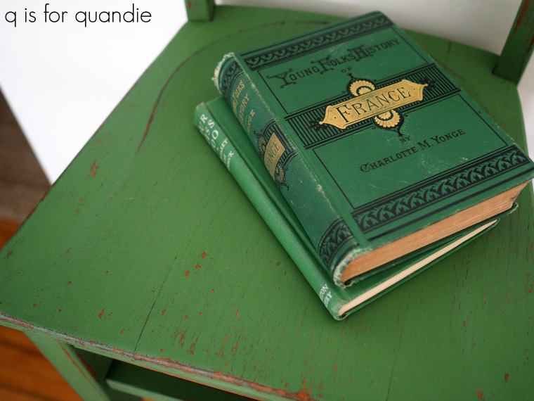
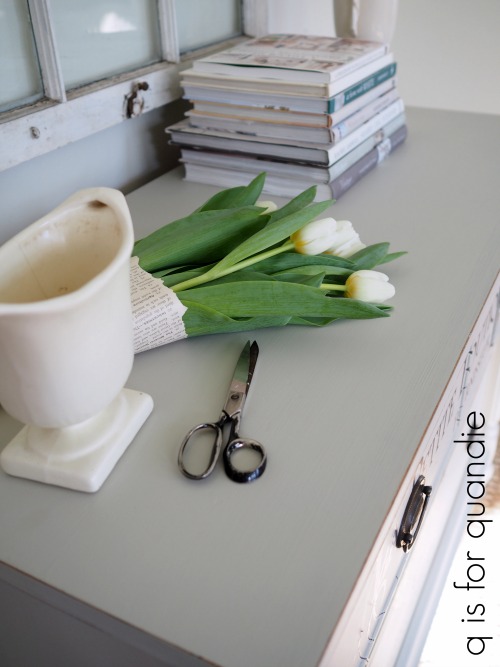
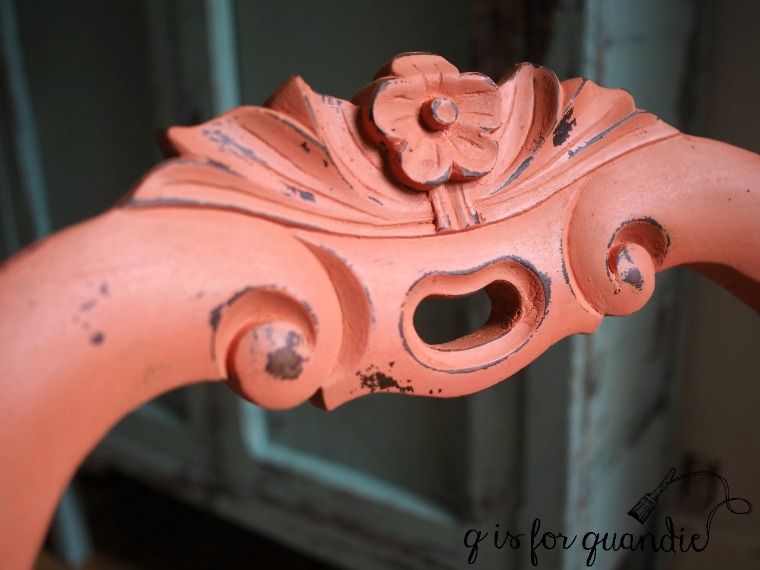
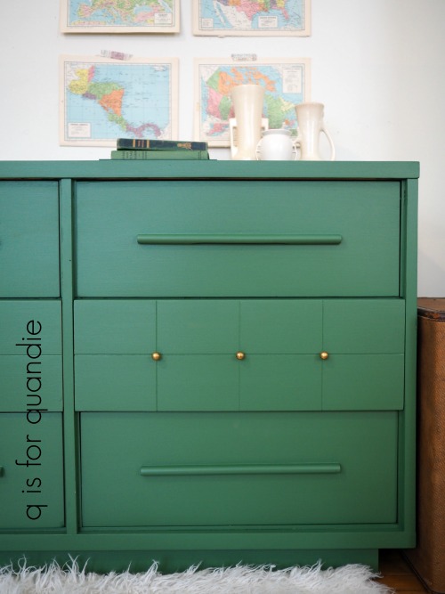
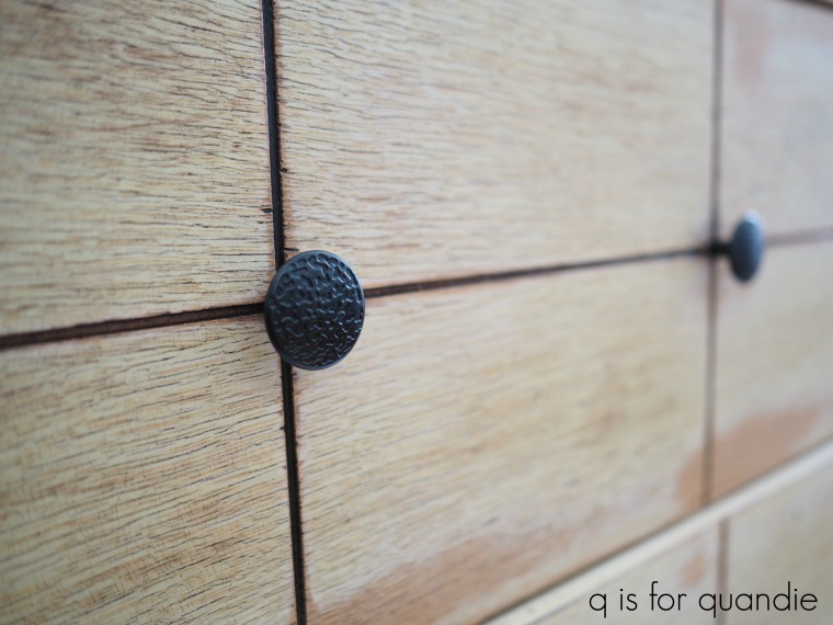
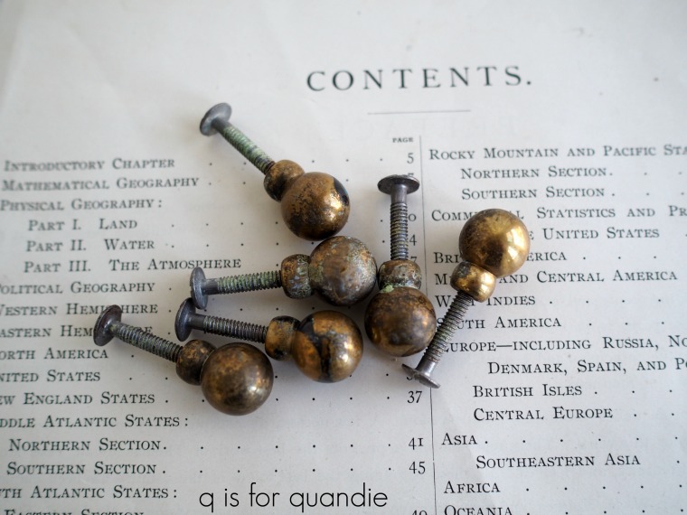
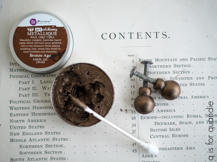
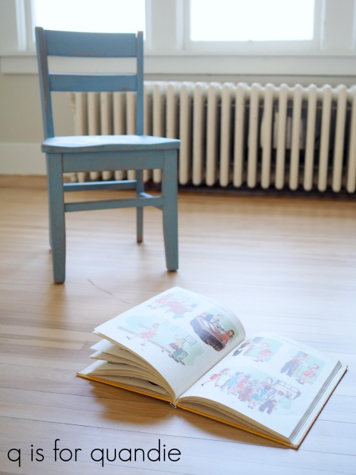
You might be wondering how you can accomplish that with a close up furniture shot where the piece fills the frame. The trick is to pay attention to what the subject of your photo really is. For example, in this next shot the subject of my photo is the drawer pull itself, not the entire piece.

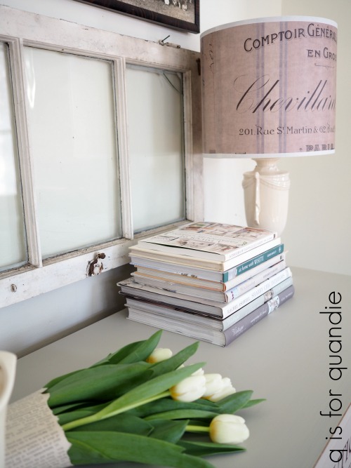
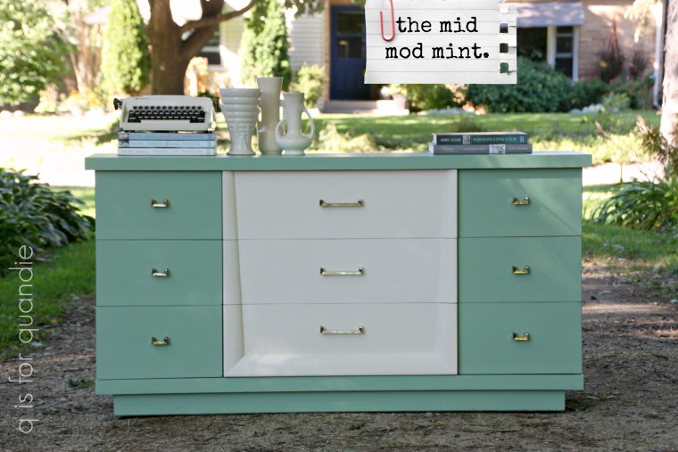
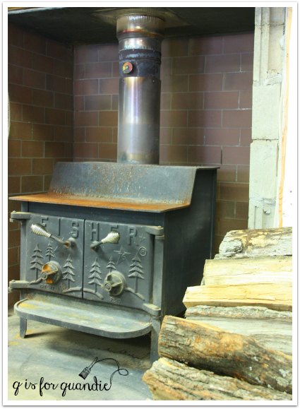
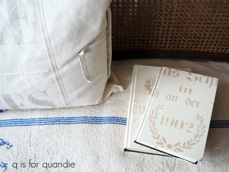
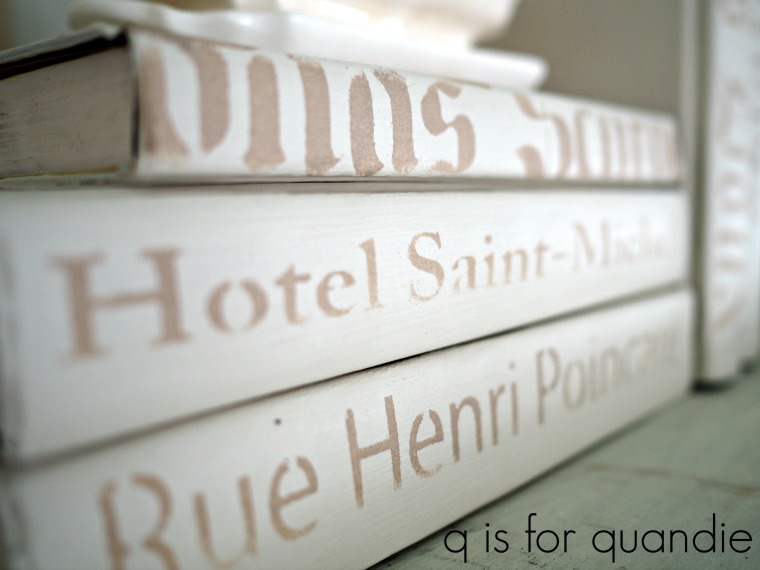
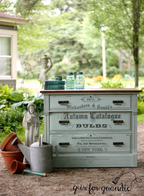
But even with photos from further out showing the entire piece of furniture you can use props on one side of the piece to balance a photo where your furniture isn’t centered in the frame.
Sometimes it still makes sense to center your piece in the frame though, if so then try to use some of these next tricks to improve your composition.
Symmetry.
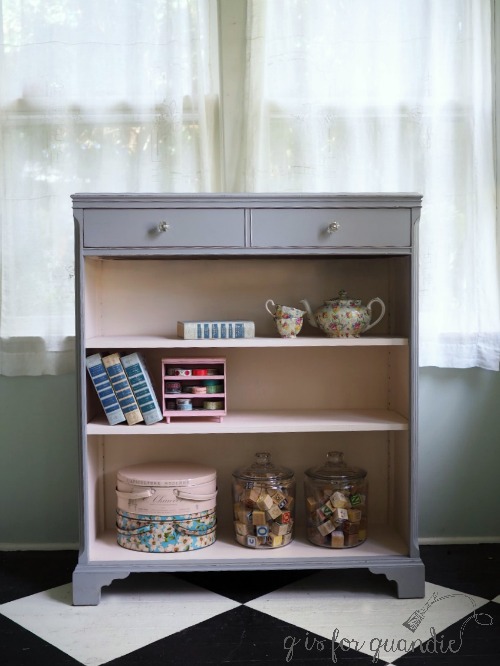
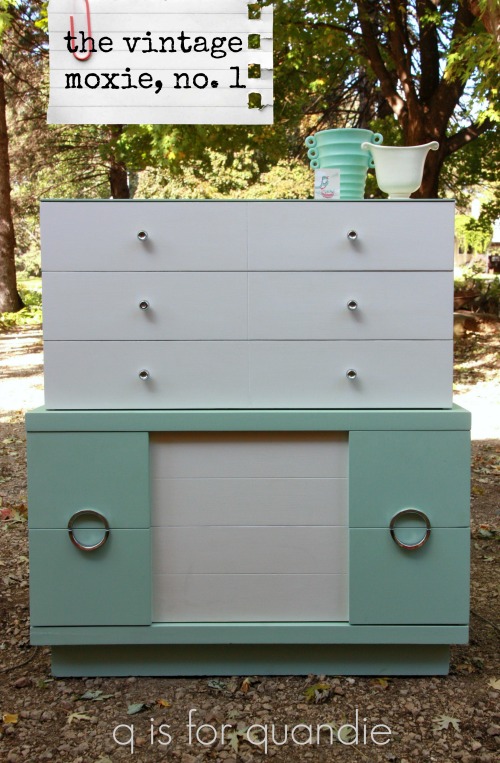
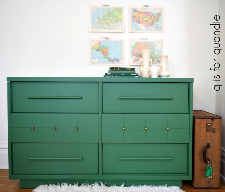
As I was looking back through my blog posts for a good example of symmetry, I realized it’s something I rarely use. To achieve symmetry you want to center your subject and then have each side of the frame somewhat mirror each other, or at least be visually balanced. This symmetry in this next photo comes from the cabinets that are behind the piece and are equally balanced on each side.

Triangles and diagonal lines.
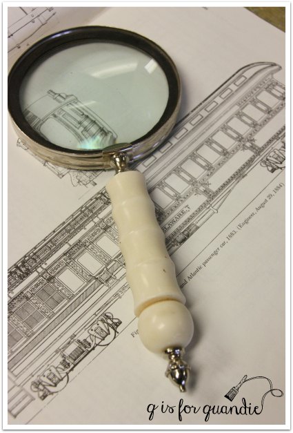
Making a visual triangle with your props is another great way to add dynamic tension to your photos.

Diagonal lines work well for this also.

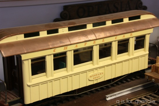
OK, technically that’s not a piece of furniture, but you get the idea.
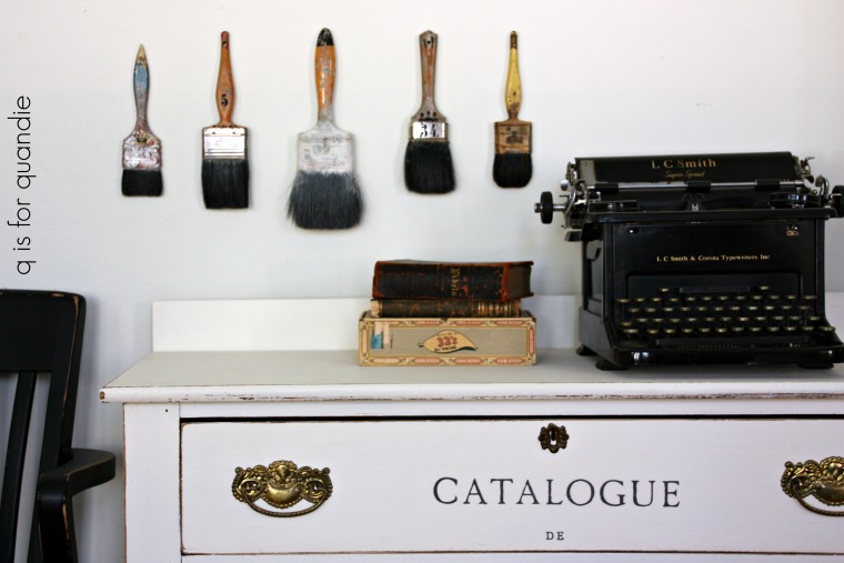
Rule of odds.
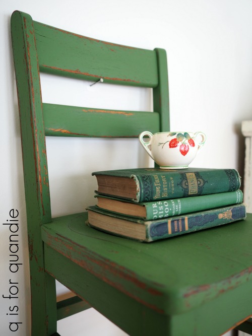
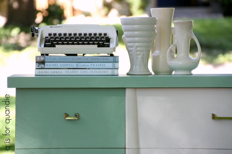
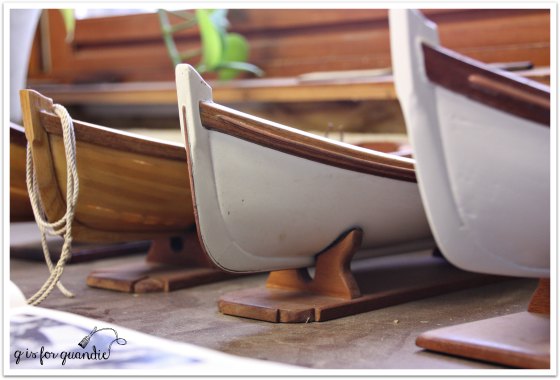
This is a simple rule to follow when adding multiple props to your photos. For some reason odd numbers of items always look better than even numbers. For example, five paint brushes, three books, etc.
This works when styling shelves in your home as well, try grouping things in odd numbers.
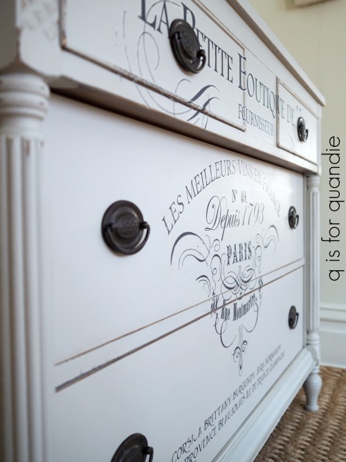
Filling the frame.
This is the idea that you should fill your entire frame with the subject of your photo, even to the point where you can’t see the entire thing. Filling the frame adds instant impact to your photo.
There are three ways to accomplish this; 1) use a zoom lens to zoom in on your subject, 2) just get close with your camera or 3) crop your photo in post-production.
Foreground interest.
This is something that I wish I would remember to do more often. One of the furniture artists I admire most does this all the time and it looks amazing (Marthe Leone). Basically the idea is to have something in the foreground of your photos to help add some depth to your photo and make it look less two-dimensional.
This can be challenging if you don’t have a lot of space where you take your photos, but if you have the room give it a try!
Point of view.
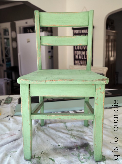
Point of view refers to the position your camera is in when taking a photo and it’s an important thing to pay attention to. Are you looking up at your piece? Down at your piece? Are you taking the photo from an angle or from straight on?

I find that a lot of people tend to take furniture photos from a standing position, and thus are really shooting down on their subject. While shooting down can be flattering for people (because it makes things look smaller), and it can add some artistic flare to one or two photos in a blog post (like the one above), it tends to throw off the scale of the piece. Especially if you’re taking a photo for an ad.
Instead try taking your photos straight on at eye level with the piece. I use a little kid size chair to sit on when I’m taking the majority of my furniture photos (just because it’s easier than spending a lot of time on my knees). Always include at least one or two photos taken at eye level when posting an ad for selling your pieces.
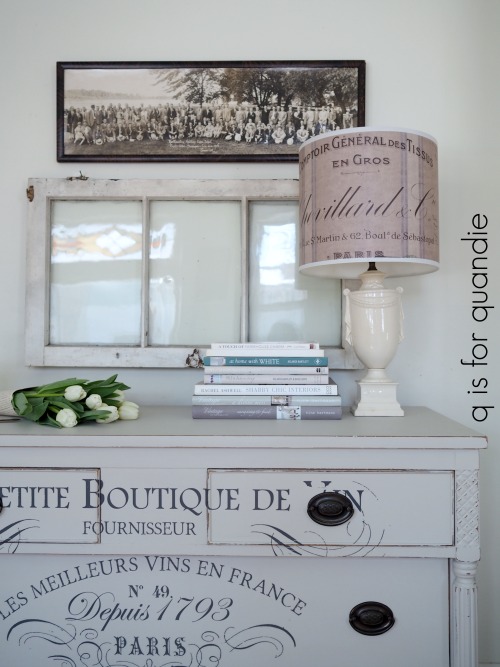
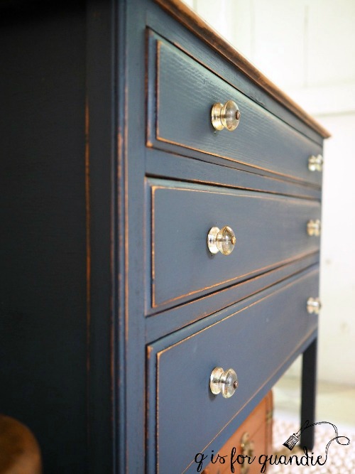
As you’re taking the photo, pay attention to your lines. The horizontal and vertical lines of the piece of furniture should all be straight and even like in the photo above.
I hope some of my tips for composing photos specifically for furniture have been helpful. If you’re interested in seeing more posts with photography tips for furniture painters or if there is a particular subject you’d like me to address, be sure to let me know with a comment. If you guys are interested, I’ll definitely do some more photo finish Friday posts!