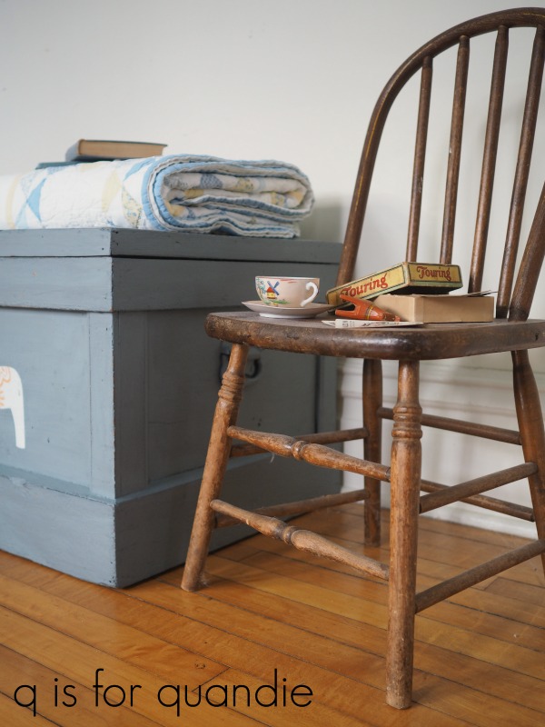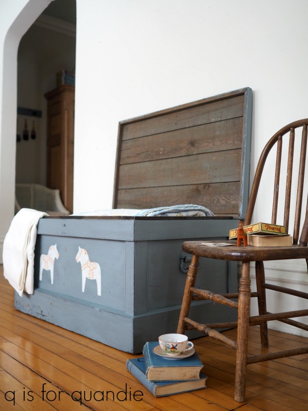
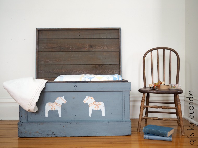
a Swedish (but slightly Norwegian) trunk.

Some of you might already be familiar with Goedele François.  Goedele is a blogger (check out her blog, Dala Muses, here), a business coach for creative entrepreneurs, a furniture painter and now a stencil designer!

Goedele recently released her own Dala Muses Nordic stencil collection.  Her stencil designs are influenced by Scandinavian folk art (read more details here) and were also inspired by her move to Sweden.  She now lives in the Swedish province of Dalarna, where the symbol of the Dala horse originated.

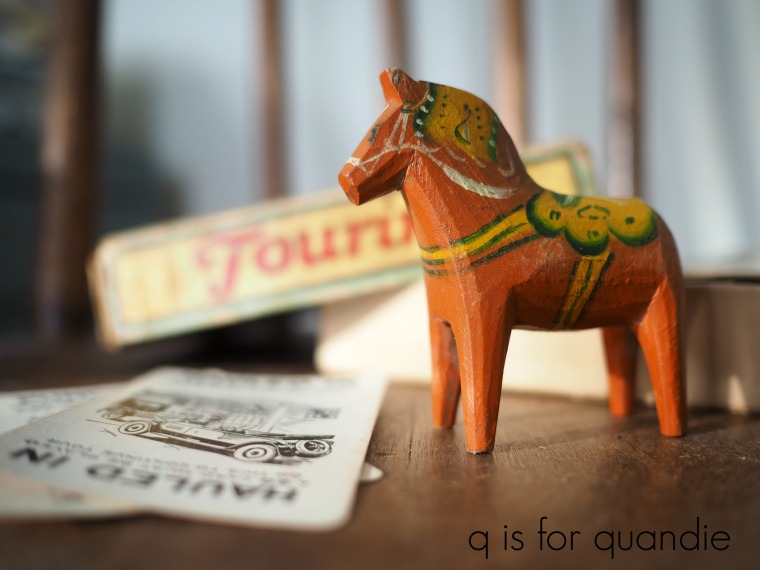
My paternal grandfather happened to be of Swedish decent and I still have the Dala horse that he gave me when I was a child.  My sister has one too.

So, when Goedele offered to send me one of her stencils to try out I chose the Dala Horse stencil.

I had the perfect project for it too.

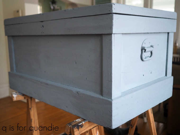
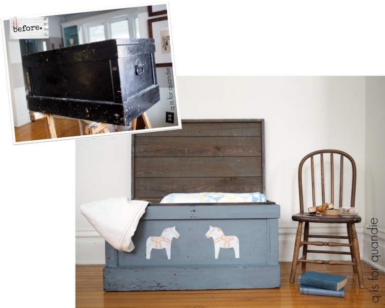
This is a trunk that my sister uses as a bedside table (how many of you are noticing that I took this ‘before’ photo before I painted my living room?).

The trunk originally belonged to our maternal grandmother, so technically it’s Norwegian rather than Swedish.  It was not always painted black, my sister spray painted it about 40 years ago!

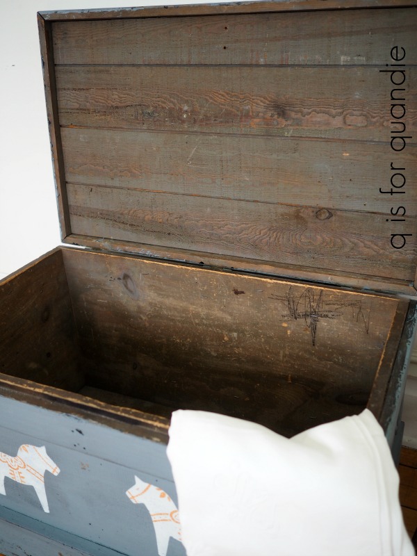
Unfortunately no one has retained any historical information about this trunk other than that it came from our grandmother’s attic.  My mom doesn’t recall anything about it at all.  So I have no idea how old it might actually be or who might have made it, which is a bit of a bummer.  I searched the inside and the bottom hoping to find some clues, like a signature or a written note, but no such luck.

Well, regardless, it was ready for a makeover.

I started by sanding it down thoroughly and then cleaning it well.  I decided to use milk paint this time because I think milk paint gives the most authentic looking aged finish.  Plus I had the perfect color for my sister, Miss Mustard Seeds Aviary.  However, I’ve had some super chippy experiences using milk paint over spray paint, so I added a little bonding agent to the mix this time.  My sister would be OK with a slightly chippy finish, but I don’t think she’d like a seriously chippy look.

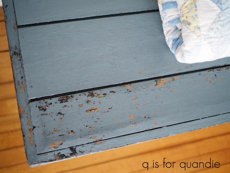
The Aviary is a lovely smoky blue.  And lucky thing I added that bonding agent because even though I did’t see much chipping as the paint was drying, once I started sanding it smooth the next day I got a bit more chipping than I thought I would.

Especially on this lower corner which makes me suspect there was some kind of oily residue on this part of the trunk …

Had I not used the bonding agent this piece would have been over the top chippy.

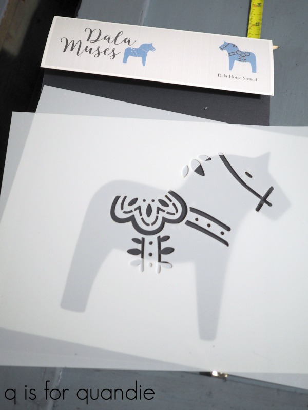
Next I pulled out Goedele’s stencil.

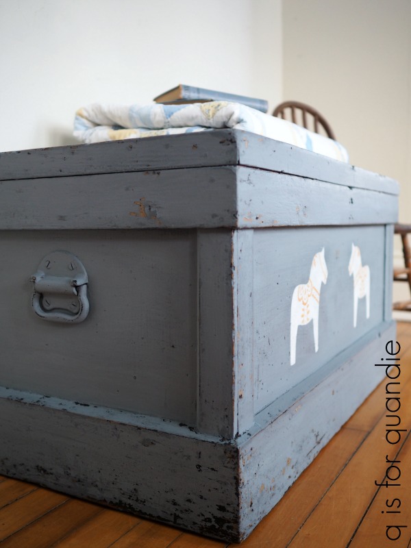
As you can see, it’s a two-part-er.  One stencil is the body of the horse and the other is the detail of the saddle, etc.

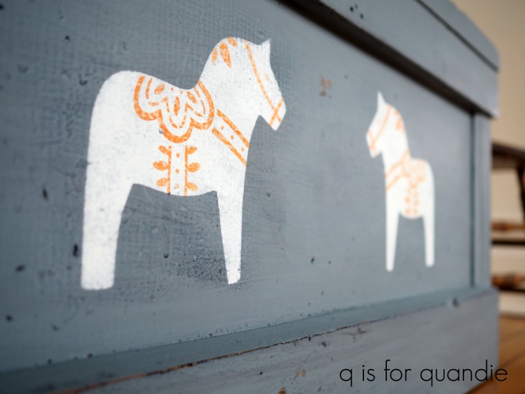
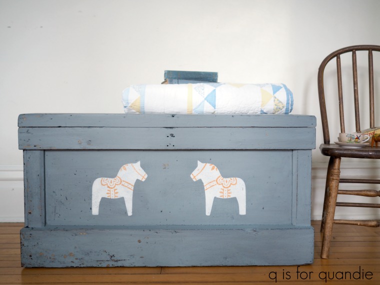
I suggested to my sister that we use a warm white for the body because I thought it would stand out nicely against the smoky blue of the Aviary, and Debbie really wanted some traditional orange in there somewhere so I used orange for the details.  I used acrylic craft paint for both.

I wanted to line up three horses in a row across the front, all facing the same direction, mainly because I’m a fan of using odd numbers of things.  But Debbie vetoed that plan and said it was either one centered horse, or two.  So I went with two (I thought one would look rather lost all by himself) and turned the stencil over on the 2nd so that they are facing each other.

Once the stencil paint was dry I sanded over the horses lightly to give them a more distressed look.  Then I finished the entire trunk with Miss Mustard Seeds clear wax.  The next day I added a second coat of wax to just the top of the trunk for added durability.

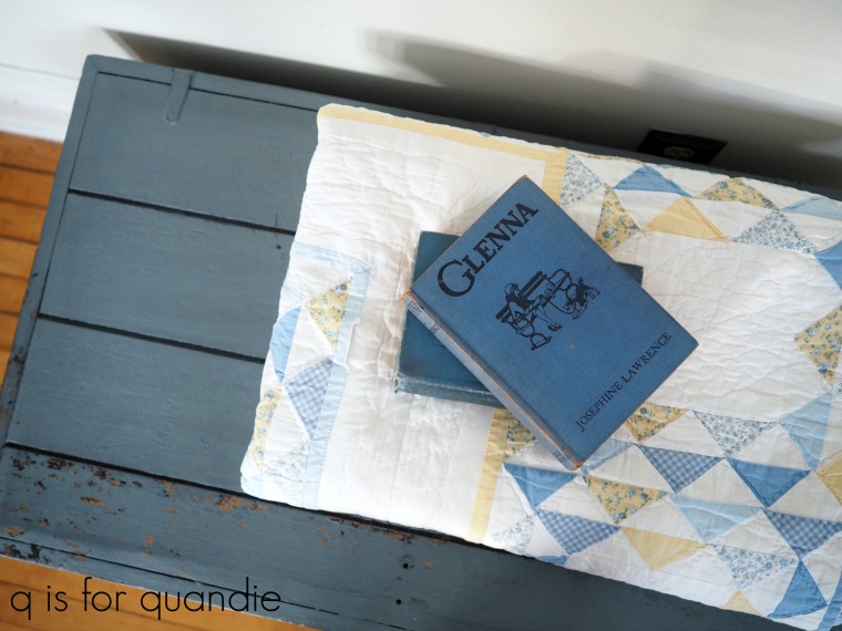
So here’s some behind the scenes info.  When I stage pieces to take photos of them I often start out rather stumped.  For this trunk I just couldn’t imagine how I was going to stage it aside from adding the blue and yellow quilt and some vintage books.

I also knew I wanted to include my little Dala horse and I tried just placing him on top of the books, but that looked pretty silly.  That led me to bringing in this adorable kid sized chair …

and then adding a few other smaller details to the chair like this fun vintage card game …

It wasn’t until I’d taken quite a few photos already that I thought ‘hmmm, maybe I should get some shots with the trunk open’ …

I then added this beautiful vintage monogrammed tablecloth because that’s what you would pull out of a trunk like this, right?

Finally, I realized that I really preferred the look of the trunk open.

So I took a few more shots that way and they turned out to be my favorites.

We were planning on delivering the trunk back to my sister yesterday, but we had snow for most of the day so I opted to stay in.  We’re supposed to have more snow late tonight and into tomorrow, and again on Thursday … so, I’m not sure when I’m going to get this over to her.  But hopefully she’ll like it, and now this trunk will always remind her of our Swedish grandfather and our Norwegian grandmother.

Many thanks to Goedele for sending me the Dala Horse stencil.  You can check out Goedele’s Dala Muses Nordic stencil collection here.

Her stencils are available from selected paint retailers in Europe, but those of you in the U.S. and Canada can order directly from Goedele by emailing her.  Be sure to check out that link for more details.

Also, I’d like to once again thank Miss Mustard Seeds milk paint for providing the Aviary paint, bonding agent and clear wax used for this project.


a colorful desk do-over.

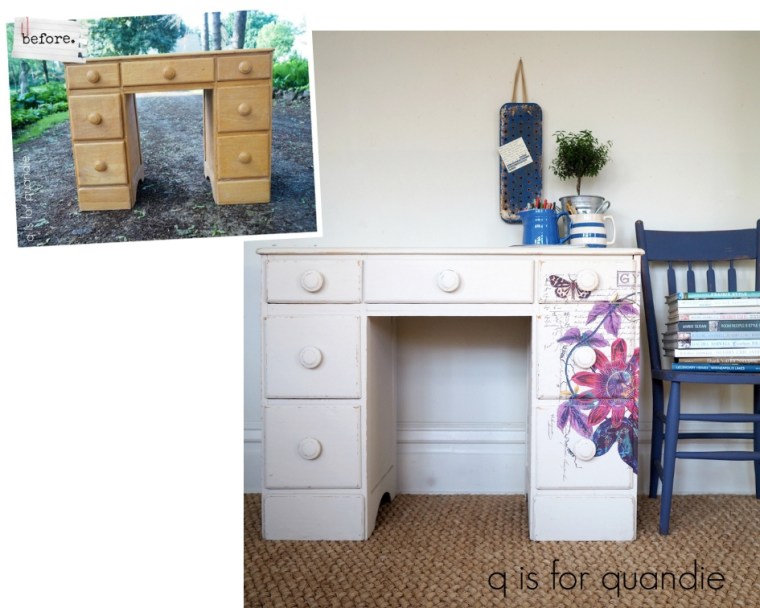
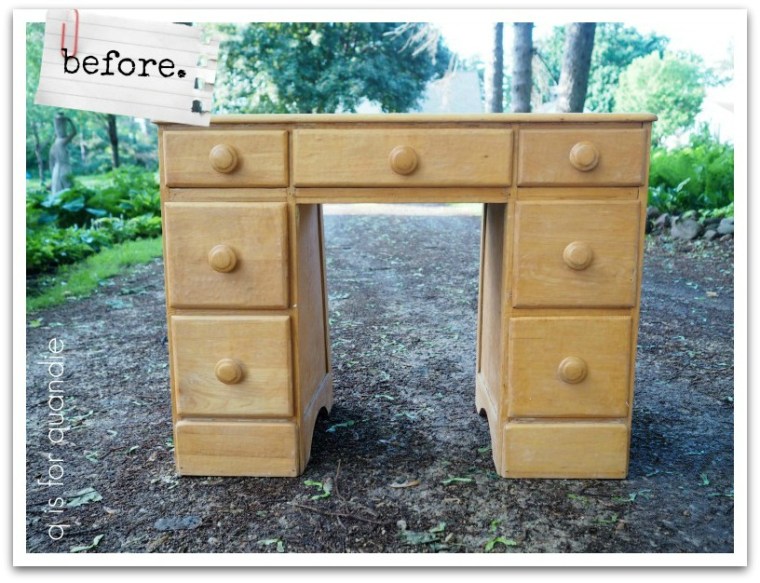
Last summer I brought this desk home from a garage sale.

I loved the chunky knobs, and at just $5, the price was definitely right.

After my handyman Ken made some repairs to it, I painted it with Dixie Belle’s Drop Cloth and added a grain sack style stripe in their Yankee Blue.  You can see all of those details in my original post about the desk.

Unfortunately, here it is January and I still have this desk in inventory.  For whatever reason, I have not had any luck selling this piece.  Well, then again, I have to admit I’ve been a little slack about promoting it.  I took my remaining Facebook Marketplace and Craigslist ads down before I went on my trip back in early November, and I never re-posted this one.  So that could have something to do with it.

Never the less, I decided it was time for a do-over.

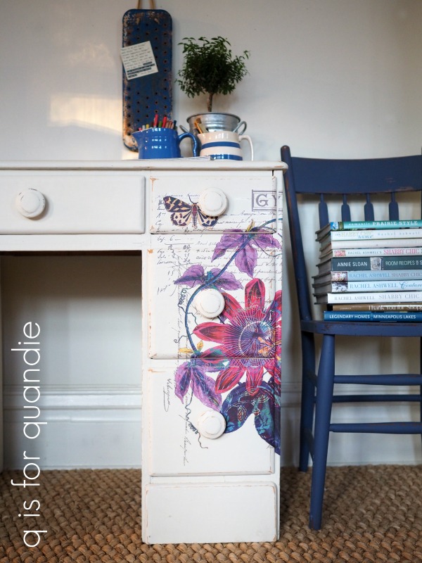
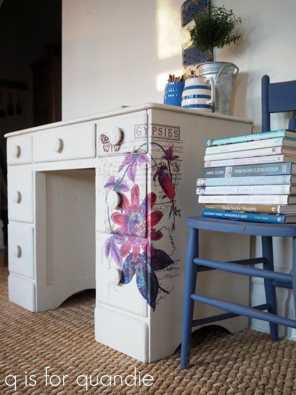
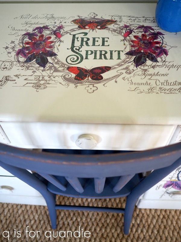
I started out by sanding down the grain sack stripes and painting over them with more of the Dixie Belle Drop Cloth.  Then I pulled out one of the new Prima Marketing re.design transfers called Passion Flower.

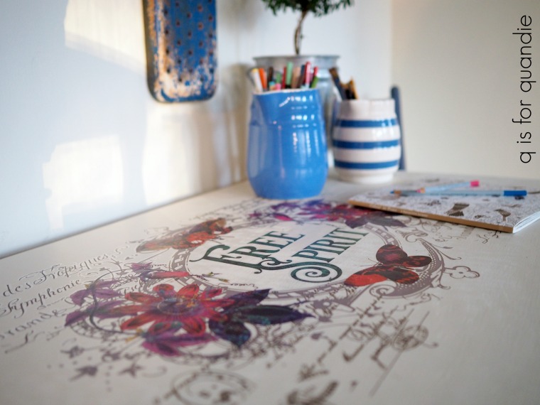
Isn’t that just gorgeous?  All of those vibrant colors!  This boho style is a bit outside of my normal comfort zone, but I’m hoping it will add that little bit of something special to this desk and help it find a new home.

Now before you get all excited and rush out to try and find this one somewhere, this is a sneak peek at one of the brand new designs coming out soon from Prima.  So it’s not available quite yet.  I’ll try to remember to give you guys an update when it becomes available.  But for now, this is just a tease.

I definitely wanted to use the entire transfer on this desk with the oval ‘free spirit’ portion on the top.

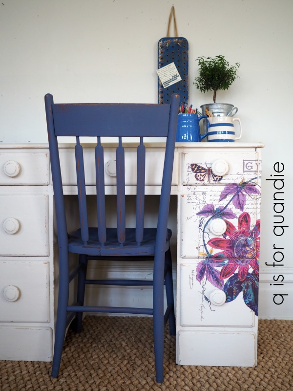
But I wasn’t quite sure at first how to make the other section of the transfer work with this desk.  Then I realized that it would look pretty fab if I just wrapped it around one corner giving the desk a more asymmetrical look.

If you’re wondering about the logistics of actually applying the transfer, here’s how I did it.  I started by removing the knobs from the drawers.  Then with the drawers back in place I figured out the placement I wanted and taped the transfer in place over the front of the desk.  I used a razor blade to trim the transfer around each of the drawer fronts, then pulled each one out individually and applied that section of the transfer.  Next, with the drawers still out, I applied the sections of the transfer that went between the drawers.

Once that was completed, I lined up the transfer around the side of the desk and applied that part.

It took a little patience to do this, and my results are not 100% perfect.  I don’t think anyone would notice unless they were seriously scrutinizing the details though.

Applying the transfer on the top was much simpler.

Once that was done, I added two coats of The Real Milk Paint Co’s Finishing Cream in Dead Flat to the top of the desk.  Since this is a desk, and it’s white, I thought it wise to have a very durable and washable surface on the top.  The rest of the desk was already finished with Dixie Belle’s Clear Matte Spray Wax so I freshened that up with another coat of the spray wax.

At first I was completely at a loss as to how to stage this piece for photos.  I think we can all agree that my usual look is more vintage, farmhouse, neutral, or sometimes even more mid-century.  I don’t have very many boho style props … or more accurately, I don’t have any boho style props.

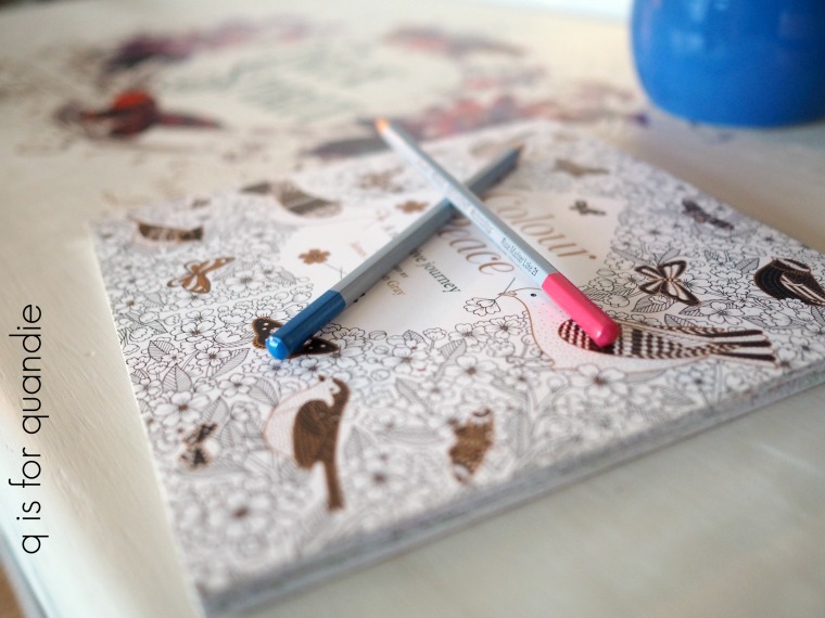
But as I was studying the desk with its new transfer, it reminded me quite a bit of a little gift my sister and niece brought over for me while I was sick.

Yep, it’s a grown up coloring book.  It was the perfect thing for me.  It allowed me to be creative without having to think about it too hard, nor did it require too much physical effort.  I colored quite a few of the pages while I was laid up on the sofa watching Outlander.

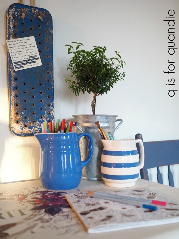
I added a couple of my favorite blue pitchers, a pretty plant and an old swing set seat turned into a magnet board and that was all it took to style this desk.

The Dixie Belle Yankee Blue that I originally used inside the drawers still works beautifully with the transfer …

as does the Yankee Blue chair …

Now, all that remains is to see if this version of the desk sells better than the last!

Hopefully there is a free spirit out there somewhere who needs a desk!

Fingers crossed!

Thank you to Dixie Belle for supplying the paint and spray wax for this project, Prima Marketing for supplying the transfer and The Real Milk Paint Co for supplying the Finishing Cream.

If you’re wondering where to purchase the Prima Marketing transfers check out their ‘where to buy’ page.

If you’re wondering where to buy the Dixie Belle Drop Cloth or Yankee Blue paint and Easy Peasy Spray Wax, you can shop with them directly online or find a retailer near you.

You can also order The Real Milk Paint Co’s Finishing Cream online here.

And finally, if you happen to be local (Twin Cities, MN) and in need of a free spirited desk, check out my ‘available for local sale’ page for more details.

sweet everyday farmhouse chairs.

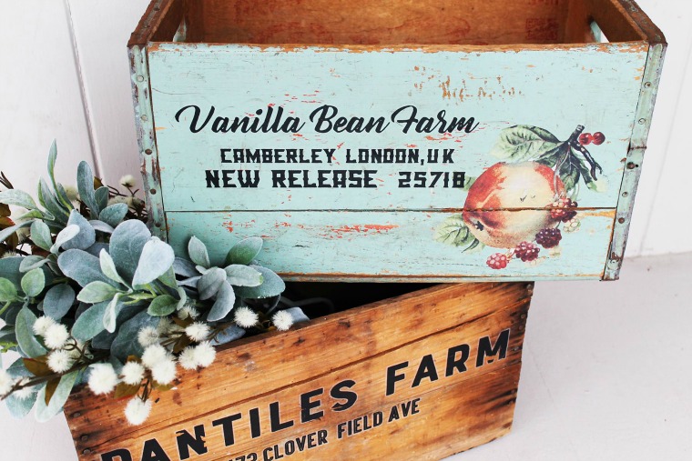
A while back Cari from Prima Marketing posted these adorable crates on the re.design with Prima Facebook group page.  She gave them a new life using the Sweet Apricot and the Everyday Farmhouse transfers.

I absolutely fell in love with the aqua color on the top crate, as well as her use of the transfers.  I have to say I would never have thought to pair that particular paint color with that apricot transfer, but they look amazing together, don’t they?

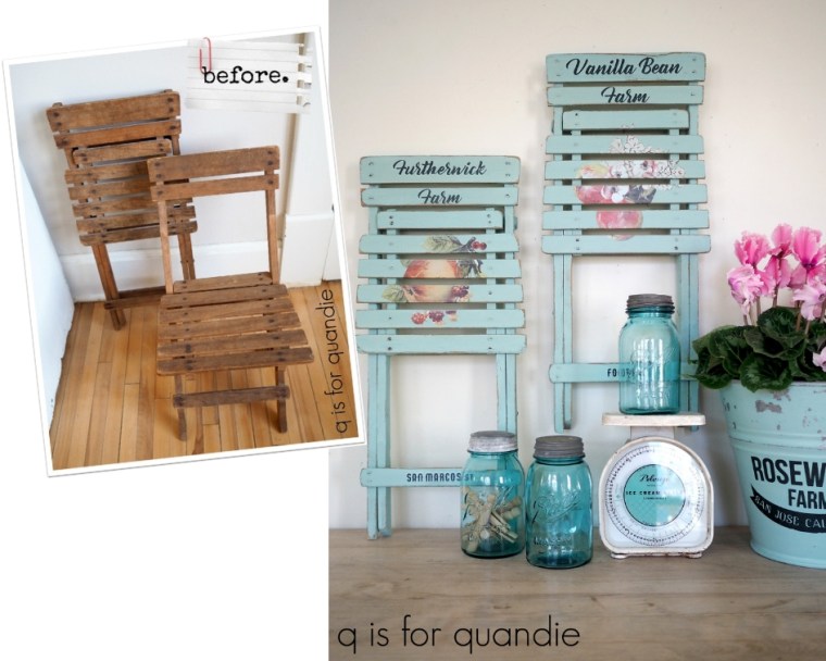
When my picker, Sue, found these kid-size folding chairs at the thrift store for me, I just had to see if Cari’s combination worked on them too.

First things first, I had to choose a paint color from my stash that was similar to that pretty aqua that Cari used.  Initially I thought that Fusion’s Laurentien would be the perfect color, and I did have some of that color on hand.  However, I really wanted a chippy milk paint finish on these chairs.

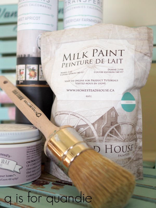
I considered using Miss Mustard Seed’s Eulalie’s Sky, but that color is a tad more blue.  I also thought about using Sweet Pickens’ Patina, but that one is a bit brighter than I wanted.  Then I remembered, Homestead House makes a milk paint version of Laurentien.  And not only that, but I just happened to have some in my milk paint stash!

Much like baby bear’s bed in Goldilocks and the Three Bears, it was just right.

Speaking of bears, painting these chairs was a bit of a bear.  All of those slats and legs and cross braces, oh my.  Every time I looked at the chair from another angle I found spots that I had missed.

But it was definitely worth the effort.

Once I had them painted, I sanded them to distress the edges and remove any chippy paint.  I also wiped them down with a clean, dry cloth to remove any excess dust before applying the transfers.

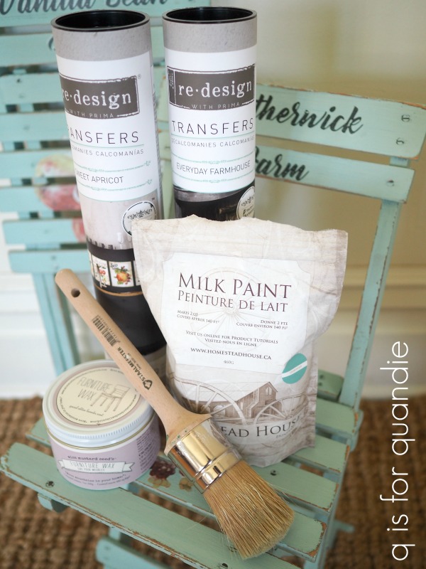
Here are what the Sweet Apricot transfers look like out of the tube.

There are 9 different designs in this set.

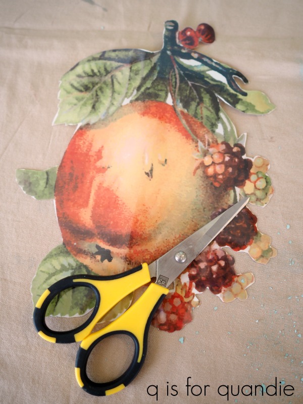
I decided to follow Cari’s lead once again and trim away the transfer around the piece of fruit.  Initially I tried using my larger pair of scissors, but I found it was much easier to use my Cutter Bees.

I used to use these little scissors all the time when scrapbooking.  They are perfect for getting around small details.

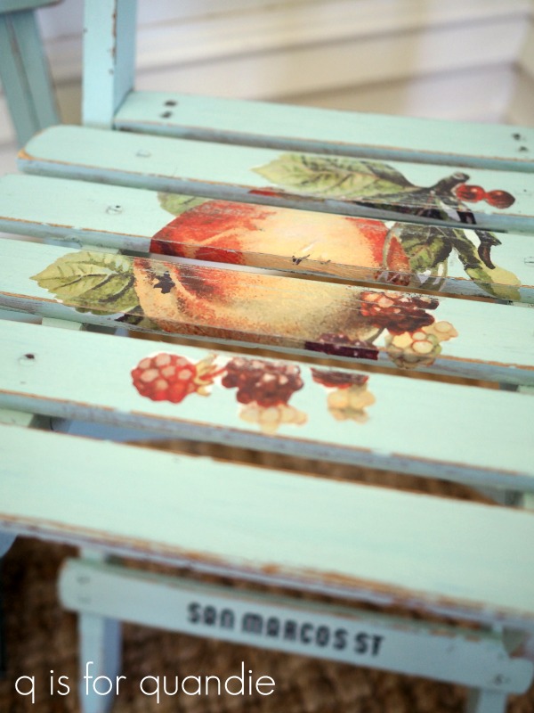
Once I had the transfer trimmed, I removed the backing paper and placed the fruit where I wanted it on the seat of the chair and pressed it down.  Before removing the top sheet of the transfer, I sliced it about halfway between each of the slats using a razor blade.  That way I was able to sort of wrap the transfer around the edge of each slat.

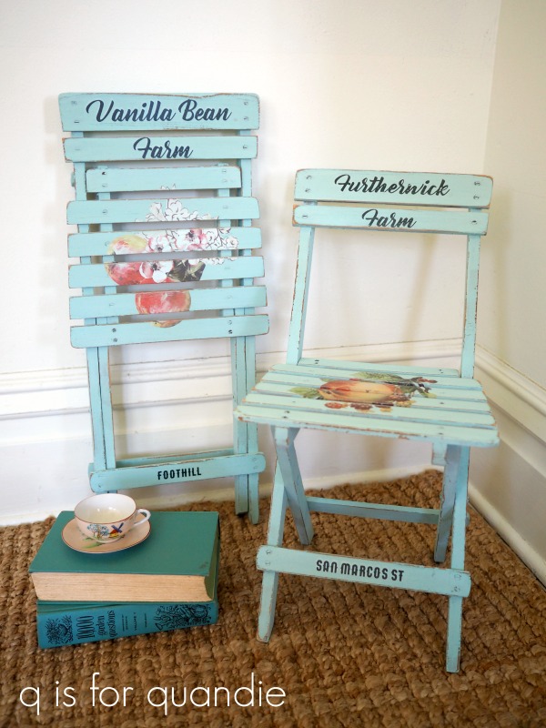
Next I chose some pieces from the Everyday Farmhouse transfer set to add wording to the back of each chair and the cross piece on the legs.

Once I had the transfers adhered, I added a protective topcoat of Miss Mustard Seeds’ clear furniture wax.

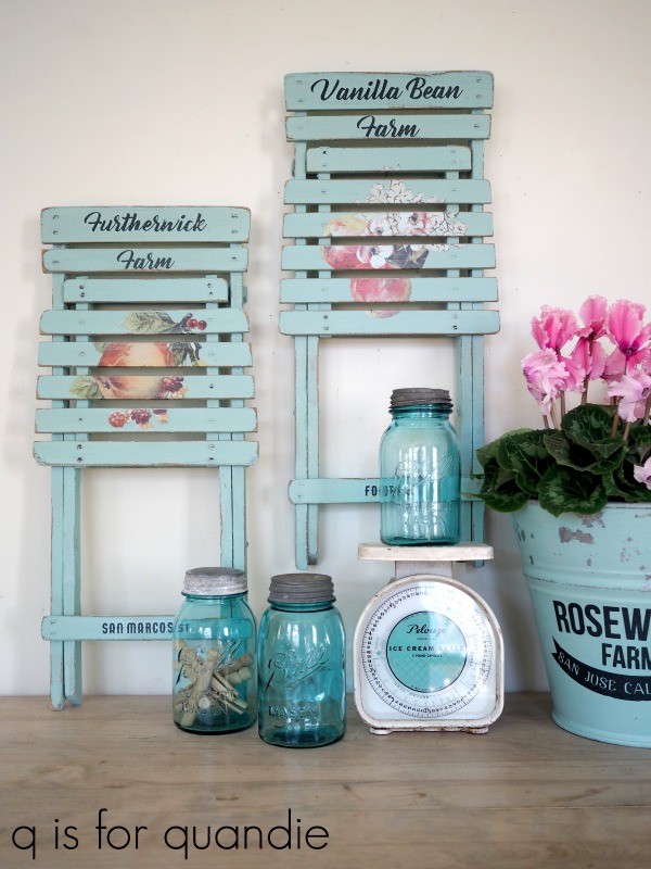
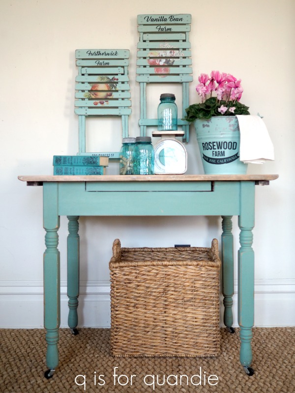
I love that these chairs fold up completely flat, which makes them perfect for hanging on the wall as decoration if one doesn’t happen to have a practical use for kid sized chairs.

They would be awesome hung in the kitchen, and you could always pull them down in a pinch if you need the extra seating for diminutive guests.

FYI – the table in that photo is one I painted a while back in a custom mix of milk paint that I called Green Alligator.  You can visit the original post for more details on that.

Since I had a little milk paint left over after finishing the chairs, I also painted this galvanized bucket.

Using milk paint on galvanized metal can be hit or miss.  If the metal is smooth and shiny, or has an oily residue on it, you will likely get chipping.  Possibly even lots of chipping.  However, if the metal feels rougher and doesn’t have a shiny coating then milk paint will adhere quite well.  As you can see, this bucket was somewhere in between.  It was rough and dull but I think there was some sort of residue where it chipped.  But no worries, I love this look!  Once the paint was dry I sanded well to remove most of the chips.  Then I wiped it down with a dry, clean cloth and added the transfer (also from the Everyday Farmhouse set).  I finished it all off with a coat of The Real Milk Paint Co’s Finishing Cream in Low Sheen.  This topcoat will help protect the rest of the paint from further chipping.

Many thanks to Homestead House, Miss Mustard Seed, The Real Milk Paint Co and Prima Marketing for providing the products I used on these chairs.  And a special thank you to Cari for providing the inspiration for these frickin’ adorable little chairs.

If you’re wondering where to purchase the Prima Marketing re.design transfers, check out their ‘where to buy’ page.

If you’re wondering where to buy Miss Mustard Seed’s products, here is where you can ‘buy online.’

If you’re wondering where to buy Homestead House Milk Paint, you can order it online here.

You can also order The Real Milk Paint Co’s Finishing Cream online here.

And finally, if you happen to be local (Twin Cities, MN) and in need of a pair of adorable little chairs, check out my ‘available for local sale’ page to see if these are still available.  I will most likely bring them in to Reclaiming Beautiful if nobody snatches them up right away.

the chair with a heart.

Last week was a rough one for me.  I won’t go into the details, but I was camped out on the sofa for nearly 5 days.  I had time to watch the entire Outlander series from the beginning through the current episode, and that is no small feat.  Luckily I had finished today’s project prior to getting ill so I had something to share with you guys today.  I’m still working on regaining my strength though, so I can’t promise I’ll be back to my regular posting schedule just yet but I’m sure you guys will cut me some slack.

I picked up this chair at a garage sale last summer … well, really last spring, as evidenced by the tulips blooming in the background of my ‘before’ photo.

It was in decent shape, just terribly outdated.  I apologize to grandmothers everywhere, but there isn’t much of a market for these needlepoint seats anymore.  But this chair had some lovely lines to it, and a rather unique look to the back, so I snatched it up.

I knew I could give it an entirely new look with some chippy milk paint.

Now I have a small confession to make.  I actually painted this chair last summer.  And then somehow it got shoved to the back of the workshop and I forgot about it, so I’m a little spotty on the details regarding exactly which products I used.

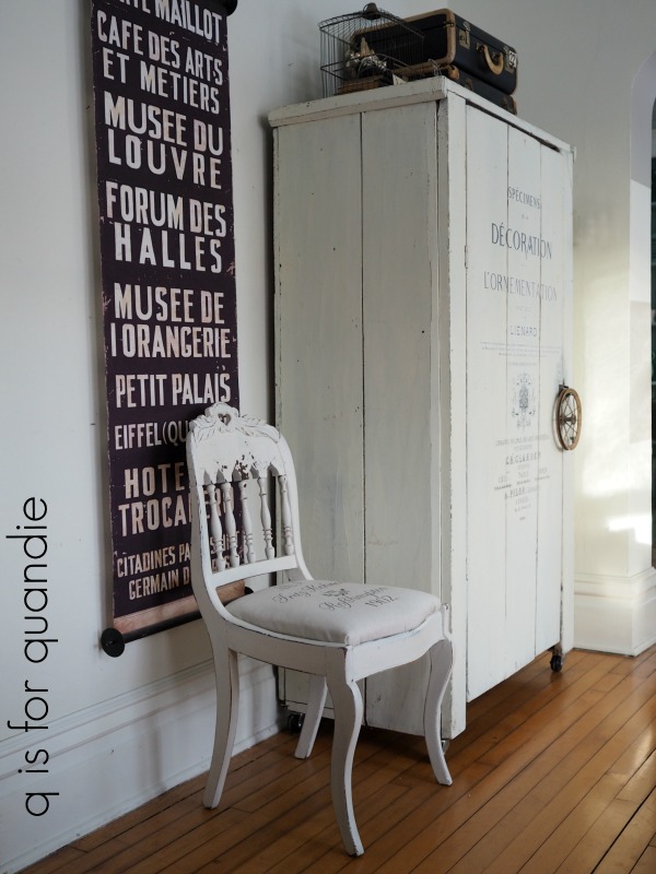
I know I painted it with a layer of blue paint first but I can’t remember for sure which blue, I think it was Miss Mustard Seed’s French Enamel.  Then I added Miss Mustard Seed’s Ironstone over that.  You can just see the blue peeking through in a few spots where I’ve distressed the carving at the top of the chair.

And as you can see, I got some great chipping!

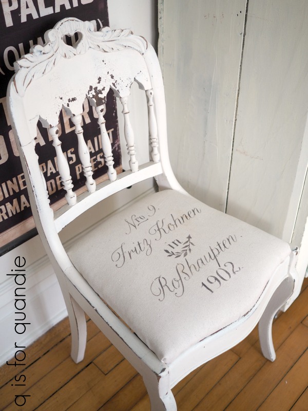
I pulled this chair out of the workshop at least a month ago or so thinking that all it needed to finish it up was some new fabric for the seat.  My vision for this piece was to use a fabulous vintage European grain sack for that.  But I didn’t actually have one.  I shopped around a bit for one, but those things are not cheap.

Finally I realized I was being foolish.  I know how to create something nearly as fabulous at a fraction of the price.  Duh!

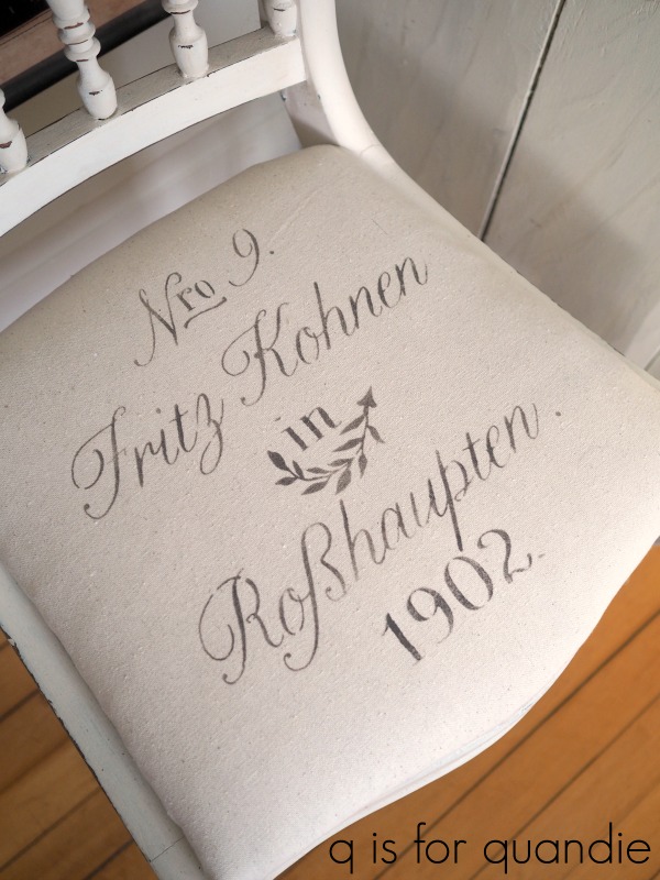
Just stencil some drop cloth material and ta da!

The stencil is from Maison de Stencils.  If you are looking for European grain sack style stencils, they have a fantastic selection.

And just like that, the chair was finished.

I don’t know what took me so long to finish it off!

the aviary chair.

For quite some time now I’ve been wanting to try the newest Miss Mustard Seed’s Milk Paint color, Aviary.

Let’s see.  I think this color came out about a year or so ago, right?  Hmmmm.  Why am I always so hopelessly behind the times?  Well, better late than never I hope.

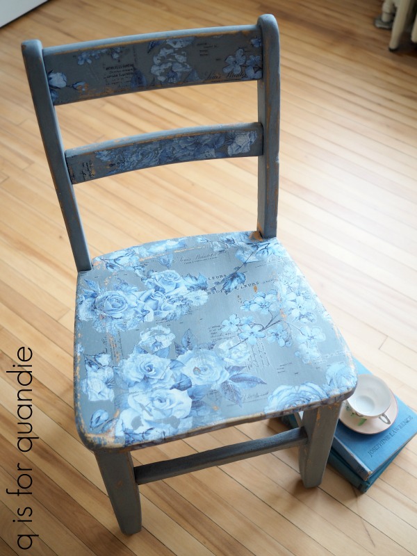
One of my strategies when working with a new paint color is to paint a practice board first so that I can get a feel for how the color looks with different top coats before moving on to a large piece of furniture.  But this time I decided it would be more fun to paint a little schoolhouse chair to test out this color.

As you can see, the finish on this chair was in pretty rough shape.  Parts of the finish were so dried out that I really didn’t think I would get any resistance at all (and thus no chipping).  I wanted to end up with a chippy, beat up, authentically old looking finish, so I didn’t do much prep work to the chair at all.  OK, let’s be honest, I did absolutely zero prep.  I may have wiped away a cob-web or two, but that was it.

Sometimes that can backfire on you, and had this been a larger piece of furniture it would have been a mistake.  But for this little chair, it was a calculated risk.  It’s a small piece, so it would be easy enough to fix if the paint didn’t adhere at all.  Sure enough,  I ended up getting quite a bit more chipping than I expected on the legs of the chair, but very little chipping on the seat.  So I simply sanded down the super chippy legs and painted them again.  Problem solved.  The sanding helped the next layer of paint stick.

Today’s q tip:  If you’re comfortable with taking a chance and rolling the dice, you can skip the prep on your project like I did.  But if you’d prefer to exercise a little more control over the amount of chipping you get with milk paint then do proper prep first.  Sand your piece lightly all over and clean well with TSP Substitute (or similar).  For more tips on painting with milk paint, check out my milk paint basics post.

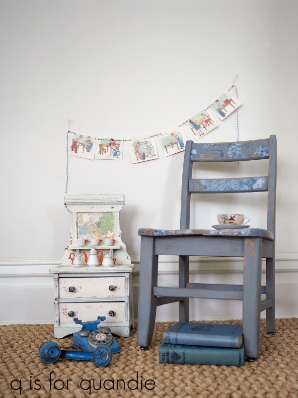
The coverage with Aviary was really good.  Two coats of paint was plenty.

Once my paint was dry I sanded heavily for two reasons; first, I wanted to be sure I removed any chipping paint (more on that in a minute) and second, I wanted a very distressed look for this vintage chair.  I still had some chipping, but it was just the right amount this time.

Once sanded, I vacuumed the chair with my shop vac.  Then I used a clean, dry, nubby cloth to wipe the chair vigorously.  I wanted to be sure that I had all of the chipped paint and dust off before applying a transfer to the seat and back of the chair.

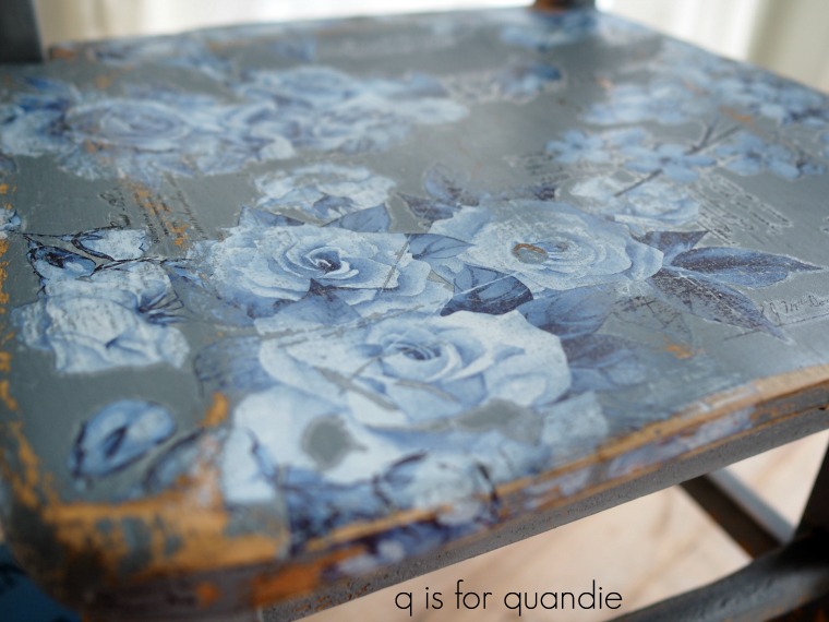
This project was a great way to use up the leftover pieces of the Prima Marketing French Ceramics transfers that I used on a dresser that I painted last year.

When using a transfer over chippy milk paint I have found two options that work well.  Sand the chippy paint really thoroughly and be sure to remove all chips and dust first; or seal the milk paint with Miss Mustard Seed’s Tough Coat Sealer (or another water based sealer) before applying the transfer.  If you don’t do either of these things, you may find that the transfer backing paper removes your chipping paint rather than releasing the transfer onto your piece.

Also, do not try to apply a transfer over freshly applied wax.  It will become a sticky, gooey mess as the friction from rubbing on the transfer will heat up the wax and it all just goes downhill from there.  Been there, done that.  Remember transfer first, wax second.  However, you can apply a transfer to a waxed surface that has cured for 30 days or more.

Once I had my transfer in place, I sanded over it with 220 grit sandpaper.  I wanted a distressed look, so I wanted the transfer to look worn away in spots too.

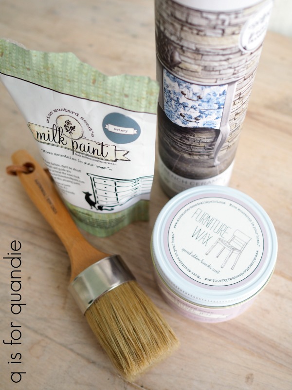
Next I wiped the chair down with a clean cloth again and then applied Miss Mustard Seed’s Furniture Wax in the special edition lavender scent.

I applied it using a new wax brush that my friend Terri gave me for my birthday.  It came in a kit with three brushes, some brush soap and a few other little things like a pair of plastic gloves and one of those sanding blocks.
I haven’t tried the brush soap yet, but it smells divine.  I’d be tempted to use it as a regular hand soap it smells so good.  I think that smaller non-tapered brush might work well for stenciling.  And the pointy brush just came in handy for getting at a hard to reach spot on the bench I shared last Friday.

I used the largest brush at the bottom for waxing this chair though and to be honest I think the bristles are just a bit too long and too soft for really effective waxing.  I prefer my waxing brushes to be a little bit more stiff.  It was hard to work the wax into the surface with this brush.  It might be better suited to painting rather than waxing (and fyi, it is meant for either painting or waxing).

I haven’t had the milk paint out in a while, and now I’m reminded of why I love it so much.  It really does provide the most authentically aged looking chippy finish.

And isn’t the Aviary a lovely shade of grey-blue?  I’ll be keeping an eye out for the perfect dresser to put this color on next!

Thank you to Miss Mustard Seed’s Milk Paint for providing the paint and wax, and to Prima Marketing for providing the transfer for this project.

If you’re wondering where to purchase the Prima Marketing re.design French Ceramics transfer, check out their ‘where to buy’ page.

If you’re wondering where to buy Miss Mustard Seed’s product, here is where you can ‘buy online.’

And finally, if you happen to be local (Twin Cities, MN) and in need of an adorable little chair, check out my ‘available for local sale’ page to see if this one is still available.

dreaming of spring.

OK, I know I’m jumping the gun a bit with the garden theme of this piece.

I just couldn’t help myself though.  I’m already dreaming of spring, how about you?

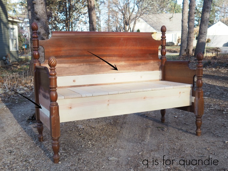
I wasn’t especially looking for another bed frame to turn into a bench, but I came across this bed while garage saling on my lunch break last fall.  Luckily I was with my co-worker Jodie and she was driving a pick up truck so we were able to load it up.

There were no side rails included, so that made this one a great candidate for a bench.  If I’d wanted to sell it as a bed I would have had to replace the side rails.
In addition to adding a seat and the lower front trim piece to the bench, this time my handyman Ken also had to insert boards into some gaps in the headboard and foot board in order to make this piece work.
This is the third bench that Ken has made out of an old bed frame (here is the first and the second if you want to see them).

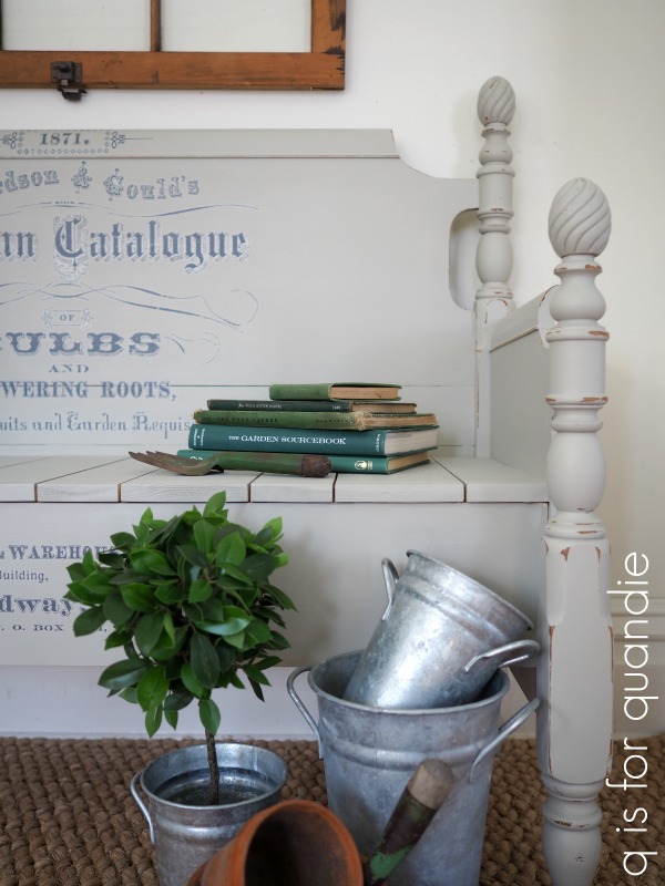
Once the bench was constructed, I painted the old wood with two coats of Fusion’s Bedford, while the new wood on the seat only required one coat.  Bedford is a medium warm grey.

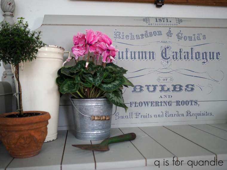
I let the paint dry overnight, and then I added Prima Marketing’s Seeds transfer.

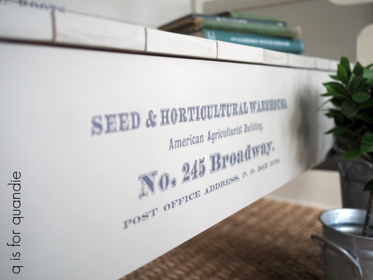
I didn’t quite use all of the transfer, although I did put some of it on the lower section of the bench too.

I also sanded the edges of the piece to distress the paint job.  With Fusion paint I recommend doing this within a few days of painting the piece.  Fusion is more difficult to distress once the paint has cured.

Although Fusion paint does not require a top coat for durability, the bare wood that I exposed by sanding could use a little protection.  So I added just a little bit of Miss Mustard Seed’s furniture wax to a cloth and wiped it over all of the distressed areas of the bench.  I didn’t add a lot of wax, just a bit.

I did the same over the transfer, just rubbed it lightly with a waxy cloth to give it a little extra protection.

I couldn’t resist staging the bench with plants and gardening supplies.  Sure, it’s January and everything outside my window is frozen solid.  But inside I can pretend it’s practically spring!
If you’re wondering where to purchase the Prima Marketing Seeds transfer, check out their ‘where to buy’ page.

If you’re wondering where to buy the Fusion paint in Bedford, check out their ‘where to buy’ page.

And finally, if you happen to be local (Twin Cities, MN) and in need of a fabulous bench, check out my ‘available for local sale’ page to see if this one is still available.

that’s a wrap.

Happy New Year!

Where in the world did 2018 go?  It just flew by for me.  Overall it was an awesome year, except this last part got a little rocky.  I had some dental work done just a couple of weeks before Christmas and it was a rough recovery.  My body just doesn’t adjust well to having foreign objects installed (it was a crown, in case you are wondering what in the world I’m talking about).  I’m only just starting to feel more like myself again.  Have any of you had this experience with a crown?

It required four trips to the dentist, and I do not enjoy the dentist (even though my dentist and her assistant worked really hard to make me comfortable).  Honestly, the whole thing just threw me for a loop.  Mr. Q was concerned because I completely abandoned my paint brush during this time frame.  I find it difficult to be creative when I’m not feeling well, how about you?

Next time remind me not to schedule this sort of thing just before the holidays!

I’m starting to feel much better now though and I’m putting the whole experience behind me, along with the rest of 2018.  But before we move on, let’s take a look back at some of the projects that I shared with you here on the blog this past year.

Photo collages wrapping up your work for the year are all the rage on Instagram these days, so I thought it would be fun to create one myself for this blog post.  But as I started looking back through my 2018 posts I realized that I needed more than just one.  How about more like seven?

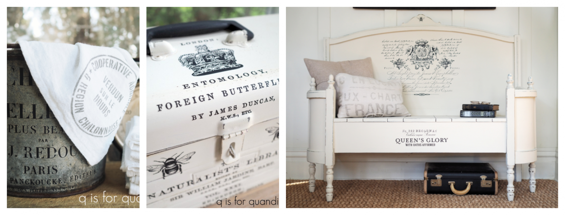
Starting with some of the pieces I did with Prima Marketing transfers …

In fact, I had so much fun using transfers during 2018 that I have to share a second collage of transfer projects.

I was going to do a collage with just pieces painted with Dixie Belle paint, but I soon realized I could do an entire collage of just those painted in Dixie Belle’s Caviar

This deep, rich black has turned out to be one of my favorite colors to work with.

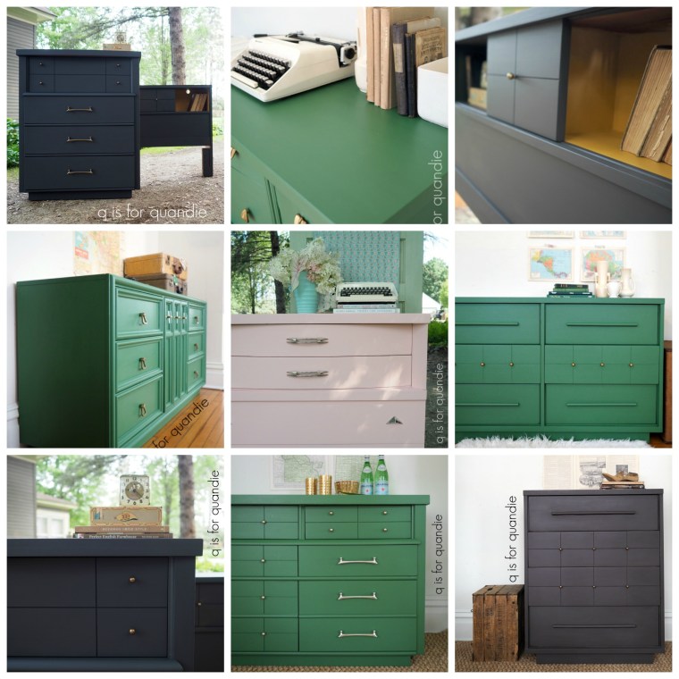
Next, here are many of the mid-century modern pieces I painted last year.  It’s obvious that Fusion’s Park Bench (green) was my go-to paint for the mid-mods in 2018.

Those are four different dressers painted green, not just different shots of the same piece.  I also did a few dark grey pieces usually using Fusion’s Ash, but the one on the lower right is Dixie Belle’s Gravel Road.  Fusion’s English Rose is the perfect Millennial Pink for this style of furniture too.

And then there are the milk paint pieces from 2018 …

Hmmm, it would seem that I have a definite preference for using milk paint in shades of blue.

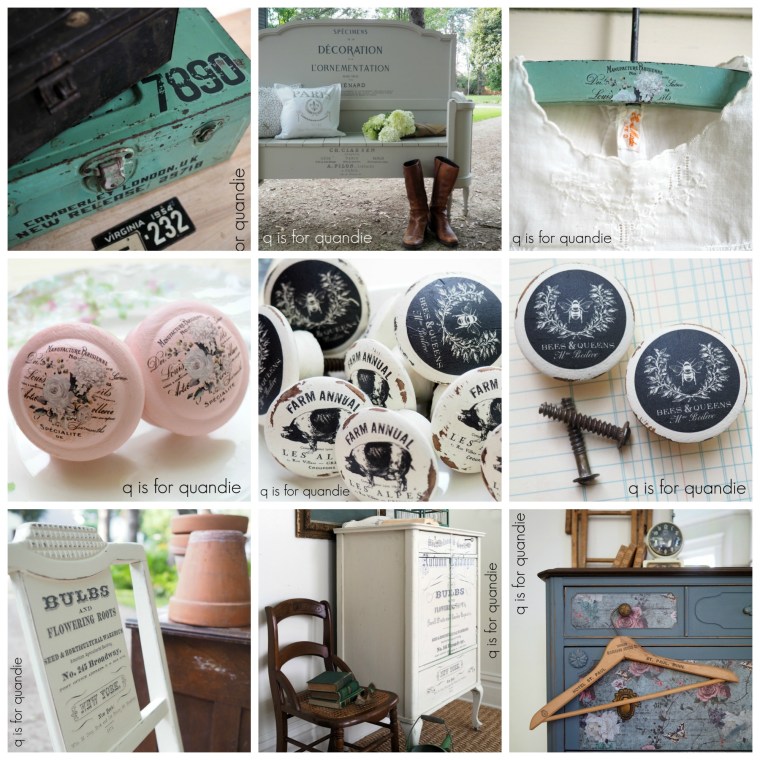
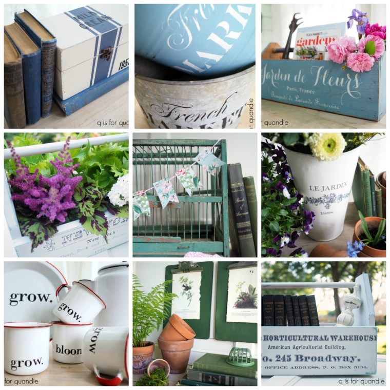
Next up are some of my favorite smaller projects that I did in 2018 …

Smaller projects like these are one of my favorite ways to try out new techniques or new paint colors.

And let’s not forget my favorite garage sale finds of 2018.

Is anyone else starting to experience garage sale withdrawal?  Spring is just around the corner, right?

Well, that’s a wrap on 2018.  If you’re looking for more details on any of the pieces of furniture featured in the photos above just visit my ‘fab furniture‘ page where you can see ‘before’ & ‘after’ photos with links to blog posts with all of the details.

I hope to have many more inspiring projects to share with you in 2019, and perhaps I’ll experiment with a couple of new products here and there too.  Be sure to stay tuned!

keeping it simple.

While I was gone on my cruise last month I received a text from one of my favorite customers.  Nikkii has purchased a gazillion pieces of furniture from me, I do believe I have lost count of just how many.  Last summer she purchased the gorgeous bed I painted in Dixie Belle’s Caviar.

She got in touch because she was looking for a dresser to pair up with the bed.  She wanted something that would hold a decent amount of stuff.

Mr. Q and I happened to have just returned to the ship after our Street Food Tour in Genoa when she texted, but I promised to get back to her when our trip was over because I had a couple of dressers that I thought might work for her.

She ended up going with this one.

Initially you might be thinking that the simple, clean lines of this chest on chest dresser don’t relate to the more ornate style of the bed at all.  However, I knew that painting it the same color would go a long way towards making them work together.

I prepped the dresser using my regular m.o.; removed the hardware, sanded lightly, vacuumed inside and out, cleaned with Krud Kutter Kitchen Degreaser, and rinsed with a damp cloth.  Then I added two coats of Dixie Belle’s Caviar.

Once that was dry I added my Blanchisserie de Francaise stencil using Ceramcoat craft paint in a color called Deep Taupe.  The curvy lines of the stencil will also help this piece relate to the curvier lines of the bed.

Readers frequently ask where I got this stencil, but unfortunately the Etsy vendor I purchased it from is no longer in business so I can’t provide a source for it.

After adding the stencil it was simply a matter of sanding lightly again using 220 grit paper, vacuuming again and then waxing the piece using Dixie Belle’s Best Dang Wax in Black.

Gosh, I’d forgotten what a workout it is to wax a large piece of furniture.  And this one is large at 53.5″ tall.  I never feel guilty about skipping the gym when I’m spending time waxing a piece of furniture.

And it sure did feel good to be painting again.  I’d definitely missed it!

I retained the original drawer pulls on this piece.  I initially debated swapping them out, but they had two screws each which would have meant filling holes and re-centering new holes for knobs.

When I think about it, this dresser makeover really was an exercise in keeping in simple.

First of all, that original red stain would have definitely bled through a lighter color of paint.  Sure, I could have used a stain blocking primer like Dixie Belle’s BOSS and that would have solved that problem.  That would have been an extra expense, and an extra step or possibly two (if it had required two coats).  Just painting it black was much simpler.

Second, keeping the original hardware meant I didn’t have to fill those extra holes.  Plus there would have been the added expense of buying 10 knobs.

Some days it feels like the competition out there on social media is so fierce, and everyone is trying to out-do each other with the most elaborate makeover possible.  Sometimes it’s good to remind myself that keeping it simple is OK too.

You can really change the look of a piece of furniture with just some paint, don’t you agree?


your choice of toppings, on the lighter side.

On Monday I shared my favorite technique for using a dark wax over bare wood.  Today I thought I’d focus on using other colors of wax over bare wood (or white washed wood).

Once again, all of my favorite wax brands make a version of white wax.

Starting at the top and moving clockwise that’s Miss Mustard Seed White Wax, Homestead House White Wax, the Real Milk Paint Co Soft White Wax, and Fusion Liming Wax.

That brings up the first question, are white wax and liming wax the same thing?

I don’t have a definitive answer from the experts, but I’m pretty sure they can be used interchangeably.  One may have a slightly different color, or maybe a little more or less pigment, but as you can see all of the white waxes that I have are slightly different in color anyway.

You can apply white wax to bare wood in just the same way as the dark waxes that I talked about on Monday.  If you need a refresher you can refer back to that post.  However, I often choose to apply a coat of clear wax before applying the white.    The purpose of that is to soften the look of the white wax and allow it to blend a little bit more.  But if you want that cerused or lime waxed look to be more pronounced and you really want to see those streaks of white that catch in the grain of your wood, go ahead and just use the white wax right over your bare wood.

The tabletop below has a coat of clear wax followed by a coat of white wax.

As does the top of this washstand.

These days I almost always apply my wax with a brush and then remove any excess wax with an old t-shirt.  The large Miss Mustard Seed wax brush is a favorite of mine (you can find it online at Carver Junk Co if you need one).  Mine is well used …

Another favorite light wax of mine is grey wax.  I used to make my own grey wax by mixing black and white wax together.

But now when I want grey wax I just use Dixie Belle’s Best Dang Wax in Grunge Grey.

I used this wax on a coffee table last winter.

It gives that sort of driftwood appearance.

Finally, there is always the option of just using a clear furniture wax over bare wood.  That’s what I did on this buffet top.

Just keep in mind that clear wax won’t alter the color of your wood like the tinted waxes will, it also won’t help blend any discolorations that your wood might have.

But if you love the natural color of the wood on your piece, try just using clear wax.

Before I let you go I want to mention that besides being an incredibly easy and relatively foolproof technique to use, I think wax provides the most natural looking finish for beautiful wood.

It isn’t the most impervious finish, nor is it the shiniest.  If you’re looking for a perfect looking finish, maybe wax isn’t for you.

But if you like to embrace the imperfections in old furniture and bring them back to life just a bit, definitely give this a try!

Also, if you’d like to learn more about lime waxing or white washing, check out this post …

your choice of toppings.

I can still remember that ‘eureka moment’ when I realized it was possible to strip the old finish from furniture and then just use wax to refinish it.  Prior to that I had no idea that it could be just that simple.

I thought that you had to stain wood and also then finish it with some sort of poly topcoat, but I was wrong.  You don’t have to do it that way.  You can choose to just strip off the old finish and then wax it.  If you use a colored wax, the wax itself will give a beautiful color to the wood, so there’s no need for stain.

This is pretty much the most fool-proof method for refinishing a wood top that I’ve found.  No need to worry about your stain not taking evenly, or your poly topcoat looking streaky.  Anyone can wax.

And it doesn’t matter if your piece is solid wood or a wood veneer, this technique works beautifully for both.

Solid oak:

Burled walnut veneer:

Step 1:  Strip off the old varnish using Citristrip (or your stripper of choice).  Clean the piece well and sand it smooth using 220 grit sandpaper.

Step 2:  Apply the wax using a brush or a lint free cloth.  Remove any excess wax using a clean cloth.

Step 3:  Wait 10 or 15 minutes and then buff to bring out some shine.  If you prefer a more matte or rustic look, you can do very little buffing or even skip it altogether.

Are you wondering which wax product to use?  Here are my favorite dark waxes …

As you can see, they are all very well loved.  They are also all non-stinky and safe for indoor use (to read more about wax safety, be sure to check out this post).

All of the various wax brands that I use have dark and/or brown versions and they are all just slightly different in color.  I thought this would be a good opportunity to show you some options so you can compare.

First up, Miss Mustard Seed Antiquing Wax.

MMS Antiquing Wax is the color of dark chocolate.  I’m not a fan of eating dark chocolate (give me milk chocolate or white chocolate every time), but I love this wax.  It’s very creamy, has almost no smell, and it works beautifully.

Fusion also sells wax under their brand name.  Keep in mind that Fusion and Miss Mustard Seed are both from Homestead House Paint Company, so their waxes come from the same wax manufacturer.  As does the Homestead House brand wax.  It’s all museum quality, safe for you and the environment, non-smelly and I think it’s the creamiest wax out there.  It’s a bit softer than some of the others which makes it much easier to apply.

I’ve included the Cece Caldwell Aging Cream in my line up today because that was one of the first dark waxes I used over stripped wood.  I don’t tend to use it anymore mainly because the local shop where I used to buy it went out of business.  It has a bit more of a reddish tone than the others, so if you’re looking for that color this wax is a great choice for you.  Here it is on a dresser top …

I’ve only recently started using the Dixie Belle Best Dang Wax.  Their Brown wax is perfect for finishing bare wood tops.

It is just a bit harder (more firm, less soft and creamy) than the others.  So it takes a little more elbow grease to apply.  However, I think I’m also less prone to wasting product because I don’t accidentally get too much on my brush.  I also think it buffs up to more of a shine than the others.  I have a feeling that there is a relationship between how soft/hard the wax is and how much shine you can get out of it, but that might just be my own perception.

  One caveat regarding wax, it should be reapplied periodically to maintain the finish.  The good news is that wax is super easy to refresh, simply clean the surface and then apply more wax.  If you get a water ring or a scratch or two, just spot sand lightly, clean and re-wax.  It couldn’t be easier.

Personally I would not choose to use wax on a surface that is going to get a lot of wear, be exposed to a lot of moisture or require regular scrubbing such as kitchen cabinets or a bathroom vanity.  For those surfaces I would opt for something more durable like a poly finish or Fusion paint (which is very durable and washable once cured, even without a top coat).  However, I think wax is quite durable enough for a dresser or desk top.  I even have a wax finish on my dining table that has held up very well (although we do use coasters for sweaty glasses).

So if you haven’t already tried refinishing some pretty wood with wax, give it a go next time.  I’ll add a link for this post to my ‘how to‘ page so you can always find it for future reference.

And in the meantime, be sure to check back on Wednesday to learn about more choices in toppings!