Don’t let the green grass in this ‘before’ photo fool you. No, it has not suddenly become summer here. Last weekend while I was writing this post we had a solid layer of white (well, sort of white, and sort of brown from that Texas dust that blew in) snow on the ground, although it has melted again now. The snow may be gone again, but things are only just starting to look green.

But I purchased this pair of tables at a garage sale last summer and I took a quick ‘before’ photo of them when I got them home.
I then put them in the photo cottage last fall along with a few other smaller pieces thinking I’d get to them over the winter. Then they got snowed in. I had a 4′ snow drift in front of the cottage and neither Mr. Q or I had any intention of shoveling that out just to get to some furniture to paint.
I’ll be honest, I only purchased the tables because they were ridiculously cheap. I think I paid $10 each, or maybe it was $10 total. I don’t remember for sure. I considered it a bit of a gamble though, because I wasn’t sure if I could change them up enough to make them marketable.
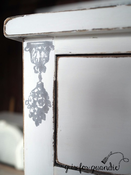
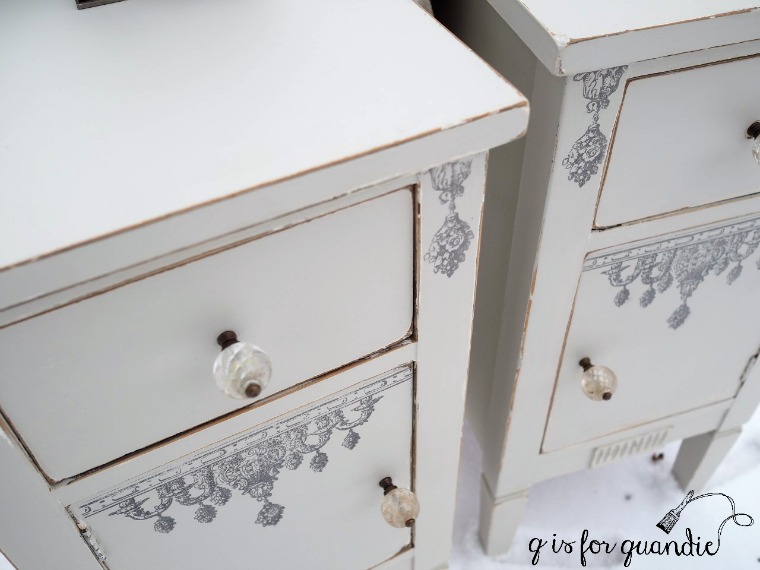
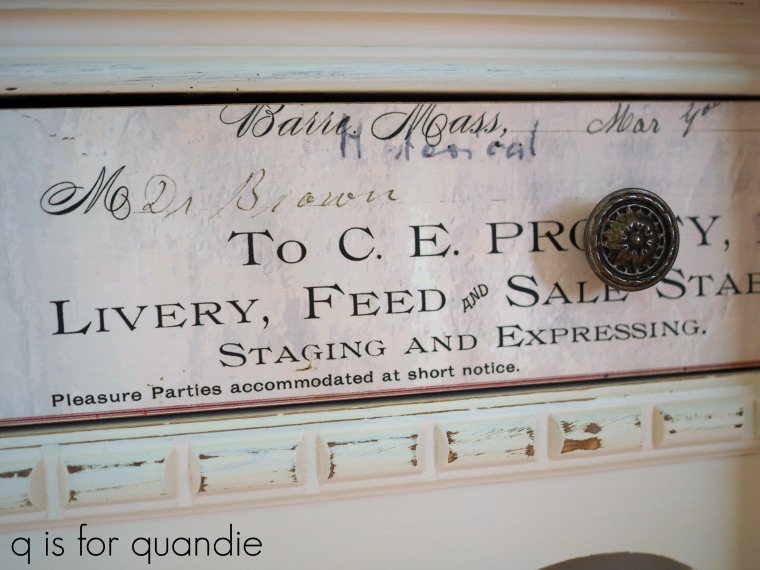
Initially I was going to go for a feminine look. Paint them white and add a floral transfer to the tops. But as I was going through my stash of transfers I came across Prima Marketing’s Industrial Mechanics transfer.
This transfer comes on three sheets. I had used just part of one of them on a metal roller skate case …

So I had two full sheets plus part of a 3rd left. Each full sheet fit the top of a table pretty well. They didn’t go all the way to the edge, but I thought I could make that work by painting the tables a dark color.
I wasn’t sure how the transfer would look over dark paint though, so I was glad I had that scrap of the 3rd sheet to use in an experiment.
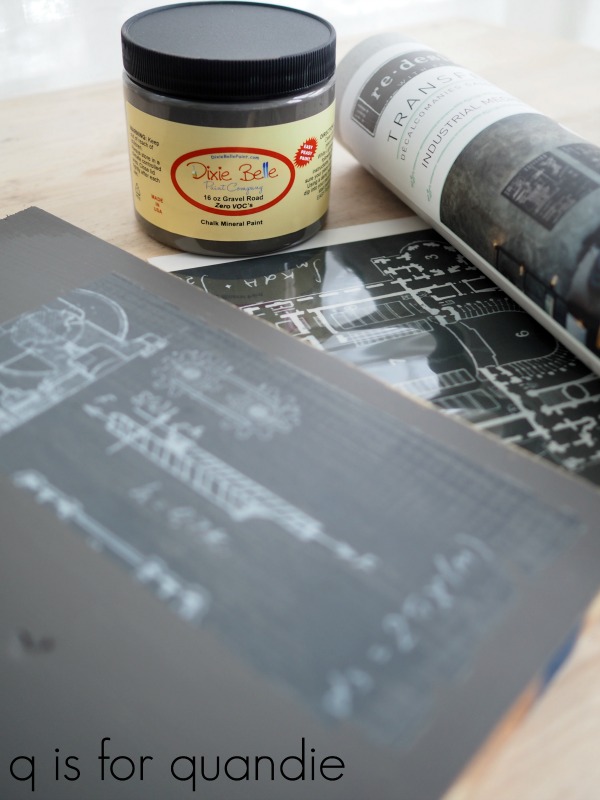
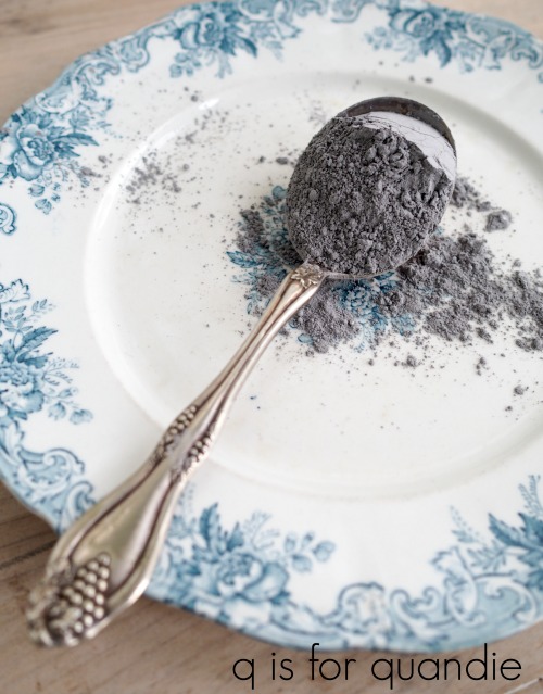
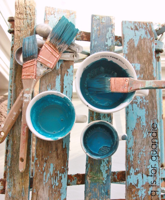
I pulled out some Dixie Belle paint in Gravel Road which is a deep, rich grey. Then I grabbed an old board out of the workshop and painted it. Once dry I added a section of transfer, sanded it lightly to distress and then finished it with The Real Milk Paint Co’s Finishing Cream.
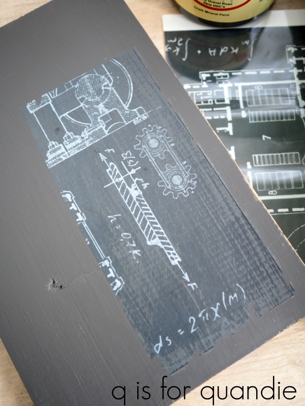
I wanted to make sure that the transfer would look good over the Gravel Road, and also that it would look good with a durable, washable topcoat over it since they would be on a table top. The sample board turned out great, so I knew I was good to go with this more masculine look for the tables.
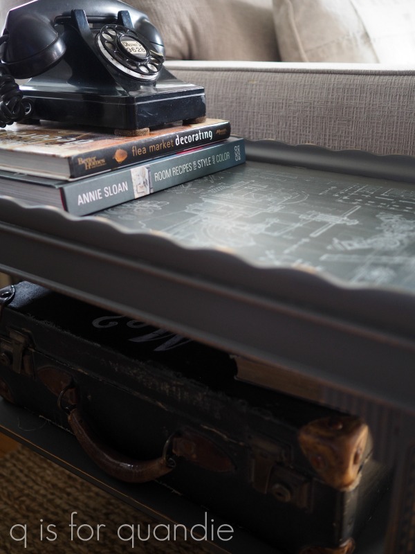
I followed my usual m.o. Light sanding, followed by cleaning and then painting. I used two watered down coats of the Gravel Road. Next I sanded the tops lightly with 220 grit just to smooth them out a little. I vacuumed away the dust and wiped them with a dry microfiber cloth to be sure they were mostly dust free. Then I applied the transfer. Both went on easily and once they were down I even burnished them lightly with the same microfiber cloth to make sure I removed any air bubbles.
So far, so good. Everything looked great.
But then I decided to sand the transfers lightly to distress the edges a little, again with the 220 grit paper. Sure enough, I pulled up a chunk of one of the transfers. See it there on the right toward the lower corner?
![]()
Dang!
This is the second time this has happened to me with one of the full image transfers (a full image transfer is one where the transfer is one solid sheet). Both times I was applying the transfer over unsealed chalk style paint. I have not had this happen when using a full image transfer over Fusion Mineral Paint. I touched on this briefly in Monday’s post about the different kinds of paint that I use. I recently heard someone recommend sealing chalk paint with a water based topcoat before adding a transfer to improve adhesion (just be sure not to use wax, you can’t add a transfer over a freshly waxed surface).
The more I thought about it, the more that made sense to me. The Fusion paint has a built in top coat. If you’ve ever worked with these paints, you’ll know that when freshly dry the Fusion feels a bit more tacky. Not tacky in a bad way, but it has more gripping power than freshly sanded chalk paint, which feels sort of chalky and dry.
I haven’t tried this yet myself, but I wanted to pass on this tip in case any of you have had similar problems using a full image transfer over chalk paint.
Luckily the background paint under my transfer was very close to the background color of the transfer, so my boo boo isn’t a glaring problem. In addition, the overall distressed looks of the tables helps it blend in as well.

I think these transfers would look amazing over black, but I like them over the dark grey.
![]()
This would be a fun look for bedside tables in a boy’s room.

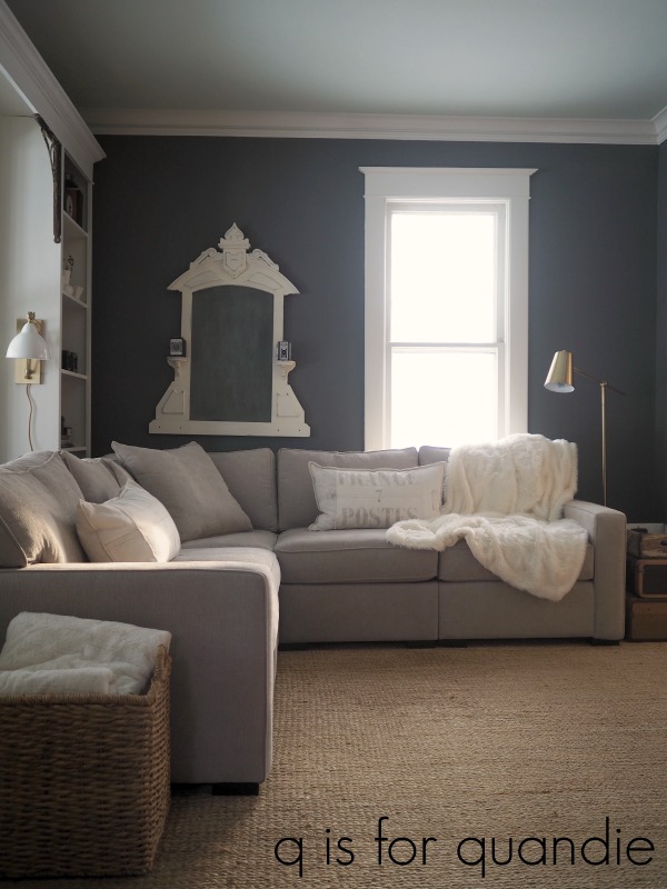
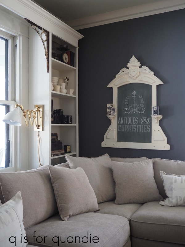
I set the tables up in my living room to stage some photos of them.

But it didn’t take long for me to realize that they were the perfect size to pair with my sectional.
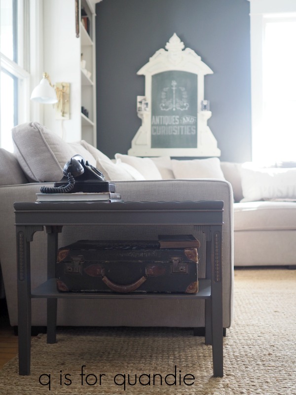
Plus the Gravel Road worked perfectly with my new wall color. So now I’m thinking I might just keep them.

It’s funny since I purchased them long before I had this sectional, and I certainly never thought I would be keeping them. But for $10, why not?
Thanks to Dixie Belle Paint Co and Prima Marketing for sponsoring this post with free product.


 q tip: If you decide you simply must have a transfer on your piece but you’ve already waxed it, you will need to wait 30 days for the wax to cure before adding the transfer. Or you could remove the wax with mineral spirits, but who wants to go down that road?