a colorful desk do-over.

Last summer I brought this desk home from a garage sale.

I loved the chunky knobs, and at just $5, the price was definitely right.

After my handyman Ken made some repairs to it, I painted it with Dixie Belle’s Drop Cloth and added a grain sack style stripe in their Yankee Blue.  You can see all of those details in my original post about the desk.

Unfortunately, here it is January and I still have this desk in inventory.  For whatever reason, I have not had any luck selling this piece.  Well, then again, I have to admit I’ve been a little slack about promoting it.  I took my remaining Facebook Marketplace and Craigslist ads down before I went on my trip back in early November, and I never re-posted this one.  So that could have something to do with it.

Never the less, I decided it was time for a do-over.

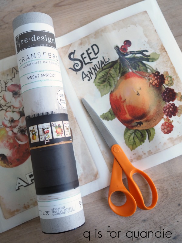
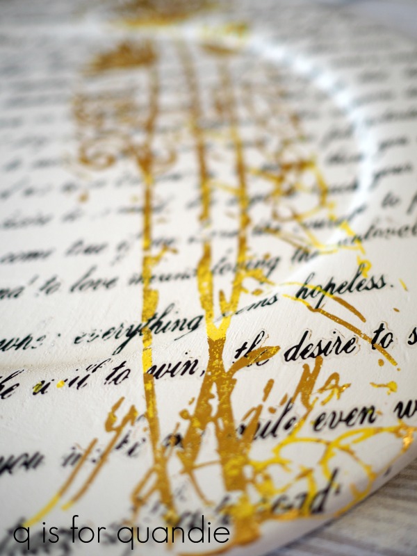
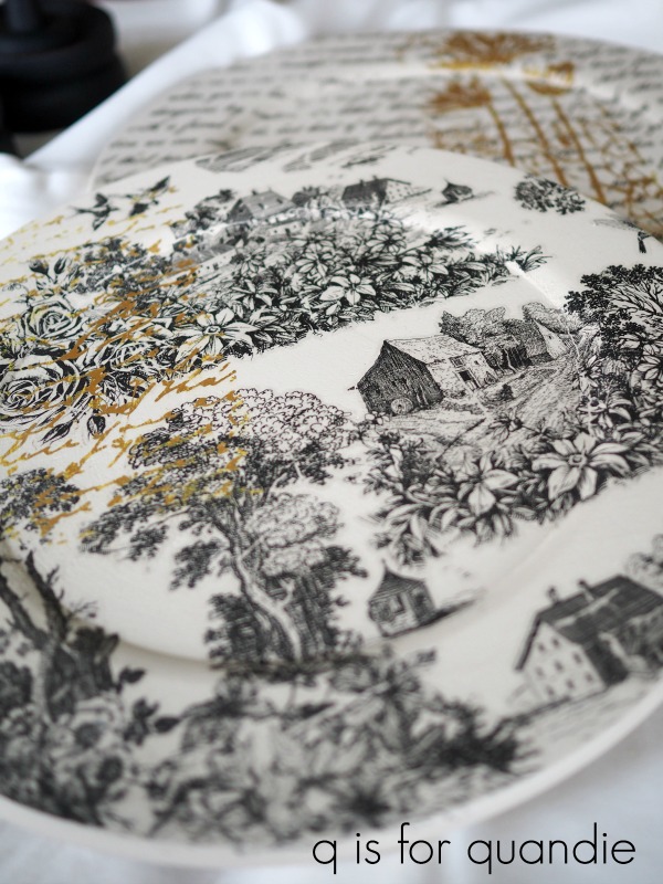
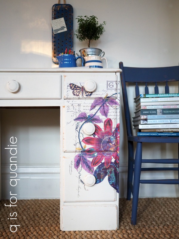
I started out by sanding down the grain sack stripes and painting over them with more of the Dixie Belle Drop Cloth.  Then I pulled out one of the new Prima Marketing re.design transfers called Passion Flower.

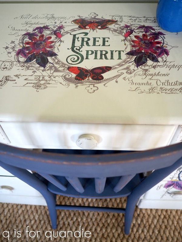
Isn’t that just gorgeous?  All of those vibrant colors!  This boho style is a bit outside of my normal comfort zone, but I’m hoping it will add that little bit of something special to this desk and help it find a new home.

Now before you get all excited and rush out to try and find this one somewhere, this is a sneak peek at one of the brand new designs coming out soon from Prima.  So it’s not available quite yet.  I’ll try to remember to give you guys an update when it becomes available.  But for now, this is just a tease.

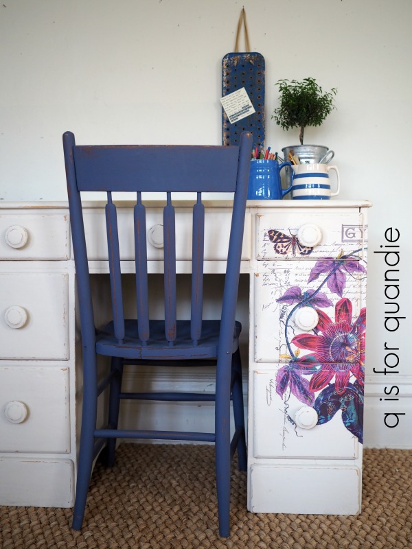
I definitely wanted to use the entire transfer on this desk with the oval ‘free spirit’ portion on the top.

But I wasn’t quite sure at first how to make the other section of the transfer work with this desk.  Then I realized that it would look pretty fab if I just wrapped it around one corner giving the desk a more asymmetrical look.

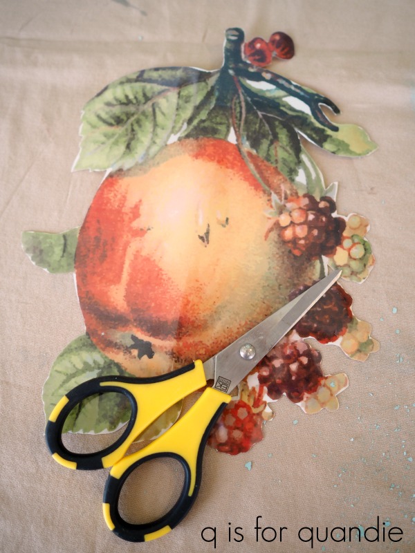
If you’re wondering about the logistics of actually applying the transfer, here’s how I did it.  I started by removing the knobs from the drawers.  Then with the drawers back in place I figured out the placement I wanted and taped the transfer in place over the front of the desk.  I used a razor blade to trim the transfer around each of the drawer fronts, then pulled each one out individually and applied that section of the transfer.  Next, with the drawers still out, I applied the sections of the transfer that went between the drawers.

Once that was completed, I lined up the transfer around the side of the desk and applied that part.

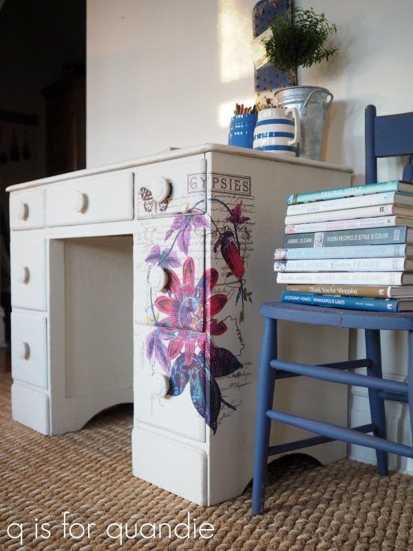
It took a little patience to do this, and my results are not 100% perfect.  I don’t think anyone would notice unless they were seriously scrutinizing the details though.

Applying the transfer on the top was much simpler.

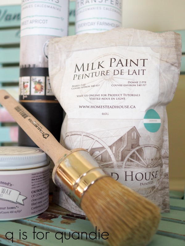
Once that was done, I added two coats of The Real Milk Paint Co’s Finishing Cream in Dead Flat to the top of the desk.  Since this is a desk, and it’s white, I thought it wise to have a very durable and washable surface on the top.  The rest of the desk was already finished with Dixie Belle’s Clear Matte Spray Wax so I freshened that up with another coat of the spray wax.

At first I was completely at a loss as to how to stage this piece for photos.  I think we can all agree that my usual look is more vintage, farmhouse, neutral, or sometimes even more mid-century.  I don’t have very many boho style props … or more accurately, I don’t have any boho style props.

But as I was studying the desk with its new transfer, it reminded me quite a bit of a little gift my sister and niece brought over for me while I was sick.

Yep, it’s a grown up coloring book.  It was the perfect thing for me.  It allowed me to be creative without having to think about it too hard, nor did it require too much physical effort.  I colored quite a few of the pages while I was laid up on the sofa watching Outlander.

I added a couple of my favorite blue pitchers, a pretty plant and an old swing set seat turned into a magnet board and that was all it took to style this desk.

The Dixie Belle Yankee Blue that I originally used inside the drawers still works beautifully with the transfer …

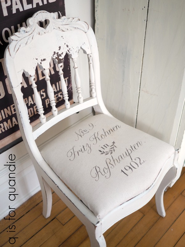
as does the Yankee Blue chair …

Now, all that remains is to see if this version of the desk sells better than the last!

Hopefully there is a free spirit out there somewhere who needs a desk!

Fingers crossed!

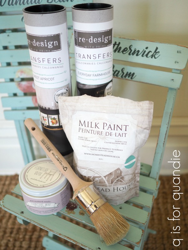
Thank you to Dixie Belle for supplying the paint and spray wax for this project, Prima Marketing for supplying the transfer and The Real Milk Paint Co for supplying the Finishing Cream.

If you’re wondering where to purchase the Prima Marketing transfers check out their ‘where to buy’ page.

If you’re wondering where to buy the Dixie Belle Drop Cloth or Yankee Blue paint and Easy Peasy Spray Wax, you can shop with them directly online or find a retailer near you.

You can also order The Real Milk Paint Co’s Finishing Cream online here.

And finally, if you happen to be local (Twin Cities, MN) and in need of a free spirited desk, check out my ‘available for local sale’ page for more details.

a maltese morning.

Before I get to today’s travel post, congrats to Laura who is the winner of last week’s giveaway.  I’ll be shipping her prize off to Canada later this week.

It’s a tad embarrassing to admit, but prior to planning our cruise last year I didn’t exactly know where Malta was.  I’m pretty sure I didn’t realize it was an island either.  Just in case any of you are equally clueless about it, here’s a map to put it in perspective for you.

Malta is about 50 miles south of Italy in the Mediterranean Sea.  It’s only 122 square miles in size but has a population around 475,000 making it one of the most densely populated countries in the world.  There are also three UNESCO World Heritage Sites and nearly 8,000 years of fascinating history crammed into those 122 square miles.

Maltese dogs are thought to have originated in Malta, and there really is such a thing as a Maltese Falcon (Falco peregrinus brookei).  However, Maltesers (which are the British version of malted milk ball) are not related to Malta in any way.  They are one of my favorites candies though (and are much tastier than Whoppers), and did you know that you can get them at Target now?

Anyway, fortunately Mr. Q has a much firmer grasp on both geography and history than I do.  As soon as he saw that Malta was on our itinerary he suggested we figure out how to see as much of it as we could on our one day in port.  So once again we hired a private guide.  Joan Sheridan came highly recommended on TripAdvisor.  We booked both Joan and her driver, Chris (who as it turned out is her husband), for the full day.

We’d heard that the sail in to Malta was quite lovely, so we got up early that morning so that we could watch it from the top deck.

We definitely weren’t disappointed, isn’t it a fascinating looking place already?

Joan and Chris met us just outside the pier area.  We hopped in the car and took a small driving tour around the perimeter of Valletta, the capital of Malta, where we were docked.  Then Chris dropped us off at the Upper Barrakka Gardens.  It was incredibly convenient having a driver and a guide, we never had to worry about finding parking and the car always magically appeared to pick us up after touring each site we visited.

Although the gardens were pretty enough …

Joan had really brought us here for the panoramic view overlooking the Grand Harbor and Fort St. Angelo.

From there we headed towards Saint John’s Co-Cathedral on foot.  Along the way, Joan took the opportunity to educate us about the Auberge that we passed by.  An Auberge was a hostel that provided accommodations for the knights of the Order of Saint John.

The Auberge de Castille was completely rebuilt in the Spanish Baroque style between 1741 and 1744.  Apparently the knights required some rather posh digs.

We also had the opportunity to check out some of the famous balconies of Valletta on our walk.

Ironically, even though I had no idea that Valletta was the capital of Malta (or even where Malta was), I had pinned a photo of the balconies of Valletta a couple of years ago.  It was totally cool to find myself seeing them in person.  If you want to learn more about these balconies, check out this link.

You can see a glimpse of the Co-Cathedral at the end of that street above.

I wasn’t terribly impressed by the rather plain exterior, and I have to say both Mr. Q and I were skeptical about spending much time seeing a cathedral.

And by the way, I had no idea why everyone kept calling it a Co-Cathedral so I finally asked Joan why that was.  Apparently when there is more than one cathedral in a diocese, the 2nd one is called a Co-Cathedral.  In this case, the original cathedral for this diocese is in Mdina (which we’ll visit in next Wednesday’s post).

I also have to mention that this was just one of many instances during our tour of Malta where it really paid off to have an experienced tour guide.  There was a long line of people waiting to buy tickets and get inside, and Joan took us to the head of the line and slipped us right in with pre-purchased tickets.  She knew that large tour groups would be showing up soon and she wanted us to see as much as we could before the church became crowded.

Clearly the incredibly ornate interior more than makes up for that plain exterior, huh?  That will teach me to judge a book by its cover!

The ceiling was painted with scenes from the life of John the Baptist by Mattia Preti in the 1660’s.

There are nine chapels around the perimeter of the church, each one was sponsored by a specific division of the knights, and each one attempted to out-do the others with ever more elaborately gilded decoration.  Those knights were a competitive bunch, always wanting to have the most impressive auberge or the best chapel.

However, the real pièce de résistance of the Co-Cathedral is in yet another room.

This is Caravaggio’s painting depicting The Beheading of Saint John the Baptist.  It was painted in 1608 and is the largest painting he did at 12′ x 17′.  Caravaggio was most famous for his use of chiaroscuro (the use of strong contrasts between light and dark) and this painting is brilliant example of that.  Honestly, this painting was breathtaking in person.  I know my photo does not do it justice.

While we studied the painting, Joan told us about the tumultuous life of Caravaggio.  He ended up in Malta in 1607 after fleeing Italy and a death sentence for murdering someone in a brawl.  He was hoping to secure a pardon for his crime.  However, he didn’t change his brawling ways and was arrested and jailed for assaulting someone else in Malta in 1608.  But somehow he managed to create that beautiful painting in between skirmishes.

After being rather overwhelmed by the interior of the Co-Cathedral, we needed a breather.  We stopped off at Caffe Cordina next for a delicious cup of coffee.

Believe it or not we weren’t even halfway through our day in Malta yet.  Chris picked us up at the end of the street (this cafe is in a pedestrian only area) and next we headed off to see the Blue Grotto.  But I’m going to save that, along with the rest of our visit to Malta for next week.

In the meantime, I have a desk do-over to share on Friday so be sure to check back!


sweet everyday farmhouse chairs.

A while back Cari from Prima Marketing posted these adorable crates on the re.design with Prima Facebook group page.  She gave them a new life using the Sweet Apricot and the Everyday Farmhouse transfers.

I absolutely fell in love with the aqua color on the top crate, as well as her use of the transfers.  I have to say I would never have thought to pair that particular paint color with that apricot transfer, but they look amazing together, don’t they?

When my picker, Sue, found these kid-size folding chairs at the thrift store for me, I just had to see if Cari’s combination worked on them too.

First things first, I had to choose a paint color from my stash that was similar to that pretty aqua that Cari used.  Initially I thought that Fusion’s Laurentien would be the perfect color, and I did have some of that color on hand.  However, I really wanted a chippy milk paint finish on these chairs.

I considered using Miss Mustard Seed’s Eulalie’s Sky, but that color is a tad more blue.  I also thought about using Sweet Pickens’ Patina, but that one is a bit brighter than I wanted.  Then I remembered, Homestead House makes a milk paint version of Laurentien.  And not only that, but I just happened to have some in my milk paint stash!

Much like baby bear’s bed in Goldilocks and the Three Bears, it was just right.

Speaking of bears, painting these chairs was a bit of a bear.  All of those slats and legs and cross braces, oh my.  Every time I looked at the chair from another angle I found spots that I had missed.

But it was definitely worth the effort.

Once I had them painted, I sanded them to distress the edges and remove any chippy paint.  I also wiped them down with a clean, dry cloth to remove any excess dust before applying the transfers.

Here are what the Sweet Apricot transfers look like out of the tube.

There are 9 different designs in this set.

I decided to follow Cari’s lead once again and trim away the transfer around the piece of fruit.  Initially I tried using my larger pair of scissors, but I found it was much easier to use my Cutter Bees.

I used to use these little scissors all the time when scrapbooking.  They are perfect for getting around small details.

Once I had the transfer trimmed, I removed the backing paper and placed the fruit where I wanted it on the seat of the chair and pressed it down.  Before removing the top sheet of the transfer, I sliced it about halfway between each of the slats using a razor blade.  That way I was able to sort of wrap the transfer around the edge of each slat.

Next I chose some pieces from the Everyday Farmhouse transfer set to add wording to the back of each chair and the cross piece on the legs.

Once I had the transfers adhered, I added a protective topcoat of Miss Mustard Seeds’ clear furniture wax.

I love that these chairs fold up completely flat, which makes them perfect for hanging on the wall as decoration if one doesn’t happen to have a practical use for kid sized chairs.

They would be awesome hung in the kitchen, and you could always pull them down in a pinch if you need the extra seating for diminutive guests.

FYI – the table in that photo is one I painted a while back in a custom mix of milk paint that I called Green Alligator.  You can visit the original post for more details on that.

Since I had a little milk paint left over after finishing the chairs, I also painted this galvanized bucket.

Using milk paint on galvanized metal can be hit or miss.  If the metal is smooth and shiny, or has an oily residue on it, you will likely get chipping.  Possibly even lots of chipping.  However, if the metal feels rougher and doesn’t have a shiny coating then milk paint will adhere quite well.  As you can see, this bucket was somewhere in between.  It was rough and dull but I think there was some sort of residue where it chipped.  But no worries, I love this look!  Once the paint was dry I sanded well to remove most of the chips.  Then I wiped it down with a dry, clean cloth and added the transfer (also from the Everyday Farmhouse set).  I finished it all off with a coat of The Real Milk Paint Co’s Finishing Cream in Low Sheen.  This topcoat will help protect the rest of the paint from further chipping.

Many thanks to Homestead House, Miss Mustard Seed, The Real Milk Paint Co and Prima Marketing for providing the products I used on these chairs.  And a special thank you to Cari for providing the inspiration for these frickin’ adorable little chairs.

If you’re wondering where to purchase the Prima Marketing re.design transfers, check out their ‘where to buy’ page.

If you’re wondering where to buy Miss Mustard Seed’s products, here is where you can ‘buy online.’

If you’re wondering where to buy Homestead House Milk Paint, you can order it online here.

You can also order The Real Milk Paint Co’s Finishing Cream online here.

And finally, if you happen to be local (Twin Cities, MN) and in need of a pair of adorable little chairs, check out my ‘available for local sale’ page to see if these are still available.  I will most likely bring them in to Reclaiming Beautiful if nobody snatches them up right away.

experimenting.

Having been a tad under the weather recently, I haven’t been terribly energetic.  Which means I haven’t exactly jumped into working on my next piece of furniture.  That’s OK though, January doesn’t tend to be a great month for furniture sales anyway.

Instead I’ve been playing around with some awesome products that Prima Marketing has sent my way.  So I thought I’d share a few of those with you today starting with these wooden plates.

They come in three sizes, 10″, 12″ and 14″ and they are basically a blank canvas for getting creative.  Once finished you could use them as chargers, display them in a china cabinet or maybe just hang them on the wall.  I have another idea for them too, but I’ll be sharing that in a separate post.

But for today’s project, I started by painting a pair of them with Dixie Belle’s Drop Cloth, which is a fantastic warm creamy white.  Once they were painted I pulled out a few of my favorite Prima Marketing transfers including Never Ending Story and Simplicity.

I covered the entire surface of each plate with these.

Then I thought it would be fun to try the new Adhesive Transfers and Decor Foils that Prima Marketing has come out with.

These work a bit differently than their other transfers.  The Adhesive Transfer itself is bright yellow and is sticky on both sides.  The Decor Foil is then used over the adhesive transfer.  This gives you some versatility since you can use any of the different colored foils with any of the different transfers.

So, let’s go over the process step by step.

Step 1.  Choose the portion of the adhesive transfer that you want to use.  These transfers have multiple designs in each package and they retail for around $20 or so.  For example, here is the sheet that comes with the Nature & Scripts set.

I’m going to use that floral section in the upper right on my first plate so I cut that section out from the rest of the transfer.

Step 2.  Apply the transfer using the flat stick that is provided just like you would any transfer (see this post if you don’t know how to do that).

Yep, at this point it’s bright yellow.  It’s also sticky on top.

Step 3.  Choose a Decor Foil.  They come in lots of pretty metallic colors such as Relic Copper, Dark Slate and Moon Water. There are six 6″ x 12″ sheets of foil in each tube and the tubes sell for less than $6.  I chose to use Stardust which is a matte gold.

Step 4.  Place the Decor Foil metallic side up over the sticky yellow adhesive transfer.  Press the foil into the adhesive using that same flat stick you used with the transfer.

Step 5.  Pull away the sheet of Decor Foil leaving the foil behind where it adheres to the sticky adhesive transfer.  It’s important to note here that you may not get complete coverage with the first pass.  See …

Any spots that still show as bright yellow need more of the foil applied.  It’s super simple to just keep going over those areas by pressing unused sections of the foil into them with your fingers or the stick until they are fully covered.

By the way, I used the script portion from the same set of adhesive transfers for the smaller plate.

I think the Decor Foils have a look similar to gold or silver leaf, and I love how they look layered over the black and white transfers.

This look would translate well to furniture.  I can see doing something like this on the drawer fronts of a dresser or vanity.  I will warn you though, I used Miss Mustard Seed’s furniture wax as a top coat over my finished plates and that did not work well over the Decor Foil.  It seems to rub away some of the foil and make it sticky.  I would suggest either skipping a top coat, or using a water based top coat like Miss Mustard Seed’s Tough Coat or the Real Milk Paint Co’s Finishing Cream instead.

If you’re wondering where to purchase the Prima Marketing products, check out their ‘where to buy’ page.

Prima Marketing has been so generous in sharing these new products with me, so I want to pay it forward by giving away the Spring Radiance Adhesive Transfer set along with the Decor Foil in Boudoir Rose today.

The basic rules:  to be eligible to win today’s prize leave a comment of any kind on this blog post.  Your comment must be left on the blog, not on Facebook or Instagram.  You are not required to follow my blog, although it would be awesome if you did!

Normally I make a point of answering every comment left on my blog.  If someone takes the time to leave a comment, I like to acknowledge that.  I usually only get 10 to 20 comments so it’s easy to fulfill that promise.  But I suspect I’ll get a few more comments on this post so I’m going to warn you up front that I may not be able to answer each one, so I hope you guys will cut me some slack on that.

I will randomly draw the name of a winner for today’s prize from all of the comments left on this post by Sunday, January 20, 2019 at the stroke of midnight (U.S. Central time).

The fine print: no purchase necessary, you must be 18 years of age or older to win, void where prohibited by law, the number of eligible entries received determines the odds of winning, approximate retail value of prize is $25, if the prize is not claimed by Friday, January 25, 2019 another name will be drawn at random to win, blah, blah, blah.

Good luck!


an offer you can’t refuse.

When Mr. Q and I were planning out what to do in the various ports of call on our Adriatic cruise last November we tried to schedule in a bit of variety.  As we were researching our options, it seemed like we were ending up with lots of visits to ancient archaeological sites like Herculaneum, Diocletian’s Palace in Split and the temple of Hagar Qim in Malta.  So when it came to Messina, Sicily we wanted to do something a little different.

We narrowed it down to either a wine tasting tour or a ‘Godfather tour’.  I would have opted for the wine tasting, but Mr. Q doesn’t drink wine so that seemed a tad selfish on my part.  So the Godfather tour it was.

Ironically, neither of us are fans of the Godfather movies.  In fact, we could barely even remember having watched them.  But the tour went to two small hill towns in Sicily that looked absolutely charming and that’s what drew us in.  We did watch The Godfather a few weeks prior to our trip just in case we needed any context for the tour, which as it turned out we did not.

The first stop on our tour was the town of Savoca, a tiny hilltop village that was reached via a narrow, winding road.

This was the rainiest day of our entire trip and going up that wet, narrow road in a huge bus was maybe a tad nerve wracking.  I kept imagining the newspaper headlines at home, American tourists die in tragic Italian bus accident.

I’ll admit, I had to close my eyes a few times.

But it was definitely worth it.  Savoca was utterly charming.

The first site in Savoca was the Bar Vitelli.

In the film this bar is owned by Apollonia’s father.  Our guide told us that at the time of the filming this wasn’t a bar at all, but rather a villa.  Francis Ford Coppola turned it into a bar just for the movie.  Once the movie became a blockbuster, Bar Vitelli was there to stay.

It now functions as both a bar and a small ‘museum’ (ie. tourist trap) with a collection of photographs taken during the filming.  It was a tiny little place though, and there definitely was not enough room for both a bus load of tourists looking at photos and patrons trying to get a drink.  Since it was raining cats and dogs at the time, the crowds were struggling not to spill out onto the patio.  Mr. Q and I gave the inside of the bar a pass and headed to the next site while huddled under our umbrella.

Maybe the rain was a good thing because as you can see, we had the place pretty much to ourselves.

We headed uphill to the Chiesa di San Nicolo/Santa Lucia where the wedding scene between Michael Corleone and Apollonia was filmed.  If you scroll back up the beginning of this post, this is the building that can be seen at the top of the hill in my first photo.

After seeing inside the church we had a very short time to stroll around the tiny village before returning to the bus to head to our 2nd stop, Forza d’Agrò.

Forza d’Agrò is another charming little hilltop village, and it required traveling even more super steep and winding roads to reach it.  Once there we trooped around after our guide for a bit, first visiting the Church of Sant’Agostino.

To be honest, I haven’t found any reference to this church actually having been used in the film.

  It was a lovely spot though.

Next we stopped in front of the Cattedrale Maria S. Annunziata e Assunta which was another filming location for the movie.

Isn’t that a gorgeous old church?

I was also fascinated by this building opposite.

There is just something about that crumbling stucco and those old wooden doors that appeals to me.

We were getting more wet and cold by the minute at this point though, so I made Mr. Q an offer he couldn’t refuse.  I suggested we stop in at a little cafe for a cappuccino.

I left him there enjoying a 2nd cup while I wandered around and took a few more photos of this picturesque little town before we had to head back to the bus and return to our ship.

No need for faux finishes here, these are genuinely chippy or rusty!

They definitely provide some inspiration for creating a faux finish though, don’t you agree?

I loved this fountain that was in the middle of the town square.

I wish I could get moss like this to grow on my own fountain.  I suspect it would require a slightly warmer climate than we have here in Minnesota.

I hope you enjoyed this visit to Sicily and some of the filming locations there for the Godfather films.  I’m hopefully back on track with my Wednesday travel posts and next week we’ll be heading to Malta!


the chair with a heart.

Last week was a rough one for me.  I won’t go into the details, but I was camped out on the sofa for nearly 5 days.  I had time to watch the entire Outlander series from the beginning through the current episode, and that is no small feat.  Luckily I had finished today’s project prior to getting ill so I had something to share with you guys today.  I’m still working on regaining my strength though, so I can’t promise I’ll be back to my regular posting schedule just yet but I’m sure you guys will cut me some slack.

I picked up this chair at a garage sale last summer … well, really last spring, as evidenced by the tulips blooming in the background of my ‘before’ photo.

It was in decent shape, just terribly outdated.  I apologize to grandmothers everywhere, but there isn’t much of a market for these needlepoint seats anymore.  But this chair had some lovely lines to it, and a rather unique look to the back, so I snatched it up.

I knew I could give it an entirely new look with some chippy milk paint.

Now I have a small confession to make.  I actually painted this chair last summer.  And then somehow it got shoved to the back of the workshop and I forgot about it, so I’m a little spotty on the details regarding exactly which products I used.

I know I painted it with a layer of blue paint first but I can’t remember for sure which blue, I think it was Miss Mustard Seed’s French Enamel.  Then I added Miss Mustard Seed’s Ironstone over that.  You can just see the blue peeking through in a few spots where I’ve distressed the carving at the top of the chair.

And as you can see, I got some great chipping!

I pulled this chair out of the workshop at least a month ago or so thinking that all it needed to finish it up was some new fabric for the seat.  My vision for this piece was to use a fabulous vintage European grain sack for that.  But I didn’t actually have one.  I shopped around a bit for one, but those things are not cheap.

Finally I realized I was being foolish.  I know how to create something nearly as fabulous at a fraction of the price.  Duh!

Just stencil some drop cloth material and ta da!

The stencil is from Maison de Stencils.  If you are looking for European grain sack style stencils, they have a fantastic selection.

And just like that, the chair was finished.

I don’t know what took me so long to finish it off!

the aviary chair.

For quite some time now I’ve been wanting to try the newest Miss Mustard Seed’s Milk Paint color, Aviary.

Let’s see.  I think this color came out about a year or so ago, right?  Hmmmm.  Why am I always so hopelessly behind the times?  Well, better late than never I hope.

One of my strategies when working with a new paint color is to paint a practice board first so that I can get a feel for how the color looks with different top coats before moving on to a large piece of furniture.  But this time I decided it would be more fun to paint a little schoolhouse chair to test out this color.

As you can see, the finish on this chair was in pretty rough shape.  Parts of the finish were so dried out that I really didn’t think I would get any resistance at all (and thus no chipping).  I wanted to end up with a chippy, beat up, authentically old looking finish, so I didn’t do much prep work to the chair at all.  OK, let’s be honest, I did absolutely zero prep.  I may have wiped away a cob-web or two, but that was it.

Sometimes that can backfire on you, and had this been a larger piece of furniture it would have been a mistake.  But for this little chair, it was a calculated risk.  It’s a small piece, so it would be easy enough to fix if the paint didn’t adhere at all.  Sure enough,  I ended up getting quite a bit more chipping than I expected on the legs of the chair, but very little chipping on the seat.  So I simply sanded down the super chippy legs and painted them again.  Problem solved.  The sanding helped the next layer of paint stick.

Today’s q tip:  If you’re comfortable with taking a chance and rolling the dice, you can skip the prep on your project like I did.  But if you’d prefer to exercise a little more control over the amount of chipping you get with milk paint then do proper prep first.  Sand your piece lightly all over and clean well with TSP Substitute (or similar).  For more tips on painting with milk paint, check out my milk paint basics post.

The coverage with Aviary was really good.  Two coats of paint was plenty.

Once my paint was dry I sanded heavily for two reasons; first, I wanted to be sure I removed any chipping paint (more on that in a minute) and second, I wanted a very distressed look for this vintage chair.  I still had some chipping, but it was just the right amount this time.

Once sanded, I vacuumed the chair with my shop vac.  Then I used a clean, dry, nubby cloth to wipe the chair vigorously.  I wanted to be sure that I had all of the chipped paint and dust off before applying a transfer to the seat and back of the chair.

This project was a great way to use up the leftover pieces of the Prima Marketing French Ceramics transfers that I used on a dresser that I painted last year.

When using a transfer over chippy milk paint I have found two options that work well.  Sand the chippy paint really thoroughly and be sure to remove all chips and dust first; or seal the milk paint with Miss Mustard Seed’s Tough Coat Sealer (or another water based sealer) before applying the transfer.  If you don’t do either of these things, you may find that the transfer backing paper removes your chipping paint rather than releasing the transfer onto your piece.

Also, do not try to apply a transfer over freshly applied wax.  It will become a sticky, gooey mess as the friction from rubbing on the transfer will heat up the wax and it all just goes downhill from there.  Been there, done that.  Remember transfer first, wax second.  However, you can apply a transfer to a waxed surface that has cured for 30 days or more.

Once I had my transfer in place, I sanded over it with 220 grit sandpaper.  I wanted a distressed look, so I wanted the transfer to look worn away in spots too.

Next I wiped the chair down with a clean cloth again and then applied Miss Mustard Seed’s Furniture Wax in the special edition lavender scent.

I applied it using a new wax brush that my friend Terri gave me for my birthday.  It came in a kit with three brushes, some brush soap and a few other little things like a pair of plastic gloves and one of those sanding blocks.

I haven’t tried the brush soap yet, but it smells divine.  I’d be tempted to use it as a regular hand soap it smells so good.  I think that smaller non-tapered brush might work well for stenciling.  And the pointy brush just came in handy for getting at a hard to reach spot on the bench I shared last Friday.

I used the largest brush at the bottom for waxing this chair though and to be honest I think the bristles are just a bit too long and too soft for really effective waxing.  I prefer my waxing brushes to be a little bit more stiff.  It was hard to work the wax into the surface with this brush.  It might be better suited to painting rather than waxing (and fyi, it is meant for either painting or waxing).

I haven’t had the milk paint out in a while, and now I’m reminded of why I love it so much.  It really does provide the most authentically aged looking chippy finish.

And isn’t the Aviary a lovely shade of grey-blue?  I’ll be keeping an eye out for the perfect dresser to put this color on next!

Thank you to Miss Mustard Seed’s Milk Paint for providing the paint and wax, and to Prima Marketing for providing the transfer for this project.

If you’re wondering where to purchase the Prima Marketing re.design French Ceramics transfer, check out their ‘where to buy’ page.

If you’re wondering where to buy Miss Mustard Seed’s product, here is where you can ‘buy online.’

And finally, if you happen to be local (Twin Cities, MN) and in need of an adorable little chair, check out my ‘available for local sale’ page to see if this one is still available.

dreaming of spring.

OK, I know I’m jumping the gun a bit with the garden theme of this piece.

I just couldn’t help myself though.  I’m already dreaming of spring, how about you?

I wasn’t especially looking for another bed frame to turn into a bench, but I came across this bed while garage saling on my lunch break last fall.  Luckily I was with my co-worker Jodie and she was driving a pick up truck so we were able to load it up.

There were no side rails included, so that made this one a great candidate for a bench.  If I’d wanted to sell it as a bed I would have had to replace the side rails.

In addition to adding a seat and the lower front trim piece to the bench, this time my handyman Ken also had to insert boards into some gaps in the headboard and foot board in order to make this piece work.

This is the third bench that Ken has made out of an old bed frame (here is the first and the second if you want to see them).

Once the bench was constructed, I painted the old wood with two coats of Fusion’s Bedford, while the new wood on the seat only required one coat.  Bedford is a medium warm grey.

I let the paint dry overnight, and then I added Prima Marketing’s Seeds transfer.

I didn’t quite use all of the transfer, although I did put some of it on the lower section of the bench too.

I also sanded the edges of the piece to distress the paint job.  With Fusion paint I recommend doing this within a few days of painting the piece.  Fusion is more difficult to distress once the paint has cured.

Although Fusion paint does not require a top coat for durability, the bare wood that I exposed by sanding could use a little protection.  So I added just a little bit of Miss Mustard Seed’s furniture wax to a cloth and wiped it over all of the distressed areas of the bench.  I didn’t add a lot of wax, just a bit.

I did the same over the transfer, just rubbed it lightly with a waxy cloth to give it a little extra protection.

I couldn’t resist staging the bench with plants and gardening supplies.  Sure, it’s January and everything outside my window is frozen solid.  But inside I can pretend it’s practically spring!

If you’re wondering where to purchase the Prima Marketing Seeds transfer, check out their ‘where to buy’ page.

If you’re wondering where to buy the Fusion paint in Bedford, check out their ‘where to buy’ page.

And finally, if you happen to be local (Twin Cities, MN) and in need of a fabulous bench, check out my ‘available for local sale’ page to see if this one is still available.

herculaneum.

In the year 79 A.D. Mount Vesuvius erupted.  At the time it had been dormant for 800 years, so I imagine that the residents of the nearby towns had no idea what was happening or how to react.  Following the eruption, the town of Herculaneum was buried under 50 – 60 feet of ash.

You can see Vesuvius in the background of that photo, the mountain that has blown its top.  You can also see that Herculaneum sits about 60′ below the ground level of the current town around it.

While our ship was docked in Naples last November, we toured Herculaneum.  We were happy to be out enjoying the sunshine for this tour!  Plus, there is just something amazing about walking around a town that was last populated almost 2,000 years ago.

Did you know that fast food is not a modern invention?  Herculaneum’s residents could visit the thermopolium to purchase ready made hot food and beverages served from counters.

Public baths were also very popular at the time.  Few people could afford a private bath in their home.  The public baths were open to everyone regardless of class and the one in Herculaneum had separate areas for men and women.

In last week’s post I mentioned that most of the mosaics, furnishings and other artwork from both Herculaneum and Pompeii have been moved to the archaeological museum in Naples, however some mosaics are still intact like the Neptune floor in the public bath.

And the amazing mosaics surrounding the garden court of the House of the Neptune.

Many structures were also decorated with beautiful frescoes.

Sadly, many of the residents of Herculaneum fled to some underground boat sheds to shelter from the eruption.  They thought they would be safe in these cave-like structures.

But nothing could have protected them from the surges of extreme heat from the volcano.

These skeletons weren’t excavated until 1982.  Prior to their discovery it was thought that the people of Herculaneum had managed to escape.

It’s sad that the people living around Mount Vesuvius met with such a terrible fate, but at the same time it created such a unique opportunity to study what life was like 2,000 years ago and it was fascinating to tour Herculaneum.  If you ever are in Naples, Italy I highly recommend taking the time to see it!

that’s a wrap.

Happy New Year!

Where in the world did 2018 go?  It just flew by for me.  Overall it was an awesome year, except this last part got a little rocky.  I had some dental work done just a couple of weeks before Christmas and it was a rough recovery.  My body just doesn’t adjust well to having foreign objects installed (it was a crown, in case you are wondering what in the world I’m talking about).  I’m only just starting to feel more like myself again.  Have any of you had this experience with a crown?

It required four trips to the dentist, and I do not enjoy the dentist (even though my dentist and her assistant worked really hard to make me comfortable).  Honestly, the whole thing just threw me for a loop.  Mr. Q was concerned because I completely abandoned my paint brush during this time frame.  I find it difficult to be creative when I’m not feeling well, how about you?

Next time remind me not to schedule this sort of thing just before the holidays!

I’m starting to feel much better now though and I’m putting the whole experience behind me, along with the rest of 2018.  But before we move on, let’s take a look back at some of the projects that I shared with you here on the blog this past year.

Photo collages wrapping up your work for the year are all the rage on Instagram these days, so I thought it would be fun to create one myself for this blog post.  But as I started looking back through my 2018 posts I realized that I needed more than just one.  How about more like seven?

Starting with some of the pieces I did with Prima Marketing transfers …

In fact, I had so much fun using transfers during 2018 that I have to share a second collage of transfer projects.

I was going to do a collage with just pieces painted with Dixie Belle paint, but I soon realized I could do an entire collage of just those painted in Dixie Belle’s Caviar

This deep, rich black has turned out to be one of my favorite colors to work with.

Next, here are many of the mid-century modern pieces I painted last year.  It’s obvious that Fusion’s Park Bench (green) was my go-to paint for the mid-mods in 2018.

Those are four different dressers painted green, not just different shots of the same piece.  I also did a few dark grey pieces usually using Fusion’s Ash, but the one on the lower right is Dixie Belle’s Gravel Road.  Fusion’s English Rose is the perfect Millennial Pink for this style of furniture too.

And then there are the milk paint pieces from 2018 …

Hmmm, it would seem that I have a definite preference for using milk paint in shades of blue.

Next up are some of my favorite smaller projects that I did in 2018 …

Smaller projects like these are one of my favorite ways to try out new techniques or new paint colors.

And let’s not forget my favorite garage sale finds of 2018.

Is anyone else starting to experience garage sale withdrawal?  Spring is just around the corner, right?

Well, that’s a wrap on 2018.  If you’re looking for more details on any of the pieces of furniture featured in the photos above just visit my ‘fab furniture‘ page where you can see ‘before’ & ‘after’ photos with links to blog posts with all of the details.

I hope to have many more inspiring projects to share with you in 2019, and perhaps I’ll experiment with a couple of new products here and there too.  Be sure to stay tuned!