bees and queens.

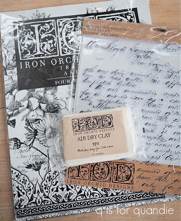
As you may remember, when I was out at my mom’s a while back I purchased another of the I.O.D. stamps called Kindest Regards.

At the time I mentioned that I don’t know why I let myself get sucked in by these stamps. I’ve never been happy with the way stamps look on anything other than paper or fabric, so I don’t do a lot of stamping.

I do love the results on paper …

I used the I.O.D. Crockery stamp on those packages.

I also think stamps work great for fabric (as long as you can lay it flat on a hard surface to apply the stamp).  I used stamps from two different sets of IOD Décor Stamps on a pair of chairs; the letters and no 2 are from the Alpha II set and the wreath and the crown are from the Grain Wreath set.

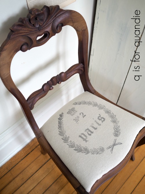
Sidebar note:  although I used Ranger Archival Ink on those chairs, I would not recommend that brand for fabric.  It fades quite a bit over time.  Instead, use a permanent fabric ink.

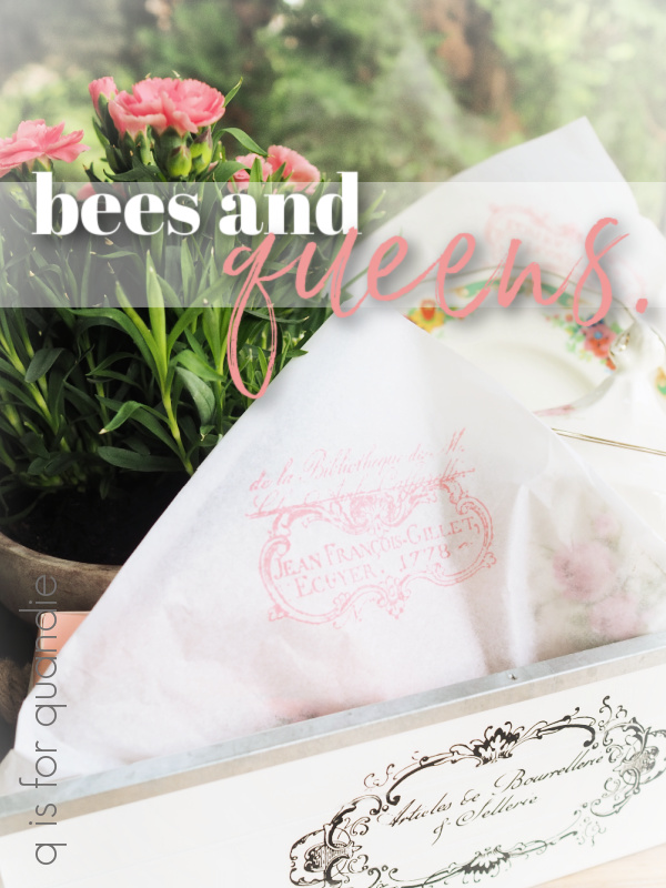
Well, I got sucked in again while at my mom’s house the 2nd time and I purchased the I.O.D. Queen Bee stamp.

What is wrong with me?!

The thing is, I was hoping that I could figure out how to make the stamps look good on painted items.  Because I can’t keep buying the re.design with prima Classic Vintage Labels just for the two small bee transfers that come with it.  Or their Lovely Ledger transfer just for the crown.  No matter how much I love them!
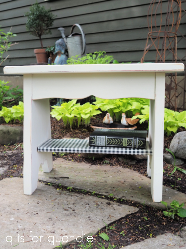
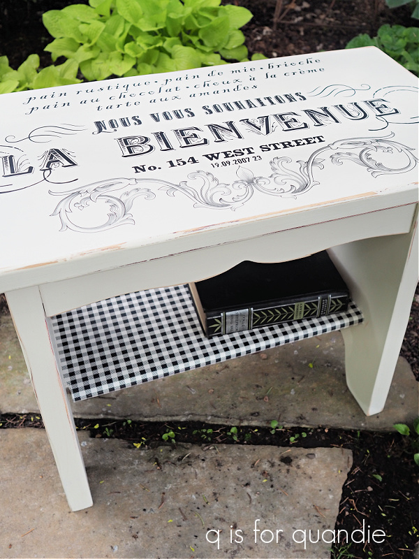
If I can get a stamp to look this good, I can add bees and crowns to everything!

So I decided to do a little experimenting with various products to try and find a combination that would work.

First up, I’ve already learned that stamping on unsealed chalk paint or milk paint is no good.  I tried that on a pair of nightstands and met with disaster.  I did have luck stamping over Fusion paint (with its built in top coat), so I felt sure I could get the same result over Dixie Belle’s Silk Paint (this product also has a built in top coat).

So I pulled out a sample board that already had Silk Paint on it, and I pulled out various stamping mediums to test out.

I tested that same Ranger Archival Ink in Watering Can that I used on the nightstands, the I.O.D. Décor Ink in Stone Gray, Momenta permanent fabric ink in Black, and Dixie Belle Silk paint in Anchor.

And here are the results.

OK, so once again I achieved the best, most crisp, result with the Ranger Archival Ink …

The color I used, Watering Can, is a medium gray.  Perhaps I need to purchase this ink in black and see how I like it.

I applied the DB Silk Paint with a brayer, and I got mediocre results with that …

If you’re kind of a picky perfectionist (um, I might have to admit this often applies to me), this look isn’t going to cut it for you.  I find that I always get a slightly sloppy look when stamping with paint, it’s difficult to keep the stamp from slipping around.  I like the idea of using a paint with a built in top coat for durability, but I think it’s always a gamble whether or not you’ll achieve a clean result.

Hmmmm.  Clearly (pardon the pun) something went very wrong with the I.O.D. ink …

I had high hopes for their ink since they’ve designed it specifically for this sort of use.  The I.O.D. content creators that I watch on YouTube seem to use it with good results.  Was it user error?  Did I not shake the bottle enough before applying?  The ink seemed really watery to me.  I used a brayer to apply the ink to the stamp, maybe I need to invest in an ink pad to use with it?  If any of you use the I.O.D. ink please share some tips with me.

Last up is the Momenta fabric ink …

This one gave me a fairly good result at first glance.  However, after giving all of the inks about an hour to dry, I gave them all a smear test by dragging my finger over it.

Yep, clearly this ink is not intended for use on anything other than fabric.  This is the only one that smeared.

I also then let all of the inks dry for 24 hours and added a coat of Dixie Belle’s flat clear coat over them.  Once again, the fabric ink smeared all over the place.  The other three mediums were all good with the top coat though.

Since the Ranger Archival Ink in Watering Can gave the best result of the four options I had on hand, I decided to move on to phase II of my experiment using it.

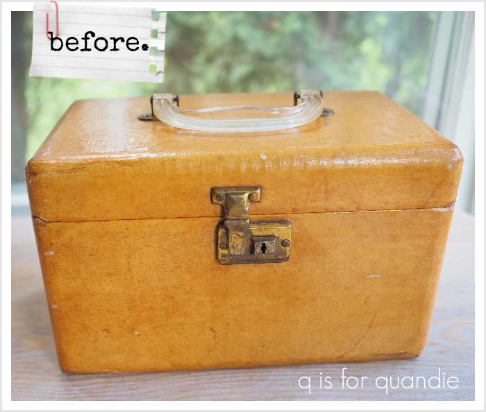
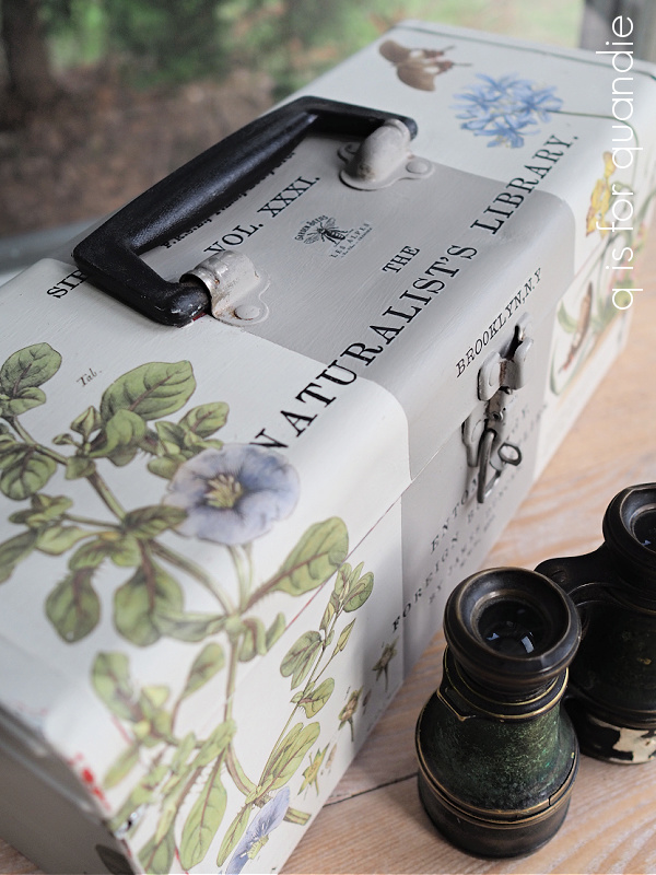
Stamping over a hard, completely flat surface is all well and good, but most of the time I would be stamping on potentially lumpy surfaces and working around things like hardware and such.  So I decided to experiment on a toolbox.

Since I’d already painted the toolbox using Dixie Belle’s Sawmill Gravy, which is a chalk style paint, I had to start by sealing that with their flat clear coat.  Once that was dry, I started playing around with my I.O.D. stamps.

I started out with the Kindest Regards stamp on the sides of the toolbox.

As you can see, I ended up with some smudging, especially in the upper section where there are ridges in the toolbox.  But even the completely flat area ended up a bit smudgy in spots.

I thought maybe that I could better control a smaller sized stamp, so I attempted a few of varying sizes on the top of the toolbox …

and again on the front of the toolbox …

Unfortunately, in the end, stamping on toolboxes isn’t going to work for me.  If you’re OK with the possibility of smudging, and you don’t mind how that looks, maybe it’s workable for you though.

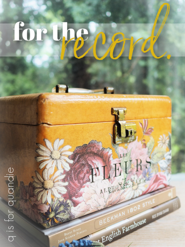
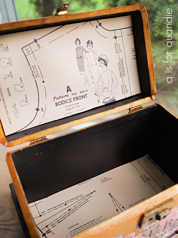
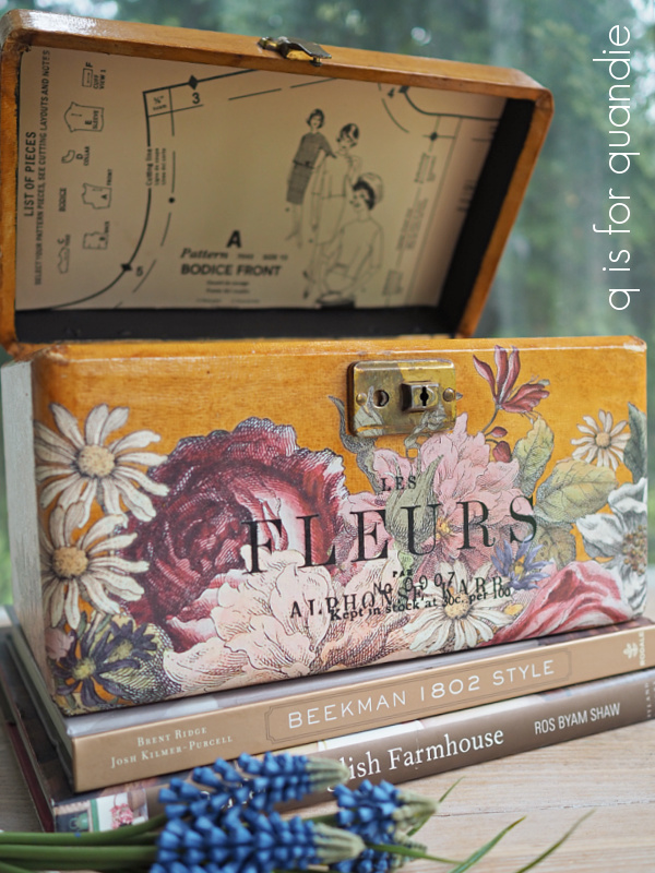
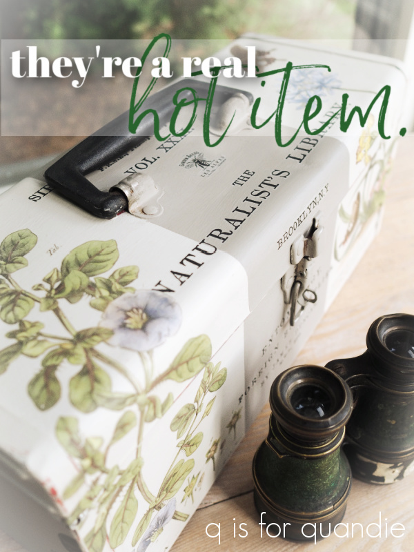
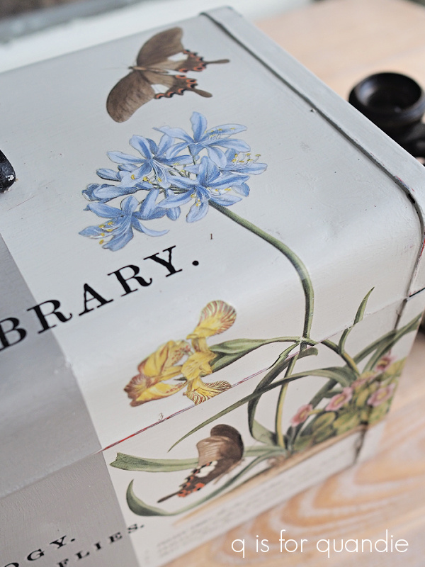
I ended up painting back over this one and turning it into this …

So for me personally, I’ll probably stick to mainly using my stamps on paper.  Just look how pretty this one is stamped in pink on some tissue paper.

So, leave me a comment and let me know, have you had better success stamping over painted items?  If so, do you have any tips that you’d like to share with the rest of us?  We’re all ears!

for the record.

My friend/picker Sue found this little case for me.

At first I thought it was a makeup case, but then I realized it was probably used to hold 45’s.  Oh boy, that might really be aging me.  How many of you now thinking “45’s?  What is she talking about?”

But I bet more than a few of you will know exactly what I’m talking about, records of course.

That clear handle screams record carrying case to me, sort of like this one …

Although the shape doesn’t seem quite right.

I never actually had a case like that for my 45’s, mine looked like this …

It was so groovy.  Who else remembers these?  You turn that handle at the top and the blue pieces lifts off to reveal all of your 45’s.  I borrowed that photo from Etsy, so if you’re looking for one of these cases, they are out there!

Anyway, I don’t think anyone is going to use this case for their records now.  Especially now that I’ve given it a new look.

Let’s start with the inside though.  Unfortunately I neglected to get a ‘before’ photo of the inside, but it was a little beat up and tired looking.

I painted the inside black using Dixie Belle’s Silk Paint in Anchor.  Then I lined the lid and the bottom with some old scrapbook paper that I had on hand.

You might be surprised to learn that I decided not to paint the outside.  I rather liked that butterscotch sort of color and the original patina on the case.

So rather than paint it, I just gave it a good cleaning with soap and water and then added some I.O.D. transfers to it.

The florals are from their Floral Anthology transfer, and the wording is from their Label Ephemera transfer.

Oh, and the cute little crown is from their French Pots transfer.  I stole it from the goose …

I applied some clear wax over the case to give it a little protection, and then that was it.

I’m not sure what it is about that Lucite handle, but I just love it.

And I guess I’m not entirely sure that is Lucite either.  But it has a bit more heft than your typical cheap plastic handle, and it’s crystal clear which usually means Lucite.

But, for the record, I’m not sure if this is a record case and I’m not sure if that is a Lucite handle, but I am sure that it’s pretty cute now.

What do you think?

This little case is for sale, so be sure to check my ‘available for local sale‘ page for more details (sorry, I don’t offer shipping).

a real cold item?

Unlike the painted toolboxes, which are a real hot item, my painted suitcases can be very hit or miss.  I’ve painted quite a few suitcases in my day, you can check out most of them in this post from April 2021.

One of my favorite suitcases was this one …

Although I guess technically that one is not painted.  I just added some I.O.D. transfers to it.  It did sell really quickly though.

But lately my suitcases are mostly a miss, rather than a hit.

Last Christmas season I painted this one …

I loved how it turned out.  But you know what?  It didn’t sell.

I think it would be adorable just sitting under the tree, or maybe placed in your foyer to greet Christmas guests.  As an added bonus, you could store Christmas ornaments in it when you pack it away with your decorations at the end of the season.

I still have it available if any of you locals are interested.  It’s priced at $45.

More recently I painted this one …

This time I also spruced up the inside thinking maybe that would help sell it.

But last I checked, this one is still unsold (it’s at the shop where I sell on consignment).

It’s priced at only $35 if any of you locals are interested.

Due to lack of sales, I’ve placed a moratorium on bringing home any more vintage suitcases.  Well … maybe I should clarify.  The moratorium is on paintable suitcases.  I’ll still grab fabulous vintage suitcases for my own non-collection.

However, I still have a couple of suitcases remaining in my ‘to be painted’ inventory including this one …

So decided to go ahead and get this one painted up.

This time I used Dixie Belle’s Drop Cloth paint, and then I added I.O.D.’s June, Ode to Henry Fletcher transfer.

This was a super simple project.  I just painted the suitcase, gave it a light sanding with 220 grit paper, added the transfer and then finished with a topcoat of Dixie Belle’s flat clear coat.

Oh, and I did also sand over the transfer very lightly with 220 grit to give it a more worn appearance before applying the topcoat.

That is such a pretty transfer!  The last time I used it was on this toolbox …

It sold really quickly and one of my regulars missed out on it.  So when I finished up this suitcase, I shared it with her and she called dibs on it.  So today’s suitcase is spoken for.

But I wonder if part of the reason the suitcases don’t normally sell as well as the toolboxes is because they are often musty inside.  This one actually isn’t too smelly, but it is quite orange.

Here are some q tips for mitigating that ‘I’ve been closed up for 50 years’ smell.

no 1 – fill the suitcase with crumpled newspaper and close it back up for a week or so.  The newspaper will absorb some of the odor.  Repeat several times with fresh newspaper if necessary.

no 2 – throw a scented dryer sheet inside.  Maybe pick a nice lavender scented variety.

no 3 – spray with Fabreeze.

no 4 – give the suitcase its day in the sun.  Open it up and set it outside in a sunny spot to air out.

no 5 – if you’re really fancy, create your own lavender sachet to place inside the suitcase.

I’ve tried all of these options … well, except I’ve never made my own sachets.  Usually I employ several of these options at once.  But, I haven’t found a 100% fool-proof way of totally removing that musty-ness.  Once the suitcase goes back to sitting around closed up all the time, it will likely return.  For that reason, I use my own vintage suitcases to store things that won’t pick up odors like my glass tree toppers.

If nothing else, a suitcase like this one is just pretty to look at.  You can put it at the foot of your bed, or next to your dresser, or anywhere really.

Do you have any tips on freshening up the inside of a suitcase?  If so, please be sure to share them in a comment!

gardening small.

After taking some time to evaluate my garden after our recent hailstorm, I’ve realized that although some plants were quite damaged, some weren’t really impacted too much.  My large leaved hostas are toast.

At least the ones where the leaves were unfurled.  There were still a few varieties that weren’t up all the way yet, so that was an unexpected bonus to the cool spring we’re having.

My tulips all bit the dust as well.  Ironic, right?  They survived the winter, and then the deer, only to succumb to hail.

But for the most part, plants with small leaves, like the sweet woodruff …

and the brunnera were just fine.

Which brings me to my smallest plants of all, the ones in my fairy garden.

As you can see, the fairy garden fell victim to the hail much like the rest of my garden.  But it’s easy enough to fix a toppled birdbath when it’s only 3″ tall, and once the hail melted I could see that there wasn’t much damage done to the fairy garden at all.

This seems like a good opportunity for a fairy garden update.

My fairy garden lives in an old cracked bird bath that I purchased at a garage sale.  The crack meant that it would no longer hold water and function as a bird bath, so that made it perfect to plant in since it has drainage.

If you’ve been following me for long, you may remember that I gave it a refresh back in 2018.

Since then only two of the perennials have reliably returned each year.  One is the bright lime green mini hosta called Feather Boa, and actually it’s doing so well that it’s threatening to take over.  I’m going to have to pull it up and divide it again soon.

I keep trying other miniature hostas, but so far none of them have made it through a winter.  We bury the fairy garden in a big pile of leaves up against the house for winter to give it some extra protection from our ridiculously low temps.

The Berberis thunbergii ‘Concorde’, the dark purple ‘shrub’, has also come back each spring.  The Barberry has not retained that dark purple coloring though, now it looks like this …

I suspect this is because it doesn’t get enough sun.

I always add a few annuals to the fairy garden each year.  Unfortunately, I rarely know the names of them.  I buy most of them at Bachman’s (my local garden center) and they are just labeled as ‘pixie plants’.

I added a little vertical interest with this next one …

It will be interesting to see how that one performs.

I also added something from Stepables this year.  Are you familiar with them?  They are low growing ground cover plants that can handle some foot traffic.  They are supposed to be good for planting in the crevices of a flagstone walkway, for example.

This one is called Blue Star Creeper and I hope I can keep it blooming in my fairy garden this summer because those tiny blue flowers are super cute.

My little garden angel is getting pretty ratty looking …

I may have to do some experimenting with the Dixie Belle Patina Paint on him next!

If you like my fairy garden, you should see my in-law’s!  I’m going to make a point of getting some photos of it to share with you guys this summer.  But until then, do any of you have a fairy garden?  If not, I highly recommend it.  You can fit one in just about anywhere, it’s much cheaper, it’s much easier to take care of than a full sized garden, and apparently it won’t suffer much from hail damage.  So I say, garden small!


my bronze buddha.

First up, congrats to Sue Pagels.  I drew her name at random to win my giveaway from last week.  Not to worry if you didn’t win, I have another fab giveaway today!  Be sure to read all the way to the end of today’s post for the details.

You may have seen my buddha statue in previous posts about my garden.

I’ve had him for years … possibly even decades.  I have absolutely no memory of when or where I purchased him.  He’s just been hanging around in the garden for a long time.

I’ve always left him outside year round, and over the last couple of years he’s been looking pretty rough.  The last two, or maybe even three, springs I’ve said to myself “I really should do something about that.”  But, I never got around to it.

Well, now that I’m retired from the day job, this is going to be the summer of getting around to it!  Starting with buddha.

So here’s how he looked this spring, prior to his makeover.

I believe he is made out of some sort of pinkish/orange concrete.  I had once thought he was terracotta, painted to look like concrete, but he’s far too heavy to be clay.  He must be concrete of some kind.  He’s heavy and solid.

Anyway, I lugged him out of the garden and brushed the dirt off a bit before I brought him inside.

But before I got started on him, I decided it would be wise to practice my technique on a smaller item first.  So I pulled out this acorn finial.

You may remember that I found this while thrifting a while back and I was going to leave it ‘as is’.  But I decided this piece would be a good guinea pig.

So I pulled out my Dixie Belle patina paints in Bronze and Iron, the Green spray and some of their gilding wax in Bronze.

I started out by painting the acorn in a coat of Bronze paint.  Once dry, I added a 2nd coat and while that coat was still wet I sprayed it with the Green patina spray.

To add a little more authenticity to the look, I then dabbed some of the Iron paint just on the corner and sprayed it (while still wet) with the Green spray to add a little rust.

Lastly, I used my finger to rub some of the Bronze gilding wax on some of the high points on the piece to bring some of that bronze back out again.

Yep, perfect.  This is the look I wanted for my buddha.  So I followed the same process; base coat of Bronze, allow to dry, 2nd stippled coat of Bronze, spray with Green spray while paint is still wet, allow to dry, stipple some Iron paint to add patches of rust, spray again with Green spray while wet, allow to dry.  Step back and evaluate the results.  Add some more rust spots.  Allow to dry and then bring out some highlights with the Bronze gilding wax.

I applied the gilding wax using my finger, just rubbing it on to add some highlights on his nose and brow for example.

He turned out fabulous.

I put him back out in the garden a couple of weeks ago, and here’s how he’s looking now.

He’s looking pretty genuine, right?

Here are some q tips for you on using the Dixie Belle patina paints.

no. 1 – the verdigris patina develops a lot more quickly than the rust patina.  The rust patina can take days to fully develop in fact, so if you don’t see as much rust as you want right away just be patient.  If a couple of days go by and you still want more rust, you can always stipple on more Iron paint and spray again.

no. 2 – whether shaken or stirred, be sure to mix your paint thoroughly, and often, as you’re working with it.  There are actual metal flakes in the paint that create the patina and they tend to settle to the bottom of your jar of paint rather quickly.

no. 3 – if you have distinct brush strokes in your paint, the spray may settle in those lines making them more apparent.  For that reason, I recommend stippling the 2nd coat (or any subsequent coats) of paint.  Stippling is just pouncing the paint on with an up and down motion.

no. 4 – you don’t have to seal your patina projects.  However, if you’re adding patina to something that will come into contact with people’s clothing you may want to seal it (the patina will likely rub off on clothing).  In addition, the patina will continue to develop over time, so if you want to halt that process, you can seal it.  Dixie Belle does make a sealer for the patina paint called Patina Guard, but I find that it adds a bit of shine and I personally don’t like that look.  That’s just my personal preference though, you may be just fine with it.

no. 5 – if you’re working on a flat surface, you may find that the verdigris looks like droplets on your piece (because you sprayed it on in droplets).  I think this product gives a more authentic look on items with some texture and detail.  The spray settles in the crevices and looks amazing.

I definitely think my buddha benefitted from a little patina.

And now you can benefit too!

I’m going to draw the name of one lucky winner to receive all of the products I used to create my bronze buddha.  You’ll receive Patina Paint in Bronze and Iron, the Green Spray and some Bronze gilding wax.

The rules:  To be eligible to win, simply leave a comment on this blog post.  Maybe let me know what item you would turn into bronze!

Your comment must be left on this blog post, not on Facebook or Instagram.  You are not required to follow my blog, although it would be awesome if you did!

I will randomly draw the name of a winner for today’s prize from all of the comments left on this post by Sunday, May 29, 2022 at the stroke of midnight (U.S. Central time).

The fine print: no purchase necessary, you must be 18 years of age or older to win, void where prohibited by law, the number of eligible entries received determines the odds of winning, approximate retail value of prize is $69, if the prize is not claimed by Friday, June 3, 2022 another name will be drawn at random to win, blah, blah, blah.

Thank you to Dixie Belle Paint Co for providing the Patina Paint I’m giving away today.

garage sale regret.

Do any of you suffer from garage sale regret?

You get home from a day of garage saling and suddenly realize that the painted wooden chicken feeder you passed up on would have been awesome hung up somewhere in the garden and filled with plants.  It was only $6, why didn’t you buy it??

Or you wonder why in the world you refused that 3rd vintage sled.  Sure, it was priced higher than the other two that you did grab, but still …

And you really should have snatched up all of the Rocket Ligularia that were $1 each, why did you only take two (because it felt greedy to take them all?!).

For me, it’s inevitable that after a day spent at a fabulous neighborhood sale, I will realize there were things I should have grabbed but didn’t.

And on the opposite side of that coin, sometimes I regret the things that I did buy.  Like this toy cash register.

I mainly bought it because I thought the little note attached, ‘I bet your grandpa can fix it!’, was clever.

Sure, it’s adorable.  But red isn’t my color, so I don’t have anywhere to display it myself.  So I added a little transfer scrap to it and I’ll bring it in to the shop and hope someone else will give it a good home.

Garage sale regret is simply part of the deal, right?  That’s the difference between garage sales and shopping retail.  If you don’t grab something right away, it will likely be gone five minutes later.  And you also can’t go back and return something if you decide you shouldn’t have purchased it.

These items were all from the Linden Hills neighborhood sale last Saturday.  Linden Hills is such a pretty neighborhood, lots of old craftsman style bungalows and tudor style cottages.  And it feels as though nearly every house has a fabulous garden!  It’s really just a pleasure to drive around (especially when your sister is doing all of the driving, thanks again for that sis!).  It’s a bonus to also bring home some fabulous finds.

In addition to the two sleds, the plants and the toy cash register above, I also brought home a few more goodies like two vintage totes.

The green one is wood, the pink one is metal.  I wonder if it was originally red and had faded to that pink shade.  Or was it always pink?  A mechanic’s tool tote in pink?  What do you think?

I also purchased these bits of wrought iron salvage …

These are really fun to add to a planter in the garden.

I bought this headboard for $5.

It’s fairly non-descript, but I have a plan for turning it into a sign.  The price was right, so I grabbed it.

It’s basically an automatic reaction to pick up any ironstone pieces that I find, apparently even chamber pots.

This one is pretty filled with some lobelia though.

I don’t believe this casserole is actually ironstone, but it would still be lovely displayed with ironstone pieces.

I picked up this teapot as a gift for my m-i-l.

I think she’s going to love it.

I googled it and found a little more info about it online (here), and prices ranging from $67 on Mercari to $339.95 on replacements.com (yikes!).  I paid $3!  But, shhh, don’t tell my m-i-l it was only $3.

I picked up a pair of watering cans at Linden Hills.  Usually I’m thrilled to find just one watering can, so it was pretty exciting to find two.

This first one is pretty dinged up, has a broken plastic sleeve on the top handle and no rose on the spout.

In case you aren’t familiar, the ‘rose’ is the piece that fits on the end of the spout and allows you to sprinkle the water.

Vintage/antique watering cans are often missing their rose.  They tend to be more valuable with a rose, than without.  My personal theory is that it’s quicker to water a potted plant without the rose.  Also, the rose tends to get clogged up by debris.  So people often removed them, and then they were lost.

Funny enough though, my friend/picker Sue had recently found a rose that she gave to me.

This rose from Sue just happens to fit on this can.

So I added the rose, pounded out the dents a bit, removed the broken plastic sleeve on the handle and added a transfer.

This one will be heading into the shop as well.

And this brings me to my find of the day.

You’re probably wondering, what makes this watering can so special that it deserves find of the day status?  Well … as you know, I have a bit of a non-collection of watering cans.

And the truth of the matter is, most of them don’t actually hold water!  I’d say 99% of the time these old watering cans have rusted through in spots on the bottom and they are leaky.  So while they are great as décor, they don’t actually function.

As a result, I still use an ugly plastic watering can from IKEA when I apply water soluble fertilizer to my potted flowers.

But this watering can does hold water!  It also has a nice big spout (without a rose).  I’m looking forward to using it this year to feed my flowers.

So how about you?  Do you have any garage sale regrets that you still think about?  And what would you have chosen as the find of the day?  Leave a comment and let me know.

an old favorite.

Remember I mentioned that I purchased a vintage dry sink at a garage sale a few weeks back?  Well, here it is in its ‘before’ state.

How could I resist that?  It even had the old green pump still attached.  Well, part of it anyway.  The handle is missing.

This one was definitely the perfect candidate for some milk paint.  I just happened to have some Homestead House milk paint on hand in a color called Stone Fence.  I’d used this color quite a few years ago and I really liked it, so I’d ordered more of it recently.  It was just waiting for the right project.

I went very minimal on prep because I knew I’d be OK with some chipping.  So I simply cleaned the beadboard on all four sides with some TSP substitute, and then rinsed with clear water.  Next I painted the beadboard with two coats of the Stone Fence leaving the top of the dry sink unpainted.  Once dry, I sanded with 220 grit paper.

I then vacuumed away any dust, gave it a wipe down with a clean, dry microfiber cloth, and then applied my old favorite transfer called Seeds.

That transfer could not have been any more perfect for this piece (although I didn’t use the entire transfer, there were a couple more lines at the bottom that I cut off and will save for another project)!

This is an old Prima Marketing transfer from before they parted ways with the I.O.D. sisters.  I was just looking back at one of my blog posts about a pair of twin beds that I put this transfer on back in 2018, and I mentioned in that post that the transfer cost $17.99!  Dang, what happened to those prices?!  Now you can’t find transfers this size for less than $29.99.  That’s a 65% increase in 4 years.  What’s up with that?

(Sidebar:  that urn planter on the left is another that I used Dixie Belle’s patina paint on to give it a rusty iron look, it’s really just plastic!)

The Seeds transfer came in a larger size (which is what I used on this dry sink), and a smaller version.  I used part of the smaller one on this chair …

I used this design on A LOT of pieces, and I was hoarding this last one for something special (the transfer is retired, so no longer available).

Just a quick q tip to say that I don’t necessarily recommend storing (a.k.a. hoarding) transfers for more than a couple of years.  They can dry out and then become difficult to apply.  I’ve also had them come unstuck from their backing and stuck to the protective sheet instead, and then they are worthless.

But I was ignoring my own advice and hanging onto this one until just the right piece came along.  Luckily, the transfer was still in good shape and went on fairly easily.

That being said, it can be a little more challenging to apply a transfer over an uneven surface like beadboard …

You just have to go slowly and continually press the transfer down into those grooves.

As for the top of the dry sink, I decided to just clean it up a bit.

I sanded it with 220 grit paper to remove some smudges of paint left on it by a previous owner, and then revived the finish with a coat of Dixie Belle’s Big Mama’s Butta.

It’s not perfect, but that was my point.  I didn’t want to totally remove the patina that showed its age.

The remainder of the piece received a top coat of Dixie Belle’s flat clear coat.

As for the inside, I cleaned it and that’s it.  I like that it looks authentic inside with original chippy paint.

I think this piece would be adorable as a plant stand.  You could fill the ‘sink’ area with potted plants and store all of your plant supplies underneath.

In the end, this was the perfect piece for my last precious Seeds transfer, don’t you think?

This piece is for sale, so be sure to check my ‘available for local sale‘ page for more details.

a pair of benches.

I picked up this rather non-descript pair of benches at the Bryn Mawr sales earlier this month.

They were literally the first thing I saw as I stepped out of the car.  I think I was a little over-excited at the prospect of returning neighborhood sales when I snatched these up.  They really weren’t anything special.  They certainly aren’t vintage.

They are pretty sturdy though.  So after I gave them a good cleaning, I hoped I could give them each a new personality with a little paint and some transfers.

I painted the first one in Dixie Belle’s Kudzu.

I added the I.O.D. Rose Chintz paint inlay to the shelf underneath.

And then I added the Fresh Cut Flowers stencil from The Stencil Market to the top.

It was a perfect fit.

I followed all of that up with some sanding to distress the edges, and then a couple of coats of Dixie Belle’s flat clear coat.

I painted the 2nd bench in my favorite warm white, Dixie Belle’s Drop Cloth.

I covered the shelf underneath in a black and white gingham transfer from re.design with prima.

Then I added a portion of their French Specialties transfer to the top of the bench.

Once again, I finished it off with a couple coats of DB’s flat clear coat.

As a sidebar, I took all of the photos for this post yesterday morning, and then yesterday afternoon this happened …

That white stuff?  It’s hail.

We had a massive hail storm.  It sounded like rocks were being dropped from the sky.  And really, they may as well be rocks … except they melt eventually.  Many of my hostas were totally shredded.

Just when they were starting to look really fabulous.

I have to steel my nerves to head out there this morning, survey the damage, and start the clean up.  But, on the bright side, I have lots of time to spend in the garden this summer.  Looks like I’m gonna need it.

So anyway, two somewhat different looks for a pair of formerly matching benches.

Which one do you prefer?

If any of you locals are in need of a small but sturdy bench, both of these are for sale.  Check out my ‘available for local sale‘ page for more details.

Thank you to Dixie Belle Paint Co for supplying the paint and clear coat used on the benches.

they’re a real hot item.

“Give shy persons the strength they need to get up and do what needs to be done. Made from whole wheat raised by Norwegian bachelor farmers, so you know they’re not only good for you, they’re pure, mostly.”

Were any of you fans of A Prairie Home Companion?  The radio show on public radio?  OK, this one makes me sound older than I am because I was a fan of a radio show (as if I was around before TV).  But it was on the air from 1974 through 2016.  It originally started at a local college here, Macalester.  If that name sounds familiar to some of you non-locals, maybe it’s because I regularly go to a neighborhood garage sale in that area, MacGrove.

Anyway, one of the fictional sponsors of the show was Powdermilk Biscuits.  When I mentioned how fast Monday’s toolbox sold, Mr. Q started singing the Powdermilk Biscuit jingle.

Has your family tried them, Powdermilk?
Has your family tried them, Powdermilk!
Well, if your family’s tried ’em,
You know you’ve satisfied ’em,
They’re a real hot item, Powdermilk!

Which brings me to the 2nd toolbox that I transformed last week.  If you’ll remember, here is the ‘before’ photo.

This is one that my friend Sue found for me.

I started out with my usual prep; a good cleaning with a grease cutting cleanser (Dawn dish soap in this case), a light sanding to remove any flaking paint and to scuff up the surface, then two coats of Dixie Belle’s B.O.S.S. to show this toolbox who’s boss.

Next I painted the inside and the tray in Dixie Belle’s Bunker Hill Blue.  I chose that color because I thought it would be gorgeous with the Cobalt Flourish decoupage paper from re.design with prima.

Before decoupaging this paper to the bottom of the tray, I had to paint just the part I was covering up in DB’s Drop Cloth in order to provide a white background for the tissue paper design.

Once I had the inside finished, I painted the outside in Dixie Belle’s Sawmill Gravy.  I then used this toolbox to experiment with my new I.O.D. stamps, and you’ll see those details in a later post.  Suffice to say, spoiler alert, I didn’t love the results.  So I ended up painting over them with a stripe of Dixie Belle’s French Linen down the center of the toolbox.

Next I pulled out some wording from I.O.D.’s Label Ephemera transfer and added that to the toolbox.

Then I took a step back and thought it was still just a little bare looking.  It needed something more.

So I pulled out the I.O.D. Brocante transfer.  As I was looking through the various designs in that transfer, this botanical one with a blue flower caught my eye …

I realized it would wrap around from the front of the toolbox to the top of it perfectly, plus the blue flower would tie in with the Bunker Hill Blue on the inside.  Not to mention, the butterflies would tie in perfectly as well.

Then I saw a 2nd botanical design with a blue flower in that set.

It was also nearly the perfect size to wrap up and over, it just covered up a tiny bit of the “N” in Naturalist’s.  Of course, it would have been better to put the florals on first, then layer the wording over them.  Had I planned this out, I would have done that.

But this design was continuously evolving as I went along.

In fact, when I then put the tray with the Cobalt Flourish paper lining back inside it was all wrong.  I meant to take a photo so that I could show you what I mean, but completely forgot.  You’ll just have to imagine it.  It just didn’t mesh with the botanicals on the outside of the toolbox.

So I made the decision to remove the decoupage tissue and just leave the inside plain.

If you’re wondering how hard it is to remove the prima decoupage paper that was applied with DB’s clear coat, it’s not that hard.  I misted it with water, let it sit for a minute, and then it scraped right off with a paint scraper.  Of course, it hadn’t had a chance to cure, I think it had been about 24 hours since I put it on.  I’m sure it would become more difficult to remove over time.  But once I had it off, I sanded the tray down a bit and added a fresh coat of the Bunker Hill Blue.

I love the rich, pop of navy blue inside …

but the outside is the real star of the show.

This toolbox is for sale locally, and they’re a real hot item, so if any of you locals (I don’t ship my items) are interested, be sure to check out my ‘available for local sale‘ page for more details.

As always, thank you to Dixie Belle Paint Co for supplying the B.O.S.S., paint and sealer I used for this project.

loving life on the edge.

First up, congrats to Cyndi.  I drew her name to win the paint giveaway from my previous post about Charleston.  Today I’m sharing the last post from our trip.  Be sure to read all the way to the end for another paint giveaway!

While the first half of our trip to Charleston was spent exploring historical sites and admiring beautiful homes and gardens, the 2nd half was spent at the beach.  Folly Beach, to be specific.  We packed up all of our stuff, checked out of our first hotel and drove about 20 minutes to hotel #2 so that we could stay right on the beach.

Here is how visitfolly.com describes Folly Beach …

Folly Beach, South Carolina is one of America’s last true beach towns. Just minutes from historic downtown Charleston, Folly Beach is a 12 square mile barrier island that is packed with things to do, see and eat. This is a funky, laid-back, come-as-you-are kind of beach. The pace is invitingly slow, the people are captivatingly unique and the shops and restaurants will receive you with good old fashioned Southern charm and hospitality. It won’t take long for you to feel right at home.

Surrounded by the Atlantic Ocean and the Folly River, visitors enjoy six miles of wide beaches, surfing, fishing, biking, kayaking, boating, eco-tours, and sea wildlife including several endangered species. The sunsets on Folly are legendary, so make sure you have plenty of space on your camera or smart phone … seriously, free up lots of space!

A few steps from the beach, downtown Folly features an eclectic array of locally owned stores and restaurants. Fun bohemian clothing, beach knick-knacks and surf shops are mixed with fantastic seafood restaurants, casual cafes and one-of-a-kind bars. With live music coming from all directions and fruity cocktails calling your name, your cares will melt away as you become lost in the Folly lifestyle. And when the sun goes down, Center Street becomes a lively mix of beach-casual nightlife and rooftop dance clubs.

Whether you need a beach front home for 20 or a romantic room for the two of you, Folly Beach is the perfect spot for vacations, reunions, beach weddings, or just a quick weekend getaway. Come visit us at ‘The Edge of America’ … you’ll love life on the edge.

I have to say, for a marketing blurb, it’s fairly accurate.  Folly absolutely felt like a funky, laid-back beach town.  We had some great seafood, some delicious cocktails and listened to some live music.  Everyone we met there was friendly and welcoming.  The staff at our hotel were exceptionally good (and after the really awful staff at our first hotel, this was a welcome change).

Speaking of our hotel, we stayed at Tides Folly Beach.

What I thought was really unique about this hotel was that every room was truly ocean-front.  In the photo above you’re looking at the street facing side of the building.  This is where the open air hallways and doors to the rooms are.  I’ve put a little arrow on the photo to show the location of our room, we were on the 7th floor.

Once you step into the room, all you’ll notice is the wall of glass looking out the opposite side onto the Atlantic Ocean.

Full disclosure, I did not take that photo.  I borrowed it from the web.  However, that is basically what our room looked like with the exception of the pretty aqua colored bed spreads.  We had some really drab beige colored spreads that were itchy and kind of gross.  Also, our room never looked that tidy.  One of the outcomes of COVID is that most hotels no longer clean your room during your stay.  I’ve stayed in … let’s see … five hotel rooms over the last year and none of them offered maid service every day.  The Disney hotels cleaned your room every 3rd day, but the rest did not clean the room at all regardless of duration of stay.  The Tides staff did say that you can request maid service, but you have to do so 24 hours in advance.  We probably should have done that because by day 3 there was so much sand on our floor that we may as well have been sleeping on the beach.

But … that view!

That view was worth having a little sand on the floor.

While lying in bed you couldn’t even see the beach, just the water, so it felt a lot like being on a cruise ship with the vast ocean outside your window (minus the motion of the ship).

I was fascinated by the pelicans that would glide silently past our balcony.  Since we were on the 7th floor, they were right at eye level.  I was never quick enough with my camera to get a photo of them from the room, but I did snap this one from the beach.

Looking down from our juliette balcony (if you aren’t familiar, this is a balcony that is only about 2′ wide, no space for chairs) you’ll see the pool.

I took that photo in the early morning before it was full of screaming children playing.  For the remainder of the daylight hours the pool was packed full.  As a result, we never went there, choosing instead to spend our time on the beach.

If you step out the door from your room into the open air hallway, you’ll see Center Street which basically ends at the hotel.

This street is lined with restaurants, bars and souvenir shops.  I’ve put an arrow on the photo showing our favorite place to eat, Rita’s Seaside Grille.

We ate there three times … no wait … four times.  Three of which were breakfast.  They had the most amazing Belgian waffles and a delicious peach bellini mimosa.

In the end, our favorite thing to do at the beach is to get up early and walk along the shore.

In my experience not all beach locales are conducive to this activity.  For example, we once stayed at La Jolla de Mismaloya in Puerto Vallarta which is situated in a cove that didn’t allow you to walk much in either direction.

But you can walk quite far on Folly Beach (the beach is six miles long).  We walked to the southern-most tip of the island where the Folly River meets the Atlantic one morning, and as you can see we pretty much had it entirely to ourselves.

We debated walking up the other direction to see the Morris Island lighthouse, but in the end we decided we weren’t up for the 8 miles round trip.

We enjoyed checking out some of the beachfront homes while we were out walking.

Mr. Q and I dreamed about how amazing it would be to live right on the beach.  We don’t even need a big ol’ fancy house like that one.  We’d be happy in a little cottage by the sea.  But as seems to be the trend in most waterfront locations, there are only a handful of small vintage cottages remaining.  I suspect that they get torn down to make way for the huge, expensive homes.  Although, to be fair, Hurricane Hugo did blast through Folly Beach in 1989 damaging many of the homes.  That may also explain why there are so few small, older beach cottages left.

One last thing.  Before you get the impression that the beach always looked like this …

Let me clarify.

That’s how it looked at 7 a.m. before anyone showed up.  Later in the day this beach was positively packed with people.

If you’re looking for a quiet, peaceful beach vacation, this may not be the spot for you.  However, it’s a great spot for families, and for those looking for more of a party atmosphere.

As we realized at the end of our beach stay, Mr. Q and I are really rather lame.  We could have done so much more in Folly Beach, rented bikes, taken surfing lessons, played volleyball, danced all night at the rooftop bars, but instead we mostly just relaxed on the beach, ate delicious seafood, and enjoyed a few cocktails.

FYI, that shrimp was delicious, and the cocktail was called ‘And Just Like That’, so clearly I had to have one (it was your basic Cosmopolitan with the addition of POM juice).

As you can probably tell from my photos, we were blessed with absolutely perfect weather the entire time we were in Folly.  This was a great way to end our Charleston vacation.  Although we stayed right there on the beach, you could also easily plan a day at Folly Beach while staying in Charleston as well.

Before I totally wrap up my Charleston blog posts, I have another paint giveaway for you guys.  Obviously, this one is inspired by the colors of Folly Beach; Stormy Seas, Endless Shore and Wharf.

The rules:  To be eligible to win, simply leave a comment on this blog post (you could tell me about your favorite beach.  Folly Beach was fabulous, but my all-time favorite beach is definitely White Bay on Jost van Dyke.)

Your comment must be left on this blog post, not on Facebook or Instagram.  You are not required to follow my blog, although it would be awesome if you did!

I will randomly draw the name of a winner for today’s prize from all of the comments left on this post by Sunday, May 22, 2022 at the stroke of midnight (U.S. Central time).

The fine print: no purchase necessary, you must be 18 years of age or older to win, void where prohibited by law, the number of eligible entries received determines the odds of winning, approximate retail value of prize is $95, if the prize is not claimed by Friday, May 27, 2022 another name will be drawn at random to win, blah, blah, blah.

Thank you to Dixie Belle Paint Co for providing the paint I’m giving away today.