We had the most beautiful day for garage saling on Saturday. It was sunny with low humidity and cooler temps in the 70’s.
I didn’t come home with tons of treasures, but I found a few good things. You might be surprised by the item I’ve chosen as my ‘find of the day’, but you’ll have to read to the end to find out what it is.
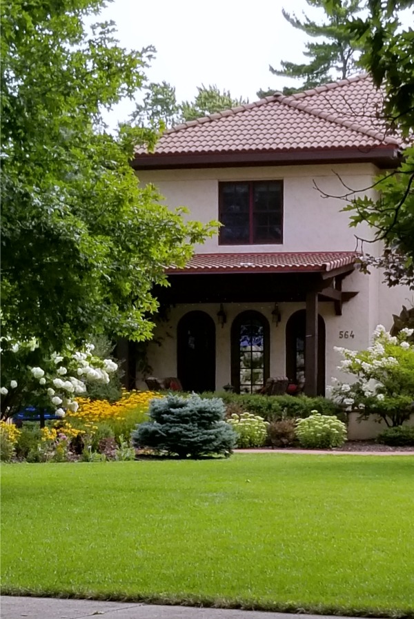
Before I get to the ‘finds’ though, I have to tell you guys that the garage sales themselves are really only part of the reason why I love these neighborhood garage sales. The other part is getting to drive around these gorgeous neighborhoods and snoop.

This particular neighborhood is in St. Paul and is bordered on one side by the Mississippi River. The homes along Mississippi River Boulevard are especially fab. Isn’t that row of hydrangeas spectacular?
I was totally envious of the hydrangea tree (on left) in front of this next house.
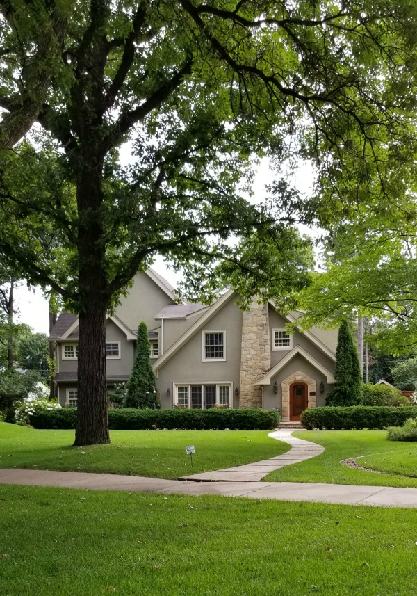
Who wouldn’t love to live in a pretty little cottage like this next one?
But let’s get back to the finds.
First up, Shelly suggested I show you my sister Debbie’s finds this time. I aim to please, so here they are.
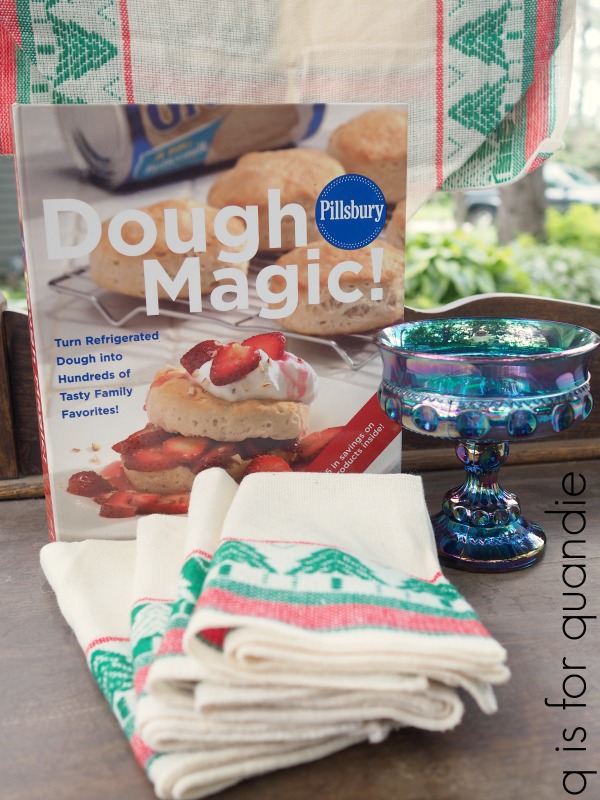
She spent less than $10 and came home with some Scandinavian style Christmas linens, a cookbook and a piece of blue carnival glass, which she non-collects 😉
I think it’s fair to say that Debbie comes along for the sight-seeing and the scintillating company more so than the actual garage saling (right Deb?). But she usually finds a couple of things to buy.
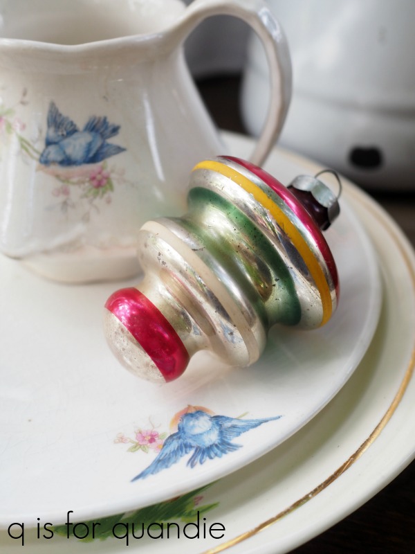
I came home with a couple of things to add to my own non-collections.
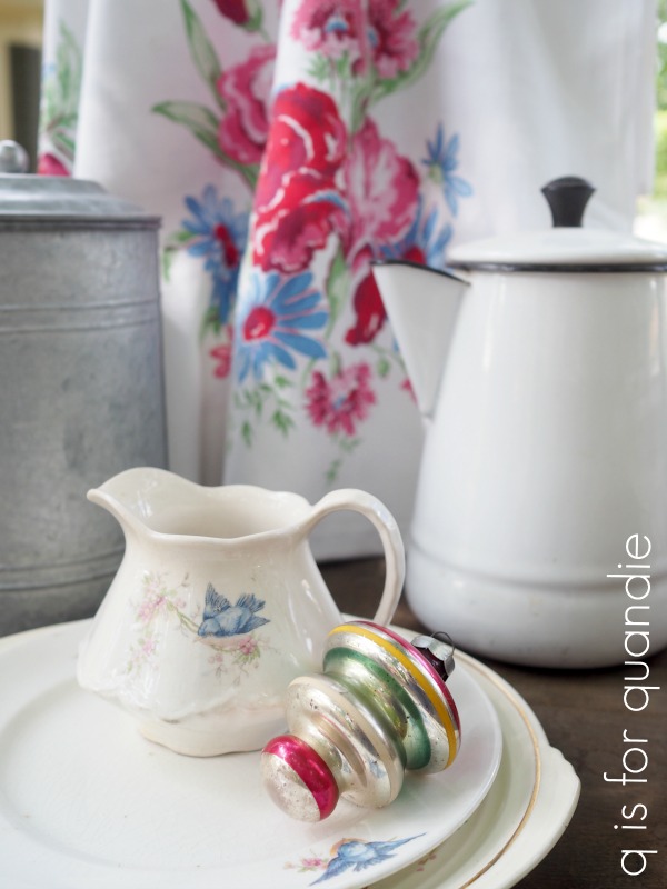
Including just one solitary Christmas ornament and some bluebird china.
I also purchased a gorgeous vintage tablecloth. The colors in it were just so vibrant.
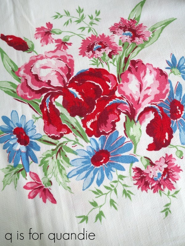
You may remember that I pared down my non-collection of these earlier this year, so it was silly to buy another … but at $10, I just couldn’t pass it up.
Somehow I also can’t seem to resist sweet painted china like this plate …
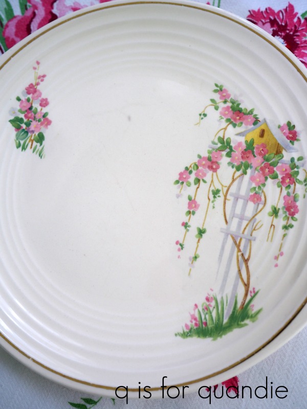
There’s really no market for these pieces right now and as a result they tend to be dirt cheap. I paid $1 for this one. I was thinking it would be pretty hung on the wall in my guest room.
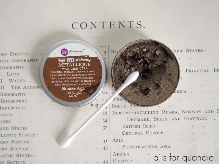
I also picked up another enamelware coffee pot.
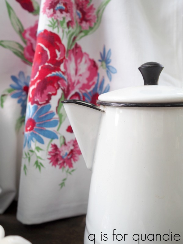
These have been selling well for me with the Prima Marketing transfers added to them, so I added some on this one too.

I also nabbed this mid-century glassware …

I think I’m going to use them as a prop for the mid-mod credenza that I’ll be sharing later this week.
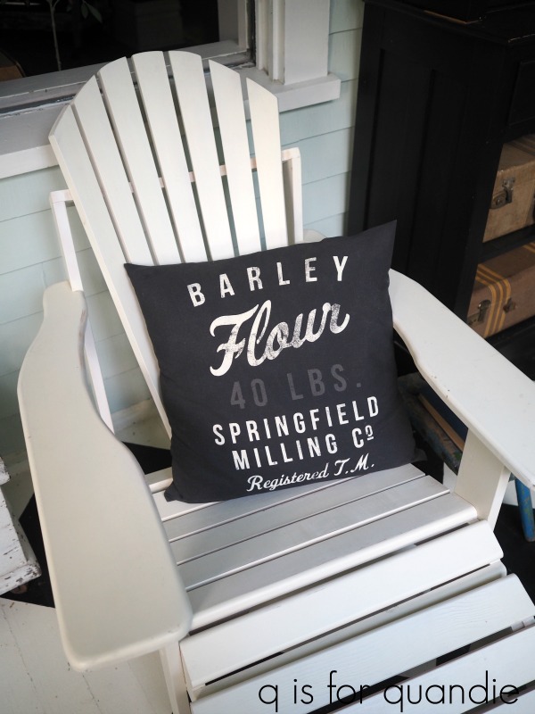
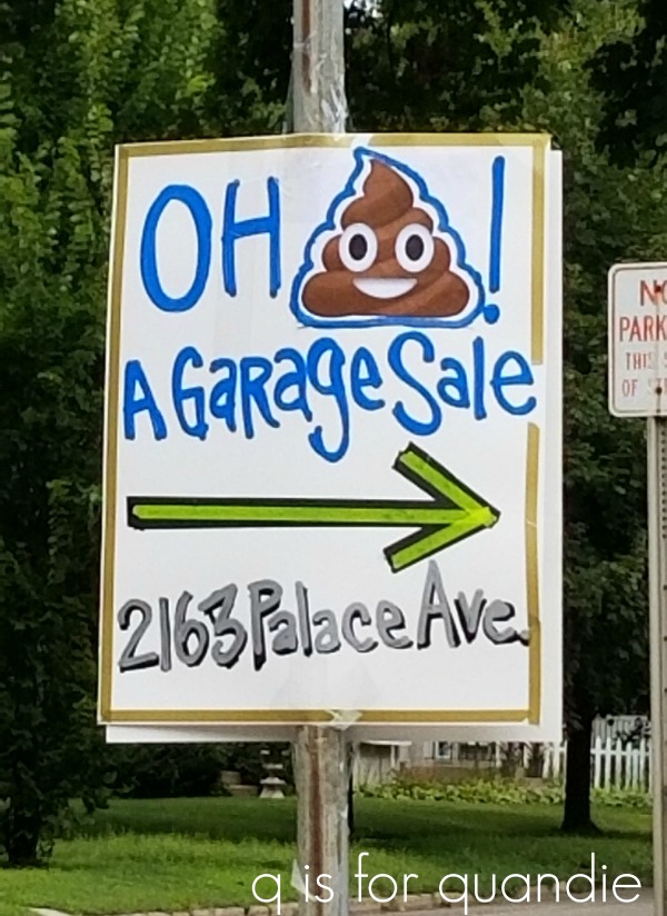
Speaking of things one can’t resist, who can resist heading to a garage sale that uses the poop emoji on their sign?
I didn’t end up buying much from these ladies, just a pair of quail.
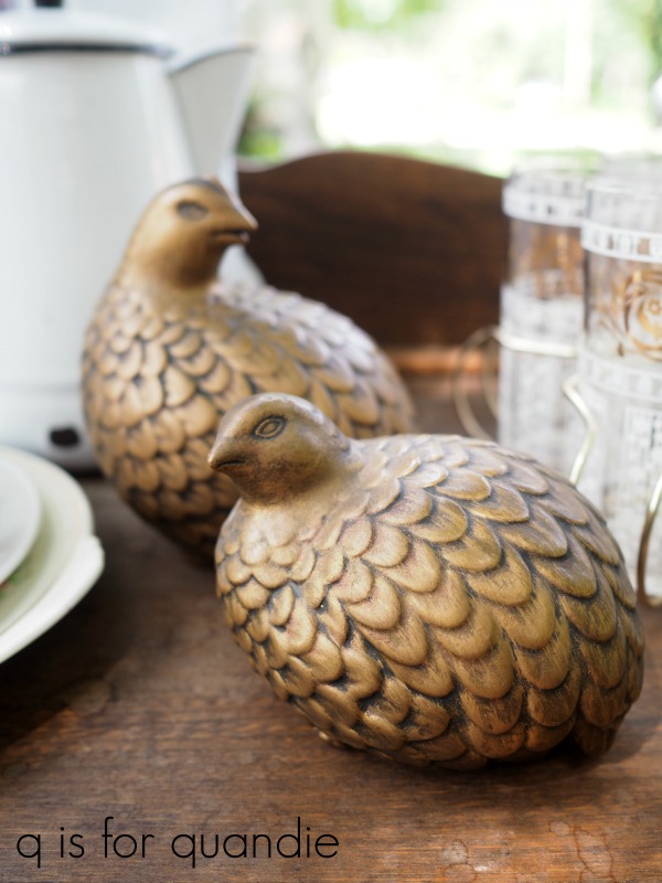
I’ve already given them a fresh new look with a coat of spray paint. You’ll also see them again as props on that mid-century credenza, but here they are with their new paint job …

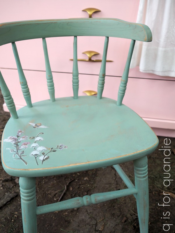
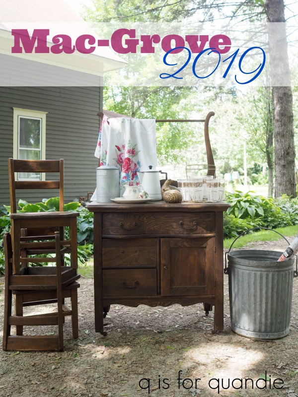
I also bought a few bigger pieces at Mac-Grove.
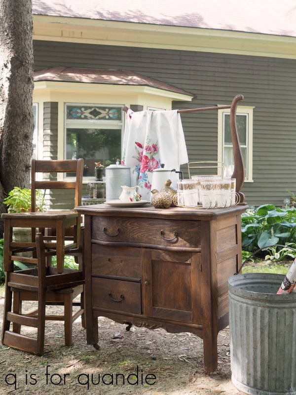
The three kid-sized wooden chairs will get makeovers eventually. I have some ideas for those swimming around in my head. Of course the washstand will also get a paint job and probably some new hardware since one pull is missing.
The bucket on the right would make a fantastic large planter, don’t you think? It is really quite heavy and the seller told me that it’s an old ash bucket. It would also be a great container for firewood if you’re lucky enough to have a wood burning fireplace.
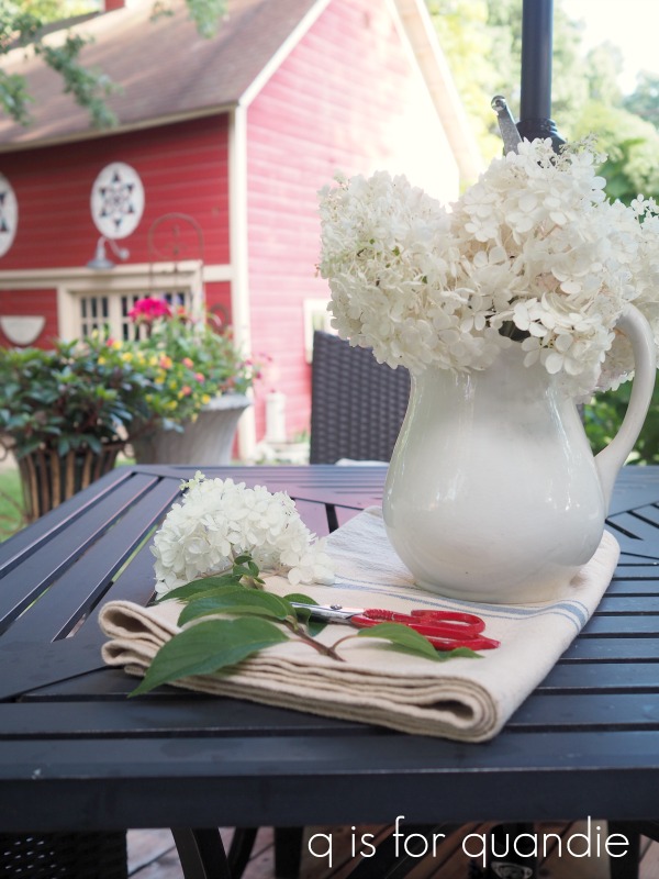
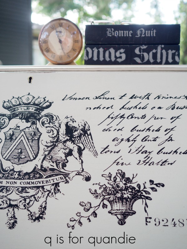
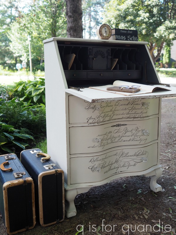
Remember the secretary desk I shared last week with the Prima Marketing Parisian Letter transfer on it? I mentioned that I couldn’t quite fit the entire transfer on the desk. The remaining portion was perfect for this bucket.

It looks pretty awesome filled with Limelight hydrangeas, doesn’t it?
Now, you’re probably wondering, what about that ‘find of the day’? Well, it’s actually not included in any of the photos so far but here it is …
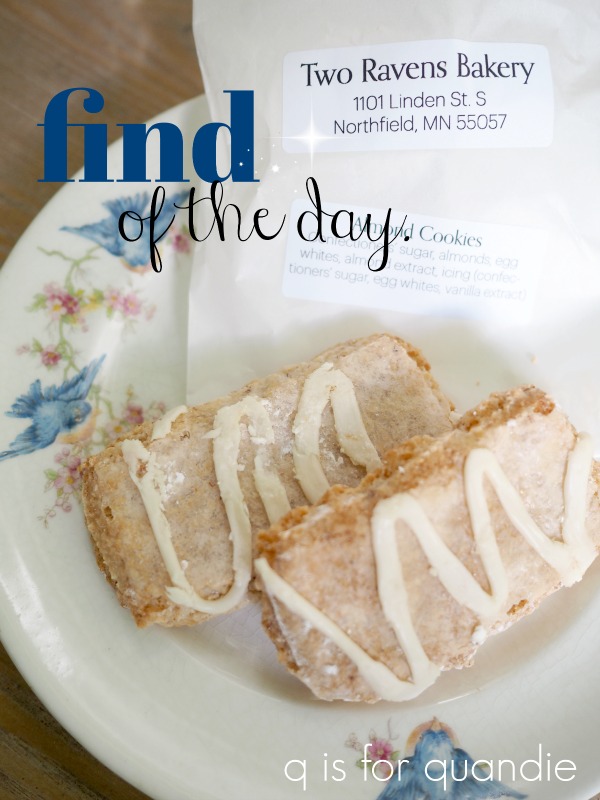
Oh my gosh you guys, these cookies were so delicious that I just had to call them my find of the day. The gal selling them is going to be opening a bakery in Northfield, MN. She said that she uses a lot of old Swedish recipes for her baking. These cookies might not look like much, but they had the most delicate crisp texture on the outside, with a chewy interior. Plus they were the perfect almond flavor. The gal also mentioned that she crushes the almonds by hand to make these. If any of you are ever near Northfield, keep an eye out for this bakery. You’ve got to try these cookies!
So, what’s your favorite among my finds this week? Were you surprised that my ‘find of the day’ was a cookie? Did you have your own fab finds last weekend? Leave me a comment and let me know.


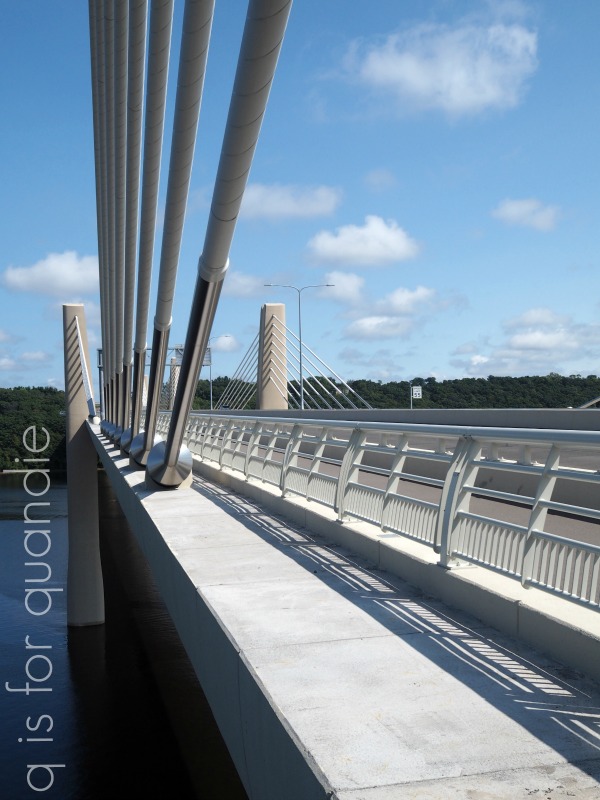
 The new bridge is in the more commercial part of town, so the modern aesthetic makes a little more sense here.