thrifting finds.

My sister and I braved the cold snap this past Saturday to do a little thrifting.  I came home with a fun pile of goodies to share with you today …

Some of the items will be left ‘as is’ such as the glass cloches, the vintage pudding mold and the cement garden bird.

Some of the items have a bit more work to be done on them, such as the suitcases.  I’ll be devoting a full post to the aqua suitcase with the bad stencil job later.

But a few of the items have already received their makeovers starting with this tray.

This one really didn’t need a makeover, but I wanted to tweak just a couple of details.  I painted the wooden handle thingie in the middle black instead of red, and then I added a transfer from re.design with prima’s Everyday Farmhouse collection.

Next up was this cute little box.

  Again, it didn’t need a lot of work, but I freshened it up with a coat of Dixie Belle’s Drop Cloth and then added a transfer from the Classic Vintage Labels.

It’s amazing what the addition of a simple transfer can do for something.

The little metal watering can also benefited from the addition of a Classic Vintage Label.

Finally, did you notice the set of stacking boxes?

Noah’s Ark on one side …

Halloween on the other …

These are classic 80’s country style, don’t you agree?

I gave them a little update with some fresh paint and more transfers.

The boxes are all painted in Dixie Belle paint from top to bottom, Drop Cloth, French Linen and Midnight Sky.

The top two boxes have Classic Vintage Label transfers on them, and the bottom black box has part of the Somewhere in France transfer on it.

As always, thanks to Dixie Belle Paint Co and re.design with prima for providing the products I used to give all of these thrifty finds their makeovers.

I’ll be sharing more fun vintage makeovers this week, so be sure to stay tuned!

french folding chairs.

The main reason that I ordered the aqua paint colors from Dixie Belle that I’ve been sharing this week was for this pair of french bistro style folding chairs that I picked up while garage saling last summer.

Here’s a photo that I took when I purchased them … when the grass was green and the ground wasn’t frozen …

I folded them up to store them and I have to tell you, I had a heck of a time opening them back up again!

As I was working on them, I discovered that one of them had an IKEA tag on it.  So, that explains the poor functioning.  They were cheap chairs to begin with, and time had not done them any favors.

Well, hopefully my custom paint job will make them more appealing to a buyer than the basic IKEA originals, and I’ll be pricing these pretty low since they aren’t vintage.

To prep I simply cleaned the chairs with a damp rag.  Then I painted the wood slats with two coats of Dixie Belle’s The Gulf.  I opted to not paint the metal because I felt that it would scratch far too easily, especially if anyone tries to fold the chairs up.  Once dry, I sanded the chairs to distress them.  Next I pulled out the leftover scraps of the new re.design with prima Cosmic Roses transfer that I used on this dresser …

I had a 6″ strip left over at the bottom that didn’t fit on the dresser.  It was just enough to do both chair backs.

Initially I wasn’t sure how I was going to like this design on just two 1.75″ slats with a wide gap in between.  But after I had the first one in place I really liked it.

I also added some Tim Holtz number rub-on’s to the back of each chair.

I used Dixie Belle’s flat clear coat on the chairs just to give them a little bit more protection than my usual wax top coat.

These chairs are perfect for pairing up with a small farmhouse table to turn it into a desk.

I enjoyed staging these photos with all of my aqua pieces from this week.

I had loads of fun playing around with the three different shades from Dixie Belle.  As always, thanks to Dixie Belle for providing the paint and to re.design with prima for providing the transfer.

If you’re looking for the perfect aqua, you can check out Dixie Belle paints here.

And if you’re local and need a pair of pretty french bistro style chairs, check out my available for local sale page to see if these are still available.

a fan of aqua (pardon the pun).

I shared this gorgeous aqua paint from Dixie Belle called The Gulf in Monday’s post.

I’ve always been a big fan of aqua and I thought this shade would be perfect for a vintage fan that my friend/co-worker Jodie gave me.

Much like with toolboxes, I usually don’t like to paint over an authentically aged metal patina … except when they are this not so fabulous shade of brown.

Jodie had already removed the electrical cord from the fan.  I always do that too when I’m working with a piece with old wiring that doesn’t look safe.  I don’t want anyone to be tempted to plug it in.  This fan is for looks only.

I was hoping to be able to temporarily remove the safety grill allowing me to easily paint the blades, but that proved to be impossible.  The nuts and bolts holding it in place probably hadn’t been moved in at least 50 to 60 years and they weren’t budging.  So instead, after wiping down all of the surfaces as well as I could, I pulled out a long, slender Staalmeester brush.

I was gifted these brushes by Loree from Homestead House Milk Paint/Fusion Mineral Paint.  I have to confess, they are so gorgeous that I’m afraid to even use them.  I don’t want to mess them up!  Is it wrong that I just want to display them like art in a pretty jar on my desk rather than actually paint with them?

I also have to confess that when I initially saw the long slender brush in the middle I thought to myself ‘this looks like an artist’s brush’ and I wondered if I’d ever find a use for it.

Sure enough, it came in handy almost immediately for painting the blades of this fan.

I was easily able to reach in between the wires of the guard with the brush to get to the blades, and the brush was slender enough that I didn’t have to work too hard to not get paint on the guard.

As you can see above, once the paint was dry I sanded everything including those ridges on the blades to produce some faux distressing.

To be honest, I’m still wondering if I should have just stopped there.  But I didn’t.  I also added a couple of Tim Holtz rub-on’s to the fan.

Should I have left it alone for a more authentic vintage vibe, or do you like it with more of a ‘altered art’ sort of look?

Once the rub-on’s were in place, I coated everything with some of that delicious new Fusion wax that is scented with essential oils.

How do you like this fan transformation?

As always, thank you to Dixie Belle Paint Co for providing the paint for this project, and to Loree at Homestead House Milk Paint/Fusion Mineral Paint for the brushes and the wax.

You can find Dixie Belle paint here.

And you can find the Staalmeester brushes here.

the aquas.

I recently ordered a few new-to-me Dixie Belle paint colors including two beautiful shades of aqua, The Gulf and Mermaid Tail.

 Plus I already had Sea Glass on hand, a lighter shade of aqua.

I painted a really pretty dressing table in this color in 2018.

Anyway, I thought it would be fun to show a comparison of these three shades of aqua in case any of you are looking for a good aqua.  And what better way to do that than painting up some clay pots?

All three colors provided a perfect background for more of the Classic Vintage Labels from re.design with prima.

The Mermaids Tail is a deep, rich, teal …

The Gulf is a classic turquoise …

The Sea Glass is a pale, more subtle version of aqua.

So, what do you think?  Is there one of these colors that appeals to you more than the others?

Here are a few q-tips about painting and/or adding transfers to clay pots.  Always keep in mind that clay pots are porous, they are meant to allow water to seep through the clay.  Because of that, it’s never a good idea to plant something directly into a decorated clay pot unless you are prepared for the paint/transfer/whatever to break down.  Instead keep your plant in a plastic liner pot and remove it to water.

Let it drain, and then put it back in the decorative clay pot.

Keep in mind that adding a top coat to the outside of the pot won’t prevent water coming through from inside the pot and lifting your paint/transfer from behind it.  You could try sealing the pot both inside and out, but I think even the most durable top coat would break down over time with wet dirt up against it.

If you want to protect the outside of the pot since you’ll be handling it or water might occasionally get splashed on it, you can add a wax or water-based top coat of some kind like Dixie Belle’s Clear Coat or Miss Mustard Seed’s Tough Coat.  I added just a light coat of wax to these pots.

Finally, if you’re like me and you’re OK with replacing items like these after a shorter life-span, just go ahead and plant directly in them (or use them outdoors) and just plan on replacing them down the road.  After all, it’s always fun to make more, right?

While I had the aqua paint out, I painted a few more things too.  So stay tuned, we’re about to embark upon a week full of aqua.

As always, thank you to Dixie Belle Paint Co for providing the paint for this project, and to re.design with prima for providing the Classic Vintage Labels transfer.

You can find Dixie Belle paint here.

If you’re looking for re.design with prima products you can find local retailers here, or online sources here.

classic vintage labels.

One of the new transfer collections available from re.design with prima is called Classic Vintage Labels, and I absolutely love it.  I mentioned it last week when I shared how I used one of the sections on a secret Santa gift …

Here’s what comes with this transfer.

There are 27 different labels included in this one set, so I decided to get to work and see if I could add some labels to a few more things around here.

First I gathered up some raw materials including some enamelware and some clay pots.

Then it was as simple as just adding the rub-on labels.

This set of 4 enamelware refrigerator boxes got jazzed up with some labels.

The Bees & Queens label is definitely one of my favorites.

The transfers adhere beautifully to enamelware.  I added one to this old pot as well.

I think it makes a great impromptu ice bucket.

It feels like this cafe label was meant to go on this bucket.

This container was perfect for a hot chocolate gift basket that I put together.

Next I added a few labels to some clay pots.

I’d purchased a variety of cyclamens to give as hostess gifts over the holidays and it was fun to present them in pretty pots.

Even just the simple bee transfers add a lot to a plain clay pot.

Of course I couldn’t resist buying a cyclamen to keep for myself.

I love the pop of bright color they add to cold January days.  The flowers on these last quite a long time too, so you can enjoy them for a while.

Is it too early to start transitioning from holiday decor to spring decor?  Because I feel like I’m ready.  How about you?

Thank you to re.design with prima marketing for providing the Classic Vintage Labels transfers used in all of these projects.

hello 2020.

Happy New Year everyone!

Well, here we are not only saying hello to a new year, but also a brand new decade.  At my age (I’m 56 now), it is shocking how fast time seems to fly by.  Who’s with me on that?

I like to take a moment at the end of each year and reflect back on my favorite pieces from the previous 12 months, so here, in no particular order, are my top five from 2019.

The Lovely Ledger dresser.

I painted this dresser in Fusion Mineral Paint’s Limestone.  This is a warm shade of off-white, which is generally what I lean towards when painting something white.  For that reason, I also love Miss Mustard Seed’s Milk Paint in Linen, Dixie Belle’s Drop Cloth, and Homestead House Milk Paint in Limestone.

The re.design with prima transfer on this piece is called Lovely Ledger.  I have another of these in my stockpile of transfers and I’m hoping to find another tall dresser to use it on sometime this year.

The Romantic Prairie Style washstand.

The color on this washstand was inspired by a piece in Fifi O’Neill’s book, Romantic Prairie Style.  It’s painted in Sweet Pickins milk paint in one of my favorite shades of green, In a Pickle.

This is one of those pieces where the milk paint did exactly what I wanted it to.  After a little encouragement with some painter’s tape, it chipped in all the right places, not too little and not too much.

I’ve used this gorgeous shade of green on a few pieces now, and as I usually find to be the case, they take longer to sell than more neutral pieces.  Still, I can’t resist this gorgeous green.  This one ended up selling to an artist who wanted it for her warehouse style loft and she absolutely loved it.

My farmhouse table.

It’s not all that often that I work on a piece just for myself, but that was the case with this table.  The base is painted in one of my other favorite shades of white that I mentioned above, Miss Mustard Seed’s Milk Paint in Linen.  The top of the table is waxed with Fusion Mineral Paint’s Liming Wax.

The lines of text on the table base are part of an old Prima Marketing transfer that is no longer available.

This table sits out on my front three season porch (which is really just comfortable for part of one season here in Minnesota) and I mainly use it for staging photos.  I can’t tell you how many hours I spend out there freezing my butt off this time of year while taking photos like this one …

But the light is awesome out there, so I put on fuzzy slippers and a sweater and suffer for my art.

The flower power dresser.

I definitely had to include this piece in my top five from 2019.  I absolutely love this one.  It’s painted in Dixie Belle’s Sawmill Gravy and then finished off with re.design with prima’s Cosmic Roses transfer.

I have been holding off on listing my pieces for sale on Craigslist and FB Marketplace until after the holidays.  I didn’t want to juggle being home to meet up with potential buyers and holiday parties.  So this dresser is still available.

I’m always a little nervous about how long pieces like this will take to sell, but that remains to be seen.  Fingers crossed that someone out there will fall in love with it.

My baby grand.

This list really wouldn’t be complete without mentioning the piano.  I had procrastinated on painting it for years thinking it would be a huge undertaking.  But I really couldn’t have been more wrong.  It didn’t take long at all to paint it using Dixie Belle’s chalk style paint in Midnight Sky.

The stencil I added on the top is from Maison de Stencils and is one of my favorites, mainly just because I love that pretty script font.

I painted the piano itself back in March, but I didn’t get around to painting the chair until September.

What can I say?  My own stuff is always at the bottom of the list.  But now that it’s painted I absolutely love it.

Well, there you have it.  My top five.

  Take a look at my ‘fab furniture‘ page to see all of my furniture ‘before & afters’ and let me know what your favorite was in 2019.

As always, thank you to re.design with prima, Dixie Belle Paint Co, Fusion Mineral Paint, Miss Mustard Seed Milk Paint and Maison de Stencils for sponsoring my blog by providing the products used in these projects.

a jewel tone jewelry box.

My picker, Sue, texted me a few weeks ago and told me she was at an awesome estate sale and I should check it out.  My sister was on her way over so we could do some holiday shopping anyway, so we just had to take a little detour when she got here and head to Stillwater.

One of the items I purchased at the estate sale was this wooden box.

I think it might be homemade, although I’m not entirely sure of that.  I’m also not sure of it’s original purpose, but I’m going to call it a jewelry box.  It could also have held small hand tools, or nuts and bolts I suppose.

Clearly it was in need of some paint.  I painted it in Dixie Belle’s Sawmill Gravy.

Once the paint was dry I pulled out the Royal Burgundy transfer from re.design with prima.  This transfer comes in six sheets, but I only used two of them for my project.

I did the front and the top of the box.

You might be thinking that it was a total waste to use just two of the six sheets for this box (and trust me, I was thinking that too at first), but I can always use the other sheets for at least one if not two more small projects.  In fact, I already used the scraps from just the two sheets I used on this project on the ice skates I shared last week.

So really, this is a great way to get more bang for your buck with the transfers.

Aren’t the colors in this transfer gorgeous?  I love the combination of the chartreuse with the bright pinks.  Jewel tone colors are perfect for a jewelry box.

I lined the drawers with some patterned scrapbook paper.

And I swapped out the original knobs for these petite glass knobs from D Lawless Hardware.

This box ended up being so darn photogenic I had a hard time deciding which photos to use for my post.

You probably didn’t really need to see quite this many.  But I just couldn’t help myself.

By the way, I did draw the winners for the last two days of my 12 days of giveaways.  Congrats to Lynn and Alice for winning those!

Thank you to Dixie Belle Paint Co and re.design with prima marketing for providing the products used in today’s project.


better not pout.

Today I’m sharing the gift that I put together for my Secret Santa recipient at work.  Since we’ve exchanged our gifts by now, it’s safe to go public with this one.

I started out with another crusty old toolbox that my picker found for me.

When they start out this crusty, plus are an unappealing color like … hmmm … what can I call that color that is blog appropriate? … I like to give them new life with paint.

In this case I also decided it was a good idea to seal it (after washing it thoroughly of course).

This time I used the Dixie Belle BOSS as a sealer.  I gave it one coat inside and out and let it dry 24 hours before painting.  I probably could have gotten away with painting sooner this time, but the BOSS is most effective if given a day to dry.  Better safe than sorry, right?

Next I painted the entire outside of the box in two coats of Dixie Belle’s Drop Cloth.  Once that was dry, I taped off a red cross and then painted that plus the inside of the box in Honky Tonk Red.

I sanded the edges to distress and then added one of the newest re.design with prima transfers.

I bet you guys are going to love this new set of transfers as much as I do.  This one is called Classic Vintage Labels and contains a collection of 27 ‘labels’.  These are going to be perfect for use on clay pots, galvanized watering cans, glass jars … the possibilities are endless.

I decided to use a more durable top coat than wax on the inside of the box so that it would hold up to potential liquid spills (based on the contents, which you’ll see in a minute), so I pulled out Dixie Belle’s Clear Coat Flat.  I applied it using a new to me tool, their blue sponge.  To use, simply dip the sponge in the clear coat and wipe it on.  It worked really well for this project.

My red and white color scheme had a double meaning.  First, I wanted the box to look like a first aid kit (sort of an ‘open in case of emergency’ vibe) and second, it also has a peppermint theme.

I’ve included all of the ingredients for making Peppermint Patties.  In case you aren’t familiar, that’s basically hot chocolate with peppermint schnapps.

I threw in this pair of vintage shot glasses that I found at an estate sale …

Plus this cute mug from Hobby Lobby …

You might think I was super creative when I thought to add some broken candy cane stir sticks to my photos, but that wasn’t quite how it happened.  Actually, as I was setting up for my photo shoot I dropped the mug with the sticks inside.  Fortunately the mug survived the fall, but every single one of the candy canes broke.

Luckily I just happened to have a second package of them so my photo shoot was salvaged and I decided to put the broken sticks to use as props for my photos.

Hopefully my Secret Santa recipient loved her gift!

I know I really enjoyed putting it all together!

Thank you to Dixie Belle Paint Co and re.design with prima marketing for providing the products used in this project.

projects that didn’t make the cut.

A very merry Christmas to those of you who celebrate Christmas!

I wasn’t planning on having a blog post today.  In fact, I was actually planning to take a bit of a blogging break from Christmas through New Years.  But as it turns out, instead of running out of blog posts over the holiday season, I had too many.  I was so absorbed in my 12 days of giveaways that I never found time to blog about some of the projects I finished.

In addition, this year most of my friends and family have decided to move the Christmas celebrations to after the holiday.  Last night was just a quiet dinner at our house with my sister and my niece.  Today we have a family brunch with Mr. Q’s side.  But over the next week we have three more dinner parties and another brunch.  So, aside from the brunch, I actually have a little down time today so I thought I’d go ahead and post something.  Plus, I wanted to make a last ditch effort to share some of my holiday projects that didn’t make the cut.  So, get yourself a beverage and kick back, because this is going to be a long post.

First up is this pair of ice skates that I picked up at an estate sale.

I added sections from the re.design with prima transfer called Royal Burgundy to dress them up.  I posted these on some Facebook groups and on Instagram and several people asked if I sealed them.  I did not.  These are old skates, not skates someone would actually wear anymore.  At least I assume so.  I don’t actually ice skate, but I’m guessing that modern technology has vastly improved the ice skate since these were made.  So I meant these to be used for decor only, and therefore they don’t really need to be sealed in any way.

Next up is this vintage pink dust pan.

My picker found this for me a while back and as soon as I saw it I wanted to turn it into a holiday decoration.  The rusty, chippy pink finish works perfectly with vintage pink Christmas ornaments and some evergreens lightly dusted with snow.

Another project I worked on, and took lots of pictures of, but never really shared here was the galvanized bin in front of my carriage house.  When I put it together, it looked like this …

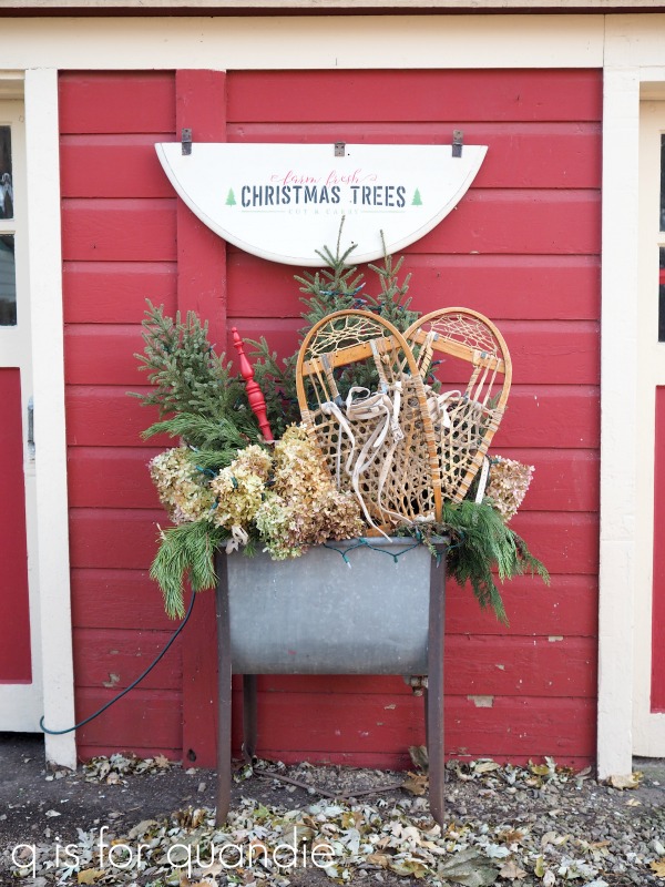
But it wasn’t long until it looked more like this …

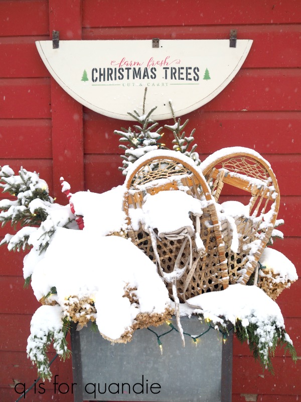
Hmmm.  Most of the contents were completely buried in snow, but it still looks really pretty lit up at night.  One of the items I included in my arrangement was this …

I wanted to add a pop of color and I didn’t have a branch with red berries or anything like that, so I grabbed this … hmmm … do these things have a name?  This is one of the arms that would have held the mirror on a dresser.  I have a few of these lying around since I tend to take mirrors off dressers and not put them back on.

Anyway, I painted it in Dixie Belle’s Honky Tonk Red, sanded to distress and then waxed it.  Wax is not a durable enough top coat for outdoor use on a regular basis, but I don’t really care if the paint job on this doesn’t hold up beyond the holidays.

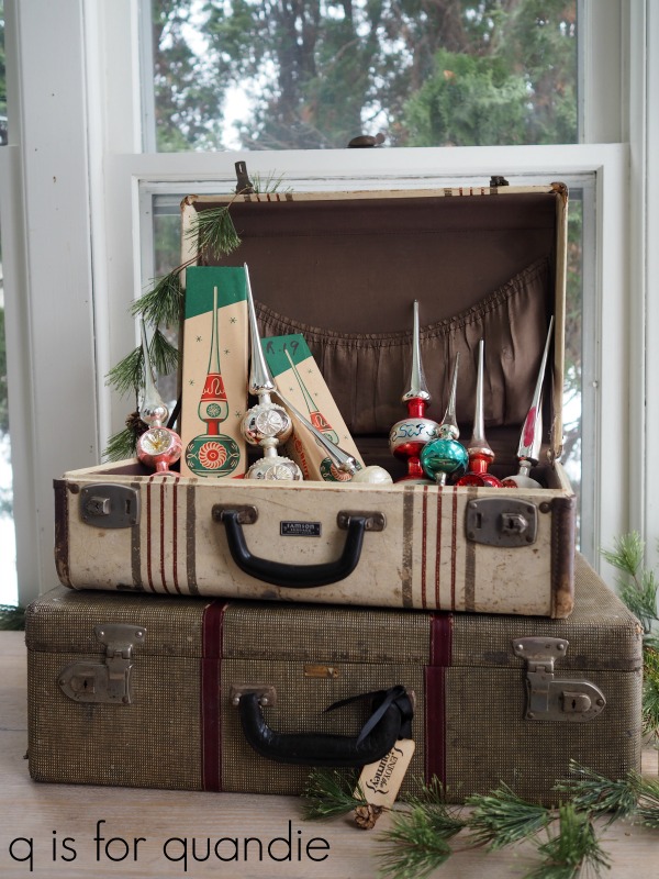
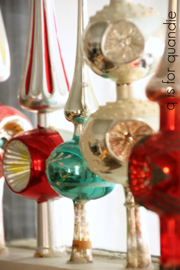
Another post I was planning to share, but never found time for, was the new way I found of displaying my non-collection of vintage glass tree toppers.  First, I was going to show how I store them in my vintage suitcases.

In the past I’ve displayed them in the window.

But they were literally held in place with some Stick-Um Candle Adhesive wax which wasn’t terribly secure.  I realized I was living dangerously and it was only a matter of time before one fell off (or, gasp, even several at a time).  So I needed to come up with a better plan.

I did a bunch of searching on Pinterest and found several ideas, but none that I loved.  It occurred to me that putting them over some kind of pointy stick that was somehow secured to something would be the best option.  So I decided to go with wooden skewers and floral foam.

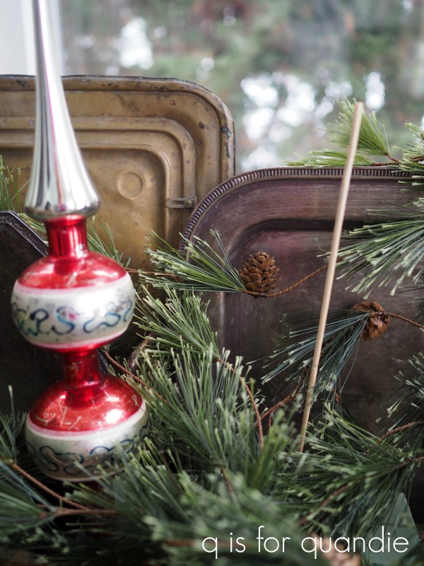
I secured the foam in my wooden tote, added some silver platters and some greenery, then poked the skewers into the foam and placed my toppers over them.

It was easy to get the toppers to sit at just the exact angle I wanted them to.

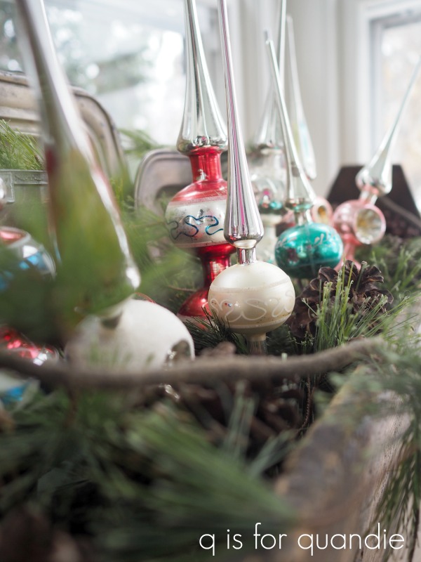
I put the wooden tote back on the window ledge in my dining room.

After the holidays are over, the toppers will go back into their suitcases along with the floral foam and the skewers.  Easy, peasy storage.

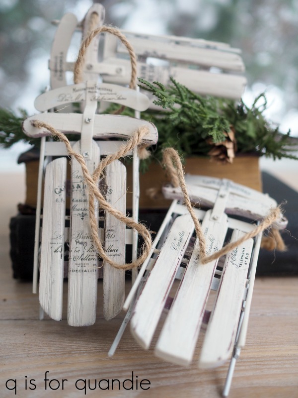
I’m still not done with the rejects folks.  Next up are these sled ornaments.  Here’s the ‘before’ …

I purchased these after Christmas a couple of years ago for just a dollar each.  They looked pretty cheap and tacky, but I knew I could dress them up.

I painted them with Dixie Belle’s Drop Cloth, then I added various segments from some of the re.design with prima knob transfers.

I had initially planned to share these on the re.design with prima Facebook page as part of their 12 days of ornaments, but I was overcome with self-doubt.  I just didn’t think they could compete with the amazing ornaments that others were sharing.

To be honest, I often feel like my more simple, not so embellished, creations pale in comparison to other projects out there being shared.  I have to remind myself that I’m not the only one who loves a more simple, clean look.  Right?

Plus, it’s not a competition.  At least I hope it isn’t 😉

This brings me to my last reject for today, our Christmas tree.

You’ve normally seen it in the past filled with my huge non-collection (I swear I’m not a collector, remember?) of vintage ornaments (and there are those toppers in the window too).

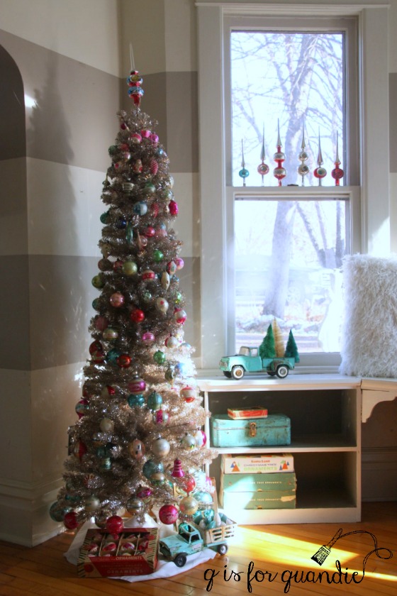
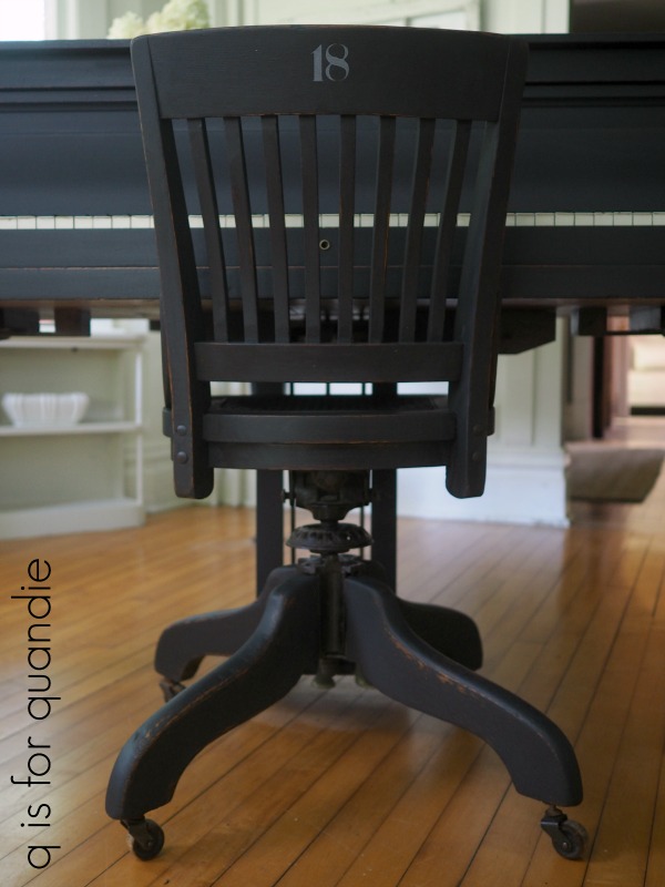
In the past I haven’t had a great spot for the tree, and I also didn’t have a lot of room for a large tree.  So I have a slender, silver tree and I placed it in the corner of the piano room (above), and I also tried tucking it beside the pine cupboard in the q branch one year.

But now that I’ve changed up my living room, I’ve opened up some space in one corner that seemed like the perfect spot for a Christmas tree.

Unfortunately, my slim silver tree looks completely lost in this corner.

I have to confess, I am totally envying all of those big, full, flocked trees that everyone seems to have this year except for me.  I’m still debating whether or not I’m going to hit the after Christmas sales to look for a new tree.

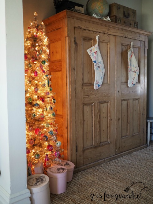
But in the meantime, this year I decided to change it up and keep my tree monochromatic.  I also decided to play around a bit with some less than traditional ornaments starting with the brass horns that I purchased at a garage sale last summer.

I borrowed this idea from my friend Amy who creates the most amazing Christmas trees.  I simply tucked them in place throughout the tree.

Another unique addition was this old framed black & white photo of my mom.

Quite a few of my vintage ornaments made it onto the tree as long as they were silver or gold.

The sleds were added as well.

Well, that’s a wrap on the holiday season.  I hope you enjoyed seeing the projects that didn’t make the cut today.  Once my social calendar slows down a bit, I hope to get back to painting more furniture.  First I have to find some though, so I’m off to Facebook Marketplace to see what I can find!

Thank you to Dixie Belle Paint Co and re.design with prima marketing for providing the products used for some of these projects.

day 12.

Welcome to the final day of my 12 days of giveaways!

I first want to say a huge thank you to everyone who participated by leaving a comment.  I so wish that each and every one of you could be a winner … well, in my eyes you are all winners … but I wish I had enough prizes to share with all.  I very much appreciate each of you and want to again say that without you, there would be no q is for quandie.  So thank you for following along, leaving the occasional comment, or otherwise supporting my blog.

A couple of you have been asking if I was going to announce the names of all of my winners, and I have to confess that I had to make some time to pull together an organized list.  So I sat down with my coffee this past weekend a came up with the list:

Giveaway no. 1 was already shipped out to Susan Williams.

Giveaway no. 2 went to Laura Hopwood.

Giveaway no. 3 went to Kim Moran.

Giveaway no. 4 was shipped out to Jennifer Knopf.

The lucky winner of giveaway no. 5 was Melissa Sullivan.

Giveaway no. 6 (which is yet to be shipped, because I only want to send Mr. Q to the post office one more time in this busy holiday season) will go to Regina (please note, I won’t reveal last names if the winner did not make it public in her comment).

Giveaway no. 7 went to Paris Burns, who happens to be a neighbor of mine so she stopped by and picked up her prize.  Paris is an amazing gardener and she lives near the park where Mr. Q and I walk most days, so I’ll be looking forward to seeing some rusty stuff in her garden next summer!

Giveaway no. 8 was won by Wendy Olgine.

Giveaway no. 9 was won by Debbie Payne (check your email Debbie, I’m waiting to hear back from you).

Giveaway no. 10 was won by Carrie (Carrie, you also should check your email if you’re reading this), a name near and dear to my heart since my grandmother’s name was Carrie.

The deadline to comment on Friday’s post and be in the running for giveaway no. 11 was last night at midnight, and no, I don’t stay up late to draw the name of a winner.  I’ll draw the name later today, but your comments are time stamped so any comment left after midnight will not be eligible to win.

And this brings us to giveaway no 12.  I wish I had some kind of amazing grand finale prize, you know, like a new car or a trip to Italy.  But instead I have another complete set of the same stuff that made up prize no. 11.

So this gives you a 2nd chance to win these fabulous products from Fusion and Homestead House!  Not quite as exciting as a car, but still a fabulous prize.

Thank you to Homestead House and Fusion for sponsoring this giveaway by providing all of the products I’m giving away today.  In addition, extra thanks to all of the companies that provided items for my 12 days of giveaways including Homestead House Milk Paint, Fusion Mineral Paint, redesign with prima marketing, Dixie Belle Paint Co and Maison de Stencils.

The rules:  to be eligible to win today’s prize leave a comment on this blog post.  If you can’t think of anything to say, tell me if you’re a Scrooge or more like Buddy the Elf this time of year.  Your comment must be left on the blog, not on Facebook or Instagram.  You are not required to follow my blog, although it would be awesome if you did!

I will randomly draw the name of a winner for today’s prize from all of the comments left on this post by Wednesday, December 25, 2019 at the stroke of midnight (U.S. Central time).

The fine print: no purchase necessary, you must be 18 years of age or older to win, void where prohibited by law, the number of eligible entries received determines the odds of winning, approximate retail value of prize is $100, if the prize is not claimed by Friday, December 27, another name may be drawn at random to win, blah, blah, blah.

Good luck!