The other day my neighbor nnK called to say that she had picked up some trash on the side of the road for me. Wasn’t that thoughtful? I bet not everyone has a neighbor who brings them road kill now and then!
LOL, but seriously, she did pick this up off the curb somewhere, and she knew it was right up my alley.
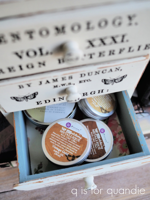
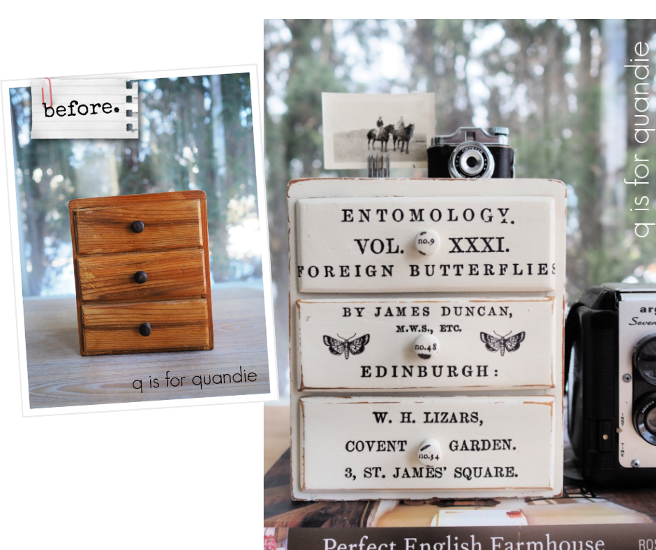
I just recently mentioned here that my preference is working on old, primitive pieces and this one certainly fits that description.
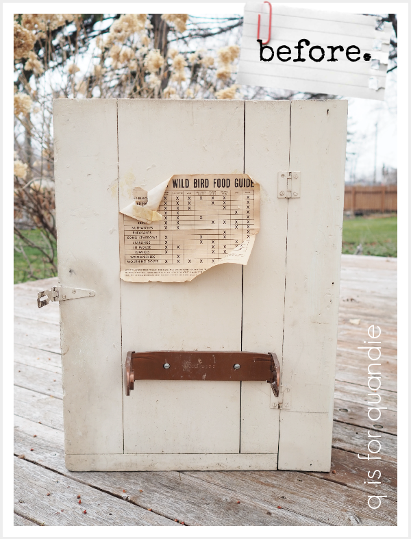
It was definitely in need of some TLC. The outside was bad enough, but the inside was positively gross.

I thought that upper shelf was just kittywampus on accident, but no, it was purposely installed on an angle like that. I have absolutely no idea what it was used for.
I wonder if the wild bird food guide that was stuck to the front of the cupboard is a clue?
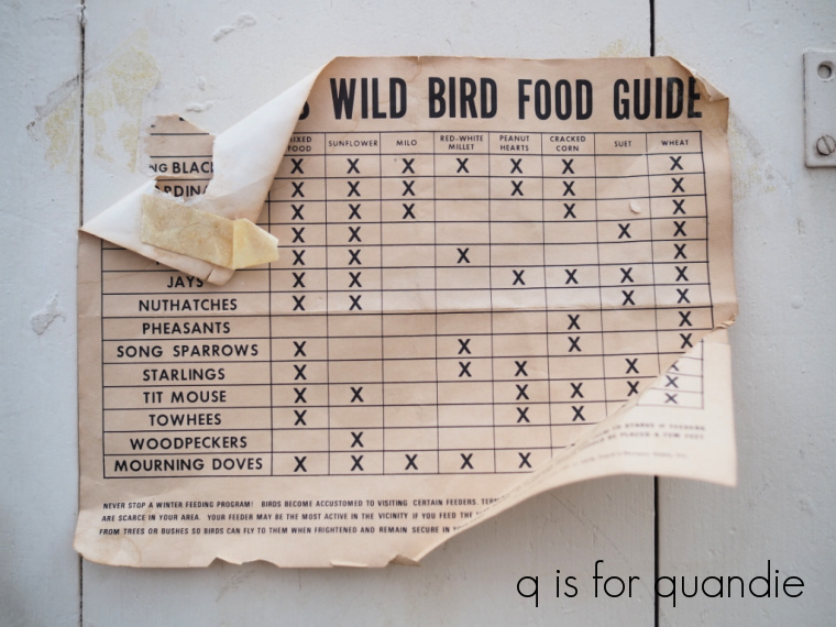
I just have to say, it looks like pheasants and woodpeckers are picky eaters, while mourning doves and redwing blackbirds will eat just about anything. Perhaps this cupboard hung on the wall in a nature preserve and there were bird identification guides of some kind on that angled shelf.
Well, regardless of its original use, I knew that angled shelf had to go. I called my handyman Ken over for a consultation and he advised removing the existing two shelves and replacing them with one simple shelf, and I seconded that motion. We worked together to remove the existing shelves, and then Ken took the cupboard back to his workshop to add a new shelf.
Next up was cleaning. As I mentioned, this thing was disgustingly filthy. Luckily we’d had a patch of warm weather and I was able to hose it down out in the yard. The first time around I cleaned it with some Dawn dishwashing soap. That worked fairly well for the dirt, but there was some sort of oily residue on the inside bottom of this cupboard. In fact, there was originally a piece of cardboard lining that bottom and it was totally saturated with oil (you can see it in the ‘before’ photo above), and that had seeped through and soaked into the wood as well. Anyway, the Dawn barely touched the oil. So I brought out my TSP substitute and cleaned those oily spots again. The cupboard was drying out in the warm sunshine, and I noticed an interesting phenomenon. Even though initially those oily spots looked clean, the warmth of the sun drew more oil to the surface as it heated up. I basically repeated this process of cleaning with TSP substitute, letting the sun draw out more oil, and then cleaning again about 4 times. By the 4th pass I had made pretty good progress, but the oil was definitely not entirely eliminated. But I had a plan in mind for this. I turned the cupboard upside down.
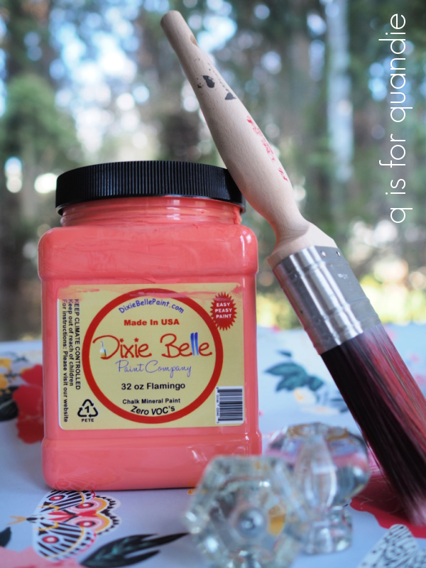
Now what was once the bottom is the top. Next I decided to put Dixie Belle’s B.O.S.S. to the test. I added two coats to all of the oily areas of the cupboard and then let them dry overnight. After painting the interior in Dixie Belle’s Gravel Road and the exterior with their Drop Cloth, you can’t see a speck of oil seeping through either. Here is the top (which again, was once the bottom) …
See any oily spots seeping through? Nope, I didn’t think so. Also, FYI, I took these photos about a week after painting so some time has elapsed.
I have to say, I am super impressed by this. Even so, I am glad I flipped the cupboard so the once oil saturated interior bottom is now the inside top and you can’t even see it unless you stick your head inside the cupboard, or take photos of it from a low angle.

I wanted to retain some of the original patina on the outside of the cupboard, while also cleaning it up. This is one of my favorite things to do with these old primitive sort of pieces. To do that I simply added one quick coat of the Drop Cloth. I wasn’t aiming for full coverage, just a sort of touch up (and some parts of the cupboard were not painted originally, like the back and the inside of the door, so those got a little more paint). Then I sanded the fresh paint back again, especially in areas that would naturally be more worn like around the latch.
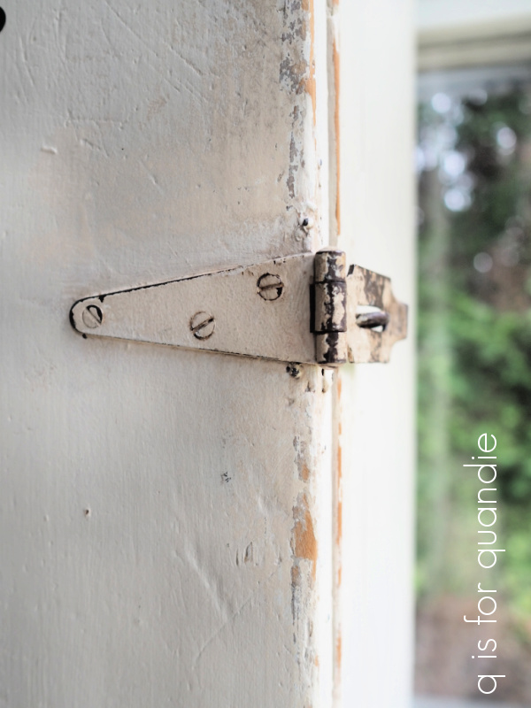
Now it looks deliciously worn, but not gross.
I simply had to keep Frank’s Wild Bird Food Guide as part of the finished cupboard, so I attached it inside the door.
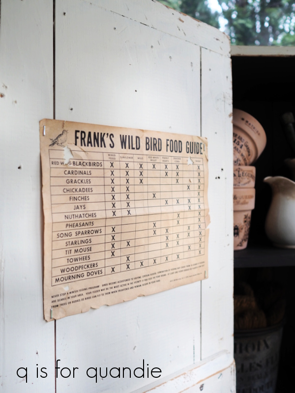
It’s just stapled in place, so the future owner of this cupboard could easily remove it if they don’t want it.
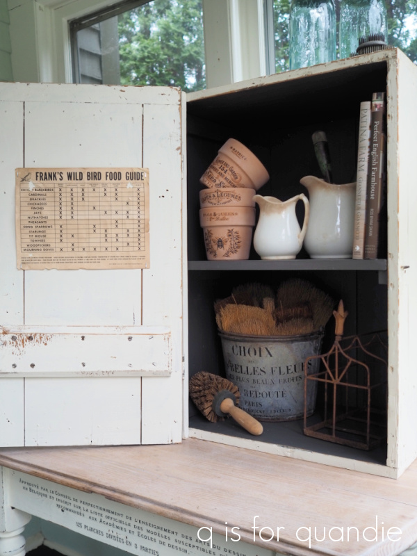
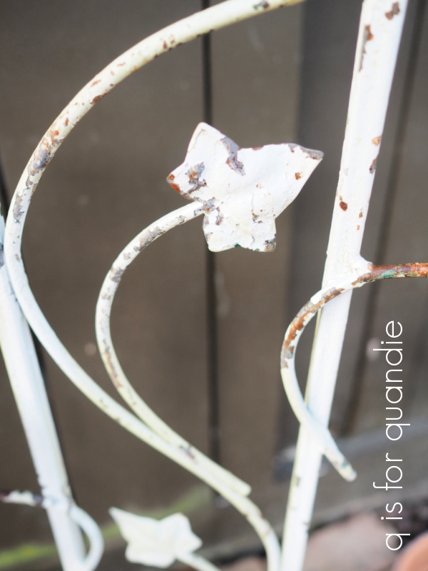
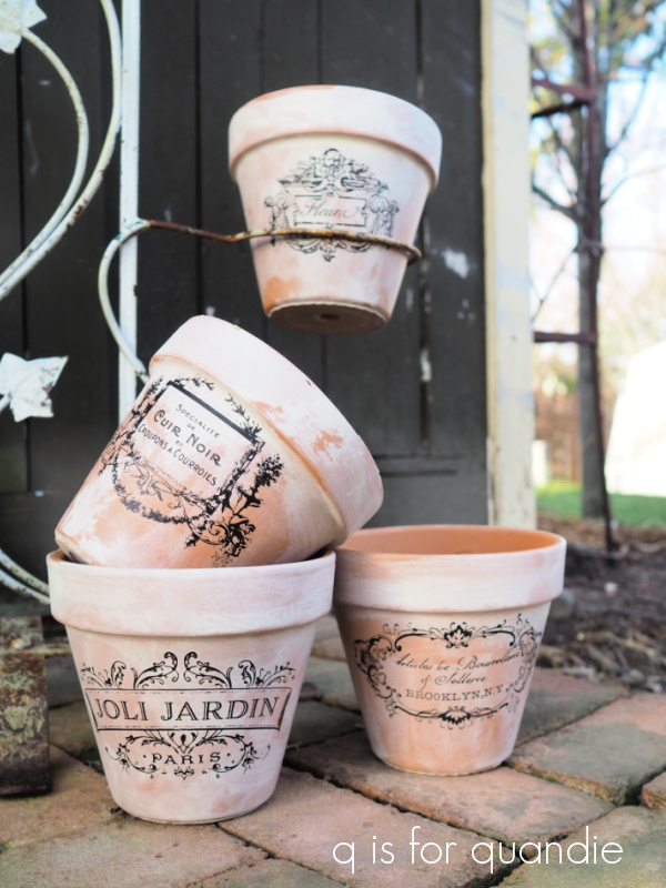
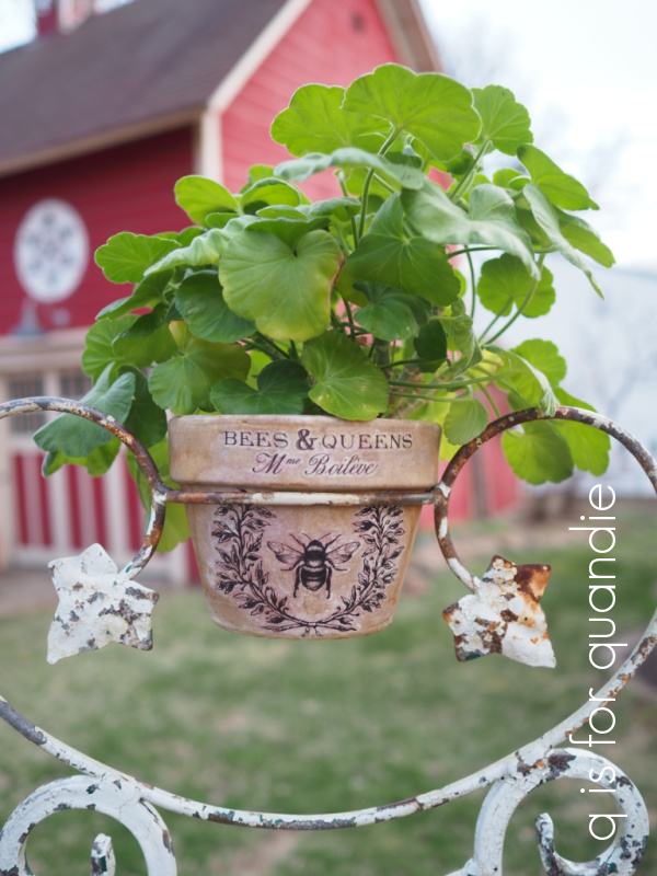
By the way, those clay pots?
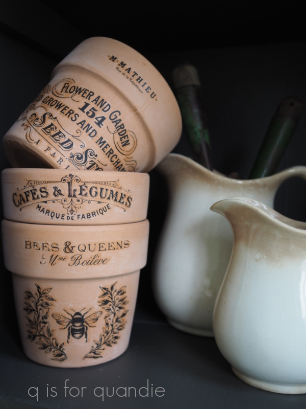
Yep, I found the size I needed for my wrought iron plant stand at my local plant nursery, Bachmans. And I found it a bit ironic that they literally say ‘perfect size’ on the tag.

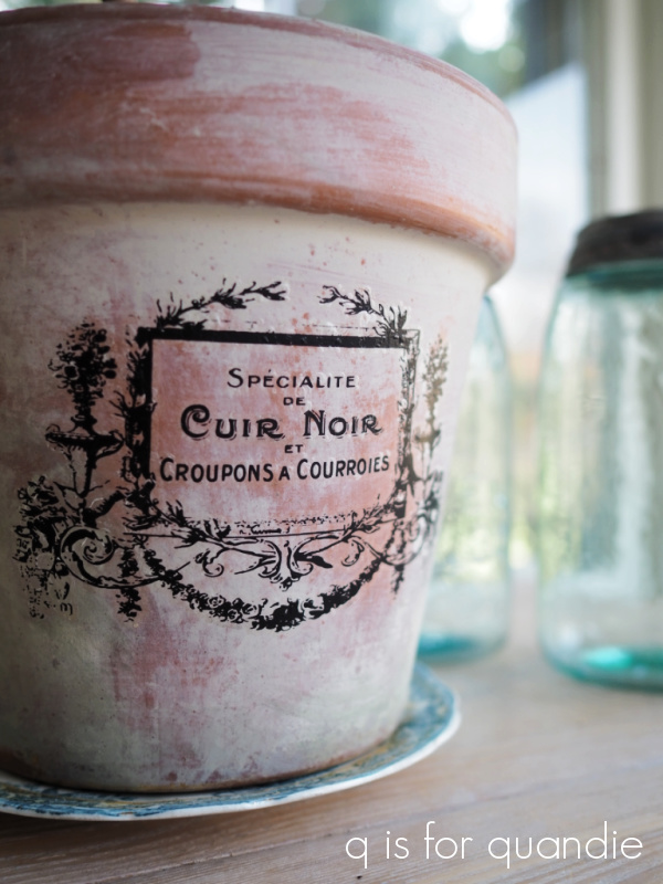
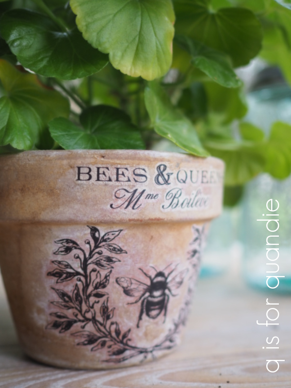
And conveniently enough, they were already white washed. All I had to do was add the transfers. I paid $2.99 each for the pots, and was able to buy just the four I needed.
The bucket I used for staging is a bit of foreshadowing.

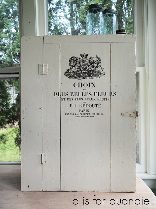
I added that same section of the IOD Label Ephemera transfer to the front of the cupboard.
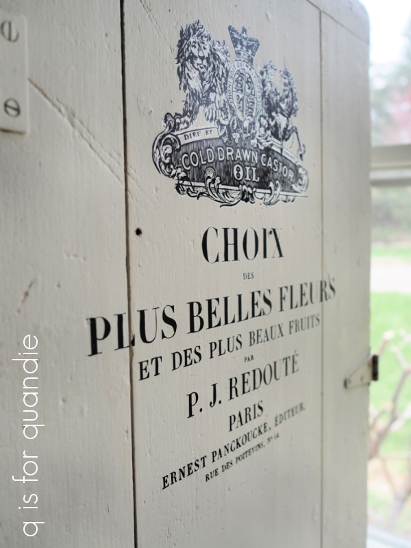
I recently stocked up on that transfer after learning that it was retired. So yes, you’re going to continue to see a lot of that one added to random pieces this year.
The inside was finished with Dixie Belle’s flat clear coat and the outside has a clear wax topcoat.
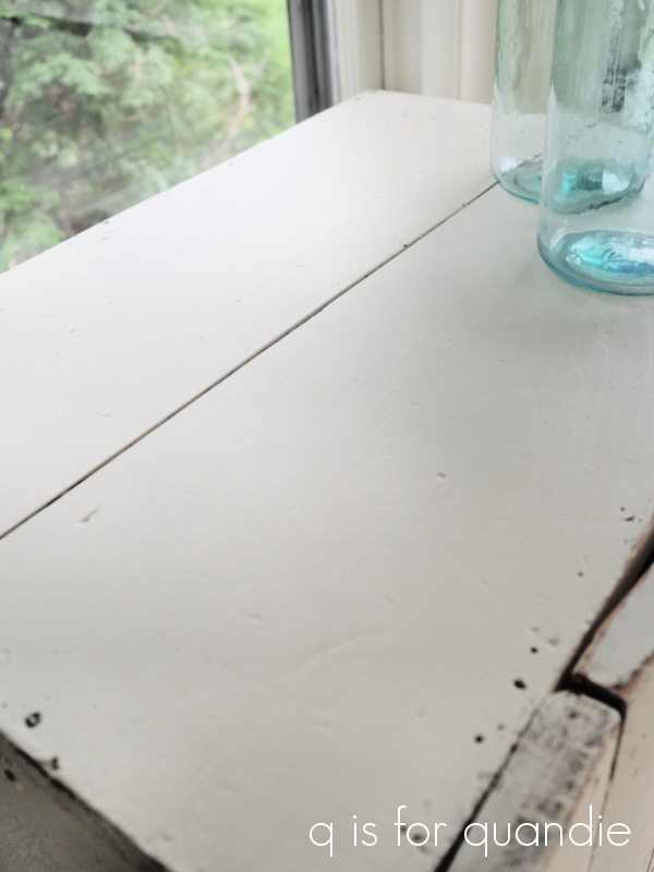
Here is a side view because I realized that you can’t really get a good feel for the depth of the cupboard from the photos I’ve already shared.

You have a few options with this cupboard. You could hang it on a wall using a french cleat to support the weight. Or you could put it on top of a dresser to treat it like a hutch. You could also add some casters, legs, or feet of some kind to the bottom and have it be a stand alone piece. I decided not to do any of those things myself so that a potential buyer would have options.
It’s really a good size to use as a bed side table.
But I love the idea of mounting it to the wall in a potting shed and using it to store gardening supplies.

It’s really just a fun ‘container’ of sorts for pretty much anything you’d like to store inside of it. If nothing else, I feel really good about taking something that was cast off on the side of the road and turning it into a functional item that hopefully someone can get some use out of.

If any of you local readers need a unique storage solution, be sure to check out my ‘available for local sale‘ page to see the details on this piece.
As always, thanks to Dixie Belle Paint Co for providing the all of their products used for restoring this cupboard.