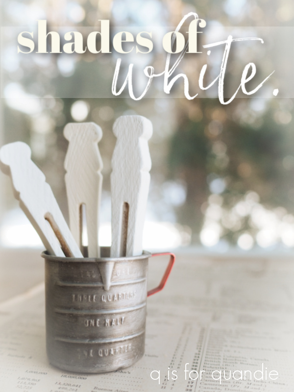
Hey guys, tomorrow is Mr. Q’s birthday! I thought maybe we could celebrate with a giveaway so be sure to read all the way to the end to get all the details on how to qualify for the giveaway.
Actually, the idea for this post has been brewing since way back in October when I compared the different shades of black Dixie Belle paint.
I think someone suggested that I do the same with shades of white at the time, and that sounded like a pretty good idea to me.
So I went to the Dixie Belle website to review all of the different shades of white, and guess what? There are quite a few of them! There are 4 in their chalk style paint line and 5 in their all-in-one Silk paint line.
That’s a lotta white.
So I’ve decided to break them down into separate posts (and separate giveaways). Today I’m just focusing on the chalk style paint … and oh, not all 4 of the colors that Dixie Belle includes in their ‘white’ category. I neglected to include Buttercream. I think of that as more of a pale yellow or cream rather than a white, so I hope you’ll forgive me.
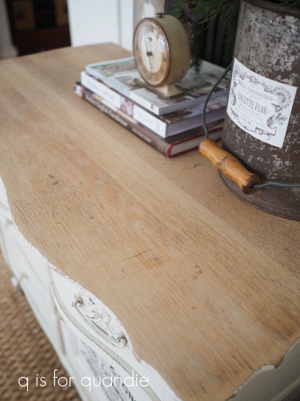
For today that leaves us with Fluff, Cotton, and Drop Cloth.
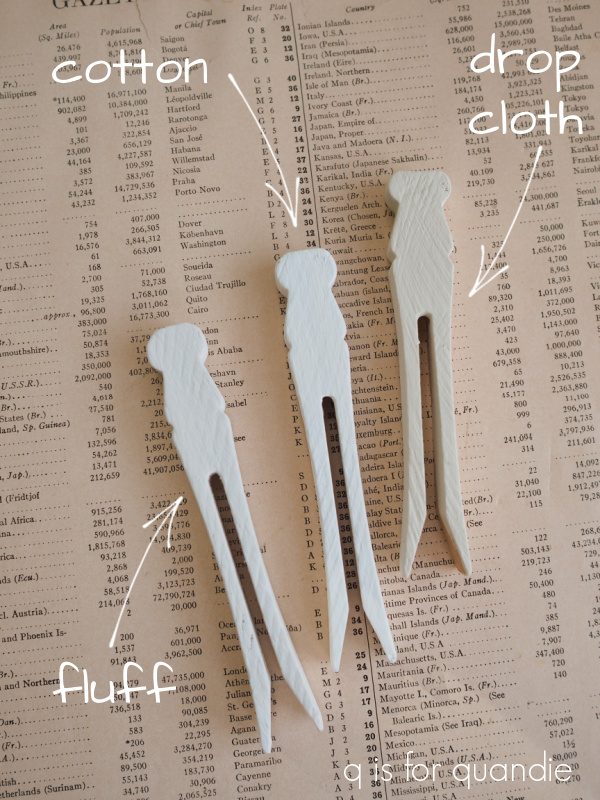
If you’ve been following me for any length of time, I think you know which is my favorite!
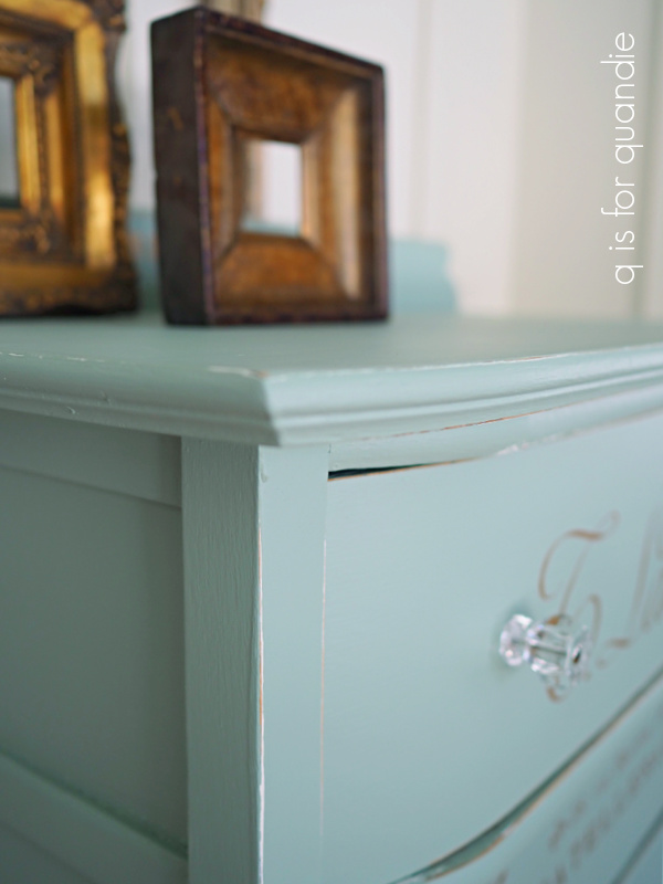
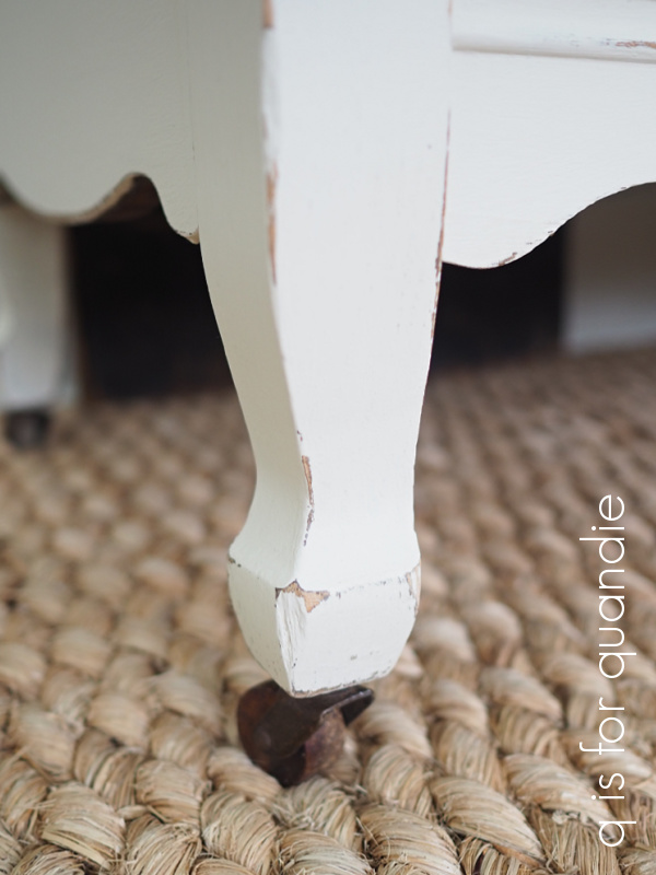
Drop Cloth!
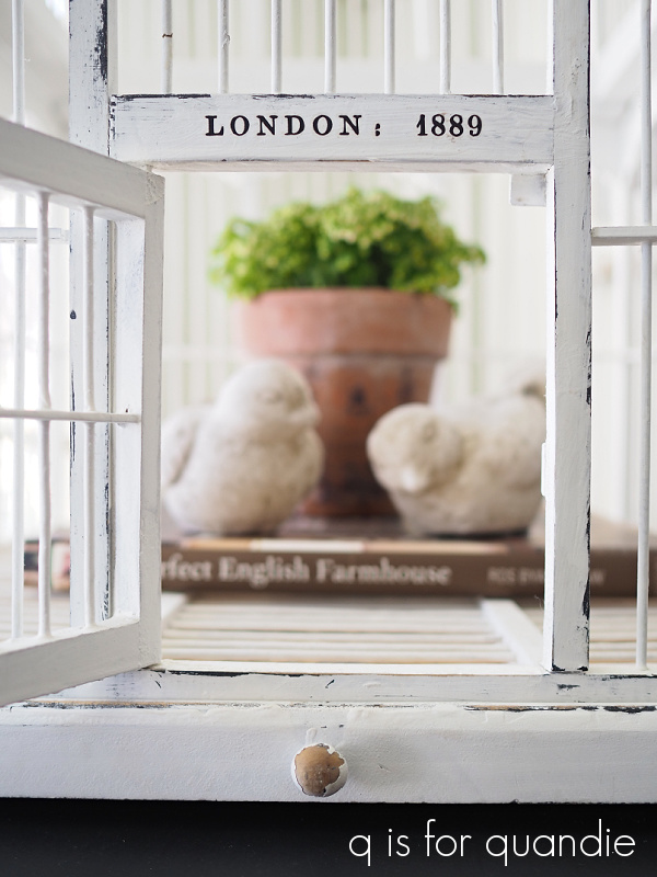
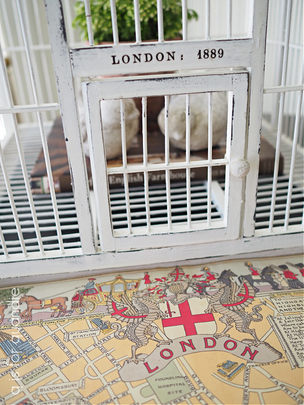
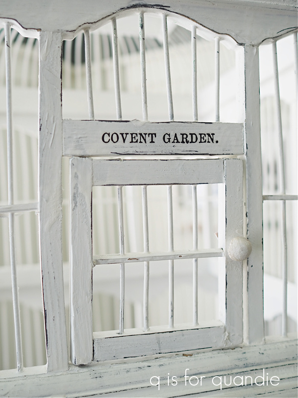
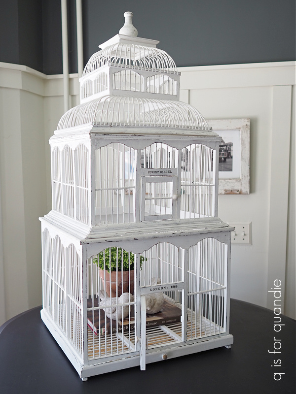
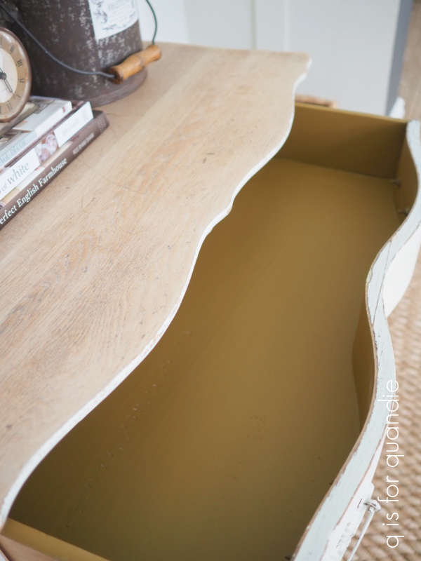
I’ve used this color on a multitude of pieces.

Seriously. I don’t think I could even begin to count all of the things I’ve painted in Drop Cloth.

Dixie Belle describes this color as “a stylish linen white with a touch of warmth,” and that pretty much nails it. I really prefer working with a warm shade of white that you can bring into your home and it doesn’t instantly make all of the other white items look dull.
When standing alone, Drop Cloth reads as warm white to me. It’s only when you put it right next to a bright white that it appears so much darker.
I am not a fan of a harsh, bright white and that brings me to the Cotton. Dixie Belle has this to say about Cotton: “Cotton is our purest white, perfect for a clean and classic look. This color is for anyone who wants to decorate their home with stark simplicity.” Yep, that pretty much sums it up.
The fact that I’m not really a fan was readily apparent when I tried to find samples of my work in this color. The best I can do is the table runner that I shared back at the end of December.
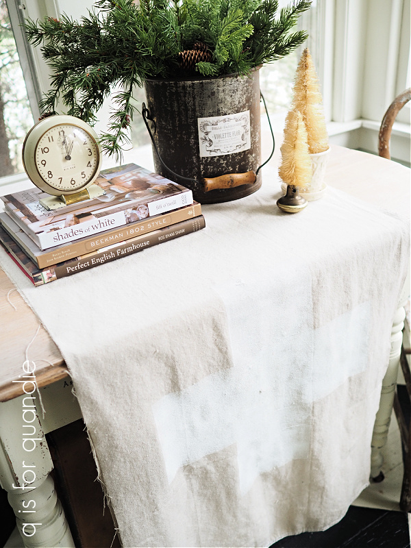
I ended up painting that swiss cross on the drop cloth in Cotton because my usual go-to white, Drop Cloth, was … well, duh!, the nearly the same color as the drop cloth itself (no wonder they named it that!).
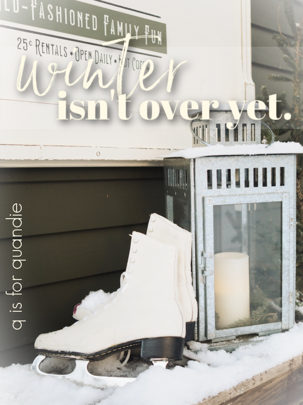
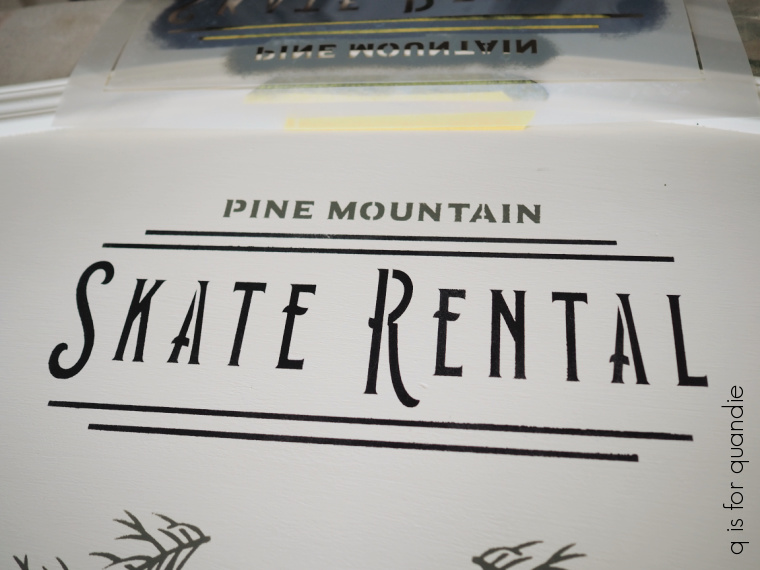
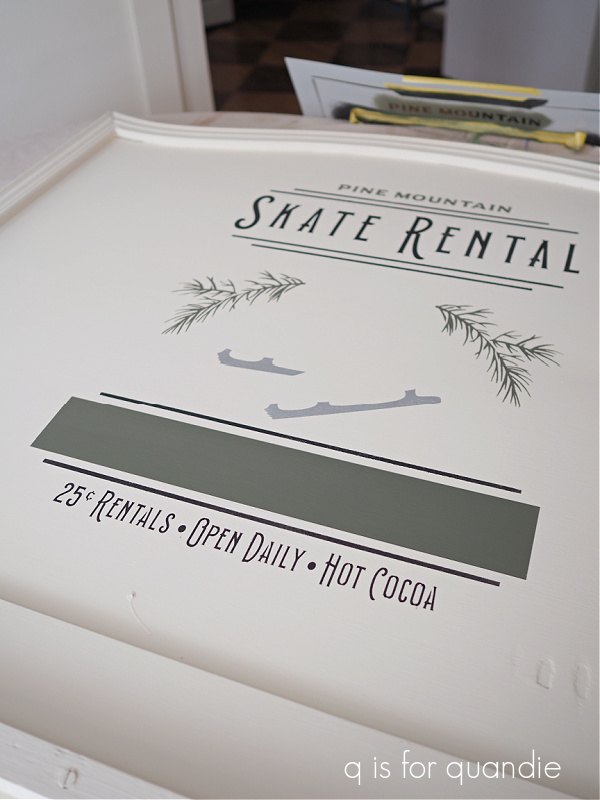
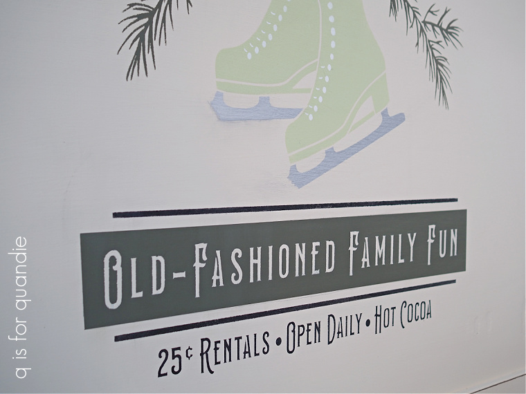
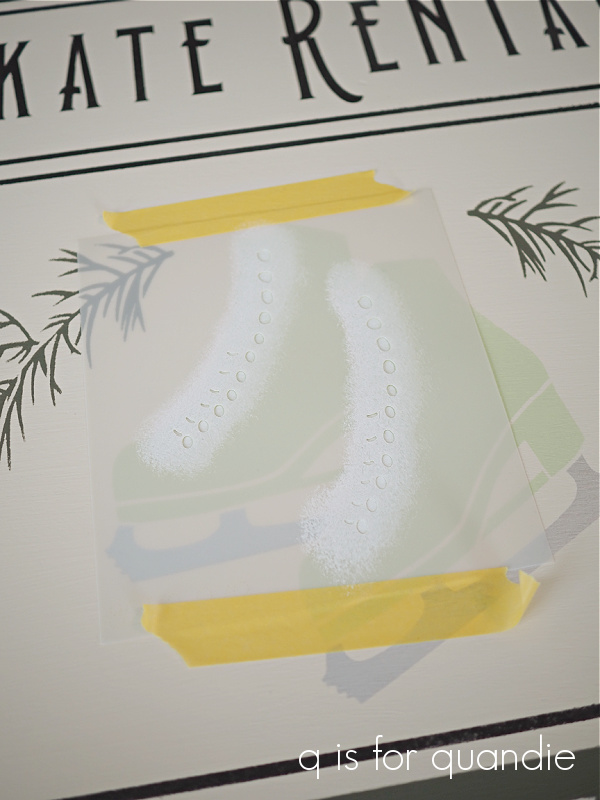
I also used the Cotton on the Skate Rental sign that I shared last week, just to do the laces on the skates.

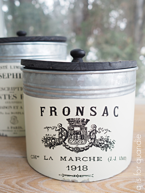
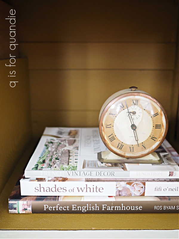
That brings us to Fluff. Dixie Belle describes Fluff as “a serene, soft white with a slight gray undertone.” Spot on again. I have to say, if you are wondering what a color really looks like, read the description. Many times the photos can be deceiving. It’s so hard to get a color right on a computer screen. But I find that Dixie Belle does a really good job of describing the colors.
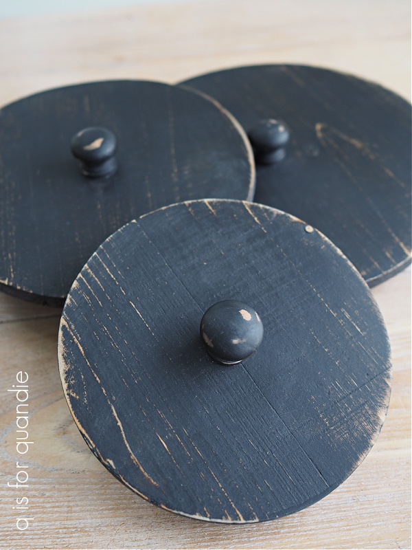
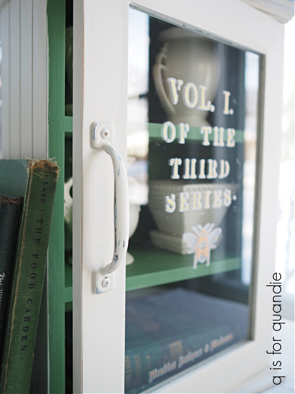
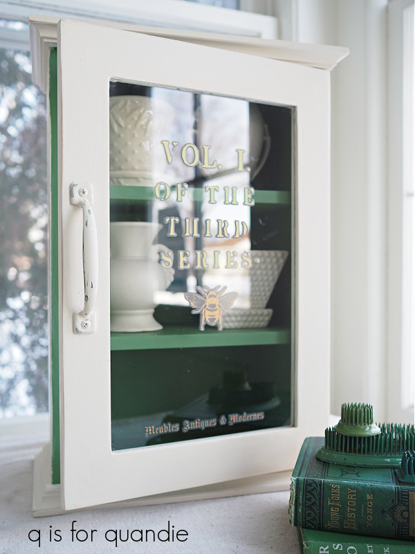
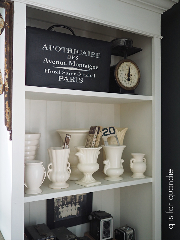
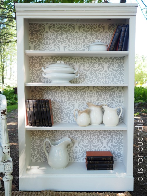
Once again, examples of Fluff are few and far between on my blog. I did use it on this bookcase.
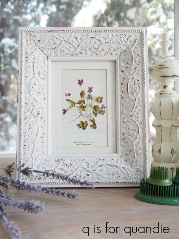
And here is Fluff on a picture frame.
It would be fair to say that when I want a whiter white than Drop Cloth, Fluff would be my choice.
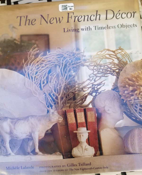
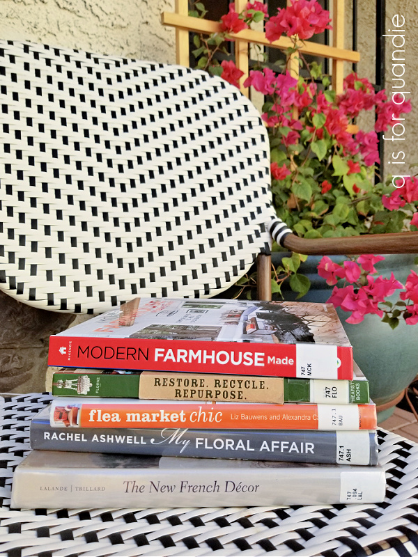
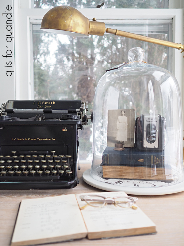
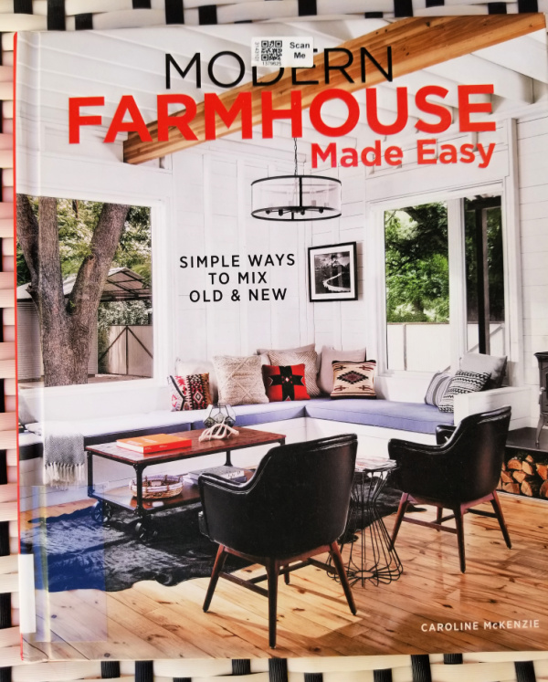
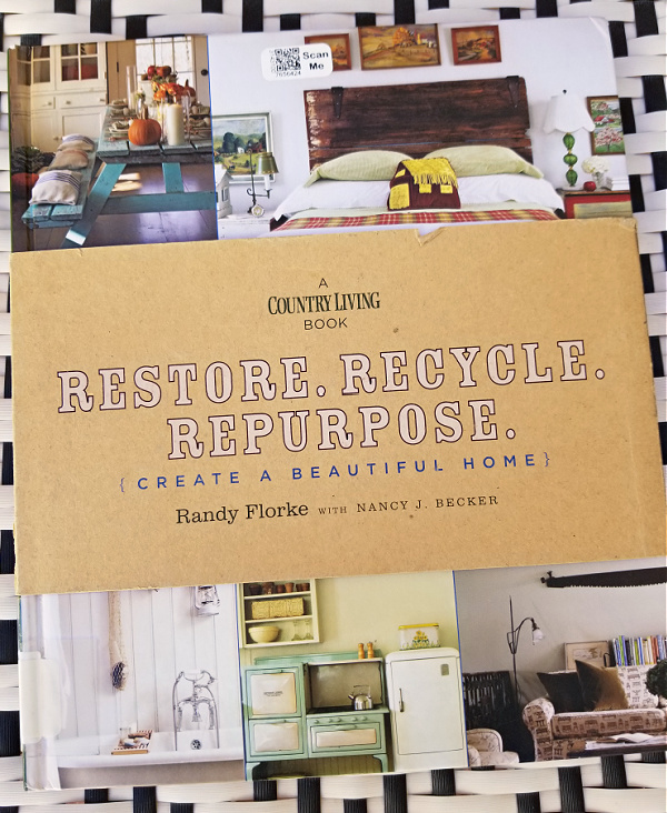
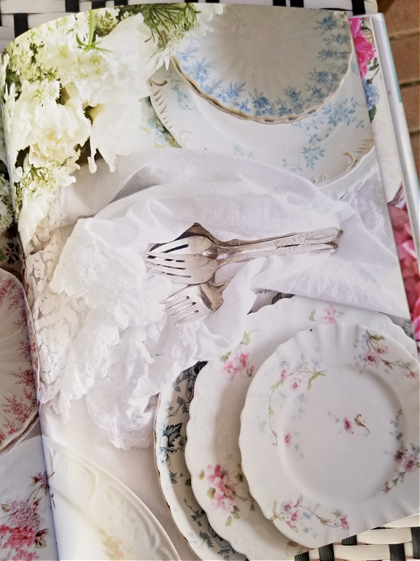
Speaking of Shades of White, have you seen Fifi O’Neill’s newest book by that name?
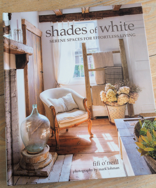
If you are a fan of decorating with white, vintage and pale wood tones, you will love this book.
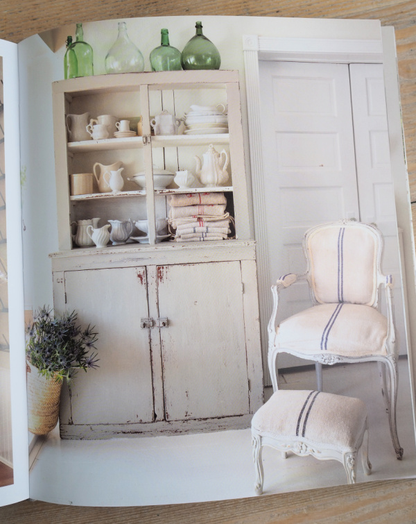
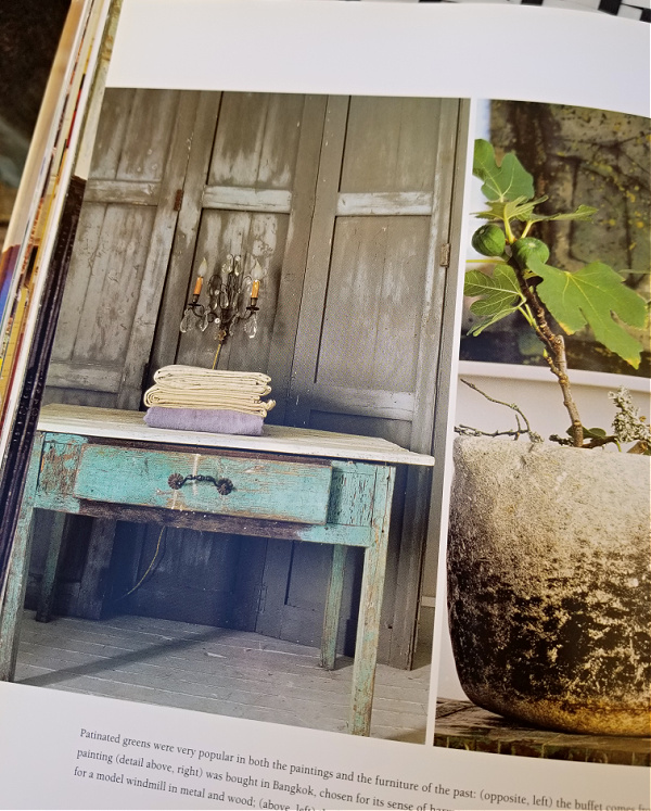
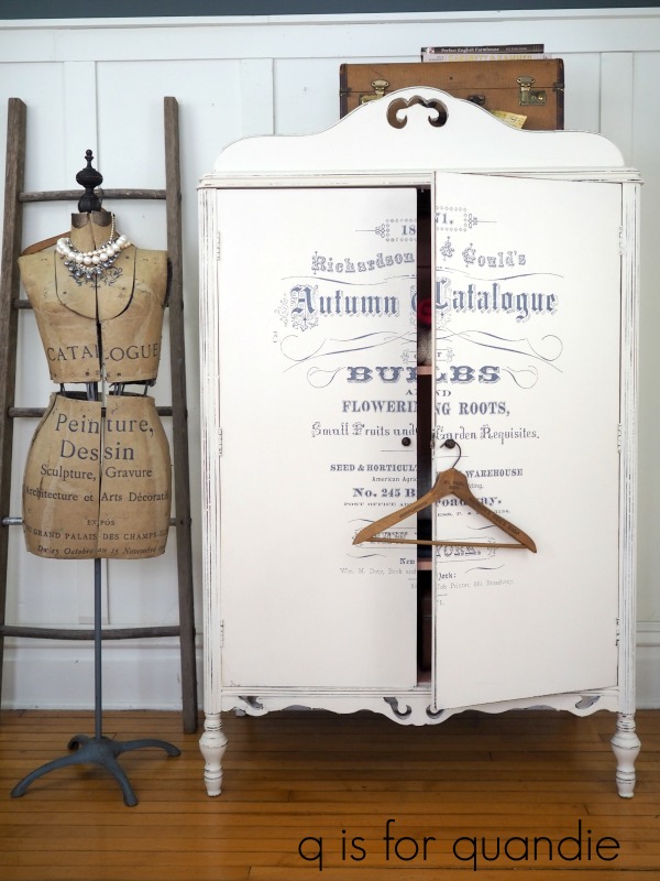
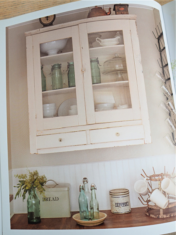
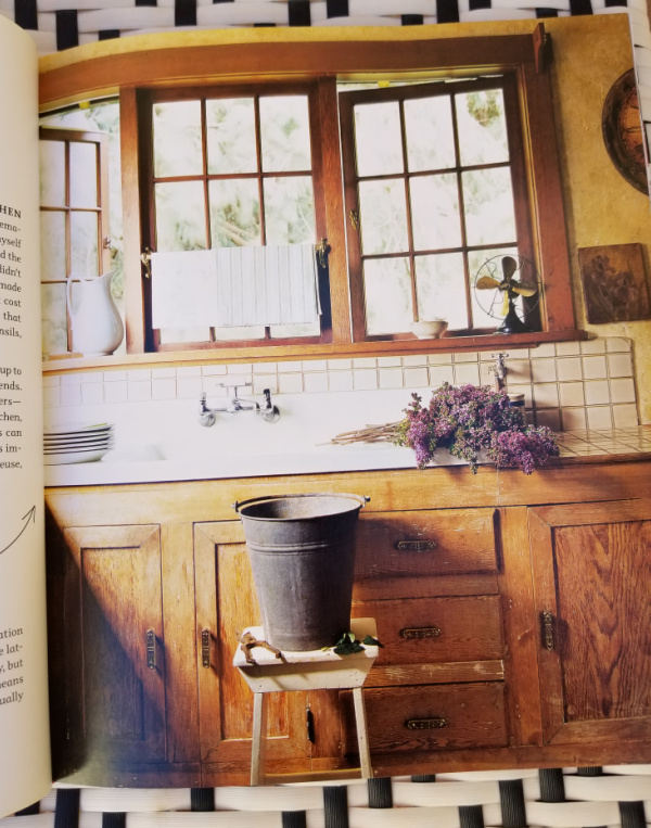
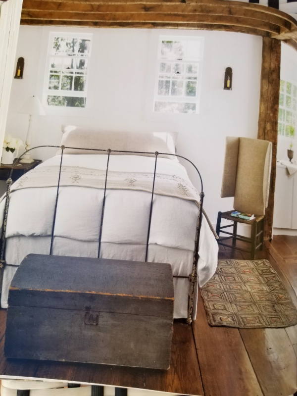
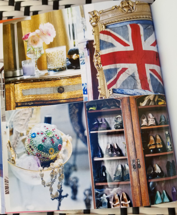
I’d say the trick to making a mostly white color scheme work is using varying shades of white such as white with the barest hint of grey like the cupboard above. Or warm white walls with a brighter white beadboard wainscoting like shown below.
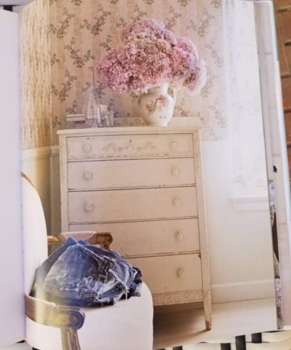
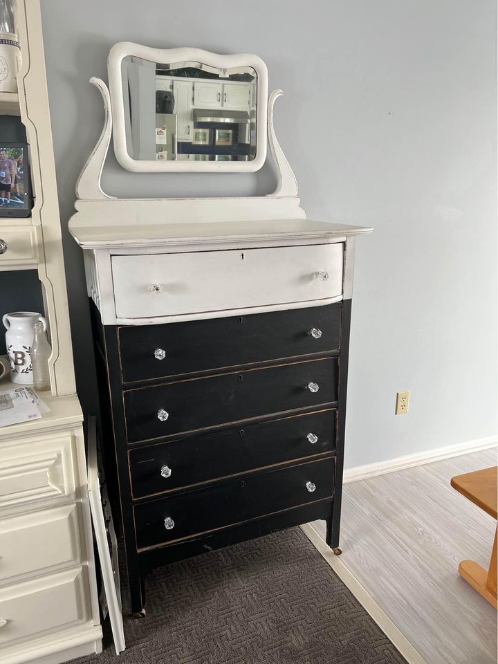
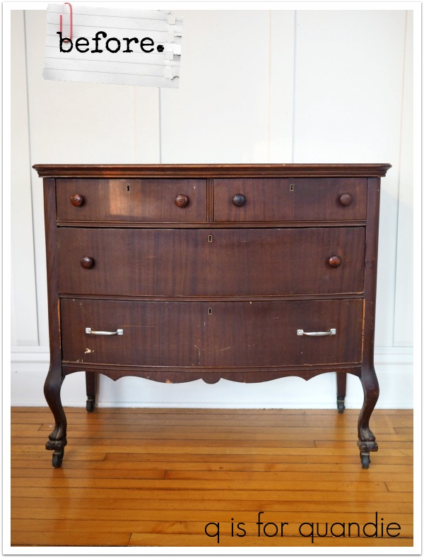
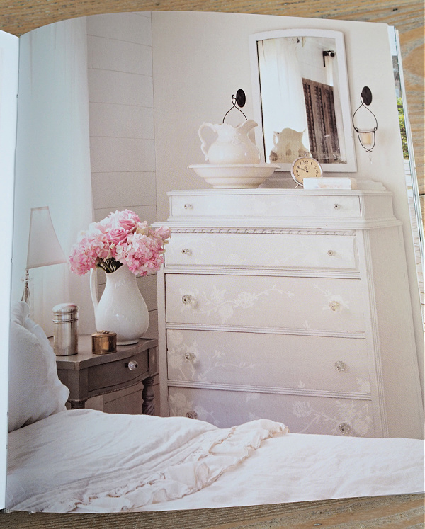
And of course I love the tone on tone look of this next dresser …
So, in other words, one can embrace all of the shades of white and allow them to mix together.
And that brings me to my giveaway!
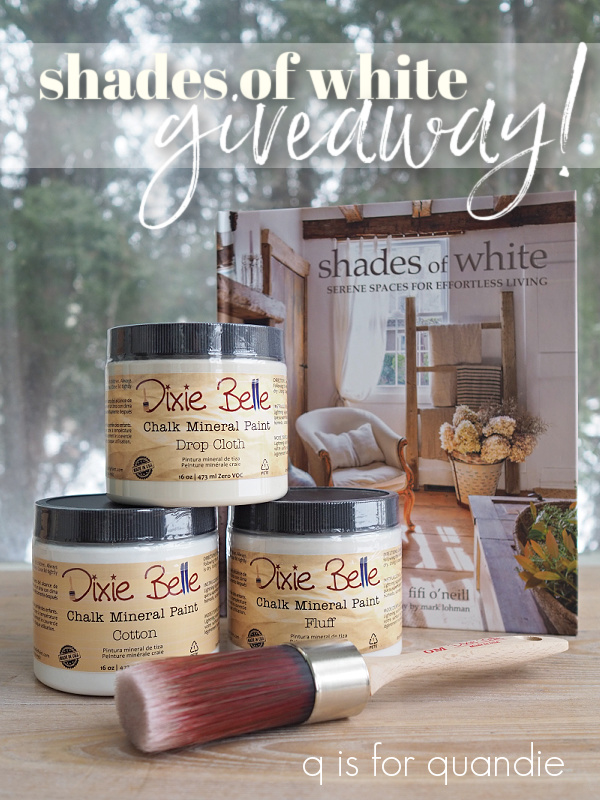
The lucky winner of today’s giveaway will receive a copy of Shades of White, 16 oz. of Drop Cloth, Cotton and Fluff, and the medium oval paint brush from Dixie Belle.
The rules: Simply leave a comment (if nothing else, wish Mr. Q a happy birthday) on this blog post to be eligible to win.
Your comment must be left on this blog post, not on Facebook or Instagram. You are not required to follow my blog, although it would be awesome if you did!
I will randomly draw the name of a winner for today’s prize from all of the comments left on this post by Sunday, February 27, 2022 at the stroke of midnight (U.S. Central time).
The fine print: no purchase necessary, you must be 18 years of age or older to win, void where prohibited by law, the number of eligible entries received determines the odds of winning, approximate retail value of prize is $135, if the prize is not claimed by Friday, March 11, 2022 another name will be drawn at random to win, blah, blah, blah.
Thanks to Mr. Q for ordering the book for today’s giveaway from amazon.com, and thank you to Dixie Belle Paint Co for continuing to provide me with products that I can give away 😉 Good luck!


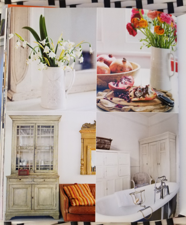
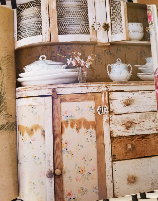 There are a few examples of classic Rachel Ashwell shabby chic style painted furniture too.