Now that spring has finally sprung here in Minnesota, stuff is happening. I have to admit, those last couple of months of winter were tough ones. I’m going to have to adjust to being retired and figure out what to do with all of my time in the winter. But that’s a (first world) problem for next winter.
Now that the weather has warmed up, the gardens are growing, garage sales are everywhere, and I can work out in my carriage house workshop … so, as I said, stuff is happening!
In fact, I have so much stuff to share with you guys this week that I’m going to post daily, at least on the weekdays.
First up for today, the garden. I would say that this time of year is when my gardens are the most work. I keep them packed full with perennials that don’t require much maintenance throughout the summer. If I get everything pruned, weeded and mulched with compost now, before the plants get too big, the rest of the summer just involves occasional watering and deadheading. If you want my top q tip for gardening, I think this is it.

If your plants take up every available space and you add a good layer of mulch, weeds have a much harder time taking over.
Here’s what my garden looks like once it has filled out (early June).

See? Jam packed.
Of course, I know this isn’t easy if you’re starting from scratch. Plants can be expensive (and the prices are going up this year, just like with everything else). But you don’t have to spend an arm and a leg. I recommend buying plants at garage sales, getting divisions from friends, or keeping an eye on Facebook Marketplace for people dividing their perennials. You can often get them free, or in exchange for helping to dig them up.
My tulips seem to have done really well this year. For the last several years, deer have treated my spring garden as a salad bar, munching all of the flower buds right off the tulips before they could even open. As a result, I decided to give up on planting tulip bulbs again last fall.

So now, of course, we seem to be having a really good year for tulips. The red ones in my photo above are tulips that I planted at least 20 years ago. They literally hadn’t bloomed in years.

Now I wish I’d planted more tulips!
Here’s another q tip for you. Take photos of your garden regularly throughout the season, and keep notes regarding where you’d like to add things like tulip bulbs. I plan to get more in this fall, especially since my neighbor has one of those fancy garden augers to make planting easy.
But wait a minute, this post isn’t supposed to be about gardening. It’s actually supposed to be about sharing last week’s garage sale haul.
I went out on Thursday with my friend/picker Sue. Now that we are both retired we can take advantage of sales that start on Thursday. We went to a small neighborhood sale around Como Park in St. Paul. Not all of the participating homes were starting their sales on Thursday (some started on Friday, some were Saturday only), but we were able to hit up all of the ones that were.
Although I didn’t bring home a huge load of stuff, I did get some really cool finds. Plus Sue had a box load of stuff for me as well.
I found the mini dresser on the left (below) at Como, Sue found the rest of the items in this photo including that really, really tiny dresser.

I’ve already added an I.O.D. white transfer to the tiny oil can.

It’s hard to judge the size of it from my photos, but in total it’s only 6″ tall, but the can part is only about 2″ tall.
I like to add little clips to these and use them as photo holders.

And of course I’m going to give both of the small dressers a new look.
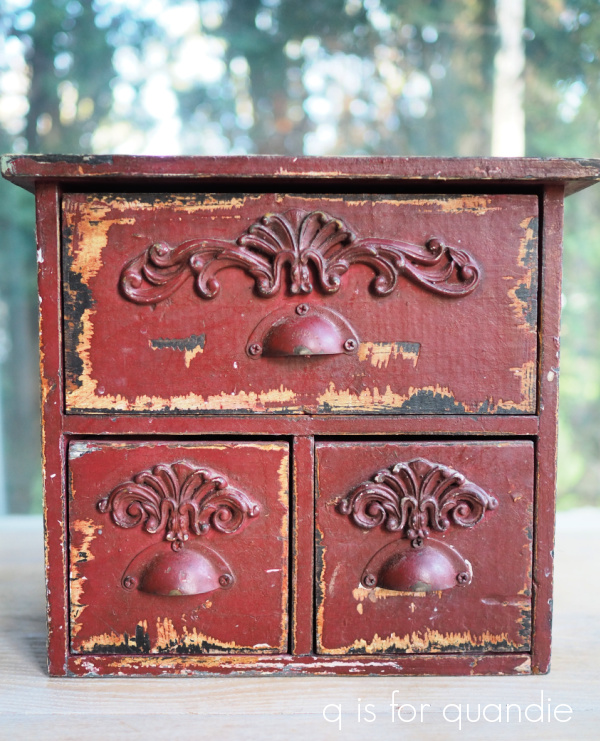
I feel like the combination of the cup pulls plus the scrolly embellishments on this one is too much. I may remove those embellishments. Or, I could remove the cup pulls and replace them with little glass knobs. What do you think? And of course I’ll be painting both of them.
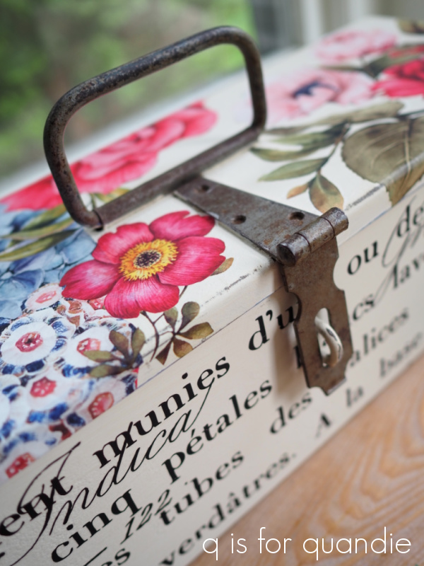
I also picked up these things.

I thought Mr. Q might like to have the books, since he tends to be a Goethe fan, but no, he didn’t want to keep them, so I’ll be selling them on.

They are a nice looking set to add to someone’s décor, even if they don’t want to read them.
Sue spotted the glass vessel at one of the sales we visited and handed it over to me.

Neither of us really knew what this was, we just liked the ‘writing’ on it.
I googled it later and discovered it would have been part of a butter churn like this one.
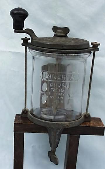
Isn’t that kind of cool? I think it would make a great vase, or one could fill it with pens and pencils on a desk, or use it to corral your paint brushes.
I purchased the camera from a guy who was a collector. He was refining his collection and thus getting rid of some.

I’m not sure why this one didn’t make the cut for him.
I thought I’d take this opportunity to show you guys how these cameras work, and especially how to identify them if you see them and they are closed up (as this one was when I found it).

They really don’t look like much when they are closed, right?
There is always some sort of lever or catch that opens it up. In this case, I had to ask the seller how to open it because it wasn’t obvious. I was trying to slide that little lever on the lower right in the photo above, but you had to lift up rather than slide.

The case opens up and then the lens can be pulled out all the way.
So the next time you see a closed case like this, be sure to take a closer look.
Sue had also brought me a camera, along with this little train case.

Check out the back of this camera …

Doesn’t that look complicated? Imagine having to putz with that before each shot. We’ve got it so easy now!
In true Baader–Meinhof phenomenon fashion, I came across another stoneware pitcher.
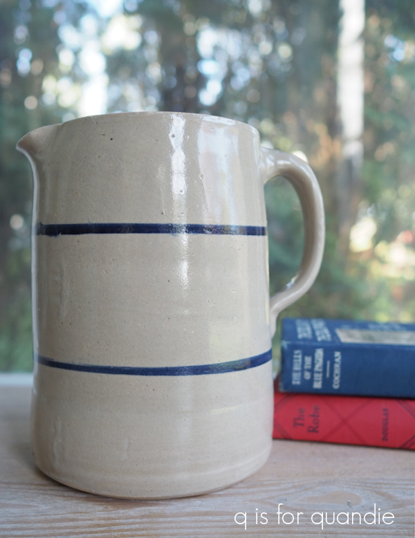
If you aren’t familiar, the Baader–Meinhof phenomenon “is a cognitive bias in which, after noticing something for the first time, there is a tendency to notice it more often, leading someone to believe that it has a high frequency of occurrence.”
I’m sure it’s just a coincidence that I found a similar stoneware pitcher at the thrift store back in April …

but we’ll see if finding these pitchers really has a ‘high frequency of occurrence’ this summer!
I’m still picking up nice copper pieces when I see them. They seem to be selling like hotcakes at the shop. If only I could raid my handyman Ken’s kitchen! His wife has a serious collection of vintage copper … and when she originally purchased it, it was not vintage. I’m sure those pieces have been in her kitchen since they built their house 50 years ago.

That gorgeous ironstone platter is one that Sue had and is now passing on to me. It’s a nice big heavy one, and just check out the mark on the back …

I sometimes will hang an ironstone piece on the wall backwards just to show the mark because they can be so pretty. I’m not sure if I’ll keep this one, or sell it on. I have to look around to see if I have a spot for it first.
I’ve saved my ‘find of the day’ for last.

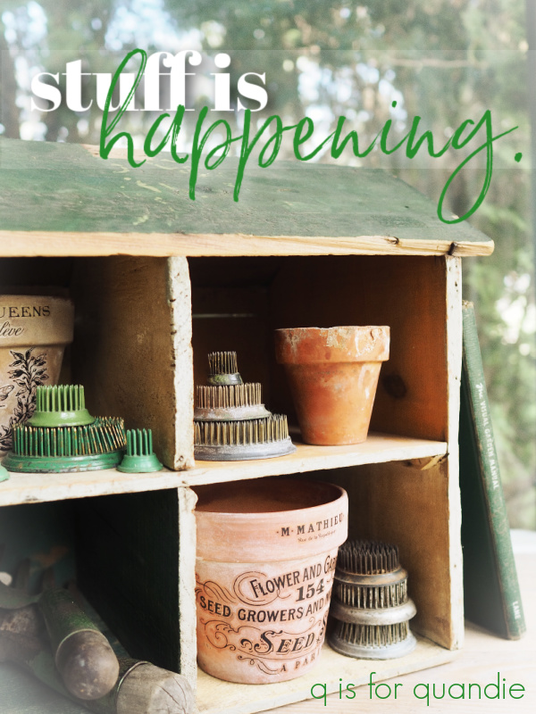
Now, I’m sure this primitive dollhouse made out of an Old Dutch Cleanser crate isn’t everyone’s cup of tea, but I found it totally charming.

I just love that someone made this out of simple items they had on hand, and they took the time to paint a couple of the ‘rooms’ in different colors.

And add those shaky looking windows painted onto the sides.
But I bet some little girl absolutely loved it and spent hours playing with it.
I’m not sure what the fate of this piece will be. I may keep it, I may let it go. Those little cubbies (rooms) could be used for all kinds of things …

I like the idea of using it on a potting bench.
Hmmm, yeah, I may not be able to part with this one. I’m considering turning my photo cottage back into a potting shed this summer, so this is going to go in the pile of potential décor for the potting shed.
So tell me, what is your favorite from amongst my finds this week? And if you’re local, did your tulips do especially well this year, or is it just me? Also, are you OK with five posts this week, or will it seem like I’m flooding your in box with blog posts? Oh, and P.S., there will be a giveaway included with one of them, so be sure to stay tuned for that!


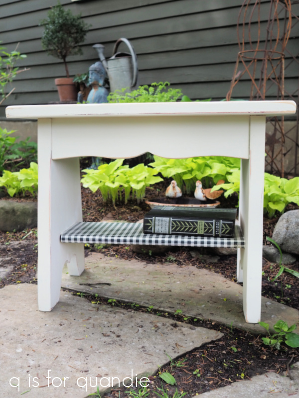

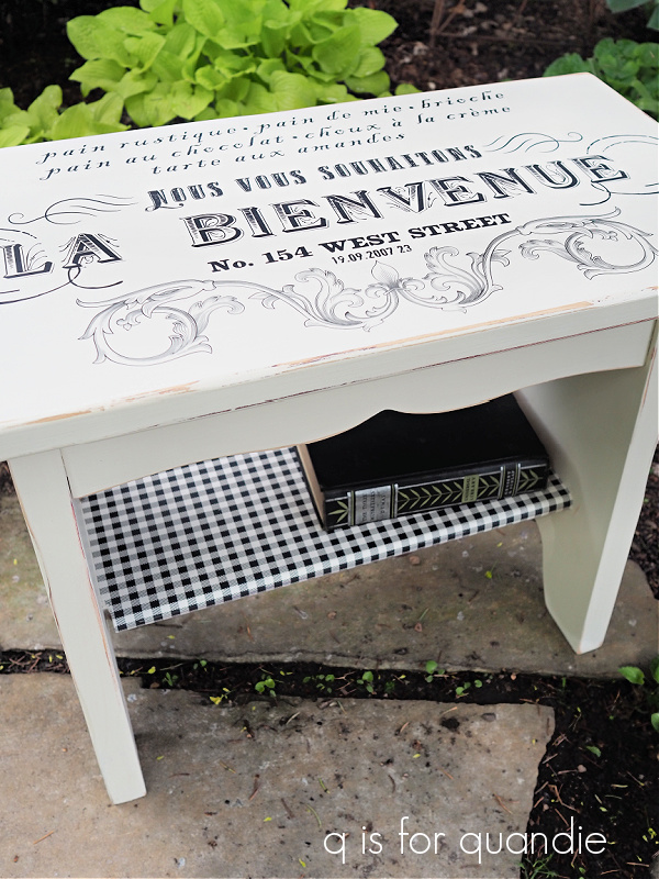


 I just love that warm white shade, it has a very vintage look.