go big or go home.

First up, congrats to Mary from Glass Horse Studio.  I drew her name to win my patina paint giveaway!

I don’t know how many of you check out my ‘available for local sale’ page on a regular basis, but if you do, you may have noticed that my furniture is not exactly flying off the shelf these days.

I’m not sure what the hang up is.  Earlier this year I thought maybe it was just the cold weather, but I can’t blame it on that anymore.

Then I thought, maybe white just isn’t ‘in’ anymore.  Several of my pieces are white including this stenciled dresser …

Or maybe the problem is that ‘farmhouse style’ is on the way out.

I’ve sold so many of these washstands, they are perfect as nightstands or side tables.  I can’t imagine why this one isn’t going.

Desks are always a bit of a tough sell, most people simply don’t use desks in their homes anymore, so not being able to sell the desk isn’t a complete surprise.

Black has always been a quick seller for me, so I went with simple black on this next one.  No transfers, no stencils …

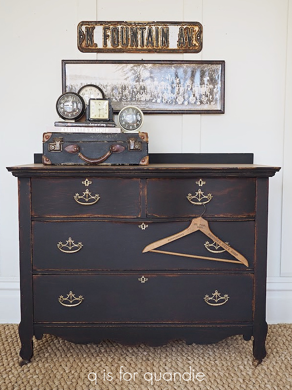
And I still have it.  What’s up with that?

This pretty shade of blue green has always been one of my personal favorites, but maybe it’s no longer so popular?

Or maybe it’s the french writing that’s holding this one back?

I have all of these pieces advertised on Craigslist and on Facebook Marketplace and I’m not getting even a nibble.  On any of them!

And that brings me to the bench.

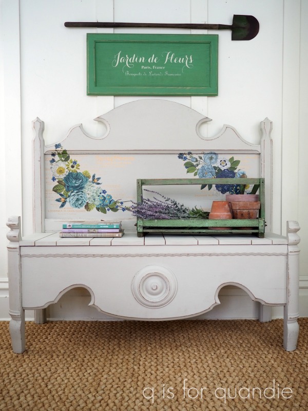
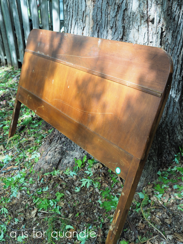
This bench goes all the way back to December 2020 when Ken created it out of an old 3/4 bed frame.  I had painted it in DB’s Sawmill Gravy and added re.design with prima’s Cosmic Roses transfer.

I had it listed for about 9 months, and then in October 2021 Ken and I decided to revamp it a bit to see if we could get it to sell.

Ken cut down the posts at the front of the bench because he’d thought they looked weird from the start.  Then I repainted it in Dixie Belle’s Drop Cloth and added that french transfer to the back.  If you’ve been following me that long, you may remember that I wasn’t happy about the repetitiveness of the transfer (cakes and pastries, cakes and pastries, cakes and pastries).  I didn’t even notice it until I already had it half applied.

Anyway, another 7 months have gone by and I still have the bench.

So I decided to give it one more try.

I consulted with Ken and we decided to remove the circular do-dad from the bottom of the bench.  It kind of draws the eye and looks a little … well … kind of nipple-y really.  It popped off fairly easily, then I sanded that area a bit and touched up the paint.

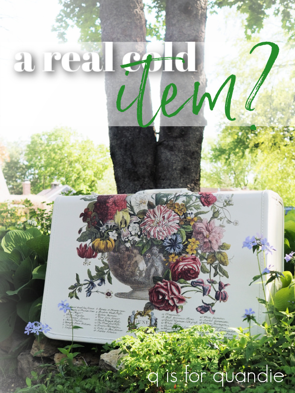
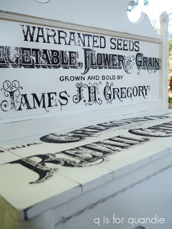
Next up I sanded off the transfer and re-coated that area with more Drop Cloth.  Then I applied I.O.D.’s Gregory’s Catalogue paint inlay.

Go big or go home, right?

This paint inlay isn’t playing around.  It’s big and it’s in your face.  And I love it.

I actually purchased this particular paint inlay to create a sign for myself, something that would hang on my carriage house … or maybe on my front window box.  I still plan to pursue that project, but for now, the inlay was kind of perfect for this bench.

Several of you have commented that the paint inlay process seems putzy or complicated, but I have to say that applying this one to the bench was easier than applying a transfer of the same size would have been.  Or at least it took far less arm strength (all of that rubbing with transfers!) and less time (not including dry time, but less actual working time).

As long as you pay attention and follow the directions (see my tutorial here), these are quite easy to apply.

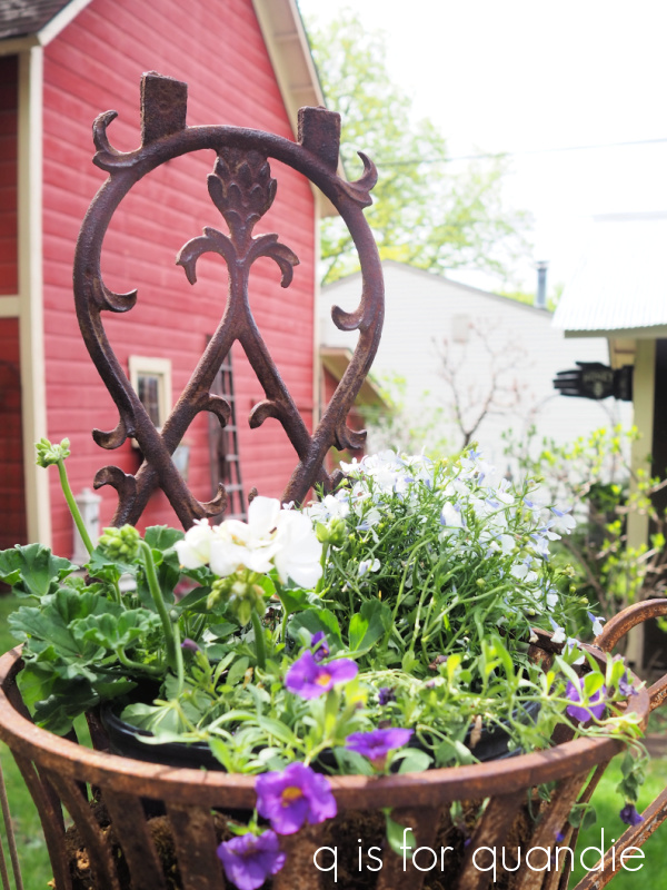
Before I let you go, we just have to talk about that gorgeous purple petunia for a minute.

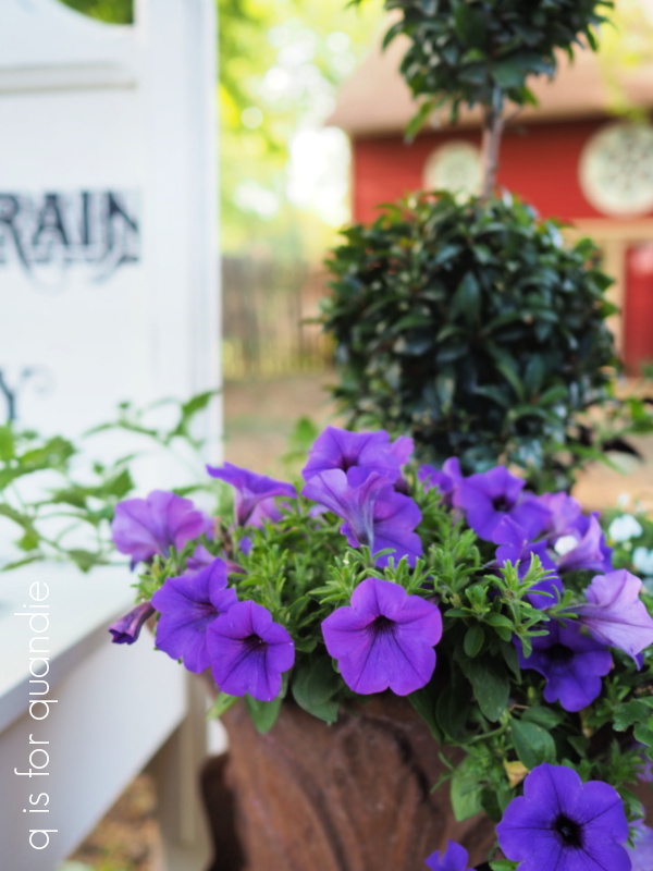
That is the Proven Winners Supertunia Mini Vista® Indigo.  The color on this thing is so gorgeous.  It’s probably going to entirely take over that pot and consume the topiary behind it, but I don’t care.  It makes me smile every time I see it.  I just had to share that with you guys.  I’ve seen lots of photos of this plant online and they seldom do justice to the actual color of it.

So the question remains, will this bench finally sell?

That remains to be seen, but I’m cautiously optimistic.  I think it turned out pretty fabulous and I really wish I had a spot for it myself.

If any of you locals are interested, be sure to check my ‘available for local sale‘ page for the details on this bench as well as the other pieces that are still in my inventory.

As always, thank you to Dixie Belle Paint Co for the paint and clear coat used on this piece.

itsy bitsy, teenie weenie.

It’s not a yellow polka dot bikini, but it’s definitely itsy bitsy, teenie weenie.

It might be difficult to judge the scale based on that photo, but I can tell you that this little guy is 2 3/4″ tall by 3 1/4″ wide.  The knobs appear to be beads that are just glued on.

Here, maybe this photo gives you a better idea of the size.

I believe this probably qualifies as 1″ scale, if you are familiar with such terms (as in 1′ is reduced to 1″).  Way smaller than yesterday’s mini.

Now you may have thought that I should just leave this one alone, but you know me better than that by now, right?  Of course I painted it!

And of course I found some itsy bitsy transfers to add to it.

This is a mash up of transfers from I.O.D. , re.design with prima, and Tim Holtz.

I had the little tool tote and the bucket in my stash of dollhouse décor from back in the day when I had a pretty fabulous dollhouse (you can see it here).  I ended up sending that dollhouse out to my in-law’s place because I didn’t have a good spot for it, but I hung onto a handful of little things.

The tool tote was in the attic in my dollhouse …

But clearly it needed a coat of paint and a transfer as well.

Both the dresser and the tote are painted in Dixie Belle’s Drop Cloth.

The bee transfer on the tote is part of a re.design with prima knob transfer with some bits trimmed away.

Naturally, I had to line the drawers with some pretty paper as well.

I had to dig to find some scrapbook paper with a small enough floral design to look appropriate in these drawers, and that floral paper was perfect.

Seriously you guys, how frickin’ adorable is this thing?  I can hardly stand it.

I’m definitely going to have to hang onto this one for now.

What do you think?

the historic styles mini.

You may remember that I picked up this little mini dresser while garage saling recently.

I knew it would be a fun one to restyle.

I started by sanding it lightly, cleaning it and then painting the outside in Dixie Belle’s Drop Cloth.  Then I added some bits and pieces from I.O.D.’s Label Ephemera transfer to the top and front.

I really wish someone would come out with another typography transfer.  I just love this one, but I am getting a little tired of re-using the same wording over and over.  And of course, it also is retired so eventually retailers are going to run out of their inventory.  It would be fun to have something new, wouldn’t it?

I gave it a pop of color on the inside by painting it with Fusion’s Laurentien.  I wanted to use an all in one style paint, like Fusion or Dixie Belle’s Silk for durability.  After choosing some October Afternoon scrapbook paper to line the drawers, I decided that the Laurentien was the perfect color to go with the paper.

Rather than flipping up on hinges, or having a top drawer, this little dresser has a lid that comes off.

This piece would be fantastic as a jewelry box, but I chose to style it with crafting supplies.

I mean seriously, how cute would this be for keeping some of your crafting supplies organized?

But using it as a jewelry box would be a valid option as well.

I definitely prefer the ‘after’ version, how about you?

This one is for sale, so if you’re local (I don’t ship) be sure to check out my ‘available for local sale‘ page for more details.

bees and queens.

As you may remember, when I was out at my mom’s a while back I purchased another of the I.O.D. stamps called Kindest Regards.

At the time I mentioned that I don’t know why I let myself get sucked in by these stamps. I’ve never been happy with the way stamps look on anything other than paper or fabric, so I don’t do a lot of stamping.

I do love the results on paper …

I used the I.O.D. Crockery stamp on those packages.

I also think stamps work great for fabric (as long as you can lay it flat on a hard surface to apply the stamp).  I used stamps from two different sets of IOD Décor Stamps on a pair of chairs; the letters and no 2 are from the Alpha II set and the wreath and the crown are from the Grain Wreath set.

Sidebar note:  although I used Ranger Archival Ink on those chairs, I would not recommend that brand for fabric.  It fades quite a bit over time.  Instead, use a permanent fabric ink.

Well, I got sucked in again while at my mom’s house the 2nd time and I purchased the I.O.D. Queen Bee stamp.

What is wrong with me?!

The thing is, I was hoping that I could figure out how to make the stamps look good on painted items.  Because I can’t keep buying the re.design with prima Classic Vintage Labels just for the two small bee transfers that come with it.  Or their Lovely Ledger transfer just for the crown.  No matter how much I love them!

If I can get a stamp to look this good, I can add bees and crowns to everything!

So I decided to do a little experimenting with various products to try and find a combination that would work.

First up, I’ve already learned that stamping on unsealed chalk paint or milk paint is no good.  I tried that on a pair of nightstands and met with disaster.  I did have luck stamping over Fusion paint (with its built in top coat), so I felt sure I could get the same result over Dixie Belle’s Silk Paint (this product also has a built in top coat).

So I pulled out a sample board that already had Silk Paint on it, and I pulled out various stamping mediums to test out.

I tested that same Ranger Archival Ink in Watering Can that I used on the nightstands, the I.O.D. Décor Ink in Stone Gray, Momenta permanent fabric ink in Black, and Dixie Belle Silk paint in Anchor.

And here are the results.

OK, so once again I achieved the best, most crisp, result with the Ranger Archival Ink …

The color I used, Watering Can, is a medium gray.  Perhaps I need to purchase this ink in black and see how I like it.

I applied the DB Silk Paint with a brayer, and I got mediocre results with that …

If you’re kind of a picky perfectionist (um, I might have to admit this often applies to me), this look isn’t going to cut it for you.  I find that I always get a slightly sloppy look when stamping with paint, it’s difficult to keep the stamp from slipping around.  I like the idea of using a paint with a built in top coat for durability, but I think it’s always a gamble whether or not you’ll achieve a clean result.

Hmmmm.  Clearly (pardon the pun) something went very wrong with the I.O.D. ink …

I had high hopes for their ink since they’ve designed it specifically for this sort of use.  The I.O.D. content creators that I watch on YouTube seem to use it with good results.  Was it user error?  Did I not shake the bottle enough before applying?  The ink seemed really watery to me.  I used a brayer to apply the ink to the stamp, maybe I need to invest in an ink pad to use with it?  If any of you use the I.O.D. ink please share some tips with me.

Last up is the Momenta fabric ink …

This one gave me a fairly good result at first glance.  However, after giving all of the inks about an hour to dry, I gave them all a smear test by dragging my finger over it.

Yep, clearly this ink is not intended for use on anything other than fabric.  This is the only one that smeared.

I also then let all of the inks dry for 24 hours and added a coat of Dixie Belle’s flat clear coat over them.  Once again, the fabric ink smeared all over the place.  The other three mediums were all good with the top coat though.

Since the Ranger Archival Ink in Watering Can gave the best result of the four options I had on hand, I decided to move on to phase II of my experiment using it.

Stamping over a hard, completely flat surface is all well and good, but most of the time I would be stamping on potentially lumpy surfaces and working around things like hardware and such.  So I decided to experiment on a toolbox.

Since I’d already painted the toolbox using Dixie Belle’s Sawmill Gravy, which is a chalk style paint, I had to start by sealing that with their flat clear coat.  Once that was dry, I started playing around with my I.O.D. stamps.

I started out with the Kindest Regards stamp on the sides of the toolbox.

As you can see, I ended up with some smudging, especially in the upper section where there are ridges in the toolbox.  But even the completely flat area ended up a bit smudgy in spots.

I thought maybe that I could better control a smaller sized stamp, so I attempted a few of varying sizes on the top of the toolbox …

and again on the front of the toolbox …

Unfortunately, in the end, stamping on toolboxes isn’t going to work for me.  If you’re OK with the possibility of smudging, and you don’t mind how that looks, maybe it’s workable for you though.

I ended up painting back over this one and turning it into this …

So for me personally, I’ll probably stick to mainly using my stamps on paper.  Just look how pretty this one is stamped in pink on some tissue paper.

So, leave me a comment and let me know, have you had better success stamping over painted items?  If so, do you have any tips that you’d like to share with the rest of us?  We’re all ears!

for the record.

My friend/picker Sue found this little case for me.

At first I thought it was a makeup case, but then I realized it was probably used to hold 45’s.  Oh boy, that might really be aging me.  How many of you now thinking “45’s?  What is she talking about?”

But I bet more than a few of you will know exactly what I’m talking about, records of course.

That clear handle screams record carrying case to me, sort of like this one …

Although the shape doesn’t seem quite right.

I never actually had a case like that for my 45’s, mine looked like this …

It was so groovy.  Who else remembers these?  You turn that handle at the top and the blue pieces lifts off to reveal all of your 45’s.  I borrowed that photo from Etsy, so if you’re looking for one of these cases, they are out there!

Anyway, I don’t think anyone is going to use this case for their records now.  Especially now that I’ve given it a new look.

Let’s start with the inside though.  Unfortunately I neglected to get a ‘before’ photo of the inside, but it was a little beat up and tired looking.

I painted the inside black using Dixie Belle’s Silk Paint in Anchor.  Then I lined the lid and the bottom with some old scrapbook paper that I had on hand.

You might be surprised to learn that I decided not to paint the outside.  I rather liked that butterscotch sort of color and the original patina on the case.

So rather than paint it, I just gave it a good cleaning with soap and water and then added some I.O.D. transfers to it.

The florals are from their Floral Anthology transfer, and the wording is from their Label Ephemera transfer.

Oh, and the cute little crown is from their French Pots transfer.  I stole it from the goose …

I applied some clear wax over the case to give it a little protection, and then that was it.

I’m not sure what it is about that Lucite handle, but I just love it.

And I guess I’m not entirely sure that is Lucite either.  But it has a bit more heft than your typical cheap plastic handle, and it’s crystal clear which usually means Lucite.

But, for the record, I’m not sure if this is a record case and I’m not sure if that is a Lucite handle, but I am sure that it’s pretty cute now.

What do you think?

This little case is for sale, so be sure to check my ‘available for local sale‘ page for more details (sorry, I don’t offer shipping).

a real cold item?

Unlike the painted toolboxes, which are a real hot item, my painted suitcases can be very hit or miss.  I’ve painted quite a few suitcases in my day, you can check out most of them in this post from April 2021.

One of my favorite suitcases was this one …

Although I guess technically that one is not painted.  I just added some I.O.D. transfers to it.  It did sell really quickly though.

But lately my suitcases are mostly a miss, rather than a hit.

Last Christmas season I painted this one …

I loved how it turned out.  But you know what?  It didn’t sell.

I think it would be adorable just sitting under the tree, or maybe placed in your foyer to greet Christmas guests.  As an added bonus, you could store Christmas ornaments in it when you pack it away with your decorations at the end of the season.

I still have it available if any of you locals are interested.  It’s priced at $45.

More recently I painted this one …

This time I also spruced up the inside thinking maybe that would help sell it.

But last I checked, this one is still unsold (it’s at the shop where I sell on consignment).

It’s priced at only $35 if any of you locals are interested.

Due to lack of sales, I’ve placed a moratorium on bringing home any more vintage suitcases.  Well … maybe I should clarify.  The moratorium is on paintable suitcases.  I’ll still grab fabulous vintage suitcases for my own non-collection.

However, I still have a couple of suitcases remaining in my ‘to be painted’ inventory including this one …

So decided to go ahead and get this one painted up.

This time I used Dixie Belle’s Drop Cloth paint, and then I added I.O.D.’s June, Ode to Henry Fletcher transfer.

This was a super simple project.  I just painted the suitcase, gave it a light sanding with 220 grit paper, added the transfer and then finished with a topcoat of Dixie Belle’s flat clear coat.

Oh, and I did also sand over the transfer very lightly with 220 grit to give it a more worn appearance before applying the topcoat.

That is such a pretty transfer!  The last time I used it was on this toolbox …

It sold really quickly and one of my regulars missed out on it.  So when I finished up this suitcase, I shared it with her and she called dibs on it.  So today’s suitcase is spoken for.

But I wonder if part of the reason the suitcases don’t normally sell as well as the toolboxes is because they are often musty inside.  This one actually isn’t too smelly, but it is quite orange.

Here are some q tips for mitigating that ‘I’ve been closed up for 50 years’ smell.

no 1 – fill the suitcase with crumpled newspaper and close it back up for a week or so.  The newspaper will absorb some of the odor.  Repeat several times with fresh newspaper if necessary.

no 2 – throw a scented dryer sheet inside.  Maybe pick a nice lavender scented variety.

no 3 – spray with Fabreeze.

no 4 – give the suitcase its day in the sun.  Open it up and set it outside in a sunny spot to air out.

no 5 – if you’re really fancy, create your own lavender sachet to place inside the suitcase.

I’ve tried all of these options … well, except I’ve never made my own sachets.  Usually I employ several of these options at once.  But, I haven’t found a 100% fool-proof way of totally removing that musty-ness.  Once the suitcase goes back to sitting around closed up all the time, it will likely return.  For that reason, I use my own vintage suitcases to store things that won’t pick up odors like my glass tree toppers.

If nothing else, a suitcase like this one is just pretty to look at.  You can put it at the foot of your bed, or next to your dresser, or anywhere really.

Do you have any tips on freshening up the inside of a suitcase?  If so, please be sure to share them in a comment!

gardening small.

After taking some time to evaluate my garden after our recent hailstorm, I’ve realized that although some plants were quite damaged, some weren’t really impacted too much.  My large leaved hostas are toast.

At least the ones where the leaves were unfurled.  There were still a few varieties that weren’t up all the way yet, so that was an unexpected bonus to the cool spring we’re having.

My tulips all bit the dust as well.  Ironic, right?  They survived the winter, and then the deer, only to succumb to hail.

But for the most part, plants with small leaves, like the sweet woodruff …

and the brunnera were just fine.

Which brings me to my smallest plants of all, the ones in my fairy garden.

As you can see, the fairy garden fell victim to the hail much like the rest of my garden.  But it’s easy enough to fix a toppled birdbath when it’s only 3″ tall, and once the hail melted I could see that there wasn’t much damage done to the fairy garden at all.

This seems like a good opportunity for a fairy garden update.

My fairy garden lives in an old cracked bird bath that I purchased at a garage sale.  The crack meant that it would no longer hold water and function as a bird bath, so that made it perfect to plant in since it has drainage.

If you’ve been following me for long, you may remember that I gave it a refresh back in 2018.

Since then only two of the perennials have reliably returned each year.  One is the bright lime green mini hosta called Feather Boa, and actually it’s doing so well that it’s threatening to take over.  I’m going to have to pull it up and divide it again soon.

I keep trying other miniature hostas, but so far none of them have made it through a winter.  We bury the fairy garden in a big pile of leaves up against the house for winter to give it some extra protection from our ridiculously low temps.

The Berberis thunbergii ‘Concorde’, the dark purple ‘shrub’, has also come back each spring.  The Barberry has not retained that dark purple coloring though, now it looks like this …

I suspect this is because it doesn’t get enough sun.

I always add a few annuals to the fairy garden each year.  Unfortunately, I rarely know the names of them.  I buy most of them at Bachman’s (my local garden center) and they are just labeled as ‘pixie plants’.

I added a little vertical interest with this next one …

It will be interesting to see how that one performs.

I also added something from Stepables this year.  Are you familiar with them?  They are low growing ground cover plants that can handle some foot traffic.  They are supposed to be good for planting in the crevices of a flagstone walkway, for example.

This one is called Blue Star Creeper and I hope I can keep it blooming in my fairy garden this summer because those tiny blue flowers are super cute.

My little garden angel is getting pretty ratty looking …

I may have to do some experimenting with the Dixie Belle Patina Paint on him next!

If you like my fairy garden, you should see my in-law’s!  I’m going to make a point of getting some photos of it to share with you guys this summer.  But until then, do any of you have a fairy garden?  If not, I highly recommend it.  You can fit one in just about anywhere, it’s much cheaper, it’s much easier to take care of than a full sized garden, and apparently it won’t suffer much from hail damage.  So I say, garden small!


my bronze buddha.

First up, congrats to Sue Pagels.  I drew her name at random to win my giveaway from last week.  Not to worry if you didn’t win, I have another fab giveaway today!  Be sure to read all the way to the end of today’s post for the details.

You may have seen my buddha statue in previous posts about my garden.

I’ve had him for years … possibly even decades.  I have absolutely no memory of when or where I purchased him.  He’s just been hanging around in the garden for a long time.

I’ve always left him outside year round, and over the last couple of years he’s been looking pretty rough.  The last two, or maybe even three, springs I’ve said to myself “I really should do something about that.”  But, I never got around to it.

Well, now that I’m retired from the day job, this is going to be the summer of getting around to it!  Starting with buddha.

So here’s how he looked this spring, prior to his makeover.

I believe he is made out of some sort of pinkish/orange concrete.  I had once thought he was terracotta, painted to look like concrete, but he’s far too heavy to be clay.  He must be concrete of some kind.  He’s heavy and solid.

Anyway, I lugged him out of the garden and brushed the dirt off a bit before I brought him inside.

But before I got started on him, I decided it would be wise to practice my technique on a smaller item first.  So I pulled out this acorn finial.

You may remember that I found this while thrifting a while back and I was going to leave it ‘as is’.  But I decided this piece would be a good guinea pig.

So I pulled out my Dixie Belle patina paints in Bronze and Iron, the Green spray and some of their gilding wax in Bronze.

I started out by painting the acorn in a coat of Bronze paint.  Once dry, I added a 2nd coat and while that coat was still wet I sprayed it with the Green patina spray.

To add a little more authenticity to the look, I then dabbed some of the Iron paint just on the corner and sprayed it (while still wet) with the Green spray to add a little rust.

Lastly, I used my finger to rub some of the Bronze gilding wax on some of the high points on the piece to bring some of that bronze back out again.

Yep, perfect.  This is the look I wanted for my buddha.  So I followed the same process; base coat of Bronze, allow to dry, 2nd stippled coat of Bronze, spray with Green spray while paint is still wet, allow to dry, stipple some Iron paint to add patches of rust, spray again with Green spray while wet, allow to dry.  Step back and evaluate the results.  Add some more rust spots.  Allow to dry and then bring out some highlights with the Bronze gilding wax.

I applied the gilding wax using my finger, just rubbing it on to add some highlights on his nose and brow for example.

He turned out fabulous.

I put him back out in the garden a couple of weeks ago, and here’s how he’s looking now.

He’s looking pretty genuine, right?

Here are some q tips for you on using the Dixie Belle patina paints.

no. 1 – the verdigris patina develops a lot more quickly than the rust patina.  The rust patina can take days to fully develop in fact, so if you don’t see as much rust as you want right away just be patient.  If a couple of days go by and you still want more rust, you can always stipple on more Iron paint and spray again.

no. 2 – whether shaken or stirred, be sure to mix your paint thoroughly, and often, as you’re working with it.  There are actual metal flakes in the paint that create the patina and they tend to settle to the bottom of your jar of paint rather quickly.

no. 3 – if you have distinct brush strokes in your paint, the spray may settle in those lines making them more apparent.  For that reason, I recommend stippling the 2nd coat (or any subsequent coats) of paint.  Stippling is just pouncing the paint on with an up and down motion.

no. 4 – you don’t have to seal your patina projects.  However, if you’re adding patina to something that will come into contact with people’s clothing you may want to seal it (the patina will likely rub off on clothing).  In addition, the patina will continue to develop over time, so if you want to halt that process, you can seal it.  Dixie Belle does make a sealer for the patina paint called Patina Guard, but I find that it adds a bit of shine and I personally don’t like that look.  That’s just my personal preference though, you may be just fine with it.

no. 5 – if you’re working on a flat surface, you may find that the verdigris looks like droplets on your piece (because you sprayed it on in droplets).  I think this product gives a more authentic look on items with some texture and detail.  The spray settles in the crevices and looks amazing.

I definitely think my buddha benefitted from a little patina.

And now you can benefit too!

I’m going to draw the name of one lucky winner to receive all of the products I used to create my bronze buddha.  You’ll receive Patina Paint in Bronze and Iron, the Green Spray and some Bronze gilding wax.

The rules:  To be eligible to win, simply leave a comment on this blog post.  Maybe let me know what item you would turn into bronze!

Your comment must be left on this blog post, not on Facebook or Instagram.  You are not required to follow my blog, although it would be awesome if you did!

I will randomly draw the name of a winner for today’s prize from all of the comments left on this post by Sunday, May 29, 2022 at the stroke of midnight (U.S. Central time).

The fine print: no purchase necessary, you must be 18 years of age or older to win, void where prohibited by law, the number of eligible entries received determines the odds of winning, approximate retail value of prize is $69, if the prize is not claimed by Friday, June 3, 2022 another name will be drawn at random to win, blah, blah, blah.

Thank you to Dixie Belle Paint Co for providing the Patina Paint I’m giving away today.

garage sale regret.

Do any of you suffer from garage sale regret?

You get home from a day of garage saling and suddenly realize that the painted wooden chicken feeder you passed up on would have been awesome hung up somewhere in the garden and filled with plants.  It was only $6, why didn’t you buy it??

Or you wonder why in the world you refused that 3rd vintage sled.  Sure, it was priced higher than the other two that you did grab, but still …

And you really should have snatched up all of the Rocket Ligularia that were $1 each, why did you only take two (because it felt greedy to take them all?!).

For me, it’s inevitable that after a day spent at a fabulous neighborhood sale, I will realize there were things I should have grabbed but didn’t.

And on the opposite side of that coin, sometimes I regret the things that I did buy.  Like this toy cash register.

I mainly bought it because I thought the little note attached, ‘I bet your grandpa can fix it!’, was clever.

Sure, it’s adorable.  But red isn’t my color, so I don’t have anywhere to display it myself.  So I added a little transfer scrap to it and I’ll bring it in to the shop and hope someone else will give it a good home.

Garage sale regret is simply part of the deal, right?  That’s the difference between garage sales and shopping retail.  If you don’t grab something right away, it will likely be gone five minutes later.  And you also can’t go back and return something if you decide you shouldn’t have purchased it.

These items were all from the Linden Hills neighborhood sale last Saturday.  Linden Hills is such a pretty neighborhood, lots of old craftsman style bungalows and tudor style cottages.  And it feels as though nearly every house has a fabulous garden!  It’s really just a pleasure to drive around (especially when your sister is doing all of the driving, thanks again for that sis!).  It’s a bonus to also bring home some fabulous finds.

In addition to the two sleds, the plants and the toy cash register above, I also brought home a few more goodies like two vintage totes.

The green one is wood, the pink one is metal.  I wonder if it was originally red and had faded to that pink shade.  Or was it always pink?  A mechanic’s tool tote in pink?  What do you think?

I also purchased these bits of wrought iron salvage …

These are really fun to add to a planter in the garden.

I bought this headboard for $5.

It’s fairly non-descript, but I have a plan for turning it into a sign.  The price was right, so I grabbed it.

It’s basically an automatic reaction to pick up any ironstone pieces that I find, apparently even chamber pots.

This one is pretty filled with some lobelia though.

I don’t believe this casserole is actually ironstone, but it would still be lovely displayed with ironstone pieces.

I picked up this teapot as a gift for my m-i-l.

I think she’s going to love it.

I googled it and found a little more info about it online (here), and prices ranging from $67 on Mercari to $339.95 on replacements.com (yikes!).  I paid $3!  But, shhh, don’t tell my m-i-l it was only $3.

I picked up a pair of watering cans at Linden Hills.  Usually I’m thrilled to find just one watering can, so it was pretty exciting to find two.

This first one is pretty dinged up, has a broken plastic sleeve on the top handle and no rose on the spout.

In case you aren’t familiar, the ‘rose’ is the piece that fits on the end of the spout and allows you to sprinkle the water.

Vintage/antique watering cans are often missing their rose.  They tend to be more valuable with a rose, than without.  My personal theory is that it’s quicker to water a potted plant without the rose.  Also, the rose tends to get clogged up by debris.  So people often removed them, and then they were lost.

Funny enough though, my friend/picker Sue had recently found a rose that she gave to me.

This rose from Sue just happens to fit on this can.

So I added the rose, pounded out the dents a bit, removed the broken plastic sleeve on the handle and added a transfer.

This one will be heading into the shop as well.

And this brings me to my find of the day.

You’re probably wondering, what makes this watering can so special that it deserves find of the day status?  Well … as you know, I have a bit of a non-collection of watering cans.

And the truth of the matter is, most of them don’t actually hold water!  I’d say 99% of the time these old watering cans have rusted through in spots on the bottom and they are leaky.  So while they are great as décor, they don’t actually function.

As a result, I still use an ugly plastic watering can from IKEA when I apply water soluble fertilizer to my potted flowers.

But this watering can does hold water!  It also has a nice big spout (without a rose).  I’m looking forward to using it this year to feed my flowers.

So how about you?  Do you have any garage sale regrets that you still think about?  And what would you have chosen as the find of the day?  Leave a comment and let me know.

an old favorite.

Remember I mentioned that I purchased a vintage dry sink at a garage sale a few weeks back?  Well, here it is in its ‘before’ state.

How could I resist that?  It even had the old green pump still attached.  Well, part of it anyway.  The handle is missing.

This one was definitely the perfect candidate for some milk paint.  I just happened to have some Homestead House milk paint on hand in a color called Stone Fence.  I’d used this color quite a few years ago and I really liked it, so I’d ordered more of it recently.  It was just waiting for the right project.

I went very minimal on prep because I knew I’d be OK with some chipping.  So I simply cleaned the beadboard on all four sides with some TSP substitute, and then rinsed with clear water.  Next I painted the beadboard with two coats of the Stone Fence leaving the top of the dry sink unpainted.  Once dry, I sanded with 220 grit paper.

I then vacuumed away any dust, gave it a wipe down with a clean, dry microfiber cloth, and then applied my old favorite transfer called Seeds.

That transfer could not have been any more perfect for this piece (although I didn’t use the entire transfer, there were a couple more lines at the bottom that I cut off and will save for another project)!

This is an old Prima Marketing transfer from before they parted ways with the I.O.D. sisters.  I was just looking back at one of my blog posts about a pair of twin beds that I put this transfer on back in 2018, and I mentioned in that post that the transfer cost $17.99!  Dang, what happened to those prices?!  Now you can’t find transfers this size for less than $29.99.  That’s a 65% increase in 4 years.  What’s up with that?

(Sidebar:  that urn planter on the left is another that I used Dixie Belle’s patina paint on to give it a rusty iron look, it’s really just plastic!)

The Seeds transfer came in a larger size (which is what I used on this dry sink), and a smaller version.  I used part of the smaller one on this chair …

I used this design on A LOT of pieces, and I was hoarding this last one for something special (the transfer is retired, so no longer available).

Just a quick q tip to say that I don’t necessarily recommend storing (a.k.a. hoarding) transfers for more than a couple of years.  They can dry out and then become difficult to apply.  I’ve also had them come unstuck from their backing and stuck to the protective sheet instead, and then they are worthless.

But I was ignoring my own advice and hanging onto this one until just the right piece came along.  Luckily, the transfer was still in good shape and went on fairly easily.

That being said, it can be a little more challenging to apply a transfer over an uneven surface like beadboard …

You just have to go slowly and continually press the transfer down into those grooves.

As for the top of the dry sink, I decided to just clean it up a bit.

I sanded it with 220 grit paper to remove some smudges of paint left on it by a previous owner, and then revived the finish with a coat of Dixie Belle’s Big Mama’s Butta.

It’s not perfect, but that was my point.  I didn’t want to totally remove the patina that showed its age.

The remainder of the piece received a top coat of Dixie Belle’s flat clear coat.

As for the inside, I cleaned it and that’s it.  I like that it looks authentic inside with original chippy paint.

I think this piece would be adorable as a plant stand.  You could fill the ‘sink’ area with potted plants and store all of your plant supplies underneath.

In the end, this was the perfect piece for my last precious Seeds transfer, don’t you think?

This piece is for sale, so be sure to check my ‘available for local sale‘ page for more details.