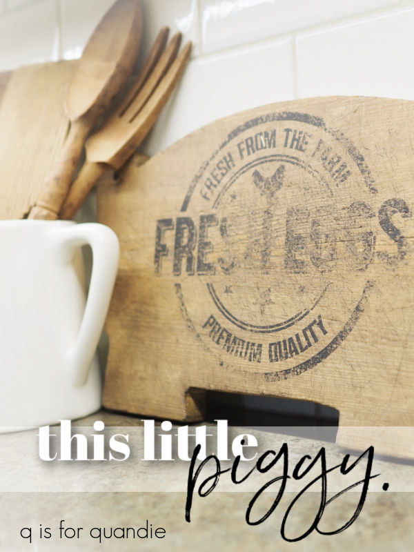
I picked up this pig shaped cutting board a while back. Well, to be honest, far enough back that I don’t really even remember where I got it. Was it a garage sale? A thrifted find? I’m not sure. But I had it in the stash waiting for a makeover.

I have a feeling that there was a time when every high school shop class churned out these pig shaped cutting boards by the millions. They seem to be fairly common around here.
I added a French Market stencil to one way back when I was still hosting an occasional sale out of my carriage house.
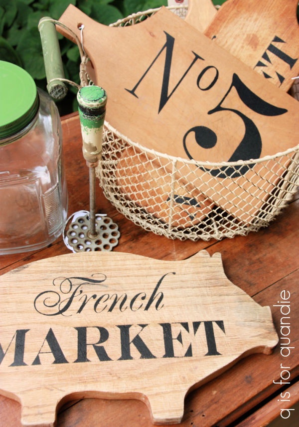
In fact, I stenciled quite a few different cutting boards back then.
But lately I’ve been more into painting them.

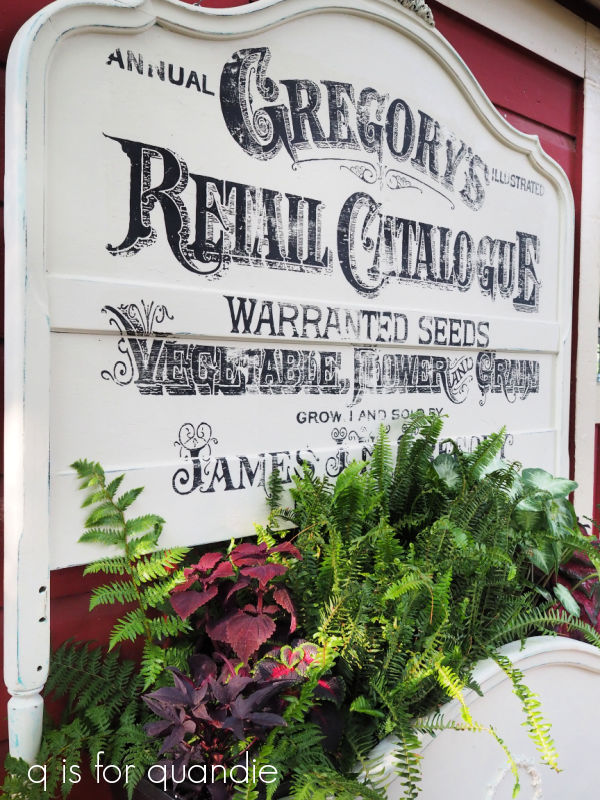
But for this pig, I decided to go back to my roots and give him a quick stencil using one of Dixie Belle’s silk screen stencils from their Farmhouse set.

First up, I washed the cutting board thoroughly with very hot water and some Dawn dish soap. Often times these old cutting board are pretty grungy. Then I sanded it down to some fresher wood.
Then I applied the stenciled design using Dixie Belle’s Midnight Sky paint.

Let’s talk for a minute about silk screen stencils. They are a bit different from traditional stencils. For one thing, they are made out of a flexible, adhesive backed vinyl rather than the stiffer mylar of typical stencils. Also, rather than a fully cut out design, the area to be stenciled is backed with silk screen. That means bridges aren’t required in the design.
If you aren’t familiar, bridges are the areas that hold inside pieces in place, like below in the letters “P”, “O” and “A”.

So silk screen stenciled designs can look less, well, stenciled.
One downside to the silk screen stencils is that they don’t hold up to tons of use though. I find that the silkscreen gets a little clogged with paint after a few uses if I’m not super diligent about cleaning them immediately after use. And as we all know, I’m definitely not super diligent about that.
So if lots and lots of repeated use is something you value, and you aren’t all that good about cleaning your stencils, you may not like the silkscreen stencils.
You can see the result of a slightly clogged silk screen stencil on my pig.

Once I saw that rather rustic result from the stencil, I decided to make it work by adding some age back to the wood using Homestead House’s Antiquing Wax.

In hindsight, I kinda wish I had followed my own regularly given advice to lay down a coat of clear wax before adding the dark wax. That allows you to move the dark wax around a bit more for a uniform look.
But no, I didn’t do that.

So I did end up with the dark wax being more pronounced over my stencil, basically where the cutting board was more worn. This is definitely a case of do as I say, not as I do.
I will say that I think I certainly accomplished my goal of adding back some age though.

This definitely doesn’t look like freshly sanded wood with a newly painted stencil, right?

I should be sure to point out that this little piggy is no longer food safe, but rather intended for décor only.
What do you think? Do you prefer the stenciled look, or the painted with transfers look? Leave a comment and let me know.