fake it till you make it.

I don’t know about you, but I have to admit that I am a bit of a floral snob.  Fake flowers just don’t cut it for me.  Especially the ones that people put outside in pots when everyone knows that hydrangeas aren’t blooming in Minnesota in May, and geraniums don’t survive here in January.

However, a recent trip to Bachman’s (my local nursery/florist) really made me rethink my aversion to faux stems.

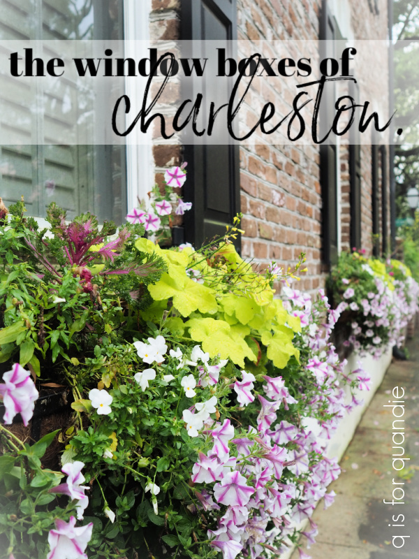
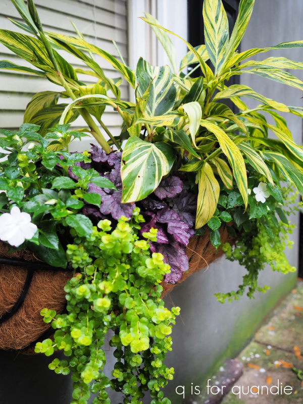
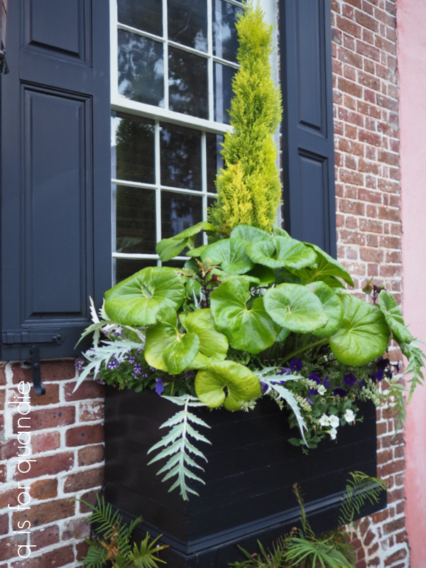
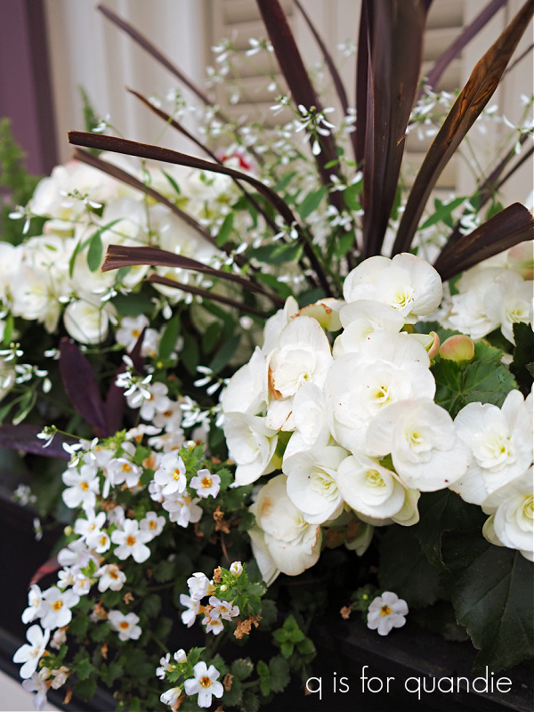
As you locals already know, here in Minnesota it’s still too early for gardening.  Today’s forecast calls for a low of 25.  Ugh.  After seeing all of those gorgeous window boxes in Charleston, I just really needed to splurge on something green and pretty though.  So I decided to head to Bachman’s for some pansies.

Pansies are a cold hearty plant.  They can tolerate temps down to around 25, although if it’s going to be much lower than that you should cover them (I’ll throw old bed sheets over mine if the temps get any lower).  This makes them a great choice for us northern gardeners who just want to have something growing in early spring (and P.S. locals, they were 50% off at Bachman’s last Friday, not sure if they still are on sale this week though).

I found my pansies at Bachman’s, but I also found something else that I wasn’t really expecting; a huge selection of faux flower stems.

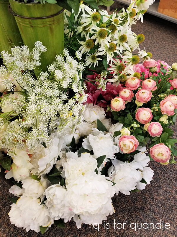
And honestly, I thought they weren’t at all fakey looking.  Plus they had what I felt were some unique choices.  Just check out this fake astilbe.

If anything, it looks even better than the real stuff.

I guess Bachman’s is faking it till they make it with lots of faux options before true gardening season starts.

As a sidenote, check out those green lanterns.  That’s almost the exact color of the Sweet Pickins’ In a Pickle, or Dixie Belle’s Kudzu.  I am really loving this shade of green lately, and it looks like I’m not the only one.

Lately I’d been wishing I had a few more fake flowers on hand to use when staging photos for the blog.  All I had on hand was some fake lavender.

Which meant I had to go out and buy real flowers whenever I wanted to use them in photos.

Not that it’s the end of the world, but I don’t always want to take the time to run to the florist.

I’d been looking at the fake flowers at the various thrift shops, and they tend to look a bit tacky to me.  Plus the prices often seem to be weirdly high on them.  I’d also looked at Hobby Lobby, but the day I was there they weren’t on sale and the regular prices there are also a bit on the high side.

So when I realized that the faux stems were 20% off at Bachmans, and the prices were actually fairly reasonable (their prices are often on the higher end too), I decided to grab a few to have on hand as photo props.

Just check out these grape hyacinths.

Aren’t they fab?  You guys are certainly going to see more of them in the future.

I couldn’t resist this columbine either.
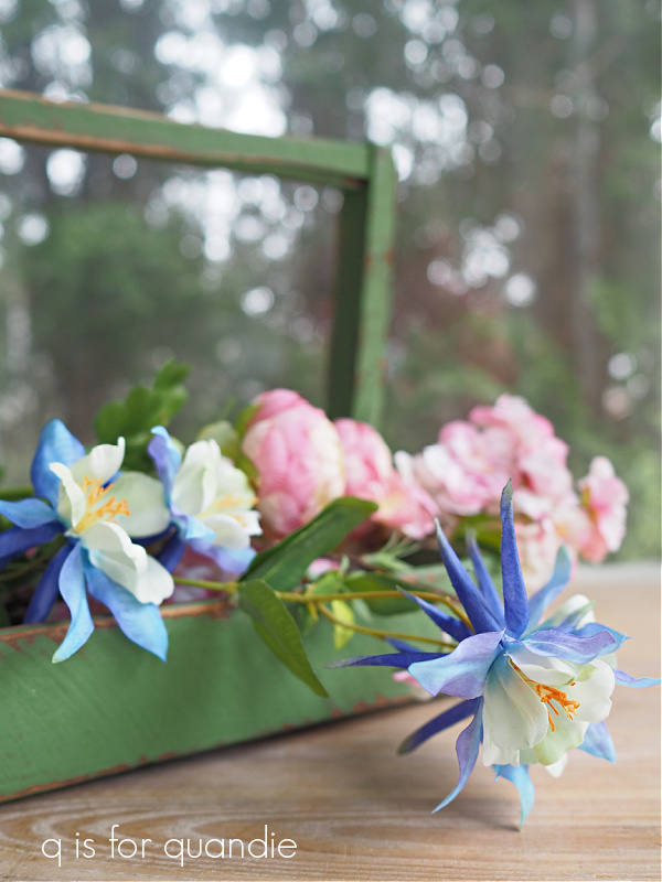
Isn’t that lovely.

I had to have some white peonies.  The season for real peonies from the garden is always so short (although this year I will definitely be saving some buds in the fridge for later, check out my experiment with that from last year).

And then I grabbed just a couple of pink choices.

Some ranunculus and some cherry blossoms.

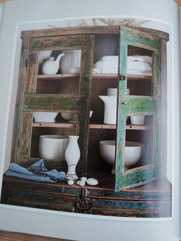
I’d been tucking my faux lavender in a french bucket that I keep on the top of the cabinet on my front porch.  That kept it handy for grabbing for photos.

But now that I’ve added a few more stems, it’s looking pretty good.

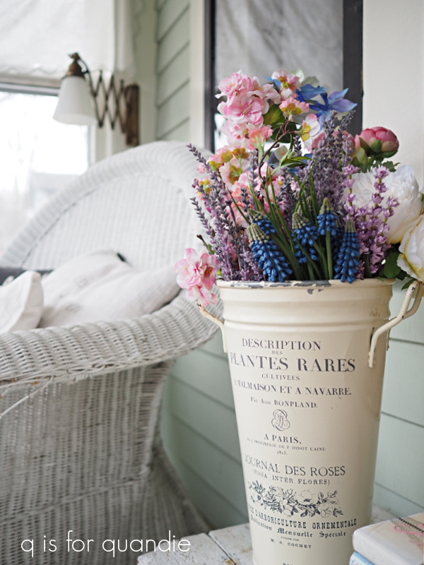
I may just have to display them somewhere more prominent so that I can enjoy them on the regular.

So what are your thoughts on faux flowers?  Are you a flower snob like me, or do you prefer flowers that don’t require any care at all?  Leave a comment and let us know.

an april thrift haul.

I still have lots to share from our trip to Charleston, but just in case some of you are growing bored with my travelogue, I thought I’d break it up a bit today and post about my recent thrift haul.

Sue and I headed out Wednesday morning to see what we could find at our local thrift stores.  The forecast called for rain, but the rain held off until we were almost done for the day.  I did have to unload the van in a downpour, but at least it wasn’t snow!

First up are the items that I can flip ‘as is’, although I always wash everything I bring home first, such a these ironstone-like pieces.

I’m not sure if any of those qualify as legit ironstone, but they have the ironstone look.

I also brought home this stoneware pitcher.

It’s super heavy, and looks vintage to me.  But I don’t really know much about stoneware.  There are no marks on the bottom, but I did find these embossed marks.

Does anyone know anything about this stuff?  If so, please leave me a comment and clue me in.

I purchased this silver footed tray just because I liked the shape of it, and the fact that it’s footed.

I thought it would be perfect in the kitchen with olive oils and spices on it.

I also grabbed this set of six copper mugs.

Moscow mules anyone?

Someone really needs to stage an intervention to get me to stop buying pretty china.

After reading about grand millennial style I gave myself permission to consider china again, and so far I haven’t actually managed to sell any of it.  Also, unfortunately, although the dinner plates in this set aren’t crazed, the salad plates are.  I didn’t notice that before I got them home.  So I realized after the fact that I can’t really sell these as functional plates.  I may have to just turn them into garden china.

But that green!

How could I resist that green?

I also picked up a few things that just needed a little something-something added.  I added a quick transfer to this plain white pitcher.

I also added some transfers to these enamelware pieces.

I think any of these would be great as flower pots.  Just punch some holes in the bottom for drainage (I usually do this with a hammer and a large nail), and fill with your favorite flowering annual.  As I’ve mentioned before, in my experience these transfers hold up perfectly well outside.

When I picked up this barn bird house at the thrift store, it was obvious that there were some things rattling around inside.  I had to take 4 screws out to get the bottom off, and here’s what tumbled out.

A strange little mish mash of items; some craft paint, a chapstick, a little foam brush and a fake plastic strawberry.  Someone was having fun figuring out what they could fit through that hole in the front 😉

I thought it would be adorable to add a transfer from Dixie Belle’s On the Farm set.

Now I can’t decide if I want to keep this for myself, or sell it at the shop.  Decisions, decisions.

I love this tall wire basket that I found, although I’m not 100% sure how one would use it.  Of course, you could always put some tall faux stems in it, or maybe some french bread?

Or hey, maybe hang it from a peg and fill it with rolling pins.  To show the height of the basket, I staged the photo with a pair of rolling pins that I picked up while thrifting too.  I subsequently have painted the handles on the rolling pins to give them a more vintage look.

I went with red and green and I think I’ll hang onto these for the Christmas season.

Whenever I see a pretty original oil painting at a good price, I always grab it.

This one is perfect for someone’s lake cabin, and it’s just about to be cabin season.  I gave the frame a quick freshening up with a coat of Dixie Belle’s Silk paint in Deep Sea, which is a deep navy blue.

It wasn’t until I was about to photograph the painting that I remembered that I had this wooden buoy.  I picked it up while thrifting over the winter and I tucked it aside to be a summer project.

I wish I’d thought to take a ‘before’ photo of the buoy, but no such luck.  It was white with a seafoam green colored stripe.  I gave it a fresh coat of Dixie Belle’s Drop Cloth and then added some red stripes in their Honky Tonk Red and a blue tip using Bunker Hill Blue.  Then I added the numbers, which are from re.design with prima’s Everyday Farmhouse transfer.

It’s the perfect companion to the nautical painting.

I did grab a few more things that I’ll be sharing next week, some garden items that will get the Dixie Belle patina paint treatment, a foursome of wooden totes that are all going to get painted, and I even picked up a couple of dressers from my friend Annie.  She and her husband have recently moved back to Minnesota from New York, and she had a little more furniture than her new house would accommodate.

I’m going to get started on this one over the weekend, so hopefully I can share the finished product with you guys soon!

So be sure to stay tuned!

the hidden alleys of charleston.

As I mentioned recently, I have a thing for alleys with the exception of Minneapolis alleys that have a 6″ thick crust of ice in the winter and you’re trying to load a dresser into your van.  But otherwise, alleys always have a mysterious allure that draws me in and makes me want to see where they lead.

And the narrower, the better, right?  Well, as long as you’re on foot.

I think part of the appeal of the alley is that you can get a sneak peek into areas that aren’t necessarily seen from the regular street, without getting arrested for trespassing.

So when I saw that there was a walking tour in Charleston called Charleston’s Hidden Alleys & Passages, naturally I had to book it.

We booked the tour for our first morning in Charleston so we could get the lay of the land and have an idea which areas we wanted to go back and explore further later in our stay.

We were a little worried about the weather forecast.  We had flown in the night before during severe thunderstorms and a tornado watch (something I absolutely do not recommend).  And there was the potential for more severe thunderstorms the day of our tour.  As you can see in my photos, things were definitely wet.

But miraculously, aside from a brief light drizzle, we stayed pretty dry.  We never even pulled out the umbrellas we’d brought along.

And really, I think the overcast skies just added a misty romantic ambiance to the experience.

From a photography point of view, the gray skies made it much easier for me to get great photos in these alleys where the shadows would have been very deep and dark on a bright, sunny day.

One of the alleys we visited was the Philadelphia Alley.

How amazing is it that this alley was created in 1766 and we are still walking on it today.

According to our guide the bricks making up this alley were made by slaves, and the slave children had the job of turning the bricks as they dried in the sun.  As a result, their small handprints can be seen in many of the bricks.

Legend has it that this alley was also a popular spot for duels and that it’s haunted to this day by a man who lost his life there.  I didn’t run into him, but hey, you never know.  I will admit that between the ghostly handprints and the story of duels being fought, it was a little spooky.

One of the last stops on our tour was the Gateway Walk.

The Gateway Walk is an informal trail through gardens and graveyards.  It’s named for the many wrought iron gates that you pass through along the way.

Part of this walkway leads you through the Unitarian churchyard.

Oh my gosh you guys, is this not what you picture every southern cemetery must look like?

Filled with ancient tombstones and trees draped with spanish moss?

And camellias?  It definitely should have camellias.

Is that the most perfect shade of pink?

I really couldn’t stop taking photos of this place.

You might be wondering to yourself why the Unitarians don’t take better care of their graveyard, keeping it mowed, weed-free and tidy.

Instead it looks overgrown and unkempt.

But apparently this churchyard “is a garden that is allowed to flow and blossom and bloom right over and around the many old gravestones. This natural state is in keeping with Unitarian beliefs about the web of creation.”

I kind of love that concept, how about you?

Although this tour was very well done, I have to say that I wish our guide had focused more on the alleys themselves.

He led us through the alleys while talking about the history of Charleston in general.  So, while it was lovely to be walking through all of these amazing spots, in many cases he never even mentioned the name of the alley or any history associated with it.  I found a lot more information online while writing this post and I wish he had shared more of that with us.  This is not to say that he wasn’t incredibly knowledgeable about the history of Charleston, super charming, and quite entertaining.

Would I take this tour again?  Absolutely.  In a heartbeat.  It was a great way to get some background history on Charleston, and to get your bearings.  It also was definitely off the beaten path.  And trust me, that beaten path in Charleston is pretty well beaten.  But if you want to save yourself the $30/person we paid for it, with a little research and planning you could also easily wander these alleys on your own using info available online here and here.  My next post will explain how we did exactly that the following day, so be sure to stay tuned.

the window boxes of charleston.

First up, congrats to Jill H.!  I drew her name at random to win my giveaway of paint from Dixie Belle’s new Desert Collection.  I’ve got a couple more giveaways planned for the next month or two, so if you didn’t win this time, don’t give up.  There will be more chances coming soon.

Well dear readers, I have to confess that I have pulled a fast one.  Mr. Q and I were in Charleston, South Carolina over the past two weeks.  I probably err on the side of caution, but I’ve always felt it unwise to broadcast it to the world when our house is going to sit empty … well, semi-empty anyway.  Our cat, Lucy, was on guard duty.  And Ken kept an eye on Lucy, and things in general, from next door.

But now we are back!  And we had an amazing time.  So, fair warning, you’re going to see a few Charleston themed posts coming up because I took a lot of photos.  Charleston has to be one of the prettiest places I’ve ever visited.  It has a lot going for it, gorgeous old homes, stunning gardens, delicious food, and lots of history.

I’ll be sharing more on all of those things, but for today I wanted to share something that I saw all over the place in Charleston … beautiful window boxes!

As you may know, we have several window boxes at our house.  So I was definitely scoping out the various combinations of plants to get ideas for my own window boxes this year.

One trend that I noted in Charleston were window boxes that included some perennials in the mix rather than just relying on flowering annuals.  The lime green heuchera in the box below is gorgeous combined with pansies and petunias.

Here is another box that used the same lime green heuchera.

I love how they used a lemon cypress to add some vertical interest in the middle of that one too.  I may have to copy that idea.

This next box includes a deep purple heuchera that contrasts beautifully with the variegated leaves of that tropical looking plant (I don’t know what that plant is, so if any of you are familiar with it please be sure to leave a comment to let us know).

That box is a great example of using foliage rather than flowers to make a statement.

I would guess that you can keep perennials alive in a window box year round in the southern climate of Charleston (hardiness zone 8).  Unfortunately, here in Minnesota our winter temps get far too low to keep most perennials from freezing beyond recovery unless they are in the ground.  The rule of thumb for a perennial surviving winter in an above ground planter is to choose a plant with a hardiness zone two times lower than your normal zone.  Since the twin cities are a zone 4, I’d need to find plants hardy to zone 2 before I could expect them to survive the winter in a planter.

Of course, I could also simply treat the heuchera (or any perennial) as an annual and replant it every year.

I saw a few other options for more permanent window box plants, like boxwood.

At least I’m fairly sure that’s boxwood (if any of you know differently, let me know).  There aren’t many varieties of boxwood that do well in my area, so I’m not that familiar with it.  But I love the idea of underplanting an evergreen of some kind with flowering annuals.

Here’s another example of a box using an evergreen.

There were a few gardeners who were really thinking outside the box (pardon the pun) when it came to plant choices for their window boxes.

I love the use of cyclamen in this one …

And how unique is the use of orchids in this next one?

Now, I’m not sure, but I believe that big round leafed plant is a leopard plant (Farfugium japonicum).  Apparently this plant used to be considered a ligularia, but has been reclassified.

Here is it in another box …

I saw quite a lot of this plant growing in the ground as well.  Clearly whatever it’s called, it does very well in the Charleston climate.

I would never have thought to use a calla lily in a window box, and here it is combined with more of that lime green heuchera and some yellow pansies creating an amazing bright pop of color.

I have to admit I’m not usually a huge fan of yellow, but that combination is gorgeous.

I’m going to go off on a tangent for just a moment and admire the green color on those shutters and how beautifully it works with the plant choices in the window boxes as well.

Around the other side of this same house, they went in a slightly different direction with their plant choices incorporating some purple tones.

I saw window boxes with more monochromatic themes in Charleston too.

Such as this one with white begonias, euphorbia and bacopa.

And this one in purply pinks.

I was thinking that tall plant is a mandevilla.  I’ve only seen mandevilla’s as a vine, but apparently they come in a mounding variety as well.  Or maybe that is a different plant entirely, does anyone know?

The cool color scheme of this next one with its pop of blue pansies and purple Scaevola aemula combined with white alyssum and snap dragons really appeals to me.

You’d have to swap out the pansies when the weather becomes too hot for them (they like it cool).  I’m guessing that the owner of this window box pulls them out and puts something else in for summer.

I was especially impressed by the combination of gerbera daisies and kalanchoe in this next window box.  Those pinks match each other almost perfectly.

And to cap it off, this one was decorated for Easter.

See what I mean?  There are little eggs tucked in here and there.  It’s subtle, and I love it.

As you can see, everywhere I looked in Charleston I saw gorgeous window boxes.

I hope you’ve enjoyed seeing them as much as I did.  I’ve certainly come away with a few ideas that I plan to use in my own window boxes this year (you know, once they finally thaw out).  How about you?  Do you have any favorite plants, or combination of plants that you like to use?  If so, be sure to leave a comment and let us know!

I also hope you’ll stay tuned for more posts about our recent trip to Charleston.

mousse and quail.

A while back … actually, wait a minute, I have to insert here that it was THREE years ago, even though it feels like just last year or something.  How does time fly by so quickly?  I could have sworn this was more recent than that, but of course it was B.C.  Before Covid.  So it had to be 2019 or earlier.

Anyway, quite a while back, I found a pair of quail at the Mac-Grove neighborhood sales.

I thought they were sweet, but I didn’t love their dull, antiqued sort of finish.  So I gave the pair a paint job using RustOleum Mirror Effect spray paint in Gold.

I think that gave them an updated, more modern look.  You know I don’t love a lot of shine, but in this case I think adding some shine made a great improvement.

This pair sold fairly quickly at the shop, so it must have been a good thing.

So recently when I saw another quail at the thrift store I decided to pick it up and do the same.

Since it was still below freezing outside however, I couldn’t spray paint it.  I don’t have a properly ventilated warm space for spray painting indoors.  So I decided to try using the Dixie Belle Gemstone Mousse in Golden Gem on it instead.

I’ve only used this product to stencil so far …

so I wasn’t quite sure how it would work to paint an entire, albeit small, piece.  I really like how bright and shiny the mousse is though, so I decided to try it on the quail.  In the event of a fail, I could always hang onto the quail until the weather warms up and then give it a coat of spray paint.

The Gemstone Mousse is a water based formula with zero VOC’s, making it perfectly safe to use indoors in winter.  And since it’s water based, I figured I could easily spray paint over it if necessary (unlike with a gilding wax or other oil based products).

In addition to the Golden Gem, it comes in three other colors; Garnet, Amber and Diamond.

I did find that my mousse had separated a bit in the jar since the last time I used it, so I added just a couple of drops of water and gave it a good stir before using it.

You might be thinking that it comes in a teeny, tiny jar … and you wouldn’t be wrong.  I actually can’t even find the size (weight) of the jar anywhere, but it’s small.  However, a little goes a LONG way with this stuff.  I used hardly any to paint my quail.  I have a feeling this product will be similar to the metallic waxes, where it takes multitudes of projects to get through an entire container.

I used an artist brush to apply the mousse on my quail, but you can also just use your finger to apply this stuff.

And here he (she?) is.

I have to admit, I haven’t quite figured this product out yet.  It’s thicker than a metallic paint, but not as thick as a metallic wax.  You can rub it on with your finger, or apply it with a brush.  It’s water based, so you can reactivate the mousse with water.  It doesn’t require a top coat, although if it’s going to get wet I think I’d be tempted to add one.  That being said, a water based topcoat that is brushed on may reactivate the mousse causing it to lift off your surface.  Also, my quail felt tacky to the touch for a couple of days after being coated with the mousse.  I’m not sure if that’s because my application was too thick or what.  According to the instructions, the mousse should cure in 24 hours.  For that reason, you may want to use a spray sealer of some kind, even the Dixie Belle Easy Peasy spray wax would work.  But after a few days of dry time, my quail feels just fine.

I’d definitely use the Gemstone Mousse as an alternative to metallic spray paint again, at least in the winter.

How about you?  Have you used this product?  If so, let me know how you liked it by leaving a comment.

Thank you to Dixie Belle for providing the Gemstone Mousse used for today’s project.

the farmers market basket.

This little wooden basket was another find from my picker.

I love the way it’s constructed with all of those little slats nailed in place.

This was a quick and easy makeover.  I painted the basket in Dixie Belle’s Drop Cloth and sanded to distress.

Then I added a few transfers including this new one from Dixie Belle.

This is from their On the Farm transfer set.

They also offer a Farmhouse silkscreen stencil with a couple of these same designs.

I put this transfer on the other side of the basket.

And then I added a section from re.design with prima’s Everyday Farmhouse transfer down the slatted side.

I finished it up with a quick coat of clear wax.

This would make an adorable Easter basket, wouldn’t it?

I wish I could say those tulips are from my own garden, but it will still be a few weeks before my tulips are blooming.  But a bunch of tulips from the grocery store is a great way to brighten things up and add a little spring to my surroundings until they get here.

Thank you to Dixie Belle for providing the paint and the transfers for today’s project.

rusty garden stuff.

Over the past few months I’ve been trying to stock up on garden items while out thrifting and I’ve managed to put together a nice little pile of things.

OK, wait a minute … the ‘Eat’ sign isn’t really garden related is it?  But I’m going to give some of the garden items a patina finish, and I’m doing the same with the ‘Eat’ sign so it got thrown into this mix.

Now that it’s April and gardening season is nearly here, it was time to pull these items out and get them ready for the shop.

If you aren’t familiar, Dixie Belle has a line of products called The Patina Collection.  It includes patina paint that has real metal flakes in it that react with the patina sprays creating a genuine aged finish.  If you want to learn more about how to use the patina paint and spray, click on the image below to see my how-to post.

Pairing the Iron paint with the Green Spray will create a rusty finish, and that is my favorite of the looks.

First up for a makeover is this stone pot that someone had painted in a flat black paint before I picked it up at the thrift store.

The flat black wasn’t really adding much to the pot, but it saved me the step of painting on a base coat before starting with the patina paint and spray.

I simply added one coat of Iron paint, let it dry, followed up with a 2nd coat of Iron paint and while that was still wet, I sprayed it with the Green spray.  Don’t expect your patina to develop immediately.  I usually give my pieces about 24 hours and then check back, but even after 24 hours the rust will continue to develop.

But if you feel like you didn’t get enough patina, you can always add more paint and spray again.

I hadn’t even noticed the cool details on either end of the pot until after I started painting, and a little bit of rustiness really brought them out.

Next up are these two items.

Both of these are things that could be used inside, but I also think they would be nice just popped into the garden somewhere.  So I gave both of them the rusty treatment too.

I didn’t bother with a base coat on either one of these pieces, although it is recommended for metal pieces that might continue to react over time with the spray.

Somehow the rusty look makes these pieces look more authentic to me.

Although I originally planned to give this next piece a patina finish, I ended up deciding it looked good ‘as is’.

I think the manufacturer did a pretty good job of giving it a faux mossy sort of look.

I have patinated a similar item before using the Green spray over the Bronze paint and it looked pretty fab though …

I don’t know … should I have done it again?  I guess we’ll see if it sells first, and if not, I’ll take it back and give it some patina.

And that brings me to that ‘Eat’ sign.  I really just wanted to play around a bit with adding some patina on this one.

I started with the Iron paint and Green spray.  Then I dabbed a little of the Bronze paint here and there and added more Green spray.  And then I went back and added more Iron paint and Green spray again.  That’s one of the fun things about this product, you can just keep playing around and dabbing more paint here and there and re-spraying.

This would be fun to hang near your outdoor kitchen or dining space.

I have found that exposing these patina paints to the elements just allows them continue to develop and look even better over time.  I did not top coat the rusty planters that I painted back in July 2019, they sit out year round including during our Minnesota winters, and they still look great.

However, if you would prefer to protect your patina paint job you can add the Patina Guard that Dixie Belle sells.

I have to say that I personally did not like the way that the Patina Guard changed the look of the garden pedestal I used it on though.

It adds a bit of shine, and takes away some of the textured look of the rusty finish.

But if you like that look, go for it.  I also think the Patina Guard is a good idea if anyone is going to be sitting or leaning on your rusty piece.  Much like any authentically rusty item, the rust may rub off on clothing if it doesn’t have a top coat.

Another option for a top coat would be any sort of matte spray sealer.  That would retain a bit more of the matte look of authentic patinas.

Have you used any of the patina paints and sprays?  If so, I’d love to hear how they worked for you.  Be sure to leave a comment and let me know.

Thank you to Dixie Belle for providing me with their Patina Paint products!

talk about flexibility.

Remember the desk I painted last July?

I painted it in Dixie Belle’s Drop Cloth and added a couple of the smaller version of IOD’s Petit Rosier transfers.

I never intended for the piano stool to go with it, and in fact the piano stool that was pictured with it sold separately right away.

But the desk is still with me.  I have to admit, I’m a bit bummed out that this piece hasn’t sold yet.  I absolutely love it, but don’t have a spot for it.  Usually I will re-do a piece that doesn’t sell, but in this case I just can’t bring myself to do that.  I would hate to cover those transfers back up again.

In an effort to try and get this desk sold, I thought, “maybe it needs a chair … and possibly a mirror” (depending on if you want a desk or a makeup table).  So on my last trip to the thrift store I picked up this chair …

I had a few basic requirements for the chair.  It needed to be sturdy, a similar style to the desk, and easy to recover.  This one filled the bill perfectly.

I started with a good cleaning, and then applied a coat of Dixie Belle’s B.O.S.S. in clear.  This type of finish tends to bleed.  An ounce of prevention is worth a pound of cure, so I just went ahead and started with the B.O.S.S.

Next up I gave it two coats of Drop Cloth.  As per usual, the Drop Cloth went over the B.O.S.S. beautifully only requiring two coats for full coverage over that dark stain.  Once dry, I sanded lightly to distress and gave the chair a coat of clear wax.

For the seat, I pulled off the old grungy fabric and replaced it with some pretty black and white toile that I had on hand.  I wanted something that would work with the black and white on the desk.

Using toile always feels like a risk to me, but I know there are a couple of other toile lovers out there, right?

Next I pulled out a mirror that I had taken off a dresser (this one), and painted the frame in Drop Cloth.

I added a hanger to the back of the mirror so it can be hung on the wall.

Finally, I restaged photos of this piece as both a desk and a makeup table/vanity.  Talk about flexibility!

First up, the desk.

There is plenty of space on the top of this desk for a laptop, or really any sort of computer set up you have, leaving lots of room on either side for paperwork, books, a desk lamp and so on.

And you could hide a lot of office-y stuff in those 7 drawers!

One of the drawers has this funky glass piece that slides forward and back …

I’m completely baffled as to what the purpose of that piece is.  Do any of you have an idea?

If I add the mirror hanging over the desk, it magically becomes a vanity or makeup table.

Since the piece is black and white, it can be paired with any accent color, such as a pretty coral or pink.

So whether you are a neutral lover, or prefer a bit of color, this piece could be worked in to an existing décor.

Desk?  or Makeup Table?  Neutral color scheme, or dressed up with a pop of color?


Talk about flexibility, this one could go either way.

And it’s still for sale, and now includes the mirror and the chair.  If any of you locals need a desk … or a makeup table … be sure to check my ‘available for local sale‘ page for the details.

Thanks to Dixie Belle Paint Co for providing the B.O.S.S. and the Drop Cloth paint used on this project.

stillwater library book review.

After finding so many great decorating books at my mom’s local library, and after listening to advice from many of you, I decided to get a myself a new library card.  I’d had one about 25 years ago, and in fact there used to be a good-sized library just down the street from us.  We could walk there, and often did.  That was back in the day when there was no such thing as a Kindle.  But eventually that library closed, I started reading ebooks rather than paper books, and then things like pinterest and decorating blogs became a thing, and really, who needed a library card?

Now that I have a little more time on my hands, I’ve decided to check out the various libraries in my area and see what they have in stock for decorating books.  So a few weeks back Mr. Q and I popped into the Stillwater Library and got signed up with library cards, and I brought home this stack of books …

One big difference that I noted at the Stillwater Library v. my mom’s library in Henderson, Nevada is that my mom’s library had some newer books.  The publication dates on those books ranged from 2007 to 2021.  The most recent of the books I found here was 2013.

Full disclosure, I didn’t do any sort of deep dive into what books could potentially be available to me, I just went through those that were currently on the shelves.

So let’s start at the top of the stack with Cath Kidston’s in print (2005).  I grabbed this one because I’ve always enjoyed Cath Kidston’s style.  It’s very floral and colorful, and I love her use of vintage fabrics.

This particular book has lots of ideas for ways to those fabrics in your home.  If you enjoy sewing, this might be a great book for you to check out.

If you’ve followed me for long, you know that I don’t sew.  However, I do iron.

I thought this idea was positively brilliant.  I’d never really seen an ‘ironing table’ before.  I have a couple of fabulous old farmhouse type tables hanging about, I could easily make an ironing table.

I don’t have a fabulous laundry room to put it in though.  But I can sure see the appeal of ironing vintage linens on a big table like this rather than a narrow ironing board.

What do you think of that idea?  Would you use an ironing table?

The next book in the stack is another Country Living book, Decorating with White, and it’s the most recent of the books I checked out.

I mentioned last time that I tend to really like Country Living books and this one is no exception.  Although it was published in 2013, decorating with white seems to be fairly timeless.

Isn’t this pair of twin beds fabulous?

And apparently decorating with green is a classic also.  I was paging through the March 2022 issue of Country Living and came across a photo that was recycled from this book.

It was just a coincidence that I had just seen it in the book.  Talk about a timeless look.

By the way, although the book is called Decorating with White, there is a big chapter on pairing blue with white, and another section on using other colors as well.  Such as green.

This was the only one of the books that I checked out that I would consider buying just to go back and admire the photos now and then.

The next book I looked at was Salvage Style for the Garden by Marcianne Miller with Dana Irwin (2003).

I thought this one would really appeal to me since it combines two of my favorite things, gardens and upcycling.  It features various projects using reclaimed items.

I like the bench made out of a door and spindles, but not sure about the feasibility of finding 18 spindles at a reasonable cost.

I did get one takeaway idea from this book, and that is using andirons to support a flower box …

I just happen to have a spare pair of andirons lying around.  I picked them up at last year’s Trash to Treasure day.  See them there in the center front?

So now I’ve got some ideas swirling around in my head on how to use these in the garden this year.

Tattered Treasures by Lauren Powell (2001) definitely contains some vintage eye candy.

Even though it was the oldest book in the stack, it was filled with timeless classics like vintage cameras …

and crackled ironstone and pottery …

Most of the projects in this book felt a bit dated to me though, but what can you expect from a book that is 21 years old?

I definitely went through a china shard mosaic period myself.

Lars Bolander’s Scandinavian Design by Heather Smith MacIsaac was published in 2010.

This book is a bit different than the others since it isn’t focused on vintage items, but rather on Scandinavian design in general.  Painted furniture is very much a part of this style, and although I imagine it wasn’t originally distressed, much of it has worn over time.

I would say that my own style is strongly influenced by Scandinavian design.

I love the sparseness, and of course I also love the look of the painted pieces.

Although most of the colors used are pale, you’ll also see a lot of this blue.

After a trip to Norway in 2017, I was inspired by this color and painted a little stool in Miss Mustard Seed’s Flow Blue to try and recreate the look.

I ran out of time to really study this book because it was due back at the library, but I may check it out again sometime.

Last up is For the Love of Old by Mary Randolph Carter, published in 2006.

As I just mentioned above that I love the sparseness of Scandinavian style, if you’re familiar at all with Mary Randolph Carter’s style, you may already realize that I don’t love it.

Although I like some of the individual pieces she uses, like that shabby painted office chair, the clutter in most of her photos makes my eye twitch a little.

All I can think when looking at these rooms is how much dust there must be, and as someone who is allergic to dust I feel a sneeze coming on just looking at the photos.

So, her style is not for me.  But hey, variety is the spice of life.  Even though I may not like it, some of you may love it.

Which of these books would be your favorite?  Be sure to share your own opinions with a comment.

garden china.

Thanks so much for all of the fabulous comments on Friday’s post!  If you haven’t had a chance to check it out, I’m giving away some paint from Dixie Belle’s new Desert Collection.  You have until Friday, April 15 to leave a comment to be eligible to win.  So go back and do that if you haven’t already.

If you’ve followed me from years back, you’ve seen this before … so I apologize if this is a repeat for you.  But I like to make what I call ‘garden china’.

It’s a great way to use some of my stash of pretty dishes.  Especially the ones that are too crazed to be used as actual plates anymore.

Please note that it is not safe to eat off china that is crazed, ie. has tiny cracks all over the surface like the plate above.  Those cracks can harbor tiny unseen bacteria that no amount of cleaning can remove.  So, don’t ever use crazed china for food.

I simply add words that I cut out of adhesive vinyl on my Cricut to the pretty dishes and then use them in flower pots.

I’ve been known to do the same thing on other items too, like orphaned enamelware lids.

Or other enamelware pieces …

If you don’t happen to have a Cricut for cutting your own vinyl words, using the Classic Vintage Label transfers from re.design with prima work great for this too.

Back in the days of the occasional sale that my friend/picker Sue and I hosted, we had LOTS of pretty china.

We’re talking the hey day of shabby chic here.

I don’t have a stash quite as fabulous of that these days, but I did have a pile of floral china from garage sales last fall or recent thrifting.  So I pulled them all out and whipped up some garden china.

Most of them got Cricut words, but I did use a Classic Vintage Label on this pretty platter.

I’ve priced them ranging from $8 to $14, the $14 belonging to this fabulous ‘welcome’ platter.

That one would be perfect in a flower pot next to your front door.

I took these in to the shop last week, and I’m hoping to find some more pretty plates in the coming weeks to add to the basket.

One last note, if you’re wondering whether or not the vinyl words and/or transfers hold up outdoors, they absolutely do.  I have several plates that have been outside for several years and still look great.

In fact, my house number plate has been hanging outside all year round, including our frigid winters, for at least 7 years or more …

and it still looks just as good as the first day I hung it.  And yes, that is the same adhesive vinyl cut out on my Cricut machine.

Also, not to worry, if you ever want to remove the vinyl or a transfer you can scrape them off using a razor blade.  So, no china was harmed in the making of this blog post.