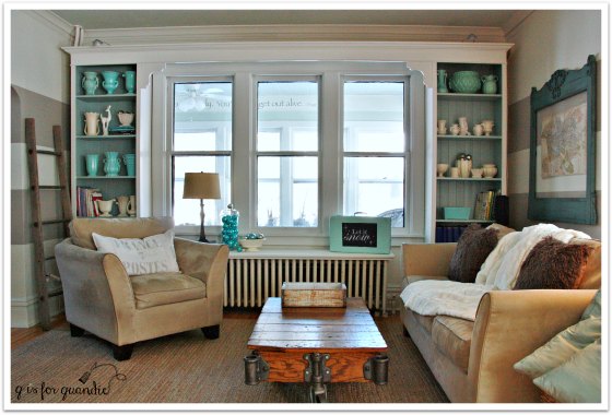
My house is not large. Just in case you hadn’t noticed. It’s also old, built in 1904. Back then, unless you were building a mansion like Glensheen, rooms were not that big. My house was originally a farmhouse, so definitely not a mansion. So, it’s no surprise that my living room is a modestly sized room. Not only that, but one wall has a large arched opening that leads to the piano room …
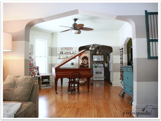
and another wall has a large arched opening that leads to the front hallway …
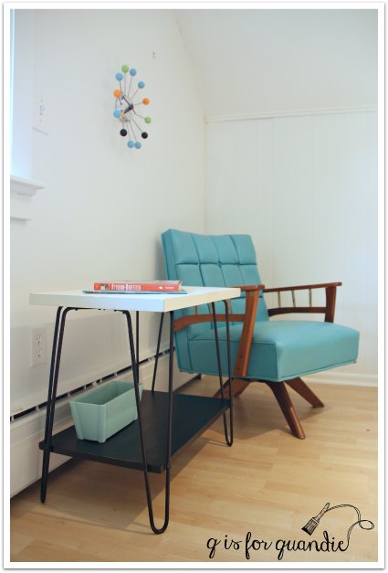
Leaving the wall with windows, built in book cases and radiator and a second wall with just one window (it’s behind the sofa, just out of range of this photo).
By the way, these are all old photos, I have’t actually decorated for Christmas already.
One the positive side, all of the these open archways make the space feel open and light, but on the downside, furniture placement is a challenge. Sometimes in summer I’ll move the sofa in front of the radiator, but putting a giant piece of furniture in front of your heat source isn’t the greatest plan for winters in Minnesota.
In the past, since it’s typically just Mr. Q and I hanging out in the living room, our sofa and chair combo has worked out great. I get the sofa and Mr. Q gets the chair for movie viewing. But now that my sister and niece have moved to town, we need more seating. We can all squeeze in on the sofa, but that’s a little too touchy-feely for us (and my sister always gets annoyed when I try to touch her with my feet, which of course means I do it frequently). However, I don’t have a lot of space for more seating. So I have been on the hunt for a smallish side chair that would be at least somewhat comfortable. I also didn’t want too spend much on it.
When I came across this barrel cane back chair on Craigslist, I wasn’t quite sure about it. The price was definitely right at $40 though. I also noticed that it would be a simple staple job to re-upholster it, always a bonus! But still, it did have that 70’s – 80’s vibe that I’m not too fond of.

Whenever I’m looking at a piece and can’t decide whether or not it can be helped with paint, I generally then head to pinterest to see if I can find some examples. Bingo!

This chair, by the way, is priced at $699 at Horchow.com (bwa ha ha ha).
Anyway, dang! It’s pretty cute, right? As it should be for $699! Especially with all that chippy-ness going on. All my chair needed was a chippy paint job and new fabric on the seat and it too could look this good, for a mere fraction of the price!
I started by removing the seat. It was just screwed on from the bottom like most dining room chairs, but in an interesting twist it had this row of piping at the front. It was held in place by staples …
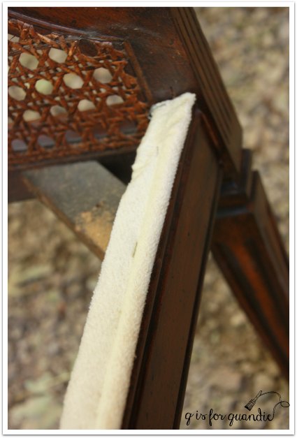
I ripped that off and kept it, not sure at that point if I was going to re-cover it and put it back on, or just go without.
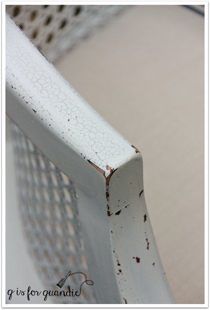
Next I sanded the chair lightly and cleaned it with TSP substitute. Then I used my spray paint trick on the cane back first, and then painted the rest of the chair using Miss Mustard Seed’s Linen. Since this chair was for me, I wanted plenty of chipping.
And I got it, along with some crackling too!
For the seat, I purchased some heavy linen upholstery fabric and painted on a blue grain sack stripe using my favorite skinny tape (some girls have skinny jeans, I have skinny tape).
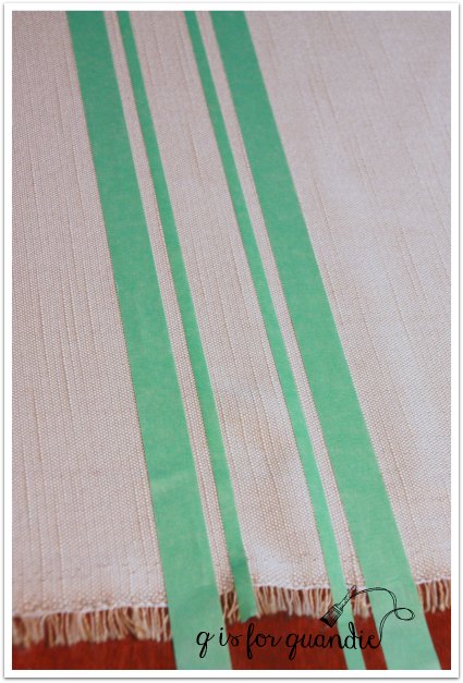
I used acrylic craft paint and a stencil brush to stipple the paint on.

I decided the chair didn’t really need that length of piping trim along the front, what do you think?

I do think it needs a small pillow to really be comfortable though, so I stole one from my patio chairs for now.

It was such a beautiful day last Saturday when I finished the chair that I couldn’t help taking advantage of it and staging these photos outside.

My “Boo” pumpkin is a fake, FYI.

I think it looks pretty good for a fake though.
But, back to the start of our story. I purchased and revamped this chair to provide additional seating in my living room. Here it is in place and just in time since I’m having my sister and niece over tomorrow night. We are going to have a barrel of fun watching scary movies and eating Halloween candy (since I always buy some, but seldom actually get any kids at the door).

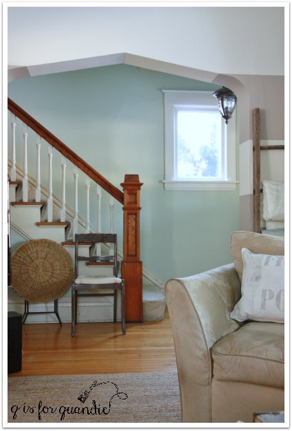
Here is a fun ‘aerial’ view of the living room (taken from the front hall stairs).
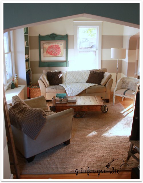
This chair has to sort of float in the room, the back is fully visible from the piano room.
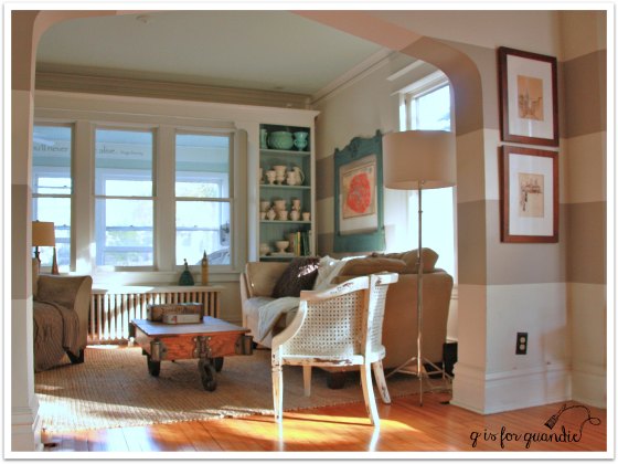
Luckily it looks good from all angles!
At least I think so, what do you think?
Sharing at: French Country Cottage and The Curator’s Collection


 From a practical point of view, I have to say that I really love the canning jars! It’s very easy to wipe the rim and put the lid back on. Somehow much easier than a traditional can like Annie Sloan uses, and definitely better than the plastic lidded can that Cece Caldwell uses.