It’s the darkest hour
Of the darkest night
It’s a million miles
From the morning light
Anybody else remember that song by Gary Moore, Midnight Blues? I’m probably dating myself again. Well, if you’re in the mood for some bluesy guitar riffs check it out on YouTube.
But if you’re in the mood for some bluesy furniture, stick with me.
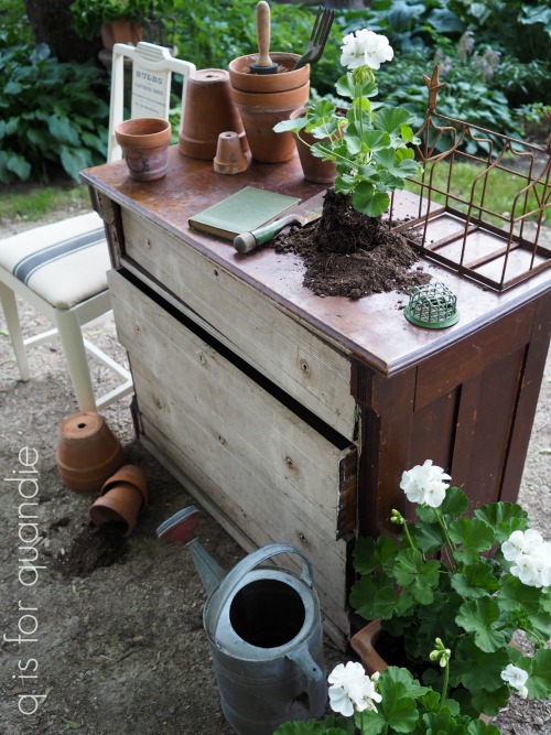
Let’s start at the beginning with a ‘before’ photo.
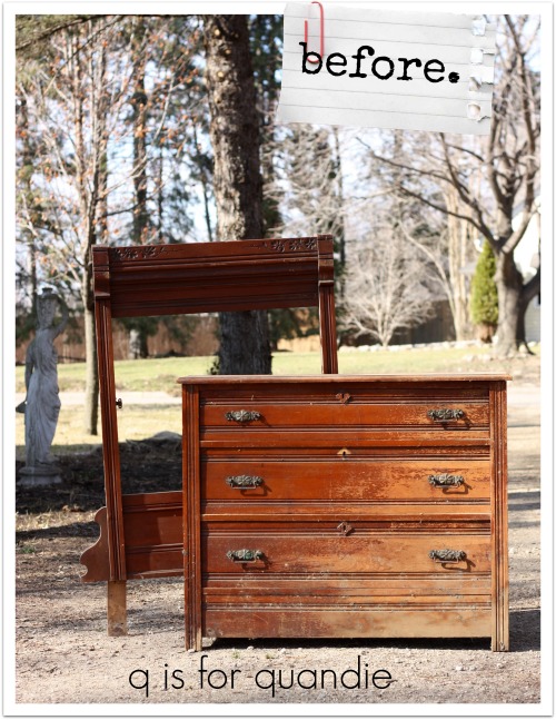
If you’re paying attention to details in the photo you might guess that I brought this dresser home last spring before there were any leaves on the trees. But actually I brought this dresser home in spring of 2017.
I initially wanted it for its mirror frame. I turned that into a chalkboard way back then, but I’ll be darned if I can find the blog post about it! I’ve done so many that they are all starting to blend together in my mind.
But anyway … that left the dresser. Which then sat in my carriage house for over a year. I hate storing furniture that long. It’s not good for the furniture. My carriage house is damp, stinky and full of critters like spiders and mice and possums, oh my!
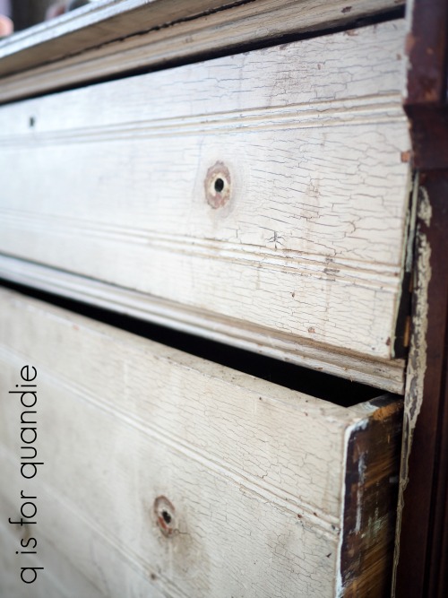
However, as you can see from the photo, this one was already in terrible shape so I suppose another 16 months or so in storage didn’t do too much additional damage. I finally pulled it out a few weeks ago to get started on it.
First my handyman Ken had to do some work. The top of the dresser had split its seam, so he took it off and repaired it with glue and dowel pins. Then reattached it to the dresser. Ken wasn’t entirely happy with the repair because he wanted the seam to be invisible.

I try to explain to him that I like the rustic look. As long as the piece is sturdily glued and isn’t going to fall apart, I’m happy with a non-perfect look.
Once the repair was done, I stripped the finish from the top, sanded it down and then waxed it with Miss Mustard Seed’s Antiquing Wax.

I painted the rest of the piece with Homestead House milk paint in Midnight Blue.

I’d say this color is certainly a million miles from the morning light. It’s the most gorgeous deep, rich, navy blue. The color of darkest night.
You might be wondering why I chose the milk paint version of the paint rather than the Fusion acrylic version of the paint, because both come in Midnight Blue (and if you didn’t already know this, Fusion Mineral Paint and Homestead House Milk Paint come from the same company, as does Miss Mustard Seed Milk Paint). However, I wanted a more aged looking finish on this dresser. Something that looked more authentically old to match the age of the dresser itself.
Plus, there was quite a lot of texture left on this piece from the previous finish. I could have sanded that down to bare wood, or stripped it, but I like the look of that texture. Especially with milk paint.

I also wanted to distress the piece and that is easier to do with milk paint. You can do it with Fusion, but it just doesn’t have quite the same look and it takes just a little bit more elbow grease (or pre-treatment with Homestead House Salad Bowl Finish, but that’s another subject altogether).
After two coats of the milk paint were dry, I sanded with 180 grit paper and then added a coat of Miss Mustard Seed’s Hemp Oil to give me the darkest version of the color. Hemp oil will give you a deeper, darker version of your milk paint color while wax will leave the color a little bit lighter.
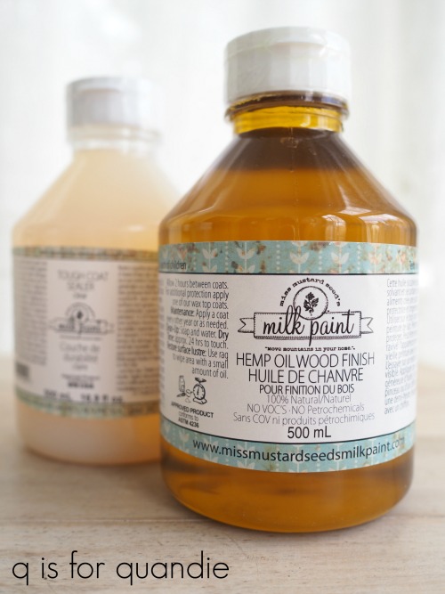
Also, keep in mind that most water based sealers like the Miss Mustard Seed Tough Coat or The Real Milk Paint Co’s Finishing Cream may look cloudy or streaky over dark colors and neither product is recommended for use over deep, dark colors like this one.
The final obstacle in the makeover of this dresser was the drawer pulls. Looking at the before picture you might be tempted to think that the originals were pretty fab and could be put back on. However, in reality they were pretty beat up; bent out of shape, rusty and crusty. Plus one was missing its bail. I wanted to replace them with some brass cup pulls but I had a heck of time finding just what I wanted at a reasonable price.
I found what I thought was a great option on Amazon until I realized they came in a five-pack. Ugh. A five-pack? What are they thinking? Who needs an odd number of pulls? Well, maybe for a kitchen I suppose. But I would have had to order two packs at around $25 each and then would have had 4 left over. I may have been able to use 4 pulls down the road, but who knows.
So instead I ended up with these pulls from Target. These came in a six-pack which was perfect. They were $27.99 plus tax. They also happened to fit the existing holes from the original hardware.

The drawer bottoms for this piece weren’t in really awful shape, but they did show some signs of their age. So I opted to line them with some fabric that I purchased at a garage sale a couple of years back.
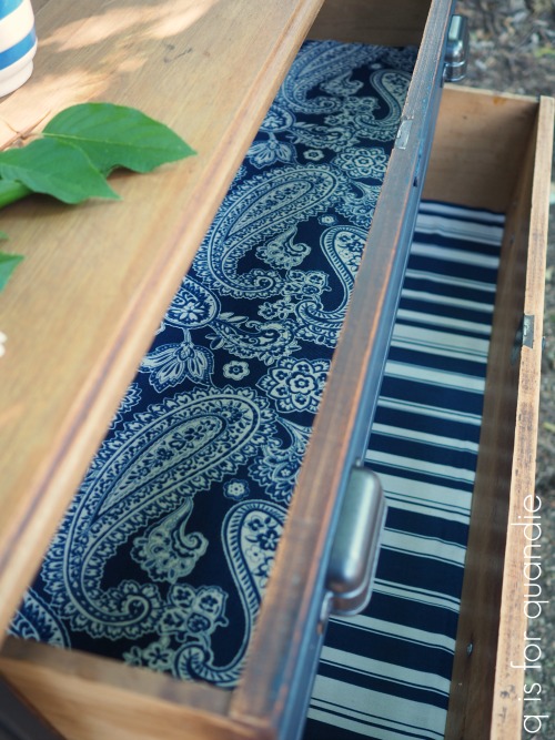
I didn’t have enough of either fabric for all three drawers, so the top drawer got the paisley and the bottom two got the coordinating stripe. To line drawers with fabric I simply cut the fabric to fit and then use some spray adhesive to hold it in place. If the future buyer wants to remove it down the road, it will be easy for them to pull it back out and clean off the adhesive residue. It comes out much more easily than contact paper or, heaven forbid, paper that was decoupaged into place.
I think it goes without saying that this piece was definitely improved.

The cup pulls give it an updated feel. It’s all spruced up and ready for a new home.
If you are local and need a Midnight Blue dresser check out my ‘available for local sale‘ page for more details!
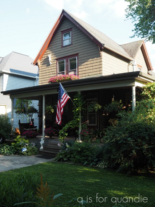
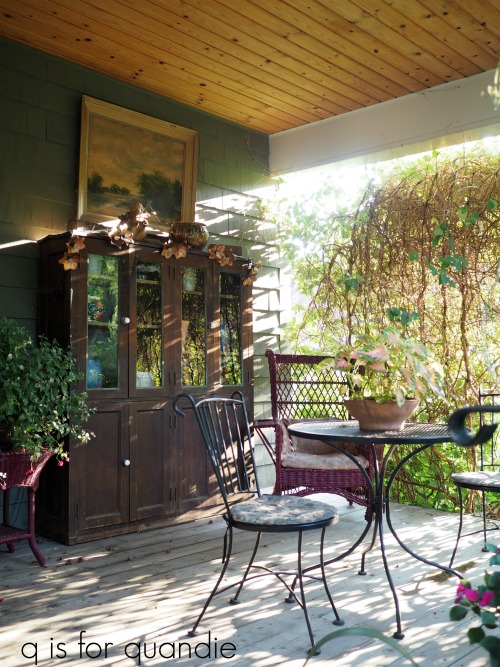
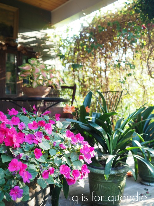
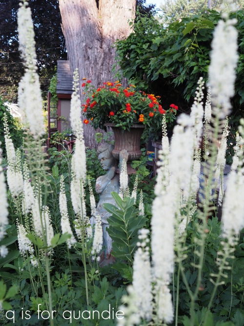
I’ll be sharing the rest of the tour of Jackie’s garden on Wednesday this week, so be sure to stay tuned.
Please note that Homestead House provided the milk paint used on this dresser, but all opinions are my own.