my bronze buddha.

First up, congrats to Sue Pagels.  I drew her name at random to win my giveaway from last week.  Not to worry if you didn’t win, I have another fab giveaway today!  Be sure to read all the way to the end of today’s post for the details.

You may have seen my buddha statue in previous posts about my garden.

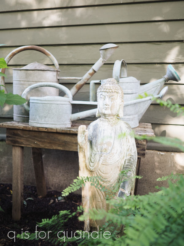
I’ve had him for years … possibly even decades.  I have absolutely no memory of when or where I purchased him.  He’s just been hanging around in the garden for a long time.

I’ve always left him outside year round, and over the last couple of years he’s been looking pretty rough.  The last two, or maybe even three, springs I’ve said to myself “I really should do something about that.”  But, I never got around to it.

Well, now that I’m retired from the day job, this is going to be the summer of getting around to it!  Starting with buddha.

So here’s how he looked this spring, prior to his makeover.

I believe he is made out of some sort of pinkish/orange concrete.  I had once thought he was terracotta, painted to look like concrete, but he’s far too heavy to be clay.  He must be concrete of some kind.  He’s heavy and solid.

Anyway, I lugged him out of the garden and brushed the dirt off a bit before I brought him inside.

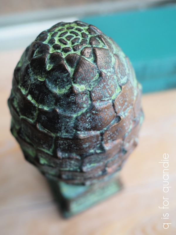
But before I got started on him, I decided it would be wise to practice my technique on a smaller item first.  So I pulled out this acorn finial.

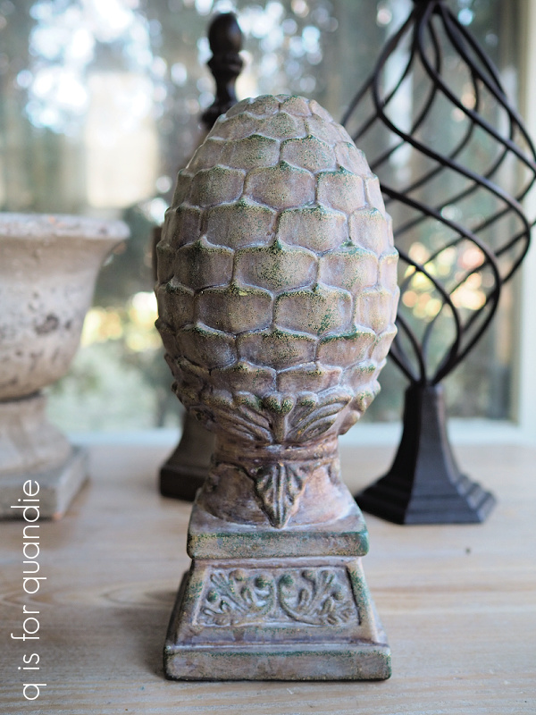
You may remember that I found this while thrifting a while back and I was going to leave it ‘as is’.  But I decided this piece would be a good guinea pig.

So I pulled out my Dixie Belle patina paints in Bronze and Iron, the Green spray and some of their gilding wax in Bronze.

I started out by painting the acorn in a coat of Bronze paint.  Once dry, I added a 2nd coat and while that coat was still wet I sprayed it with the Green patina spray.

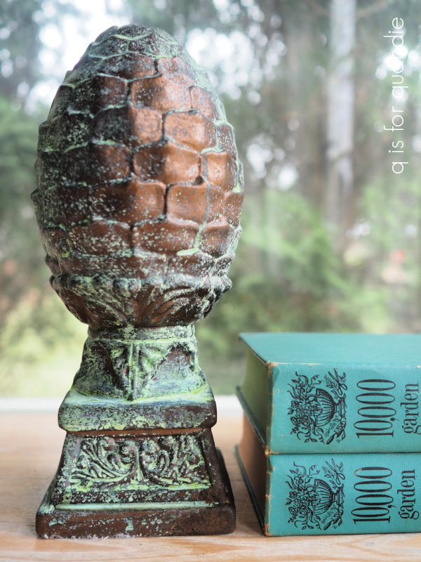
To add a little more authenticity to the look, I then dabbed some of the Iron paint just on the corner and sprayed it (while still wet) with the Green spray to add a little rust.

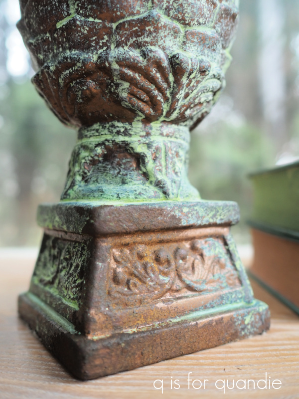
Lastly, I used my finger to rub some of the Bronze gilding wax on some of the high points on the piece to bring some of that bronze back out again.

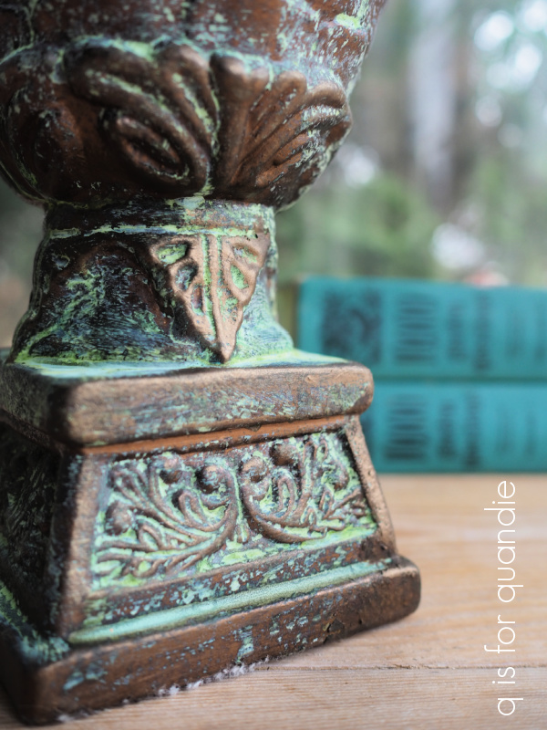
Yep, perfect.  This is the look I wanted for my buddha.  So I followed the same process; base coat of Bronze, allow to dry, 2nd stippled coat of Bronze, spray with Green spray while paint is still wet, allow to dry, stipple some Iron paint to add patches of rust, spray again with Green spray while wet, allow to dry.  Step back and evaluate the results.  Add some more rust spots.  Allow to dry and then bring out some highlights with the Bronze gilding wax.

I applied the gilding wax using my finger, just rubbing it on to add some highlights on his nose and brow for example.

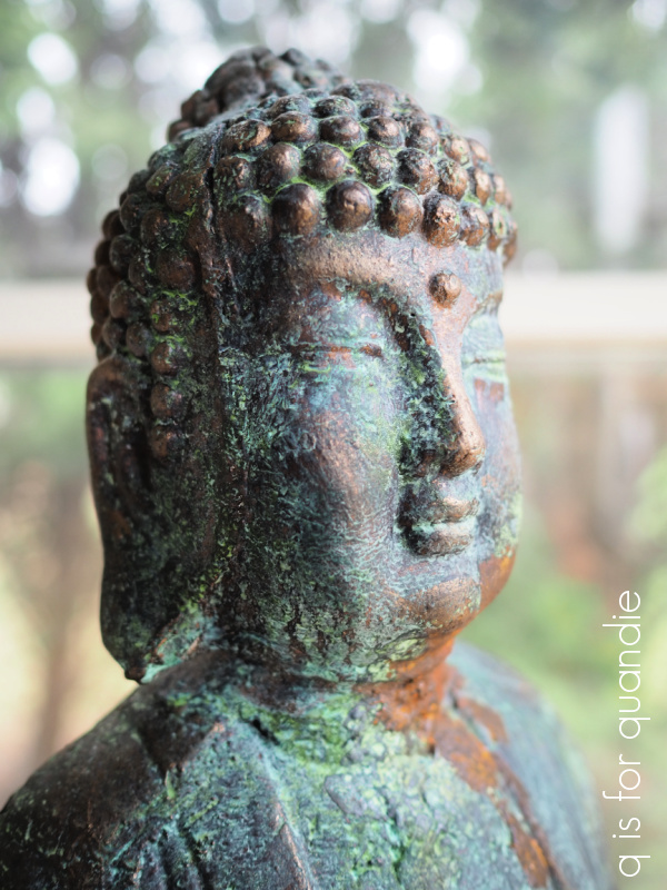
He turned out fabulous.

I put him back out in the garden a couple of weeks ago, and here’s how he’s looking now.

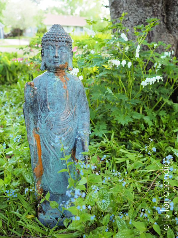
He’s looking pretty genuine, right?

Here are some q tips for you on using the Dixie Belle patina paints.

no. 1 – the verdigris patina develops a lot more quickly than the rust patina.  The rust patina can take days to fully develop in fact, so if you don’t see as much rust as you want right away just be patient.  If a couple of days go by and you still want more rust, you can always stipple on more Iron paint and spray again.

no. 2 – whether shaken or stirred, be sure to mix your paint thoroughly, and often, as you’re working with it.  There are actual metal flakes in the paint that create the patina and they tend to settle to the bottom of your jar of paint rather quickly.

no. 3 – if you have distinct brush strokes in your paint, the spray may settle in those lines making them more apparent.  For that reason, I recommend stippling the 2nd coat (or any subsequent coats) of paint.  Stippling is just pouncing the paint on with an up and down motion.

no. 4 – you don’t have to seal your patina projects.  However, if you’re adding patina to something that will come into contact with people’s clothing you may want to seal it (the patina will likely rub off on clothing).  In addition, the patina will continue to develop over time, so if you want to halt that process, you can seal it.  Dixie Belle does make a sealer for the patina paint called Patina Guard, but I find that it adds a bit of shine and I personally don’t like that look.  That’s just my personal preference though, you may be just fine with it.

no. 5 – if you’re working on a flat surface, you may find that the verdigris looks like droplets on your piece (because you sprayed it on in droplets).  I think this product gives a more authentic look on items with some texture and detail.  The spray settles in the crevices and looks amazing.

I definitely think my buddha benefitted from a little patina.

And now you can benefit too!

I’m going to draw the name of one lucky winner to receive all of the products I used to create my bronze buddha.  You’ll receive Patina Paint in Bronze and Iron, the Green Spray and some Bronze gilding wax.

The rules:  To be eligible to win, simply leave a comment on this blog post.  Maybe let me know what item you would turn into bronze!

Your comment must be left on this blog post, not on Facebook or Instagram.  You are not required to follow my blog, although it would be awesome if you did!

I will randomly draw the name of a winner for today’s prize from all of the comments left on this post by Sunday, May 29, 2022 at the stroke of midnight (U.S. Central time).

The fine print: no purchase necessary, you must be 18 years of age or older to win, void where prohibited by law, the number of eligible entries received determines the odds of winning, approximate retail value of prize is $69, if the prize is not claimed by Friday, June 3, 2022 another name will be drawn at random to win, blah, blah, blah.

Thank you to Dixie Belle Paint Co for providing the Patina Paint I’m giving away today.

a small craft advisory.

Back when we were on vacation in Charleston, we were watching the weather report one day and they mentioned that there was a ‘small craft advisory’ in effect.  I hadn’t heard that terminology in years, probably since I lived in Florida.  Although we have plenty of people with boats on lakes here in Minnesota, it’s not quite the same thing as ocean going vessels.

Anyway, when they said it, Mr. Q said ‘that sounds like it should be the title to one of your blog posts!’

What a clever idea.  I made a note of it in my phone.  And lo and behold, it seemed appropriate for today’s post.

I’m about to share a very quick and easy update to a metal bin today, so consider this your ‘small craft advisory’.

I’ve had this particular container in my pantry for years.  I’m sure that I originally purchased it from a garage sale, but I don’t remember when, where or how much I paid.  It started life in copper, and who knows what I kept in it back then.

This is the best I could do for a true ‘before’ photo.

Yikes!  Who remembers my pantry in its ‘before’ state?  I’ve shared it here in the past.  It was not pretty.  It was behind a closed door most of the time back then.

Here is how the pantry looks now (to see the full transformation of this space, check out this post).

As part of the pantry makeover, I decided to paint the container in that everyday kitchen green color.

Copper just didn’t work with my color scheme out there.  I painted it using a fancy spray paint that I got at Michaels, I’m fairly sure that it was the Liquitex Chromium Oxide Green 6, but I’m not 100% positive about that.  FYI, it has held up beautifully, even on a metal canister with a very tight fitting lid.

Well, recently Mr. Q and I purchased an air fryer from Amazon.  When it arrived, it was too big to fit inside any of our kitchen cupboards, or in the other pantry/closet we have next to the kitchen, so that left finding a spot for it in my pretty pantry.

I’ll just go ahead and admit it, I tend to value form over function.  I love the way my pantry looks.  It does serve a function as well though.  We store toilet paper, kleenex, cleaning supplies, cat food, extra coffee pods, and other pantry items in it.  For the most part these items are kept inside pretty containers.  Generally, if I can’t put it in a pretty container, it gets stored somewhere else.

So I’m not super happy about ruining the carefully curated look in my pantry with a big, black, shiny appliance.  But sometimes I guess function has to win out.  In order to make room for the air fryer, something had to go from the pantry.  And after a process of elimination, this container is the item getting the boot.

I decided I may as well snazz it up a bit and then try to sell it.  So I gave it a good cleaning, and then I added a section from I.O.D.’s Label Ephemera transfer to the front.

I added a couple of coats of Dixie Belle’s flat clear coat over the transfer to protect it.

Then I cut out a new label from some pretty floral scrapbook paper and added the “PARIS,” which is also from the Label Ephemera transfer.

What a difference a little transfer can make!

I love how it turned out, but since it seems likely that we’re keeping the air fryer, I don’t have a spot for this anymore.

So it’s up for grabs.  If you’re local, and in need of a pretty container to stash things in (please note, it is not food safe), check out my ‘available for local sale‘ page for details.

I’m curious, which do you tend to value more, function or form?  Do you want things to look pretty at the expense of functionality (like me!), or are you more practical?  Leave a comment and let us know!


mousse and quail.

A while back … actually, wait a minute, I have to insert here that it was THREE years ago, even though it feels like just last year or something.  How does time fly by so quickly?  I could have sworn this was more recent than that, but of course it was B.C.  Before Covid.  So it had to be 2019 or earlier.

Anyway, quite a while back, I found a pair of quail at the Mac-Grove neighborhood sales.

I thought they were sweet, but I didn’t love their dull, antiqued sort of finish.  So I gave the pair a paint job using RustOleum Mirror Effect spray paint in Gold.

I think that gave them an updated, more modern look.  You know I don’t love a lot of shine, but in this case I think adding some shine made a great improvement.

This pair sold fairly quickly at the shop, so it must have been a good thing.

So recently when I saw another quail at the thrift store I decided to pick it up and do the same.

Since it was still below freezing outside however, I couldn’t spray paint it.  I don’t have a properly ventilated warm space for spray painting indoors.  So I decided to try using the Dixie Belle Gemstone Mousse in Golden Gem on it instead.

I’ve only used this product to stencil so far …

so I wasn’t quite sure how it would work to paint an entire, albeit small, piece.  I really like how bright and shiny the mousse is though, so I decided to try it on the quail.  In the event of a fail, I could always hang onto the quail until the weather warms up and then give it a coat of spray paint.

The Gemstone Mousse is a water based formula with zero VOC’s, making it perfectly safe to use indoors in winter.  And since it’s water based, I figured I could easily spray paint over it if necessary (unlike with a gilding wax or other oil based products).

In addition to the Golden Gem, it comes in three other colors; Garnet, Amber and Diamond.

I did find that my mousse had separated a bit in the jar since the last time I used it, so I added just a couple of drops of water and gave it a good stir before using it.

You might be thinking that it comes in a teeny, tiny jar … and you wouldn’t be wrong.  I actually can’t even find the size (weight) of the jar anywhere, but it’s small.  However, a little goes a LONG way with this stuff.  I used hardly any to paint my quail.  I have a feeling this product will be similar to the metallic waxes, where it takes multitudes of projects to get through an entire container.

I used an artist brush to apply the mousse on my quail, but you can also just use your finger to apply this stuff.

And here he (she?) is.

I have to admit, I haven’t quite figured this product out yet.  It’s thicker than a metallic paint, but not as thick as a metallic wax.  You can rub it on with your finger, or apply it with a brush.  It’s water based, so you can reactivate the mousse with water.  It doesn’t require a top coat, although if it’s going to get wet I think I’d be tempted to add one.  That being said, a water based topcoat that is brushed on may reactivate the mousse causing it to lift off your surface.  Also, my quail felt tacky to the touch for a couple of days after being coated with the mousse.  I’m not sure if that’s because my application was too thick or what.  According to the instructions, the mousse should cure in 24 hours.  For that reason, you may want to use a spray sealer of some kind, even the Dixie Belle Easy Peasy spray wax would work.  But after a few days of dry time, my quail feels just fine.

I’d definitely use the Gemstone Mousse as an alternative to metallic spray paint again, at least in the winter.

How about you?  Have you used this product?  If so, let me know how you liked it by leaving a comment.

Thank you to Dixie Belle for providing the Gemstone Mousse used for today’s project.

the farmers market basket.

This little wooden basket was another find from my picker.

I love the way it’s constructed with all of those little slats nailed in place.

This was a quick and easy makeover.  I painted the basket in Dixie Belle’s Drop Cloth and sanded to distress.

Then I added a few transfers including this new one from Dixie Belle.

This is from their On the Farm transfer set.

They also offer a Farmhouse silkscreen stencil with a couple of these same designs.

I put this transfer on the other side of the basket.

And then I added a section from re.design with prima’s Everyday Farmhouse transfer down the slatted side.

I finished it up with a quick coat of clear wax.

This would make an adorable Easter basket, wouldn’t it?

I wish I could say those tulips are from my own garden, but it will still be a few weeks before my tulips are blooming.  But a bunch of tulips from the grocery store is a great way to brighten things up and add a little spring to my surroundings until they get here.

Thank you to Dixie Belle for providing the paint and the transfers for today’s project.

a cloche call.

I originally purchased this really cool clock at a garage sale over a decade ago.

It didn’t quite look like that when I bought it.  It had glass over the front, and of course it had hands and was a functioning clock.

I had it hanging in my living room.  But one dark, stormy night (OK, I don’t know that it was actually stormy) it fell off the wall startling both Mr. Q and me awake from a deep slumber.

I was bummed to find that the glass had broken and the metal clock hands were bent out of shape.  I’d still have been happy using the clock without the glass, but those hands never did work right again.  So I tucked it away out in the carriage house thinking that one day I would fix it.

Remember those library books I reviewed while visiting my mom in February?  Well, flea market chic had this photo in it …

It’s my clock!  And they called it a French Train Station clock, or some such equally fabulous name (sorry, I didn’t take specific note).  That sure made it seem like a more glamorous item.

Seeing it in the book inspired me to pull it back out of the carriage house once I’d returned home from my mom’s house last time.  I purchased one of those battery operated clock kits from my local hobby store and figured it would be super simple to just pop it in.  But the hands were too small, and too shiny, and just didn’t fit with the look of the clock.

I have to confess to you guys, I’m sure I could try and find a more suitable clock kit to repair it with.  And I could probably get the glass replaced fairly cheaply.  But I tend to get easily frustrated with these sorts of projects and just throw in the towel.  I had enjoyed the clock for a long time, I didn’t spend much on it in the first place, maybe it was time to just chuck it.

I had placed it on the table near the door to be carried out to the trash on my next trip outside.

But then my friend Patty stopped by.  She saw it there and mentioned how fabulous it was, and I told her my sad story and that I was at the point where I was going to just toss it.  And she said ‘why don’t you just use it like that, laying flat on a table as some sort of pedestal for something’.

Eureka!  What a brilliant idea!  Why didn’t I think of that?

And just a foot away on that same table was this …

the giant cloche that I purchased at one of my local garden centers just after Christmas.

I had it sitting on the wooden charger that I painted and added a clock transfer to, remember?

So I thought, hey, that cloche just might fit perfectly on top of the French clock.  So I whipped it off the charger and what do you know?  It did fit perfectly!

How cool is that?

I switched out the black books that I was using under the cloche for this warmer toned brown book.  I think it works better with the brown clock.

But otherwise, I kept the rest of the items that I used originally under the cloche.

To think that I nearly threw that clock in the trash, what a cloche call (pun compliments of Mr. Q)!

What do you think?  Pretty awesome, right?  Thank you Patti for giving me this fabulous idea!

we’re talking trash.

First up, thank you so much for all of the comments on Monday’s post.  I know Mr. Q appreciated all of the well wishes on his birthday, and I enjoyed reading all of your comments as well (although I wasn’t able to respond to all of them).  Remember, you have until Sunday to leave a comment on that post to be included in the drawing for the giveaway!

Today on q is for quandie we’re talking trash.  Well, my kind of trash anyway.  Vintage trash cans to be precise.

My picker Sue found a pair of old metal schoolhouse trash cans for me last summer.

That isn’t exactly a true ‘before’ shot.  I cleaned these up a bit last summer when I could hose them down out in the yard.  They were quite grungy.  I also gave the insides of the cans a quick spray paint.  I really thought I’d taken a ‘before’ photo before doing all of that, but I’ll be darned if I could find it.  After that clean up, I put them aside out in the carriage house to await their moment in the sun.

After being inspired by a vignette in one of the library books that I was studying while visiting my mom, I had an idea for the trash cans so I pulled them out of the carriage house and took that quick ‘before’ photo above.

Since I had two trash cans, I decided to give them each a different color scheme.  I painted one of them in a couple of coats of Dixie Belle Drop Cloth, and the other got two coats of their Caviar.

Once the paint was dry, I sanded them to distress.  I’ve learned the hard way to distress my painted pieces before adding a contrasting color to avoid dust from one color getting into the other.  This is especially important with red and white!

Next I taped off some swiss crosses.

I don’t get super precise with these.  I just sort of eyeball it, and measure a little to make sure they are even, and the lines are straight.

I painted a cross in Honky Tonk Red on the Drop Cloth can, and a Drop Cloth cross on the Caviar can.

Once the crosses were dry, I did sand them to distress them a bit, but I was very careful not to drag any of the dust into the neighboring color.

I’m quite happy with the results of both combinations.

But I bet you can guess which one is my favorite!

You know I love me some black and white.

You may have noticed that I left the rusty rims of the trash cans unpainted.

I felt like just that touch of rust and old paint around the edge lent some authenticity to the cans.  I sealed the insides of the cans and those rusty rims with a couple of coats of Dixie Belle’s clear coat.  However, the painted exteriors received a topcoat of clear wax instead.  There’s just something about a waxed finish that feels more authentic to me too.

I really debated keeping this black one for myself, but couldn’t find a spot for it.  So I took them both into Reclaiming Beautiful last week.

Which one is your favorite?  Black and white, or white and red?

Thank you to Dixie Belle Paint Co for providing the products used for this makeover.

elevating the ordinary.

My sister and I popped into one of our local garden centers (Gertens, for any of you locals wondering) a week or so after Christmas.  We just happened to be in the neighborhood, and thought maybe they’d have some Christmas stuff at a steep discount.

And sure enough, all of the Christmas stuff was 75% off.  I purchased some fun starburst lights that I’m going to use in the front window box next year, but I also found this large glass cloche in the Christmas section.  I have no clue why it was considered a Christmas item, do you guys have any guesses?

I know it’s hard to tell the size from that photo, but it’s about 16″ tall and a foot wide.  It was originally $79.99, but at 75% off I got it for around $20.

I couldn’t resist it.  You just gotta love a good cloche, right?

Once I got it home, I decided it needed a good base to go with it.  I happened to have some large wooden chargers that I received from re.design with prima back when I was a content creator for them.

The chargers come in three different sizes, 10″, 12″ and 14″   …

Back in early 2019, I had dressed these up with some paint and transfers.

I sent them in to the shop to sell, but only the top one went.  That, by the way, is the French Ceramics transfer that re.design with prima recently re-released because it was in such demand.  It is fab, isn’t it?

The bottom two eventually came back home with me and have been awaiting a do-over.  The largest one happened to be just the right size for this cloche.

So I sanded down the transfer a bit first.  Not enough to remove it completely, but just enough to smooth out any edges that would show through paint.  Then I painted over it with Dixie Belle’s Drop Cloth.  Once that was fully dry, I pulled out my IOD Brocante transfers.

I think you’ll probably agree that there was an obvious choice staring me in the face.  Yep, the clock.

The clock was literally the same exact diameter as my new cloche.

It was about at this point that I realized that putting anything on the charger, inside the cloche, was basically just going to cover up that cool clock.  Duh.

Well, no worries.  I gave it a shot and decided I like the look after all.

No, you can’t see all of the clock, but you can see that it’s there.

Somehow putting even the most ordinary items inside a cloche elevates them to something special.

For now I’ve got some books, a vintage camera and an old photo of my grandmother on display.

Do you have any cloches?  And if so, what’s under yours?

the apothicaire bag.

Sometimes I make bad choices.  Like the time I thought that the underwater motor scooter excursion in St. Thomas would be super cool (not a good choice for someone who is a bit claustrophobic).  Or the time I decided to go through a red light at 2 a.m. because there was absolutely no one else on the road (except for that police car that I didn’t see half a block over).

And now I can add this attempted makeover to the list.

I purchased this bag from a friend of mine who had a really cool shop in an old round barn.

I’ve had it for several years and it sits on an uppermost shelf in our living room.  For some inane reason, I recently decided that it might look really cool painted in Dixie Belle’s Drop Cloth instead.  So I dusted it off and gave it a couple of coats.

I quickly realized that this was totally misguided.

Another coat of paint, some sanding and a topcoat of wax would have improved this look somewhat, but even so, I could see it wasn’t going to work.  Mainly because I didn’t want to paint the metal trim and handle.

I love the original patina on those and didn’t want to lose it.  But they totally looked wrong with the warm white paint color.

So obviously, the best way to salvage the situation was to just go back to the black.  So I pulled out Dixie Belle’s Caviar and painted back over the Drop Cloth.

Ahhhhh.  So much better already.

Then I picked a stencil out of my stash that I thought was appropriate for a bag and added that to the front using the Drop Cloth.

If this feels really familiar to you, it’s because I used this stencil on a black bag before.

Anyway, after adding the stencil, I added a coat of clear wax to the bag.

Then I tied a tag made out of an old family photo to the handle, just for fun.

I purposely did not distress the paint job because I didn’t want the white paint underneath to show at all.

And now I’ve returned the bag to its rightful spot on the top shelf in the living room.

Live and learn, right?

Have you ever made any bad decisions that you almost immediately regretted?

stylish storage solutions.

Today I’m sharing another quick and easy thrift store upgrade.  Unfortunately, I forgot to take a real ‘before’ photo.  Instead I grabbed a quick photo after paint, but before the remainder of the makeover.

Does that count?  Probably not really.

Well, suffice to say, this metal storage drawer box thingie was originally just a dark colored metal throughout.  I left the drawers unpainted, so you’ll see that original color in a minute.

I painted the outside of the box in Dixie Belle’s Sawmill Gravy first.  But it turned out that I didn’t like it in that color.  I felt like it was too stark of a contrast with the dark drawers.  So I then painted it in Dixie Belle’s Putty.  As a result, when I sanded to distress, you can see some of that Sawmill Gravy peeking through.  But that’s OK, in my opinion it just adds another layer of interest.

Next up I added a couple of designs from IOD’s new Brocante transfer to the top.

This is another set of transfers that are perfect for using on smalls.  I have to give my honest appraisal though, this one is probably not one that I will purchase again.  It leans a little bit more towards the florals rather than the words, and it’s also a bit pricier at around $40.

And you know I love me some typography.

You know what?  Maybe that’s not fair.  It really does have a good mix of everything.  Typography, florals, farmhouse animals, birds, bugs, and the Eiffel Tower is really cool (can’t wait to find something to use that on).  You do get a lot of bang for your 40 bucks.

So you be the judge.  You may absolutely love this one!

I’m sure that I will ultimately use almost every one of those designs on something, and I’ll probably have to eat my words at some point.

But back to the drawers.

They are perfect for storing craft supplies like distress ink and some paper ephemera.  They would be great for someone’s scrapbooking area.

One of these days I really need to get back to finishing up my index card scrapbook project.

Maybe if I run out of stuff to paint next week I’ll find time to work on it.

What would you store in these drawers?  And what are your thoughts on the Brocante transfer?  Are you a fan of more than just typography?  Leave me a comment and let me know!

simply fabulous.

I was online recently and saw that IOD has released another version of their ‘Pots’ transfers.  This time it’s called Traditional Pots and you get 4 sheets of the transfer designs; two in black, one in white and one in blue!

I’ve been a fan of these ‘Pots’ transfers going way back. The first few sets I had came in a grey color and were called French Pots I, II, III and IV.  Each set only included 3 of the various designs, rather than all of them.  I used one of those on a galvanized watering can once and that wasn’t such a good choice.

The grey really disappeared on that galvanized metal.

However, that being said, it did work great on other surfaces if you like this more subtle look …

Then they switched to black with their Classic Pots, which worked much better on galvanized metal.

But now, they’ve added white and blue with Traditional Pots.  How exciting is that?  Or am I the only one to find that thrilling?

A quick q tip for today.  When ordering online, be sure you are ordering the set you want.  I see all three versions of these transfers still available out there, so pay attention to which one you are looking at.

To recap; French Pots = grey (and only 3 designs in each), Classic Pots = black, Traditional Pots = blue, white and black.

Anyway, I ordered a set of the Traditional Pots online and while waiting for them to arrive I stocked up on potential transfer candidates at the thrift store.

Once I started looking for white porcelain, I found a fair bit of it.

Then it was as simple as washing it all up and applying some transfers.  As always, use care when applying transfers to glass/ceramics/porcelain.  They are attracted like a magnet and once any part of the transfer touches the glass, it is stuck.  Make sure you have it aligned properly before you get to close to the surface.

Doesn’t that blue look amazing?  It totally takes that cannister from boring to simply fabulous.

This next one is my favorite …

I even added just a couple of lines of blue text to this little ironstone dish.

Such a tiny detail, yet it adds so much.

This little pitcher was one of my picker’s finds, and the blue edges it already had made it the perfect candidate for a blue transfer.

I have just one complaint about this new set of Traditional Pots transfers … that they aren’t ALL blue!

In addition to the one sheet of blue, there is one sheet of white transfers.  I have to admit, I’ve never been much of a fan of the white transfers.  I’ve always felt like they left too much of a shadow around the edges (like on this piece).  But these look pretty darn good.

You might see a few more black toolboxes with white transfers from me in the future.  This toolbox contains a bunch of my scrapbooking supplies (why can’t I part with them?  I rarely scrapbook anymore) so it’s not for sale.

And then of course, there are two sheets of the black versions included in the Traditional Pots.  Not that I don’t like the black ones, obviously I do since I’ve been using them for a while.

Remember that adorable button box!

That’s one of the older Classic Pots transfers, and you do get this same transfer in black with the Traditional Pots.

Since I had a feeling about the blue transfers that was very similar to how I assume hoarders must feel, I decided to use black ones on the pair of cannisters (thus hoarding the remaining blue transfers).

I painted the wooden lids black using Dixie Belle’s Midnight Sky to work with the black transfer.

I used a black transfer on the enamelware refrigerator box as well.

The question I’m always asked when I use transfers on glass, or on enamelware, is whether or not I put any sort of sealer over them, and I do not.  I find that the transfers really want to stick to these surfaces (sometime even more than you want them to!).  However, I would advise gentle handwashing only.  If you scrubbed on them, I’m sure they would scratch. But gentle washing with warm soapy water is fine.

So, what do you think?  Are you as big a fan of the blue transfers as I am?

I brought most of these items into the shop last week, so I’ll have to see whether they sell well or not.  I’ll be sure to keep you posted.