the pie safe.

I found this vintage metal pie safe at a garage sale earlier this summer.

I liked the chippy original paint job, but it needed to be cleaned up, and the inside was in pretty rough shape.  It was also missing the shelves.

I wanted this piece to be functional for storage, so I asked Ken to cut a piece of wood to use as a shelf.  Then I cleaned the interior and followed that up with a couple of coats of Dixie Belle’s Kudzu.

I love that pop of vibrant green, don’t you?

As for the outside, I decided to retain that original chippy finish.  I gave it a good clean, then I sanded it lightly to remove any flaking paint and then I sprayed it with some Rustoleum matte clear spray sealer to reduce further chipping.

Finally, I added some bits from I.O.D.’s Label Ephemera transfer to the door, and then gave that another coat of the spray sealer.

I’m happy that I was able to keep the authentic look of this piece, while also giving it a little more pizzazz (and functionality) with some paint and transfers.

I suppose if you bake a lot of pies, you could actually use this as a pie safe, but I think it would be perfect in a potting shed.

It would also be awesome hung on the wall in a bathroom and used to store toiletries and such.  If only we didn’t have the world’s smallest bathroom at our house!

It has some holes at the back of the top that would make it easy to hang.

No matter where you use it, I think it would make a fabulously unique storage solution.

This piece is for sale, so if you’re local be sure to check out my ‘available for local sale‘ page for more details.

stencils by ellen j goods.

Mr. Q and I can be opposites in some ways, but there is one thing that we share a common love for … office supplies.

I know, that’s kind of weird, right?  Or is it?  Maybe lots of you also have a secret passion for pencils, fresh tablets of paper and those old heavy tape dispensers.  Do you?

My love of office supplies goes all the way back to my childhood.  I can clearly remember visiting my grandpa Quist (dad’s side) and spending time in his home office.  He had one of those big old steel desks, sort of like this one …

And he had lots of cool drafting pencils, little boxes of pencil lead, and various other old office supplies in his drawers.  I remember that he had the coolest sharpener for his mechanical pencils, like this one …

I loved sharpening all of his pencils.  I would pretend that I was a clerk in an office somewhere, taking calls on his old rotary telephone.

Really, it’s no wonder that I ended up becoming an accountant, is it?

I wasn’t really thinking about those memories when working on today’s projects, but as I was staging my photos they were brought back to mind.

Which brings me to the projects at hand.

Recently Lynne from ellen j goods reached out to me to ask if I would like to try out her new line of stencils in designs that are based on old German grain sacks.  I don’t think I could say ‘yes’ fast enough.  Even without my recent resolution to say yes more, I would have said ‘yes!’

Just a few days later I received the stencils in the mail.  I love that she offers a variety of sizes, I especially like the smaller 8″ x 8″ versions.

I wanted to give them a try right away, so I pulled out a small wooden box that my friend Sue found for me.

It was super simple to paint up the box in Dixie Belle’s Midnight Sky, and then add a portion of one of the 8″ x 8″ stencils to the top and front of the box using Gravel Road.

I love the subtle look of the dark grey stenciled over black.

In fact, I liked it so much that I pulled out a 2nd box that I’d found while garage saling and gave it the same treatment using part of another of the 8″ x 8″ stencils.

I think these look totally legit, don’t you?  These pencil boxes would have looked right at home on my grandpa’s desk next to his funky mechanical pencil pointer.

I lined both of the boxes with some Paris map paper from October Afternoon (no longer in business).

The black and white paper worked perfectly with my color scheme.

As I was staging the pencil boxes for photos, I decided that a drop cloth would create a better background than the white waxed wood of my table top.  And of course, I couldn’t just leave it completely plain.

So I stenciled it with the Koch Lions 1871 stencil from ellen j goods.

Isn’t that gorgeous?  It would be perfect for pillow covers, or on the seat of a chair.  Hmmmm … that has me thinking about a chair I’ve been meaning to get to, I may have to try that.

But in the meantime, those 8″ x 8″ stencils are perfect for use on smaller projects and I know I’m going to get lots of mileage out of them.

Be sure to check out the stencils at ellen j goods, and if you’ve got some time you could also check out Lynne’s YouTube video featuring the stencils here.

So tell me, do you share our fondness for office supplies?  Or are we the only ones?

saying yes.

I am a little startled to realize that I don’t actually have a ‘real’ blog post for today.  Apparently I have been slacking off.

Well, not exactly.  I had hoped to share a dresser that I’m working on with you today.  But then after I added the last coat of clear sealer and waited for it to dry, I realized that the sealer was drawing the tannins (or maybe it’s the red stain, I’m not sure) through my paint.  Sometimes this can happen (more on that in this post).  Your paint job looks great before you add a topcoat, no bleed through, but shortly after applying a water based sealer, bang!  bleed thru!  Ugh!  So frustrating.  Even after 25+ years of furniture painting experience, I still don’t always judge the bleeder situation correctly every time.

So it will be back to the drawing board on that piece.

I’m also working on two pairs of planters that are getting the rusty treatment from Dixie Belle’s Patina Paint.  But I ran out of paint and had to order more.  I’m waiting for that to arrive.

And then there is the set of wrought iron garden furniture I’ve been working on.  A couple of the pieces are done, but one isn’t finished yet.

So after all of that, I’ve managed to leave you guys high and dry for a post today.  On top of that, I’m heading back out to see my mom tomorrow.  She fell recently and broke her ankle, so she is in need of some help.  Both my sister and I are going, and neither of us is looking forward to the forecasted 112 degrees we’re going to find there.  Yikes!

But I also don’t have any blog posts lined up in advance for next week, so that means the blog will be silent all week.

Here’s the thing though, since retiring I’ve decided to say ‘yes’ to more things.  When my neighbor wants me to help her put a new liner in her pool, I say yes.  When Ken’s wife needs help getting her garden planted, I say yes, I can help.  When my mother-in-law invites us out to see her field of daisies in bloom, I say yes to that too (that’s what I’m up to today).

And when my sister and niece ask if I want to head to a state park and hike to the waterfall, I definitely say yes.  Even though it might will rain.

We headed to Nerstrand Big Woods State Park last Sunday.  According to our guide book this park is known for it’s spring wildflowers, and we did see a lot of pretty woodland flowers.

It may have been cold and rainy, but that meant that everything was green and lush.  The pitter patter of drizzle on the leafy canopy of the woods was really peaceful as well.

The weather also meant that there weren’t a lot of hikers out that day, so when we arrived at the falls we had them all to ourselves.

That was fun for picture taking.

That’s my niece and her dog, Jade.

On our way back home we decided to stop at another waterfall, Vermillion Falls in Hastings, MN.

Viewing this one didn’t require much in the way of hiking, it’s in a bit more of an urban setting.  It was still fun to see though.

We wandered around the area and I was surprised to discover that they have a love lock bridge near the falls.  Who knew?!

I’ve written about this phenomenon before.  Mr. Q and I locked up our love in Prague way back in 2011 and so far it’s still working.

I feel like Tim & Stacy might be taking things a bit too seriously though …

They’ve doubled up their locks, just in case … and added a bit of a morbid P.S.

I wonder if they are still together?

Ultimately, I figure you guys will forgive me for deciding to prioritize spending time with friends and family over blogging.  Right?

I should be back to posting on June 20th, so be sure to stay tuned!

for the record.

My friend/picker Sue found this little case for me.

At first I thought it was a makeup case, but then I realized it was probably used to hold 45’s.  Oh boy, that might really be aging me.  How many of you now thinking “45’s?  What is she talking about?”

But I bet more than a few of you will know exactly what I’m talking about, records of course.

That clear handle screams record carrying case to me, sort of like this one …

Although the shape doesn’t seem quite right.

I never actually had a case like that for my 45’s, mine looked like this …

It was so groovy.  Who else remembers these?  You turn that handle at the top and the blue pieces lifts off to reveal all of your 45’s.  I borrowed that photo from Etsy, so if you’re looking for one of these cases, they are out there!

Anyway, I don’t think anyone is going to use this case for their records now.  Especially now that I’ve given it a new look.

Let’s start with the inside though.  Unfortunately I neglected to get a ‘before’ photo of the inside, but it was a little beat up and tired looking.

I painted the inside black using Dixie Belle’s Silk Paint in Anchor.  Then I lined the lid and the bottom with some old scrapbook paper that I had on hand.

You might be surprised to learn that I decided not to paint the outside.  I rather liked that butterscotch sort of color and the original patina on the case.

So rather than paint it, I just gave it a good cleaning with soap and water and then added some I.O.D. transfers to it.

The florals are from their Floral Anthology transfer, and the wording is from their Label Ephemera transfer.

Oh, and the cute little crown is from their French Pots transfer.  I stole it from the goose …

I applied some clear wax over the case to give it a little protection, and then that was it.

I’m not sure what it is about that Lucite handle, but I just love it.

And I guess I’m not entirely sure that is Lucite either.  But it has a bit more heft than your typical cheap plastic handle, and it’s crystal clear which usually means Lucite.

But, for the record, I’m not sure if this is a record case and I’m not sure if that is a Lucite handle, but I am sure that it’s pretty cute now.

What do you think?

This little case is for sale, so be sure to check my ‘available for local sale‘ page for more details (sorry, I don’t offer shipping).

the farmers market basket.

This little wooden basket was another find from my picker.

I love the way it’s constructed with all of those little slats nailed in place.

This was a quick and easy makeover.  I painted the basket in Dixie Belle’s Drop Cloth and sanded to distress.

Then I added a few transfers including this new one from Dixie Belle.

This is from their On the Farm transfer set.

They also offer a Farmhouse silkscreen stencil with a couple of these same designs.

I put this transfer on the other side of the basket.

And then I added a section from re.design with prima’s Everyday Farmhouse transfer down the slatted side.

I finished it up with a quick coat of clear wax.

This would make an adorable Easter basket, wouldn’t it?

I wish I could say those tulips are from my own garden, but it will still be a few weeks before my tulips are blooming.  But a bunch of tulips from the grocery store is a great way to brighten things up and add a little spring to my surroundings until they get here.

Thank you to Dixie Belle for providing the paint and the transfers for today’s project.

stillwater library book review.

After finding so many great decorating books at my mom’s local library, and after listening to advice from many of you, I decided to get a myself a new library card.  I’d had one about 25 years ago, and in fact there used to be a good-sized library just down the street from us.  We could walk there, and often did.  That was back in the day when there was no such thing as a Kindle.  But eventually that library closed, I started reading ebooks rather than paper books, and then things like pinterest and decorating blogs became a thing, and really, who needed a library card?

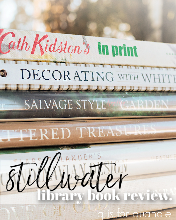
Now that I have a little more time on my hands, I’ve decided to check out the various libraries in my area and see what they have in stock for decorating books.  So a few weeks back Mr. Q and I popped into the Stillwater Library and got signed up with library cards, and I brought home this stack of books …

One big difference that I noted at the Stillwater Library v. my mom’s library in Henderson, Nevada is that my mom’s library had some newer books.  The publication dates on those books ranged from 2007 to 2021.  The most recent of the books I found here was 2013.

Full disclosure, I didn’t do any sort of deep dive into what books could potentially be available to me, I just went through those that were currently on the shelves.

So let’s start at the top of the stack with Cath Kidston’s in print (2005).  I grabbed this one because I’ve always enjoyed Cath Kidston’s style.  It’s very floral and colorful, and I love her use of vintage fabrics.

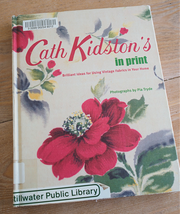
This particular book has lots of ideas for ways to those fabrics in your home.  If you enjoy sewing, this might be a great book for you to check out.

If you’ve followed me for long, you know that I don’t sew.  However, I do iron.

I thought this idea was positively brilliant.  I’d never really seen an ‘ironing table’ before.  I have a couple of fabulous old farmhouse type tables hanging about, I could easily make an ironing table.

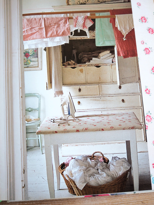
I don’t have a fabulous laundry room to put it in though.  But I can sure see the appeal of ironing vintage linens on a big table like this rather than a narrow ironing board.

What do you think of that idea?  Would you use an ironing table?

The next book in the stack is another Country Living book, Decorating with White, and it’s the most recent of the books I checked out.

I mentioned last time that I tend to really like Country Living books and this one is no exception.  Although it was published in 2013, decorating with white seems to be fairly timeless.

Isn’t this pair of twin beds fabulous?

And apparently decorating with green is a classic also.  I was paging through the March 2022 issue of Country Living and came across a photo that was recycled from this book.

It was just a coincidence that I had just seen it in the book.  Talk about a timeless look.

By the way, although the book is called Decorating with White, there is a big chapter on pairing blue with white, and another section on using other colors as well.  Such as green.

This was the only one of the books that I checked out that I would consider buying just to go back and admire the photos now and then.

The next book I looked at was Salvage Style for the Garden by Marcianne Miller with Dana Irwin (2003).

I thought this one would really appeal to me since it combines two of my favorite things, gardens and upcycling.  It features various projects using reclaimed items.

I like the bench made out of a door and spindles, but not sure about the feasibility of finding 18 spindles at a reasonable cost.

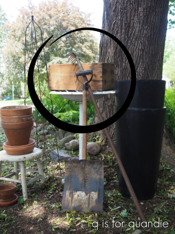
I did get one takeaway idea from this book, and that is using andirons to support a flower box …

I just happen to have a spare pair of andirons lying around.  I picked them up at last year’s Trash to Treasure day.  See them there in the center front?

So now I’ve got some ideas swirling around in my head on how to use these in the garden this year.

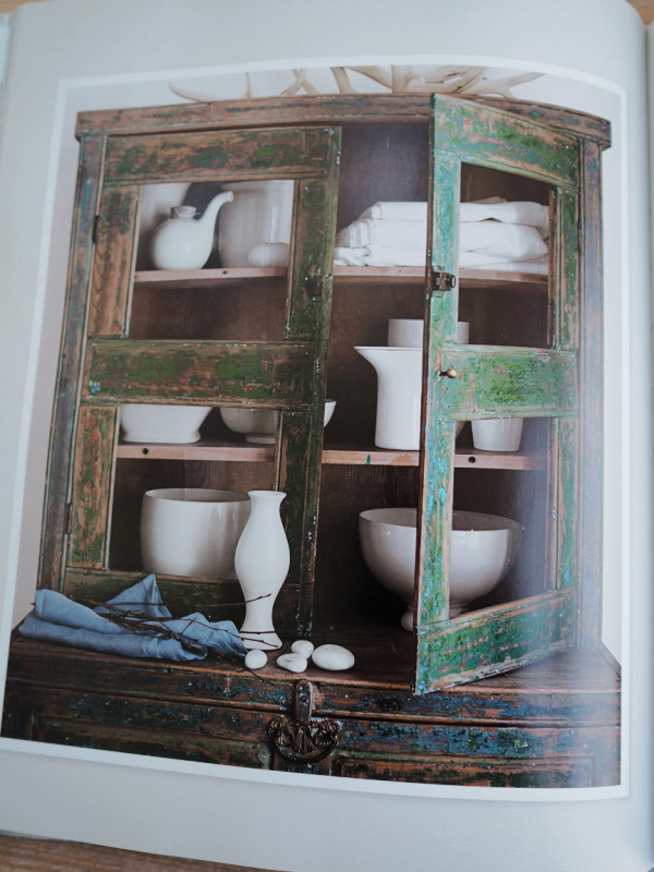
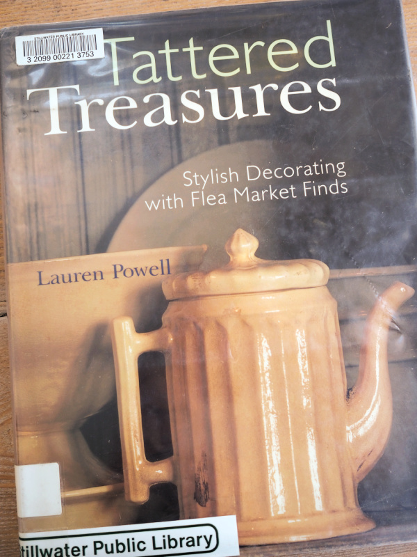
Tattered Treasures by Lauren Powell (2001) definitely contains some vintage eye candy.

Even though it was the oldest book in the stack, it was filled with timeless classics like vintage cameras …

and crackled ironstone and pottery …

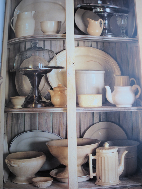
Most of the projects in this book felt a bit dated to me though, but what can you expect from a book that is 21 years old?

I definitely went through a china shard mosaic period myself.

Lars Bolander’s Scandinavian Design by Heather Smith MacIsaac was published in 2010.

This book is a bit different than the others since it isn’t focused on vintage items, but rather on Scandinavian design in general.  Painted furniture is very much a part of this style, and although I imagine it wasn’t originally distressed, much of it has worn over time.

I would say that my own style is strongly influenced by Scandinavian design.

I love the sparseness, and of course I also love the look of the painted pieces.

Although most of the colors used are pale, you’ll also see a lot of this blue.

After a trip to Norway in 2017, I was inspired by this color and painted a little stool in Miss Mustard Seed’s Flow Blue to try and recreate the look.

I ran out of time to really study this book because it was due back at the library, but I may check it out again sometime.

Last up is For the Love of Old by Mary Randolph Carter, published in 2006.

As I just mentioned above that I love the sparseness of Scandinavian style, if you’re familiar at all with Mary Randolph Carter’s style, you may already realize that I don’t love it.

Although I like some of the individual pieces she uses, like that shabby painted office chair, the clutter in most of her photos makes my eye twitch a little.

All I can think when looking at these rooms is how much dust there must be, and as someone who is allergic to dust I feel a sneeze coming on just looking at the photos.

So, her style is not for me.  But hey, variety is the spice of life.  Even though I may not like it, some of you may love it.

Which of these books would be your favorite?  Be sure to share your own opinions with a comment.

mom’s canisters.

Hey everybody, I’ve gone to visit my mom in Vegas again this week.  But no worries, once again I’ve pre-scheduled a couple of posts to keep you entertained while I’m gone.  This time around my sister is joining us, and we’re going to take a little road trip to Sedona.  If anyone has any tips on what to see and do in Sedona, be sure to leave a comment today!

Meanwhile, it feels apropos to share this post about my mom’s canisters with you guys while I’m away visiting her.

If you’ve followed me for years, you’ll know that my sister and niece moved here to Minnesota from New Jersey nearly 7 years ago now (gosh time flies!).

When they initially moved here, my sister stored some unpacked boxes upstairs in my carriage house.  Once she bought her house a few years later she moved almost everything over to her place.  She just left behind a couple of things that she no longer wanted.  One of those things was my mom’s old canister set.

I have photographic evidence of this set when it was new.

That’s my mom, and she is pregnant with my sister in that photo, making it 1961.  That is my parent’s first apartment in Chicago, and there are the canisters.

My mom says they were either a bridal shower gift, or a wedding gift.  Seems like a canister set would be a more typical shower gift back in the early 60’s (it’s not fancy enough to be a wedding gift, those were more likely china, silver or crystal).

My mom used these canisters for 20+ years.  Until after my sister got married.  At some point my sister mentioned to her how much she liked them and my mom gave them to her (she has always been, and still is, my mom’s favorite!).  Then my sister used them for another couple of decades until they ended up in a box in my carriage house.  And she doesn’t want them back (and yet, she’s still the favorite, go figure!).

I am a little stunned by how well the canisters have held up after 60 years!

I gave them a good clean, and they look amazing.

A couple of little dents here and there, and one lid is missing its knob.

  But otherwise they are in really great condition.

It is a little obvious that neither my mom nor my sister drink coffee or tea,

those two canisters are in the most pristine condition.

It’s also obvious which one got the most wear at our house …

Duh.

I am a self-professed cookieholic.  Give me a fresh baked cookie and I simply can’t say no.  I’m sure my grubby little hands were into that one on a regular basis (given the state of my dress in the photo below one has to assume that my hands were pretty grubby!).

And hey, can I just note that I was rockin’ the beachy wave before it was even a thing.  These days I have to work really hard to get my hair to look that good.

I have to admit, it cracks me up a bit that these were called ‘BeautyWare’.

As though they were some sort of cosmetic product, or pretty clothing, rather than a functional kitchen item.  Seems like a blatant attempt to glamorize the drudgery of housework to me.

I wish mid-mod was my thing.  But it just isn’t.  I can appreciate the aesthetic, but it doesn’t work with the rest of my décor.

I know what Marie Kondo would say, that I should thank these canisters for the service they have done over the years and then let them go.  And I have to agree.

I would much rather see them go to someone who is going to appreciate them and give them another 20 years of use.  I did a little googling and found a never used, still in the original box, set of 4 of these canisters (it doesn’t include the cookie one) for $299.95 on Etsy.  Wowza!  I also found a set in similar condition to this one (also without the cookie one) for $129.99, also on Etsy.

So I’m going to price this set at $49, and include the cookie one, and hope that some mid-mod lover out there will want to purchase them and continue to use them.

How about it, are any of you locals in need of a mid-mod canister set?  If so, be sure to leave me a comment.


one last paint inlay experiment.

I wanted to share one last IOD paint inlay experiment with you today.

According to IOD, the paint inlays can be re-used up to three times.  So I thought I’d try using a sheet more than once to see how it goes.

I started with this trio of books that I had lying around.

I painted the middle book (Robinson Crusoe) in Dixie Belle’s Kudzu and stenciled the spine.

I thought it would be nice to have a coordinating color to go with my pair of floral books.

Next, I painted the smallest book on the top of the stack in Dixie Belle’s Drop Cloth.  I let the first coat dry, and then added a second coat and while it was still wet I applied the IOD Rose Chintz paint inlay.

As a reminder, you can find a how-to on using the paint inlays here:

It was fairly easy to apply the inlay to a book cover …

As you can see, the texture of the cover causes the inlay to not transfer perfectly.  But I think that is part of the charm of an inlay and it gives the book an authentically distressed look.

Finally, I painted the third book in DB’s Drop Cloth as well, and then I pulled out my used inlays.

For comparison purposes the inlays above are (from left to right) unused, used once over Kudzu, used once over Sea Glass.  As you can see, the inlay will pull some of the paint you are working with back off with it when you peel away the paper.

I decided to use the inlay that had been used once over Sea Glass for my 2nd book.

And here you can see the result.

That book on the bottom of the stack is the one done with a 2nd pass of the inlay.  The design is quite a bit more faint.  I rather like it, it’s as though it has faded over time like chintz fabric would.  In fact, I think I like the look of the used inlay even better than the fresh first time inlay.  I thought I would see more of that Sea Glass color transferring back off the inlay.  Had I used the Kudzu sheet, I think you’d see some of that green coming back off onto your project though.

I’ve had fun playing around with the paint inlays.  I think they will be great to use on various small projects like my watering can, flower crates, and now these painted books.

I also think they’d be awesome for collage style art projects.  Also, one packet of the paint inlays will go a long way on smaller projects.  I’m not so sure that I would choose to use them on furniture though, especially furniture that one intends to sell.  The cost is a bit prohibitive (and spoiler alert, as you’ll see in this coming Friday’s post, you may need more than one packet of paint inlays to cover a piece of furniture) and I’m not sure they add enough value to allow you to recoup that cost by charging more for the furniture piece.  Be sure to stay tuned for Friday’s post where I’ll explore this subject a bit more!

painted watering cans.

Continuing my experiments with the IOD Rose Chintz paint inlay, I pulled out this watering can to see how hard it was to apply the inlay to a non-flat surface.

Normally I don’t paint galvanized cans like this one, but I had attempted to add an IOD French Pots transfer to it a couple of years back and as you can see, that didn’t really work out very well.

The French Pots transfers from IOD were the first generation of this design, and they were a charcoal grey color.  The color wasn’t really dark enough to show up well on galvanized metal.  Although I can see where that faded appearance might appeal to some.

Just for reference, the newer black Classic Pots and Traditional Pots transfer show up much better on galvanized metal.

But for this watering can, I felt like my best option for ‘fixing’ it was to paint it.  The only way to get that transfer off would have been to sand it off, which would have compromised the patina in that spot.  It never would have looked right.

So I painted it with a coat of Dixie Belle’s Sea Glass.  Then I applied the Rose Chintz paint inlay (for details on how to apply a paint inlay click on the image below to see my how-to post).

It really wasn’t difficult at all to work with the inlay on the curved surface.

Rather than use a brayer to press the inlay into the wet paint, I just used a wet cloth to smooth it into place.  I was worried I would have problems with the design getting smudged, but even over the curved surface it was easy to get crisp results.

One sheet of the paint inlay was not quite enough to go all the way around one side of the can.  I wanted to be sure and share this with you because there is a very definite line where the inlay ended.

I wasn’t expecting the line to be quite so obvious, so just be aware of that.

Since a) I’m a total cheapskate, and b) I was doing this watering can just for myself and therefore knew that this wouldn’t be noticeable where I was putting it, I decided to just try to soften that line rather than use another sheet of the inlay to piece in that space.

Before you seal the inlays (with a spray sealer), the paint (because they are indeed just paint) can be manipulated when wet.  So you can use a small artist’s brush and some water to reactivate the paint and move it around a bit.

Hmmm.  I may need a bit more practice at that.  I think I succeeded at softening up that edge a bit, but clearly I need to work on my fine painting skills.

Regardless, I’m quite happy with how this project turned out.

This watering can is joining a few other painted versions that live above the shelves in my pantry.

The 2nd one in line is one that was already painted white when I found it, but I added the IOD Petit Rosier transfer to it.

The 3rd can in the lineup was also already green when I purchased it.

So far I’ve left it alone, but you never know, I may add something to it one day.

And the last one in line is one I painted in Homestead House milk paint in a color called Maritime Blue.

I just fell in love with that pretty shade of blue.

I’ve done one more quick project to show how the paint inlay looks when re-using a previously used sheet and I’ll be sharing that on Wednesday.  Otherwise, I still have quite a few sheets left and I’ll be on the lookout for more fun ways to use them!  Have you tried them yet?  If so, be sure to leave a comment and let us know if you liked them or not.

flower crates.

My picker found these wooden crates for me last summer … at least I think it was last summer.  Time tends to blend together for me these days.

Either way, last summer was when I added some stencils to the sides thinking that I would sell them that way.

But ultimately I decided that I didn’t like the dark stains on the wood, and I also didn’t think the stenciling in black worked well with the dark wood.  So I never did try to sell them, I just tucked them away and figured I’d give them a do-over sometime.

Well, that sometime is now!

I painted the first crate in Dixie Belle’s Caviar.

I just added one quick coat of paint and didn’t worry too much about completely full coverage.  I knew I wanted to sand the paint way back in the end to make the crate look super worn.

I re-stenciled the ends in the same ‘flowers’ stencil that I used on one of the crates last summer.  This is part of a larger stencil that I purchased on Etsy from The Stencil Market.

I used my normal process for adding a shadow to stenciled letters.  I stenciled the design first in Dixie Belle’s Putty, then moved the stencil slightly up and over and stenciled again in DB’s Drop Cloth.

It’s a small detail, but I think it adds so much depth.  I also filled in the bridges on this stencil using a small artist’s brush.

Once I’d sanded heavily, I added a coat of clear wax.  I happened to have this cool zinc liner that fit this crate almost perfectly so I’m going to pair them together.

Lastly I filled it up with some of my matte white pottery just for the photos.

For the 2nd crate, I went in a different direction color-wise.  I painted it in Dixie Belle’s Kudzu.  I really wanted to try that IOD paint inlay over the green.

I had a feeling those pinks would really pop over the green.

If you want a step by step on how to use the IOD paint inlays, check out my how-to post by clicking on the image below:

I’m doing a bit of experimenting with the inlays, and you’ll be seeing the results of that in the next week or two.  But in the meantime, after adding the paint inlay to the two ends, I stenciled the sides of the Kudzu crate with the same ‘flowers’ stencil.  This time I did not add a shadow.

The need to get photos of these crates was a really good excuse to go to my local nursery and pick up some flowering plants.  They didn’t have much to choose from, but I got a few pretty cyclamens.

And I always get sucked in by those Baby Tears plants, and I can never keep them alive.  I think it has something to do with forgetting to water them on a regular basis.  They look great while they last though.

As per usual, my decorating split personality loves both versions of the crate.  The simple, worn black version and the colorful floral green version both really appeal to me.

As for the 3rd crate, I had something different in mind.  I wanted to provide a container for that mid-mod china that I found while thrifting last week.  I’m going to try to sell it at the shop, so I thought it would be fun to package it somehow.

First, I asked my handyman Ken to re-size that crate to fit the dishes.  He cut it down and reattached everything to create a perfectly sized container.

I painted it in Dixie Belle’s Silk paint in Tide Pool, taking that color cue straight from the dishes.  Then I added the ‘Bon Appetit’ from re.design with prima’s Delicious Menu transfer.

Mr. Q was not a fan of the way I wrapped the wording around the two sides of the crate, but I rather like it.  What do you think?

I brought both flower crates (not including contents) and the crate of mid-mod china in to Reclaiming Beautiful in Stillwater on Wednesday evening, so if any of you locals need a fabulous flower crate be sure to stop by the shop this weekend (note: closed on Sunday).

Which crate is your favorite?  Or do you have a split personality when it comes to decorating like I do?  Leave me a comment and let me know.