the unrealistic nature of blogging.

One of my favorite paintings by Vermeer is called The Astronomer.  He painted it in 1668 and usually it hangs in the Louvre in Paris.  It’s a gorgeous example of Dutch realism, or genre painting.

I was lucky enough to see it in person in 2009 when the Louvre loaned it to the Minneapolis Institute of Art.  Paintings are always so much more beautiful in person.

Have you ever wondered what Dutch realism and blogging have in common?

OK, probably not.

But I was reading an interesting article about Vermeer by Alistair Sooke on BBC.com recently, and the parallels between Dutch genre paintings and blogging really struck me.

First a quick lesson in art history.  Dutch genre paintings are basically paintings of everyday scenes painted in a ‘realistic’ style.  Here’s another nice example, Vermeer’s The Milkmaid.

Don’t you love that basket hanging on the wall?  And don’t you want to just take a bite of that delicious crusty bread?

I think when most of us look at a painting like this we assume we are looking at a realistic representation of life at the time it was painted; a woman pouring milk out of a jug in a seemingly utilitarian room with a simple basket of bread on the table.

But Sooke’s article explained that we would be wrong.  Instead it would be more accurate to consider these paintings an idealized version of real life.  The women are always beautiful, the lighting is perfect, the colors are rich and vibrant, the scene is very intentionally composed, that blue cloth on the table is draped just so.  Sooke calls this the “unrealistic nature of Dutch realism.”

Of course the Dutch painters did this on purpose.  Their goal wasn’t to provide a historically accurate representation of real life for future generations, they were trying to sell a painting.

Do you see where I’m going with this?  The same can be said about bloggers today, myself included.

When I take photos for my blog I often wait until the light is just right.

I compose my shot with seemingly utilitarian pieces arranged just so, in colors that work well together.  I try to tell a story with my composition.  But if you think about, rarely would you actually have things arranged this artfully in your home all of the time.

And it’s not likely that I’m ever going to set up a beautiful dining table like this outdoors.

But it sure did look pretty for the pictures.

I find it interesting that in the almost 360 years that have passed since Vermeer painted The Milkmaid, not much has changed in this regard.

I don’t know about you, but I’m a fan of unrealistic realism.  I like being inspired by pretty pictures that I see online, I just have to remind myself that I can’t expect my own very real home to look like that.

the vintage crawl.

Hey all of you local readers, don’t forget that the Vintage Crawl presented by the Two Rivers Vintage Collective starts tomorrow!

If you’d like to read a little bit more about each of the shops that is participating, be sure to head over to my more detailed post on the Reclaiming Beautiful blog (click here).

I’ll be dropping off a truck load of goodies at Reclaiming Beautiful later this evening including the black and white dresser …

and the headboard sign …

and this chalkboard shelf …

and who knows what else I might come up with!

The forecast for the next four days calls for beautiful spring weather, perfect for checking out some vintage shops!

the problem with perfection.

I’m pretty sure we all suffer from self-doubt, right?

Well, I often feel like an impostor.  Like I’m just faking this furniture re-styling/blogging thing.  I’m not doing it for real, I’m just doing it for fun.

I frequently compare my work to others and find it lacking.  I feel like my work isn’t good enough to put me in the same league as what I call the ‘professional’ bloggers (those are the ones who make money from their blogs, but who also spend money on their blogs in the form of professional web design, expensive camera equipment, trips to blogging conferences, and they are also the ones for whom blogging is their job).

Recently I was reading a blog post by another furniture refinisher who takes the time to use spackling compound to fill any scratches or gouges in the furniture she is about to paint.  Her completed piece was beautiful, for sure.  It had a totally smooth, blemish-free finish.  And I found myself immediately thinking “oh my gosh, I should be doing that, why am I not doing that?” which really translates to “my work is inferior.”

I was just about to add “buy spackling compound” to my to-do list when I realized, hey, wait a minute, I actually prefer furniture with some flaws.

You see, the problem with perfection is that you can’t maintain it for very long. And let’s face it, that little bit of wisdom applies to pretty much everything, not just painted furniture.  It’s true about relationships, hair styles, gardening, new cars … that first ding on your new car is always such a disappointing moment.

Eventually every piece of furniture (or relationship, or car) is going to end up with some dings and scratches though.  Someone is going to set a cup of hot coffee on it, or bash the lower corner with the vacuum cleaner.  That’s life.

So here’s the thing.  If your furniture already has a distressed, chippy, not quite perfect yet still totally beautiful finish then one more scratch or ding isn’t going to make any difference what-so-ever.  In fact it’s not even going to be noticeable.

And that is precisely what I love about working with milk paint.  It’s not supposed to look perfect.  It’s supposed to look as though the finish has evolved over time.

And if it chips a little more down the road or if Mr. Q forgets to use a coaster for his hot cup of coffee, that’s perfectly fine.

As I get older, I am realizing that life is all about embracing the flaws and not wasting time trying to achieve perfection.

Who’s with me on this one?

putting this bed to rest.

In Monday’s post about the ‘catalogue dresser’ I mentioned that it came with a bed.

Although they aren’t pictured, it did include side rails and slats as well as the headboard and foot board.  But have you noticed anything odd?

Here’s a closer look …

Wow, right?  The seller told me that the bed was too tall for her elderly grandmother, so her dad’s solution to that problem was to cut off the original feet and replace them with a block of wood and tacky white plastic wheels.

And I am guessing that this bed probably originally had ball and claw feet on the foot board to match the dresser …

Sigh.  Let’s all observe a moment of silence over the loss of those feet, shall we?

OK, moving on.  Once I had this bed home, I asked Ken to come over and consult about the feet … or lack thereof.  After discussing some options, both Ken and I agreed that it was going to be difficult to add new feet and to attain the kind of stability that you really want in a bed.  More difficult than it was worth anyway.

Obviously it was time for this bed to be put to rest!

So I decided to turn it into two separate pieces.  I started with the foot board and simply removed the blocks of wood and the tacky wheels.  Then I painted it with a coat of Rachel Ashwell Clear Primer to prevent stain bleed-thru later.  I had some of my custom Blue Alligator milk paint left over from the dresser I painted a couple of weeks ago, so I started with a base layer of that.  To clarify:  once mixed, milk paint can only be saved for 2 to 3 days.  I painted this base coat at the same time as that dresser not two weeks later.  Once the paint was dry I added beeswax in areas that I wanted to chip.  You can see those smears of beeswax in this photo …

Next I added three coats of Miss Mustard Seed milk paint in Farmhouse White.

Sure enough, I got amazing chipping wherever I had smeared on the beeswax.

I really love how this one crackled and chipped!

For the the pièce de résistance, I added another fabulous transfer from Iron Orchid Designs (FYI this design is not available at Sweet Pickins, I found it at Red Posie) …

I sealed the whole thing with General Finishes Flat Out Flat, and added a couple of hangers on the back.

And voilà, the foot board has been reinvented as a sign.

Although I currently have hung this on the wall in my dining room, I have other plans for this spot at some point so I’m going to go ahead and list it on my ‘available for local sale’ page.

I did something similar with the headboard, except I got a little help from Ken to add a shelf at the bottom.  The shelf was made from the support board that went between the two legs of the headboard.  Basically Ken cut off the legs just below the headboard, and then turned the support board perpendicular to the headboard and screwed it on from below.

Ken made an executive decision to leave just a 1/4″ below the curve on the two sides of the headboard.  He thought it would look more intentional that way, and he was absolutely right.

I mixed up some more Blue Alligator for the headboard shelf, and this time I left it that color.

I used the bottom section of the Iron Orchid Designs ‘Specimens’ transfer on this one.

I think this piece would be perfect hanging over a desk, or on the wall above a sofa.  And it’s the perfect spot to display your collection of ironstone pitchers or maybe vintage alarm clocks.

Unfortunately I definitely don’t have a spot for this piece myself, so check my ‘available for local sale’ on this one too!

happy birthday to reclaiming beautiful.

Hey local readers, Reclaiming Beautiful is celebrating their 2nd birthday today!

They will be open from 3 pm to 8 pm, and they’ll have door prizes, special event pricing and refreshments.  Plus as a added bonus they are giving away a Reclaiming Beautiful Candle with every purchase over $50!!!! (while they last, so get there early)

Reclaiming Beautiful is located in beautiful historic Stillwater, Minnesota next to the post office at 216 Myrtle Street West.  Hope you can swing by!

use extreme caution.

I told you guys that I ordered a half dozen more of those gorgeous Iron Orchid Designs transfers from Sweet Pickins.  They arrived last Friday and I was so excited!

I had decided that I wanted to use one of them on an old window.  I actually nabbed this window last year at a neighborhood trash to treasure day (you can read about that here).

The window is leaning against the back of that pile of stuff, on the left, see it?

Just your basic old window.  Not super old, probably from the 50’s or so, but it had a cute little handle which gave it a little extra personality.

To give it a little additional appeal, I first painted it with Sweet Pickins’ milk paint in a color called In A Pickle.  I love this rich green color!

Next I cleaned the glass thoroughly.  I got out one of my new transfers, removed the backing paper and went to place it on the glass.  That’s when disaster struck, well, sort of.  I forgot about how glass and rub-on transfers are attracted to each other like magnets.  As soon as that transfer hits the glass there is no picking it back up again.  This was quite different from the experience I had with the Specimens cupboard.  With that I was easily able to move and re-position my transfer several times before I got it straight.  Not so this time.  I put it down and it was not going anywhere.

I definitely should have known better.  I’ve used plenty of transfers before, on glass, metal, wood, paper and plastic.  I just wasn’t thinking.

Luckily I had placed it down fairly centered and straight!  I would have preferred to have the design centered a little bit better vertically, but it wasn’t a total fail.

The instructions on the box this transfer came in say “these rub ons adhere best to a matte surface” so I guess I was breaking the rules a bit by putting it on glass.  Forewarned if forearmed though people!  So if you decide to try using a transfer on glass, use extreme caution when you place it.  Be sure you’ve got it in exactly the right position the first time.

I added some eye hooks and chain to the window so that it would be hung somewhere.

By the way, I used the smaller version of this transfer which is 11″ x 17″.

There is also a larger size and I’m hoping to use that on a dresser I’m working on next, so be sure to stay tuned.

reinventing the wheel.

Have you ever seen a rusty, crusty old item with amazing patina and decided you simply must have it?

But what to do with it?

Such was the case with this old metal wheel.  I have no idea what it was on originally, by the time it came to me it was just a single chippy wheel.  Maybe it came off a vintage toy baby carriage?

Whatever its original use was, I turned it into a photo holder of sorts.  The photo of my grandmother is just clipped on with little metal clip and the metal label holder is a Tim Holtz product from his Idea-ology line (although they may be hard to find as they have been ‘retired’).

I’ve recently been moving some stuff around in my house and this wheel found a new home resting on the door handle on my Specimens cupboard.

I love the way it looks hanging there, but I have to admit it isn’t very practical.  I have to move it every time I want to get into the cupboard.

The combination of the old photo, the chippy wheel and that delicious furniture transfer is just about perfect though.

So until I get absolutely tired of moving it every time I open the cupboard, I think it will stay in this spot for now.

Do you have any odd little items that you’ve found a use for?  If so, I’d love to hear about it.  Be sure to leave a comment!

a toolbox towel bar.

Last year I bought quite a few old toolboxes and turned them into planters.  My favorite was this ‘hello fall’ planter painted in Fusion’s Mustard.

This kind of toolbox often comes with a lift out handled tray, like this …

There are lots of fun ways to re-purpose one of these.  You could fill it up with succulents or use it to hold all of your craft paint.

But I like the idea of hanging it on the wall and using it as a towel bar.

So while I had my Cricut out last week I went ahead and cut out some vinyl letters for this project and after giving the tray a good cleaning, I added the word ‘dry’.

I also drilled a second hole in the tray so that it could be hung with nails or even with screws for more stability.

It would be perfect in a kitchen …

but it would work equally well for the bathroom.

It would also be a fun addition to a potting bench, if you are lucky enough to have one of those.

What do you think?  Toolbox towel bar, yes or no?

the door to nowhere.

I have a fondness for old doors, how about you?  I love the original solid six paneled doors throughout my 1904 farmhouse.

bedroom-door

And then there is my pantry door, which is a vintage door that I purchased via craigslist because I wanted a door with a window in that spot to let that amazing light into my kitchen.

pantry-door

When we moved into our house all of the doorknobs throughout the house were a dingy brass except for one pretty glass knob on the closet door in what is now the guest room.

I have since swapped out most of my brass knobs for porcelain knobs.  At first I chose white porcelain, but then I discovered that I really loved the black porcelain too. So I have some white and some black, often on the same door.

Changing out my knobs didn’t happen overnight, it has taken several years of just switching them out whenever I find some.  Believe it or not, I’ve found most of my porcelain knobs at garage sales.  Apparently there are people who remove these fabulous old knobs and replace them with something else.  Check out garage sales in neighborhoods with old homes that are being renovated if you are looking to score some knobs yourself.

If you don’t happen to live in an older home with great doors, I think the next best thing is to bring in a door that goes nowhere.  A beautiful old door that you lean against a wall.

I have one of those too.  It sits behind the desk in my q branch.

It’s just an old door with the top panel painted in black chalkboard paint.  Placing it on the same angle as the desk creates a good backdrop for the desk and it covers up some radiator pipes that run up the wall in that corner.

 I’ve added a vintage light, some vinyl Cricut numbers and and old hanger with an inspiring message.

When I saw this tall vintage door (behind the sign) at a garage sale last summer I thought about my own door to nowhere and decided to snatch it up despite its banana yellow paint.

no-vacancy-sign-before

I knew I could cover up that yellow and give it a new lease on life.

Originally I had a different plan for this door and I painted it with one coat of Fusion’s Coal Black.  That did a great job of covering up the yellow.  But then I switched gears.  I wanted to experiment with my ‘perfect chipping’ method by layering some milk paint over Fusion paint.  So I added another coat of Fusion, this time in one of their new colors, Brook.  This is such a gorgeous color and certainly one that might be found in the many layers of paint on an old door.

Once the Brook was dry, I rubbed a thin layer of Homestead House Beeswax Finish (a.k.a. Salad Bowl Finish) over it knowing that I would get chipping wherever I placed the wax.  And I wanted a fair amount of chipping.

Next I added three coats of Miss Mustard Seed’s Farmhouse White milk paint.  I tend to think that I use more coats of paint than most people.  That’s because I like a really opaque finish.  That’s a personal preference thing.  Some people might have been happy with two coats of the white.

I had a weird thing happen with this project.  I could see flaking paint already with the first coat of the milk paint.  The 2nd coat of milk paint also showed some flaking.  But by the time I got to the 3rd coat, I had plenty of crackling but paint was hardly flaking off at all.  Odd.  Then I pulled out my 220 grit sandpaper and expected some chips to sand off, but no, they didn’t.  Finally I tried the painter’s tape trick; pressing a strip of tape onto the surface and then ripping it off, sort of like using tape to remove lint from your black slacks.  And bingo!  The tape pulled off plenty of chipping paint.

chippy-door

I should also note that I was very careful with sanding the edges of the door.  I did not want to see that banana yellow peeking through anywhere.  Luckily I had that warning coat of Coal Black under the Brook.  If I started to see black, I knew to stop sanding.  The only spot where I ended up with some yellow showing is the door latch.

door-latch-closeup

It actually looks kind of pretty though, don’t you think?

This technique of using milk paint over Fusion paint with a little Beeswax Finish in between could easily be used on a piece of furniture, or anything else that has an original color that you don’t want to see.

Finally, I added a stencil to the top of the door just to give it a little more character.

door-stencil

I shaded the numbers in a slightly darker grey to add depth.

door

It was so fun being out in the photo cottage again this past week!

But today we are expecting a snowstorm here in the Twin Cities.  So much for the faux spring we were all enjoying, right?  I’ll be back inside the house this weekend for sure.

So tell me, do any of you have doors to nowhere in your homes?  Or do you have any clever ideas for how to use this door?  I’d love to hear from you!

all furniture wax is not created equal (and a giveaway!).

wax-title

Back in the day when I first began painting furniture I was totally uneducated about the products I was using.  I started with latex paint, and then upped my game and began using milk paint and homemade chalk paint, both of which needed a topcoat of wax (or something).  At the time, I assumed all furniture wax was created equal.  I purchased some SC Johnson paste wax at my local hardware store and figured I was good to go.  And I spent a summer using that wax out in my carriage house workshop.  The wax had a nasty chemical smell sort of like paint thinner, but I figured all waxes had that smell.  When I wanted to experiment with an ‘antiquing wax’ I ordered some dark walnut Briwax online and mixed that with my SC Johnson wax.  It definitely did the trick and created the look I wanted, but if anything the Briwax was even stinkier than the SC Johnson.  That only confirmed my misguided notion that all waxes smelled bad.

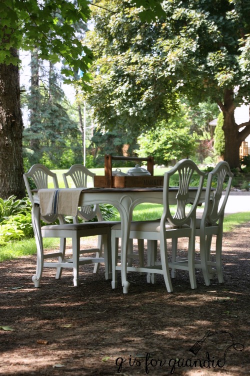
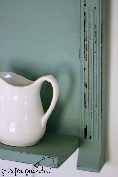
Fast forward to winter.  Back then I usually took a break from painting furniture in the winter.  But I had an adorable little wash stand that I really wanted to paint.  I figured I could paint it indoors and then wax it on my enclosed front porch.  It was warm enough out there, but even with the door shut between the house and the porch, that stink made its way inside the house and it wasn’t pleasant.

So much for winter painting!

But then I discovered Miss Mustard Seed wax.  Eureka!  It has a scent to it, but it’s very mild, not a harsh chemical smell.  I could wax inside the house all day long and not feel like my house smelled like a workshop.

waxes

However, it definitely costs more than the cheapy stuff.

Since I’m a cheapskate, I was determined to find a cheaper choice.  As a result, I’ve tried many different brands of wax and guess what?  They didn’t really save me any money at all because I’d open up the can and realize I was back at stinky wax.  As it turns out, you get what you pay for.  Sometimes.  But other times even the more expensive ‘name brand’ waxes are just as stinky.

Initially my decision to ‘splurge’ on the Miss Mustard Seed wax was really just based on the lack of smell.  But recently it occurred to me that I do A LOT of painting.  I should really be thinking about what kinds of chemicals I am subjecting myself (not to mention the environment) to on such a frequent basis.  This really is about more than just dealing with an unpleasant odor, what about repeated exposure to unknown chemicals?  Just what exactly is causing that stink?

I tried to do some online research into the ingredients in various brands of wax, and guess what?  For a lot of the brands it’s really hard to find that info.  Apparently back in 2009 Senator Al Franken helped introduce a bill called the 2009 Household Product Labeling Act which would have required paint manufacturers to list all ingredients on their packaging, but it did not pass.  But honestly, even if the ingredients themselves were listed, would you know what they are?  I know I wouldn’t.

So I went straight to my source, Homestead House Paint Co, and asked the simple question “hey, how come your wax doesn’t stink?” and I got a nice email back from Loree Pringle with lots of info about beeswax and carnauba wax, and about how they need a solvent to allow them to be spread into a thin layer.  Then she put me in touch with Roger Clapham, the co-president of the company that manufactures their waxes.  He gave me a bunch of really science-y info about atoms in a chain and whether or not they hold hands (or something like that) that was way over my head.   But basically he explained that there are two kinds of solvents that can be used for this purpose, aromatic hydrocarbons and aliphatic hydrocarbons.  The aromatic hydrocarbons have that chemical smell like paint thinner, and include Toluene or Benzene.  And guess what?  Aromatic hydrocarbons are considered carcinogens.  Yeah, that means they have been shown to cause cancer.  Both the Miss Mustard Seed waxes and the Homestead House waxes contain no aromatic hydrocarbons.  Instead they use aliphatic hydrocarbons.

waxes-2

So I followed up with the next obvious question, why would any wax still contain aromatic hydrocarbons if they are so bad?  According to Roger, the aliphatic hydrocarbons are weaker solvents than aromatic hydrocarbons.  Products made with aromatic hydrocarbons require less of them to do the job and those products can be more durable and provide more shine.  For example, he does not believe the Homestead House wax is durable enough to hold up to foot traffic on my stairs (although I’m going to try it anyway one of these days).

As Roger says himself, he has a healthy respect for aromatic hydrocarbons and their usefulness as long as people understand what they are working with and take precautions.  If you still want to use one of those products, Roger gave me some safety tips:  Buy a mask specifically designed to protect against aromatic solvents (OSHA certified) and wear it while working with them (changing the filters as directed). Toxins can be absorbed through the skin, so wear rubber gloves.  Pay attention to air circulation, apply the finish outdoors or use a fan and open the window.  On the plus side, the danger is gone once the solvent has evaporated.  So a piece of furniture that has this type of wax on it is no longer hazardous at that point, once the smell is gone so is the hazard.

Since we can’t rely on a label to tell us what kind of solvent a wax product uses, I say rely on your nose.  Give your wax the old sniff test.  Does it smell like paint thinner?

If so, ask yourself if this is really something you want to be working with on a regular basis?  And are you using the proper precautions?

As for me, I’m not a fan of gloves and gas masks.  Working outdoors is only an option about six months out of the year here in Minnesota.  So I finally tossed all of those stinky waxes and am going to stick with the non-smelly stuff!

Now for the fun part!  Here is your chance to give the non-smelly stuff a try yourself.  When I told the people at Homestead House that I wanted to post about this subject, they graciously provided me with a truckload of free samples to giveaway.

truckload-of-waxes

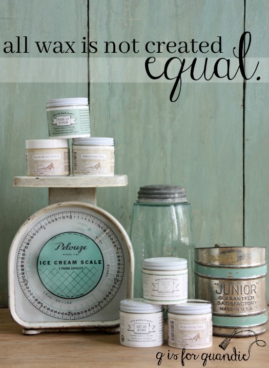
I have 8 small jars of wax and I thought I’d give them away in pairs, so 4 lucky winners will each get 2 jars of wax.  I have a variety of different waxes including Miss Mustard Seed White Wax, Antiquing Wax and Furniture Wax, Homestead House Furniture Wax in clear, Espresso and Black, and a couple jars of Salad Bowl Finish.  I will draw 4 names at random from the comments left on this blog post by Sunday, January 29 at midnight (central time), so all you need to do is leave a comment to get your name in the running to win.  Best of luck to you!

Note:  the Safety Data Sheet for SC Johnson paste wax lists Ethylbenzene and Naphthalene as ingredients (both aromatic hydrocarbons).  Briwax contains Toluene, however they do offer a Toluene free version of their product, but I was not using that version.

Also please note that I have not been paid by Homestead House for this post but they have provided me with free samples of their waxes and other products including Fusion paint, Homestead House milk paint and Miss Mustard Seed products.  In addition they provided me with the waxes that I am giving away with this post.