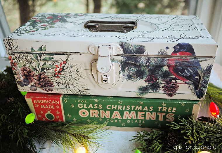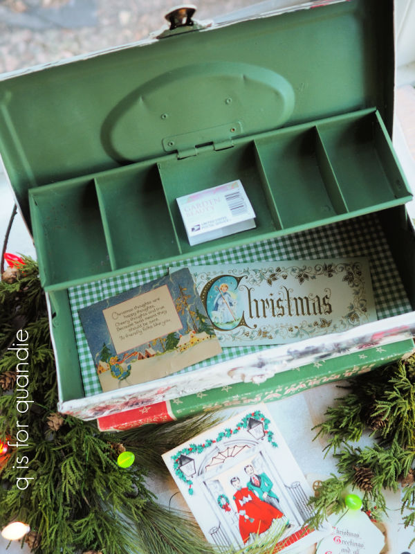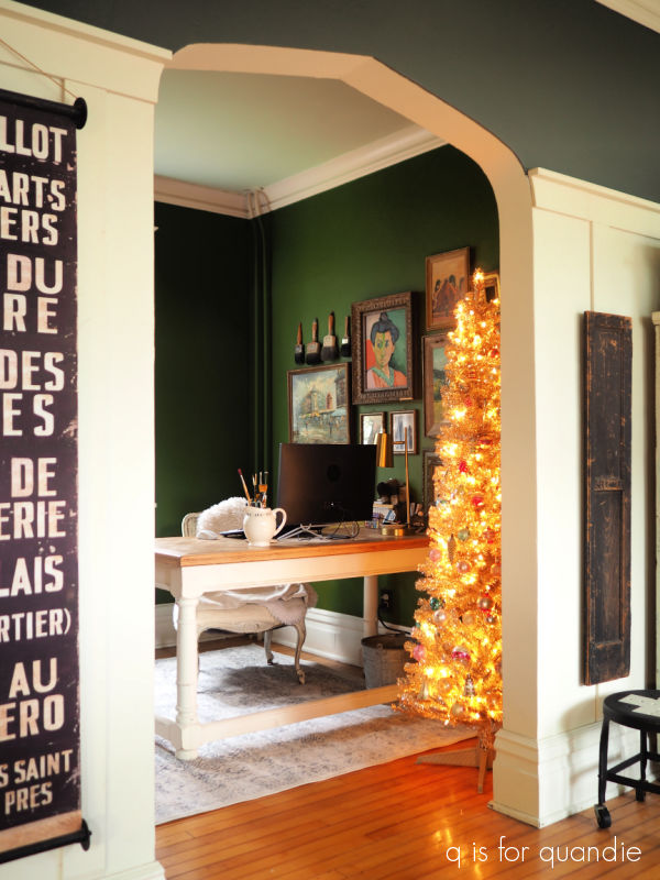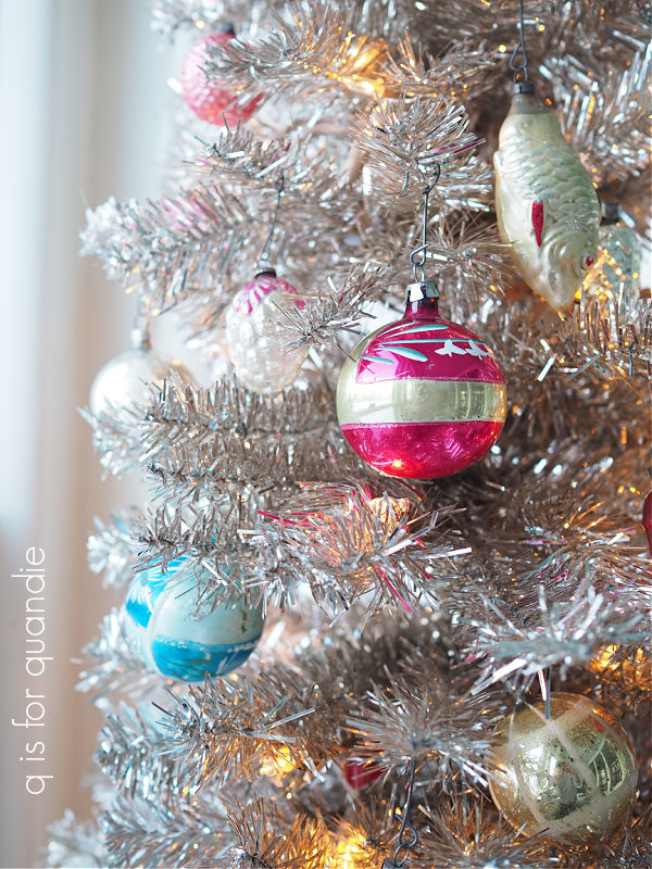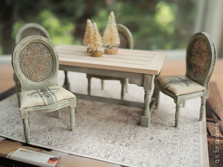
the winter dining room.

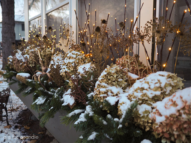
I started my holiday decorating a bit early this year for two reasons.  First, I did all of my outdoor stuff a week or two ago when we had a couple of really nice sunny days in the 50’s.  It was so fun filling the window box and putting up lights without having to wear a parka and fight with frozen soil.

Speaking of the window box, one of you requested a ‘dusk photo’ with the twig lights on.  I didn’t manage to get a dusk photo, but how about a ‘dawn photo’?

As you can see, I got this stuff in just in time before winter weather officially (in my book) arrived with a dusting of snow, blustery winds and a ‘feels like’ temp of 8°.

I got a jump on my indoor decorating too. That’s due to my 2nd reason for starting early.  Once again this year I’m going to Mexico with my neighbor nnK and her parents.  And this time my sister is joining us as well.  We leave tomorrow, and then there are only two and a half weeks until Christmas once we get back.

Putting up holiday decorations is a fair amount of work, I wanted to enjoy them for more than a couple of weeks!

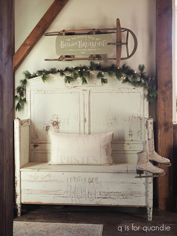
Today I thought I would share the decorations in our dining room.  This is where we enter our house from the back deck, and my Belgian bed bench is next to the door.

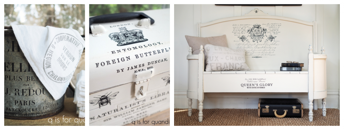
The bench is painted in Miss Mustard Seed Milk Paint in a mix of equal parts Ironstone, Linen and Grain Sack.  You can find all of the details for that project here.

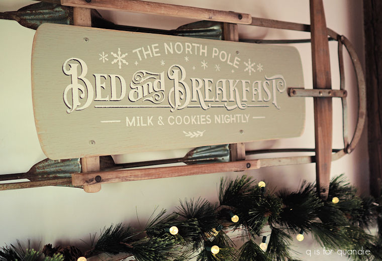
As for the sled hanging over the bench, that is one I found this past summer at an estate sale.  The price was a little higher than I like to spend (as is usually the case at estate sales), but I had to snap it up because of the solid surface of the seat.  I knew that would be perfect for stenciling.

I painted the seat in Dixie Belle’s Dried Sage, then created a shadow of the words ‘Bed and Breakfast’ using Coffee Bean, and finally added the full stencil in Drop Cloth.

I finished it off with a coat of Dixie Belle’s clear wax, including the unfinished wood and the metal slats.  The clear wax just freshens it all up a bit and would protect it from moisture if I hung it outside, although for this year I’m keeping it inside.

I added some faux evergreen garland and a string of battery operated lights to the back of the bench.

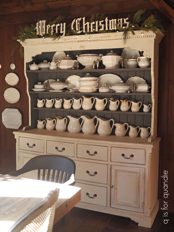
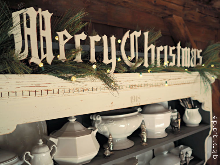
Then I added more garland and lights to the top of my Welsh cupboard.

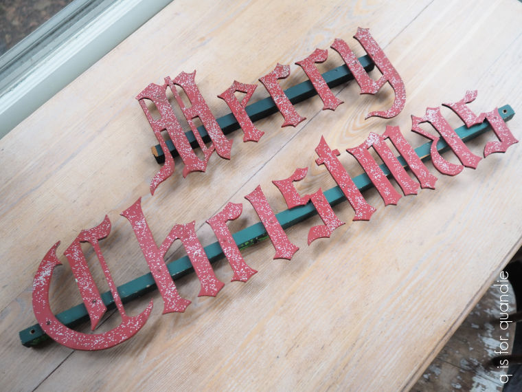
Next I pulled out the vintage “Merry Christmas” sign that I purchased last year.

Although I appreciated the original red and green paint, I didn’t love the glitter that had been added to it.  So I repainted the letters in Dixie Belle’s Drop Cloth, and the bar across the back in Midnight Sky.

By the way, nearly every piece of ironstone in that cupboard is from a garage sale.  I think there might be one or two that were from antique shops, but that’s about it.

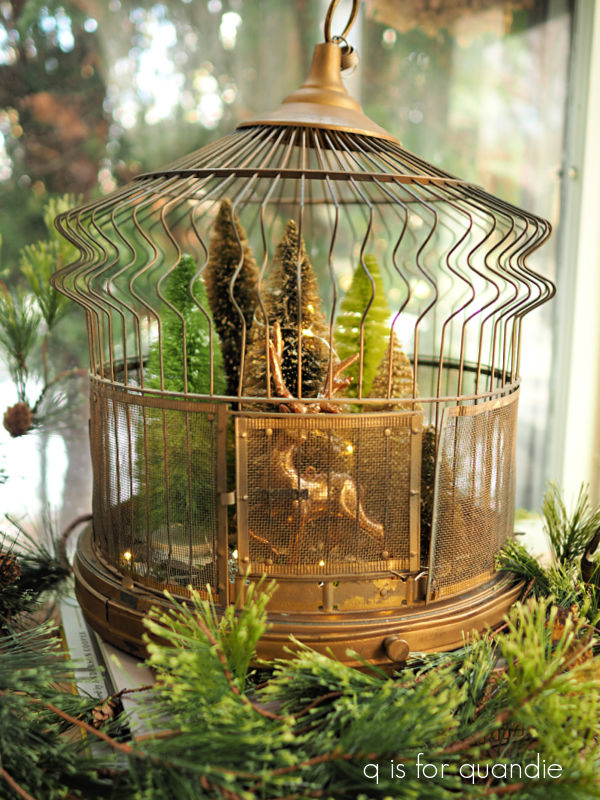
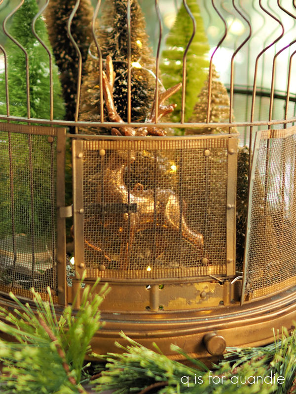
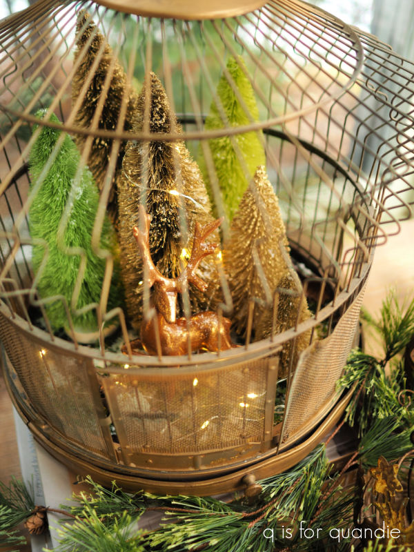
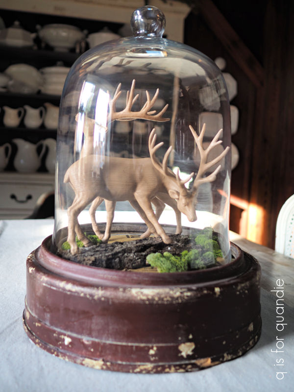
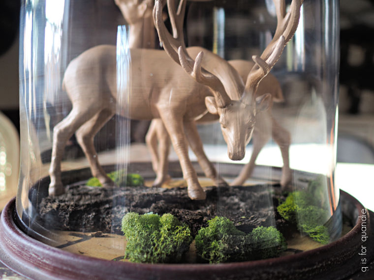
The last bit of holiday decorating in this room is my clock cloche (that’s what I’m calling it anyway) centerpiece on the table.  Some of you might remember when I popped a large glass cloche over a clock that fell off my wall and was damaged.

If not, the details can be found here.

I tend to change up the contents of the clock cloche for the seasons, and here is its Christmas look.

Well, maybe it would be more accurate to call it a ‘winter’ look.

It feels a bit plain for a holiday look.  I may have to dress it up a bit more.  Maybe it needs some faux snow, or lighting of some kind.  What do you think?

I let the paint colors that I used on the sled dictate a neutral color scheme in the dining room this year.  Sometimes it’s fun to change things up and see how you like them.  Plus, if I just remove the “Merry Christmas” signage from above the hutch, the rest of this stuff can be left in place as simply ‘winter’ decor.  Maybe next year I’ll go back to more traditional red and green.

How about you?  Are you all out red and green, with Santa’s everywhere?  Or do you sometimes stick to a more neutral ‘winter’ look?  Leave a comment and let me know.

And one last note, I did schedule a couple of posts for while I’m gone.  However, I probably won’t answer comments since I’ll be floating in a pool in Mexico.  So I hope you enjoy them, and I’ll be sure to respond when I get back!

hidden potential.

You may remember that my friend Kathy gave me a bunch of metal boxes last summer.

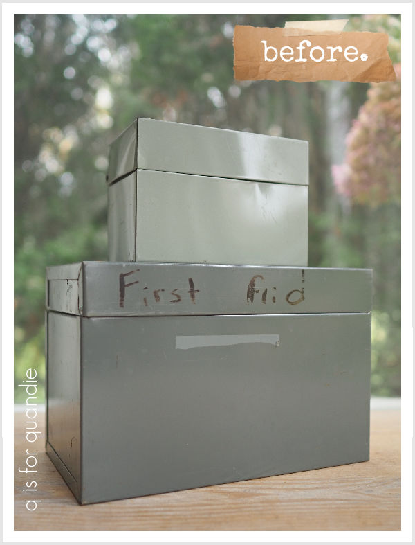
I just have a few left that haven’t been given makeovers yet, including two plain metal index card boxes that I didn’t really think had much potential.

But then the other day I was watching a YouTube video where the creator was adding Christmas scenes with bottle brush trees and little Santa’s or reindeer into vintage tins (Ginger Chick Rehab), and it looked like so much fun.  But I didn’t have any fabulous vintage tins on hand.

So I decided to try ‘making’ my own out of the two index card boxes.

I started with the smallest box.  I gave it a quick sanding with 150 grit sandpaper to rough up the surface a little to improve adhesion, then I also gave it a coat of Dixie Belle’s Bonding Boss for the same reason.

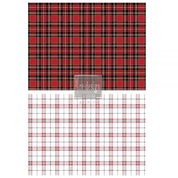
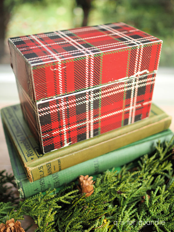
Next I gave the box a coat of Dixie Belle’s Drop Cloth to create a base.  Once thoroughly dry, I pulled out an old re.design with prima transfer called Gingham Red (I’m not sure why it’s called that since both included designs are plaid, not gingham, but don’t let that throw you off).

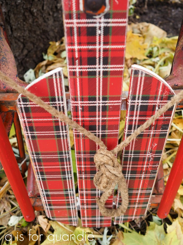
I had used most of the red plaid on this sled back in 2019 …

But I had just enough left to cover the entire box.

As you can see, it didn’t go on perfectly.  I have a couple of spots where the transfer cracked and you can see the white underneath.  But that’s OK, I wanted the box to appear vintage.

FYI, I did not apply any sort of sealer over the transfer.  I’m never happy with how a topcoat looks over these full coverage sort of transfers.  This little box shouldn’t get much wear and tear, so I think it will be OK without a sealer.

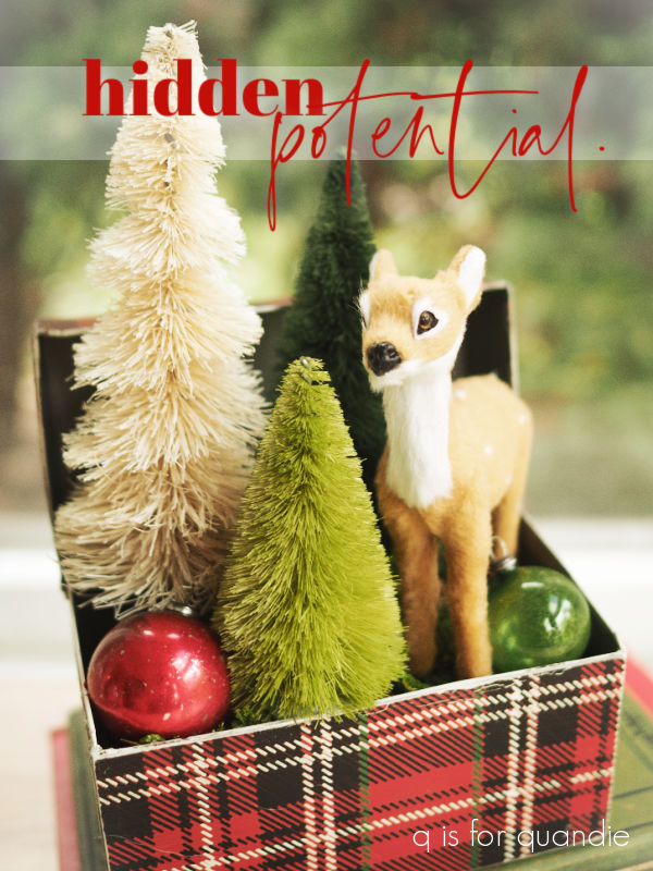
Now for the fun part.  After adding some floral foam inside the box, I hot glued in some bottle brush trees and a cute little reindeer.

Then, after adding some moss around them to hide the floral foam, I tucked in a couple of vintage glass ornaments.

Those of you who are fans of A Christmas Story might appreciate the book I used to stage the photos 😉

I went in a completely different direction with the larger of the two boxes.  I noted that when open, the lid falls all the way back, which didn’t lend itself well to the same treatment as the smaller box.

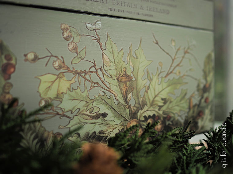
So instead I decided to just paint it up inside and out with Dixie Belle’s Dried Sage after sanding and giving it a coat of Bonding Boss first.

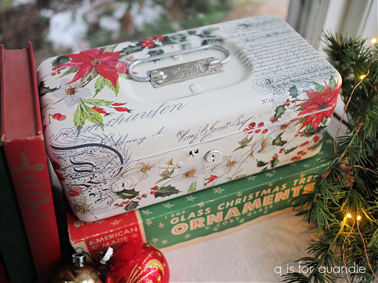
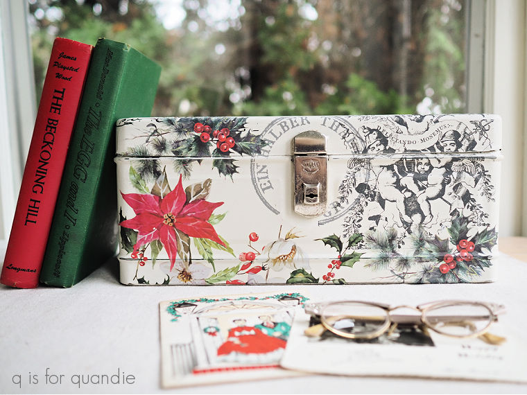
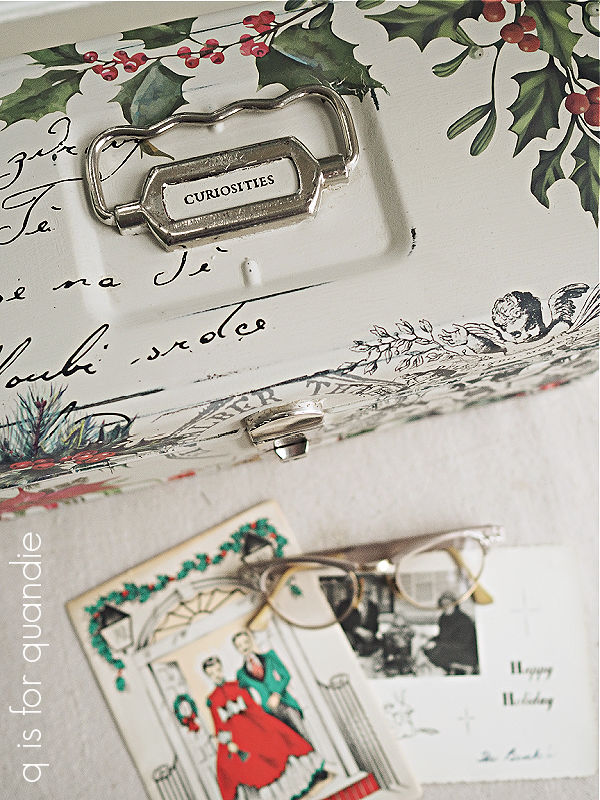
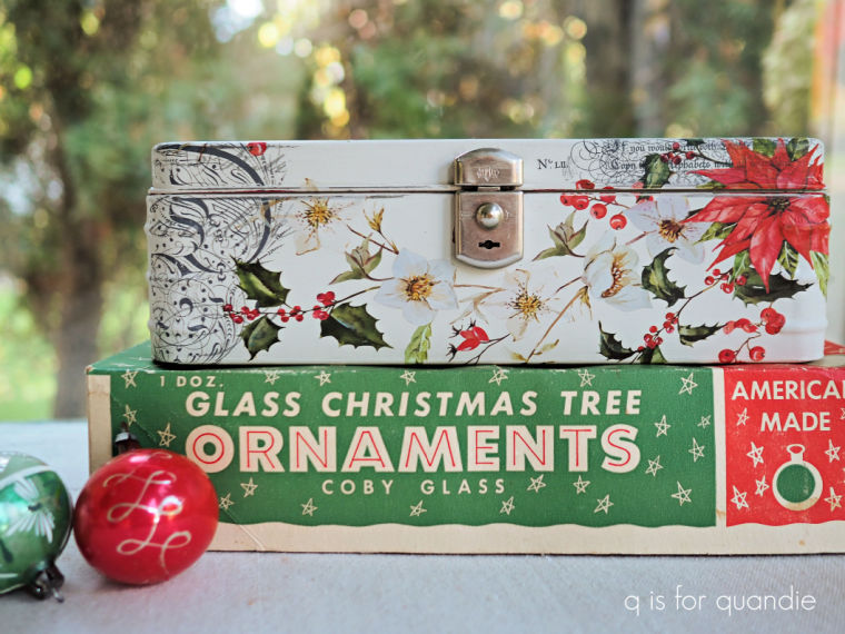
Then I pulled out I.O.D.’s Fairy Merry Christmas transfer (a 2023 release, now retired).  It has a really beautiful woodland wreath in muted colors.

I had been ‘saving’ it for just the right project.  I’m sure many of you know that feeling.

It was time to just go ahead and use it!

I didn’t want to just slap a wreath on the top of this box, so instead I started cutting it up to make it work on the box.  Part of it went on the front, and another section went on the top.

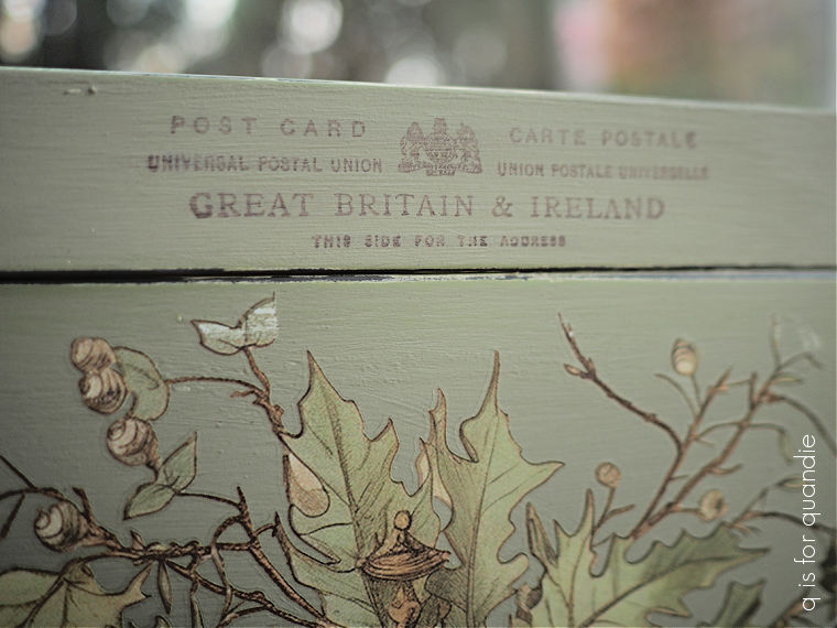
I also added a stamp to the box.  As I’ve mentioned quite a few times, I’m still struggling to get a result that I like when using rubber stamps.  This was actually attempt no. 2.  The first attempt was too smudged, so I tried to wipe it away with a damp cloth before it dried.  That ended up turning into a eureka sort of moment for me because I really liked the faded image that was left behind (although still not the smudging).

So I painted back over that area, and once the paint was dry I applied the stamp again.  Then I waited about 60 seconds or so, and wiped it away with a damp rag.

I’m sure this technique does not work with just any kind of ink and/or paint.  But in this case I was using VersaFine Clair ink in Pinecone over Dixie Belle paint (a chalk style paint).  I had not sealed my paint before applying the stamp.  I highly recommend playing around with this effect before attempting it on something that might get ruined.

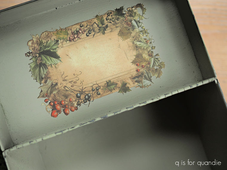
I also added a transfer from the Fairy Merry Christmas set to the inside of the lid.

I finished the box off with a coat of Dixie Belle’s flat clear coat.

What could one use this box for?

I guess I’m not really sure.  But it definitely is pretty.  And also not overtly ‘Christmas’, so it could be popped onto a bookshelf and left there all year really.

What would you put in it?  Leave a comment and let me know!

Thank you to Dixie Belle Paint Co for their products used in this makeover.

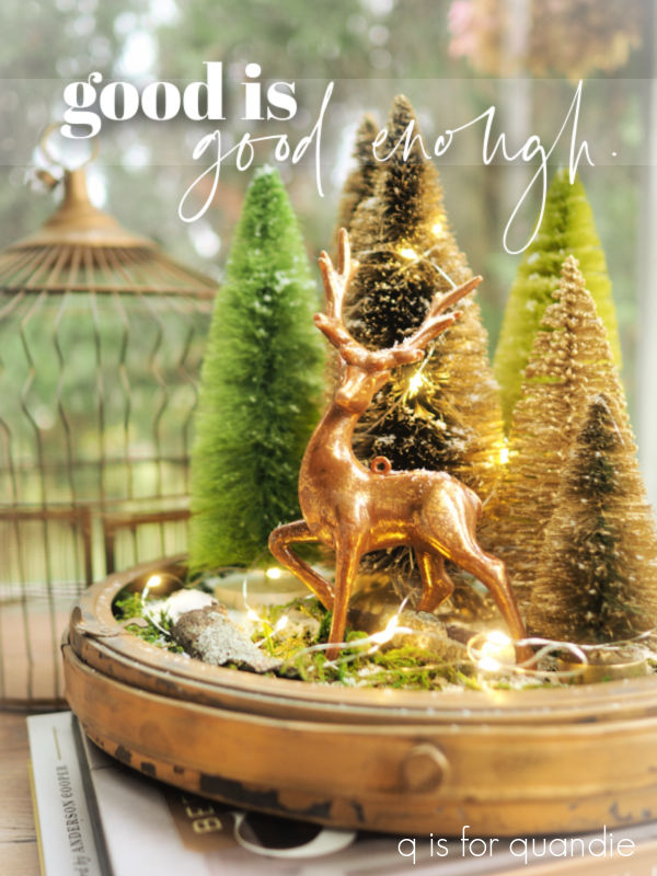
copper and gold.

Good morning from the garden!

It’s been a while since I brought you a Sunday morning in the garden post hasn’t it?

So far we’ve had a rather mild fall.  There have been a handful of nights just below freezing, but nothing really cold.  As a result, I still have some plants that look pretty darn good in the garden, like this Alexander’s Great brunnera …

and my Hakonechloa, or Japanese forest grass.

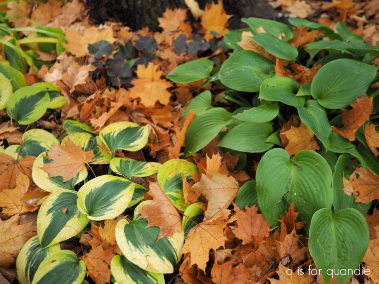
Up until a few nights ago I could also have said that some of my hostas are still looking great as well.

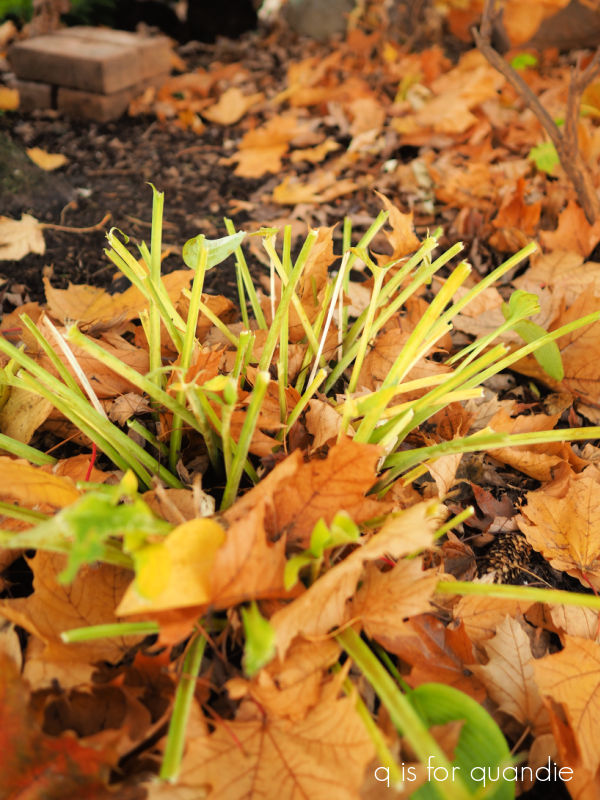
Except they no longer look like that.  Every last hosta that was still green was chomped down to stalks by roaming deer a couple of nights ago.

I really only seem to have trouble with deer in the early spring when they come and eat all of my tulips, and now apparently in late fall when they turn my hostas into a salad bar.

I’ll count my blessings since they don’t bother my garden in summer.  Knock on wood.

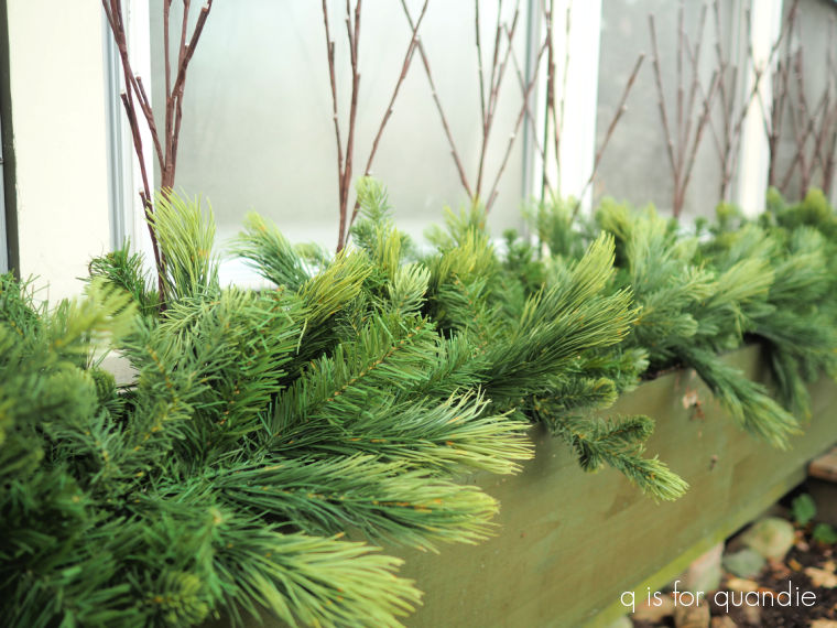
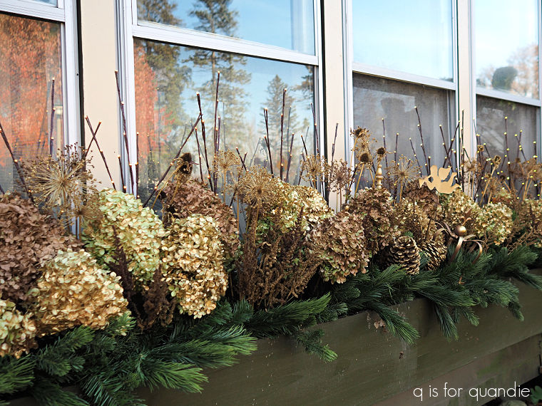
But today’s post isn’t about the deer, or what still looks good in the garden.  It’s about my front window box.  I’ve shared it here many times, but for those who may not be familiar it’s quite large at about 12′ long.  One thing I didn’t really think about when we made it so big was how much it would cost to keep it filled with annuals in the summer, and evergreens in the winter.

Unfortunately I don’t really have anywhere that I can go to forage for free evergreen cuttings so I have to buy them, and they aren’t cheap.  So last year when I went to the Bachman’s after Christmas sale I picked up two lengths of faux evergreen garland for 75% off.  They were originally priced at $79.99 (egads!), so I got them for about $20 each.

I think it looks realistic enough from the street, and no one really gets any closer than that except me.  And now I have a nice, full base to start adding further embellishments to.  Plus I’ll be able to use this over and over for several years at least.

I still have all of the faux red berries that I used in the window box last year.

But I wanted to try something different this year.  That being said, I didn’t want to spend a lot of money on all new embellishments.

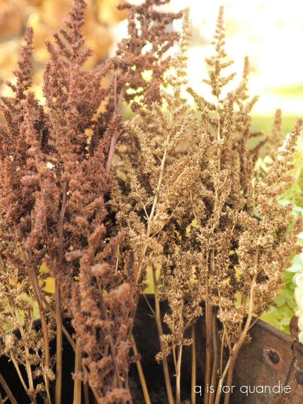
Plus, I put in a little extra effort in early fall drying quite a few flowers from the garden, like this Astilbe.

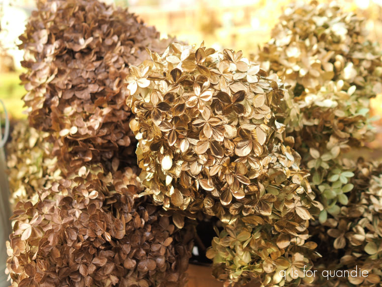
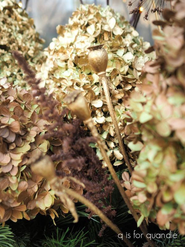
And of course, lots of hydrangeas.  So I wanted to use those.

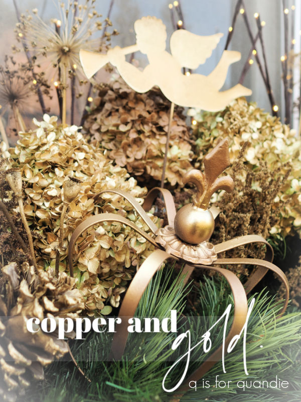
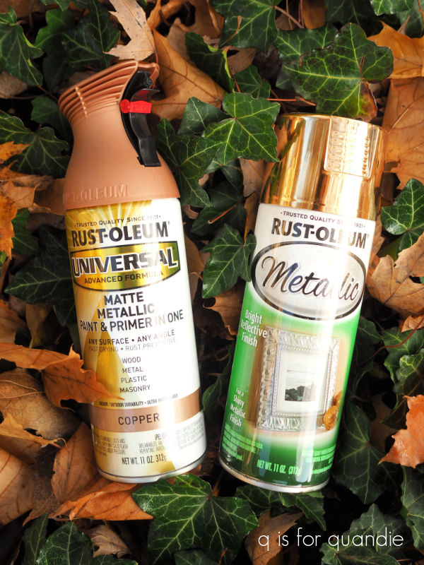
But I didn’t want a ‘brown’ color scheme, so I decided to add a little bling with some metallic spray paint.

I took advantage of some lovely fall weather this past Friday and set up a work area outside to spray paint the flowers.

They hydrangeas look amazing, but I’m not as impressed with the painted astilbe.

I also didn’t love the copper paint as much as the gold.  I chose the matte metallic copper and this is one time when I should have gone shinier.

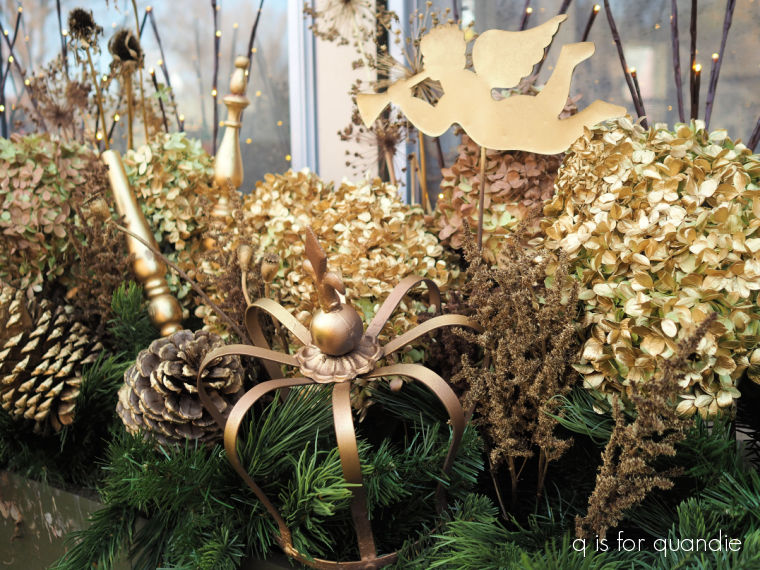
I had also dried a bunch of allium, and they are awesome painted in gold.

As are the handful of dried poppy seedheads from nnK’s garden.

After tucking all of the painted flowers in with the faux evergreen garland, I decided that I needed to add a few items with a bit more impact.  So I pulled a few different elements out of the workshop and gave them a spray of gold too.

Now, I’m sure that a few of you are wondering how well the painted dried flowers will last.  The answer pretty much depends on our weather.  If we get a heavy snowfall, it will inevitably crush them and they won’t look so good after that.

But hopefully we’ll just get the light and fluffy stuff between now and Christmas.

Fingers crossed!

Are you a fan of the more subtle copper and gold theme this year?  Or did you prefer the pop of red from last year?  Leave a comment and let me know.

old world european.

After completing quite a few Christmas projects in a more traditional red and green, I felt the need to get out one of my favorite neutrals, Dixie Belle’s Dried Sage.

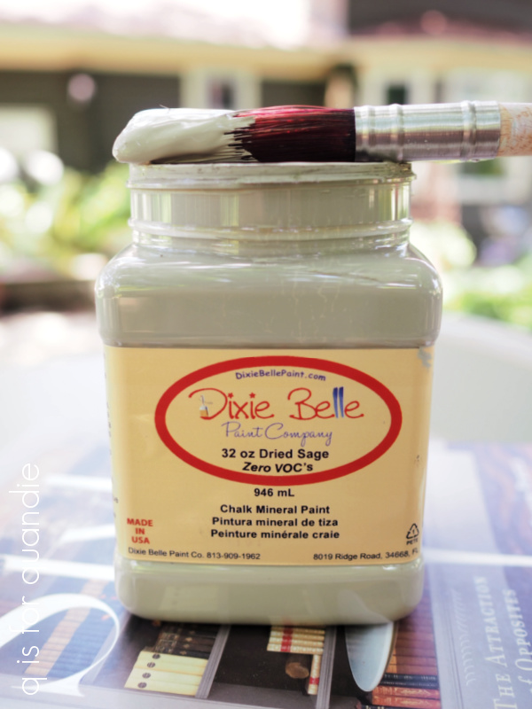
It’s such an interesting color.  Is it grey?  Is it green?  Is it beige?  I think it’s a little bit of all three.

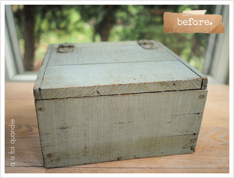
Whatever you want to call it, I think works well for creating a primitive sort of look.  So when I was trying to decided what color to paint this rustic box that I found at a garage sale this summer, I decided Dried Sage would be perfect.

Although I love a good distressed paint finish, this box was just a tad too grungy for my taste.  The Dried Sage is not too far off the original color on the box, perhaps a bit less blue.

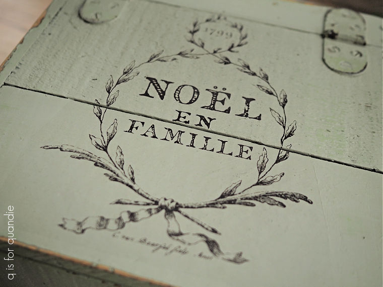
After giving it a good cleaning, I was able to get good coverage with just one coat of the Dried Sage.  Once that first coat dried, I added a fresh coat to the top of the box so that I could apply one of the I.O.D. Gloria paint inlays into the wet paint.

I just love the sort of old world European look of this inlay.

You can find my full step by step guide to using the paint inlays here.

Once I had the inlay applied, I immediately gave it a quick coat of Rust-Oleum’s matte spray sealer.  It is so easy to smear the paint inlays before they are sealed (trust me, I’ve done it many times), so I don’t start sanding or anything before giving it a quick spray.

Once that was dry, I sanded the edges of the box to distress them and then sealed the entire thing with Dixie Belle’s flat clear coat.

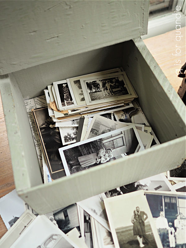
Although ‘noel en famille’ means ‘Christmas with family’, I don’t think the box is in-your-face-Christmas.  Except possibly for French speakers.  So I rather like the idea of using it to store my old family photos.

So although I had originally planned to sell it, I’m going to keep it for that purpose.

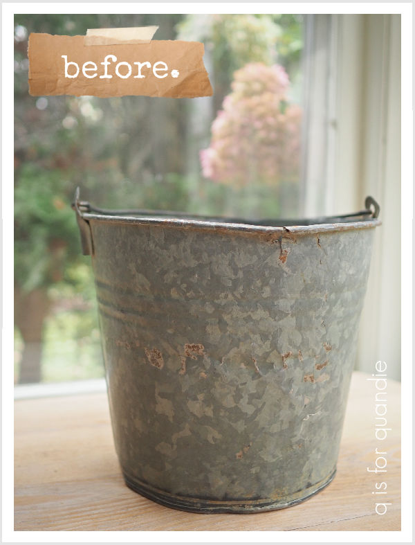
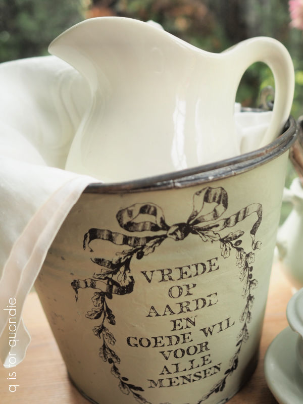
While I had both the Dried Sage and the Gloria paint inlay out, I decided to dress up this rustic old bucket as well.

After giving the bucket a good cleaning, I painted it in the Dried Sage and then applied another section from the Gloria paint inlay to it.

By the way, that is Dutch and it says something like peace on earth and goodwill to all.

I’ve staged my bucket with some white linens, ironstone and tarnished silver.

But it would also be the perfect vessel for a small faux Christmas tree.

I also gave this one a coat of the spray sealer to avoid smearing the inlay.

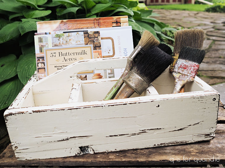
Last up in my trio of Dried Sage Christmas items is this wood tote.

I actually shared this tote back in June when I painted it in Dixie Belle’s Drop Cloth, and didn’t embellish it in any way.

It was sort of an experiment to see if it would sell this way.  Spoiler alert; it did not.

So I pulled it back out and added a couple of coats of Dried Sage.  Once the paint was dry, I sanded fairly vigorously and as you can see I ended up with a very distressed look.  That’s likely because I had originally waxed over the Drop Cloth back in June, so that worked as a resist for the Dried Sage.

I know this look isn’t for everybody.  I love it, but if you don’t you may want to use caution when painting over a previously waxed item.

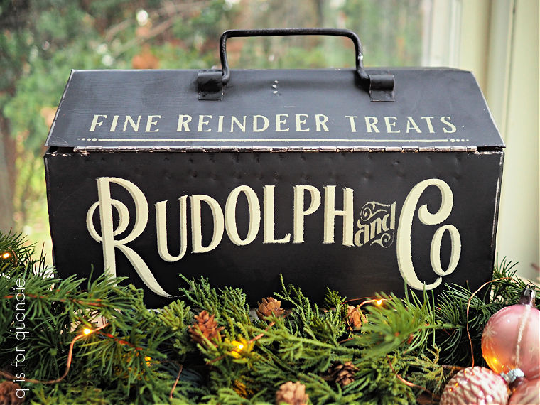
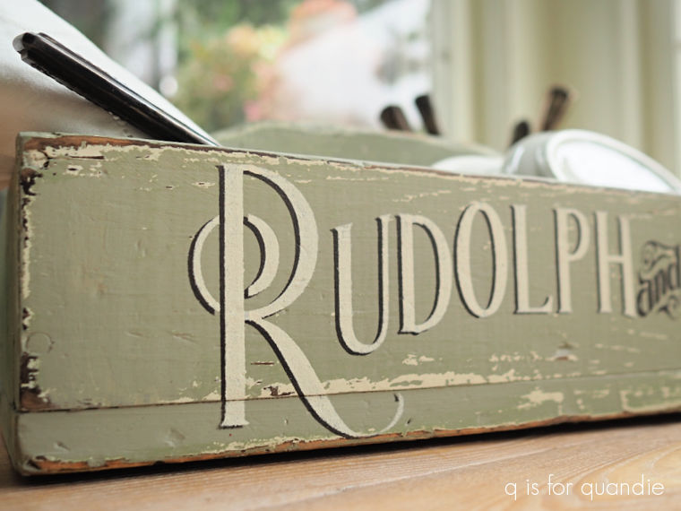
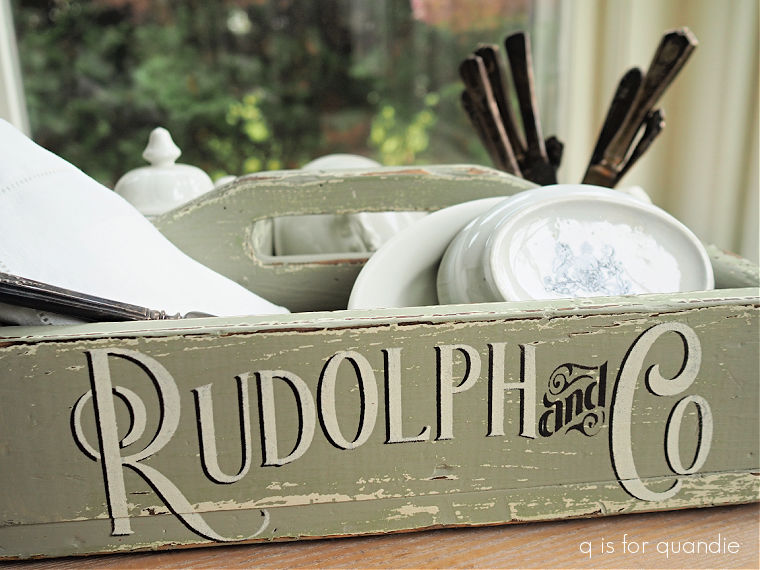
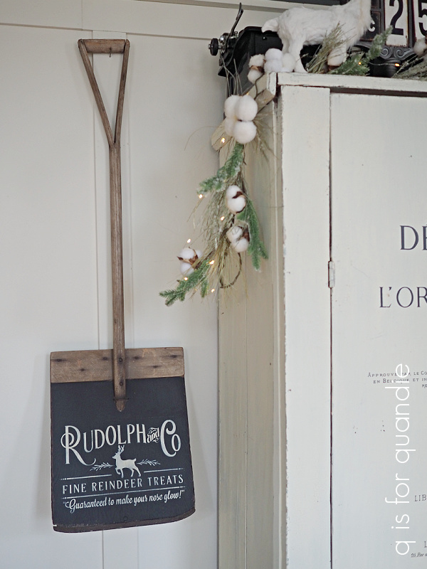
Next I added my Rudolph and Co stencil to the front of the tote using Dixie Belle’s Coffee Bean first, and then layering over ‘Rudolph’ and ‘Co’ with Drop Cloth.

That one doesn’t require any translation.  Once dry, I sealed it with Dixie Belle’s flat clear coat.

Once again I staged my piece with some white linens and ironstone.

But you could use this tote to create a table centerpiece with evergreens and candles.  Or use it for your Christmas buffet to hold silverware and napkins.

I took these last two items into Reclaiming Beautiful in Stillwater, MN where I sell on consignment.  So if any of you locals are interested, be sure to head down there soon!  They are open Thursday, Friday and Saturday from 10 a.m. to 5 p.m.  Check out their Facebook page for more details.

As for the rest of you, what do you think of neutrals for Christmas?  Are you a fan of the old world European look of the paint inlays I used, or do you prefer the more modern ‘Rudolph & Co’ stencil?  Leave a comment and let me know.

christmas schoolhouse chairs.

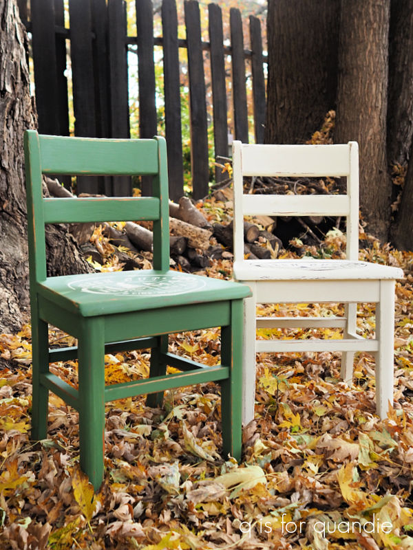
A little while back I purchased a pair of schoolhouse chairs at my friend Amy’s garage sale.

Super cute ‘as is’ really.  But I decided to give them a holiday look.

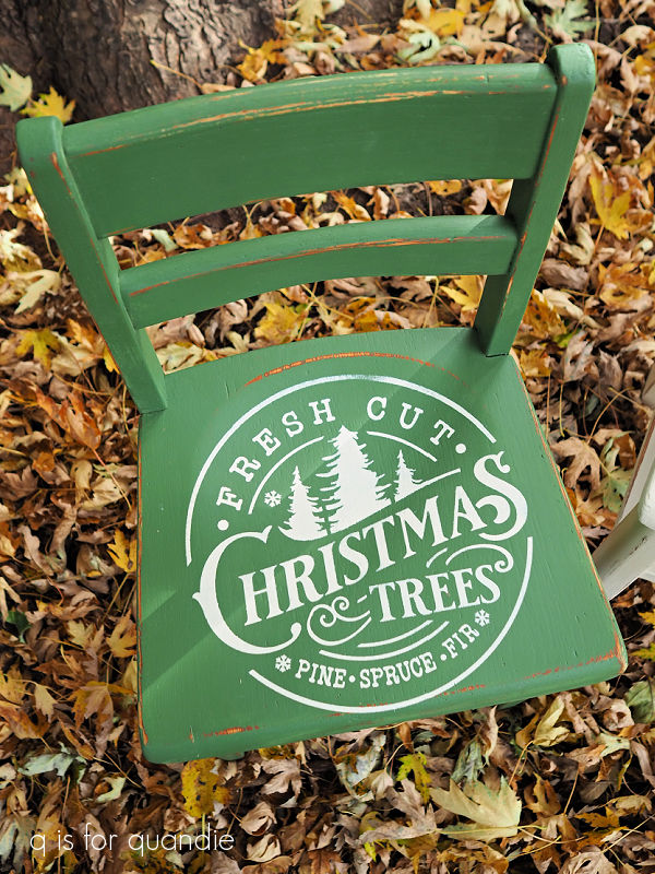
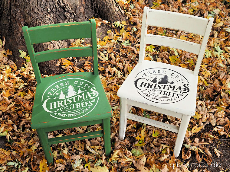
I painted one of them in Dixie Belle’s Drop Cloth, and the other in their English Ivy.

Then I went through my stash of stencils.  I have a few that fit on these little chairs.

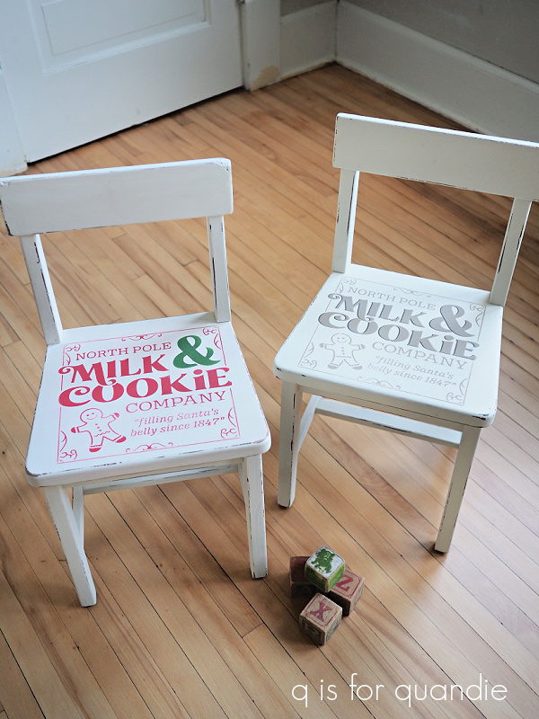
In the past I’ve used this cute Milk & Cookie Co stencil from Wallcutz …

… a few times actually …

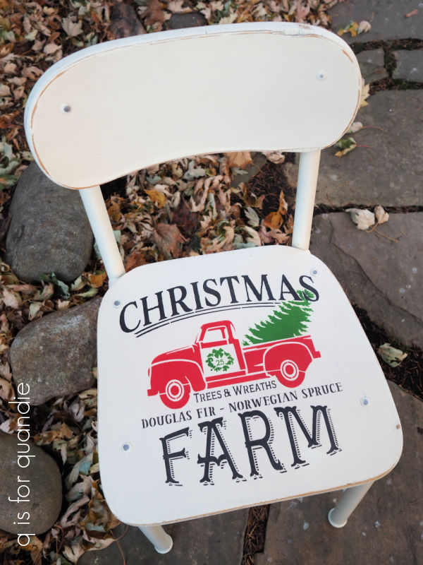
and this cute Christmas Farm stencil.

This sort of Scandinavian look was a good one too.

Sorry, I’m not quite sure where those last two stencils came from.

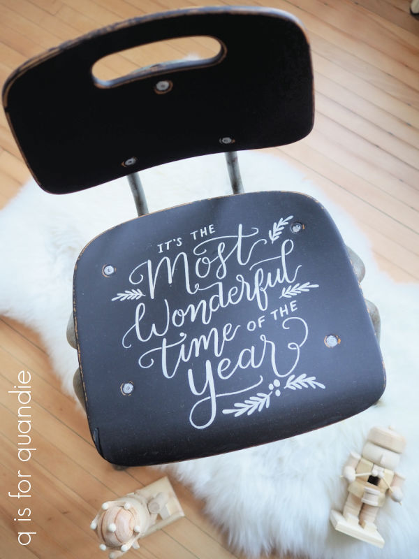
I liked the simpler look of this next stencil on more of a mid-mod style chair (stencil also from Wallcutz).

I may do another one like this yet this year.

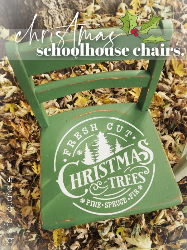
But I was in the mood for something new on these two chairs, so I started searching online.  I ended up finding a stencil I liked from Three Birds Stencils on Etsy, and I was able to order it in the right size to fit my chairs.

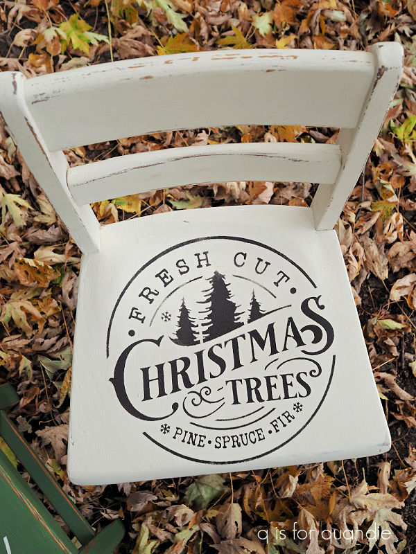
I added it to the green chair using DB’s Drop Cloth, and to the white chair using their Coffee Bean, just in case someone out there prefers a more neutral Christmas color scheme.

I’ll be bringing both of these chairs to the craft show that I’m participating in tomorrow.

Unless of course a local reader wants to call dibs on either (or both) of them today.  Check out my ‘available for local sale‘ page for more details.

As for the rest of you, leave a comment and let me know which of my many chairs was your favorite!

dreaming of a pink christmas.

Anybody else out there love a little bit of pink at Christmas?

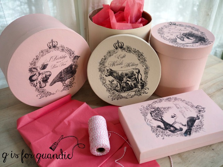
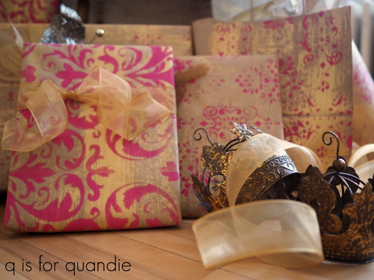
Back in 2017 I painted all of my Christmas gift boxes pink and then used Fusion’s transfer gel to add some graphics that I printed out.

And then there was my Venetian velvet inspired pink and gold stenciled wrapping paper from 2018.

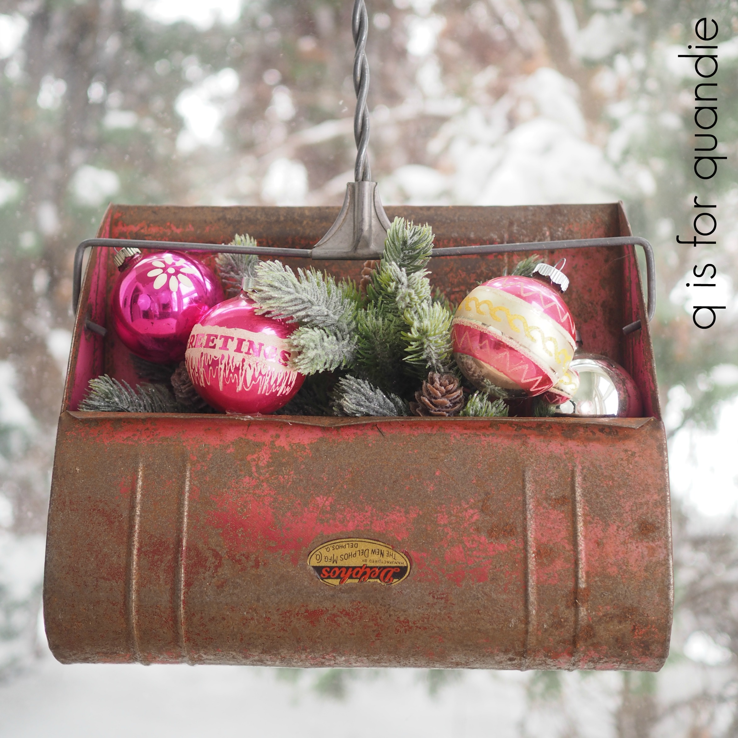
In 2019 I turned an old vintage pink dustpan into Christmas decor.

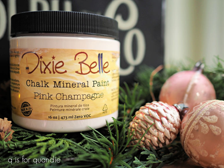
So when I was going through my paint cabinet trying to decide on a color for the inside of the toolbox that I’m sharing today, I saw Dixie Belle’s Pink Champagne and thought “yes, perfect!”

But let’s go back and start at the beginning.

My friend Sue gave me this toolbox for my birthday many years ago.  She had added a number sticker on either side.

It was simple, but I like simple.  I used it to store scrapbook supplies.

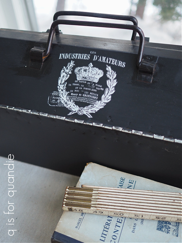
A while back I used it as a guinea pig to try out the then new I.O.D. white Traditional Pots transfers.  I removed the number stickers and painted over just that bit of the box with black chalk paint, and then applied the white transfer.

I liked that look quite a bit too.

But recently as part of my Swedish Death Cleaning kick, I really pared down my scrapbooking supplies and I ended up emptying out this entire container.  Then I put it in my stash for a makeover.

I pulled it out recently thinking that it would be fun to give it a Christmas look, but using a stencil this time rather than a transfer.  I wanted to keep the black outside, but the original interior was a dull white that definitely needed a refresh.  And that brings me to the Pink Champagne.  I love the idea of pink for Christmas, and I also think pink pairs beautifully with black.

The Pink Champagne is a cool and quite pale pink, sort of an icy pink.  Perfect for a pink Christmas.

And by the way, I did clean the box, sand it lightly and then add a coat of Dixie Belle’s Bonding Boss before I got started with the painting.  After two coats of the Pink Champagne, I applied a coat of Dixie Belle’s flat clear coat over it.

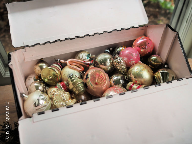
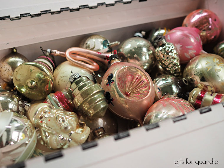
Now this box would be perfect for storing all of my pink and silver vintage ornaments.

Next up I added a coat of Dixie Belle’s Midnight Sky to the outside of the box to freshen it up a bit.  Once the Midnight Sky was dry I started stenciling.

There were several steps involved in the stenciling, with drying time in between.  I first added the “Rudolf and Co” section in DB’s Dried Sage on both sides of the box.  Then I went back in and added the “Fine Reindeer Treats” to both sides of the lid, also in Dried Sage.  Then I came back in and went over just the “Rudolph” and the “Co” in Drop Cloth.

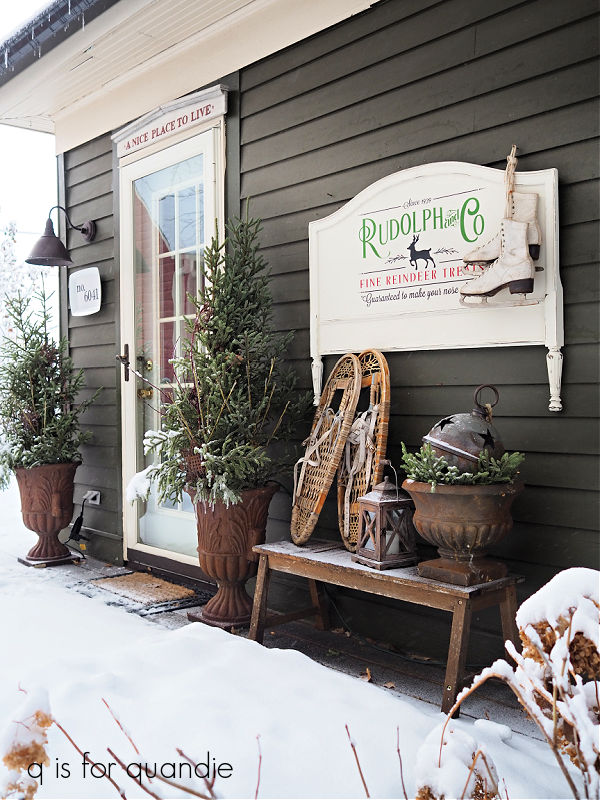
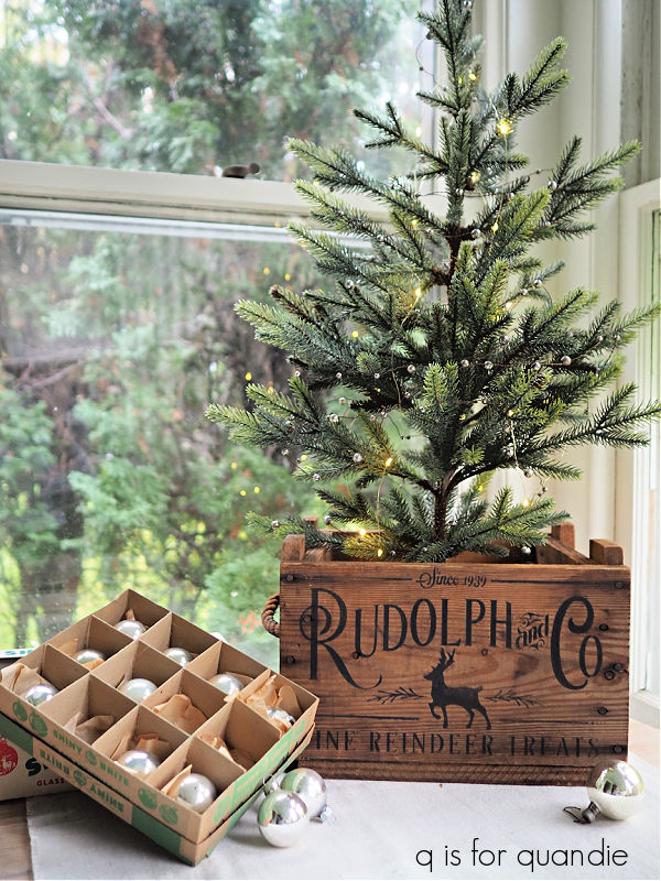
I’ve gotten so much use out of this stencil from Wallcutz.  I have it in two sizes (it comes in 7 different sizes), the bigger one was perfect for making the ‘foot board sign’ that I kept for myself and put up every Christmas.

I’ve used the smaller one on countless items like boxes …

and trucks …

and grain shovels.

I’m not always good about cleaning my stencils after use, so this one is getting a bit worn out after so many uses and it’s not as crisp as I would like it to be.  I may have to order a new one.  I used it on a couple of other items this year that you’ll be seeing soon, so be sure to stay tuned!

In the meantime, I’m not really going to store my pink and silver ornaments in this box.  I really just store them in a bigger box along with the other colors.  So this box is for sale locally (check out my ‘available for local sale‘ page for more details).

Are you a fan of pink at Christmas?  Leave a comment and let me know.

Thank you to Dixie Belle Co for supplying their products used in the this makeover.

the perfect christmas red.

Are you looking for the perfect shade of red paint to use on some of your Christmas projects?

The red I’ve used the most has to be Honky Tonk Red from Dixie Belle.

It’s a lovely cherry red, perfect for pairing with white.

It’s definitely my go-to red for stenciling Christmas signs.

If you prefer using a no-fuss acrylic style paint with a built in primer and top coat, then Dixie Belle’s Fiery Sky from their Silk Paint line would be a good option for a Christmas red.

I like to use this color on the inside of toolboxes.

Miss Mustard Seed milk paint in Tricycle is also a great choice for a Christmas-y red.  I used it last year on my North Pole Bed & Breakfast sign.

If you like the chippy look that you can get from milk paint, this is a great option.

Or if you like your red a little darker, Homestead House milk paint in Barn Red is another option if you want something chippy.

I used it on this pair of wooden skis way back in 2017.

Dixie Belle also has a Barn Red and I just finished using it on today’s project, this sled.

My friend opK found this sled for me at a garage sale.  Unfortunately the previous owners had given it a sloppy blue paint job.  After giving it a good cleaning, I decided to try a monochromatic look on this one, and I wanted to match the existing red as much as possible.  My usual Honky Tonk Red was just a bit too bright, so I pulled out the Barn Red.

I decided to work smarter rather than harder with this paint job, and this is today’s q tip for you.  When working with a combination of red and white paint, it’s pretty much impossible to prevent the white from turning pink if you sand the red after the white is applied.  It’s best to distress and then seal your background color first (whether it’s the red or the white), then add the stencil over it.

So after the Barn Red paint was dry, I sanded the edges to distress, vacuumed away any dust and then applied Dixie Belle’s flat clear coat before adding the stencil in DB’s Drop Cloth.

And here’s one more q tip for you, always put the approximate amount of clear coat you’ll need into a separate container when applying it over a vibrant color like this.  You don’t want to contaminate your entire jar with flecks of red, which are inevitable.

I like to use the Dixie Belle Finishing Pad to gently smooth out the stenciled paint without breaking through that clear coat down to the red, but you could also sand very gently with 220 grit paper, or just skip this step altogether.

Unfortunately, I did a terrible job of capturing the Barn Red color in my photos.   The color looks different in all three of my photos, but I think this next one is closest to reality.

After completing this project, I think I might actually prefer the Barn Red over the Honky Tonk Red.  I may have to switch up my go-to Christmas red.

I’ve painted up a total of four sleds this year.

I have this one in black …

And I also ended up painting the one that is to the right of the black one above.

These three will be making their way to Reclaiming Beautiful (the shop where I sell on consignment in Stillwater, MN) in time for their Christmas open house next Thursday,  unless one of my local readers wants to snatch one up before then.  Check out my ‘available for local sale‘ page for more details.

As for the 4th sled, you’ll have to stay tuned to see what I did with that one.

In the meantime, which red do you prefer?  Or do you like a more neutral color scheme for Christmas?  Leave a comment and let me know.

Thank you to Dixie Belle Paint Co for providing their products for this makeover.

santa’s workshop cupboard.

Remember this little red cupboard that I snagged out of a free pile at a garage sale this summer?

It was such a fun find!

You can’t really tell from that photo above, but one of the upper cabinet doors was cracked where the hinges were screwed in.  So I decided to simply remove both of the upper doors.  I used Dixie Belle’s Mud to fill in the holes where the hinge screws were.

After then giving it a good cleaning and a bit of sanding to smooth out some flaws, I applied two coats of Dixie Belle’s Drop Cloth.  That gave me a blank canvas to start with.

I ultimately decided that it would be fun to give it a Christmas look, so I went through my stash of stencils and transfers but didn’t find anything that would fit on that lower cabinet door.  So then I started looking for a new stencil to purchase.  The Santa’s Workshop stencil from Three Birds Stencils looked like just the ticket.  I was able to choose from a variety of sizes, and there was an option that would fit my door perfectly.

Once my stencil arrived in the mail, I added it to the lower cabinet door using Dixie Belle’s English Ivy.

After sealing all of the painted surfaces with some clear wax, I swapped out the knob on the door for a pretty little glass knob that was in my stash.

I then added some decorative paper to the back of the shelves on top

and the bottom of the shelves in the lower part of the cupboard.

It worked out perfectly that the inside width of the cupboard was exactly 12″, a.k.a. the size of my October Afternoon scrapbook paper.

How frickin’ adorable is that?

I think there are two potential markets for this little cupboard.  First, obviously someone could purchase it as a Christmas present for a child.  How fabulous would it be to have that waiting under the tree on Christmas morning?  But I also think it would be awesome as Christmas decor.  Hang it on the wall, or place it on a sideboard or dresser, and fill it with your non-collection of vintage Santa mugs.

Oh boy, now I’m starting to talk myself into keeping it … and going on the hunt for Santa mugs.

But no, this piece is for sale locally.  Be sure to hit up my ‘available for local sale‘ page for more details.

As for the rest of you, let me know what you think of this little cupboard in a comment, and let me know what you would display in it!

is it that time already?

It was quite the transition to go from 100°+ degree days while visiting my mom a week or so ago, straight into working on Christmas projects.  However, the holiday open house at Reclaiming Beautiful was just a few weeks away.  I had to get crackin’.

Luckily I’d made a good start on quite a few holiday projects before I headed out of town.  Now I just need to add finishing touches to them.

So although it feels really early to me, I’m going to share some of those projects with you today.  I used a couple of the new Dixie Belle holiday transfers and I want you all to have some time to order them if you want to use them on your own holiday decor.

First up is a pair of boxes; a tackle box and a Lane miniature cedar box.  Let’s start with the tackle box.  Here’s how it looked when I brought it home.

I kind of loved that original color and I really debated just cleaning it up and keeping it that way.  But it looks better in that photo than it did in person.  It was really quite gross and it didn’t clean up well.  Plus, I have found that my painted versions sell much more easily than the ones that I leave in their original paint.

So after cleaning it and giving it a coat of Dixie Belle’s Bonding Boss inside and out, I then painted the inside in their Fiery Sky.

That is one of the colors from the Dixie Belle Silk paint line, so it has a built in top coat that is extra durable which is great for an interior that is going to be used (for jewelry, craft supplies, etc, probably not for fishing lures).

Next up I painted the outside in DB’s Drop Cloth.  Once dry, I sanded to distress the edges and then started applying the new Yuletide Hearth transfer from Dixie Belle.

This is such a lovely Christmas floral, however I do wish the transfer had run vertically on the carrier sheet rather than horizontally.  I’m sure there was some logical reason for this placement, but it also means having to line up a seam every 6″ rather than every 12″.

So going around my tackle box meant that I had a lot of seams.

But my bigger problem is that there is no beginning and/or end to the design.  Wherever you stop ends up with a very obvious straight edge.

That would be fine if you plan to run the transfer all the way across the front of something for example, or in this case, all the way around my tackle box (although it wouldn’t meet up perfectly in the back).  It’s also fine if your item is less than 6″ wide, and you’ll see an example of that in the last project I’m sharing today.

I ended up trimming a piece for either end to try and make it look a bit more natural.

As you can see, I also struggled a bit with lining up the seams.  But that is towards the back and isn’t nearly as noticeable on the front, so I decided it would do.

But aside from all that, this is a very pretty transfer.  I just wish it was a little bit more user friendly for use on tool/tackle boxes.

As you can see above, I didn’t stop with the Dixie Belle transfer.  I also pulled out that I.O.D. Étiquettes gilded transfer that I purchased a while back.  You may remember that I didn’t love the results that I got with this one initially.  I think that was partly because I was applying the shiny gold transfer over black paint and the contrast showed every flaw in my application.

I think it works much better layered over something else rather than just on its own.

I also added some of the Étiquettes gilded transfer to the top of the tackle box.

I have to say it’s still not my favorite.  But that being said, I.O.D. did come out with a holiday themed gilded transfer and that might be fun to use on future holiday projects.  So that’s something to consider if you like the look of shiny gold for Christmas.

Next up is the Lane box.  I first painted this box last April.

You may remember that there was a flaw in that I.O.D. transfer (go back to read that post here if you want more details).  I mentioned in that post that I might end up sanding it down and starting over, and sure enough that is what I did.

I sanded the transfer off, then repainted the box in Dixie Belle’s Drop Cloth.  Once the paint was dry, I decided to attempt to use the I.O.D. Ephemeral Type stamp on it.  I still have very mixed results with stamping, but I’m working on it.

I’ll be honest, I had to repaint and restamp twice before getting a result I was happy with.  That’s why I started with the stamping rather than the transfers, I had a feeling I’d have some do-overs.  But it’s easy enough to paint back over the stamp and try again without having transfers to work around.

Once the stamp looked fairly good (I’m still not 100% happy with it, the curse of being a perfectionist), I added some of the Dixie Belle Caroling Cardinals transfers to it.

I found it much easier to play around with placement using this transfer.

I think this one is much more versatile when working with smaller projects like these.  I wrapped the poinsettia and evergreen garland around the sides, and added some individual pine cones and poinsettias to the top.

I love the pretty little red berries.

All in all, if you are trying to choose between Yuletide Hearth and Caroling Cardinals, you may want to consider how you will need to lay out the transfer before making your choice.

But both are lovely Christmas florals!

I also painted up another pair of ice skates this year.

The Yuletide Hearth transfer worked much better for me on these.  I was able to position them so that they didn’t leave a harsh straight edge anywhere.

I also added more of the I.O.D. Étiquettes gilded transfer to the skates.

If you were to scrutinize them closely, you’d see where I once again struggled to get the entire design transferred cleanly.  But I don’t think it really matters so much when it’s layered over the holly, it just looks worn and distressed … in a good way.

The original laces for this pair of skates were pretty worn out, so I removed them and added some gold ribbon instead.

If you want to check on any of my previous year’s painted skates you can find them here.

And as I mentioned in that previous post, I often struggle with the question of whether or not to paint items.  Sometimes it’s an easy decision, like with this particular pair of skates.  They weren’t anything special, and not even particularly vintage.

But then there are these two pairs of skates.

These came my way via one of Mr. Q’s coffee shop friends, and I think they are the most adorable skates I’ve ever seen.  I especially love that the lining of the little white pair is almost the same exact coral/pink of Dixie Belle’s Cottage Door paint.

Just in case you can’t judge the size when photographed on their own, here’s a shot showing the smallest pair next to some full sized (although still not nearly as big as my size 11 feet!) skates.

Clearly they start kids on ice skates pretty young around here.

But these have such an awesome vintage patina, so I decided not to paint them.  Instead I removed the laces and soaked them in some OxyClean to clean them up.  While they were soaking, I gave the skates a coat of Dixie Belle’s clear wax.  That serves to both clean up the leather a bit, and to make it a bit more supple again.  It will also protect them from the elements a bit if they are hung up outside.

All of these items will be making their way into the holiday merch pile that I’m accumulating.  My local readers (Twin Cities, MN area) will have a couple of options for purchasing some of my stuff this year.  I will have some things at Reclaiming Beautiful, the shop where I sell on consignment in Stillwater.

In addition, my friend opK is letting me have a bit of space in her booth at the Stillwater Craft & Vendor Show at the Stillwater Armory on November 9.

However, if you see anything you are interested in prior to November 6, you can always email me at qisforquandie@gmail.com for more details to purchase it in advance.

Although I struggled a bit with several of the products I was using for these projects, I did end up getting lovely results.

Which item is your favorite?  Leave a comment and let me know.

As always, thank you to Dixie Belle Paint Co for providing their products used in these makeovers!

farm fresh pumpkins?

As I’ve mentioned in the past, I’m not really into Halloween/Fall decorating.  Unless you count a whisk broom wreath.

One other notable exception is the fairy garden.  I do like to dress that up for the season with a few tombstones and a skeleton rising up from the ground.

Those fairies are a bit ghoulish!

I like to add a few fall touches to the rest of the garden as well with a few mums and ornamental kale here and there, and of course there is my Farmers Market sign.

I consider that fall decor as well.  If you’ve followed me for a while you may remember that this sign is two-sided.  The other side is painted in a more springy/summery green (Dixie Belle’s Kudzu) and has a Flower Market stencil.

I also like to come up with some sort of painted pumpkins every now and then too.

Last year I mostly went neutral.

I painted them in Dixie Belle’s Dried Sage and Sawmill Gravy.  I finished some of the stems using DB’s Gilding Wax, and then added various transfers to them.

I did a few smaller pumpkins using re.design with prima’s Middy label transfers in some very non-traditional fall colors too.

I did something similar back in 2020 with neutral colors and transfers.

I tried my hand at some toile pumpkins back in 2018.

But I found it a bit tricky to apply the toile transfers so I ended up only creating one before discarding that idea.

I ended up selling all of my pumpkins last year except this one …

Perhaps that lovely Dixie Belle Sea Glass color just isn’t ‘fall’ enough for most people.

So I decided to schedule that one for a makeover, and I also pulled out a few other faux pumpkins that were in my stash.

This year I’ve decided to add a little patina to the pumpkins using Dixie Belle Patina Paint.

I started by giving all of them a base coat of Dixie Belle’s Caviar.  You can use any chalk paint as your base coat, or you can use the ‘official’ primer from the Patina Paint line.  I like to use black paint because I find it easiest to then cover up with the Iron patina paint, which is the paint I added next.

It’s important to note that I stipple the Iron paint on with a pouncing motion.  If you brush it on you will inevitably get brush marks, which will then collect the activating spray.  And then they look pretty obvious.

So, I stipple on a first coat of Iron paint and let it dry thoroughly.  Then I stipple on a fresh coat.  Before it had a chance to dry, I also stippled a bit of the Bronze patina paint around the pumpkin stems.  Then I sprayed it all with the Green patina spray while the paint was still wet.

Once the spray dried, I very lightly dry brushed a little more of the Bronze paint on the stems and around the pumpkin just a bit.

Seriously, how cool are these pumpkins?  I love the way they turned out!

One note here.  I painted and sprayed these in the morning, and took these photos that same evening.  Usually the rusty patina (Iron paint and green spray) takes several days to fully appear.  It also continues to develop more over time, especially if the item is out in the elements (you can learn more about that here).

Since I was on a bit of a roll with the fall decor, I decided to do a quick suitcase stencil job too.

This vintage suitcase was one that I had in my occasional sale, but no one snatched it up.  Likely because it has a water stain on the front edge.

But I thought it made the perfect canvas for the Farm Fresh stencil from Dixie Belle, and displaying it standing up rather than in a stack makes that water stain less ‘in your face’.

I stenciled it using Dixie Belle’s Coffee Bean paint and their Best Dang Brush which is my favorite brush for larger stencils.

Now this is my kind of fall decor.

Although ‘farm fresh’ might not be the best description of my patinaed pumpkins, what do you think?  And how would you display this vintage suitcase?  Leave a comment and let me know.

Thank you to Dixie Belle Paint Co for providing all of their products used in these fall makeovers.