a teeny tiny chair.

tiny chair title

A couple of weeks ago when I purchased the pair of vintage school desks, they also came with this sweet little teeny tiny chair.

tiny chair before

I know that rusty patina isn’t everyone’s favorite, but I like a little well placed rust.  In the case of this chair, I decided that I didn’t want to paint it at all.  I just wanted to add a little extra pop of something.

So I added some Tim Holtz rub-on numbers to the back rest, as well as just below the seat.

chair numbers 2

chair numbers

Then I tried to use it in the school desk photos, but it just looked a little odd tucked under the desk.

tiny chair 4

On top of the desk was not much better.  So I didn’t use these photos for my post about the desks.

tiny chair 3

Then yesterday I decided to add some stripes to the seat.  I sanded it lightly, taped off the stripes and painted them using black acrylic craft paint.  I followed up with a coat of Miss Mustard Seed furniture wax to just liven up the finish a little.

chair racing stripes

And voila, the finished chair.

tiny chair after

By the way, this chair is a bit smaller than the typical little kid’s chair that I’ve painted.  This one is only about 21″ tall.  Here’s a photo I took to give you a better idea of the scale.

tiny chair scale

See what I mean?  Tiny.

But it sure packs a ton of cuteness into a tiny package.

springtime yellow.

springtime yellow

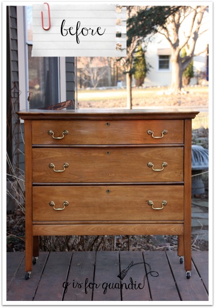
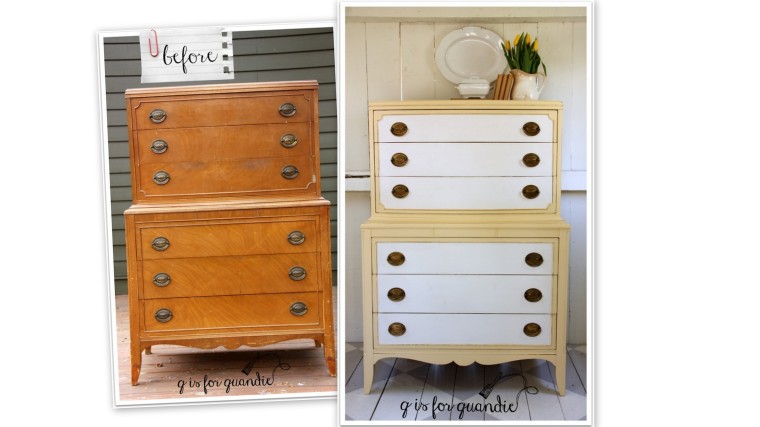
My craigslist spotter, nnK, spotted this dresser for me a week or so ago and I sent Mr. Q off to pick it up.

springtime before

It had a little bit of damage on the right side of the 3rd drawer down, some veneer is chipped off and the trim is missing.  But otherwise it was in great shape, aside from the finish being pretty dinged up.  It also looks like there was some water damage to the feet at some point.

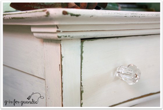
For some reason, as soon as I saw this in person I thought ‘yellow’.  And luckily I already had some of Fusion’s Buttermilk Cream, which is the perfect shade of creamy yellow.  Not in-your-face lemon yellow, but a subtle dignified yellow.  This is a fairly dignified dresser, so it deserved a dignified color.

springtime yellow 3

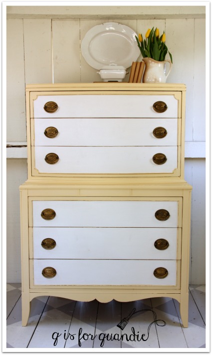
Once I had it painted in yellow, I decided to give it a little more personality with the addition of white inside the trim.  I used Fusion’s Limestone for that.

Looking at the craigslist ad, I had no idea that the top half of this dresser had a curved front.  In fact, if you look at my own ‘before’ photo you can’t really tell either.  But in person it’s quite obvious.

springtime yellow 4

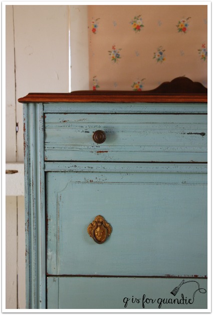
I thought about changing out the original hardware for some clear glass knobs, but there are 12 drawer pulls on this thing!  Even at only a few dollars each, that adds up when you need 12 new knobs.  So instead I spruced them up with a little gold rub ‘n buff.

springtime yellow hardware

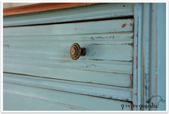
This dresser has a formal, traditional feel so I opted not to go chippy with milk paint.  The Fusion is just so darn easy to work with in comparison with no need for a top coat, no mixing, no worries about color variations.  I did end up need three coats to get really good coverage though.  I distressed the edges just a little.

springtime yellow 5

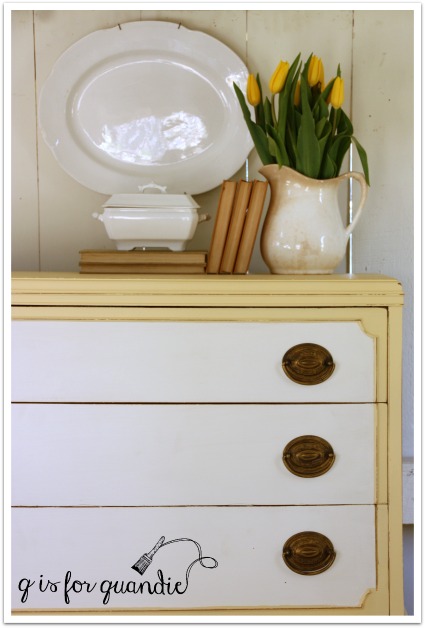
The yellow and white on this dresser reminded me of some daffodils that I used to have in my garden that were yellow and white.  I really wanted to find some daffodils to use in my photos, but wouldn’t you know it, the flower shop near me was all out.  I had to settle for yellow tulips, which paired nicely with some ironstone.

springtime yellow 6

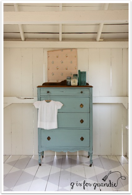
By the way, this dresser is quite large.  I think it’s often hard to tell in photos, especially in this case where I haven’t added a chair or anything to provide scale.  This baby is 52.5″ tall and 36″ wide.

springtime yellow 2

So let’s take a moment to talk about lining drawers, shall we?  Are you pro or con?  I am against lining a perfectly good drawer.  In my experience, a lined drawer ends up looking shabby much more quickly than an unlined drawer.  Loose paper liners don’t last very long, while sticky contact paper can be a nightmare to remove and it really doesn’t clean very well.  So for the most part, I don’t line the drawers of my pieces.

I make an exception to that when the drawer is really grossly stained.  Or in this case, I made an exception because two of the drawers in this piece had previously been lined with contact paper and it left behind an awful sticky residue that I couldn’t get rid of.  But, like I said, only two of the drawers had this problem.  So I only lined them.

springtime drawer lined

Two of the drawers have dividers in them …

springtime unlined drawer

And are in quite good shape.  The final two drawers aren’t divided, but also are in very good condition.  So I chose not to line them.

Is that weird?  If I were keeping this dresser, this is what I would do.  But will a prospective customer wish I had lined them all?  What do you think?  In general, are your pro-liner, or con?

springtime collage

Linking up with Friday’s Furniture Fix at Lost & Found Decor

and Making Broken Beautiful at the Curator’s Collection.

too cool for school.

I suspect that unless you are homeschooling your kids, most of you would not have looked twice at the craigslist ad for these vintage desks.

bts before

But the fact that they were a pair made me immediately think ‘nightstands’.  Plus I was kind of digging their mid-century vibe.  If you look at the base, you can see that the height is adjustable, so I knew I could raise them up a bit to be the right height for next to the bed.  So one recent Friday evening date night, Mr. Q and I drove out to one of my fave Minneapolis neighborhoods, Linden Hills, to pick these up.

I debated between two different concepts for them.  I thought about going ‘industrial steampunk’ by painting them black, ‘dipping’ the legs in copper paint and stenciling some numbers somewhere.  But in the end I decided to play up their mid-century look by painting the metal aqua and leaving the blonde tops as is.  They were in really good condition, so that seemed like a no-brainer.

I started by adjusting those legs.  That ended up being the most difficult part of this project.  Those bolts had obviously not been loosened in a very long time.  Luckily Mr. Q was able to use his brute strength to get the job done.  Then I painted the base of each table in Fusion’s Laurentien.  I absolutely love this color and am just finishing off my 3rd can of it.  I’m going to have to stock up on more!

bts side view

Once the paint was dry I sanded the edges a little to add some character, but I still felt like the paint job looked a little too new.  So although you don’t have to use a top coat with Fusion paint, I opted to wax these.  I started with a coat of Miss Mustard Seed’s furniture wax (clear).  The purpose of an initial coat of clear wax is to make the application of the next coat of dark wax easier to manipulate.  If you’ve ever tried using dark wax directly on a lighter paint color and it looked really streaky and you weren’t able to blend it as much as you’d like, that’s because you needed a base coat of clear wax first.

bts desk angle 2

I added some rub-on numbers to the pencil tray just to add a little whimsy.

bts interior

I staged some of my photos with a typewriter and of course you could use these as desks.

bts 3

bts typewriter

But really, they are just too cool for school.  I would use them as nightstands.  I just don’t have a good spot for taking photos of them next to a bed.  So if you are opposed to cookie cutter furniture and prefer unique one of a kind pieces, these are perfect for you.

bts pair

bts map

This Tokyo map paper had the perfect colors to match the desks.  There is something about that combination of aqua and french vanilla that I just love.

bts poster

How would you use these desks?

bts desk title

a chippy dresser and a clean floor.

I mentioned a little bit ago that it has been nice enough to be back out in the photo cottage already this year.  When I said that, what I meant specifically was that I could be out there taking photos without freezing my face off.  But it wasn’t quite warm enough that I wanted to be out there scrubbing away the winter grime.  Until last week (before we had another cold snap) when I came home from work one evening and it was 62 degrees outside.  So I decided there was no time like the present to head out there with my bucket of water and my scrub brush.  And now I have a fresh clean floor.  I was so happy with it, that I tried to include a bunch of floor space in today’s photos.

chippy dresser 2

All this talk of a clean floor is meant to distract you from noticing that I don’t have a ‘before’ photo of this dresser.

Drat!

I thought I had taken one, but if I did it is lost in the sea of 100’s of photos that I take every week (thus the urge to organize my photos that I mentioned yesterday).  This dresser has been patiently awaiting its turn to be made over, so it is possible that I took one some time ago and I just can’t find it!

Oh well, moving on …

I went with MMS milk paint on this one because I had a feeling it would get chippy, and indeed it did.

robins egg close up

I mixed some French Enamel and some Lucketts Green together to make this color.  I’ll be honest, I was expecting a much lighter color based on seeing what was said to be this same combination on a piece on pinterest.  This is a good reminder to everyone that colors in photos often don’t translate to how they look in real life.

This photos of this dresser are a really good example of that.  I think the dresser looks a bit more blue in the photos than it really is.  If you are proficient in MMS milk paint colors, this color is a bit lighter and a tad warmer than Kitchen Scale.

chippy dresser 3

This dresser has the prettiest drawer pulls on the lower three drawers.

chippy closeup 2

By the way, I did strip the top and then wax it with Cece Caldwell’s Aging Cream.

My vintage gardening books were the perfect color to use for staging.

chippy dresser staging 1

And I threw in one of those sweet hand sewn baby dresses that I keep just for staging furniture.

chippy dresser corner

This lovely dresser is for sale.  If interested, please feel free to leave a comment requesting the details or email me at qisforquandie@gmail.com.

garden questions


a quick folding chair makeover.

Last year I purchased these painted folding chairs at one of my favorite neighborhood garage sales, Bryn Mawr.

bryn mawr chairs (2)

They are fairly small, not the typical size of today’s folding chairs.  I liked the colors, but I didn’t especially like the way the vinyl seats were painted.  I knew from experience how to re-cover these though, so I thought I’d share that process with you today.

blue metal chair before

Here’s a close up of the seat.

blue metal chair seat before

Since normally I’m a fan of crackly and chippy paint treatments, I can’t really explain why this seat wasn’t working for me.  It was a little too far gone maybe.

If you flip one of these chairs over, you’ll see that the seat ‘cushions’ (I put that in quotes because these are hardly cushion-y, but what else should I call them?) are held in place by little metal tabs that are folded over.

blue chair tabs

It’s easy to just pry those upwards using a screwdriver and then take the seat right off.

blue chair without seat

I had some pretty vintage tea towels on hand that I also purchased at a garage sale to use recovering these chairs.  So I pulled one out and cut it to fit.

blue chair supplies

Normally I would pull out a staple gun for recovering a chair seat, but in this case the seat was made out of cardboard!  So instead I pulled out some tape and I just used my gift wrapping skills to cover the seat.

blue chair seat tape

By the way, when you have a seat cushion that is curved in the front and only goes on one way, try to pay attention if your fabric also has a ‘top’ and a ‘bottom’.  I was reminded of that when I put the cushion back in place.

blue chair backwards

Ooops.  That doesn’t look right!

I took it all apart and switched it around.

blue chair seat close up

Ahhhh, better.

blue chair final

What do you think?  I haven’t done the pair of green chairs yet.  I’m debating, will they be more marketable with a paint job?  Do I leave them green and recover the seats with vintage fabric?  Or do I remove the seats entirely and turn them into chalkboards, like these …

chalkboard pair

What would you do if you were me?

a garden chair.

The fun continues with the freebies from my friend Terri’s uncle.  Today we have a sweet little garden chair.

garden chair 1

It didn’t start out as a sweet little garden chair though.

garden chair before

This poor thing was a little rough for the wear.  I suspect it was used in the garage as a workshop chair.  It had lots of oily looking stains.

garden chair seat before

Take a look at how dark those two front legs are.  They appeared to be almost saturated with some sort of oil.  Or maybe it’s just really greasy dirt.  I scrubbed the chair good with some TSP substitute (which is a de-greaser), and then I decided to just go for it.  Either I’d paint it and the paint would just all bubble off, or it would stick.  I was willing to take a chance on it sticking.  After all, the chair was a freebie.  It likely would have ended up in the trash if I didn’t take it.

I pulled out the second sample color of Shabby Chic paint I received from Bungalow 47, Green Fields, which is a lovely pale, pale green.  I painted it on straight from the can without watering it down.  I somehow felt like I’d need a good thick coat of paint to cover this thing.

I was super impressed when two coats did the trick.

garden chair close up

Even on those legs!

garden chair leg

I was worried that those greasy stains would bleed through the paint, but I only had trouble with that in one spot on the seat.  If you were being very particular about your finish, this wouldn’t be good enough (in which case I would have used the Shabby Chic Clear Primer first) …

garden chair stain

But since I was going for a distressed look on this chair, I decided it was OK to leave that as is.  I specifically choose not to use the Shabby Chic Clear Coat this time around because I didn’t want to draw any more of those stains through the paint.  Instead I waxed this with Miss Mustard Seed furniture wax.

garden chair distressed

I could have gone without a top coat of any kind, but when I am distressing heavily like this I prefer to use a wax.  The wax darkens up those bare wood edges and makes them look more ‘believable’, like they have worn away over time, not just been freshly sanded.

Did you notice that I applied some rub-on numbers to my chair?

garden chair books

I like the touch of whimsy that they add.

garden chair full

In the end, this chair is rather wobbly and most people would feel a bit insecure sitting on it.  It will have to be more for looks rather than function.  But I think it would be darling as a bedside perch for books.  Or use it in your potting shed to hold a stack of clay pots.  If you are local, this chair went to Reclaiming Beautiful last week!

french provincial.

I think there are three categories of blog readers.  First there are the ones who just look at the pictures, but don’t really read anything I write (come on, I know they are out there … but they probably aren’t reading this, so I’m safe).  Then there are those that read my text and look at the photos, hopefully finding both at least slightly entertaining.  The last category are those that also read the comments.  I know Mr. Q reads comments, as does my sister.  How about you?  If you don’t, you are missing out!  I have quite a few regulars that leave insightful and often funny comments.  By the way, if you don’t know how to read the comments, you just click on the little ‘conversation bubble’ that is to the right of the title of the post.  Hopefully there is a number in the bubble, because that is the number of comments.

You also might get a little sneak peek into my future projects by reading the comments.  In this case, I’m referring to a comment left a while back on one of my posts from Skip.  Skip was asking whether or not I’d be interested in some free furniture, all I had to do was drive to St. Cloud to pick it up (about 1.5 hours from here).  She later sent me some photos by email, and I was in!

Although originally Skip had offered me a buffet/sideboard and dining room table pair, when I got to St. Cloud she had a couple more pieces that she was parting with and one of them was this sweet little french provincial end table.

fp before

Of course I threw this in the truck!  I love those graceful legs and the pretty hardware.  I knew that some paint would help bring out its charm.

fp 1

See?

I knew exactly what colors I wanted on this one.  I painted the body of the table in Fusion’s Inglenook and the drawer front in Fusion’s Limestone.  French provincial, Inglenook and gold hardware make a great combo.  I figured this out last year when I painted this lovely french provincial piece …

french nightstand

I love the way this little table turned out.

fp 5

I distressed the edges just a little, because that’s the way I like ’em.  Plus I always feel like if your piece is purposely distressed, than a couple more unintentional distress marks will just blend right in.

fp 3

This table has a leather insert in the top.  I just painted right over it.  I’ve done this before using milk paint

fp top

Once the paint is cured (in about 21 days), I expect this to be quite durable.

I spruced up the hardware by adding a little gold rub ‘n buff.  You could get this same effect using the Gold Leaf Goat Stick (I just couldn’t find mine, I think it rolled under the cupboard in my Q Branch and I still need to dig it out).

fp 4

This little table is the perfect spot for your cup of tea.

fp cup of tea

Do you need a spot for your tea?  Check out my ‘available for local sale’ tab to find out if this piece is still available.

fp table collage

the potting shed.

Back in the day long before it became the photo cottage, the summer house in my backyard was known as the potting shed.

photo cottage

I actually had it all decked out with a workbench for potting up plants.  In reality, it did not make a very efficient potting shed.  Potting plants is messy work, I’m better off doing it right outside where I can just brush the dirt away onto the lawn.  Still, it was fun to stage today’s piece out there as though it still were a potting shed.

the potting shed

If I didn’t get so much use out of the photo cottage as is, I’d be tempted to turn it back into a potting shed now.

green garden books
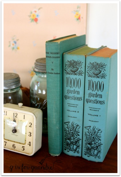
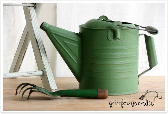
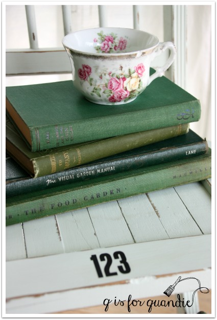
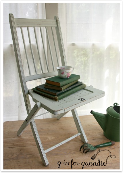
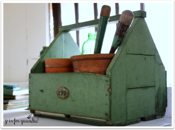
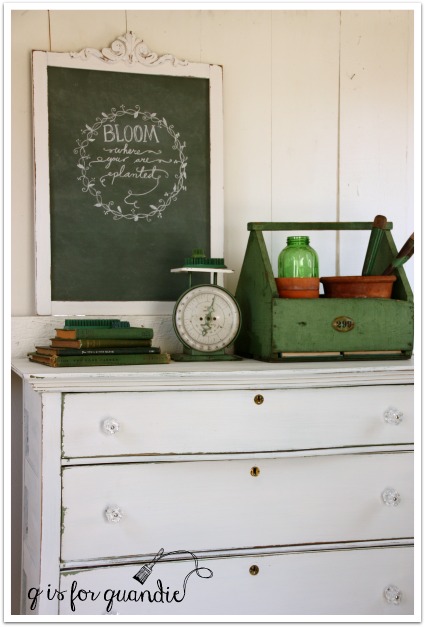
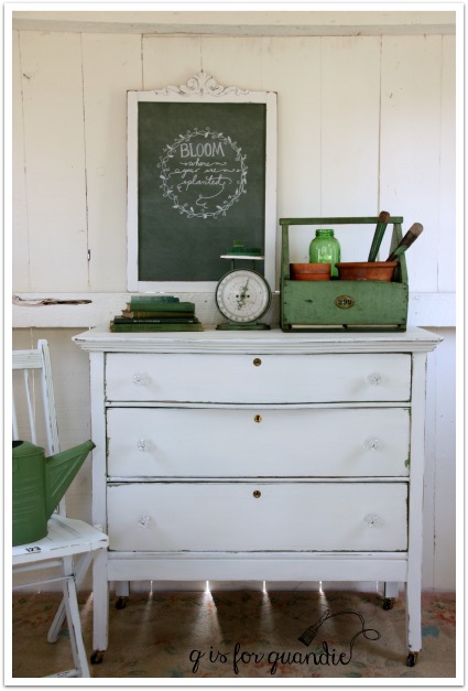
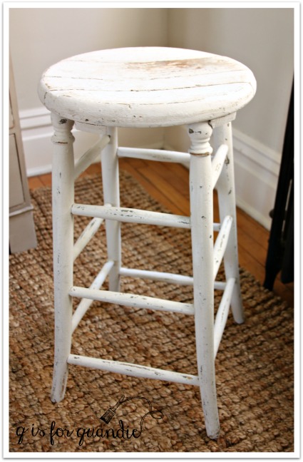
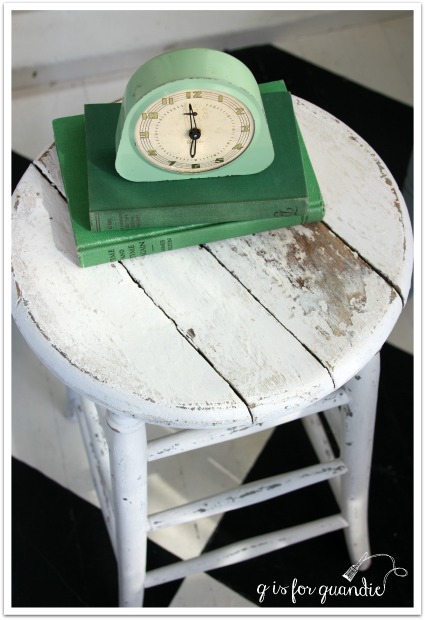
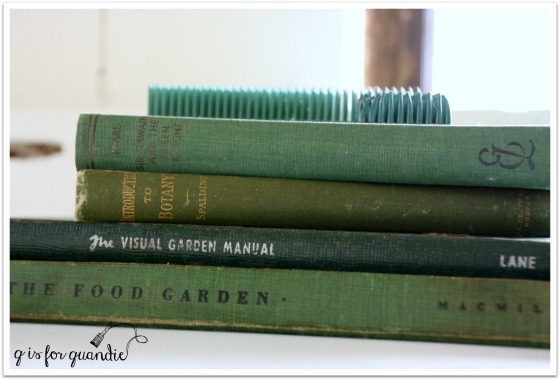
I have lots of fab garden-y props, all in lovely shades of green.

green scaleThis green box usually resides in my pantry holding cleaning supplies.

green garden box 2

But the real reason for this post is the dresser.  This is another one that Mr. Q picked up for me via Craigslist.

porch swing before

This was an interesting piece.  The style says ‘old’, and inside it looks old, but there were some things that were throwing me off.  For one thing, the casters are new.  The drawers pulls are new too.  And the finish was very plastic-y and shiny, like new.  Someone worked really hard to take the “old” out of this piece, which I found to be a little bit sad.  Obviously it was up to me to put the ‘old’ back in!

I got off to a bit of a false start with this one.  I painted it with Little Billy Goat’s Porch Swing, which is a lovely green (in fact, a very similar green to the wood box with the handle in my photos).  But it did not work out.  I’m still doing some research into where I went wrong, and when I have some answers I’ll share that with you.  In the meantime, let’s just say I knew I had to go back to the drawing board.  I decided to paint over the green with white milk paint.  I purposely added some wax around the edges first so that some of the white would chip away to reveal the green.  This is the same mix of MMS whites that I used on the chalkboard frame from Monday, by the way.

potting shed dresser close up

Perfection!  In the end, maybe this was meant to be.  Just a hint of green rather than a sea of green.

potting shed dresser angle

As you may have noticed, I replaced the brass drawer pulls with some glass knobs.  These are the 1 1/2″ glass knobs from D Lawless Hardware.  They are the larger size glass knobs, and I think the scale of these was just right for this piece.

potting shed dresser 2

potting shed dresser 3

I took about six hundred photos of this thing.  Some with the window …

potting shed dresser 4

Some with my false wall in place.  If you don’t know about my false wall, you can read about that {here}.

potting shed dresser 1

I think this dresser would be perfect in a farmhouse style kitchen, or maybe on a covered porch.  Or perhaps beside the bed in place of a nightstand.

potting shed dresser collage

This one is for sale (local sales only, no shipping available), so if you’re interested in more details feel free to leave me a comment or shoot me an email at qisforquandie@gmail.com.

lake superior blue.

lake superior blue title

A little while ago I told you about the Fusion custom color contest.  After some confusion about when the deadline was for submitting colors, I can confirm that it has definitely been extended to March 31, 2016 (instead of February 29).  Which means I had some time to get my act together and submit a piece myself.

To participate in the contest, you have to create your own custom color by mixing together two or more existing Fusion colors.  Then you have to name your color and paint something in it.  Check out their Facebook page for more details.

custom color contest

When my sister was over for my hatbox party the other day, she played around with mixing some colors and she came up with a gorgeous dark teal blue by combining equal parts of Homestead Blue and Liberty Blue.

debbies colors

So I asked her if she wanted to team up with me to paint a piece to submit to the contest using her color and my painting skills.  We even went halfsies on the paint.  She had a jar of Liberty Blue and I had a jar of Homestead Blue.  We mixed our two paints until we got a color that we thought was perfect.  Our recipe ended up being 3 parts Liberty Blue to 2 parts Homestead Blue and it leans a little more towards blue than Debbie’s original half and half mix (although it certainly doesn’t look that way in the jar!)

lake superior blue

Debbie hadn’t come up with a name for her color though, so I gave it some thought.  I wanted to name it something that reflected our partnership, but also described the color.  I thought about our trip to Duluth last fall and came up with Lake Superior Blue.

vintage Duluth postcard

I knew this color would be the perfect choice for updating this piece …

lake superior before

This was another freebie from my friend Terri’s Uncle Don.  The finish was in terrible shape and the bottom drawer was completely stuck.  Poor Mr. Q spent quite a long time getting that thing out.

Although the top of the credenza had numerous stains (I think someone probably kept house plants on it at one time), I decided to attempt to stain it rather than paint it.  I wanted the warmth of some wood to pair with the cool Lake Superior Blue.  The existing finish on this one was so dried out that I was able to easily sand it off with just a couple of passes with the palm sander.  Also, it was so nice out last weekend that I was able to work on it right there outside on the deck so creating a bunch of dust wasn’t an issue.  I sanded it down first, then I decided to try bleaching some of the heavier stains.  I used a q-tip to apply bleach just to the dark stains, then left the piece out in the sun for an hour or two.  Then I sanded some more.  I wasn’t able to eliminate all of the stains entirely, so I stained the top with in a dark walnut to camouflage them a bit more.  I then added a wipe on poly in a satin finish.

ls top

This was the darkest stain and although I didn’t remove it entirely, in the scheme of things it blends in fairly well.

ls stain mark

Here are the knobs that I ended up with on this piece.  It took me a while to land on this choice.  I’ll be posting more detail about this choice on Wednesday, so be sure to check back!

ls knobs

That brings me to the trim detail on the two upper drawers.

That’s metal.  I debated removing it and filling the groove with wood putty, but I think it would have been difficult to disguise it completely.  I also considered just painting over it.  The Fusion would have stuck to it, and that would have been a very reasonable choice.  But ultimately I decided to work with it.  It was a brassy gold to begin with, but I added some gold rub ‘n buff to give it a more of a gold leaf look.

ls front

I purchased this India board game box on eBay many years ago.  The colors worked beautifully with the credenza, but I had a lot of trouble with glare on it in my photos.  I originally tried hanging it on the wall, but for some of the shots I had to angle it in strange ways in order to not just get a shiny blank in the photos.  So for some final shots, I just took it down from the wall.

ls India

And voila!  Here is the Lake Superior Blue credenza!

lake superior blue credenza

What do you think of our Lake Superior Blue?

Voting for the contest begins in April so I may have to call on you guys to go and vote for us!

Sharing at Friday’s Furniture Fix!

a shabby stool.

I’m always a little sad when I find an already shabby, painted piece that is just not quite right.  Let’s face it, as much as we try to recreate an authentic chippy, shabby, aged finish using all of the fabulous products available to us, we are still only approximating the look of a genuinely aged piece.  But those genuinely aged painted pieces are hard to come by.  If they were a dime a dozen, people like me would be out of work (or out of a hobby might be more accurate).  And when we do find them, many times they cross the line from fantastically shabby chic to just plain shabby.

shabby stool before

Such was the case with this stool.  It’s so close to being fabulously chippy, but darn those cigarette burns!  They just aren’t charming at all!  I had to deal with cigarette burns once before (on this piece) and they can be seriously frustrating.  On that earlier piece I sanded and I bleached, and in the end I used a dark stain to try and disguise them.  On this stool I went in a different direction.  I wanted to clean things up just a bit, without losing the chippy vintage paint job entirely.

First I pulled out the Fusion Colour Blocker, which I just discovered has a new name, Concealer.

Fusion color blocker

Just so you know, this product is not a stain blocker or a primer.  Concealer is made from 100% recycled waste pigments.  It costs about half as much as the paint.  The idea is that when you want to paint a dark piece white, you can start with a coat of two of Concealer first and then follow that up with another coat (or potentially two) of your final shade of white thus saving some money on your paint costs.  In my case, I used this product much like its name implies.  I used it to conceal those black burn marks.  I used a small brush and put about 4 coats of Concealer just over the marks.

Once the Concealer was dry, I mixed up some random Miss Mustard Seed whites.  I had several already opened pouches with just a little powder left in them, so I mixed up about a tablespoon each of Ironstone, Grain Sack and Linen.  I painted on two coats of milk paint.  I did not paint carefully or try to fully cover the entire stool.  In fact, I specifically avoided the large area of chipped away paint on the top of the stool.  One the milk paint was dry, I sanded the stool fairly haphazardly to ding it back up again.

And voila!

stool after

Burn marks are gone, gross drippy marks are gone … but the shabby looks is retained.

stool

I’m choosing to forgo a top coat of any kind on this stool.  I want to see how the milk paint wears over time without one.

stool 2

So, the next time you see a painted piece that has crossed the line into just plain shabby, consider giving it a milk paint makeover!

stool with books and clock