the indigo desk.

I don’t know about you guys, but I try to use good judgement when making purchases via Craigslist.  However, I definitely don’t always manage to do so.  It feels so awkward to say ‘no’ to someone, so sometimes I end up buying a piece that I really shouldn’t.  I’m working on that skill though.  It can be really frustrating to take the time to go look at a piece, then get there and find that it’s not at all as advertised.  So if the piece is going to need tons of work and it isn’t priced accordingly (ie. dirt cheap), I’m learning to just walk away.

This happened to me a couple of months ago with a dresser.  It was priced right at the top of my price range.  That would have been OK if the dresser had truly been in ‘excellent’ condition as stated in the ad.  I was in the market for a piece that just needed painting.

However, in reality the piece was what I like to call a humpty dumpty (check out this post about the original humpty dumpty and you’ll see what I mean).  It would have required lots gluing and clamping to put it right.  So I didn’t buy it.  After looking the piece over and pointing out that it was not structurally sound, I simply said “I’m sorry, I’m going to have to pass on this dresser.  Thanks for your time.”

  That being said, nearly a year ago Mr. Q and I drove all the way out to Minnetonka to pick up two pieces from separate sellers.  I don’t normally drive that far to buy pieces anymore, but in this case I was able to arrange to pick up two things in one trip.  Plus the prices were really low on both pieces.

One of the pieces was this desk.

Obviously I was mainly drawn in by those cup pulls!

This was an interesting situation because the seller wasn’t actually going to be home.  They left the desk on a covered porch and asked me to put the money under a flower pot.  I know, it sounds crazy, doesn’t it?  This was not the first time I’ve made arrangements like this though.  There are still a few trusting people left in the world.

You’d think with that being the case it would have been super easy for me to just walk away after getting there and finding that the desk was quite a bit smaller than I pictured and the veneer was in really poor condition.  I could have just left the desk there on the porch and moved on.  But somehow I felt obligated to buy it since the seller had hauled it out there for me, and trusted me to show up and leave the money behind.  Plus after driving so far I didn’t want to go home empty handed.

So my next logical step was to shove the desk in the corner of my carriage house and try to ignore it for nearly a year (imagine that said with the proper amount of sarcasm) .

But I was finally tired of seeing it out there, so when it warmed up last week I pulled it outside and attacked the chipping veneer with my putty knife.  I basically just chipped off all of the loose veneer and then sanded heavily.  It would have taken ages to remove ALL of the veneer and this desk was just not worth that amount of labor.

While I was chipping veneer, I also stripped the top of the piece (with Citristrip) which is basically constructed of 3 solid wood boards (no veneer, thank goodness).

As I was working on the piece I noticed something kind of fab on the inside.  The desk must have been partially constructed out of old wooden storage crates.

Isn’t that kind of cool?  My favorite is the backside of this drawer front.

I’m guessing that this piece was homemade and it was cobbled together with spare bits of wood that the builder had on hand.  As I was working on this piece I began to realize that it really did have a lot of charm.

Originally I had envisioned this desk in chippy white milk paint.  After my semi-disastrous outcome the last time I used milk paint, you might think I would shy away from using it again.  But no.  I know that situations like that are the exception and not the rule.  I still love the results I get from milk paint 99.9% of the time.  However based on the size of the desk I decided it should have a more kid friendly color rather than white.  So I pulled out some Miss Mustard Seed milk paint in Flow Blue and mixed it up.  I probably could have gotten away with one coat, but I had plenty of paint mixed up so I added a second for good measure.

Once I had the paint on I was so happy I’d changed my mind about that white.

I also realized that I loved the contrast between the rich deep color of the Flow Blue and the pale wood top.  So rather than add stain or a dark wax to the top I simply waxed it with Miss Mustard Seed’s clear furniture wax.  In fact, the entire desk has a finish coat of the clear wax.

Then I cleaned the cup pulls with soap and water and put them back on.

If you’re wondering whether or not the chipped veneer is noticeable, it definitely is.

But I think that just adds to the rustic charm of this piece.

This desk is definitely too small to be used as a desk by an adult.  But it’s perfect for a kiddo.  Wouldn’t it be fun in a boy’s room?

But it also could be used as an alternative to a traditional bedside table.  It’s just the right height for that.

I have to admit, this desk turned out way better than I expected.  When I started work on it my goal was to just get it done and then move on to another piece.  I totally was not expecting to completely fall in love with the result.

Hopefully someone who needs an indigo blue kid-sized desk will fall in love with it too.

Be sure to check out my ‘available for local sale‘ page if interested!


Saturday morning coffee.

It finally feels like spring is here, and you know what that means?  Garage sale season is coming!

Since I have a 9 to 5 day job, I have to do all of my garage saling on Saturday mornings.  So I only have a few more Saturdays that I can spend lounging about with a cup of coffee and my favorite books and magazines.  Starting the first weekend in May I’ll be getting up early and heading out to hit the sales.

So this past Saturday morning I took some time to chill out, enjoy the sunshine streaming in through the windows and get some photos of the coffee table I just finished up before my sister and I headed out to Junk Bonanza in the afternoon.

I purchased this table way back in January, brrrrrr ….

and I’ve basically been working on it in bits and pieces since then.

I’ve refurbished a few of these tables in the past.  Usually I remove the drop leaves and turn them into signs and then use the table without the leaves as a desk.  I have one in my Q Branch and Mr. Q has one in his study as well.  I also have one on my front porch with casters on it that I use for staging close up photos of random small stuff.

Although I still removed the leaves and turned them into signs, this time I decided to try something different with the rest of the table.  With the help of my handyman Ken, I converted it to coffee table height.

Since I wanted to keep the detail on the lower part of each leg, I removed all of the legs and then Ken cut them down from the top and re-attached them to the table.  I neglected to get a photo of that before I added a coat of paint, so you’ll see that in a minute.  But before I painted, I stripped the top of the table.

Since it was winter in Minnesota, I had to do this inside my house.  I like to use Citristrip for that simply because it’s safe for indoor use.  I like to avoid using any toxic chemicals inside the house, and I try to keep sanding to a minimum inside as well.

Here’s the top after cleaning off the stripper.

Once that was done, I flipped the table over onto some horses and started painting the base.  I began with a coat of Fusion acrylic paint in Inglenook or maybe that’s Little Tea Pot.  To tell the truth I did this part so long ago I don’t remember!

The existing finish on the table was pretty shiny, so most likely milk paint would not have adhered well without a lot of sanding prep work.  Since I wasn’t in the mood to sand those legs (ie. was feeling lazy), I used Fusion for the first coat of paint instead.

Next I applied some of the Homestead House Salad Bowl Wax to various spots as a resist, and then added a coat of Sweet Pickins’ In a Pickle.  You can see the spots where the wax resisted the milk paint.

Next I added more Salad Bowl Wax to other spots to resist my final paint color which was Miss Mustard Seed’s Shutter Gray.

After that dried, I sanded lightly to distress and then added clear wax.  Here is the result.

After that it was time to flip the table back over and work on the top some more.  I started by sanding the stripped wood with 220 grit sandpaper.   Then, looking at the wood closely, I realized that I didn’t like the color of it.  It still had a bit of a yellow/orange cast to it.  What I wanted was more of a washed out, driftwood sort of look.

So I decided to white wash it using watered down Dixie Belle paint in Drop Cloth (see this post for more detail on white washing).  I just used one coat of watered down paint.  One that was dry, I sanded lightly, wiped away any dust and then added a coat of Dixie Belle’s clear wax.

I felt like the piece looked a little too fresh and new at that point so I pulled out Dixie Belle’s new Grunge Gray wax.  Dixie Belle sent a can of this wax my way to give it a try.  I used to make my own grey wax by mixing black and white wax, but this is so much easier.

As with all colored waxes, if you want a heavier application of the color you can apply the wax directly to your bare wood (or over a painted surface).  If you want more subtle results wax your surface with clear wax first.

When using a new product for the very first time, I always recommend testing it on an old board like I did with the Grunge Gray wax.  That way you can get a feel for how it looks and the best way to apply it before you get it on your piece of furniture. 

I already had that coat of Dixie Belle clear wax over my white washed table top so I got a more subtle result from the Grunge Gray wax.

I really worked the Grunge wax into the creases on the edges of the table.

I ended up with a table top that has that sort weathered gray appearance of a piece that has been left out in the elements for a while.

 It makes a great spot for a little Saturday morning coffee, don’t you think?

If any of you local readers need a spot to enjoy your coffee (sunshine not included), be sure to check out my ‘available for local sale’ page for more details.

the spring fling dresser.

We’re still recovering from the ridiculous amount of snow we got last weekend, but things are looking up weather-wise here in the Twin Cities, we might even hit 60 by Sunday.  I am suffering from a very serious case of garage sale withdrawal, so I’m chomping at the bit for some spring!

I thought I would nudge it along a little bit with a spring fling in the form of a garden themed dresser.

I shared the beginning of the journey of today’s dresser with you guys on Wednesday.  This dresser just insisted on being something other than what I first imagined.  After several failed attempts to salvage a milk paint finish, I threw in the towel and decided to start over again.

As a reminder, when we last left the dresser it looked like this.

The first thing that you have to understand is that any remaining chippy paint is going to leave a texture on the surface of the dresser if you just paint over it.  In addition, whatever you put over that remaining paint may ultimately chip off as well.  The adherence of your final paint layer is only as good as the adherence of what is under it.   So the first thing I had to do was make a choice between just sanding off the loose chips, or doing a heavier sanding and removing all of the milk paint entirely.

I went with with the former.  I used my orbital sander and a 120 grit paper to remove as much of the chipping paint as I could knowing that the remaining bits of paint would add some texture to my piece.

There were several ways I could have proceeded from there that most likely would have worked well.  I could have stuck with my original milk paint plan and simply added bonding agent to my paint to make it adhere to the surface of this piece better.  Unfortunately, I had already used up almost an entire bag of both the Homestead House Texas Rose and the Miss Mustard Seed Linen.  I did not have enough of either color left to start over with them (and I also don’t happen to have any more bonding agent on hand either).

Another option would have been to paint a base coat of acrylic or chalk paint over the entire piece and then add a layer of milk paint without bonding agent.  The chalk or acrylic paint would have adhered to the dresser, and the milk paint would have adhered to the chalk/acrylic paint.  Again though, I didn’t have enough of the Miss Mustard Seed Linen paint to go that route.

So I decided to just move on to chalk paint, and to switch up my color scheme a bit as well.  I started with an undercoat of two green shades of Dixie Belle paint, Kudzu and Mint Julep.

I wanted the Kudzu (the darker green) to show through some distressing on the edges, but I didn’t have enough Kudzu to paint the entire piece.  Since I hadn’t gotten all of the milk paint off the piece, I knew I would have some texture from what was left and an undercoat would show when I sanded those areas too, so I wanted to have a shade of green there as well.  Luckily I also had a bit of Mint Julep on hand.

In the end, I decided to paint the inside drawers in the Mint Julep as well.

And I’m so glad I did because it adds the prettiest pop of color when you open the doors.

But before I got to that, I painted two coats of Dixie Belle’s Drop Cloth (paint compliments of Dixie Belle) over the exterior.  Drop Cloth is a warm off-white.  Then I added one of my absolute favorite Iron Orchid Designs transfers (transfer compliments of Prima Marketing) to the front of the piece.

You can sort of see what I mean about the undercoat of green coming through in that photo above, right?  By the way, you can order this transfer online at Scrapbook.com here.  When I looked last night it was on sale for $17.99, which is a great price.

The thing that I really love about these furniture transfers is that they are sized for furniture.  I love the way this one fills up the entire front of the dresser (this is the large version of this transfer, there is also a smaller version available and you can see it on this piece).

And in fact, the large transfer was actually a tad too long so I cut off the “1871.” and put it on the trim at the back of the dresser top.

This is the 4th time I’ve used the larger version of the transfer and each time I have absolutely loved the results.  You can see the other three pieces here, here and here.

Once I had applied the transfer, I waxed this piece with Miss Mustard Seed Furniture Wax over both the Drop Cloth and the Mint Julep Dixie Belle paint, as well as over the transfer.  Yes, you can definitely was over a rub-on transfer.

By the way, I almost forgot to mention.  This dresser came with a key!

It’s really quite rare to have the key, and locks that still function.

Do you ever wonder about these old pieces with locking drawers?  It seems like all of the pieces from this era had them.  What did people lock up in them?  Money?  Their last will and testament?  Their secret diary?  Their hidden stash of chocolate?  Today it seems laughable that you would lock something up in a drawer and feel like it was secure, doesn’t it?

I swapped out the original wooden knobs for some pretty glass knobs.  I buy these knobs in bulk from D Lawless Hardware.  I am exaggerating only slightly when I say ‘in bulk’, but I do order them by the dozen so that I always have them on hand.  I also buy three different sizes.  This is the middle size, or 1 1/4″.

I love using the glass knobs on pieces with the transfers because they disappear a bit and don’t interfere with the detail of the transfer itself.

Here’s one more look at that pretty pop of mint green on the inner drawers.

And there you have it.  It may not be milk paint, but I still think it turned out beautiful in the end.

 If you need a garden themed linen press dresser and you live near the Twin Cities, be sure to check out my ‘available for local sale’ page for more details.

a complete and total fraud.

Remember the pretty sea glass dressing table that I shared a couple of weeks ago?  I mentioned at the time that there were three pieces that I picked up together that night.  Today I’m sharing a story about the 2nd piece, a linen press dresser.

There are four more drawers behind those doors.  Whenever a dresser has drawers behind doors I call it a linen press.  I’m not sure if that is technically accurate, but it works for me.

Since I had so much fun layering milk paint on the desk I painted during milk paint madness week, I decided to try that again on this piece.

So I began with removing the knobs, sanding the piece, cleaning it well and then painting a base coat of Homestead House milk paint in Texas Rose.  I painted the entire outside of the piece, as well as the four inner drawers, both inside and out.  My plan was to use the Texas Rose as a base coat under some Miss Mustard Seed Linen on the outside, but leave the inner drawers in this pretty rosy color.

I’d never used this color before, so before I started I painted a test board in it and tried out a couple of different top coat options.  As you can see, the topcoat can really make a difference in the look of this color.  I wanted to see what my options looked like before I made a decision.

Before moving on to my final color, the Linen, I decided to layer another color under it.  I went through my mostly used bags of milk paint to see what I had and pulled out Homestead House’s Upper Canada Green.  I only had a couple of tablespoons of this paint left, so I mixed it up.  I thought this would be a good opportunity for me to show you what I mean when I tell you to let your milk paint sit for 5 – 10 minutes to be sure all of the pigments are dissolved.

Here is how the paint looked before any mixing at all, just the water and the powder in a cup.

See all of those flecks of blue pigment floating around?  They still need to dissolve.

Here’s is the paint after an initial stir …

You can still see a few darker flecks of color and the overall color is pretty yellowish.

But after waiting five minutes and giving it another stir, you start to see true color of the Upper Canada Green as those blue pigments are finally dissolving.

You can see why you don’t want to start painting before those pigments are all fully dissolved.  You can end up with an entirely different color.

OK.  So you might be wondering at this point why I have mixed up a couple of tablespoons of my next color since this is clearly not going to be enough paint for the entire thing.

This is another little trick I want to show you.  I had someone comment that they hated wasting milk paint for a layer of color that was barely going to show on the finished piece.  I totally get that.  So here’s what you do.  Instead of painting the entire piece in your second color, just paint it over the areas where you want to see it peeking through your distressing/chipping.

So far, so good, or so I thought.

The paint looks pretty well adhered in that photo, doesn’t it?  There were a couple of chippy spots on the legs, but that was about it.

However, fast forward about 18 hours.  The next morning the dresser was chipping pretty much everywhere.  Ugh.  I decided all was not lost, I would just sand it well to get all of the chipping paint off and create a better base for the final color.  So I sanded, vacuumed and then painted on a coat of Miss Mustard Seed’s Linen.

As the Linen started to dry I could see that it was continuing to chip.  In fact, it was chipping even more than before.  And it was chipping all the way down to the wood.  My work applying the layered colors was all just flaking right off.

Ugh.  This was the moment when I felt like a complete and total fraud.  I’d just spent a full week here on my blog proclaiming to be an expert on milk paint and now my own milk paint project was turning into a complete disaster.  Was this the universe’s way of keeping me humble?  Reminding me that I don’t know everything and no matter how much experience I have with milk paint it can still totally backfire on me.

I was mentally beating myself up and wanting to just kick the dresser to the curb.  Suddenly a bonfire seemed like a great idea.

Or maybe I could just hide the dresser under a sheet and never mention it to anyone.  I told Mr. Q I was going to sand it down, paint it with chalk paint and never, ever tell anyone that I’d initially tried to paint it with milk paint and it was a complete failure.

  Instead I did what I usually do in these situations.  I walked away.  I pushed the dresser into a corner and decided to give it a couple of days to think about its behavior.

In the meantime Mr. Q reminded me that I’ve painted well over 100 pieces of furniture with milk paint and this chipping situation has only happened to me a few times (see them here, here and here).  He also suggested that sharing this experience with you guys was the right thing to do.  If it happens to me, it probably happens to other people too.

I really don’t know what was on this piece that caused it to chip like this.  I did prep it properly.  If anything, I sanded and cleaned it more thoroughly than I usually do.  I guess 4 times out of over one hundred or so pieces aren’t terribly bad odds.

A few days later I pulled the dresser out of its corner and I thought to myself ‘you know, that chipping is a little extreme, but some people love a really chippy finish.’  I thought that perhaps if I just added one more coat of the Linen milk paint I could make it work.

Can you guess what happened?  Sigh.  Yep, it chipped even more, if that’s even possible.  Literally to the point that there was very little paint left.  I have run into this phenomenon before, each added layer of paint activating even more chipping.

After knocking off all of the loose paint, this is what was left.

Milk paint just wasn’t meant to be with this piece.

I decided not to throw it on the bonfire, but instead to start over from square one.  After all, under all of that chipping paint is still an adorable linen press dresser that is in great shape.  You’ll have to wait until Friday to see the end result though.  I hope you’ll check back then.  But in the meantime, how about you?  Have you had any colossal paint disasters?  Please tell me I’m not the only one.


oops, I did it again.

If I come across a mid-century piece while perusing Craigslist these days, and it’s a bargain price, I can’t help but feel like I may as well buy it and paint it green.

This formula has been such a great success for me lately.  Why mess with a good thing?  If it ain’t broke, don’t fix it.  And all of those other proverbs.

So when I saw this piece on Craigslist I decided to go for it.

Luckily it was a bargain, because …

a) it isn’t quite as stylish as the other three pieces I’ve done.

b) two of the knobs are broken so I’ll need a solution for that, and there are 14 knobs total so replacing all of them could be expensive.

c) the top of this piece is plastic laminate, not wood veneer.

d) buying it was a bit of a circus.

Let’s start with that last one.  When I arranged to pick it up, the seller explained that she had already moved out of the house where the dresser was still located and now she lives over an hour away.  She was selling multiple items so she wanted to find a time to meet at the house that would work for everyone so that she only had to make the drive once.  That was two other buyers, myself, plus the seller.  Have you ever tried arranging a time that works for multiple people?  Tricky at best.

But we finally all agreed on Friday evening.  Next, the seller didn’t want to actually give out her address.  I get it.  She’d just told me that the house was empty and she was probably thinking ‘oh wait a minute, should I really be giving out the address now?‘  So instead she asked me to drive to a particular intersection and then call her and she’d give me the address from there.  That ended up working out fine, but I usually like to know where I’m going before I head out.

By the way, for safety reasons I never go pick up a piece of furniture alone.  I always have Mr. Q with me.

So we made it there, we hauled the dresser up out of the basement via a very narrow staircase with low ceilings and got it loaded into our van.  It was a lovely Friday evening, so we then took the scenic route home through St. Paul rather than just take the freeway.

Once I got it home, the first thing I did with this piece was to sand the laminate top with my orbital sander, clean it well with TSP substitute and then added a thin coat of Fusion’s Ultra Grip.  Ultra Grip is intended to improve the adhesion of Fusion paint on tricky surfaces like glass, metal or laminate.  The Ultra Grip needs to dry for at least 12 hours before you add paint over it.

I want to mention here that I hear a lot of people commenting on brush strokes when using Fusion paint, especially with the Ultra Grip.  Although you can’t really see many brush strokes in that photo, when the light hits this piece at just the right angle you can definitely see them.  I’ve read lots of tips on how to minimize the brush strokes and I do my best, but they are still there.  Certainly more so than with chalk or milk paint.  I just don’t worry about them.   All three of my previous Park Bench pieces had brush strokes, and all three of them sold like hotcakes.

Next I decided to try and remove those chunky hour glass trim pieces on the two lower drawers.

I thought this piece would look sleeker and more stylish without them and I was hoping that I would be able to remove them without doing too much damage.  If they had been super glued on I might have had some trouble, but they were nailed on with double ended nails.

I didn’t know that up front though.  I used my mini pry bar to carefully start prying it off.  I gently made my way around the edges of the trim working my pry bar under it and gently lifting to see it if would come loose.

It was held in place with quite a few nails.

I pulled the nails out with pliers and then used Dixie Belle’s Brown Mud to fill the holes and smooth out some of the damage I did prying off the trim.

If you are ever considering a piece of furniture but you don’t like the trim on it, keep in mind that removing it can sometimes be an option.  I also removed some medallions that I didn’t like from a buffet I painted a while back (you can read the details here).

The rest was easy.  I painted everything in two coats of Fusion’s Park Bench.  No need for a top coat with Fusion.

I really went round and round with the knobs for this one.  Initially I didn’t want to keep any of the originals so I went to Hobby Lobby to see what they had.  Naturally they didn’t have 14 of anything, so if I’d found the perfect knob I would have had to order more.  Also, even during a 50% off sale, I would have spent at least $35 to $50 just on knobs.

Still, I brought home a few options to try on the dresser.  As it turned out, the drawer fronts on all of the curved upper drawers are really thick.  As a result, the screws on the Hobby Lobby knobs weren’t long enough to reach all the way through.  Argh.  I’m sure Ken could solve this problem by counter sinking the nuts on the back.

But before resorting to that I decided to revisit the original knobs.  First I spruced them up a bit with some of Prima Marketing’s Mettalique wax in Vintage Gold.  Then I moved some knobs around and added new knobs to the just the bottom drawers.  I think it works.

Oh, oops, you can see I didn’t paint the underside of that overhang at the top.  But I promise, you will never even see that in person unless you decide to lie on the floor.

So there you have it, another quick mid-century makeover.

 I’ve decided to hang on to this piece until the paint cures just to be on the safe side.  I don’t always do that, but since this one is plastic laminate on the top I think it will be more susceptible to scratching until it cures.  The Fusion paint takes approximately 21 days to cure.  So I’ll list it for sale in a couple of weeks and then we’ll just have to see if my Park Bench green mid-century modern selling streak continues!

milk paint magic.

Hey everybody!  Thanks so much for joining me this week for milk paint madness.  It has been fun sharing lots of info about milk paint with you.  I hope that all of you learned at least one or two new things.  Before I continue I want to take a moment to thank you guys for all of your comments, as well as your continued support of my blog.  I really do appreciate every one of you!

For today’s post I want to take everything we’ve learned over the last week and put it all into practice on piece of furniture.  So let’s get started.

My friend Meggan or, as I now call her, the thrift doctor (I’m trying to convince her to start writing her own column here on my blog called ‘ask the doctor’ with thrifting tips, what do you think?), texted me a few weeks ago letting me know that there was a fabulous desk at the local Goodwill with a bargain price tag.  Luckily Mr. Q was available to dash over there and pick it up for me because I know it would have gone fast.

It doesn’t have a lot of frills, but I like the legs and the drawer pulls are really lovely.  It also was in fairly good shape.

I really didn’t love the orange-y color of this piece though.  I didn’t even want that color to show through in the chippy spots.  So I decided to layer some colors on it using bonding agent in the first color so that it wouldn’t chip down to the wood.

I could also have used a base layer of chalk paint or Fusion acrylic paint, but in this case I had a particular color in mind, Homestead House milk paint in Maritime.  A very pretty blue.  So I mixed my paint first using one part water to one part powder.  Once that was well mixed, I added another one part Miss Mustard Seed bonding agent and stirred it in.

Next I moved on to the prep work.  As I mentioned yesterday, good prep is key to controlling the chipping you might get with milk paint.  But in this case I was using bonding agent in my first layer of paint so I could slack off a little.  Still, I sanded the piece briefly by hand and wiped it down with a damp cloth.

Then I brushed on just one coat of the Maritime milk paint with the bonding agent added.  Now, if I was a really good blogger I would have taken a photo at that point to share with you now.  But no, I didn’t (although that photo of the brush above is taken on top of the desk with its coat of Maritime).  I can tell you that the paint did not chip at all and it had just a little bit more sheen than milk paint normally does.  Similar to the slight sheen of Fusion acrylic paint.

A couple of days went by before I got to the next step in my project, which gave the Maritime plenty of time to dry.  Next, my plan was to use the Homestead House Salad Bowl Finish (or beeswax finish) to encourage a controlled amount of chipping and paint over it with The Real Milk Paint Co’s Soft White milk paint.  So I mixed up the white milk paint, again using equal parts water and powder, and left that to sit while I used my finger to smear some beeswax finish along the edges of the desk.

After painting one coat of the Soft White, you can see the areas where the beeswax is resisting the paint.    The areas without beeswax are not chipping at all.  This also gives you a good feel for the coverage of the Soft White over a darker color.  Pretty good for one coat I think.

I added a second coat of Soft White and left it to dry.

My initial plan was to leave the desk white, but you know what?  I didn’t like it.  I felt there was too great a  contrast between the white and the blue.  It looked splotchy instead of perfectly chippy.  Sorry, again no photo of that step!

One thing that I have learned over the years is to follow my instincts when it comes to these moments.  If my gut is telling me that I don’t like it, I switch gears instead of trying to make it work as is.

So I decided to mix a custom color of milk paint that was about halfway between the lighter Soft White and the darker Maritime.  I pulled out three almost empty bags of milk paint, Miss Mustard Seed’s Shutter Grey and Eulalie’s Sky and Homestead House’s Upper Canada Green and started mixing.

I ended up with this pretty smoky blue with just a tiny hint of green.

I added just one coat of this color over the white.  Once dry I started sanding the edges and discovered the most perfect chipping.

For me, this is the magic of milk paint.

I know you can get a similar look layering chalk paint or even Fusion paint, but I think milk paint always looks the most authentic.

As you can see, I did end up with a little of the wood showing after all, but those are spots where I sanded through the layer of Maritime, not spots where the paint chipped due to the application of the beeswax.

After sanding the entire piece lightly with some 220 grit sandpaper to get it nice and smooth, I added a topcoat of The Real Milk Paint Co’s Dead Flat finishing cream.  Since this is a desk there is the potential it will get a fair amount of use, so I wanted a little more protection than just wax.

By the way, I spruced up the drawer pulls a bit by adding some of Prima Marketing’s Metallique wax in Vintage Gold.

To learn more about that product check out this post.

In the end I love how the desk turned out.  I think I’m going to do more multi-layered pieces using milk paint.  It really adds some authentic age to the piece to see multiple layers of color as though it has been painted several times through the years.

This brings us to today’s giveaway, and guess what?  I have two prizes for today!

The first prize includes:  five colors of milk paint, a Homestead House Espresso wax, a Miss Mustard Seed white wax and a brush.  Thank you to Homestead House, Miss Mustard Seed and The Real Milk Paint Co for providing the items for this giveaway.  Approx. value:  $135.

And I also have a bonus giveaway today!  A while back I had asked Sausha at Sweet Pickins if she wanted to participate in milk paint madness week by providing some merchandise to giveaway.  She said yes, but then life happened and she didn’t get her stuff shipped right away so I just received it in the nick of time in yesterday’s mail.  So I decided to just give that away as a bonus prize today.

Includes:  my absolute favorite Sweet Pickins color, In A Pickle, Oil Wax, Extra Bond, a sanding block, paint brush and paint mixing whisk.  Thank you to Sweet Pickins for providing these items.  Approx. value:  $55.

The basic rules:  to be eligible to win today’s prize leave a comment on this blog post telling me what your favorite milk paint color is.  Your comment must be left on the blog, not on Facebook.  You are not required to follow my blog, although it would be awesome if you did!

I will randomly draw the names of two winners for today’s prizes from all of the comments left on this post by Saturday, April 7, 2018 at the stroke of midnight.  You are eligible to win each day, so if you have left a comment on each day’s post, your name is eligible to be drawn for each prize.

The fine print: no purchase necessary, you must be 18 years of age or older to win, void where prohibited by law, the number of eligible entries received determines the odds of winning, if the prize is not claimed by Friday, April 13, another name will be drawn at random to win, blah, blah, blah.

I’ll be announcing the names of all six winners from milk paint madness week on Monday, so be sure to check back.

In the meantime, remember to pin today’s post for future reference.

And if you are local and in need of a pretty smoky blue desk, be sure to check my ‘available for local sale’ page for more details on the desk.

milk paint basics.

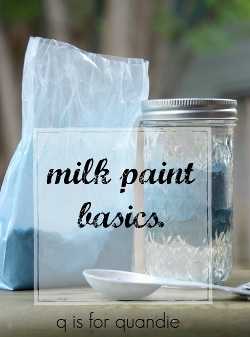
Welcome to day 1 of milk paint madness week, milk paint basics.

For those of you who might be entirely unfamiliar with milk paint, this post is for you.  But everybody, be sure to read to the end for details on today’s giveaway.

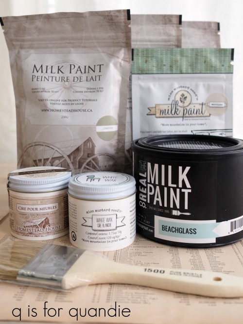
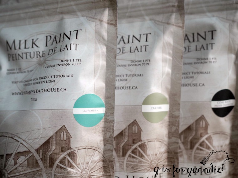
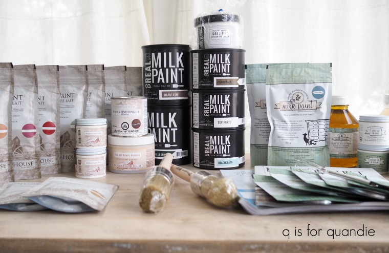
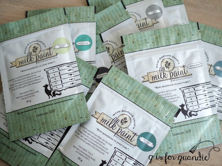
  First of all let’s just establish that when I’m talking about milk paint, I’m talking about paint that comes in powder form and you mix it yourself with water when you’re ready to use it.  Some of my favorite brands of milk paint include Miss Mustard Seed, Homestead House, The Real Milk Paint Co and Sweet Pickins.

Don’t be confused by General Finishes Milk Paint which is really an acrylic paint and not a milk paint at all.

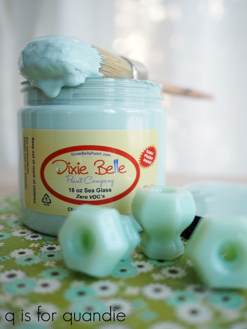
Also, don’t be confused by The Real Milk Paint Co’s packaging.  It looks more like a traditional paint can, but there is a bag of powder inside.  There is also a marble inside which is a very clever tool for mixing your paint, but I’ll get to mixing in a minute.

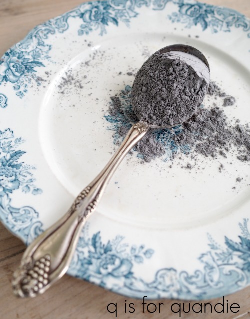
Milk paint is made with only a handful of basic ingredients including milk protein, lime and pigment.  It is non-toxic and has zero VOC’s.  In other words, it is a very green product that is not harmful to the environment or to you while you’re using it (go here to read more about the green quality of milk paint).  Since I paint a lot, I’m exposing myself to the products I use on a regular basis and I bet you are too.  Don’t forget to take this important quality into consideration when choosing which products you’re going to use.

Milk paint in powdered form can be stored pretty much indefinitely as long as it is in a sealed container and stays dry.  It doesn’t take up very much space on your shelf this way, which is an added bonus.

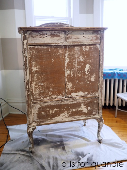
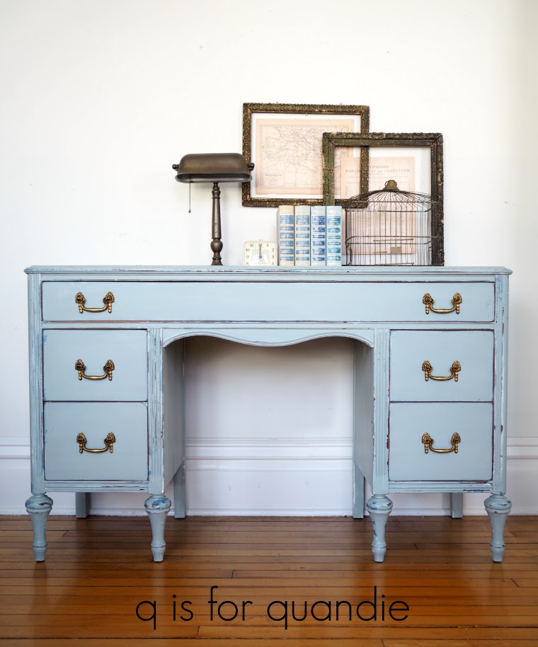
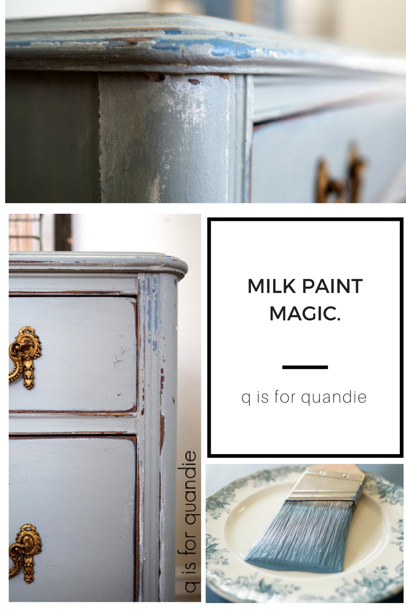
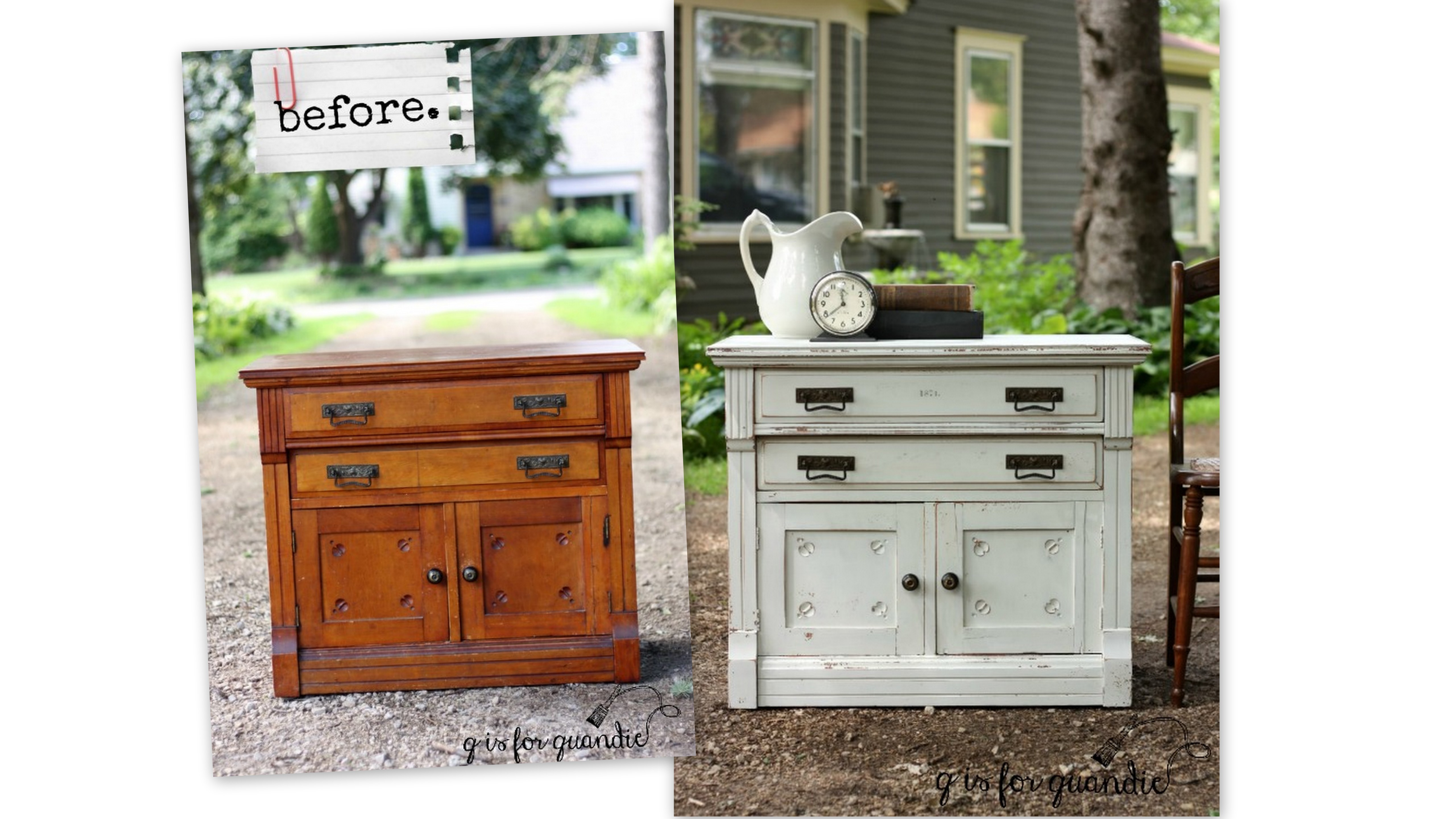
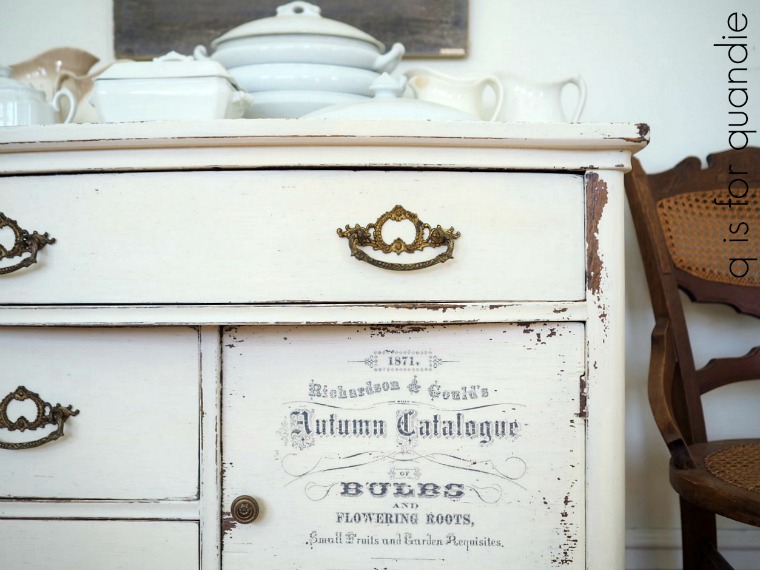
Although these days most of us use milk paint over a pre-existing finish and are delighted when it chips and crackles because of that resistance, historically milk paint was intended for use on raw wood.  When used on raw wood, milk paint soaks into the wood much like a stain rather than sitting on the surface like other paints.  That makes it incredibly long lasting and durable.  When used on raw wood milk paint won’t chip or peel away.

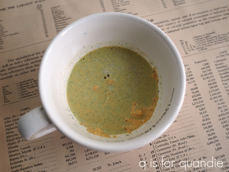
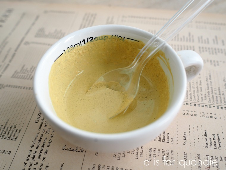
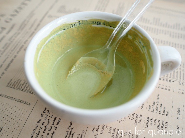
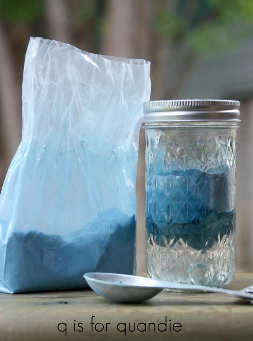
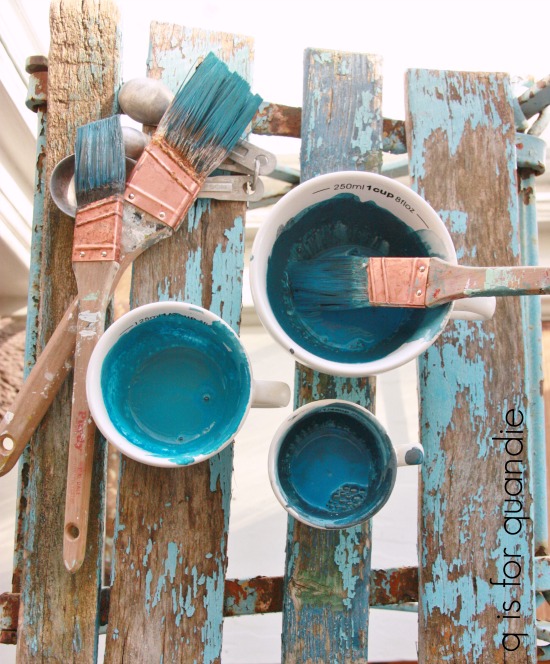
So let’s talk about mixing your milk paint.  The basic rule of thumb is to mix equal parts water to powder.  However I like to mix darker colors a little thinner (more water, less powder) and lighter colors a little thicker (less water, more powder).  But half and half is a good starting point.

You can also mix your paint really thin and use it as a wash.  Or leave it thicker if you want to add some texture to your piece.

There are all kinds of methods for mixing your milk paint.  Unlike Mr. Bond’s martini’s, it can be shaken OR stirred.  This is where that marble comes in from The Real Milk Paint Co.  If you like to shake your paint in a jar, throw the marble in the jar as well and it helps mix the paint beautifully.  You can also choose to use one of those battery operated milk frothers to mix your paint (reserving it for paint use only of course).  I’ve even heard that some people use a blender, but that seems like overkill to me.

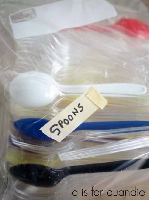
I used to always shake my milk paint in a glass jar and the marble is pure genius for that.  It was also a very environmentally sound practice.  However, Mr. Q eventually got tired of washing out those jars for me (he does all of the dish washing in our house, we don’t have a dish washer).  So I switched over to stirring my milk paint in a disposable solo cup with a plastic spoon.  I purchased what may prove to be a lifetime supply of plastic spoons at a garage sale for a dollar and I haven’t run out yet.

Do you put the water in first, or the powder in first?  Some say one and some say the other, but I don’t think it makes that much of a difference.  However, if you put the powder in first, just be sure to mix all the way to the bottom.  It’s sort of like making hot chocolate from a powder, you don’t want to get that overly chocolaty last swallow because a bunch of the mix was stuck at the bottom of your cup.

Should you use cold water or warm water?  Again, I’ve heard both.  I suggest meeting in the middle and using room temperature water.

I’ve also heard that sometimes well water may cause problems with milk paint.  When I was in high school a friend of mine had orange hair from washing it with well water.  So if your well water turns things orange, you might want to try using bottled water instead.  But city water from the tap should be perfectly fine.

One thing to keep in mind about milk paint is that once it’s mixed with water it has a limited shelf life (no longer than one week).  So obviously you don’t want to mix way more than you are going to need.  I think this factor stresses people out unnecessarily.  Over time you’ll develop a feel for how much paint you need, but in the meantime I have a little trick for you.  For a typical piece of furniture like a desk or medium sized dresser, start with about a 1/2 cup paint mixed with a 1/2 cup water.  Then start the first coat of paint on your piece and pay attention to how much of the paint you use.

Did you use all of it for the first coat?  If so, mix the same amount again for the 2nd coat.

Did you run out?  If so, mix a bit more the next time adding enough to finish the first coat and complete the 2nd coat.

Did you have way too much?  You get the idea.  As long as you have enough paint mixed to paint your final coat all from one batch you are going to be OK.

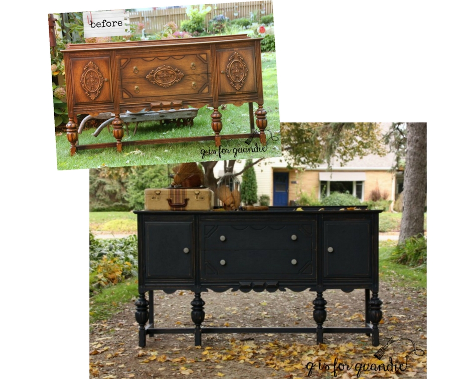
That being said, you can not mix a new batch of milk paint just to finish that one last drawer and expect it to match.  It most likely won’t.  So be sure your final coat of paint is all mixed at the same time (see an example of that here) .

Speaking of mixing, be sure to stir your milk paint frequently as you use it (that plastic spoon really comes in handy for this).  Because this paint is all natural, the heavier pigments will sometimes fall to the bottom of your cup as you’re painting.  This can result in some fairly obvious color differences between the beginning and end of your piece .  The best way to prevent that is to give your paint a little stir every 10 minutes or so as you are painting.

Here’s one of the best milk paint tips I ever got; mix your paint first and then let it sit while you are prepping your piece to be painted.  That gives the milk paint ingredients time to dissolve and blend while you are removing knobs, lightly sanding and then cleaning your piece.

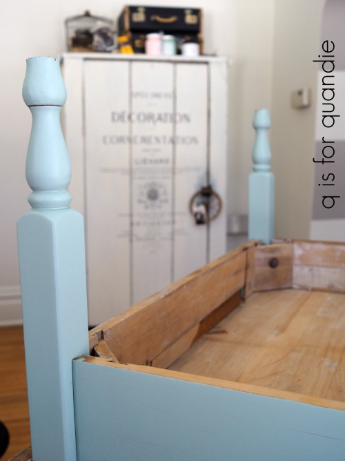
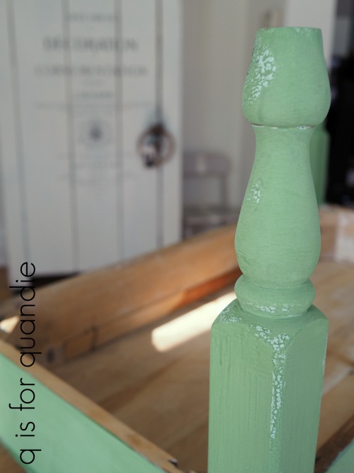
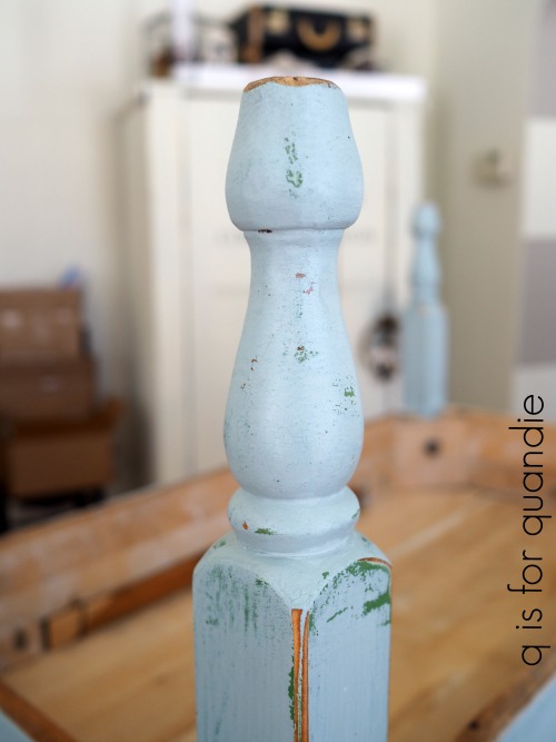
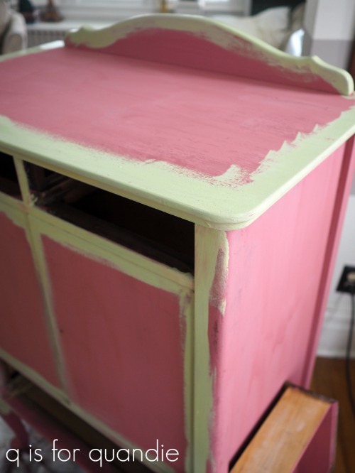
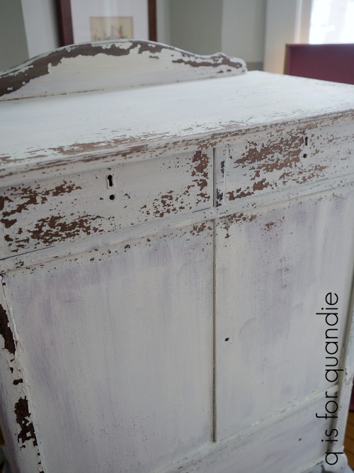
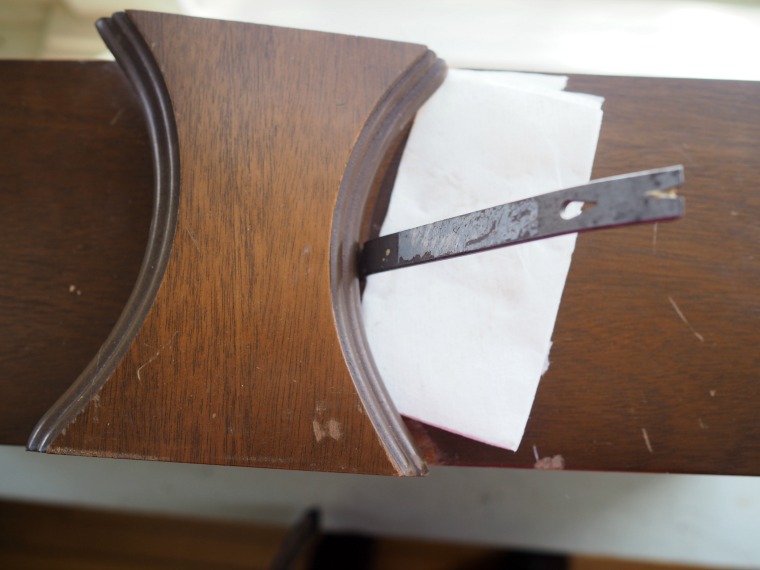
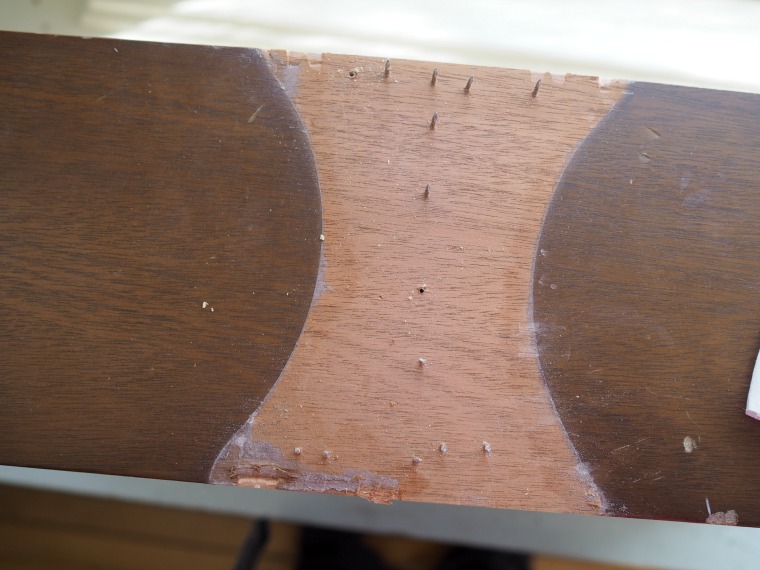
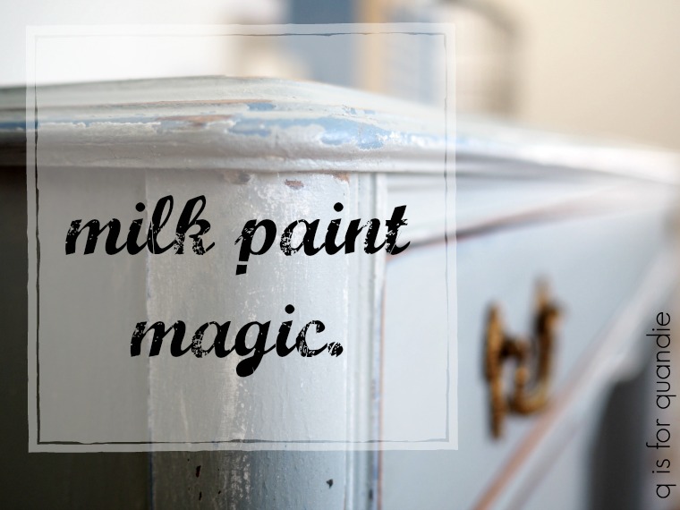
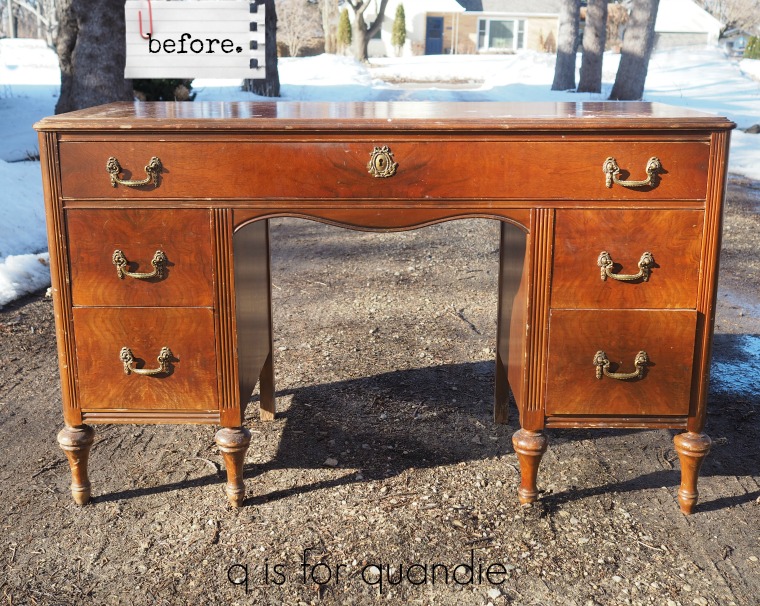
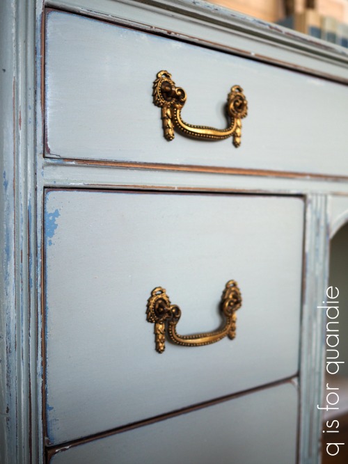
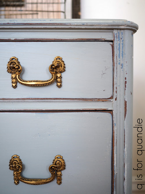
Speaking of prep work, I recommend not skipping this step when using milk paint (actually, I recommend taking the time to prep your piece no matter what paint you are using).  Especially the cleaning step.  If there are any oils (or furniture polish) on your piece of furniture it will resist the paint, possibly by a lot.  I like some chipping, but maybe not quite this much (check back later this week to learn how to get the perfect amount of chipping).

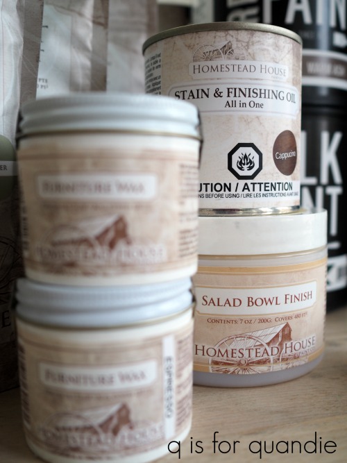
When buying a piece of furniture always ask the seller if they cleaned it up with anything recently.  I often find that Craigslist sellers will put a coat of furniture oil on a piece to make it look good for pictures.  If that’s the case, you want to be sure to clean that off before you start painting.  I like to use TSP Substitute for that.

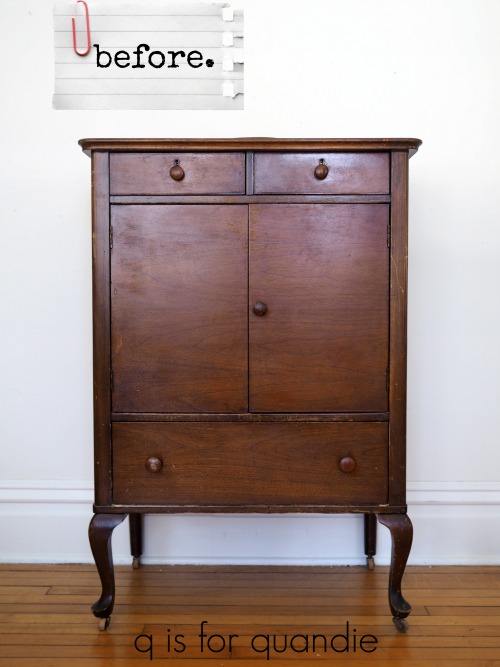
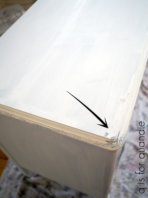
Also, don’t panic if your piece looks like the one above after the first coat of paint.  If this happens to you, get out your shop vac and vacuum off the flaking paint.  Sand the piece thoroughly, you don’t have to remove all of the paint just the lose stuff, but you also want to give the wood underneath some more ‘tooth’ to hold the paint so you don’t repeat the same result.  Vacuum again after sanding, wipe the piece down and start over.

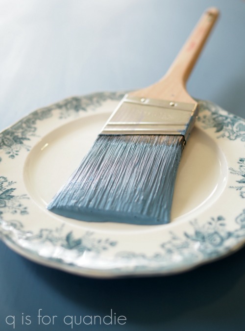
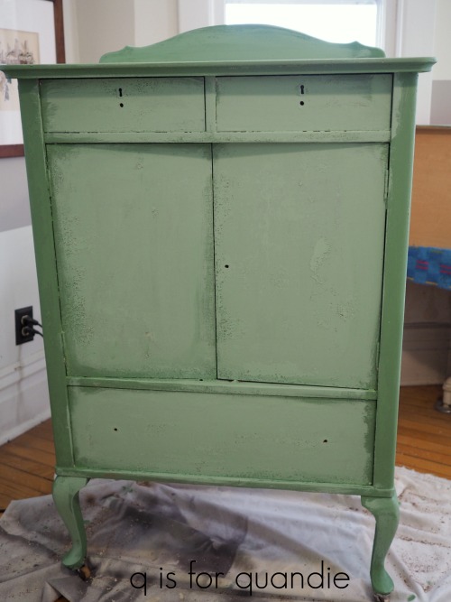
OK, so you’ve mixed your paint and you’ve prepped your piece.  The next step is painting.  This is the simplest part of milk paint.  Because it’s thinner than most paints you don’t have to worry about brush strokes (although do keep an eye out for drips).  You really can use just about any kind of paint brush and still get good results with milk paint.  This may sound odd, but I find it less physically taxing to paint with milk paint versus other kinds of paint because it’s much lighter on your brush and it doesn’t really drag as you’re painting it on.  I don’t think I can really explain that properly, but if you’ve ever gone from painting with milk paint to then painting with another paint you’ll know what I mean.  It just feels like less work.

Another big bonus to milk paint is how quickly it dries.  When painting a dresser I generally remove the drawers and paint them first, then move on the body of the dresser.  By the time I’ve finished the body, the drawers are usually dry (unless it’s a super humid day).  Because the paint dries so quickly, I often am able to complete a piece from start to finish in one day.

Milk paint coverage can be variable.  It will depend on how thick or thin you mixed your paint, what color you are using and what color you’re covering up.  I’ve gotten away with as little as one coat when using black or other very dark colors, but I’ve also needed at least three coats when using white over a dark wood.

Here’s a great tip regarding coverage.  If you’re painting over a dark finish with a very light color, like white, start with a coat of paint in a mid-tone shade of grey first.  Then move on to the white.   You’ll get better coverage in fewer coats.

Don’t worry if you feel like your first coat of milk paint looks terrible.  The first coat rarely looks good (with the exception of those dark colors).  Move on to the 2nd coat and you’ll be amazed at how much better it suddenly looks.

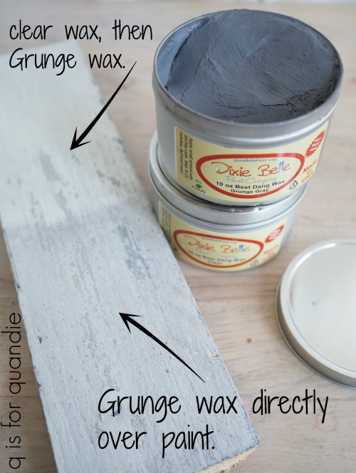
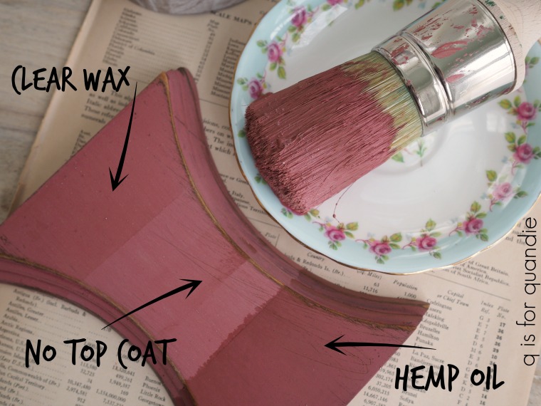
Once your final coat of paint is dry you might notice that milk paint is a little rough to the touch.  Get out your sanding block and some 220 grit sand paper and hand sand over the entire piece (I say you can count this as your cardio for that day).  The finish will become smooth like butta’ and it will be time to move on to the topcoat, which is the subject of our post for tomorrow.

By the way, if you are a visual or auditory learner you can click here for a link to a great milk paint basics video by Marian Parsons, a.k.a. Miss Mustard Seed.

Now it’s time for the fun part, the prize!

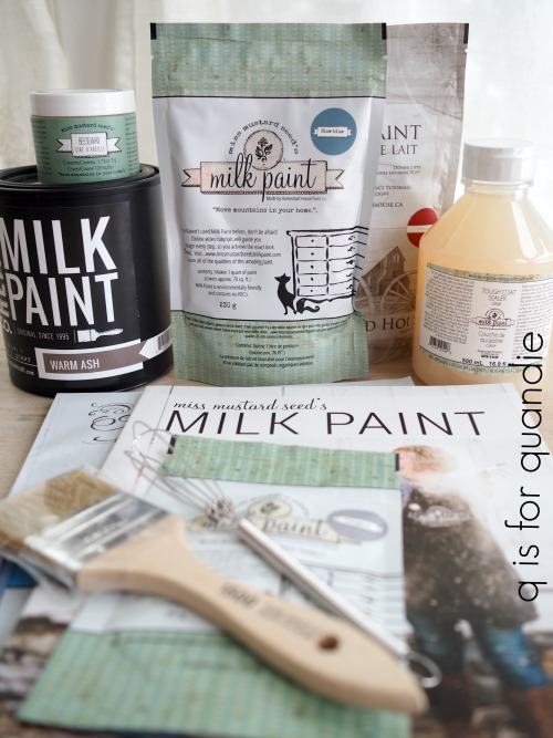
Includes:  Miss Mustard Seed Look Books 1 & 2, paint brush, whisk paint mixer, 4 colors of milk paint, Miss Mustard Seed’s Beeswax, Miss Mustard Seed’s Tough Coat Sealer.  Thank you to Miss Mustard Seed, Homestead House and The Real Milk Paint Co for providing items for today’s giveaway!

The basic rules:  to be eligible to win today’s prize leave a comment on this blog post telling me whether or not you’ve tried milk paint.  Your comment must be left on the blog, not on Facebook.  You are not required to follow my blog, although it would be awesome if you did!

Normally I make a point of answering every comment left on my blog.  If someone takes the time to leave a comment, I like to acknowledge that.  But I usually only get 10 to 20 comments so it’s easy to fulfill that promise.  But I’m guessing that I’ll get many more comments on these posts so I’m going to warn you up front that I won’t be answering each one.  That helps make it easier for me when it’s time to pick a winner too, so I hope you guys will cut me some slack on that this week.

I will randomly draw the name of a winner for today’s prize from all of the comments left on this post by Saturday, April 7, 2018 at the stroke of midnight.  You are eligible to win each day, so if you leave a comment on each day’s post, your name is eligible to be drawn for each prize.

The fine print: no purchase necessary, you must be 18 years of age or older to win, void where prohibited by law, the number of eligible entries received determines the odds of winning, approximate retail value of prize is $140, if the prize is not claimed by Friday, April 13, another name will be drawn at random to win, blah, blah, blah.

Be sure to check back tomorrow for the next segment of milk paint madness, and in the meantime remember to pin today’s post for future reference.

milk paint madness.

One of the things that you may have noticed about my blog is that I like to use different types of paint, as well as different brands of paint.    Although I do receive free product to use from several different paint brands, I don’t sell paint myself.  I like to think of myself as the Switzerland of furniture painting blogs, able to remain neutral.  I love trying new things, but I only promote the products that I truly love working with.

I love the ease and simplicity of using acrylic paint for some projects, especially mid century pieces.

 And I also love the beautifully smooth finish and the gorgeous coverage you can get with chalk paint.

And sometimes I even resort to using spray paint on certain pieces like wicker and cane items, but shhhh, don’t tell anyone about that little dirty secret.

However, in the end, the paint I love the most for pieces I’m keeping is milk paint.

Just for fun I took a little walk around my house and counted my own painted furniture pieces.  I have 1 piece painted in Fusion, 1 piece painted in latex from way back, 3 pieces painted in chalk paint, 4 cane backed chairs that were partially spray painted, and 19 pieces painted in milk paint!

My guest bed below is painted in Homestead House milk paint in a color called Ochre and finished with the Real Milk Paint Co’s Dead Flat finishing cream.

One of my favorite pieces is my rooster cupboard.  It’s painted in Miss Mustard Seed milk paint, a base layer of Artissimo and a 2nd layer of Flow Blue, then finished with Miss Mustard Seed Antiquing Wax.

The bed in our master bedroom is painted in Homestead House milk paint in Coal Black with Homestead House black wax as a topcoat.

I love the look you can achieve with milk paint, especially when it crackles …

or gets chippy in just the right places.

There is just simply an authentic feel to a distressed milk paint finish that you can’t get with any other kind of paint.  Sure, you can come close, but to me the others always look a bit more faux.

That being said, I thought it would be fun to write a blog post sharing all of my favorite products from the various brands of milk paint that I’ve used over the years.  I’m hoping that I can inspire some of you to break out the milk paint yourselves.  And what better way to do that than having a giveaway?

So I reached out to my favorite Fab Four milk paint companies, Homestead House, Miss Mustard Seed, The Real Milk Paint Co and Sweet Pickins, and asked if any of them would like to offer some product for me to give away.

And you know what?  They all said yes!  And then sent me piles of stuff to give away.

Not just paint, but also different top coats, brushes, books and even some stains.

In fact, they were so generous with the free stuff that I’ve decided to break it down into five prizes!

One for each day of the week, Monday – Friday.  So just for next week, and next week only, I am going to return to posting each weekday.  Five days in a row of posts all about milk paint.  We’ll start with the basics and work our way up.  I’ll post about different techniques such as layering with other types of paint, how to get your paint to crackle, how to achieve perfect chipping every time (and how to fake it if not), what kinds of topcoats to add and how durable they are and any other subject I can think of.

And each day there will be a giveaway!

Details on how to win will be included with each post.

So be sure to check back on Monday for the start of Milk Paint Madness!

the piano stool.

Do you ever make a decision to try something knowing full well that you are probably making a mistake but you just can’t help yourself, so you do it anyway?

You’re so excited to see the end result that you press on full steam ahead even though you know deep down inside that you shouldn’t?

Yeah.  I do that sometimes too and this is a story about one of those times.

You might have noticed the awesome antique piano stool in the photo of the desk that I shared a while back.

I purchased the stool last summer at a garage sale just down the street from my sister’s new house.

Here’s another ‘before’ picture.

I love the gorgeous ball and claw feet, don’t you?  Although gosh, I guess they aren’t really ball and ‘claw’ because those are actually bird beaks holding those balls, not claws.

Ball and beak feet?  Doesn’t sound quite right, does it?

Anyway, I wasn’t quite sure exactly where I’d end up with a makeover on this stool.  I thought about painting the entire thing.  Or stripping and staining just the seat and painting the base.

However, when Prima Marketing sent me some samples of their Decor Transfers they included this gorgeous medallion transfer.

And it just happened to fit absolutely perfectly on the seat of this stool.  It’s as though it was meant to be.

I pictured it over a rustic wood seat, with the base of the stool painted black.

So I started by stripping the seat of the stool using Citristrip.  Then I sanded it down and realized it had some unattractive splotches and stains.  I didn’t want to go too dark on the finish because I wanted the transfer to contrast well with the color of the wood, but at the same time I wanted to blend those stains a bit.  So I thought that using Fusion furniture wax in Espresso would be perfect.  I waxed the seat of the stool which did work perfectly to blend the stains and make them less obvious.  But then this is where I made my fatal error.  I chose to immediately attempt to apply the transfer over the fresh wax.

Today’s q tip:  Do not apply transfers over freshly waxed pieces.  You will end up with a sticky gooey mess.  The more you rub the back of the transfer sheet (creating heat with friction and thus softening up the wax even more), the gooier your mess.

Normally you would wax after your add your transfer.  I knew this.  I’m still not quite sure why I did it this way.  But I was so excited to see the end result, so I just kept going even though there was a little voice inside my head that kept saying ‘um, I don’t think this is a good idea, stop now before you ruin a perfectly good transfer‘.

Yeah.  Ruin it I did.  The transfer just wouldn’t stick to the fresh wax.  The more I rubbed to try and make it adhere, the worse it got.

But even though this particular effort was a failure, I could see that the transfer itself was going to look amazing on the wood seat (once I got it right) and fortunately the people at Prima Marketing took pity on me and agreed to send me another of the Medallion transfers.

Thus it was time to start over!

First I had to remove the portions of the ruined transfer that did stick.  If you’ll remember back, I had to remove a transfer once before.  That time I had used one over a dark green color and it was also a fail (aren’t you glad you have me to make these mistakes for you, so you don’t have to waste a transfer on them yourself).  I tried using a razor blade to scrape it off, but that didn’t work at all.  Once these things are adhered, they are on there pretty good (which is a good thing usually, right?).  I ended up sanding that one smooth and then painting over it.

But in this case I didn’t want to paint over it.  I wanted to remove it entirely.  So I tried scrubbing with mineral spirits and a scrubbing pad.  After lots of elbow grease, I had made some progress but at that rate it was going to take me all afternoon to remove the entire thing.

  The mineral spirits did remove the wax though which was a good thing.

I finally decided to just break out my orbital sander and sand the heck out of it.  That did the trick.

If you’ve ever wondered how well the Prima Marketing transfers  will adhere to your finished piece, wonder no more.  They are stuck pretty good.  It takes 120 grit sandpaper and an orbital sander to get them off.

At this point the original patina of the stool’s seat was pretty much obliterated, so I stained it with Varathane Wood Stain in Early American.  Then I tried again with the transfer.

This time it went on beautifully and quite easily.  It took no more than 10 or 15 minutes to get the entire design transferred onto the stool.  Once that was done, I sanded lightly over the entire thing with 320 grit sandpaper and then added a Fusion’s clear furniture wax over the transfer and the rest of seat.

Ahhh, so much better.  And by the way, the base of the stool is painted in Dixie Belle’s Caviar.

I’m not sure if I’ll keep the stool or not.  I love the way it turned out, but it feels kind of small in front of my baby grand.  I usually have a chair in that spot.

Also, here’s a head up, Dixie Belle sent me all of the supplies needed to paint my piano black.  I’ve wanted to do so for several years now and just haven’t had the courage to tackle it.  It’s big and it has a lot of flip sides and insides and outsides.  But I’m working up the nerve.

But in the meantime, I love how the stool turned out, what do you think?

If you want to copy this idea on a stool or chair of your own, you can order the transfer via Amazon (here is a handy link).

And remember today’s q tip, don’t try to apply a Prima Marketing transfer over freshly applied wax!  Transfer first, wax second.


the sea glass dressing table.

Several weeks ago one of my blog readers contacted me and asked if I was interested in purchasing some furniture she was getting rid of.  She sent me some photos and quoted a bargain price, so I said sure.  She lives about 40 minutes away, which is a bit far but worth it because there were three pieces, and as I said, there was also that bargain price tag.

So one Friday night Mr. Q and I headed out to pick up the furniture.  We headed straight up I35, took the exit for Wyoming, MN and headed due west down a dark, curvy road with a 55 mph speed limit.  One thing I’ve mentioned here on the blog before is that I am a city girl.  I like my roads well lit at night, and straight and familiar doesn’t hurt either.  I also find that when you are driving on these country roads, the locals behind you get quite impatient if you don’t go at least 5 – 10 miles over the speed limit.  You see, they know the road.  But I didn’t, so I was driving 55 and being very cautious, using my high beams every chance I got.

We made it safely to our destination and loaded up the three pieces, which fit perfectly into our van.  Then we headed back the way we came.  We were about halfway back to the interstate when we came upon an accident scene.  No emergency vehicles had arrived yet, however I could see flashing lights headed our way from further down the road.  The roadway was full of debris.  There were multiple cars pulled over on both sides of the road and people dashing around.  And did I mention how dark it was?  We couldn’t really see much, so by the time we realized what was going on it was too late for us to pull over, the shoulders on either side were full of cars.  So we kept going, driving very slowly through the debris field.  It wasn’t until we were almost through that I glanced over and saw the van that was on its side in the ditch.

As I mentioned there were plenty of people on the scene.  A police car was responding.  And Mr. Q and I have no special skills that we can offer at the scene of an accident.  So we just kept on going.  We would only have been in the way had we stopped.

All the way home we wondered what had happened and whether or not the occupants of the vehicle were OK.  It wasn’t until a couple of days later that I learned that some of the passersby had put out a fire in the van using snow.  The driver of the van died on the scene.  His wife was airlifted to the hospital.  There was a second vehicle involved (we never saw that one) and that driver was also airlifted.

I really debated whether or not to share this story with you guys.  It’s so sad, and I really want my blog to be a happy place.  But I’m still feeling haunted by this.  Had we been on the road 10 minutes earlier, would it have been us in that accident?

My heart goes out to the family that lost a loved one, and I am reminded to be incredibly grateful for the life that Mr. Q and I get to go on living.  And also for the reminder to drive cautiously on dark country roads at night, or really anywhere, anytime.  If nothing else, I hope all of you reading this will slow down, don’t use your phones while driving, and just remember to treat driving with the respect it deserves.  Driving continues to be the most dangerous activity that most of us participate in on a daily basis.  So please, be safe.

Now let’s move on to happier topics, shall we?

I’ve finished one of the pieces we picked up that night and I want to share it with you today.  Here’s the before.  The mirror is just leaning against the back, but later on you’ll see it in place.

I know I broke one of my photography composition rules with this photo, I took it from a standing position shooting slightly downward.  But I was trying to keep myself out of the mirror.  And hey, it’s a ‘before picture’, so I don’t have to follow the rules for that, right?  It’s supposed to look bad.

As you can see, the finish is rather beat up.  In addition, there is an unseen problem.  It was pretty smoky smelling.  But that just made this a great opportunity for me to try the BOSS that Dixie Belle sent to me a while back.  BOSS stands for Blocks Odors Stains Stops bleed-thru.

The instructions require two coats of BOSS followed by paint.  Logic dictates that in order to block the odor, I have to coat every surface inside and out.  To experiment with that I coated the insides of a drawer and then asked Mr. Q to give it the sniff test.  Sure enough, he agreed that the inside of the drawer no longer smelled of smoke.  However, turning the drawer over, the underside still smelled.

So, two coats on every surface.  I went through almost an entire 16 oz. jar of BOSS for this one piece of furniture.  The jar costs around $18.  When you are negotiating the price for a piece of smoky furniture, just remember that the smell can easily be dealt with using this product but be sure to factor in the extra cost if you are flipping the piece to sell.

The BOSS leaves a sort of tacky surface behind.  Perfect for hanging onto paint, but that also means you must put paint over it you can’t just leave it.  So that meant painting every surface as well.

Luckily Dixie Belle had just sent me a fresh batch of paint including a jar of Sea Glass, a beautiful blue green.  I knew it would work beautifully with some lovely jadeite knobs that I had in my stash.  I purchased them a while back from D Lawless.

While painting this piece I used the Dixie Belle method of dipping my brush into a cup of water first, then into the paint which basically results in watered down paint.  The paint goes on much smoother this way.  If you are one of those people who don’t like to see brush strokes, this is the way to achieve that.  I used two coats of paint on everything except the undersides of the drawers which only got one coat.

After painting the insides and outsides of each drawer, I also added a topcoat of Dixie Belle’s Flat Clear Coat and then lined them with scrapbook paper.

Now, here’s something I learned recently about Dixie Belle paint.  You don’t have to put a top coat over it.  What?  Do your eyes deceive you?  No they don’t.  It’s true.  Once the paint cures (in about 30 days) it is very durable without a top coat.  Eureka!  This was a revelation to me.

After learning that I decided to try a little experiment.  As I mentioned, I used the Dixie Belle Flat Clear Coat inside the drawers.  I also used it on tops of the two sides.  But then I left the rest of the piece as is.  I wanted to see if there was a noticeable color difference between the sealed areas and the unsealed areas and the answer is no.  At least that’s true with Sea Glass, it may not hold true for darker colors.  I’ll have to test that theory further.  I like having a little extra protection on the surfaces that might get spilled on, while knowing that I don’t have to clear coat (or wax) the sides, the mirror frame, the legs and so on.

The vanity didn’t come with a chair, but once I had it painted I felt like it really needed one.  I have a few chairs out in the carriage house, I’d picked them up here and there last year at garage sales.  It’s good to have single chairs handy to pair up with desks or vanities.

I used the top chair in that stack and I asked Ken to cut a piece of hardboard that I could upholster for the seat.  I painted the chair itself in the Sea Glass and upholstered the seat with some simple muslin fabric that I stamped with the Iron Orchid Designs Decor Stamps (see this post if you’d like more details on how to do that).

By the way, getting photos of pieces with mirrors straight on without getting yourself in them is tricky.

The angle was a little bit easier.

I staged this piece with a bit of pink which I thought looked very pretty paired with the Sea Glass.

This lovely sea glass vanity is for sale locally, so be sure to check my available for local sale page for more details.