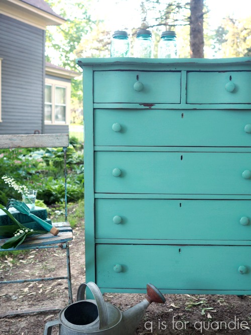
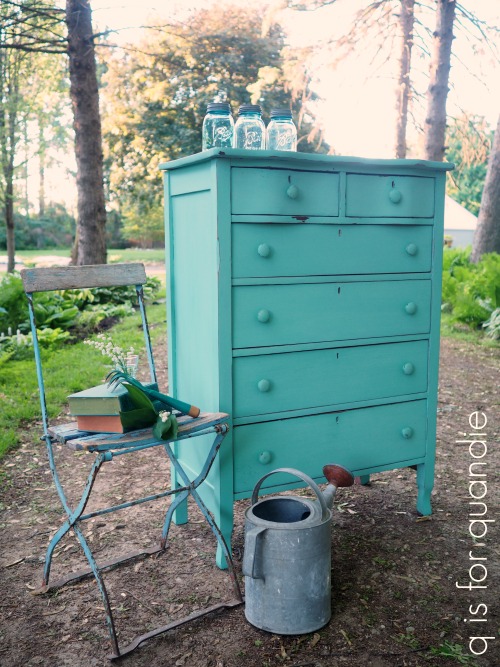
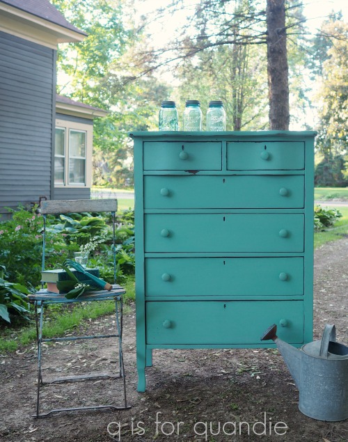
Earlier this summer I picked up a simple pedestal style table at a garage sale.

I have to admit up front that I made a couple of poor buying decisions this summer at garage sales and there is an underlying theme to them. I purchased things that had other things piled on top of them so that I couldn’t really see what I was getting. One table I purchased has a huge burn mark on the top that I didn’t notice until I went to load it in the car. And this table has a Formica (laminate) top. That fact completely escaped my attention until I got it home.

Today’s q tip: Do as I say, not as I do, and thoroughly inspect a piece of furniture before you agree to purchase it!
But look back at that ‘before’ picture, see how shiny that top is? Yep, it’s Formica instead of wood. I should have noticed that.
The problem with Formica is that paint doesn’t always like to stick to it.
But then I realized that this table provided me with the perfect opportunity to try a product that Dixie Belle sent to me recently, Slick Stick.

I plan to use this product on a dresser that is entirely laminate, but before I get to that I thought it might be a good idea to test it out on a smaller scale first. Here is how the Dixie Belle website describes it: Slick Stick is a water-base primer specifically made to bond to most any “tough to paint” surfaces. With Dixie Belle’s Slick Stick, surfaces like PVC, glass, Formica, metal, and more, are easily painted and stay painted.
It has some very specific instructions that I followed to the letter. I started by cleaning my piece thoroughly using TSP Substitute. Next I used a damp brush to apply one thin coat of Slick Stick and then I allowed that to dry for 3 hours. Then I added a second coat of Slick Stick and left it to dry overnight.
I used the Slick Stick on the laminate top only, not on the wood pedestal.
The next step was to paint the piece using two coats Dixie Belle’s Gravel Road.

I want to point out here that the Slick Stick does dry white. If you are a distress-er (and I definitely am), you will see that white when you sand the edges of your piece to distress it.
That is definitely something to keep in mind when choosing to use this product.
After I had the table painted I let it sit for a week or two. Not for any real reason, just because it was really just rather blah. While the paint job had definitely given it some more appeal, it needed something more but I wasn’t sure what.
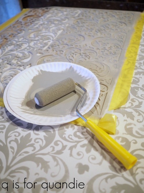
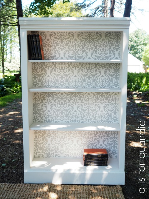
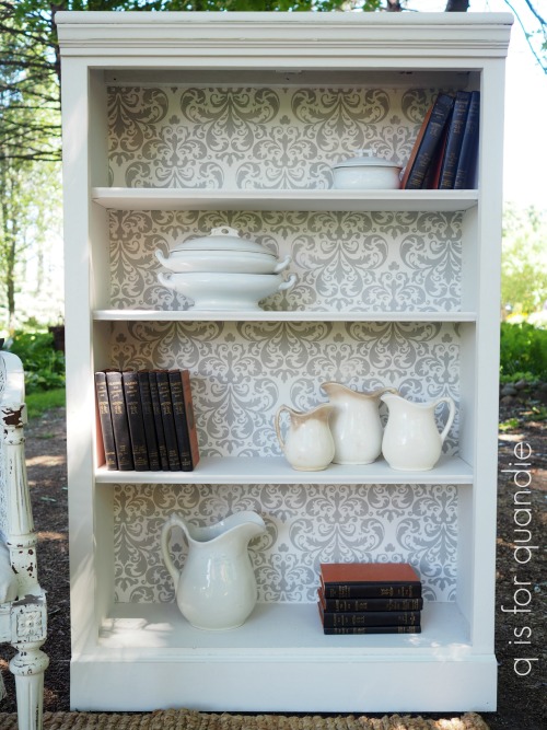
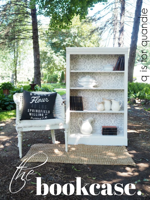
Then while I was stenciling the back of the bookcase that I shared on Friday I decided to use the same Prima Marketing re.design stencil on the top of this table.
I used the same small foam roller and the same Dixie Belle paint in Driftwood to apply the stencil over the entire tabletop.
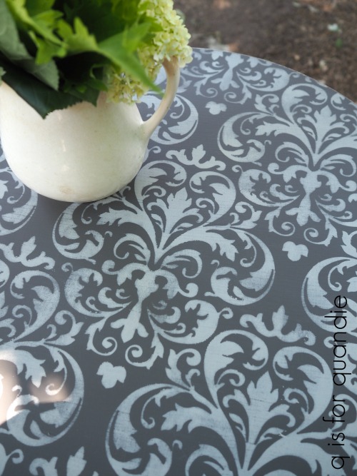
I think it’s interesting to note that when used over the darker grey of Gravel Road the Driftwood looks really light, while over the white of Fluff it looks really dark.

But I promise you, it doesn’t look it, but the stencil was painted with the exact same color on both of these pieces!

Once the paint was dry I sanded over the entire thing to give it a more faded appearance.
And that was enough to give this table plenty of personality!
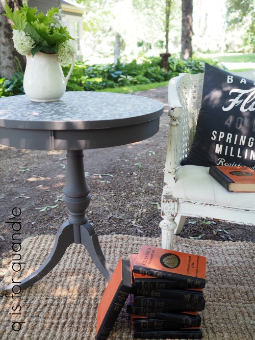
It’s now a great little table for a reading nook or perhaps at bedside.

As I was taking the photos for this post, one of the books happened to flop open to this page.

That brought a smile to my face as an unexpected reminder of the trip Mr. Q and I are taking to Italy later this fall.
In fact, it made me realize that this table has a bit of an Italian flair, maybe Italian renaissance with that damask pattern?
OK, that might be a tiny bit of a stretch, but I’m going with it.