I’ve held off on showing pics of my master bedroom on q is for quandie simply because when I look at it, I see all of the things I want to change. You see, the last time I updated the room I had some cockamamie idea that mixing vintage and space age would be a sophisticated juxtaposition of old and new. Maybe it would have, if I had done it well … but instead I just put in some stainless steel modern fixtures. I liked it for a while, but it grew old quickly. I’ve removed a lot of the modern, but I still need to make some more changes.
But recently I decided, what the heck, I’ll share it anyway. A lot of the changes I want to make are probably a ways down on the priority list. It could be awhile. So, I’ll show it to you as is.

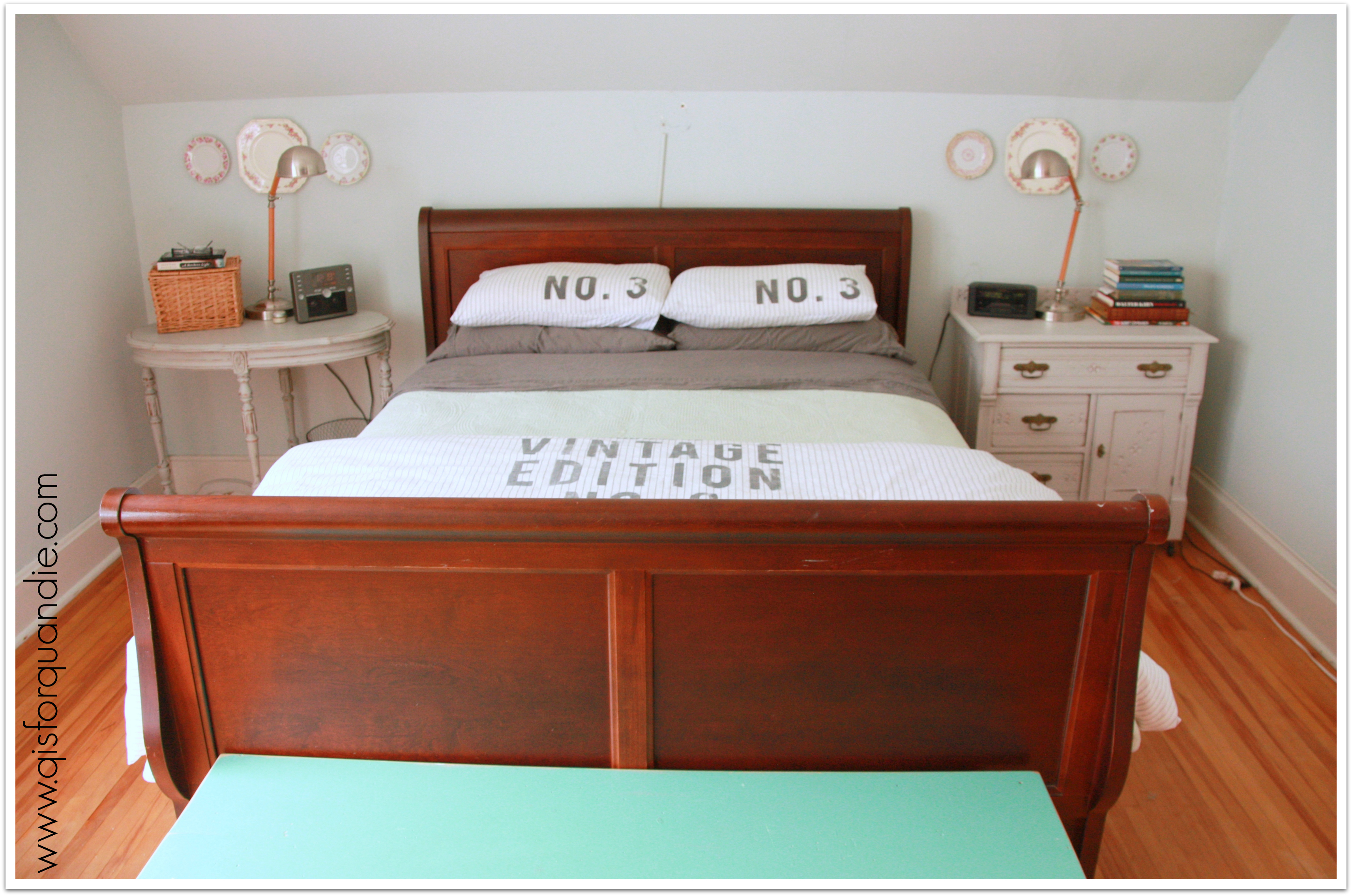
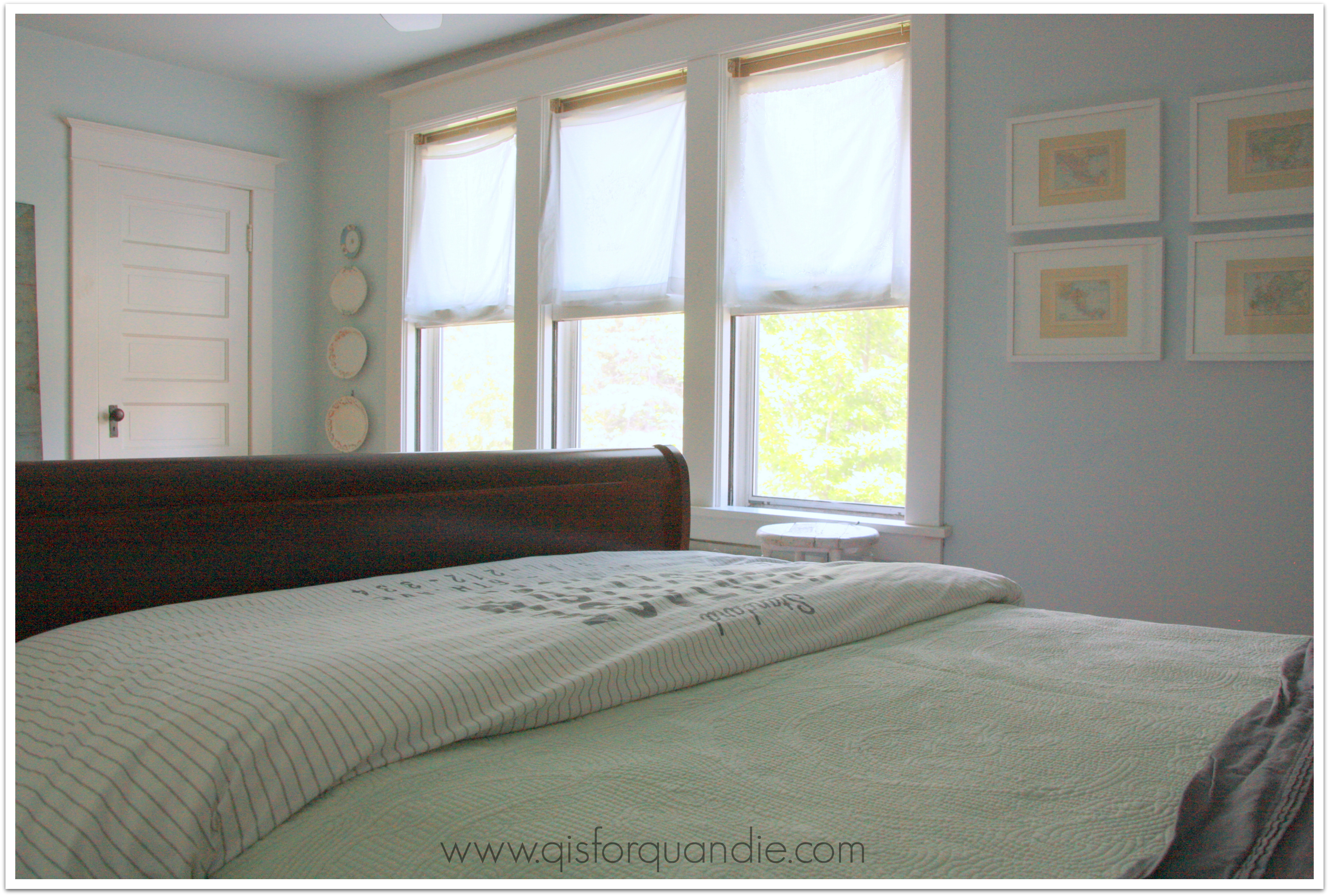
Technically, the Q casa is a story and a half. For those of you not up on house lingo, this means my upstairs is not a full story and all of the rooms have these quaint slanted ceilings. I feel like this picture makes them look really low, but they aren’t. Mr. Q and I are both tall, and we don’t hit our heads while getting into bed or anything like that.
I would love to do something with this wall behind the bed to make it more of a feature wall. Perhaps add an all over stencil, a fabulous wallpaper, or even a wood plank wall. Of all of these options, a stencil would be easiest and cheapest, a wood plank wall would be most fabulous, but least likely to ever get done. And seeing as my bff spent many hours helping me strip not one, not two, but 3 layers of old wallpaper from this room, she might want to cause me bodily harm if I decide to wallpaper again!
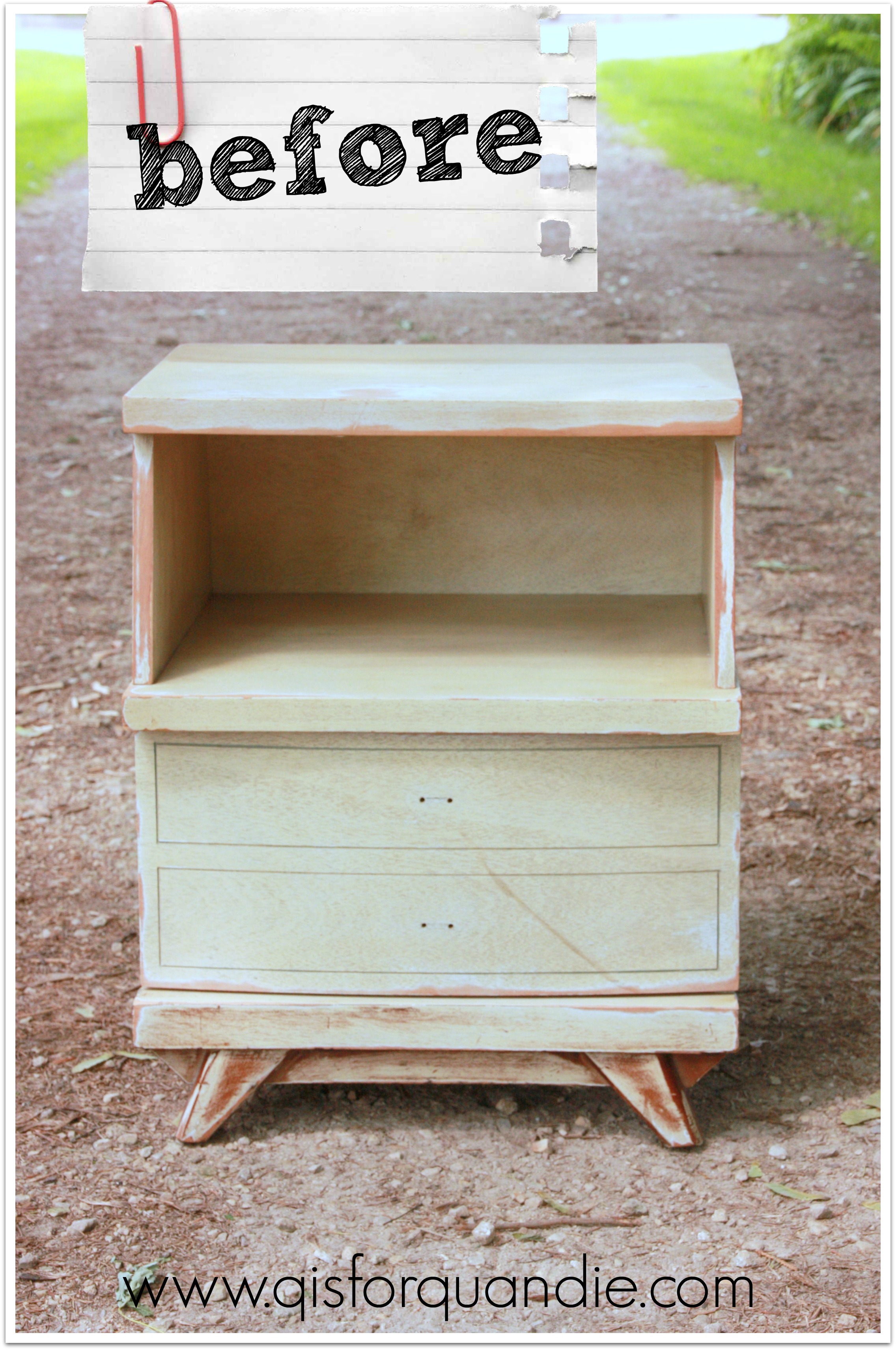
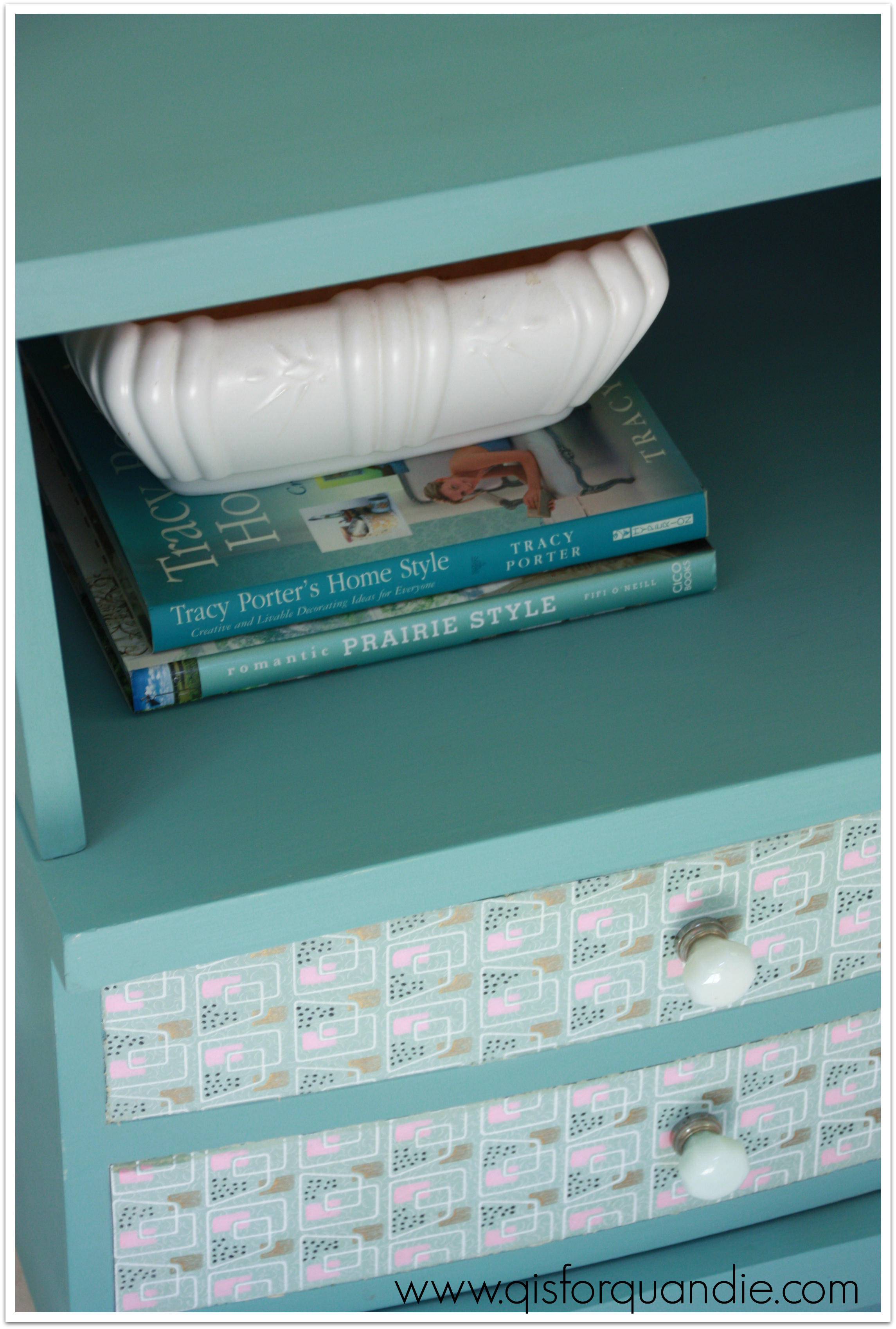
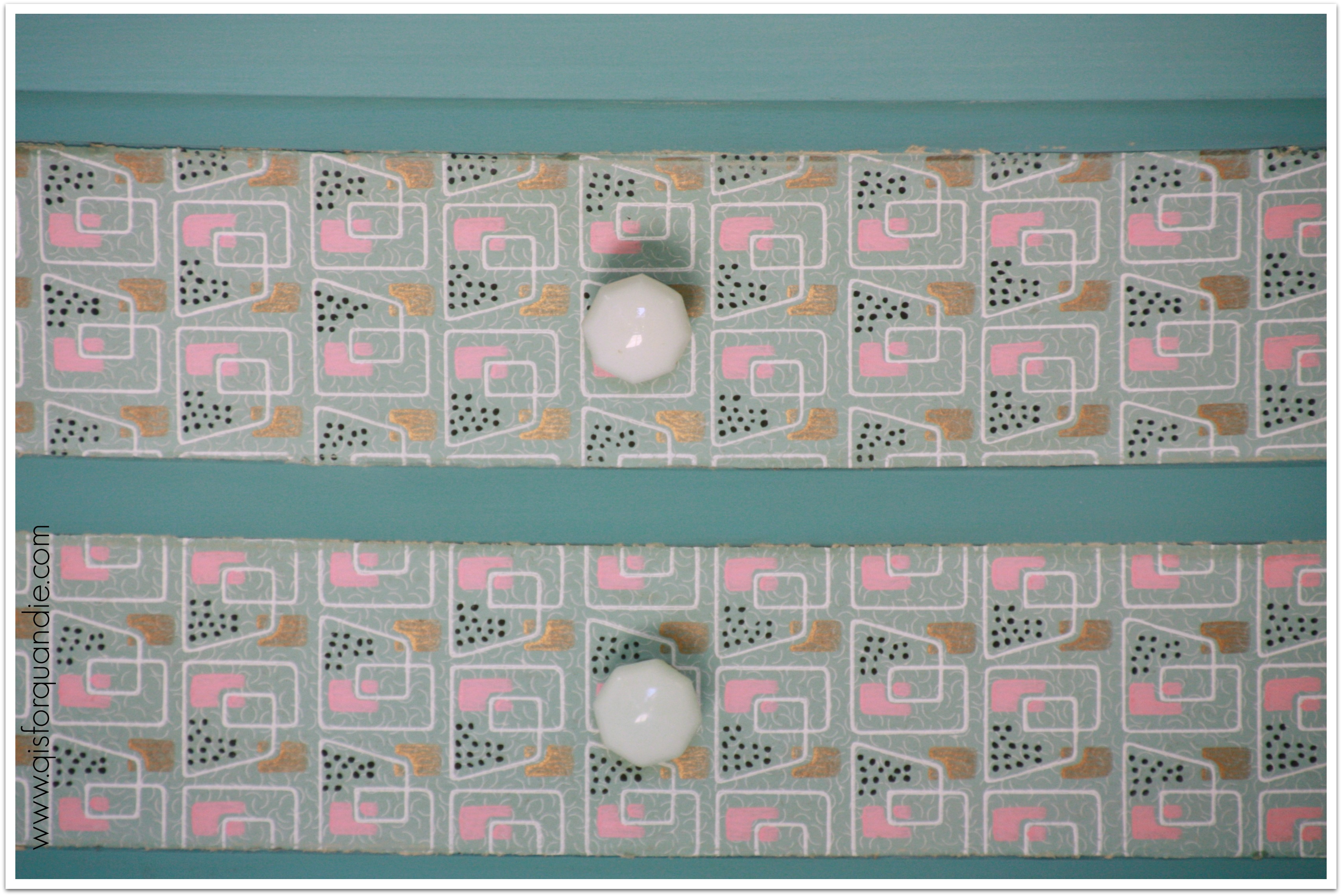
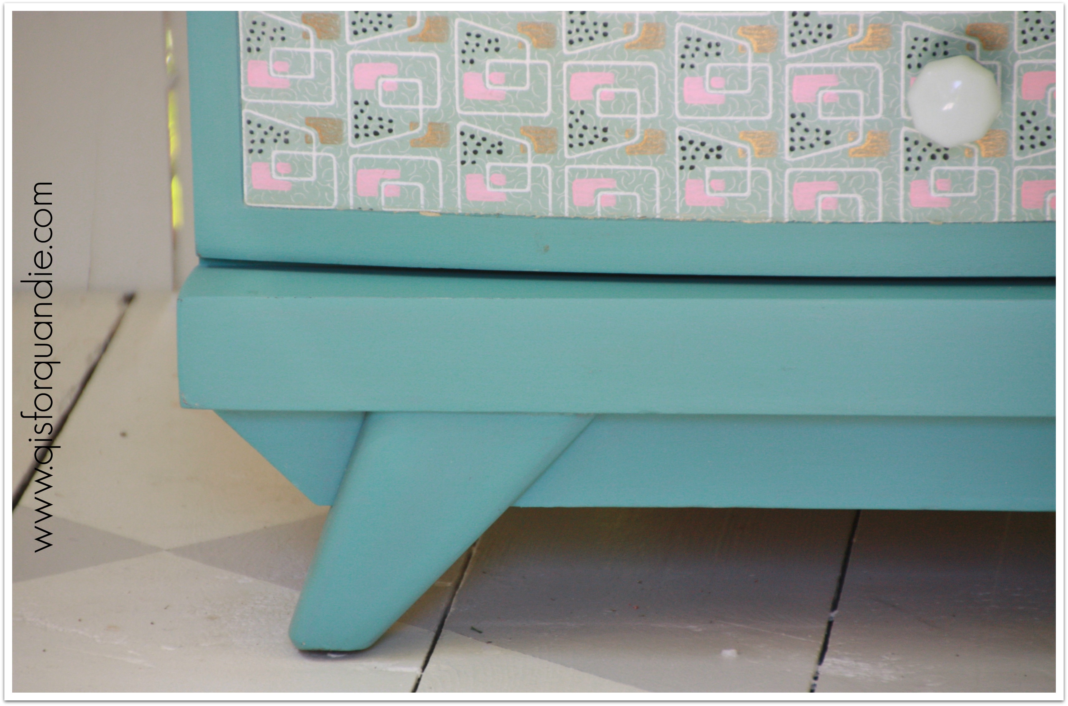
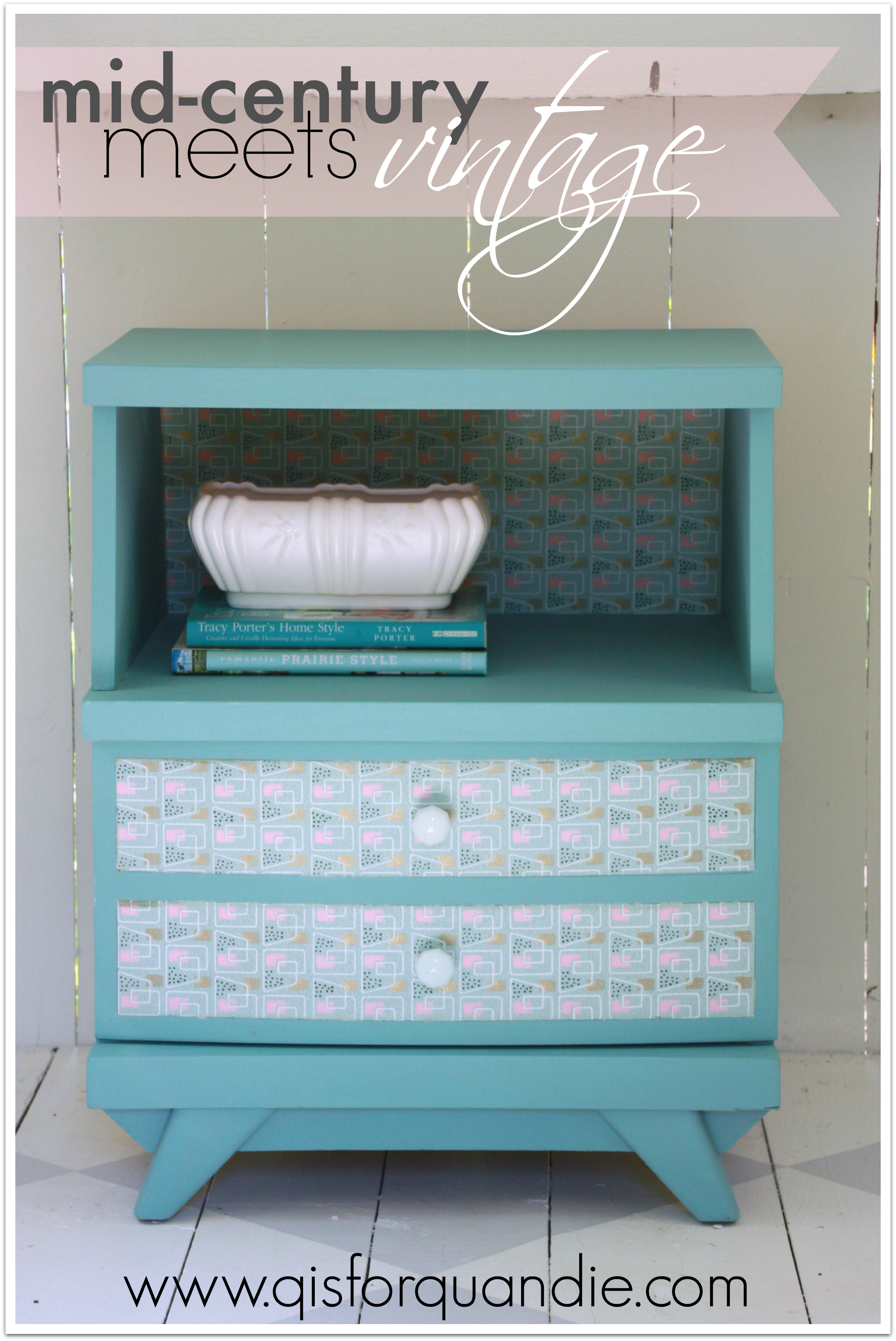
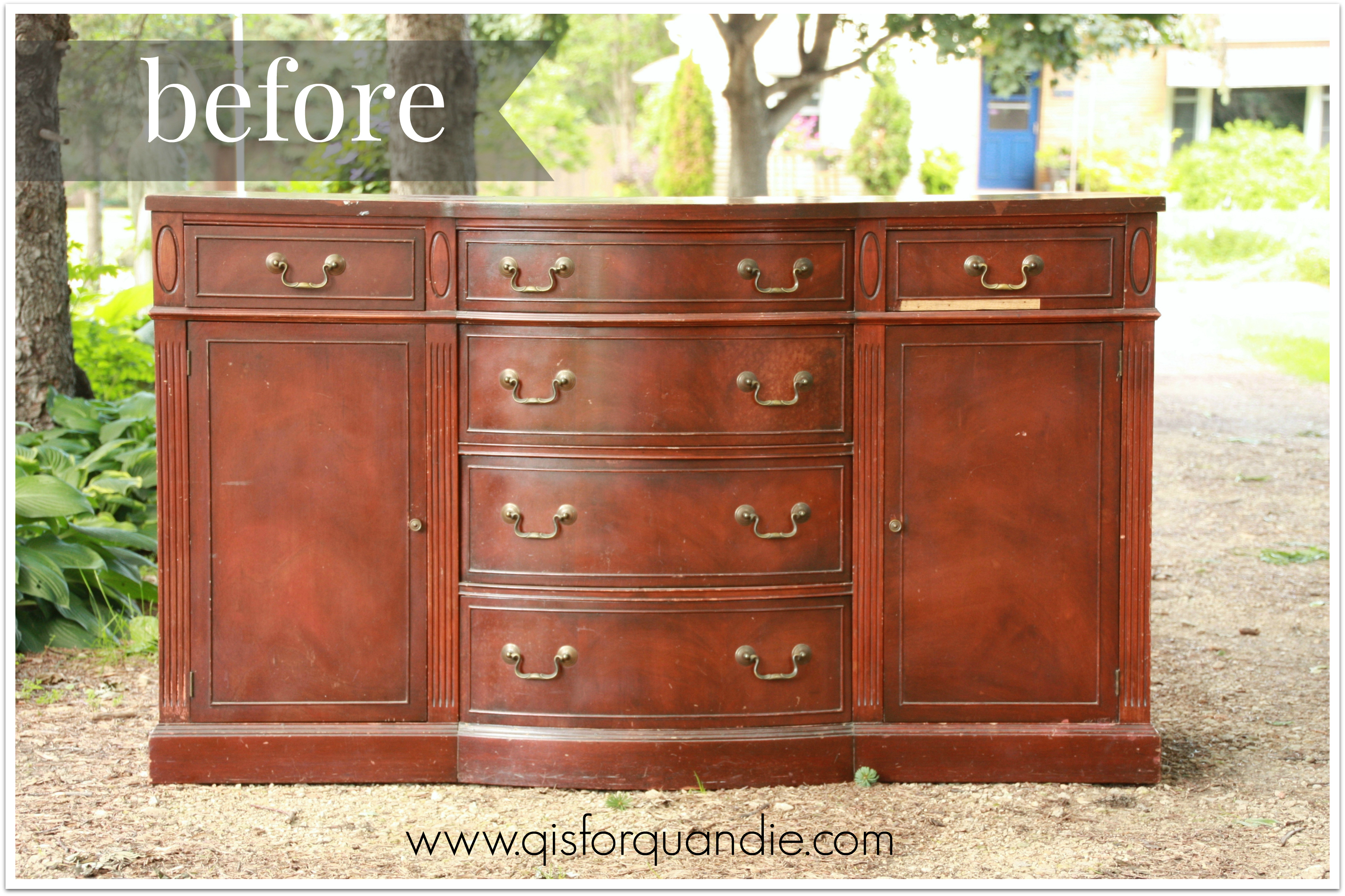
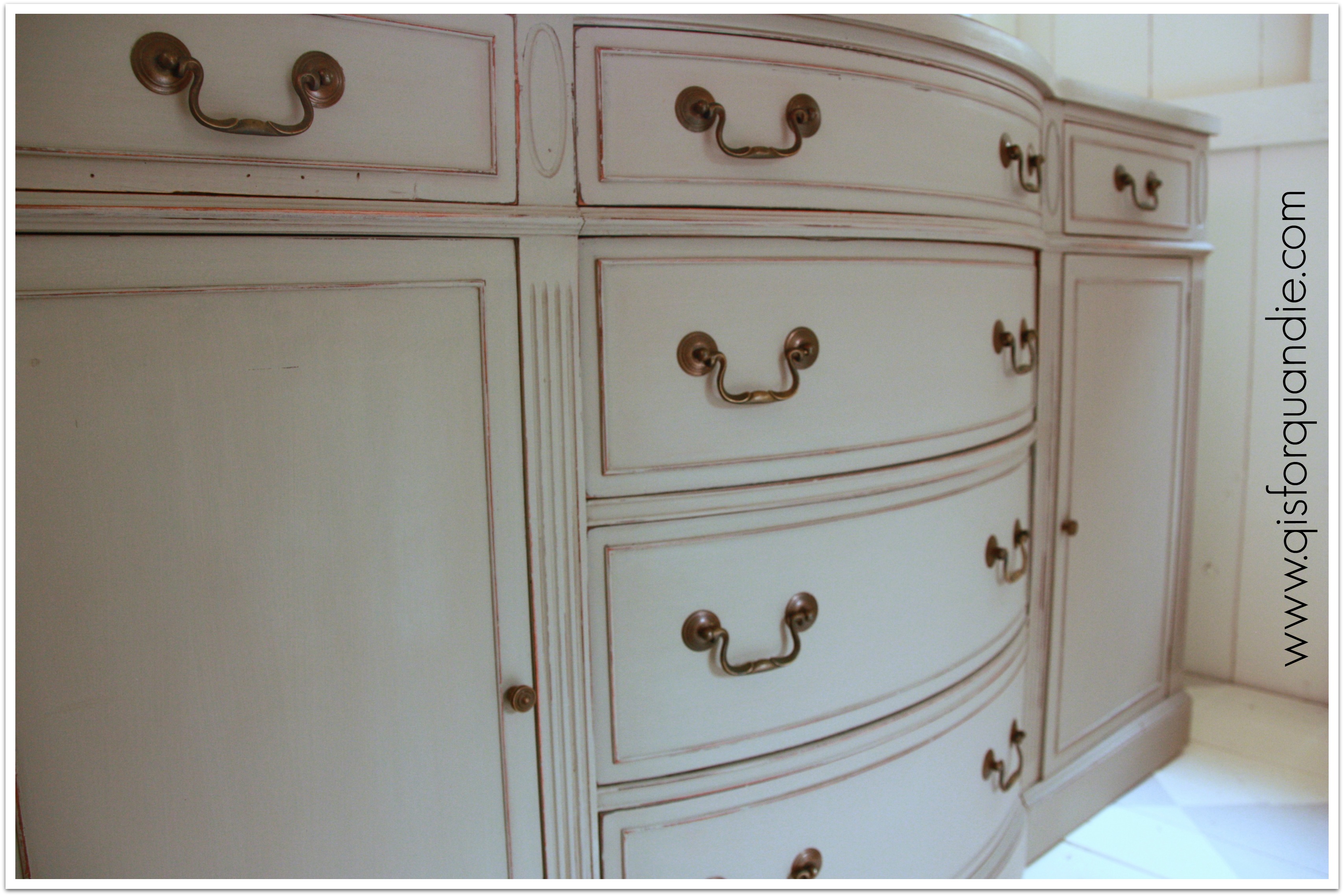
I’d also like to paint the sleigh bed. I know it would be gorgeous painted, but I just haven’t gotten around to it. Before I paint the bed though, I’d rather paint the armoire, and add a stencil to the door.

One of our big splurges back when we were relatively new homeowners was the ‘bedroom set’. Back in the day, you got a set of all matching furniture. Those of you who have read my blog for a while know how I feel about this now! Matching is bad! Mixing is good!
I ditched the matching nightstands that came with this set, and replaced them with vintage pieces that are both painted a pale grey, but otherwise are quite different in style. ‘His’ is a Swedish spoon carved commode that belonged to my grandparents, ‘hers’ is a curvy legged table.

I’ve always thought I should paint the wood parts of the lamps white. Another small project that I never quite get to.
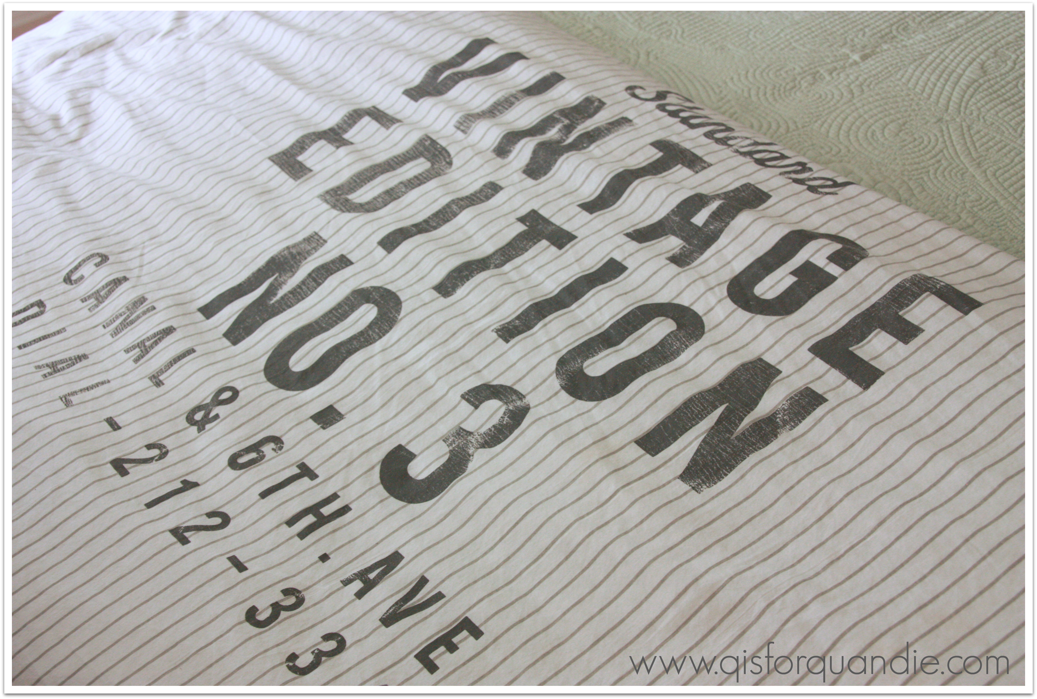
Meanwhile, I love my bedding, which came from H & M Home. I was so happy when we were finally able to get their home products in the U.S.

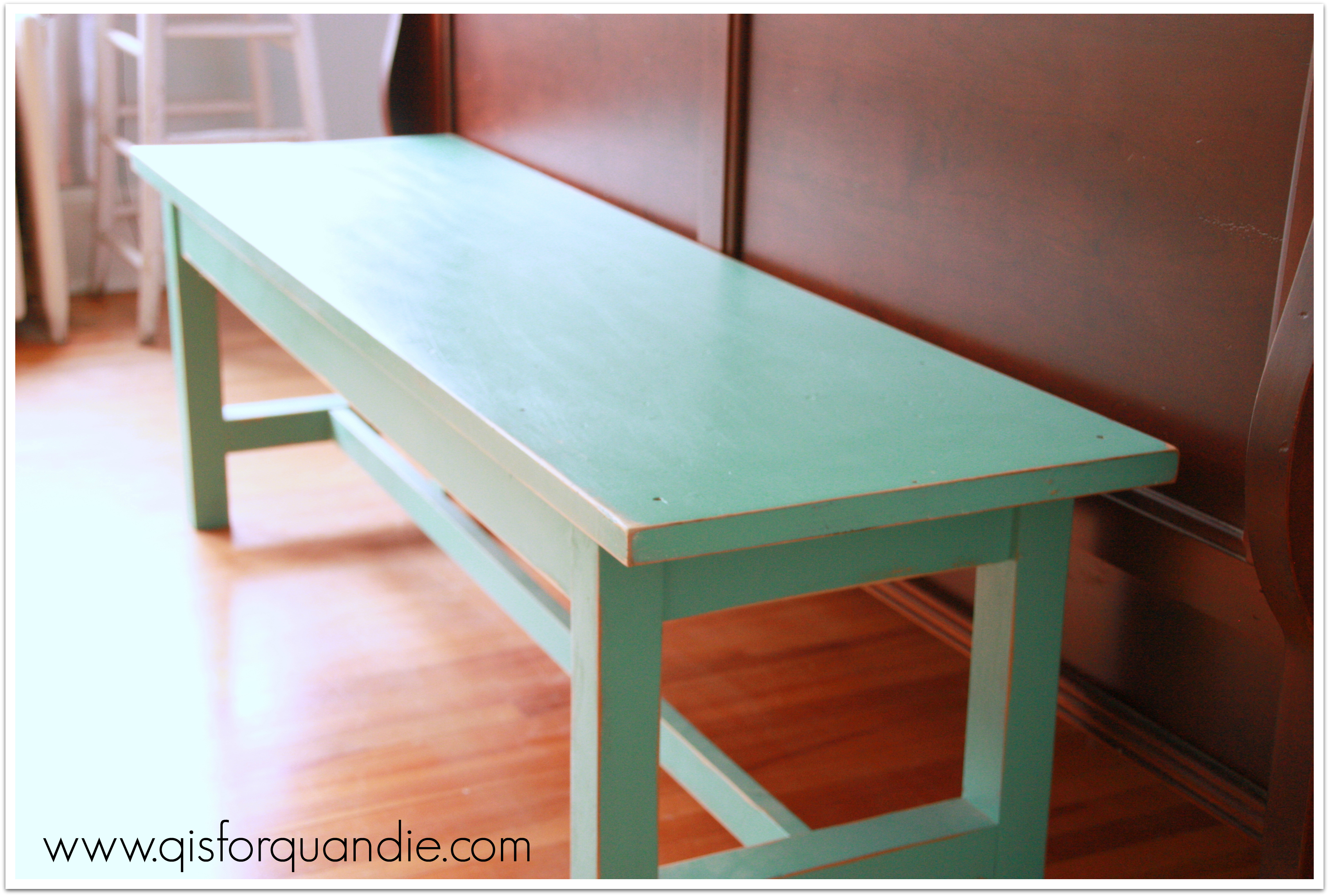
This turquoise bench lives at the foot of the bed. I painted it several years ago. It’s quite handy for piling up clothes that I don’t feel like putting away.

I could use an area rug on the floor to add a little more coziness to the room. We’ve had several different versions of rugs in this room off and on. It’s actually a very large room, so it’s not cheap to get a rug that fills it up properly, and that’s just not at the top of the priority list right now.
Oddly enough, the master bedroom is the room in my house that gets the absolute best light. It faces northwest, but with 3 big windows there is always plenty of light in here. Probably slightly wasted on a bedroom of all rooms.

See that door back in the corner? Yep, that’s my closet. And it is small. Want to live in a 100+ year old house? Then be prepared to get creative when it comes to such things. I only keep my current season’s clothes in there, and only my clothes. Mr. Q gets a closet in another bedroom (which he uses as a study), and I get the guest room closet for my off season clothes.
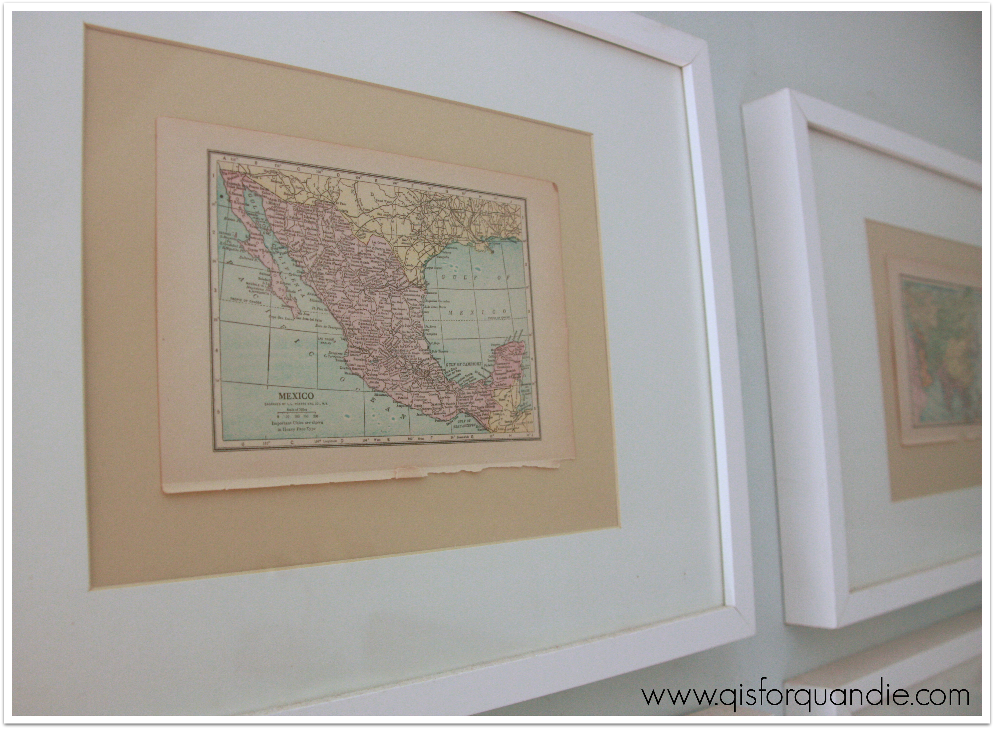
I’m not entirely happy with my current ‘artwork’ in the bedroom either. Basically I have taken the maps from the back of a vintage dictionary and framed them in basic white IKEA frames.

I would love to change these out for something with more presence. These are OK, but not fabulous.
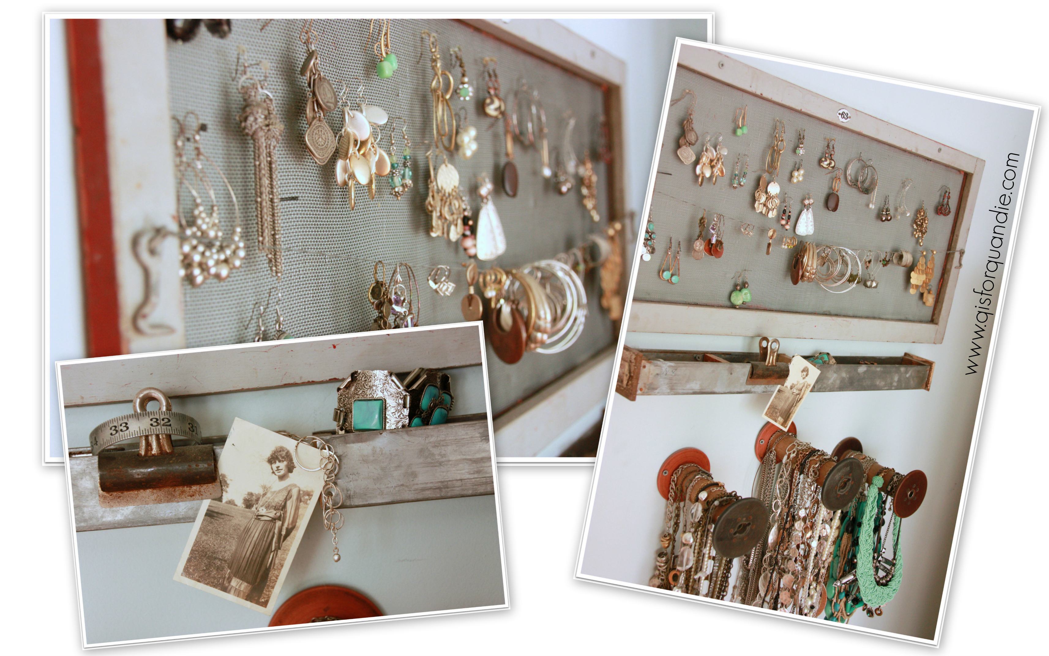
Next to the armoire is my jewelry station.

I used to keep all of my jewelry (and let’s face it, I love costume jewelry) in one of those standing jewelry boxes. The problem was, I couldn’t see it at a glance and many days I just didn’t even take the time to wear it. So I came up with this plan to keep my jewelry in plain view and right next to the door. As I leave my bedroom in the morning, I am visibly reminded to grab some jewelry!
The earrings are on an old window screen, the bracelets and rings are in two old metal drawers that are attached to the wall, and the necklaces are held by old wooden spindles that are screwed into the wall.

Sadly, it seems that master bedrooms are sometimes that last room that gets much sprucing up because the public at large rarely sees it. One of these days I will give it the attention it deserves … then again, I might rather spend the money on a trip to a tropical island in winter …


 I love rusty old metal toolboxes, don’t you? I decided this one would make the perfect container for some succulents. First, I stenciled my house numbers on it. I used my Cricut machine and made my own ‘stencil’ using contact paper. After cutting out the numbers, I just removed them and kept the rest of the contact paper. I adhered it to the metal toolbox, and then just used white spray paint to paint the numbers. I thought it would hold up well against the elements since this planter stays outside in the summer. This is its 3rd summer, and as you can see it’s getting pretty rusty, but the paint has held up well.
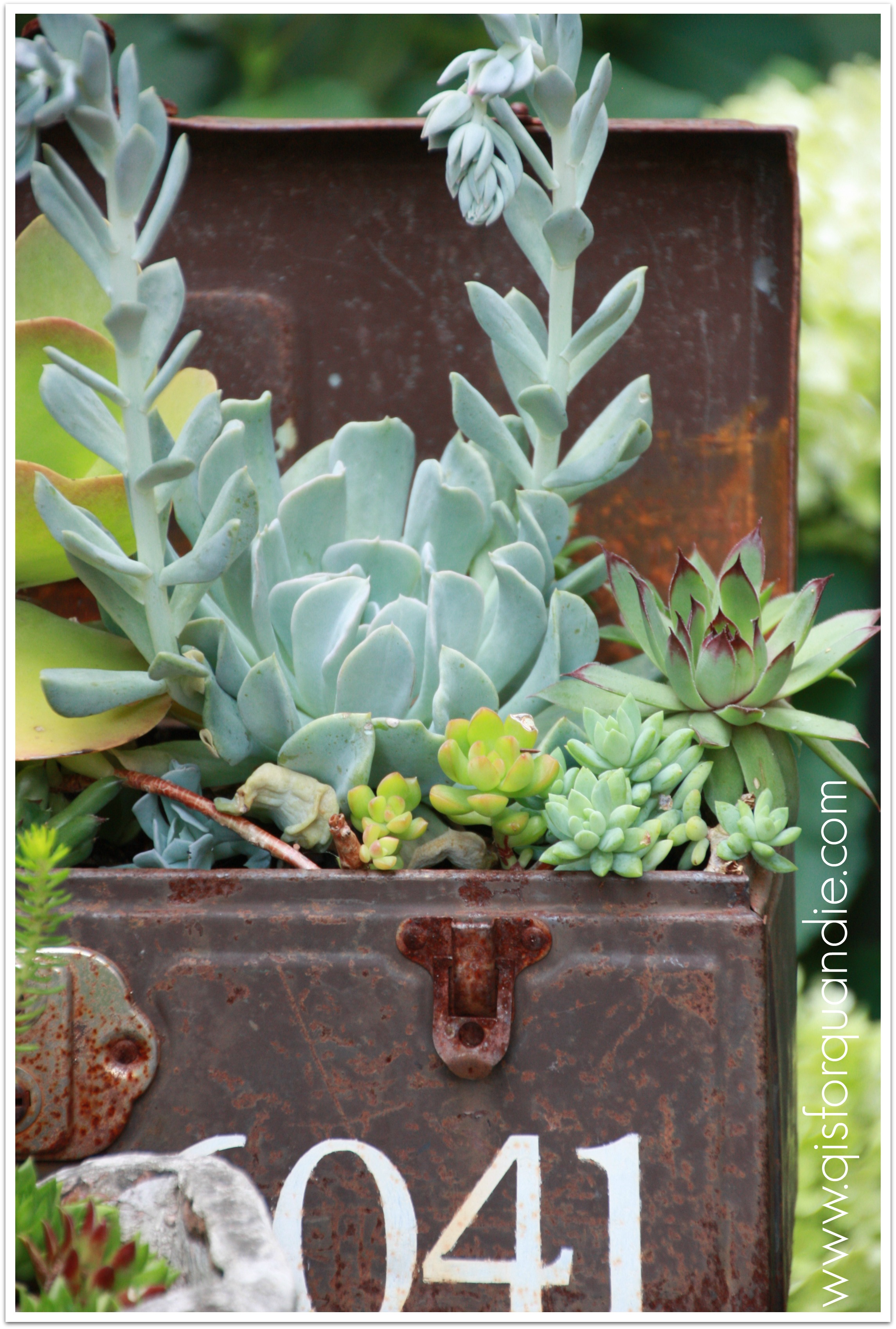
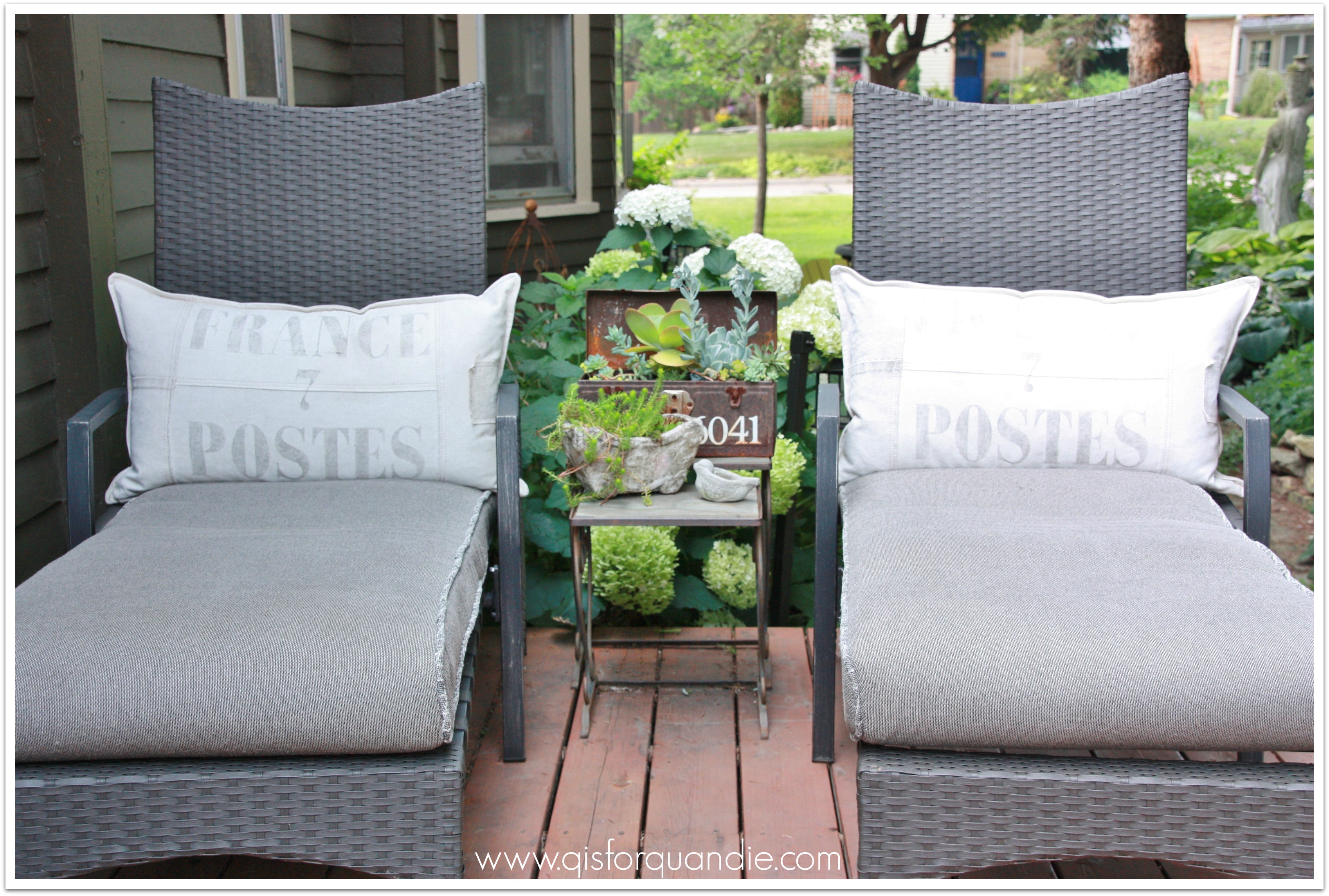
 The pillow covers came from Restoration Hardware, and I bought them on clearance. I don’t usually pay Restoration Hardware prices for stuff unless it’s on sale. This patio furniture came with some very blah pillows when I bought it, so it was nice to upgrade them to something a little more ‘me’. I’m a little embarrassed to admit that I am completely obsessive about not leaving the cushions out unless we are using them. But hey, we’ve had this furniture at least five years now and the cushions still look great and this is why!