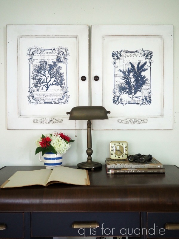
Every once in a blue moon I work on a piece that is meant for me. It doesn’t happen all that often because usually my own projects get pushed to the bottom of the list. Plus, my house is pretty much full, so if I bring in something new then I have to get rid of something else … usually something that I still kind of love, so I don’t do it very often.
But recently I decided to swap out the small farmhouse table on my front three-season porch. Let’s first look at the table that I had there before …
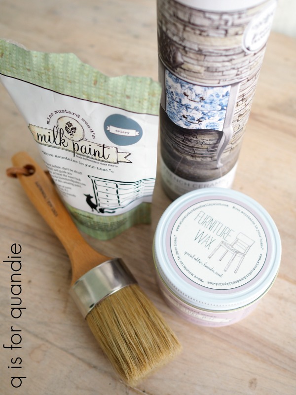
FYI, I custom mixed the milk paint on the base. It’s a lovely color, but not one that you can buy already mixed.
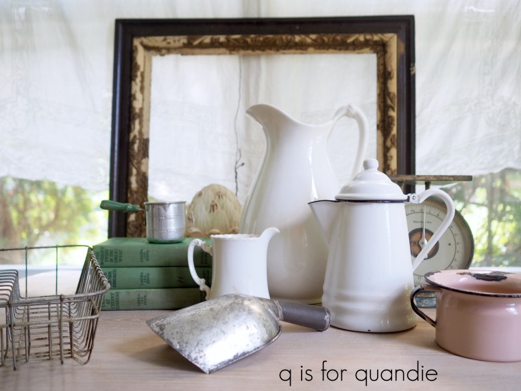
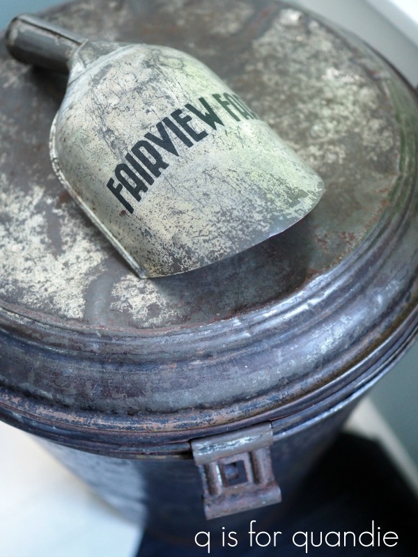
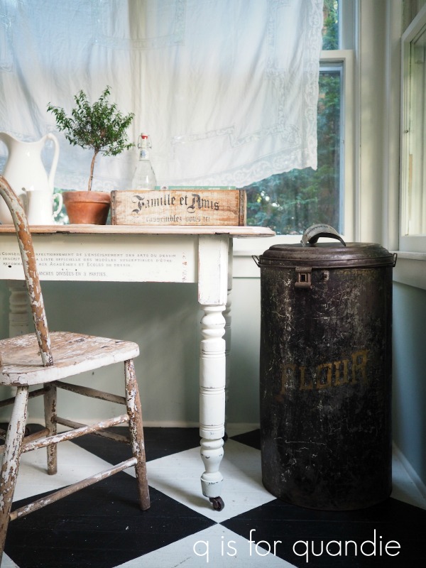
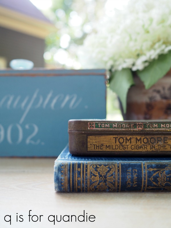
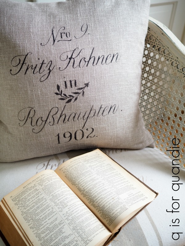
Having a small table in this particular spot is super functional for me. I generally get great lighting here, even on gloomy days. So this is where I take many of my close up photos of things, like this …
But it was bugging me that the top of this table was pretty stained, and it had black streaks in the wood. I didn’t love seeing those flaws in my close ups.
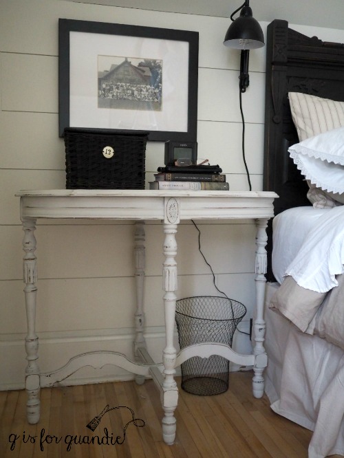
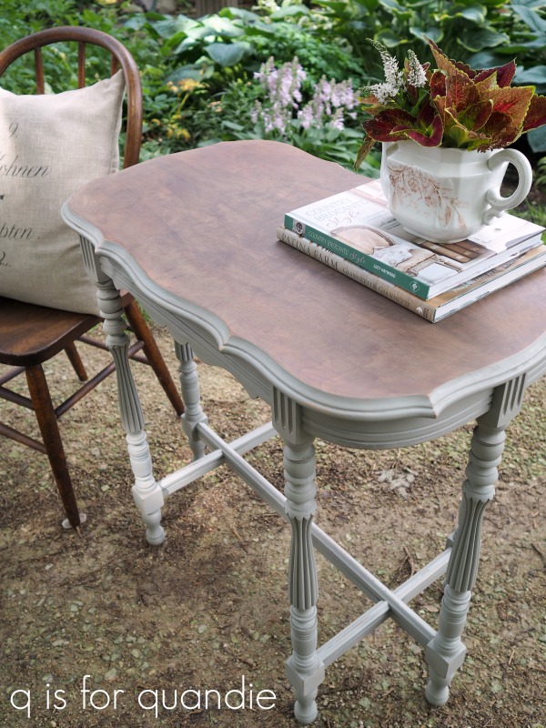
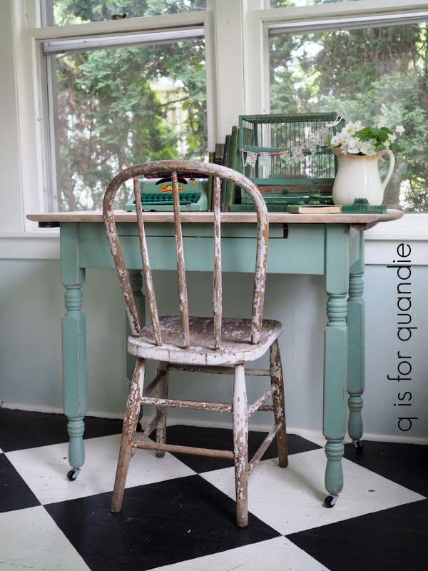
Meanwhile, I had this 2nd small farmhouse table out in the photo cottage.

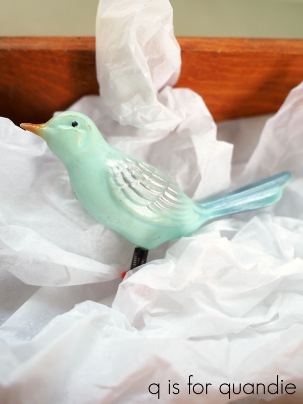
I tried to sell this table when I first painted it, which was way back in October 2015. It never did sell, and somehow it was just abandoned out there. While out there, a bird pooped on it. Yep. Gross, right? Although I’ve been told that it’s good luck to have a bird crap on you, or does that not apply to tables?
I thought that the top was probably permanently stained from the dark bird droppings. It became one of those out of sight, out of mind situations and the table just lingered out there.
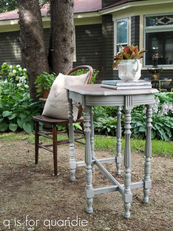
But recently I decided enough was enough, I needed to deal with the table. So I pulled it out and started by cleaning off those droppings. Much to my surprise, they came right off and hadn’t left much of a stain at all. So if you’re ever wondering just how durable a waxed wood surface is, well, there you go. This table top had been waxed with Miss Mustard Seed wax almost four years ago and I was still able to clean that crap (literally) right off.
None the less, I decided that this would be a good time to sand the top down a little and add a fresh coat of wax. This time I went with Fusion’s Liming Wax instead of the clear wax. That really brightened it up.
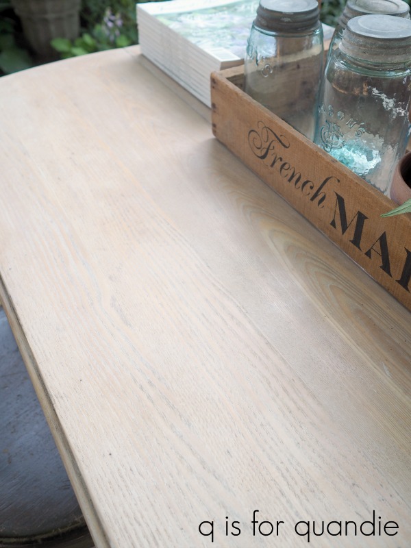
I have to note here that this is one of my reasons for preferring a waxed (or hemp oiled) surface over a poly’d one. It’s really quite an easy job to sand it quickly and apply a fresh coat of wax giving it a completely refreshed look. I would say it took maybe about 20 minutes, and now it looks brand new. Easy peasy.
After adding the wax I decided to try out my new toy, a car buffer. Mr. Q purchased it for me to save me some elbow grease when doing large waxed surfaces. It worked great, giving me just a little more sheen than I get when buffing by hand with very little effort at all. Since I’ve only used it this one time so far, I’m really not ready to provide a recommendation or a proper review of it. But I’ll keep using it and let you know how it goes.
I sort of captured the sheen of the wax in this next photo.

In the end, I loved the way the top looked so much that I decided I should keep this table and swap it for the other one on my porch.
Once I’d made that decision, I realized that the existing paint color, Miss Mustard Seed’s Shutter Grey, was not going to work on the porch. But I could easily repaint the base in the color of my choice. It didn’t take me long to decide on Miss Mustard Seed’s Linen.

I didn’t do any prep at all, other than cleaning it. I knew that I would be rolling the dice when it came to chipping since I was painting over a waxed surface (I had waxed over the original milk paint as well as the top). But the wax had been curing for almost 4 years, so I was betting it would be OK (a waxed surface is fully cured after 30 days).

Sure enough, I got just the right amount of chipping. There are some spots where you can see the Shutter Grey color underneath, but there was no excessive chipping.
After I had the table sanded, I decided that again, since this was going to be for me, I was free to add my own personal style to it. So I used just a small section from the old Prima Marketing Specimens transfer.

It was just enough to add a unique flavor to the table.
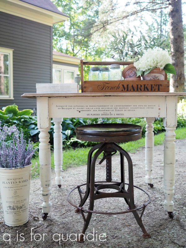
Finally, again, since this table was just for me and I could do as I liked, I did not add a topcoat to the painted part of the table. Did you know that you don’t ‘have’ to use a topcoat with milk paint? It will cure and harden over time to provide durability. It won’t be super washable or water resistant though, so that’s something to keep in mind. I’m OK with that though. After all, I’ll probably want to re-paint it again in another four years anyway 😉
But for now, I absolutely LOVE how this one turned out. As I was admiring the finished product, I said to Mr. Q, “I just love working for myself!” Somehow it frees me up to make choices based solely on what will make me happy, not on what will sell, or be durable enough for the buyer, or how much something will cost and whether or not I can recoup that cost.
In this case I cut up a large transfer to use just a small piece of it on this table. Sure, I’ll use the rest of it on something else, but I still probably wouldn’t have done this for a piece I was going to sell.

I don’t know, maybe I need to start treating more pieces as though I’m working for myself!

After taking these photos outside (because it was far too pretty of an evening not to do them outside), we moved the table into its new home on the front porch …

Yep, I have to admit, I really prefer this one over the previous one.

What do you think?
Thank you to Miss Mustard Seed’s Milk Paint for providing the Linen paint, Prima Marketing for providing the Seeds transfer and Fusion for providing the Liming Wax.