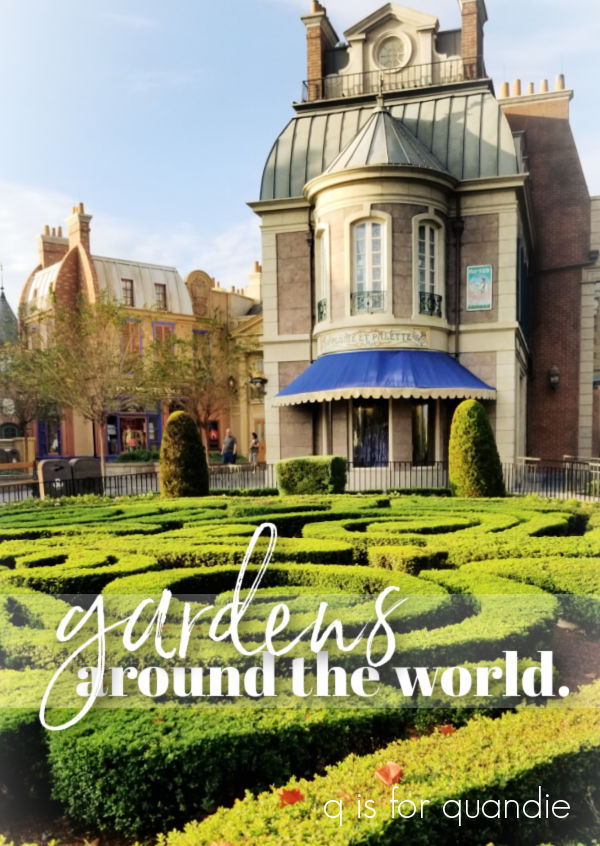
Good morning from the garden. Unfortunately, I came home from Florida last weekend to a garden that was pretty much completely done. All but the most hardy of perennials have died down to the ground, and most of the leaves are off the trees. So I’m not sharing my own gardens today, instead I thought those of you who are gardeners would enjoy seeing the gardens of Epcot’s World Showcase.
For anyone not familiar with Disney World, Epcot is one of the four theme parks there. The back half of Epcot is devoted to the World Showcase which features 11 areas themed to specific countries situated around a large lagoon.
Back in the day, Disney offered a guided tour of the gardens in the World Showcase and Mr. Q and I did that tour. I loved it. You got to go into the World Showcase in the morning before it was open to the public. This was back when the World Showcase didn’t open until 11 a.m. (this was also before the Norway ride became the Frozen ride, ahhh, the good ol’ days).
Anyway, unfortunately they no longer offer this tour. But I did get a lot of insight back then into how they use landscaping to enhance the feeling of each country’s pavilion. The attention to detail at a Disney park is always impressive, and no more so than in the World Showcase.
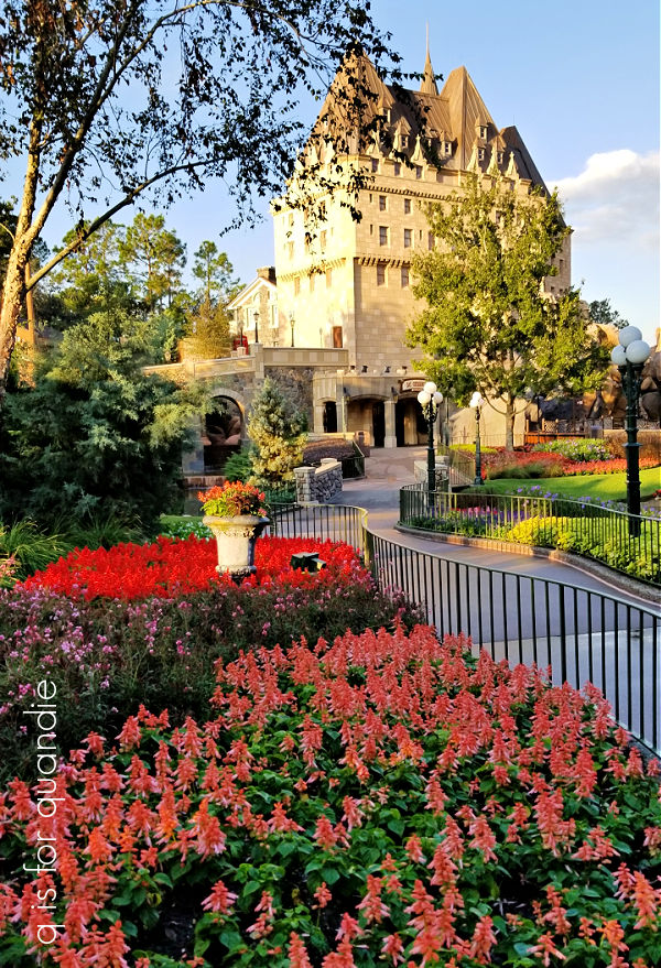
The garden in Canada is modeled after the famous Butchart Gardens in British Columbia.

It’s filled with big swaths of flowering annuals, as well as colorful coleus. If you want constant color in your garden, annuals are the way to go. But you’d better have a Disney sized budget for that since you have to replace them every year.

It inspired me to consider putting a few patches of coleus into the ground in my gardens next year though. The only problem with that approach here in Minnesota is that it takes most of our short growing season for the coleus to fill in, and by the time it starts looking spectacular our first frost is only weeks away. So maybe not.

But Florida can definitely pull it off.

By the way, here’s a quick q tip for you. If you want to explore the World Showcase without hoards of people, these days you’ll want to head there immediately when the park opens. Everyone else will be getting in line for rides. You’ll have about an hour to make your way around the lagoon (roughly 1.2 miles) before the crowds catch up with you.

The shops and dining locations may not quite be open yet, but you can explore the details of each ‘country’ while having it practically to yourself.
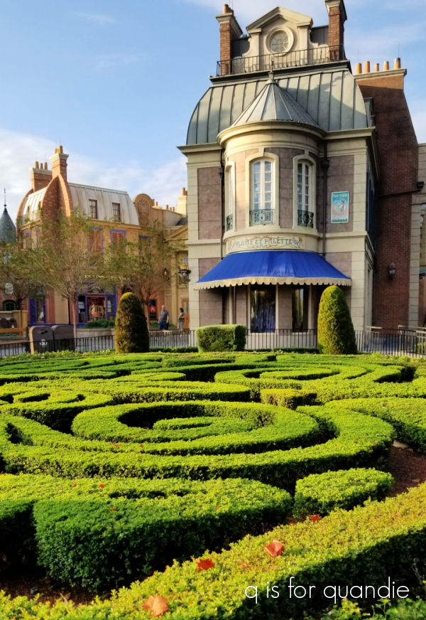
Next up is the U.K. pavilion, and it’s definitely one of my favorites.

It’s so dang charming.

A formal sort of hedged garden is right up my alley, and they have them in spades in the U.K. pavilion.

Hedges and topiary, I need to add both in my own garden. I’m putting them on the wish list.

There was a liberal use of annuals for color again, and also big masses of caladium.

The light green on the left and the pink on the right are both caladium.

We cross over the Channel into France next. The landscaping here feels even more formal than the U.K. with more hedging and topiary.
But aside from the hedge garden above, the France pavilion doesn’t have much else in the way of gardens (it does have a lovely water feature, but I neglected to take a photo of that).
The next country you’ll encounter on the way around the showcase is Morocco.

Once again, there aren’t any large garden beds in this pavilion. But really, the tilework is so impressive that you wouldn’t want to detract from it with gardens. Plus, Morocco has a dry Mediterranean climate which isn’t really conducive to lush, green gardens.
Here’s a quick bit of trivia about the Morocco pavilion. It was sponsored by King Hassan II and is the only Epcot pavilion sponsored directly by a country’s government rather than a corporate sponsor. The King sent Moroccan artisans over to design and create the tile mosaics.
Next we head into Japan.

You just know that this pavilion is going to have some gorgeous gardens.

And specifically a lovely koi pond.
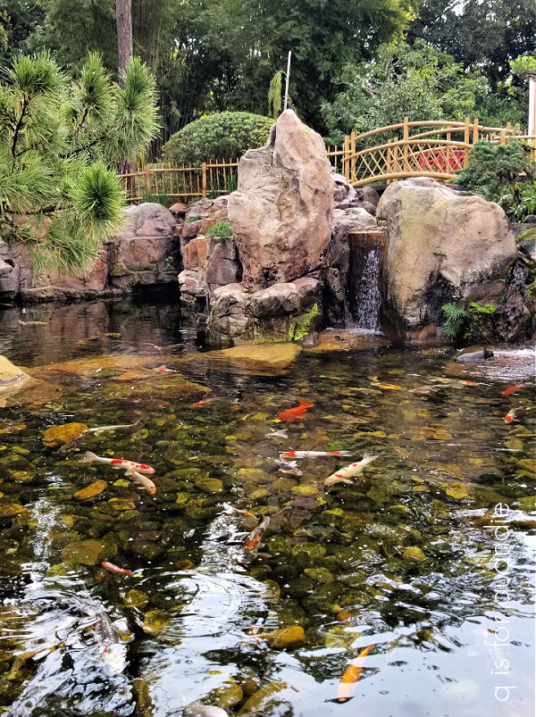
I love the simplicity and serenity of a Japanese garden.

Just a sidebar, if you’re interested in Japanese gardens be sure to watch Monty Don’s Japanese Gardens series (available on Prime).
The next country on your way around the world is Italy. Once again, it’s a gorgeous pavilion with architecture borrowed from Venice, Rome and Tuscany.

They don’t have any formal garden beds in this pavilion, instead they seem to rely heavily on terracotta pots.

There certainly are some gorgeous pots though. That one in the back of that trio above has an annual in it that I used myself this past summer.

I believe it’s Evolvulus Blue Daze and it performed really well for me. I need to make a note to plant it again next year.
I was a little surprised to find that they had hostas growing in containers as well.
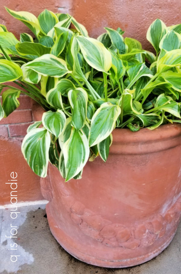
To me they look a bit sad though, don’t you think?
Germany has a very unique garden, it’s a model railroad garden.

There are several trains running around the tracks at all times. The plants seem to mainly consist of small, pruned evergreens. But I did notice that they have quite a few of the Berberis thunbergii ‘Concorde’ that I have in my fairy garden.

That’s it in the lower right corner of the photo above.
Next up we have China.

The garden in China is mainly dominated by a beautiful pond filled with water lilies.

Again, very peaceful and lovely like Japan.
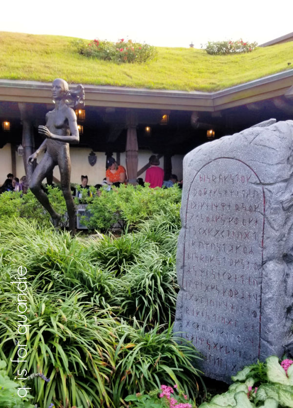
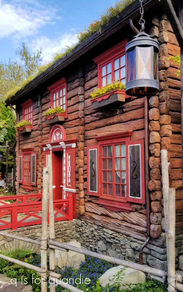
Norway doesn’t have a very structured garden area, but they do have a building with a sod roof which is quintessentially Norwegian I think.
As is the lefse that my sister purchased at the Kringla Bakeri Og Kafe in the Norway pavilion. I’m not much of a lefse fan myself, so I went with the Verden’s Beste Kake, which was delicious. We enjoyed our treats in the seating area under that sod roof.
The royal sommerhus also has a sod roof.
The last country on our journey around the world is Mexico. I was hoping to find an orchid garden in this pavilion, but apparently they only do that during the Flower & Garden event. So really the pavilion just features lots of tropical foliage.

It’s certainly pretty, but definitely not my favorite. I have to say I’m not really all that into tropical foliage. I have no desire to plant things like hibiscus, or orchids.
Any of you familiar with Epcot have probably noticed something missing in my post. I completely skipped over the American Adventure pavilion. Ooops! Well, aside from flowers in red, white and blue, there wasn’t much to write home about in that one.
Looking back at all of these pavilions, the U.K. gardens are definitely my favorite with Canada as a close second place. How about you? Which would be your favorite? Have you ever toured the gardens of the World Showcase? Leave a comment and let me know.