both moral and intellectual gratification.

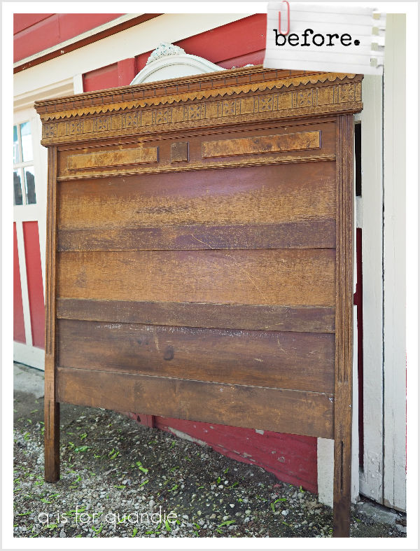
My neighbor nnK spotted this headboard at the curb with a ‘free’ sign on it sometime last summer.

She came and picked me up, and we went back for it (she couldn’t load it by herself).

I had initially hoped that my handyman Ken would be willing to turn it into a bench for me, but he wasn’t up for it this time around.  If there had been a matching footboard to cut in half and use to create the arms, he would have done it.  But without the footboard, he just didn’t want to tackle the project.

So, it sat in my carriage house all fall, and winter, and spring … and I finally pulled it out to get started on it the other day.

At first I was planning to just simply paint it black.  After all, I’ve done a couple of these spoon carved beds in the past in black …

and they were pretty quick sales.

But before I could get started painting it, I needed to sand it.  It had a lot of flaking varnish and I needed to get rid of that first.

As I was sanding it, I seriously considered doing a ‘raw wood’ sort of finish on it.  It really would have been pretty fab with the finish stripped and then a coat of clear wax.  But honestly, I just couldn’t make myself do it.  I’m not a fan of stripping, and after sanding on it for quite some time, I realized it would require the use of a stripper to get all of those spoon carved details clean.

In the end, what I really wanted to do was paint it in Drop Cloth and add I.O.D.’s The Botanist transfer to it.  I was hesitating because I just don’t know if it will sell this way.  But I decided to just go for it.

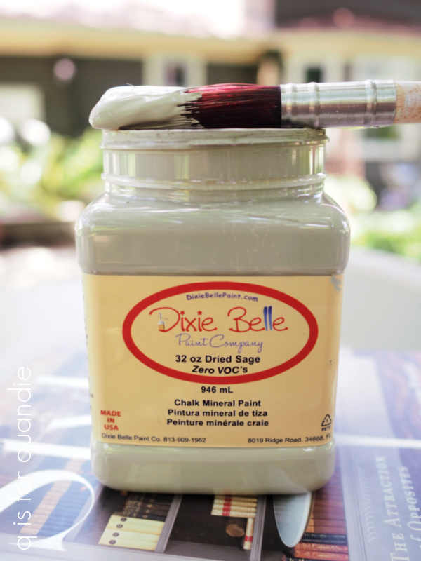
After cleaning up the dust from sanding it, I gave it a coat of Dixie Belle’s B.O.S.S. first.  I have definitely learned over the years that it’s so much easier to be safe rather than sorry when it comes to bleed-thru.

Next up, two coats of Dixie Belle’s Drop Cloth.

After that had dried for several days (while I painted the back of the house), I applied the transfer.

Isn’t that just pretty as a picture.  So sweet.

Maybe too sweet for some?  That’s what I’m worried about.

But I love it.

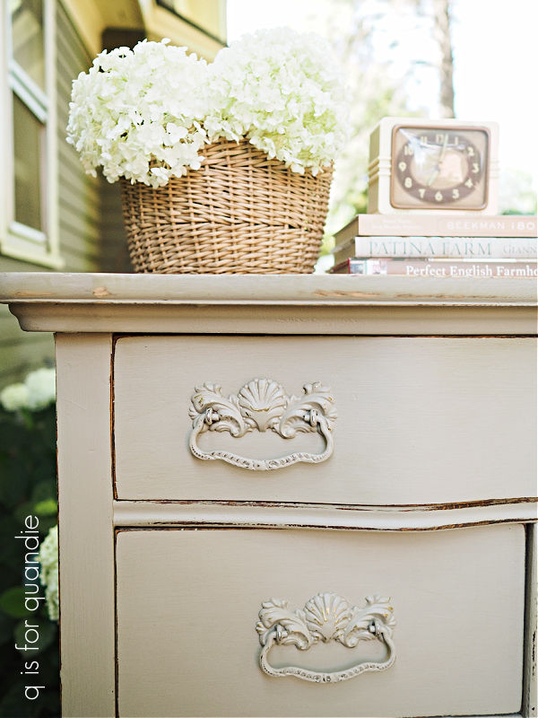
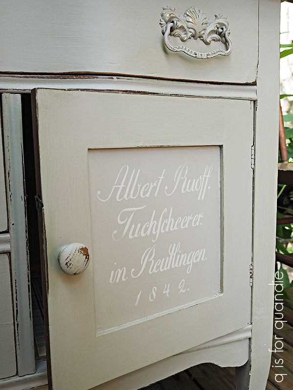
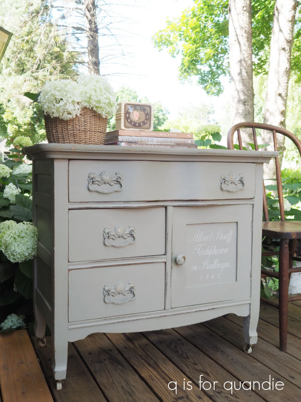
After the transfer was in place, I sanded lightly to distress this piece and then finished it with a coat of clear wax.

The transfer may seem like it’s placed too high on the headboard in my photos, but I think once you’ve got a box spring and mattress in front of it, with a nice stack of fluffy pillows, it will be just right.  And your pillows won’t hide the design.

Sidebar comment; just check out the tatting on that pillowcase.

Can you imagine how long it took to do that?

OK, back to the bed.  In case it’s not apparent in the photos so far, I should point out that this headboard is TALL at 6′.  It will definitely make a statement in any room.

As I’ve mentioned a few times before here on the blog, antique beds don’t come in sizes larger than a full.  They didn’t start making queens and kings until after WWII, and they didn’t become popular until the late 50’s to early 60’s.

So this headboard is technically for a full (or double) sized bed.  However, I’ve modified it to also fit a queen mattress.  We did this with our own bed, and it works out great.  You can find all of those details here.

But basically, with Ken’s help I’ve added a 60″ board along the bottom of the headboard.  It is pre-drilled so that one can bolt the metal frame to the board using the brackets on the metal frame.

The metal frame (that will be included with the bed) can be adjusted for a queen, full or twin sized box spring and mattress.

One could easily switch this back to a double sized bed by removing the board (it’s held on with screws) and bolting the metal frame right to the legs of the headboard.  You could also technically turn this into a twin bed by drilling new holes into that board, but I don’t think it would look quite right with so much ‘extra’ headboard.

When it comes to selling these antique beds, I’m always asked “is it sturdy?”  Well, in this case all of the weight of the box spring, mattress and sleeping people is carried by that modern metal frame.  The headboard is purely decorative.  Attaching it to the metal frame will allow it to stand up, but it won’t completely eliminate any wobble.  For example, if one were to be jumping on the bed (or, um, well, you know what I mean), it will make that headboard bounce.  But it shouldn’t come crashing down or anything, unless you’re some kind of a gymnast, and then all bets are off.

I always try to read the wording on transfers like this one, just to make sure they don’t say anything odd.

I had to laugh when I got to the part about descriptions that were ‘intended to convey both moral and intellectual gratification’.  I’m really wondering what the moral implications of ornamental plants might be.

I don’t know about moral or intellectual, but I definitely got a lot of some kind of gratification out of making over this curbside find.

Not bad for free at the curb, right?

This bed is for sale, so be sure to check out my ‘available for local sale‘ page if interested in the details.

Thank you to Dixie Belle Paint Co for supplying the B.O.S.S. and the paint used for this makeover.

home improvement.

Well, shucks.  I’m continuing to work on long overdue maintenance projects at our house, which means that once again this week I don’t have any blog fodder to speak of.

But I thought I’d share what I’ve been doing, just for the heck of it.

First up, I decided to clean up our curb appeal.

We have a small … porch? … stoop? … deck? … step? … not sure what to call it, at the front door of our three season porch.  It’s really just a simple box with decking boards on top that sits on the ground.

To be honest, I’m not sure we’ve ever cleaned the decking.  Surely we must have done it once or twice in the 30+ years we’ve lived here, right?  But I don’t recall when.  Clearly it has been a long time.

  LOL, seriously you guys.  I should probably be embarrassed to even show that.  But just look at the amazing difference a little pressure washing can make!

After a good washing, I repainted the sides in our house color and then added the same sealer to the top that we used on our deck earlier this summer.

So far I’m impressed with the way this is working on the deck, it adds some protection from the weather without changing the natural look of the wood much.  It also soaks into the wood rather than sitting on top of it, so it won’t peel off.

It had rained overnight when I took that photo, so ignore the puddling water on two of the boards.  But truly, I can’t believe what good shape those boards are still in after 35 years.  I’m not sure that you can even get boards that thick and wide anymore.

As you can see, I also painted the front door in my new outdoor green accent color that I’m calling English Green.

Next to the small porch, stoop, step thingie is a Limelight hydrangea that has been there for I suppose about 10 years or so.  It’s really outgrown the space, but I can’t bear to pull it out so instead I give it a massive pruning every spring.  This year I decided to also limb it up from the ground to make it look more like a standard.

That revealed a bunch of space underneath for a new garden.

I tried to fill it in without having to purchase any new plants.  I divided a Guacamole hosta and a May hosta from other areas and put them in here.  I moved some Chocolate Snakeroot from another garden, and also pulled some heuchera from another spot.  The bright green lamium was already growing under the hydrangea.  The only new plant is the taller hosta in the corner (left in above photo), which is a Krossa Regal.

Here’s the front of the house, all spruced up.

Some of you with eagle eyes may have noticed that I’ve made a change or two to the front window box since I last posted about it.  I pulled out the coral colored begonias and replaced them with a white caladium.  The color of those begonias was all wrong with the rest of the deep pinks in that area, plus they were getting totally swallowed up by the other plants.

The caladium is at least holding its own.

With the front of the house looking pretty good, I turned my attention to the back.

We had a lot of peeling paint on the south facing back side of our house.  Repainting it was on our to-do list last summer and we never got around to it.  So I was determined to make it a priority this year.

As I’m sure many of you know, it’s not the painting itself that’s difficult, it’s the prep work.

Ugh!  There was a fair bit of time spent scraping that peeling paint.

I decided it would be easier to break the job down into sections that wouldn’t be too overwhelming.  So for now, I’ve completed the back wall …

And it looks amazing!  Such an improvement.  It has inspired me to keep going, so I plan to get another section of the house done yet this summer, and possibly also the potting shed.  We’ll see how that goes.

In the meantime, I’m stepping away from home improvement for a bit to finish up not just one, but two pieces of furniture.  So be sure to stay tuned for those!

hosta flowers, yes or no?

Good morning from the garden!

Today I thought I’d ask you all the question, ‘hosta flowers, yes or no?’

In the past I’ve mentioned that I tend to cut the flowers off my hostas as soon as they appear.  But that’s partly because I have 500 (small exaggeration) of this old variegated variety of hosta in my garden …

and it has tall, spindly flower stalks with tiny lavender flowers on them.  You can see a couple of stragglers that I missed clipping in that photo.

If I just let them go, they look really messy and chaotic to me.  So, I have always trimmed them off.

In fact, in the past I’ve tended to remove the flowers from almost all of the hostas in my garden.

But this year it seems like the flowers on quite a few of them are really looking good.

Rather than having spindly flowers poking out in every direction, they have nice full clumps coming from the center of the plant.

Maybe it’s because they didn’t suffer any hail damage this spring.  Or maybe it’s because I top-dressed a lot of them with compost this year.  Or maybe it’s because I have been very diligent about keeping them watered.  We’ve had a very dry summer so far, currently we are experiencing what is considered a moderate to severe drought, so I’ve been doing a lot of watering.

Or maybe it’s just that I’ve never let them reach their full glory before!

Whatever the reason, this year I’ve decided that some of the hosta flowers deserve a spot in the garden.  In fact, I was standing over at nnK’s house across the street the other evening, and I noticed that from a distance it looks like my garden is full of purple blooms right now, and that’s not a bad thing.

One of the most prolific bloomers at the moment is this one …

This is a hosta that originally came to me from my friend Sue, and I’m fairly sure it’s called Golden Tiara.  Over the years, with lots of splitting here and there, I now have at least a dozen of them.

Another that’s full of flowers right now is this one.

I’ve got it tucked in between some Golden Tiara hostas on the right, and that glorious Raspberry Splash pulmonaria on the left.  I have no idea what this one is called, it’s similar in size to the Golden Tiara but is solid lime green.

Most of my hostas have pale purple flowers, but I do have a couple that get white flowers.

Wouldn’t that be a pretty addition to an all white blooming shade garden?

This next one starts out with pale lavender buds that fade to white as they open.

Not all hostas bloom at the same time.  I have several borders of a plain green hosta (also gifted by my friend Sue) that aren’t showing any signs of blooming yet.

In fact, oddly enough, although I’ve had these for years, I can’t even recall what their flowers even look like.  Clearly I don’t grow this variety for the blooms.  Instead, they make a great edging plant for a perennial border.  In fact, I just dug up two of them, divided the pair into 10 plants (yes, 10!, five each) and replanted them as a border under my Limelight hydrangeas.

They don’t look like much right now, but they will fill in quickly and create a solid border.

And speaking of hostas that aren’t blooming yet, one of my readers, Annie O, gifted me with a Royal Standard hosta that she says gets beautiful, and highly scented, white flowers.  But it’s also one that hasn’t bloomed yet (on left).

As is the Shadowland Autumn Frost hosta to the right of it.

I’ve done a little research and as far as I can tell, it does not harm your hosta in any way to remove the flower stalks before they open.  And you should definitely remove them after the flowers fade to reduce the amount of energy the plant spends on producing seed.  It can then devote that energy to growing more roots and foliage instead.

So I’m curious, do you whack the flowers off your hostas right away?  Or do you leave them until the flowers are done?  Do you have a particular hosta that you grow for its spectacular flowers, or do you pick hostas for their foliage alone?

Leave a comment and let me know.

simpler than simplicity.

A while back I picked up another simple wooden tote at a garage sale.

I love that the end pieces are curved at the top rather than cut straight like so many of them.

I planned to just do my usual, add paint and maybe some transfers.

Like I did on this one …

And this one …

And this one …

And even this one …

Although technically that is an I.O.D. paint inlay, not a transfer.

So after cleaning and then painting it with some of Dixie Belle’s Drop Cloth, I went through my transfer stash to find just the right thing.

It wasn’t until I started holding bits of transfers up against the tote that I realized the sides were really rather short.  In fact, too short for most of the florals that I had thought about using.

Then I saw my old re.design with prima Simplicity transfer, which is a black toile.  I’m not even sure if you can get this one anymore.  I know there are several other options for a toile transfer out there though, if you’re looking for one.

I had used Simplicity on the upper drawers of a dresser once.

I thought it was pretty, but ultimately it didn’t sell and I ended up sanding it off and re-doing the dresser.

Maybe that was a little bit of foreshadowing as to how this project was going to go.

Or maybe I am just doomed to keep repeating the same mistakes over and over.

Either way, I pulled out Simplicity and decided to try it on this tote.

It was a little tricky to get the transfer situated as one full piece, so I ended up cutting out separate elements of the toile design and adding them one by one.

It was working out fairly well, as I wrapped the toile all the way around.

But then I got to the last side, and decided that I really wanted to use the roosters …

Ummm … yeah … maybe not my finest moment.  There is just too much white space all around them.  And they are almost centered, which gives them too much importance in the overall design.

Honestly, I just didn’t like it.  At all.

You know what they say, if at first you don’t succeed, try again.  So I sanded it off and started over with a fresh coat of Drop Cloth!

Then I decided to go much simpler than … well … Simplicity.

I just added the word ‘SEEDS’ from the I.O.D. Gregory’s Catalogue paint inlay.

It was the perfect fit.

Also, FYI, this is the 2nd use of this inlay.  I used the full inlay once already on this piece …

So I was OK with just taking out that one word and using it on this tote.  I can still use the rest of the inlay a 2nd time (and in fact, I do have plans for it).

I will note, as I have before, that I was unable to get the inlay off this tote in one piece, so that 2nd use will be it for this one.

After sealing the inlay with some clear matte spray sealer, I used Dixie Belle’s flat clear coat over the rest of the piece.  Then, while I had it out, I also used it to apply some re.design with prima decoupage tissue to the bottom inside.

So, in the end, it’s a much simpler look.

And I really like it.

How about you?

a visit to tangletown.

I used to love going to the Tangletown neighborhood garage sale, it was always one of my favorites.  Unfortunately, it’s one that bit the dust during Covid.  The last one was held in 2019, and they haven’t brought it back.  Such a bummer.

But last weekend I found myself in Tangletown once again, this time at Tangletown Gardens.

If you are local, and looking for some garden inspiration, this is a spot you should check out.  It would be better if you’ve recently won the lottery, because I’m not going to sugar coat it, their prices can be high.

That may be partly because they have a lot of unique offerings that you won’t find at your typical garden center, like this Tibouchina grandiflora, or Princess Flower.

They have this one planted in what I’m going to call their boulevard (a.k.a. verge, tree-belt, the section between the sidewalk and the street, what do you call it?) border.

More on those borders in a minute, but as for that Princess Flower, it was $24.99.  I did a bit of googling and found that it is grown as a shrub in tropical climates, it’s hardy in zones 9 to 11.  So clearly not here in Minnesota, meaning that we would grow it as an annual.  That’s certainly a pricey annual!

But really, despite the high prices, Tangletown Gardens provides a wealth of inspiration starting with the various planters scattered around.

You definitely aren’t going to find your traditional petunias here.  I like the use of Scotch moss in the planter above, at least I think that’s what that is.

I also like that they used birch logs in this next planter.

Of course, we’ve all seen birch used for winter arrangements, but turns out it looks pretty good in summer too.

I also like how they’ve carried over the plants in this next trio of planters to the ground surrounding them, it’s as though they’ve spilled out of the planters and onto the ground.

Let’s take a closer look at the plants themselves.

I believe that bright yellow grass is Hakonechloa, or Japanese forest grass.  The front center plant seems to be a coleus, and there is a cala lily behind it.  In the upper right of the photo is an upright fuchsia.  Have you seen these?  I actually bought one by mistake earlier this year.  I was rather annoyed when I got it home and read the tag because I wanted the trailing version for my front window box.  I ended up putting the upright version in the Gregory’s Catalogue bed planter and now, a couple of months later, I’m realizing that I really like it.  I may buy some on purpose next year.

As you can see, it’s holding its own height-wise amongst coleus and ferns.

Although the planters at Tangletown were fantastic, the star of the show for me was those boulevard borders that I mentioned earlier.

They were nothing short of spectacular.

Isn’t this a fun little plant …

I should have paid attention to what that was called, but unfortunately I did not.

They used a wide variety of plants in these borders, both annuals and perennials, ranging from your typical things like zinnias, gomphrena, celosia, grasses, and coleus.  But they also had some more unusual things like that Princess Flower I shared earlier.

They also used a plant that I’m finding is super trendy right now, Angel Wings, or Senecio candicans.  It’s the plant below with the big, silvery wings … I mean leaves.

Isn’t that gorgeous?  As I mentioned last week, I’m not typically a fan of silvery foliage because it looks like powdery mildew to me, but I might make an exception for this one.

They also used one of my new favorites, Verbena bonariensis.  It’s the tall, wispy plant with purple flowers …

I’d been seeing a lot of this plant on my favorite British gardening show, Gardener’s World, and although I looked all over for it at my usual nurseries I couldn’t find it at any of them.  I did end up finding it at the Abrahamson’s in St. Croix Falls, but I now know that I can also get it at Tangletown Gardens.

The main reason I was visiting Tangletown Gardens this time around was to look for scented geraniums.  My friend Jackie, who loves to grow plants for their scent, told me that this was the place to find them.  And she was right.

They had quite a number of different varieties.

I know it’s weirdly confusing, but the flowers most of us call geraniums aren’t true perennial geraniums at all, they are pelargoniums.  Basically geraniums are perennial plants like this one (also called Cranesbill) …

or this one (Geranium macrorrhizum, or Bigroot Geranium) …

Pelargoniums are annuals usually grown for their flowers, or in this case, their scent.

In my opinion, most scented geraniums are not grown for their looks.  They tend to look a bit spindly, and their flowers aren’t usually very impressive.  So keeping that in mind, I chose both of the ones I purchased strictly by smelling them.  Scented geraniums come in lots of different scents like apricot, chocolate mint, rose, peppermint and nutmeg, but I chose two that both have a lemon scent.

First up is Pelargonium ‘Mabel Grey’.

And the 2nd one I chose is Pelargonium ‘Prince Rupert’ variegated.

I’ve placed these on the tiered plant stand that I found at the Fridley garage sales (after giving it a quick coat of black spray paint).

It’s sitting in between my newspaper roller planter of succulents and my galvanized tub herb garden.  You may remember that I mentioned having chosen a couple of the herbs for their scent as well; lemon verbena and lavender.

Our outdoor dining table is right next to this, and this is often where I sit to have coffee in the morning.  Mr. Q and I frequently eat dinner out here too.  These scented plants are best enjoyed up close and personal.  I find that you have to brush against them to release their fragrance, so this is the perfect spot for them.

Although they were priced just a little higher than what I would normally pay for an annual at $7.99 each, I plan to over-winter them as houseplants.  I hope to get many years out of them.

So tell me locals, have you been to Tangletown Gardens?  Or have any of you grown scented geraniums?  Leave a comment and let me know.

some mid-summer garage saling.

Last Thursday I headed out with opK (that’s oar painting Karen) to check out some garage sales in neighboring Stillwater.  But before we got to the garage sales, we stopped off at a vintage sale that I’ve been to off and on over the years.

In fact, I even shared a couple of blog posts about it back in 2016 and 2017.

They always have awesome vintage stuff, although I don’t usually buy much.

This time around I picked up some pretty bark cloth fabric from the ‘bargain tent’.

I thought this would be perfect for upholstering the seat on the vintage child-sized green wicker chair that I picked up a while back.  The chair is the perfect shade of vintage green and I loved the authentically distressed arms, so I didn’t paint it.

After soaking the barkcloth in some oxy-clean and letting it dry in the sun, I ironed it and then stapled it over some batting and a thin plywood seat that Ken cut to fit the chair.

This thing is so stinkin’ cute you guys.

I really struggled to come up with a way to show the size in my photos, it’s only 22″ tall, 18″ wide and 16″ deep.  The best I could come up with was adding a typically sized step ladder into the photo.

I also purchased a set of metal plant i.d. stakes.

I used to have a handful of these and earlier this spring I decided that they’d be perfect for labeling my herbs, but I couldn’t find them anywhere.  I then shopped around my local nurseries and hobby stores looking for more, but didn’t have any success.  So I was happy to find some at the barn sale.

The tricky part about these is finding a good way to add a plant name temporarily, but not so temporarily that it washes off in the rain.  I’ve discovered that painting them with some of Dixie Belle’s Midnight Sky, and then writing on them with a chalk pencil tends to work out great.

You’d think that the chalk pencil would wash off, but it really doesn’t.  Of course, we’d also have to actually be getting some rain in order for that to be a problem.

After checking out the barn sale, we headed to a few garage sales in Stillwater.  I didn’t find a whole lot, but I seemed to find just one thing to purchase at each sale starting with this enamelware coffee pot.

It’s missing the glass percolator thingie from the lid, but that makes it perfect to use as a vase.  It also has some sort of really heavy crust built up inside it.  I’m not sure what that’s all about, but for that reason I chose to add a glass vase to hold the water and flowers.

After adding one of the French Labels from re.design with prima to the pot, I filled the glass with water and placed it inside the coffee pot.  All that was left was to fill it up with some flowers from the garden.

At another sale I picked up a small, vintage rake for $2.

It’s quite petite, but I’m not sure it’s small enough to have been a child’s toy.  I could have left it yellow, I’m not totally opposed to the rusty patina.  But I’m not a big fan of yellow, so I decided to paint it green.

I painted it with a coat of chalk style paint first, to help my milk paint stick.  Then I painted it with Sweet Pickens In a Pickle.  Once the paint was dry, I sanded lightly to distress the edges, which brought back some of that yellow.  Then I gave the entire rake a coat of Dixie Belle’s Big Mama’s Butta.

This rake could be purely decorative, it would look great just hanging on the wall like the pair of kid sized tools I have in my potting shed.

But it also would be totally functional.  I have a small rake like this that I use to pull leaves out from between perennials in the garden.  It’s super handy.  And yes, this rake is for sale if any of you are interested (check my ‘available for local sale‘ page for more details).

At the next sale I purchased this little metal conversion chart.

When I turned it over, it still had the original Hearth & Hand logo on the back, and the Target price tag of $7.99.  But I really thought it was cute, and I found a spot for it hanging in front of my cutting board in the kitchen.

Last, but not least, I picked up this … thingie.

Do you know what it is?  The newspaper is a clue.

When I first glanced at it, I thought it was part of a ringer washer (it has a crank on the other side).  But that definitely wasn’t right.  Whatever it was, I thought it would make an awesome planter.

It didn’t have a price tag on it, so I asked the proprietor ‘how much?’ and he said $3.  Sold!  He also told me that it was a newspaper log roller.  These were once used to roll newspapers into logs for the fireplace.  Sure enough, I googled it and there are plenty of them out there.  I even found a YouTube video on how to use it.

After hitting up the garage sales, we stopped off at Abrahamson’s Nurseries and I picked up a few plants to put in it.

After giving the roller a good cleaning and then protecting the wooden handles with some clear wax, I even went so far as to plant them up.

But I quickly realized that even though it looked great initially, most of those plants would grow much bigger and totally envelope the newspaper roller.  In addition, I don’t think the roller holds enough dirt to keep them happy.

So I pulled them all out and filled it with succulents instead.

I hesitated before doing so because succulents have to be brought inside for the winter here, and this ‘planter’ will be difficult to water without making a mess.  I may just pull the succulents out in the fall and put them in regular pots to save them over the winter, we’ll see.

But for now, I love the way they look and thus I’m calling this my find of the day!

Not bad for 3 bucks, right?

I’m curious, what would you have picked as the find of the day?  Leave a comment and let me know.

a front window box fail.

As you may know, I have a window box along the front of my house.  Here’s a picture of it from last year.

At 11′ long, it ends up taking quite a few plants to fill it with annuals every spring.  Not to mention mums for fall …

and evergreens for winter.

I find that there are two ends of the spectrum when it comes to filling window boxes; at one end you have the gardener (not naming any names here) who plants exactly the same thing in their planters every year without fail.

Then there are gardeners like Erin from the Impatient Gardener who can’t stand to do the same thing every year and thus tries something new each spring.

I think I fall somewhere in between.  When I find something that works I like to stick with it.  But I also don’t want to fall into a gardening rut.  So this year I decided to step outside my comfort zone and experiment with some new things in the front window box.

Unfortunately, in my opinion, the resulting combination is a bit of a fail.

Before I start listing the plants for you, I’ll point out that this window box faces north and is in full shade which limits the plant options considerably.

My starting out point was a Streptocarpus Ladyslippers™ Deep Blue Vein that I found at the Amish nursery in Wisconsin that nnK and I visited in spring.

I’ve grown this plant as a house plant in the past, but had never put it outside in a planter.  These plants were just loaded with gorgeous purple flowers when I saw them at the nursery so I thought they’d add a fabulous pop of color.  And actually, they did look great for about 6 or 7 weeks, but lately the blooms have petered off quite a bit.  After doing a bit of research I learned that temperatures above 80° will cause that.  So … maybe not a great choice for an outdoor planter in summer.  They also haven’t grown much, so they are getting swallowed up by some of the more vigorous plants.

My next ‘mistake’ was taking the advice of a random stranger at the garden center who suggested that Dusty Miller would be a great companion to the Streptocarpus.

I hadn’t grown this plant in forever.  I can remember planting it in the ground way back when I was new to gardening.  So when she suggested it, I thought ‘why not?’  After all, I’m experimenting with some new options.

But I have to say, I don’t really love it.  It’s doing great, but I think I’m just not a fan of ‘silver’ foliage.

Which leads me to my next plant choice, Dichondra Silver Falls.

I’d been hearing about this plant on various gardening vlogs lately and I needed something to tie in with the Dusty Miller, so I gave it a shot.  I will say that it is also performing exceptionally well, I mean, just look at it (photo above).  It clearly loves this spot.

But again, I don’t love that silver foliage.  You know what I think it is?  To me it looks like these plants have a bad case of powdery mildew.

I also opted to add a second pop of color with a couple of Amstel Netja Dark begonias.

An Amstel begonia is a cross between a tuberous begonia and a wax begonia.  Again, I hadn’t grown begonias in years.  I’d never had good luck with them in the past, I tend to overwater them leading to root rot.  They are rather picky about not sitting in wet soil.  But these newer varieties are improvements over those I planted in the past, so why not give it a shot.

And once again, I was drawn in by that gorgeous color.  It’s always tricky to find a plant that will bloom reliably in the shade.

Although these have done fairly well with continuous blooms for color, they also haven’t really put on any additional bulk.  Much like the Streptocarpus, they aren’t holding their own against the other plants in the box.

I did put a couple of old favorites in the window box too including a Dark Eyes fuchsia.

These always do really well in this north facing location.  They tend to be messy plants, dropping those flowers all over the place, so I wouldn’t use these in a spot where they would hang over a deck or patio.  But there is a garden beneath this window box and the flowers all fall down under the plants below.

Finally, I also planted some Diamond Frost Euphorbia in the window box.

It always makes a great filler, but this year it is quickly taking over and almost smothering the other plants.

So, in the end, I’m calling this year’s front window box a bit of a fail.  Although most of the plants look rather pretty up close, in combination and from a distance they just look rather anemic to me.

I don’t think I would repeat any of them, except the fuchsia.

I would use the euphorbia again too, especially if I ever decide to do another all white and green combo like the one I did in 2014.

That one included the euphorbia along with white impatiens, a white caladium, some jester ferns and some ivy.  And it was one of my favorites.

It was a fun one to transition into fall too.  I simply pulled out the impatiens and added white mums and pumpkins, and some flower heads that were turning green from one of my hydrangeas.

I have to give the award for ‘most spectacular combination’ in a window box to this one from 2021 though.

That combination of coleus, sweet potato vine and lemon coral sedum just pops.

There were some white New Guinea impatiens in that mix too, but as you can see they got rather swallowed up as well.

In the end, I learned some valuable lessons from the choices I made for this year’s window box.  I think next year I may try another all white combination again.  In the meantime, I may try to salvage this year’s combo by pulling out the Streptocarpus and the begonias and replacing them with something else.  We’ll see.

But how about you?  Have you learned any lessons from garden fails?  Leave a comment and let me know.

big projects and little projects.

You may have noticed that I didn’t have a blog post on Monday, or on Wednesday (maybe someone noticed?).  As it turned out, for the last week or so I had a number of irons in the fire, but nothing that was both completed and felt blog-worthy.

The first big project was fixing/replacing a section of our very rickety privacy fence.

Last winter the 24′ section that was 3′ tall behind my fern bed toppled over.  It was pretty well disguised by the ferns that grow tall enough to hide it, but here’s a photo that will give you just a hint of what it looked like.

Those ferns tend to die back early, so it was time for some sort of solution.  We debated just pulling out that section and going fenceless there.  That option seemed pretty reasonable when looking at the area in summer when the ferns are taller than the fence was anyway.

But that’s only good for about 3 months out of the year, for the rest of the year we needed something to block the multiple vehicles in the neighbor’s driveway.  Luckily I have some really awesome neighbors who are good at DIY, and have lots of tools, and access to cheap labor (high school kids who need a little cash).  So all of that added up to replacing that 3′ tall section of fence with a 6′ tall section instead.

It was still a big job and took about two days to complete.

The other big job I’m working on is painting that hutch that I purchased a few weeks back at a garage sale.

I have it mostly painted, but I’m waiting on some supplies for finishing it up, so it’s kind of at a standstill for now.

Meanwhile, I did squeeze in a couple of smaller projects in between the bigger ones, such as this cutting board.

It was a fun little project, but there is really only so much you can say about painting a cutting board, so it didn’t seem worthy of its own blog post.

I painted it in Dixie Belle’s Dried Sage, then I added the artichokes from I.O.D.’s Melange paint inlay.  Then I felt like it needed just a little something more, so I added the ‘Albert Ruoff’ and the ‘1842.’ from one of the 8″ German Grain Sack stencils from ellen j goods.

Another small project I completed this week was this pair of shoe forms.

I purchased these at a garage sale quite some time ago … dare I say several years ago?

If these had a really cool original patina, I would have left them alone.  But I thought they could be improved with a paint job.  So sometime last year I painted one of them in Dixie Belle’s Drop Cloth and one of them their Midnight Sky.  Then I attempted to add some transfers, but instead of the transfer sticking to the paint, the paint stuck to the transfers and pulled right off.  I suspect that these forms had been ‘spruced up’ with some kind of oil or wax before I purchased them, thus causing adherence problems.

So I ending up pushing them to the back of the shelf where they sat for the last year or so.

But I pulled them out recently and gave them both a good sanding.  I thought the one that was originally painted in Drop Cloth looked pretty good, so I simply added a crown and some small wording from a Tim Holtz transfer.

Wouldn’t it have been more fun if that transfer said ‘non-collector’??  LOL.

I decided to paint up the 2nd one in a similar way.  So I gave it two coats of Drop Cloth, and then sanded heavily to distress.  I followed that up with another crown and some wording.

I also added a little number to the heel.

And there you have it.  Two big projects, and two small projects.

Hopefully I’ll have a few more fun things to share with you guys next week, so be sure to stay tuned!

a hint of lime.

I’m not gonna lie, Hint of Lime Tostitos are one of my favorites.  Especially paired with a mango salsa.  I also love adding a hint of lime to my Diet Coke.

But today I want to talk about a different kind of lime, a vibrant pop of chartreuse foliage in the garden.  It’s a great way to brighten up a shady area, as well as a good way to add interest to a perennial border that doesn’t have much blooming currently (like mine).

One of my favorite perennials with bright lime green foliage is ‘Gold Heart’ Dicentra spectabilis, or bleeding heart.

That photo is a couple of years old, bleeding heart blooms in the spring so mine is not currently blooming.  But I actually grow this one for the foliage rather than the flower, isn’t it fabulous?

Lamium, or dead nettles (which is an awful name and that’s why I never call it that), is one of my favorite lime green ground covers.  It’s practically evergreen, even here in Minnesota.  It pops up in the spring looking green as the snow is melting all around it.

There are many different varieties of lamium with varying leaf colors including some pretty white and/or silver versions like the Pink Pewter or the Sterling Silver.  There are also a few varieties that I really don’t like at all, like the one called Yellow Archangel.

I don’t know the precise variety of the one shown above because it was a hand-me-down from a fellow gardener, however, I do also have a patch of the Lemon Frost variety in one spot that I purchased at a garden center.

It leans just a bit more towards lemon rather than lime.

One characteristic common to pretty much all of the plants that I’m mentioning in this post is that the more sun they get, the yellower and brighter their foliage.

Golden Creeping Jenny, Lysimachia nummularia ‘Aurea’, is a good example of that.  I took this next photo at the St. Anthony Park garden tour a couple of weeks ago.  The creeping jenny in the lower left of the frame gets quite a bit of sun.

My creeping jenny is in full shade, one of the shadiest areas of my shade garden in fact, and I wouldn’t even call it lime green at this point.

So that’s something to keep in mind with all of the plants I’m sharing today.

I do have a couple of shrubs that fit into my ‘hint of lime’ category.  The first is a Morden Golden Glow Elderberry.

Laura of Garden Answer recommended elderberry as a good substitute for Japanese maples.  They have a very similar leaf structure, but are much hardier in cold climates like my zone 4b garden (they are hardy in zones 3 to 9).  The photo above was taken when I first brought the plant home from the garden center.

I ended up planting it in a fairly shady spot, and the color is definitely less yellow or more lime now.

The second shrub on my list is the ‘Tiger Eyes’ sumac.  Unfortunately, my 8′ Tiger Eyes died back to the ground last winter.  If you plant one of these in our area, you’ll find that it is one of the last plants to break dormancy.  Every spring I wonder if mine is dead, and then it eventually sprouts new leaves.  But not this year.  So we cut it back to the ground.

But I’m happy to report that it has sent up some big new shoots, so all is not lost.

A big bonus to this one is that the leaves turn a vibrant orange to red in autumn, it’s fantastic for fall color.

Unlike most of the plants I’ve mentioned, the sumac is not a shade loving plant.  Mine gets a bit of shade from the carriage house and thus has always shot out nearly perpendicular to reach the sun.

There are lots of fabulous annuals with lime green foliage too.  Last year I had Wasabi coleus and Lemon Coral sedum (far right) in my front window box.

Lime green paired with deep purple foliage is always a great combo, like this sweet potato vine paired with a dark purple Oxalis.

I’ve left the most obvious example of lime green foliage plants for last, hostas!  You know I love ’em.  And there are lots and lots of options for lime green in hostas.

One of my favorites is the ‘Sun Power’ hosta.

This one positively glows in the garden.

I have a smaller solid lime colored hosta in multiple spots in my garden.  Once again, this was a hand-me-down plant, probably from my friend Sue, so I don’t know the name of it.

But over the years, many divisions have given me about 20 of them scattered throughout my shade gardens.  They create the perfect background for the spotted Pulmonaria ‘Raspberry Splash’.

Of course, there are also many, many options for variegated hostas that can add a hint of lime to your garden.  Sunset Grooves is a smaller one that has a lovely pop of chartreuse in the middle of each leaf.

Of course, the latest hint of lime I’ve added to my garden is an  Aralia cordata ‘Sun King‘.  After seeing so many of them at the garden tour I attended a couple of weeks ago, I had to get one for myself.

It’s small right now, but I’m hoping it will grow to fill in that space entirely.  I’ll be sure to keep you all posted on how that works out.

In the meantime, my sister and I are headed out to another garden tour today, this time put on by the South Saint Paul Garden Club (thank you Jayne for the heads up on this one).  One of the gardens featured belongs to my old friend Jackie, I toured her garden for you guys here on the blog back in 2018 (you can see those posts here and here).  So I’m really looking forward to getting another tour of her garden and others today!

So tell me, what’s your favorite plant for adding a hint of lime to the garden.  Leave a comment and let me know!

my new favorite neutral.

Remember the antique washstand that I brought home from the Nokomis neighborhood sale?

Well, I’ve been working on it for weeks!  Somehow it always seems like there is something else I need to focus on first.  But I’ve been chipping away at it, a little at a time, and it’s finally done.

I started with a few repairs that involved gluing some joints.  I also had to thoroughly scrub this one inside and out because it was filthy.  Next I stripped the top.  It took a couple of applications of CitriStrip to get that dark stain off.  Once it was gone, I sanded the top smooth and then stained it with Varathane’s Sunbleached wood stain.

I’ve used this stain a few times on various pieces and always love the way it turns out.

If you’re a fan of the sun-bleached look of raw wood, but you don’t like how adding back a topcoat darkens the wood back up again, then you may want to try this stain.

After letting the stain dry for 24 hours, I added two coats of Dixie Belle’s flat clear coat over it to protect the top.

As much as I know that people are loving the raw wood look these days, and that top looked fabulous, I just couldn’t bring myself to tackle stripping the entire piece.  There is just so much elbow grease involved no matter how you do it.

So instead I decided to ‘neutralize’ the base with some of Dixie Belle’s Dried Sage.

Step aside Drop Cloth, this color is slowly becoming my new favorite neutral.

Last year I used it on my potting shed floor (as I mentioned in Wednesday’s post), then I used it on Annie’s dresser

and then I used it on the Farmers Market bookcase

And of course I used it on the trunk on my front porch.

And now I’ve used it on this washstand.

I love that this color has a little more depth than the Drop Cloth (although, don’t worry, I do have another piece that I’m going to paint with Drop Cloth soon).

I opted to swap out the round knob that was on the door for a wooden one, which I also painted.  Then I also went ahead and painted the drawer pulls.

Since I was aiming for a more neutral sort of look, I wanted to blend those pulls in with the body a bit.

Next up I lined the two lower drawers, and the cupboard area, with some scrapbook paper.  Since scrapbook paper is 12″ x 12″, it works out great if your drawer/cupboard is that size or smaller.

I doesn’t work so well if your drawer is quite a bit wider, and also has a curvy front, though.  So instead of lining the top drawer, I freshened it up with a coat of Dixie Belle’s Big Mama’s Butta.

Finally, I couldn’t just leave this piece totally plain.  So I added a small stencil to the cupboard door.

This is one of the small 8″ x 8″ German Grain Sack stencils from ellen j goods, and it fit the opening perfectly.

I have to tell you that I initially stenciled it using Drop Cloth, but found that was too much of a contrast.  I wanted a far more subtle look so I sanded that down, repainted the door, and then tried again using some more Dried Sage that I lighted up a tad with Drop Cloth.

Perfect!

I top-coated the painted areas of the washstand with Big Mama’s Butta from Dixie Belle.

I have to say, I definitely lightened this one up.

What do you think?  Do you prefer the lighter version?  Leave a comment and let me know.

This piece is for sale locally, so be sure to check out my ‘available for local sale‘ page if interested.