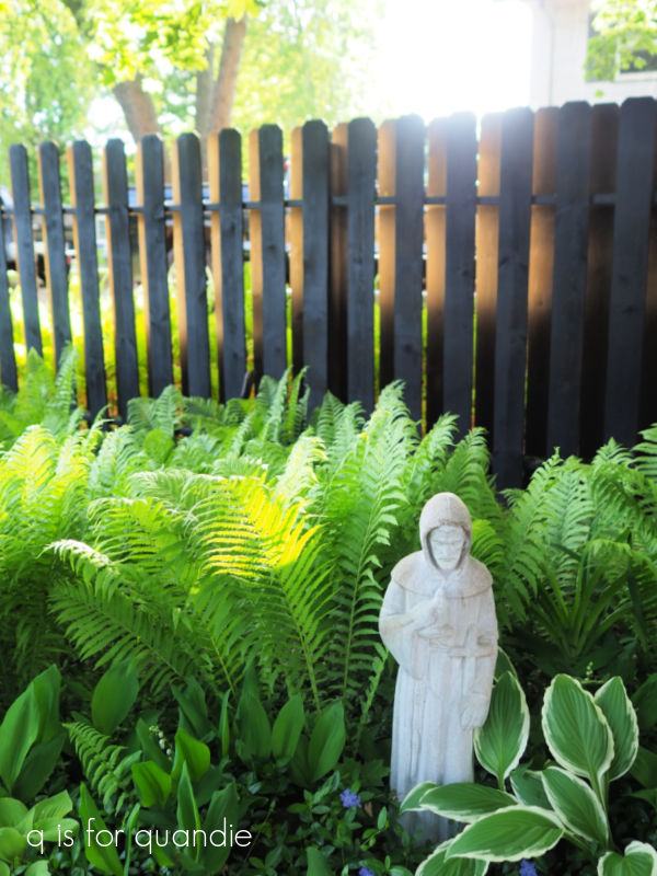
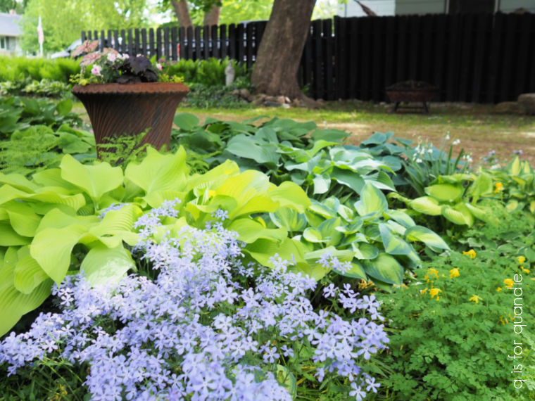
Good morning from the garden!
If you’ve followed me for a while, you’ll know that I have a large window box that goes across almost the entire width of our front three-season porch. Our house faces north-west-ish, so it’s basically full shade in that spot although it does get some evening sun.
I’ve tried lot of different looks over the years, but so far there is really no contest for the most successful plant for this shady window box, it’s definitely coleus.

It absolutely thrives, and it creates quite a dramatic show along with some sweet potato vine and lemon coral sedum.

In fact, it’s almost too successful as it grows high enough to block any breezes that might want to try to get through those windows.
Quite honestly, it almost feels like cheating to just fill up the window box with coleus and sweet potato vine and call it good. It’s a little too easy, and it also seems a bit … well … uninspired.
So sometimes I try to change it up, think outside the box a little (pardon the pun).
Unfortunately that can lead to what I consider to be window box fails. Last year is a good example of that. I tried experimenting with some new things, and the combination really didn’t work.

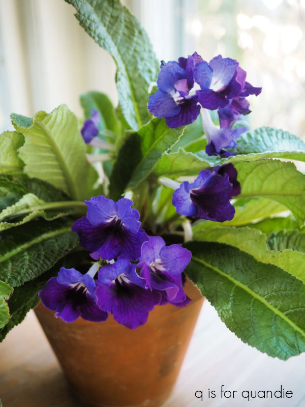
The silver of the Dusty Miller and the Dichondra Silver Falls just wasn’t me. I put in some lovely coral pink begonias that ended up being totally swallowed up by other more vigorous plants, as did the Streptocarpus Ladyslippers™ Deep Blue Vein. Although those did become some really pretty houseplants.
The very worst year for the window box had to be 2015 though.

Oh my gosh, does that look like a hot mess or what? That was the year I tried angelonia. I don’t know what I was thinking. They clearly require full sun, and I definitely don’t have full sun here. Plus, I combined the angelonia with a purple annual salvia and some Diamond Frost euphorbia, all of which have a delicate, airy look about them. I definitely needed to add something more substantial to the mix.
I did have some success in 2017 when I decided to go with a deep coral pink sort of color scheme.

The New Guinea impatiens did well, and paired nicely with some fuchsia.

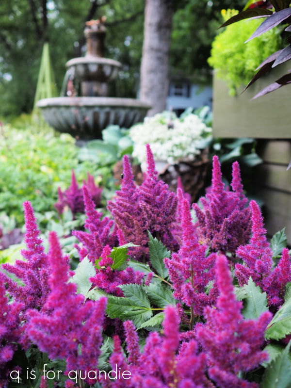
But when the cooler purple astilbe that is in the ground right below the window box was in bloom, it didn’t really pair well with those colors.
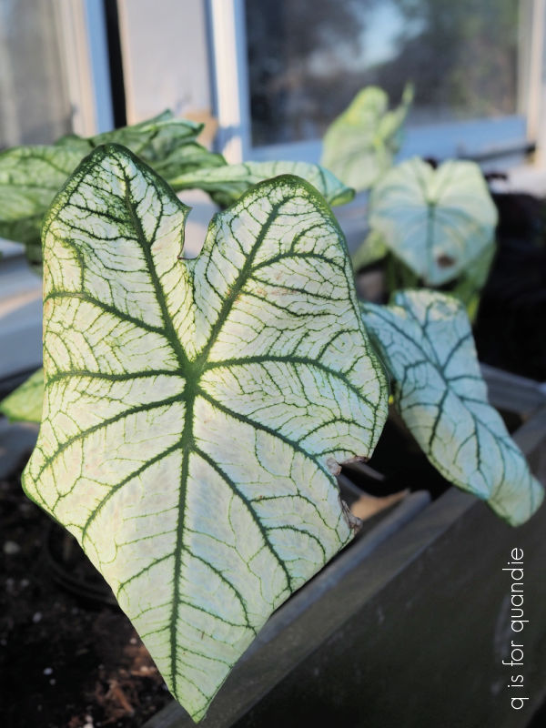
I did enjoy the monochromatic white color scheme that I tried back in 2014.

That year I used white impatiens, euphorbia, jester’s crown ferns, a swedish ivy and a gorgeous white and green caladium.
And when fall came around I pulled out the impatiens and replaced them with white mums. Then I popped in a couple of white pumpkins, and added some cut Annabelle hydrangea blooms for a less traditional autumnal look.

As much as I love that look, I will admit that it doesn’t have the same impact from the street as the brighter coleus combinations.
Once again this year, I was in the mood to do a bit more experimenting instead of falling back on the tried and true coleus/potato vine combo. After checking out what was available at a few of my favorite nurseries, I ended up with a ‘black and white’ theme.

First of all, you have to know that gardeners call colors by the wrong names. Anything called ‘blue’ is typically really purple, while ‘purple’ is often a hot pink or magenta color. And ‘black’ is really a very deep purple.
I based my ‘black’ on this coleus that I found at the Amish farm that my neighbor nnK and I visit every spring to buy plants.

It didn’t have a label, but I think it may be a variety called Black Coral.
I know it doesn’t look too exciting at first, it’s not bright, it’s not wildly variegated. But I next found this rex begonia to add to the mix, and it is pretty exciting. Paired together, I think this is going to make a fantastic combination.
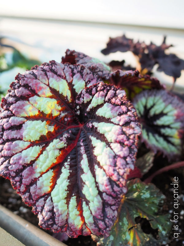
Once again, no label, but I think the begonia may be Curly Mint.
I also added this rex begonia to the mix …

Both of the begonias have that rich plum color that ties in with the ‘black’ coleus. I’m just hoping that they won’t be overpowered by the more vigorous growth of the coleus.
For the ‘white’ component in my window box I went back to that white caladium that I loved so much.
I also added a bunch of white New Guinea impatiens, and some Diamond Snow euphorbia.

The Diamond Snow euphorbia is supposed to be a more dense and compact, less ‘airy’, version of the Diamond Frost that I usually use. And again, I’m hoping this one won’t overpower the other plants.
Finally, I also threw in a Firehouse White trailing verbena.

I may have trouble getting the verbena to bloom in this shady location, but I thought I’d give it a try. For now all of those blooms are compliments of the greenhouse that grew it (Country Sun in Stillwater, FYI). Also, you do need to deadhead trailing verbena to encourage more flowers, so we’ll just have to wait and see if I keep up on that.
I added some more ‘black’ to the mix with this Charmed Wine Oxalis from Proven Winners.

It will have white flowers when it blooms as well, so it’s perfect for my black and white theme. However, I grow it mainly for it’s foliage, it won’t bloom profusely. Much like the Streptocarpus I mentioned from last year, Oxalis can be taken inside and wintered over as a houseplant. I may give that a try in the fall.
Finally I put in a couple of Blackie sweet potato vines. I guess I couldn’t fully escape the coleus or the sweet potato vines.

Now, I just have to be patient and wait for all of these to fill in. I’m guessing that’s going to take at least a month or so. Gardening is not a hobby for the impatient.
I’ll try to remember to give you all an update on how my black and white window box turned out at the end of summer.
How about you? Have you ever tried a black and white theme? Or do you have another combination that you love for containers? Leave a comment and let me know.


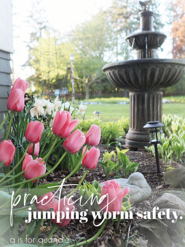


 Have you heard about jumping worms? They are a non-native earthworm that strips the nutrients from top soil. And according to