Remember my non-collection of whisk brooms?

I’ve used them as props in so many photos! This next one being one of my all-time favorites.
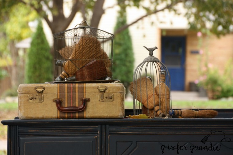
I initially started accumulating them because I wanted to make a wreath, but even after I had enough for that I still hadn’t made one.
So I put price tags on them and put them in my Carriage House sale back in June.
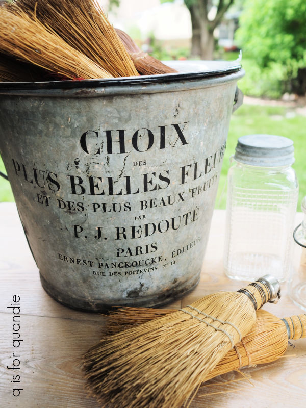
Maybe one or two of them sold, I’m not sure, but most of them didn’t. For that matter, that really cool bucket didn’t sell either.
So I said to myself, ‘you know what? I’m going to make that damn wreath after all!’
First I went to pinterest to see if I could find any examples of a whisk broom wreath, but I didn’t find anything there. Next I just simply googled ‘whisk broom wreath’ and I ended up on Ki Nassauer’s Lived-In Style online membership magazine.
Now I’ve been a fan of Ki for a long time. Back in the day she had an occasional sale over on the other side of the Twin Cities. She also was the original inspiration behind the Bachman’s Idea House (back when it was awesome). She has since moved away from Minnesota, and the Idea House was never the same.
The Lived-In Style online magazine requires a membership fee of $6 per month. Normally I don’t go for that sort of thing (because you sign up and are perpetually charged each month until you finally remember to cancel your membership three years down the road, yada, yada, yada), but I decided to bite the bullet and pay my $6 to see if there were any good tips on making the wreath.
Comically, when I finally got to the article the instructions were as follows:
“Arrange them on a wire wreath form, with the handles pointed toward the center and the threaded areas aligned as much as possible. Wire the brooms to the frame.”
And that was literally it. It was one short paragraph, with one photo.
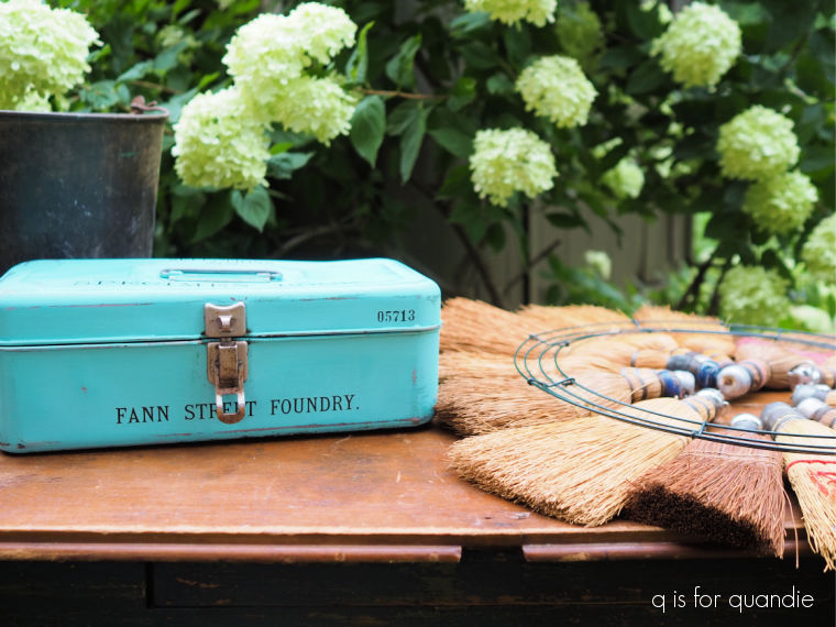
So I gathered up my supplies …

and then started laying out my brooms.

I started by spacing out the larger brooms, and then I filled in with the smaller ones.

I did get one take-away tip from Ki, to align the threaded areas on the brooms. I hadn’t done that before the photo above, but I did later.
The next challenge was to figure out exactly how to wire them to the form without the wires showing on the front. I began with a lightweight floral wire.

For the life of me, I could not get that wire through the brooms. I fiddled around with it for a while, but no go. So I switched to a heavier weight wire, but again it was a no go.
So I decided to keep it simple and just use hot glue.
I whipped out the tackle box that holds my hot glue supplies and got to work.
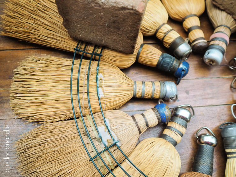
I found that I needed to weigh down the wire frame to make good contact with the brooms as the glue hardened, so I just used a couple of bricks and a heavy rock for that.
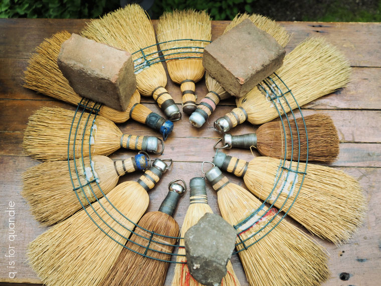
And that was it.

I flipped it over and hung it on the potting shed.

Now, I’m not at all sure how well the hot glue is going to hold up to the elements. We’ll see if it lasts the entire fall season or not. Also, as you can see, it took 13 whisk brooms to make a complete wreath, so accumulating that many might take some time. Especially if you’re hoping to find them for $1 each at garage sales.
But I think it’s a fun and unique fall decoration.
What do you think? Leave a comment and let me know.


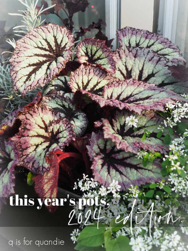
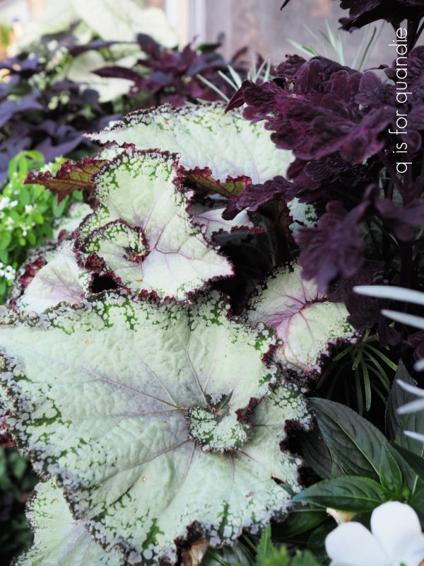


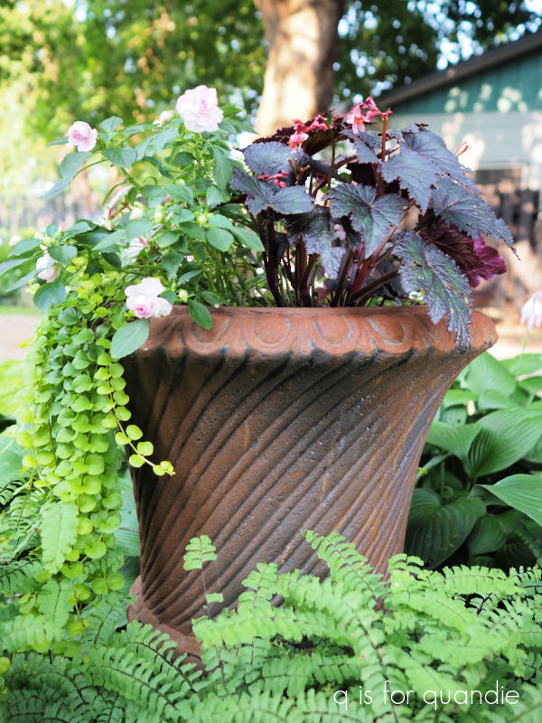
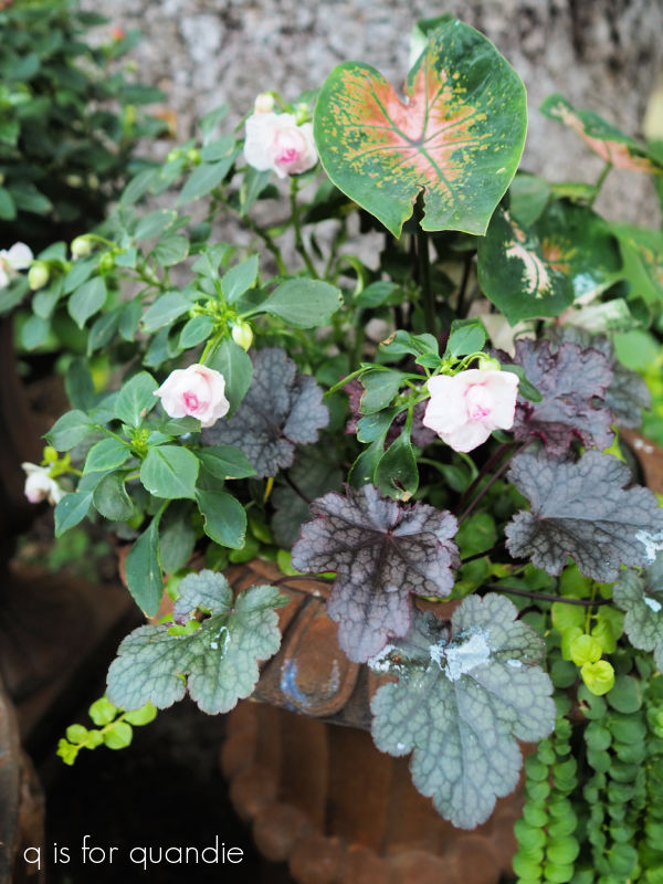
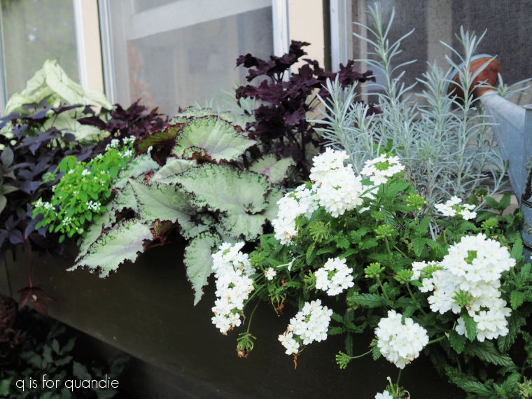
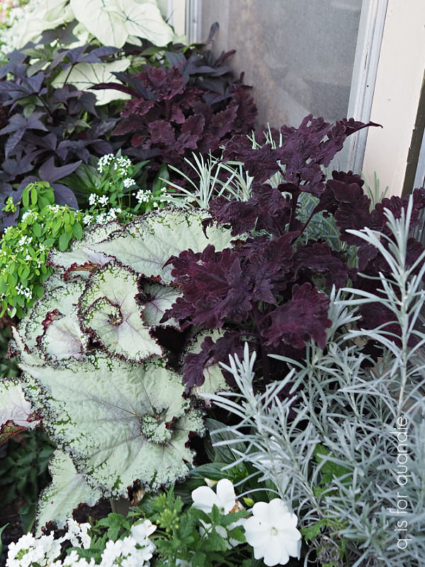
 When I planted this one up I called it a ‘black and white’ combination.
 For the ‘white’ elements, I used white New Guinea impatiens and Proven Winner’s Superbena Whiteout.