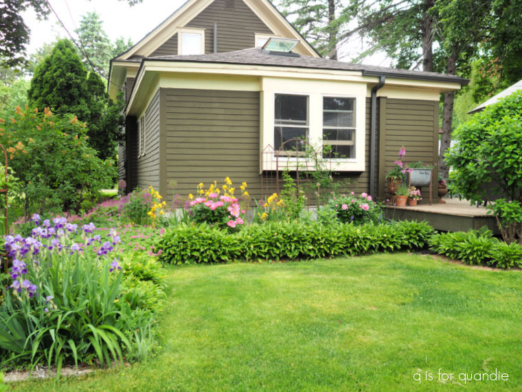
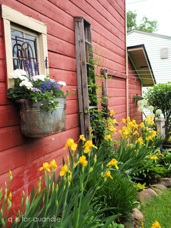
Good morning from the garden!
If you’ve followed me for a while, you know all about my fairy garden. However, just in case some of you are new here, I’ve had a fairy garden of some kind for many years.
I love gardening in miniature!
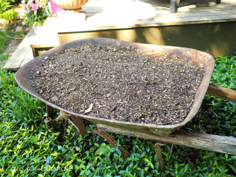
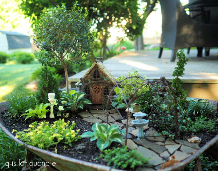
I use a mix of shrubs, perennials and annuals in my fairy garden which is planted in an old wheelbarrow with plenty of rusty holes for drainage.
Typically I add several inches of chopped up leaves and then a burlap cover for winter (we have pretty harsh winters here in Minnesota), but this past winter I never did get around to the cover (although I did add the leaves). Unfortunately, I ended up losing everything that was planted in there as a result.
On the bright side, last fall I removed the miniature hostas and planted them in a somewhat protected area in the ground to overwinter and that worked out perfectly. I also potted up the Myrtle topiary and kept it as a houseplant over the winter.
Also on the bright side, losing almost everything meant a chance to start over with a clean slate!
I started with mail ordering a bunch of miniature plants from TwoGreenThumbs.com. They shipped my plants out quickly, and they were in really good shape when they arrived. I will say that a few of them were a bit root-bound in their pots, but that’s an easy fix. Just rough up the roots a bit before planting.
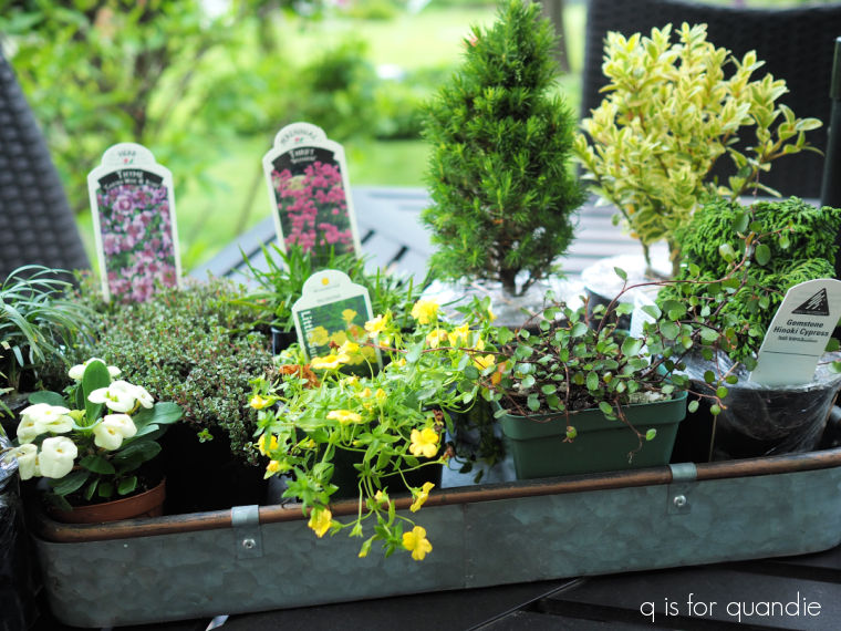
In addition to the plants that are specifically meant for miniature gardens, I also picked up a few ground cover type plants that always work well in miniature; mecardonia (the plant with the yellow flower above), a creeping thyme, and a small leaf wire vine. You can usually find those at any nursery or garden center.
Another good option is alyssum, which is sold everywhere. I didn’t get any this year, but I’ve used it in the past. It’s the purple flower shown below.

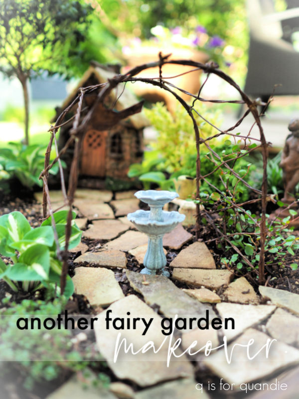
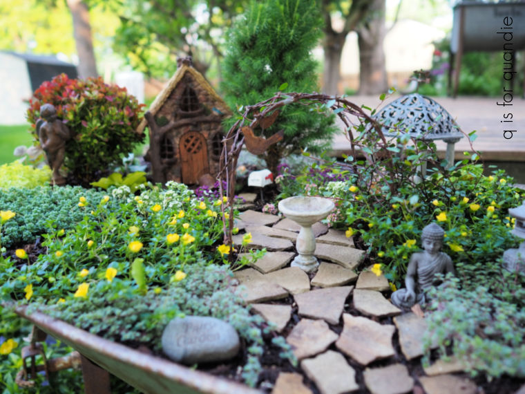
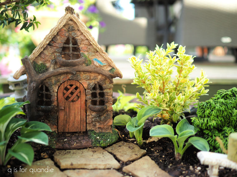
I began with placing the larger items including my fairy house and the myrtle standard that I saved over the winter. It works perfectly as a ‘tree’.
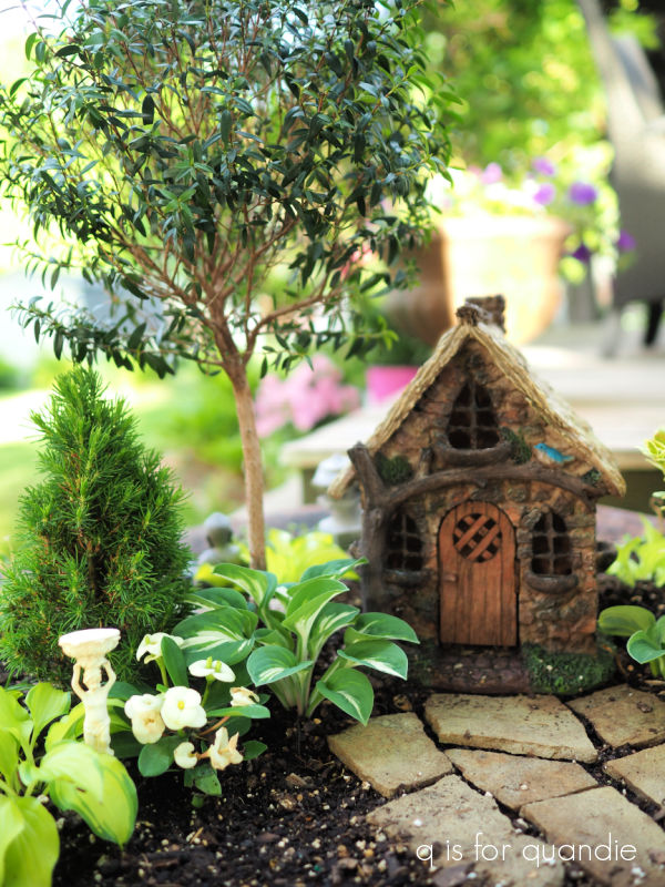
I’ll probably prune it a little for size after it recovers from any transplant shock.
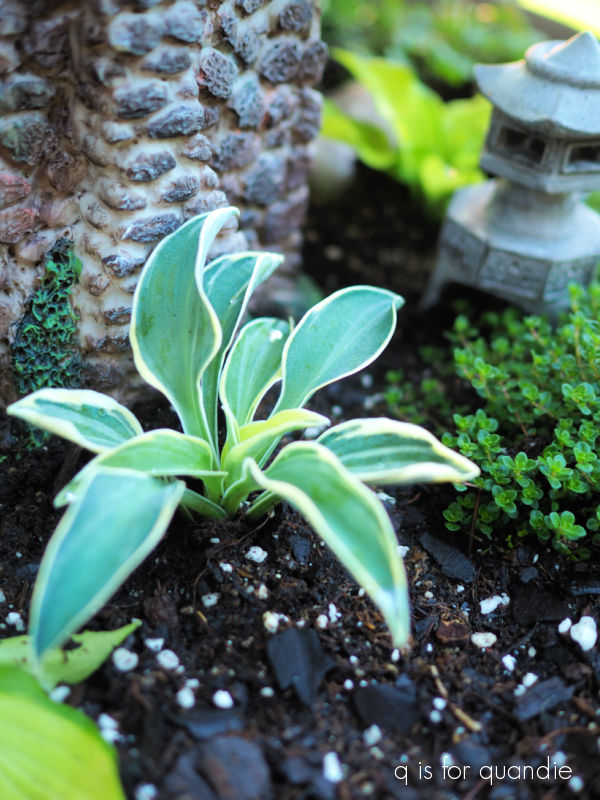
I added a Jean’s Dilly dwarf spruce under the myrtle, as well as one of the Pandora’s Box hostas that I saved from last year.
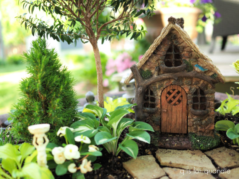
As for that little plant with the white flowers that is next to the hosta …
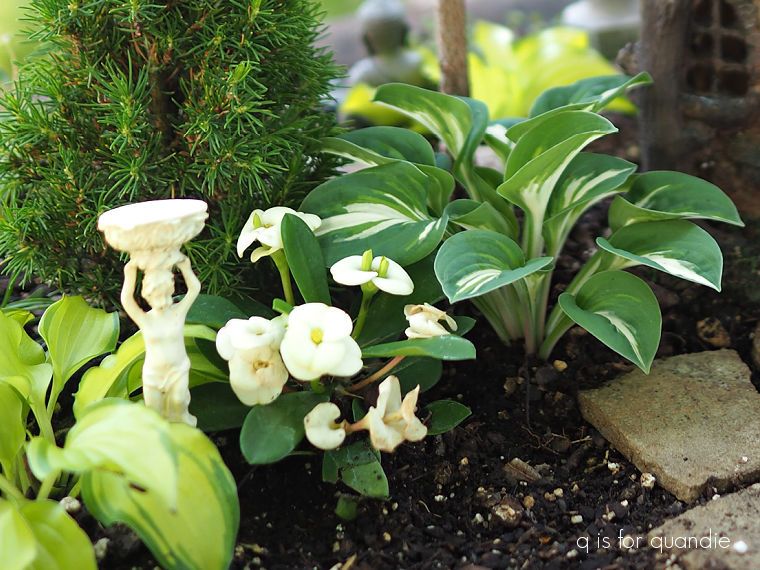
well, I have no idea what that is. I bought it at Bachman’s, but it wasn’t labeled. It sure is cute though. Do any of you know what it might be?
Over on the other side of the house I planted two shrubs, a variegated English boxwood and a Gemstone Hinoki cypress.
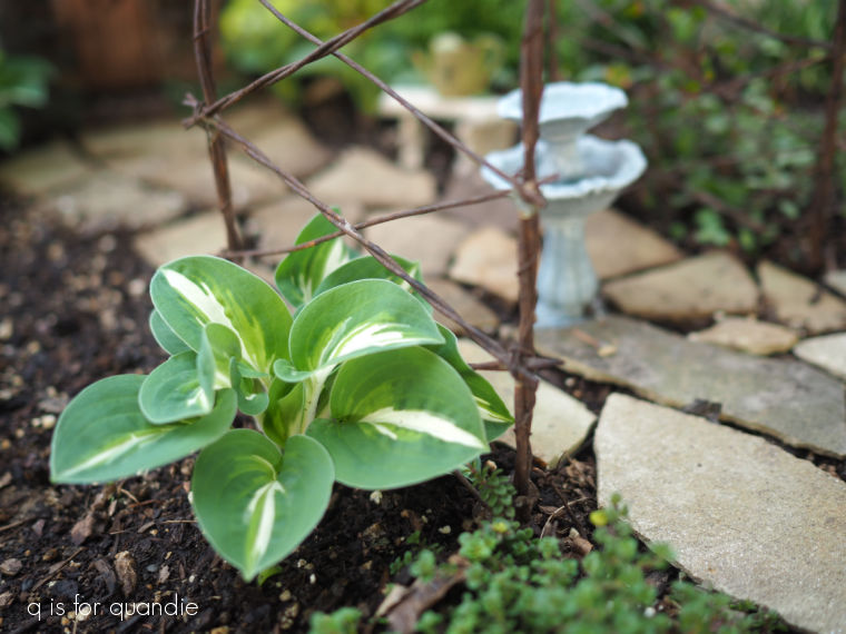
I ‘divided’ my Frosted Mouse Ears hostas and put two of them in front of the shrubs.
I planted another chunk of the Pandora’s Box next to the arbor.
I planted the wire vine on the other side of the arbor and I will train it to grow up and over.
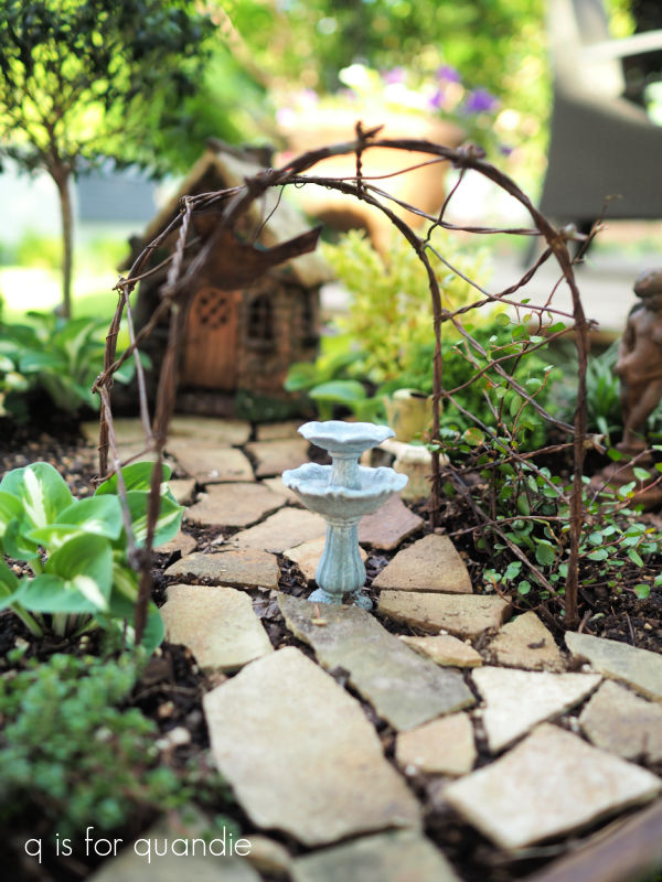
It will eventually try to take over the entire fairy garden, so I’ll have to clip it back quite often later in the summer.
I purchased a couple of Dwarf Mondo Grass plants from Two Green Thumbs, and I was able to divide them right out of the pot before planting.
I’ve never grown these before, so I’m looking forward to seeing how they do.
Around the back of the fairy house I planted a couple of the creeping thyme plants and several of my Feather Boa hostas.

I have a patch of the Feather Boa hostas in the ground near the potting shed, so I just take a chunk out of it for the fairy garden.

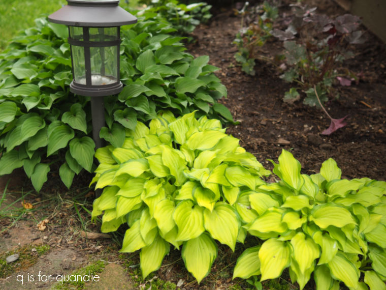
Today’s q tip on growing miniature hostas; hostas are classified by their mature height into five categories, miniature, small, medium, large and giant. The hostas in my fairy garden are all in the miniature category. If you keep the miniature hostas confined in a small planter or pot, they will stay quite small. If you put them in the ground, they will grow quite a bit larger and spread more. Here is my patch of Feather Boa hostas in the ground. Behind them on the left is another miniature hosta that originally came from my fairy garden, but I don’t remember the name of that one.
In addition to being perfect for a fairy garden, these miniature hostas make a fantastic front border for a shady garden.
Unfortunately, I do not have a good mail order source for miniature hostas. Two Green Thumbs doesn’t carry any. It looks like there are quite a few options for mail ordering them online, but having never ordered from any of them I can’t make a recommendation.
However, for my local readers, this past Friday I once again stopped in at Dragonfly Gardens in Amery, Wisconsin and they had a couple of miniature hostas available. I purchased the Funny Mouse. After I looked their supply over I found a pot that looked full enough that I could divide the hosta before planting it. I ended up with three plants. I planted one in my neighbor’s mom’s fairy garden, and two in my own.
I also found that Dragonfly had miniature trees! I was able to pick up another Primo Arborvitae for $20 (the tall, skinny evergreen on the right in the photo below).
I had added one of these last year as well, but lost it over the winter. I’ll try harder to save it this year.
I just can’t tell you how much I enjoy gardening in miniature.
If you don’t have space for a full sized garden, or you just don’t want to work that hard, a miniature garden is the way to go. All you need is a container of some kind and a bit of imagination.
Have you got a miniature garden? Or have I inspired you to consider adding one?
Before I let you go today I wanted to update you on my experiment with ordering ‘plugs’ online. I ordered three apricot snapdragon plants from Holland Bulb Farms in Milwaukee. It took them two weeks to get them shipped out, and that was only after I finally inquired about the status of my order. When they did arrive, they looked like this …
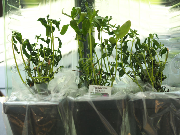
They were bone dry and two were completely shriveled, with the 3rd one well on its way. I have to wonder how long they were sitting in their packaging before being shipped out.
Shockingly enough, I paid $25 for these three snapdragon plants. The plants were $15, with an additional $10 in shipping and tax added. Somehow at that price point I expected a much higher quality plant.
I reached out to Holland Bulb Farms to let them know that the plants arrived in very poor condition and that I doubt they will survive being put in the ground. Their response was that the plants still look green (I sent the pic shown above) and I should give them two weeks “with proper care” and they should bounce back.
So I’ve put them in the ground and they are starting to look a little bit better, but definitely are not thriving. I think it will be a miracle if I get any flowers on them by July.
Well, I guess I’ll let this be a lesson to me, and possibly to you too. Ordering annuals like this is probably not something that’s worth doing for me. How about you? Have you ever ordered plants this way, and did you have any luck? Leave a comment and let me know.