knock off nightstand.

I saw this beautiful nightstand on pinterest a while back …

nightstand 2

Lovely, right?

I tracked it down to its source.  Turns out it is for sale at Neiman Marcus and it can be yours for a mere $799 plus $175 shipping.  Hmmmm.  Add in the tax, and you are looking at over $1,000.  For a nightstand.  Wowza!

I guess if you have that kind of money to blow on a nightstand, more power to you!  But if you don’t, you can create a knock off.

Start with a basic French provincial nightstand.

grey nightstand before

Paint it with Annie Soan’s French Linen (that’s what I did), or you could use Miss Mustard Seed’s Trophy.  I think that would come closer to the shade of grey on the inspiration piece.  I didn’t use milk paint on mine because I didn’t want to see much of the original white and green paint coming through any chipping.

grey nightstand close up

Sand, wax and add a little gold rub ‘n buff to the details, and voila!  A Nieman Marcus knock off nightstand.

knock off nightstand title

In hindsight, I should have added a lot more gold to mine.  Unfortunately, it’s too late, I’ve already taken it to Reclaiming Beautiful in Stillwater to sell.  Do you think they would mind if I popped by with my rub ‘n buff and added some more gold?

I know mine isn’t quite as gorgeous as the original.  The lines on my nightstand aren’t as delicate and fine as the $1,000 version.  And I definitely don’t have as much gold.

nightstand collage

But seriously, at $125 for mine and over $1,000 for theirs … well, at least if you bought mine you could still afford your mortgage this month too.

what was I thinking?

I’m almost embarrassed to show these to you guys, but here we go.

what was I thinking

These are some clay pots that I bought at a craft show of some kind many years ago.  In case you are wondering, yes, they are just drawn on with a Sharpie.  I know, right?  What was I thinking?

I apologize now if the person who made these recognizes them and feels bad that I am mocking them.  Hey, I bought them, so I guess at one time I didn’t think they were that bad.  Not only that, but I have displayed them in my office at the day job every fall since I purchased them.  And even worse, I put one in the window sill with dried hydrangeas in it last fall and it had sat there ever since.  All through last Christmas, and then spring and summer … right up until I brought it home the other day.  Seriously, for that alone I should have my official decorating blogger ID card taken away permanently (if there was such a thing).

Well, I have finally come to my senses and decided to spruce these up and make them into something I won’t be embarrassed to display.  The impetus for this change came when I stopped in at Farmhouse Inspired a few weeks ago to get some more Fusion paint.  I noticed that Jody was also carrying a new chalk paint line created by the Junk Gypsies.  And she had a small table painted in their mustard yellow color, which is called Granny’s Cornbread.  I just loved the richness of the mustard.  I wanted to buy some to play around with, but she only had the large size cans of this color in stock at the moment.  I couldn’t bring myself to spend $40 to just play around with a color, and I’m not sure how well large pieces of furniture would sell painted in this color.  But Jody graciously offered to share a small free sample with me (thanks again Jody!)  Perfect for painting some pots!

painted pots version 1

I put two coats of paint on, but noticed I could still faintly see the original sharpie drawn details, so I added a third coat of paint.  Then I used the acrylic medium transfer method to add some autumnal looking graphics (if you want more detail on this method, check out this post about the french hat box.)

Ahhh.  So much better.  Almost.  Until you look closely and see that the stars are still peeking through the paint around the rim on the shorter pot.  Drat!  I then put another coat of paint around just the rim of that pot.  Then I got involved in something else for a few days.  And when I came back to the pots … well … sigh … this happened ….

painted pots ruined 1

First of all, the Sharpie ink had continued to bleed through my paint.  Then, to add a little extra frustration to the moment, I dropped one of the pots!

broken pot

So, two lessons learned here.  First, Sharpie ink bleeds through chalk paint.  Second, don’t drop clay pots.

In the end, I went to Menards and purchased some brand new clay pots to paint.

painted pots version 2

Unfortunately, at that point I was almost out of Granny’s Cornbread and had just enough left for two more pots.  So I also used Annie Sloan’s Old White and Coco.

cornbread pot

I also went with an additional graphic that isn’t quite as fall-ish, but I thought it was just gorgeous.

opera graphic

A word to the wise, these pots would not be suitable for house plants.  I haven’t actually tested it, but I’m sure that over time too much moisture would leach through the pot and lift the paint off.  However, you can use plants that are in plastic liner pots and just remove them to water them.  Let them drain well, and then return them to the pot.  These pots happen to look great with some fall mums in them.  I know this because sent a few over to Eye Candy ReFind that way!  I also brought some pots over to Reclaiming Beautiful this week.  So if you are local and want one of these pretty pots to use for a fall mum, head to either shop!  And if you have something that you want to paint in a gorgeous rich mustard yellow, consider trying the Granny’s Cornbread.

a dark and stormy night.

grey dresser staging 2

A while back I sent Mr. Q to a garage sale to see if there were any pieces of furniture to be had. Sure enough, there were several pieces that he thought I would like.  At the time, a storm was brewing and the rain was just starting to come down as he negotiated the deal.  As a result, he didn’t spend as much time scrutinizing these pieces as he should have.  He paid for them, threw them in the truck and hightailed it home.

grey dresser before

By the time he pulled in our driveway it was coming down pretty good.  We unloaded things and dried them off, and then left them in the carriage house.  Later in the week when I pulled this dresser out for a closer look, I discovered that all of the drawers were firmly stuck closed!  Ugh!  It was a case of the dresser looking pretty good on the outside, but really in very bad shape on the inside.

Handyman Ken and I literally had to remove the back of the dresser and pound each drawer out from behind with a hammer.  Then Ken went to work sanding all the drawers down and making a couple of other fixes that were needed inside to make the drawers open and close smoothly.  Once again, thank goodness for Ken.

After all of that hard work, I decided this piece should be painted in a dark and stormy grey to match both the weather when we bought it and my mood when I discovered the drawers were all stuck!

grey dresser title

I used a mix of Urban Rooster’s Smokey Ash and Dixie Belle’s Hurricane Grey.  Honestly, there was very little (if any) difference between these two colors.  I didn’t think I had enough of either one to do the whole dresser though, so I simply mixed them together.

grey dresser close up

I gave the rich grey color even a little more depth by finishing with Miss Mustard Seed’s antiquing wax.  This dresser has some very charming trim on the front.

grey dresser detail

I wasn’t sure about the hardware, but my friend Meggan convinced me to keep it.  She loved the verdigris patina, and she was certain the color would work well with the grey.

grey dresser hardware

I think she was right, what do you think?

grey dresser angle

I love the combo of grey and mustard yellow, so I used one of my fall painted pots for staging (you’ll read more about those in an upcoming post).

grey dresser staging

I think this one turned out quite nice in the end, but there was a lot of extra effort involved.  In the future I think I’ll try and stick with dressers that don’t have sticky drawers!

Linking up with:  Making Broken Beautiful Furniture Party at The Curator’s Collection.

life, what a trip.

So, I have a confession to make.  I subscribe to notes from the universe via email.  I can’t remember how I came across this, it was quite a while ago.  I subscribed on a whim and now every day I get an email from the universe (it is free, by the way, and this not a sponsored post).   Sometimes they are a little goofy, but many times they are spot on.  It can be rather freaky when I get the exact message I need on a particular day.

Ball jars

The other day I got this message from the universe:

Start it; you don’t have to be fancy.

Keep moving; you don’t have to go crazy.

Visualize; you don’t have to admit it.

See the end result; it doesn’t have to be material.

Expect miracles; they don’t have to be huge.

Pretend you’ve arrived; you don’t have to dance on tables.

And above all else, Linda, have fun.

This is why you started it, right?

Life, what a trip –
The Universe

And it occurred to me that this explains exactly how I feel about blogging.

cricut globe

There is so much about this that fits.  I started this blog and it wasn’t fancy.  It still isn’t particularly fancy.  But I started it, and it is all me.

The end result doesn’t have to be material!  I would like to repeat that one ten times.  I’m really writing this blog for my own enjoyment.  I love the process.  The furniture makeovers, the room makeovers, the photography, writing the posts, I enjoy all of it!  I’m not doing it to make money, I have the accountant day job for that.  I don’t get any ad revenue, no one pays me to review their products, and I’m not looking for those things.  I am selling furniture of course, but I can do that just as easily without the blog.

I still have to work on pretending I’ve arrived.  I’m not even sure how I would define that.  But I think I might go ahead and dance on tables anyway.

But most importantly, I am having fun!  That is why I started it!

fall asters

So, if you’ve been thinking about starting your own blog or beginning any sort of adventure, let me refer you back to today’s message from the universe.  Start it; you don’t have to be fancy!

mums the word.

This year’s summer window box was kind of a bust.  I tried something new and it was a fail.  I used a couple of annuals that were new to me, unfortunately I didn’t even keep track of their names.  By mid-August, it just looked like I had a bunch of weeds growing in my window box.

summer window box

Ugh!  Terrible, right?

So when I heard an ad on the radio saying that the mums were in at Bachman’s, I went to Menard’s to see if they had them too.  Mainly because Menard’s is usually a bit cheaper and I can get there on my lunch hour.  Sure enough, they had rows and rows of them.  The larger ones were only $3.99 and since I needed 9 of them that seemed like a do-able price.  So I grabbed a bunch of mums, threw in some celosia (at $6.99 each) and called it good.

I ripped everything out of the window box except the euphorbia, planted the celosia together in the middle and filled in with the mums.

window box 1

I’ve added a fab pop of color to the front of my house with this combination!  I didn’t go overly ‘fall-ish’ with my color choices since it is still rather early in the season.

window box 2

And sadly, these mums aren’t going to last much more than a month or so, if that.

window box 3

But they are a huge improvement over the ‘weeds’.

I still think I liked last year’s monochromatic fall window box better though.  Remember it?

fall window box title

Which one do you prefer?


my big sister’s china closet.

I’m pretty sure that since the very first day my mom and dad brought me home from the hospital, my big sister Debbie has been trying to boss me around.  As the typical ‘oldest child’, she likes to be in charge.  As a result, she seems a bit annoyed every time I suggest that she is my ‘apprentice’ in the furniture workshop!  Nonetheless, I am proud of her work on the hutch that she completed under my tutelage (LOL, she’s not going to like that!  It’s true though.)

Debbie needed a small china cupboard for her new apartment.  She left her old one behind in New Jersey because it had seen better days and it didn’t fit in the truck.  I assured her that we could find something cheap on craigslist and make it fabulous.  So one Saturday morning about a month ago, we sat down at the computer and found a sweet little Duncan Phyfe style piece for a mere $80!

china cupboard before

It wasn’t in bad shape, just a little dated in appearance.  The curved glass on the middle section is quite lovely.  Debbie likes the simple lines of this piece.  I tried to sell her on something with a little more detail on the top, but she liked this better.

So we unloaded it into my workshop and she got started.  She removed all of the hardware and sanded lightly.  I cautioned her against over-sanding because this looked like it could be a bleeder.  And sure enough it was.  When you have a piece that has orange or red stain that bleeds, you want to maintain the original varnish as much as possible to keep the stain sealed in.  Your next option is to re-seal it with shellac or the Tough Coat Sealer.  In the end, Debbie was able to get by with just a couple spots of sealer needed on the outside, which she painted in Annie Sloan’s French Linen.  The inside was a different story.  That required two coats of sealer to keep the stain from bleeding through the Fusion Lamp White that she used there.  We also ended up removing the back to make it easier to paint the inside.  It also made it easier for Ken to repair one of the glass stops that wasn’t holding the glass in place properly.

china cupboard after

So much better, right?  By the way, Debbie calls it a ‘china closet’.  I suspect this might be an east coast thing.  I’ve always called these china cupboards, or hutches.  What do you call them?

And FYI, I thought I’d leave all of the reflections in the glass rather than erasing them with some editing software.  It makes for a fun detective project to figure out what you can see reflected there.  The turquoise t-shirt and white shorts?  That’s me.  You can also see Debbie texting, my old car (I just got a new one this week!), the carriage house … and more!

I hoped that Debbie would take my suggestion and add a stencil to her cabinet, and she did.  The “Family and Friends gather here” stencil seemed particularly perfect for a china cupboard.

china cupboard stencil

Debbie finished the piece using my custom blended dark wax.

She spent nearly as much on paint products as she did on the cupboard itself.  The Annie Sloan paint was $40, the Fusion paint was $20 and the Tough Coat Sealer was around $15.  But she has more than enough of each of them left to paint some chairs for her dining table … her next project.  And even at $155 this was a bargain.

Didn’t she do a great job?  She should let me boss her around more often, don’t you agree?!

linen times 2.

Up until last winter, I had this black waterfall buffet in my dining room.

waterfall buffet painted black

I really liked this piece, and I loved the suitcases stacked in the center section.  But I was struggling with how dark the room was.  And that back wall was especially dark, so the big black buffet sort of created a decorating black hole.

When I made the decision to spruce up the dining room, I thought bringing in white furniture would help lighten up the room.  I wanted to use the hutch that I painted way back in December 2013.

jonas hutch

I originally took this hutch to the Round Barn to sell, and it never sold.  So when Lori decided to close up shop, I brought it back home.  I didn’t mind that it hadn’t sold, because I really love it.  I thought it was a sign that I should keep it.  So I sold the black waterfall buffet and put this one in its place.

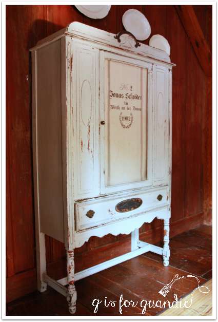
Can you see the problem though?  Here, this picture makes it more obvious …

hutch lost

That poor thing was just lost on that wall.  The scale was all wrong.  I tried to add some visual size with the plates, which did help a little.  I also debated adding old doors leaning against the wall on either side of it.  Maybe adding some sconces to the doors, and hanging some art on them.  That might have worked.

But ultimately I just decided that I needed a bigger piece!  I had a mental image of what I wanted. An open hutch where I could display my ironstone without it being behind glass.  I wanted it to be LARGE to fill up that wall and so that when I painted it white it would bring a lot of light into the room.  So I went to craigslist and I searched “large hutch” and this one came up.

pine cupboard before

It was priced at $425 which was a bit high for me.  It was also way out in Ham Lake, about a 40 minute drive from here.  However, it was exactly what I was looking for.  I loved the detailing at the top, the size, the boards at the back.  So I contacted the seller and negotiated a price of $375 and headed to Ham Lake the same day!

In person, this hutch ended up being another ‘faux-tique’ just like the Rooster cupboard that I painted for my Q Branch.  It has the same exact hinges (which are hard to describe, but kind of weird in that they twist and come apart) and the same faux-old skeleton key that is required for opening the doors on either side.  Both of these pieces have no labels on them, so I don’t know if there was a particular manufacturer making them or what.  But since I’d had great success with the earlier cupboard, I knew I would love this one too.  So I brought it home and painted it the next day!

And voila!

hutch 1

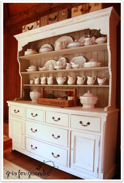
I think this piece is scaled much more appropriately for this room at 6′ wide and 7′ tall.

hutch 2

Here are the details.  The inside is painted in Fusion’s Linen.  I chose to use Fusion paint on the inside because I didn’t want to have to wax all of that!  Especially those boards in the back.  The outside is painted in Miss Mustard Seed’s Linen.  You know what’s funny, I didn’t realize until writing this post that these paint colors had the same name.  It’s Linen times 2, or Linen squared!  The MMS Linen is a warm white, while the Fusion Linen is a greige with a little bit of a green undertone.  Oh, and the reason I chose MMS on the outside is because I wanted chipping.  The more the better.  I was willing to pay the price of waxing to get that chippy-ness!

hutch stencil

And I got it!

Although not at first.  I had to resort to my new trick of using tape to pull the paint off.  But that worked beautifully.

You can see that I also added a little bitty stencil to the top, just to give it a little something unique.

hutch chipping

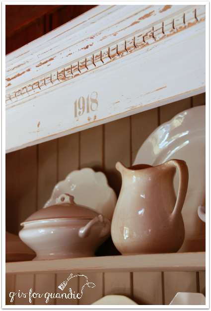
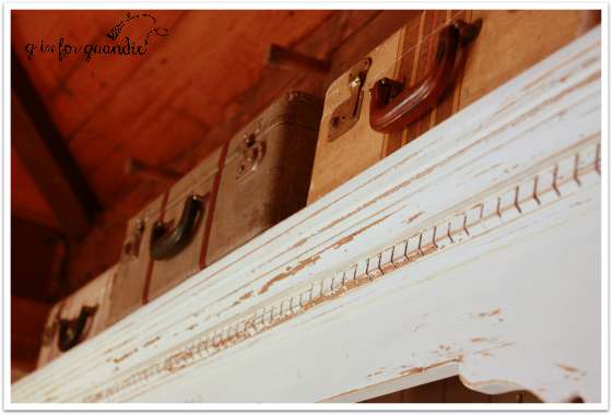
The “1918” doesn’t signify anything special, I just liked the way it looked!  Stacking some vintage suitcases on the top also adds a fun touch.

hutch top

This thing is huge, by the way.  It’s going to take a lot of ironstone to fill it up properly.

hutch ironstone

I’ve made a good start, but clearly I’ll be on the lookout for more!

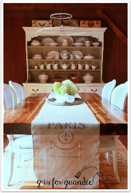
As much as I liked using the French Market wood tote on the table, it turned out that it worked even more perfectly on the hutch.

dining french market

So for now I have some hydrangeas in an ironstone soup tureen as a centerpiece instead.  The hydrangeas are starting to show their fall colors.

dining room hydrangeas

If you’re keeping track, here is what I’ve checked off on the dining room make-over to-do list so far:  new chairs, new light fixture, new hutch.

dining room south

Here’s what’s left:  paint the window trim white, find new light kit for ceiling fan, a change for the table (you’ll have to wait and see), come up with something for the large wall that was formerly full of mirrors (the mirrors have already been removed and now the wall is a blank canvas).

 So stay tuned!

P.S.  The smaller hutch is for sale if anyone local has a smaller wall to fill!  If interested, leave me a comment and I will email you with details.

they call me mellow yellow.

Last week my sister-in-law brought me yet another great piece of furniture to paint.  Delivered it right to my door as a matter of fact.  Isn’t that fantastic?

buttermilk cream before

It looks a little pink in the before photo, but that’s just a reflection from my red barn.  Really it was a sort of yellowed white with gold trim.  A sweet little French provincial desk.  Yep, it’s a desk.  You’ll see in a minute.

It was in great shape really, it just needed a little refreshing.  So that is what I did using some Fusion paint.

buttermilk desk title 2

I painted the body in Limestone and the drawer fronts in Buttermilk Cream.  I absolutely LOVE the Buttermilk Cream.  It’s the perfect pale yellow for those of us who want a sweet, subtle, mellow yellow.  One that doesn’t scream “Wowza!  Look at me!  I’m yellow!”

buttermilk angle

I debated painting the hardware before I put it back on, but I decided to take the famous advice “if it ain’t broke, don’t fix it.”

buttermilk hardware

It really worked beautifully with the yellow.

buttermilk corner

Remember that I said this piece is a desk?  Well, you pull those two little brass knobs above the top drawer and a desk top pulls out.

buttermilk desk open

How slick, right?

buttermilk desk open 2

It’s not pulled out all the way in these photos.  I think it would be the perfect size for a lap top computer if pulled out all the way.

But for my photo shoot it was the perfect spot for a vintage Boston Cook Book.

boston cook book

If you need a mellow yellow desk for your lap top (or your cook books), let me know.  So far this one is available.

buttermilk desk final

no one can know the distress of my mind.

Mac Grove is always one of my favorite neighborhood sales.  For those of you not from around here, the long name for this area is Macalester Groveland and it is near Macalester College in St. Paul.  Their neighborhood sales were last Saturday and about 40 homes were participating.  I picked my sister up at about 7:30 and we headed off.  Debbie was in charge of navigation and I was the driver.

mac grove books close up

I found some great vintage books and one of my fave finds was a ziploc bag full of vintage aqua Christmas bulbs.  Debbie spotted these, by the way.  I went right past them without noticing, but she held them up and said “um, hey, isn’t this your color?”  Dang!  Why yes it is!

mac grove bulbs close up

These don’t qualify as the ‘find of the day’ though.  That honor goes to the pile of vintage luggage.  All from one sale.

mac grove vintage luggage title

Isn’t this little train case incredibly charming?  And it matches my MMS Flow Blue chair perfectly.

mag grove vintage luggage 3

As if this matched set wasn’t enough, there were two more pieces that didn’t match including this charming monogrammed piece.

mac grove vintage luggage 2

Who remembers Northwest Orient Airlines?  They dropped the “Orient” in 1986, and of course merged with Delta in 2008.

I also found a lovely brown transferware pitcher and some primitive wooden utensils.

mac grove transferware

My pile of goodies was full of my favorite shades of blue and green.

mag grove blues and greens

After taking that photo, I decided to get out my macro lens and play around with some close ups of the little milk truck so you could see the detail.

mac grove milk truck

Seriously, how could I resist this thing?   The color, the patina, the little cow on the door panel.  And it was only 50 cents, so who could pass it by?

I still struggle a bit with the macro lens.  When I bought it I thought I would use it a lot for flower close ups.  Why I thought I needed close up photos of flowers is beyond me now.  The depth of field with a macro lens is very small.  You can see the results of that in this next photo.  Only the exact portion of the plate that I focused on is crisp (sort of?), while everything that is slightly closer or further away is out of focus.  This can be fun to play around with, but it is also rather frustrating.

mac grove china

When I took the closeups of the aqua bottle I could actually read what it said.

mac grove bottle close up

So I googled it to see if it was legit.  Turns out Dr. Pierce’s Favorite Prescription was a typical quack medicine from the late 1800’s to early 1900’s that originally contained opium.

A sales pitch for it said, “No one can know the distress of my mind as well as body. Dr. Pierce’s Favorite Prescription was the only medicine that seemed to do me any good. After I had taken the first bottle and part of the second. I could sleep well and all my troubles began to get better. I believe I took eight bottles and then I felt like a different person. I gave birth to another baby and my old complaint came back. I began using the “Favorite Prescription” and was soon relieved and was able to do my work, including the washing.”

Well, thank goodness she could do the washing, right?  She probably really enjoyed doing the washing after slurping down eight bottles of that stuff.

Too bad it was empty when I bought it!

it’s 5 o’clock somewhere.

That title really doesn’t have much to do with this dresser makeover.  I just happened to notice that the clock I used in my photos was set to 5:00 and it reminded me of the song.  I’ve had a soft spot for Jimmy Buffet ever since I lived in South Florida.  You can’t grow up down there and not turn into a Parrot Head!  My favorite Buffet songs are a little more obscure though, such as Breathe In, Breathe Out, Move On

I bought a cheap watch from a crazy man
Floating down canal
It doesn’t use numbers or moving hands
It always just says now
Now you may be thinking that I was had
But this watch is never wrong
And If I have trouble the warranty said
Breathe In, Breathe Out, Move On

Somehow I just love the idea of a watch that just says “now.”  I often need to be reminded to live in the moment.  Someone should make watches like that, don’t you think?

5 oclock somewhere

Alas, I don’t make watches!  But I do make-over dressers.

This is the last piece in the bedroom set I purchased a while back.  I’ve already painted the bed and the mirrored dresser, and now I’ve painted the tall gentlemen’s dresser.  Here it is before.

Natnl tall dresser before

I decided to paint it with Miss Mustard Seed’s Artissimo, a beautiful dark blue.  Unfortunately I had a really difficult time capturing the color correctly.  This photo looks kind of awful.  It was so much better in person, I swear.

5 oclock dresser 2

In fact it was so much better that it is already sold.  One of my favorite customers, Susan, came to pick up the Almond & Ironstone dresser and she saw this one and had to have it too!  Susan has very good taste 😉

This next photo is the only one that comes close to showing the true color.  Just squint a little and imagine this color in the rest of the photos.

5 oclock color

Much like with the other pieces in this set, a coat of paint really brought out the details.  Aren’t those feet and the trim at the bottom to die for?

5 oclock details

The varnish on the top of this dresser had some ‘alligatoring’.  I don’t know if that is truly a term or not, but do you know what I mean?  I wanted to save that because I love the look of it, so for that reason I chose not to strip and wax the top, but to paint it this time.  The milk paint does a great job of bringing out that look.

alligatoring

Ugh.  The color.  Still not good.

Well, I’m taking a look at my watch and it’s telling me that “now” is the first day of what looks to be a fab weekend.  Summer is coming to a close, but I’m going to live in the moment and enjoy every beautiful minute while it lasts.  Who’s with me?